
When you want to design complex layouts, you'll need to change the typical document flow and override the default browser styles.
You have to control how elements behave and are positioned on the page.
For example, you may want to stack elements next to each other or on top of one another in a specific way or make a header "stick" to the top of the page and not move when you scroll up and down the page.
To do the above, and much more, you'll use CSS's position property.
This property takes in five values: static, relative, absolute, fixed, and sticky.
In this article, we'll focus on the relative and absolute values.
We'll see an overview of how they work, their differences from one another, and how they are best used in conjunction for maximum effect.
Let's get started!
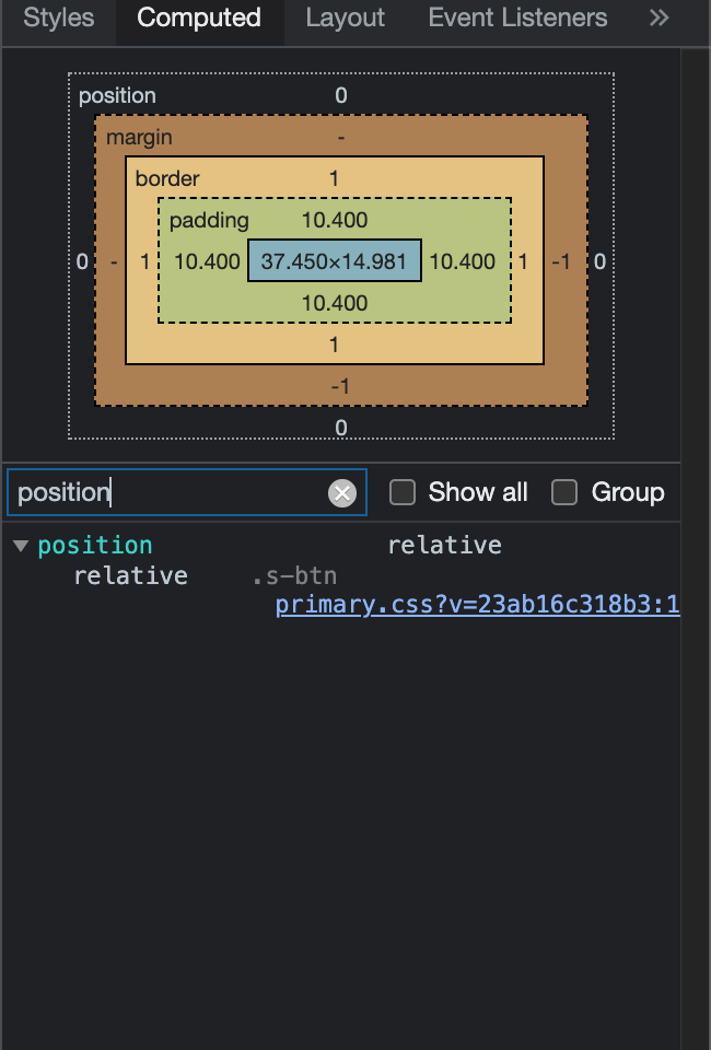
How to view the position of elements using Chrome Developer Tools
A useful tool in your front end web development workflow is Chrome's Developer Tools.
Among many things, you have the ability to look at the HTML/CSS/JavaScript code of any website to understand how different styles work.
To see what position an element has on a web page on a Mac machine, press Control and click at the same time while on the desired element. On a Window's machine, right click on the element you want to select.
A menu will then appear and from there select Inspect.
The Chrome Developer Tools will open.
Select the Computed tab and from there either scroll down to the position element or in the filter search box, type in position.
What is the default position of HTML elements in CSS?
By default, the position property for all HTML elements in CSS is set to static. This means that if you don't specify any other position value or if the position property is not declared explicitly, it'll be static.
Visually, all elements follow the order of the HTML code, and in that way the typical document flow is created.
Elements appear one after the other – directly below one another, according to the order of the HMTL code.
Block elements like <div> are stacked one after the other like this:
<!DOCTYPE html>
<html lang="en">
  <head>
    <meta charset="UTF-8">
    <meta http-equiv="X-UA-Compatible" content="IE=edge">
    <meta name="viewport" content="width=device-width, initial-scale=1.0">
    <link rel="stylesheet" href="style.css">
    <title>CSS Positioning</title>
  </head>
  <body>
    <div class="parent">
      <div class="child one">One</div>
      <div class="child two">Two</div>
      <div class="child three">Three</div>
      <div class="child four">Four</div>
    </div>
  </body>
</html>
body {
  margin: 100px auto;
}

.parent {
  width: 500px;
  border: 1px solid red;
  margin: auto;
  text-align: center;
}

.child {
  border-radius: 10%;
  width: 100px;
  height: 100px;
  margin: 20px;
}

.one {
  background-color: powderblue;
}

.two {
  background-color: royalblue;
}

.three {
  background-color: sienna;
}

.four {
  background-color: slateblue;
}
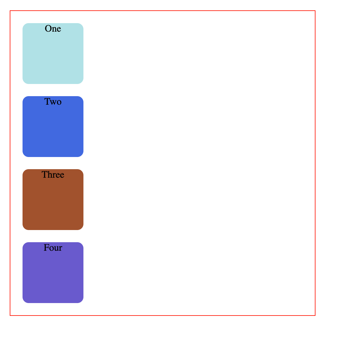
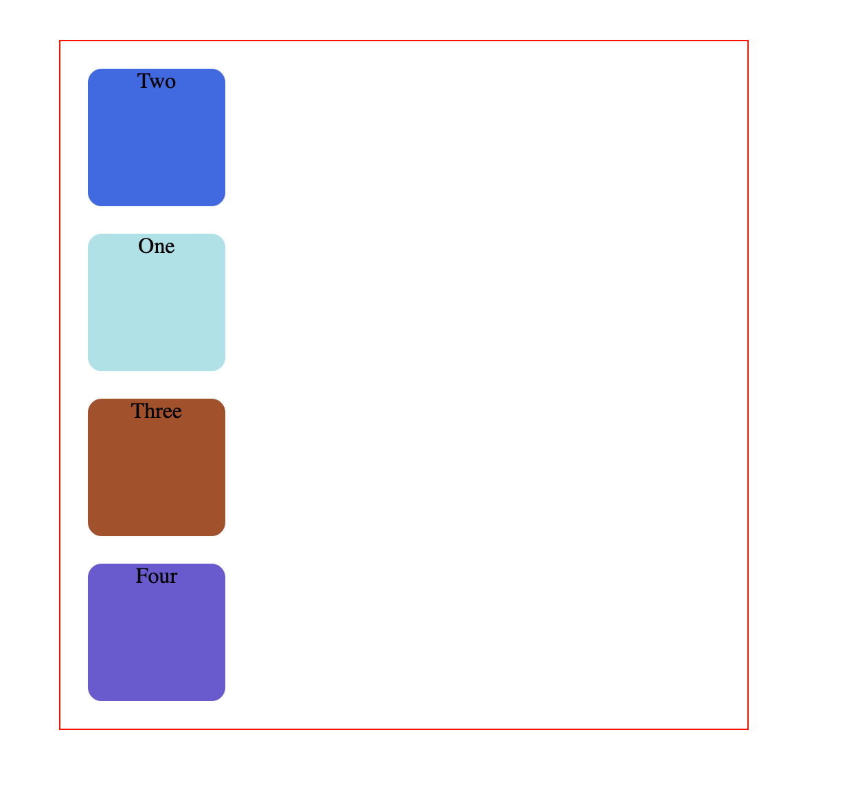
The position property isn't declared in the above code and it therefore reverts to the default position: static. It follows the order of the HTML code.
Whatever comes first in the HTML is shown first, and each element follows the next, creating the document flow as I described above.
In our code here, the div with the text "One" is written first so it is shown first on the page. Directly below that, the box with the text "Two" is shown, since it also comes next in the HTML, and so on.
This default positioning doesn't leave any room for flexibility or to move elements around.
What if you wanted to move the first square a bit towards the left of the page – how would you do that?
There are offset properties to do so, like top, bottom, right and left.
But if you try to apply them while the square has this default static position applied to it, these properties will do nothing and the square will not move.
These properties have no effect on position: static.
What is position relative in CSS?
position: relative works the same way as position: static;, but it lets you change an element's position.
But just writing this CSS rule alone will not change anything.
To modify the position, you'll need to apply the top, bottom, right, and left properties mentioned earlier and in that way specify where and how much you want to move the element.
The top, bottom, right, and left offsets push the tag away from where it's specified, working in reverse.
top in fact moves the element towards the bottom of the element's parent container. bottom pushes the element towards the top of the element's parent container, and so on.
Now, you can move the first square to the left by updating the CSS like this:
.one {
  background-color: powderblue;
  position: relative;
  right: 50px;
}
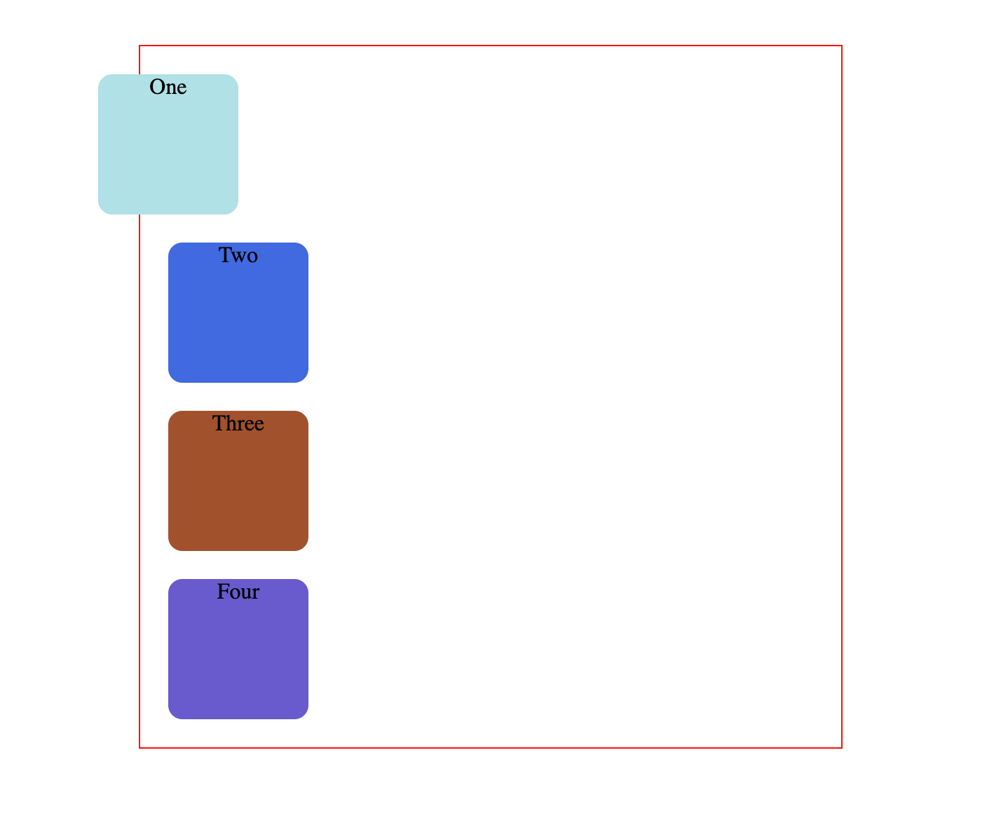
Here, the square has moved 50px from the left of where it was supposed to be by default.
position: relative; changes the position of the element relative to the parent element and relative to itself and where it would usually be in the regular document flow of the page. This means that it's relative to its original position within the parent element.
It moves the tag based on where it currently is, relative to its usual place and relative to its surrounding tags without affecting their layout.
Using these offsets and position: relative, you can also change the order in which elements appear on the page.
The second square can appear on top of the first one:
.one {
  background-color: powderblue;
  position: relative;
  top: 150px;
}

.two {
  background-color: royalblue;
  position: relative;
  bottom: 120px;
}
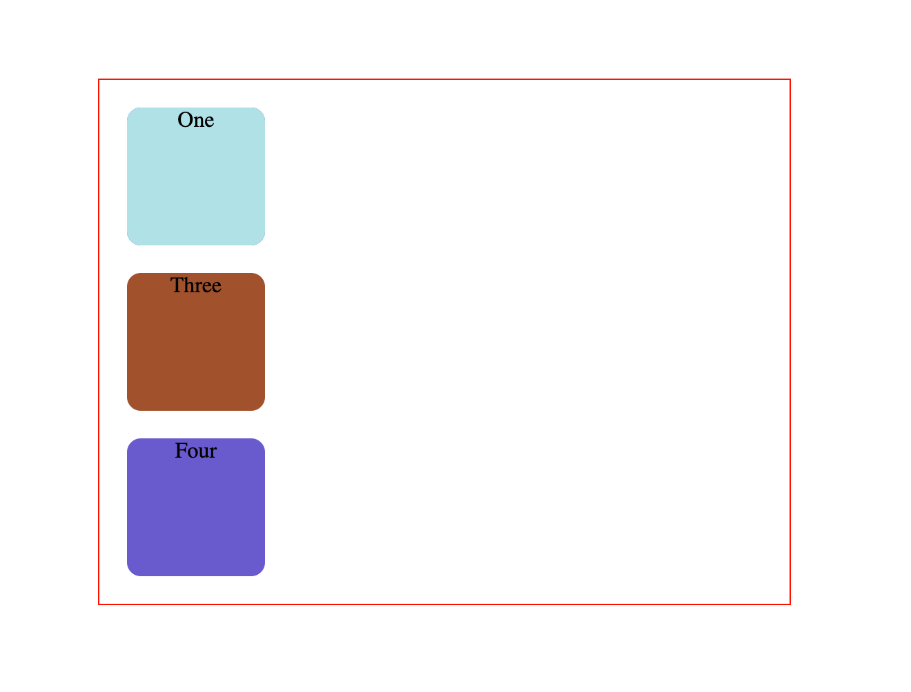
Visually the order is now reversed, while the HTML code remains exactly the same.
To recap, elements that are relatively positioned can move around while still remaining in the regular document flow.
They also do not affect the layout of the surrounding elements.
What is position absolute in CSS?
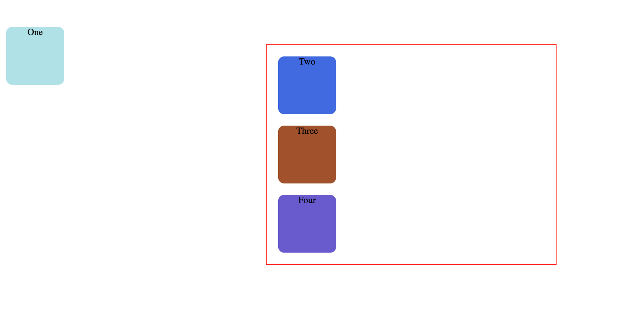
If you update the CSS rule for the first square to the following:
.one {
  background-color: powderblue;
  position: absolute;
}
You'll get this result:
This is unexpected behavior. The second square has completely disappeared.
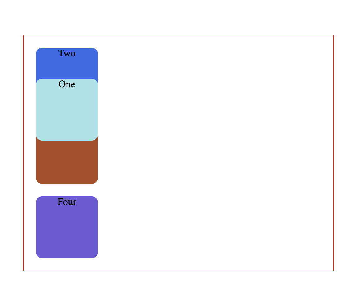
If you also add some offset properties like this:
.one {
  background-color: powderblue;
  position: absolute;
  top: 50px;
  left: 0;
}
Well now the square has completely abandoned it's parent.
Absolute-positioned elements are completely taken out of the regular flow of the web page.
They are not positioned based on their usual place in the document flow, but based on the position of their ancestor.
In the example above, the absolutely positioned square is inside a statically positioned parent.
This means it will be positioned relative to the whole page itself, which means relative to the <html> element – the root of the page.
The coordinates, top: 50px; and left: 0;, are therefore based on the whole page.
If you want the coordinates to be applied to its parent element, you need to relatively position the parent element by updating .parent while keeping .one the same:
.parent {
  width: 500px;
  border: 1px solid red;
  margin: auto;
  text-align: center;
  position: relative;
}

.one {
  background-color: powderblue;
  position: absolute;
  top: 50px;
  left: 0;
}
This code creates the below result:
Absolute positioning takes elements out of the regular document flow while also affecting the layout of the other elements on the page.
Conclusion
Hopefully now you have a better understanding of how relative and absolute positioning work.
If you are interested in learning more about HTML and CSS, you can save and work through this playlist on freeCodeCamp's YouTube channel.
It includes videos to help you get started from scratch, and it'll help you gain a good grasp of the fundamentals.
freeCodeCamp also offers a free and interactive project based Responsive Web Design Certification, which is a great place to start your front end web development journey.
Thanks for reading and happy learning!