
By Cem Eygi
The majority of today’s websites are responsive. And if you need to center and align image on those site, you need to learn how to make images fluid or responsive with CSS.
I posted a tutorial video that explains how to make a responsive website step by step a couple of weeks ago. In the video we made an image responsive. But in this post, I would like to give a bit more detail about how to make images responsive.
You will also learn some of the general problems that can occur when you're trying to make images responsive – and I will try to explain how to solve them.
How to Make Images Responsive with CSS
Should I Use Relative or Absolute Units?
Making an image fluid, or responsive, is actually pretty simple. When you upload an image to your website, it has a default width and height. You can change them both with CSS.
To make an image responsive, you need to give a new value to its width property. Then the height of the image will adjust itself automatically.
The important thing to know is that you should always use relative units for the width property like percentage, rather than absolute ones like pixels.
img {
  width: 500px;
}
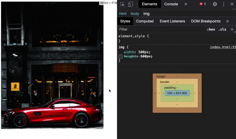
For example, if you define a fixed width of 500px, your image won’t be responsive – because the unit is absolute.
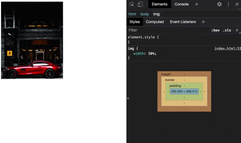
img {
  width: 50%;
}
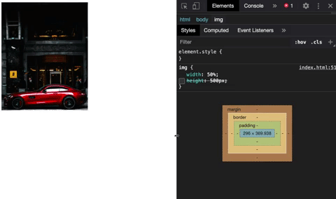
That’s why you should instead assign a relative unit like 50%. This approach will make your images fluid and they will be able to resize themselves regardless of the screen size.
Should I Use Media Queries?
One of the questions I get asked the most is whether you should use media queries or not.
A media query is another important feature of CSS that helps make a website responsive. I won’t go into further details here but you can read my other post later to learn how to use media queries in more detail.
The answer to that question is: “it depends”. If you want your image to have different sizes from one device to another, then you will need to use media queries. Otherwise, you won’t.
Now for this example, your image has a 50% width for any kind of screen. But when you want to make it full-size for mobile devices you need to get help from media queries:
@media only screen and (max-width: 480px) {
  img {
    width: 100%;
  }
}
So based on the media query rule, any device smaller than 480px will take the full size of the width of the screen.
You can also watch the video version of this post below:
Why is the max-width property not great?
Another way that developers can make responsive images is the max-width property. However, this is not always the best method to use, because it may not work for every kind of screen size or device.
The first thing to understand before we move on with an example is what exactly the max-width property does.
The max-width property sets a maximum width for an element, which does not allow the width of that element to be larger than its max-width value (but it can be smaller).
For example, if the image has a default width of 500px, and if your screen size has only 360px, then you won’t be able to see the complete image, because there is not enough space:
img {
  max-width: 100%;
  width: 500px;  // assume this is the default size
}
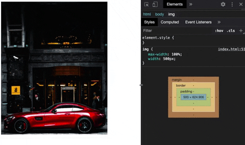
Therefore, you can define a max-width property for the image and set it to 100%, which shrinks the image of 500px to the space of 360px. So you will be able to see the complete image on a smaller size screen.
The good thing is that, since you are using a relative unit, the image will be fluid in any device smaller than 500px.
Unfortunately, the screen size will get somewhat larger than 500px, but the image won’t because it has a default 500px of width. This approach will break the responsiveness of the image.
To fix this, you need to use the width property again, which makes the max-width property useless.
What about Heights?
Another common problem you may run across has to do with the height property. Normally, the height of an image automatically resizes itself, so you don’t need to assign a height property to your images (because it kinda breaks the image).
But in some cases, you might have to work with images that must have a fixed-height. So when you assign a fixed height to the image, it will still be responsive but it won’t look good.
img {
  width: 100%;
  height: 300px;
}
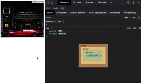
Fortunately, there is another property that CSS offers to fix this problem…
Solution: The Object-Fit Property
To have more control over your images, CSS provides another property called object-fit. Let’s use the object-fit property and assign a value, which will make your image look better:
img {
  width: 100%;
  height: 300px;
  object-fit: cover;
  object-position: bottom;
}
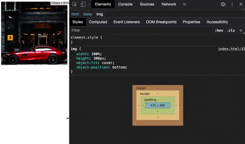
If needed, you can also use the object-position property (in addition to object-fit) to focus on a specific part of the image. Many people are not aware of the object-fit property, but it can be helpful to fix these kinds of problems.
I hope this post has helped you understand and solve your problems with responsive images. If you want to learn more about web development, feel free to check out my Youtube channel.
Thank you for reading!