
With CSS3 you can create two types of shadows: text-shadow (adds shadow to text) and box-shadow (adds shadow to other elements).
CSS3 Text Shadow
The text-shadow property can take up to four values:
- the horizontal shadow
- the vertical shadow
- the blur effect
- the color
Examples:
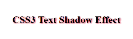
Normal text shadow
h1 {
text-shadow: 2px 2px 5px crimson;
}
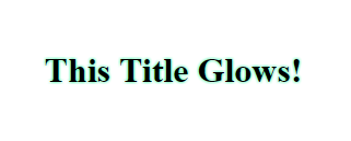
Glowing text effect
h1 {
text-shadow: 0 0 4px #00FF9C;
}
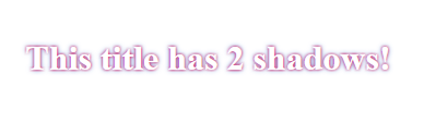
Multiple Shadows
To achieve this, you simply add a comma between two (or more) sets of values:
h1 {
    color: white;
    text-shadow: 0 0 3px #F10D58, 0 0 7px #4578D5;
}
CSS3 Box Shadow
The box-shadow property can take up to six values:
- (optional) the
insetkeyword (changes the shadow to one inside the frame) - the horizontal shadow
- the vertical shadow
- the blur effect
- the spreading
- the color
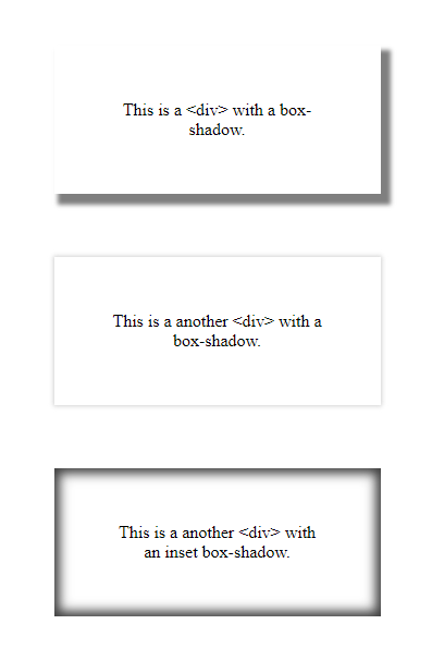
Examples:
.first-div {
    box-shadow: 1px 1px 5px 3px grey;
}

.second-div {
    box-shadow: 0 0 5px 1px lightgrey;
}

.third-div {
    box-shadow: inset 0 0 15px 5px rgba(0,0,0,0.75);
}
More Information:
- MDN web docs
- Check for browser support
- CSS box-shadow generator (feel free to experiment with box-shadows)