
Spreadsheets are the OG resource for visualizing data with charts and graphs...unless you count chalkboards, I suppose.
Spreadsheets are built to churn through tons of data. And by using a few simple built-in tools, you can glean valuable insights from large chunks of data.
 gif of "OG" graphic
When dealing with small sets of data, you can often find answers and insights at a glance. But when your spreadsheets begin to reach into the hundreds and thousands of rows, charts can help condense all those numbers down to useable pieces of information...especially if you're presenting to people who aren't good with numbers!
Video Overview
Speaking of visuals:
- Here's a link to the demo spreadsheet with all our data and charts.
- And here's the video walkthrough of everything covered below:
How to Get the Data
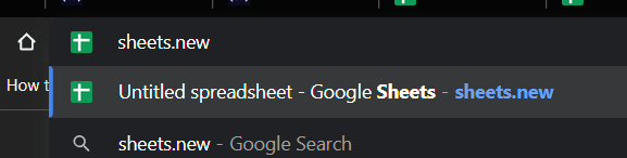
Kaggle is a wonderful resource to find interesting data sets. We're using this video game sales dataset. To import it into a Google Sheet, all that we need to do is create a new Google Sheet by typing sheets.new in the address bar of our browser.
 screenshot of web address bar
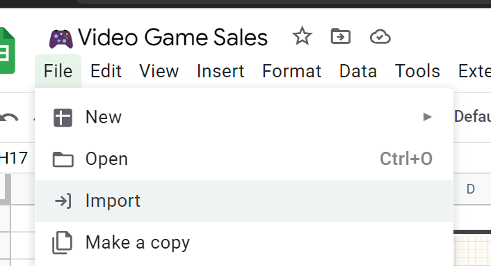
Then, select File, Import from the menu.
 screenshot of file menu in google sheets
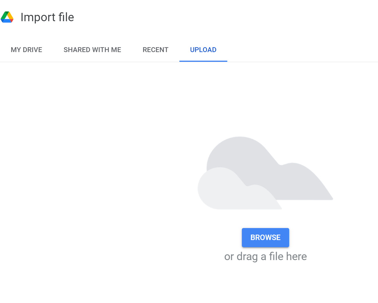
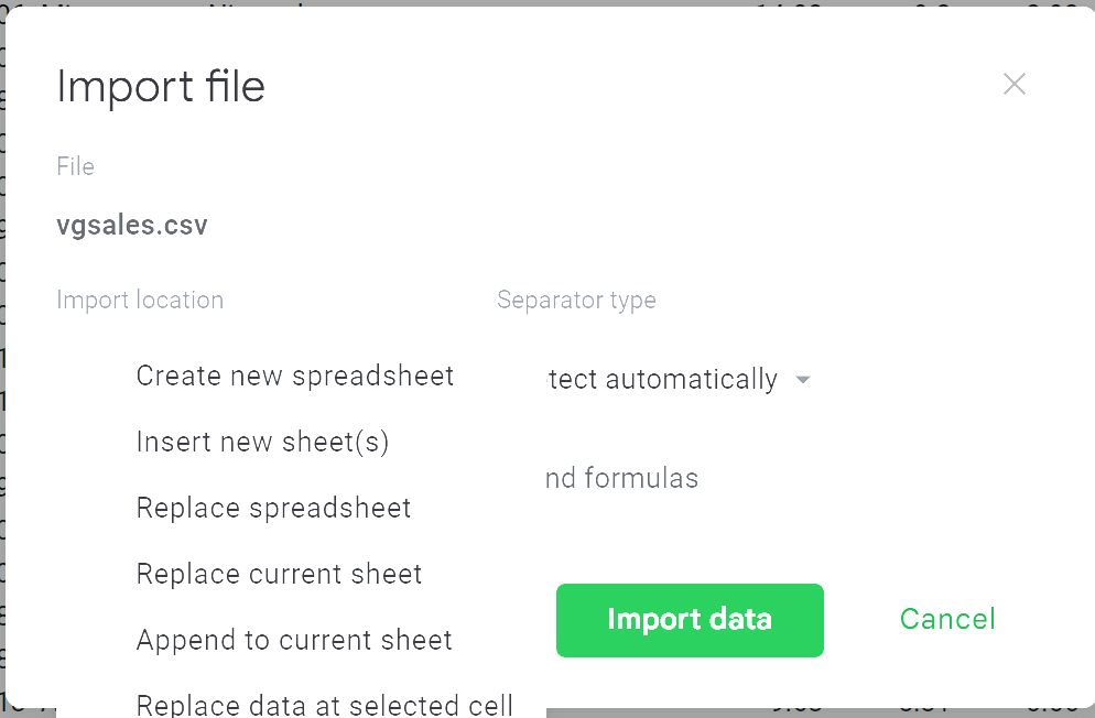
You can now upload the .csv file you downloaded from Kaggle.
 Screenshot of importing options in google sheets
This will give you several import options. If you're following along and using a completely blank, new spreadsheet, simply select Replace spreadsheet and it will pull everything in automatically.
If the data is cleaned well, and Kaggle datasets typically are, you can leave the separator to Detect automatically.
 screenshot of import file options
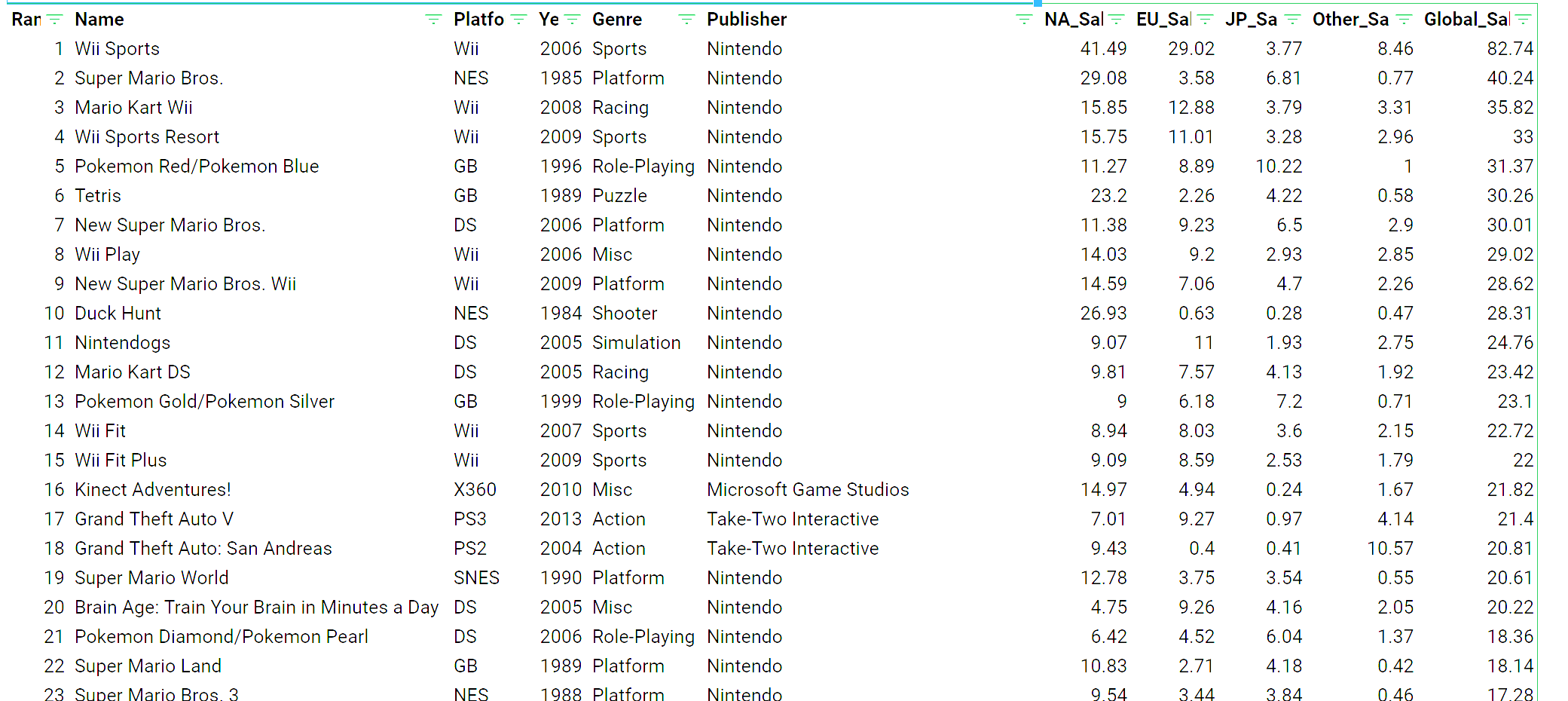
This will give us a lovely 16,000+ row spreadsheet full of video game data. 😁
 screenshot of spreadsheet dataset
How to Insert Charts
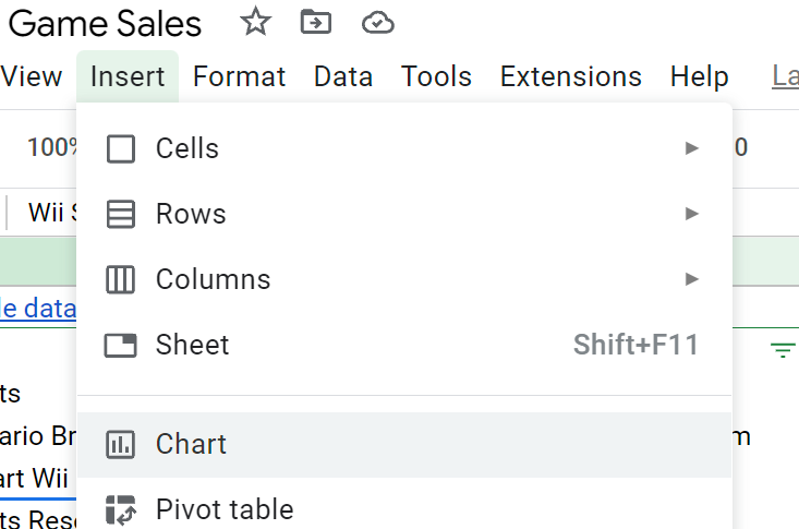
From here, we need to select Insert - Chart from the toolbar.
 screenshot of insert chart in google sheets
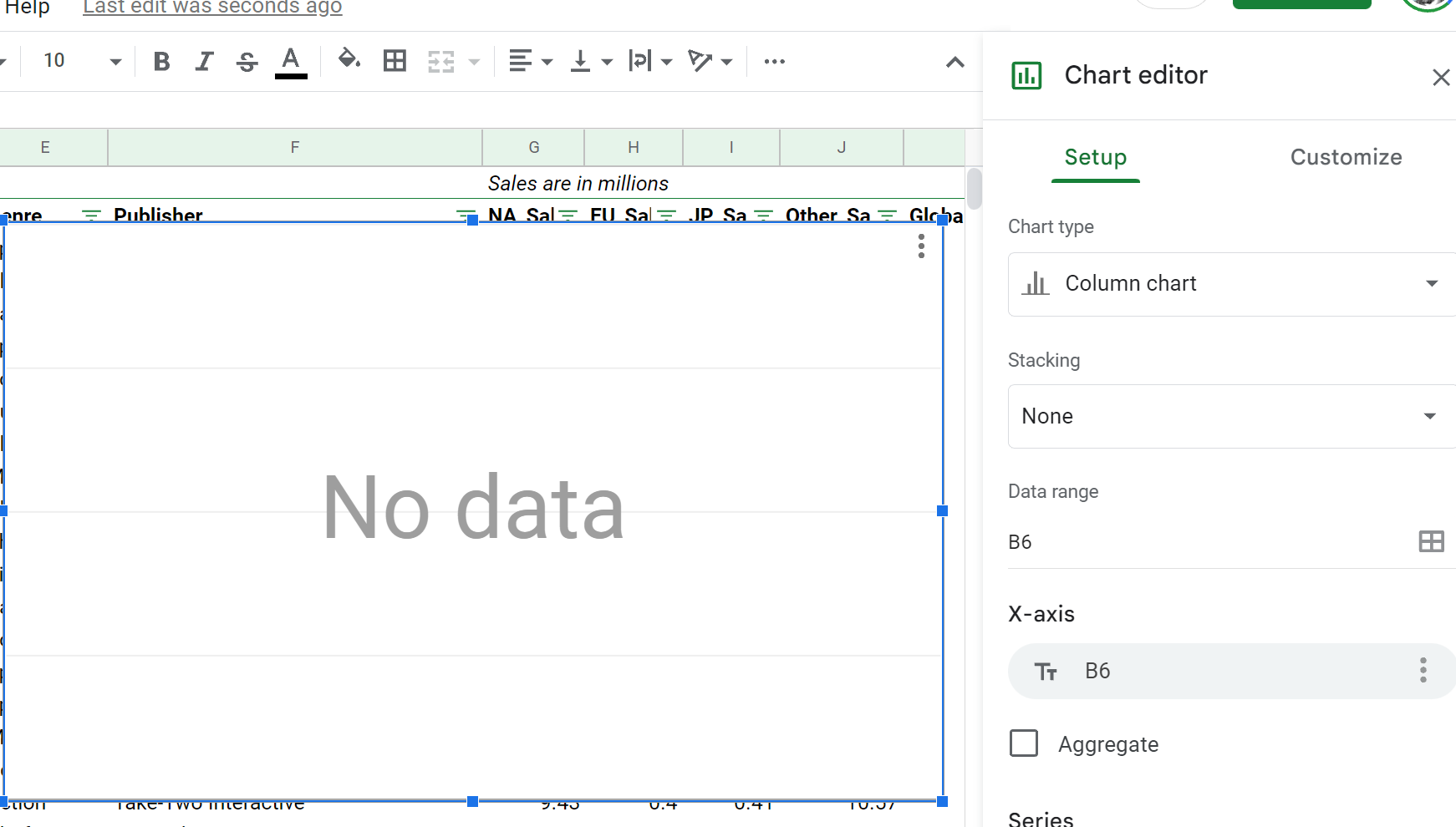
We'll be confronted with a blank chart in the middle of the screen and a Chart editor in the right sidebar.
 screenshot of chart editor
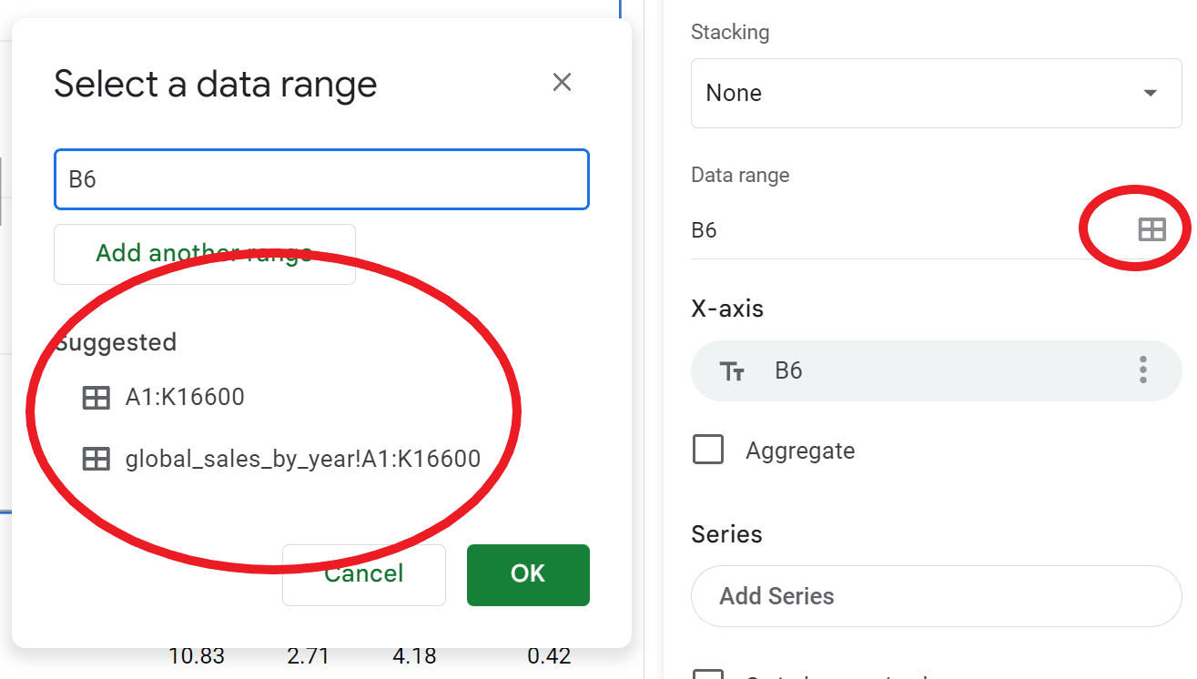
Now let's make sure we're referencing the correct data range. Google Sheets is pretty smart, and if you click the little graph icon to the right of the data range form, it will suggest some ranges to use. In our case, the range we need is suggested: A1:K16600.
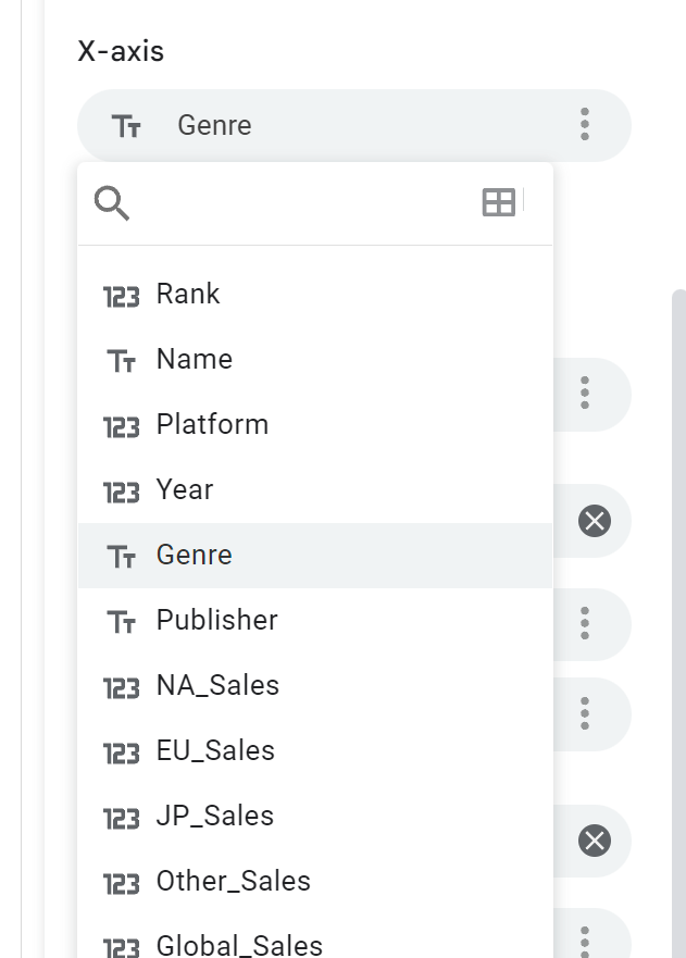
We're going to find the sales by genre, so next let's select Genre for our x-axis:
 screenshot of chart options
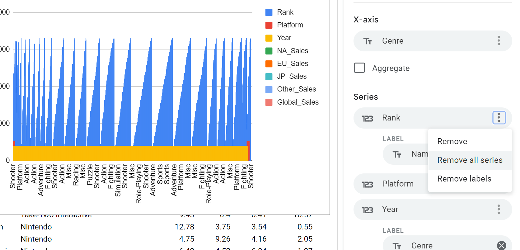
Sometimes Google Sheets will be not-so-smart. If there are a ton of series listed and a funky graph, you can simply remove all the series and manually add what you need:
 screenshot of chart series
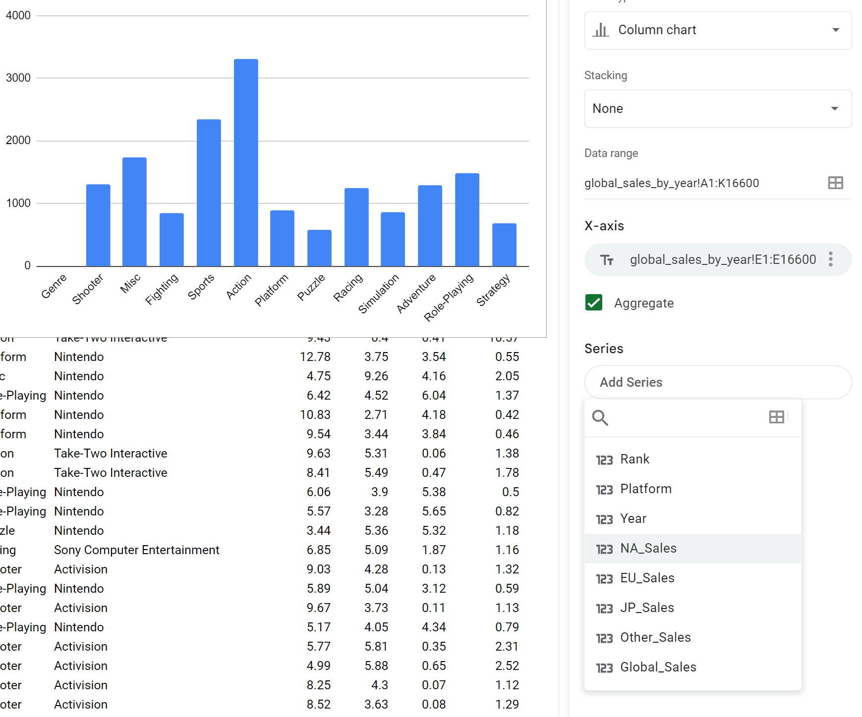
Now click the Aggregate button to group all the sales data for each genre, and select NA-Sales as the Series to display the sales in millions of dollars on the y-axis.
 screenshot of chart series options
And voilà! We've got a standard issue column bar chart. But we can do better. At the top right of our chart editor, we can Customize the chart further by changing the appearance, font, gridlines and titles.
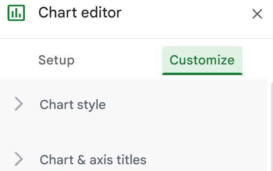 chart editor screenshot
How to Customize the Chart
From the customization tab, we have a lot of options. We can style our chart by changing the background color and font. We can make it 3D, and we can choose whether or not to maximize the chart in the chart window.
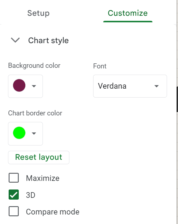 Chart style screenshot
We can then add chart titles, subtitles and axis titles and also modify the color and fonts.
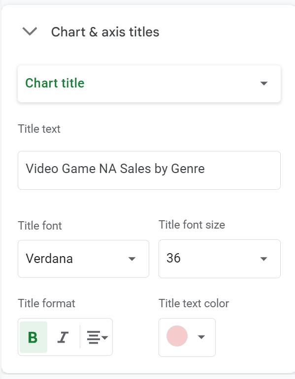 Chart titles screenshot
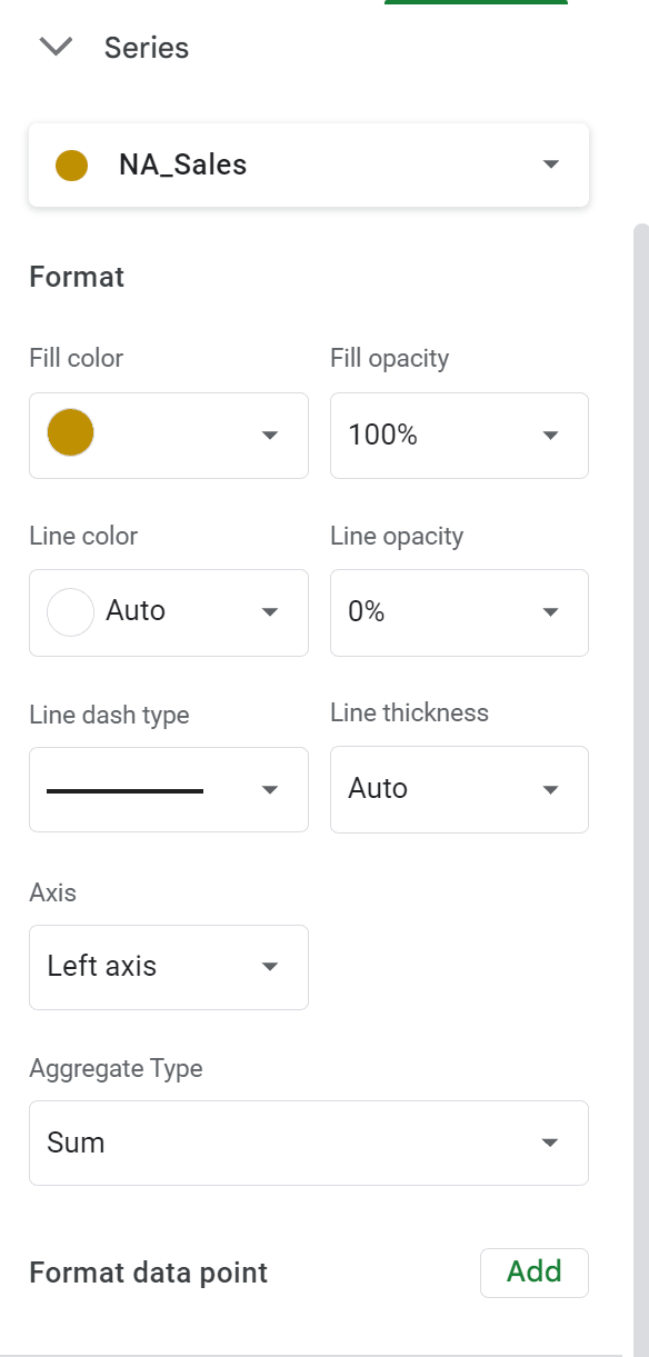
Then, we can individually edit each Series. In our example we're only using one series, but if there were more, you could modify each of their styles independently.
 screenshot of series customization options
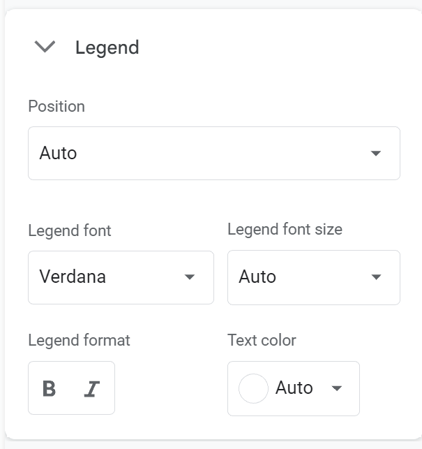
If you have a legend, you can modify those options in the next dropdown window:
Then there are customization options for both the horizontal and vertical axes.
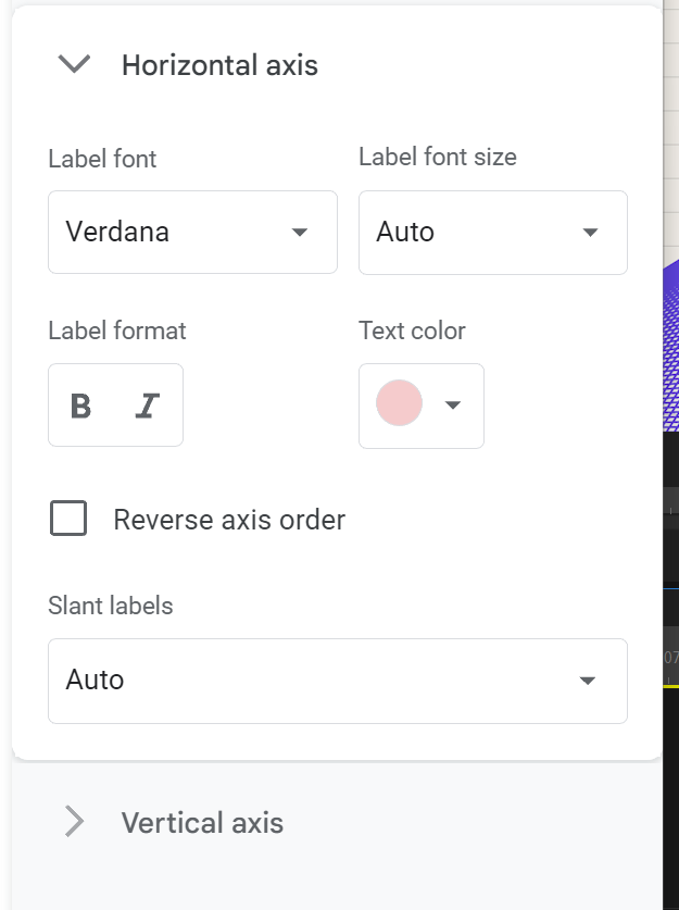 screenshot of axes options
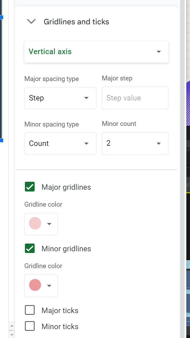
And the last block of customization options is for gridlines and tick marks. These can be toggled on and off, and we can change the color and frequency of the grid and tick lines.
Once we're done, we now have a more stylized chart:
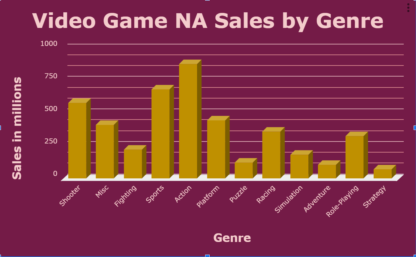 Screenshot of column chart in Google Sheets
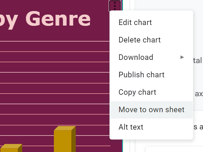
If we'd like to move this chart around, we can drag it throughout the current spreadsheet. Or, we can put it on its own dedicated sheet by clicking the three dots in the top right and selecting Move to own sheet.
How to Publish the Chart
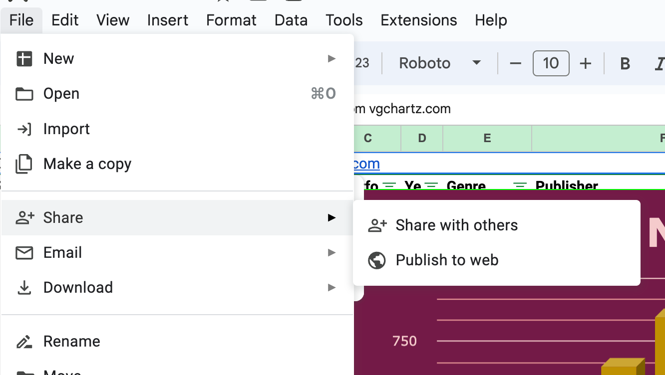
Here's an added bonus: you can actually publish the chart (or the whole worksheet) to the web. Select the Publish Chart option from the dropdown on the chart shown above, or select File, Share, Publish to web:
 screenshot of publish to web options
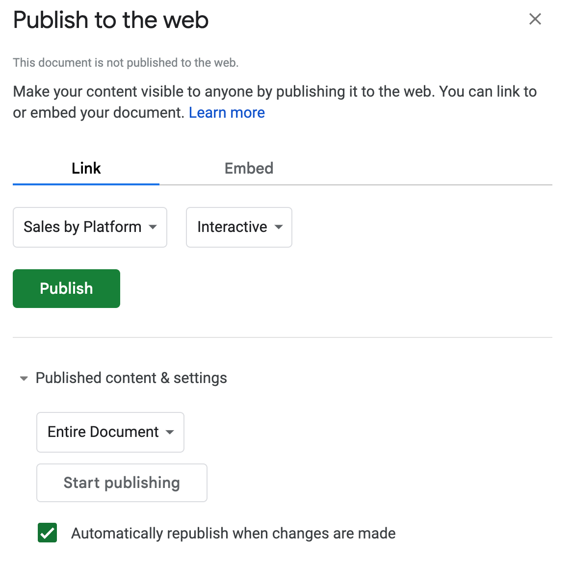
From here, you'll get to select what you wish to publish and how you want it displayed. For this example, we'll select the Sales by Platform chart to be shared as an interactive chart.
 Screenshot of publishing options in google sheets
This will generate a shareable link to the chart. It may take a few seconds to load, but once it does, you'll have a nice chart to easily share that is interactive. When you hover over the slices, it will display the percent of sales of the pie slice.
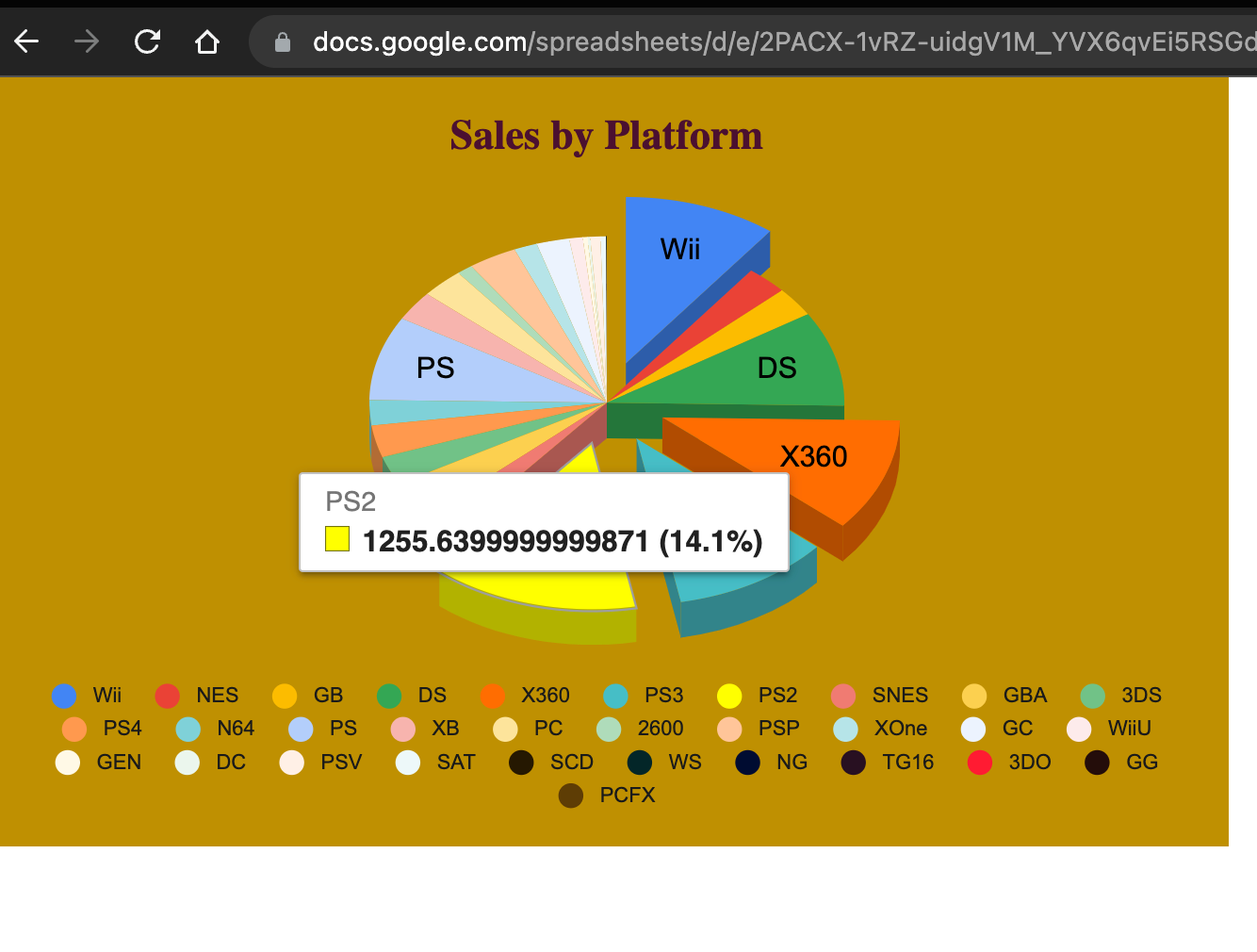 Screenshot of a published chart
Here's the link to the chart that we just made.
Conclusion
Thanks for reading! I hope that you learned something in this beginners tutorial on data visualization in Google Sheets.
You can really do a whole lot using the basic built-in charts available in Google Sheets as well as Microsoft Excel. Charts remain an extremely helpful way to interpret large data sets.
Please check out my YouTube channel here & LinkedIn page here.
Have a great one!