
Data visualization is the process of interpreting or representing data graphically. Generally, it is the graphical or visual representation of data using charts, tables, histograms, and other info-graphics.
Data plays a major role in any type of organization. Data visualization helps us understand certain trends and insights, and make important decisions based on them.
Through visual representation, you can show complex loads of data in a very simplistic manner.
What Are Data Visualization Tools?
Imagine going through a record of one million users and grouping them based on their age range. That would be a very tedious task.
Data visualization tools extract information from such records and present them to you or to anyone who needs the data in a visual way.
In the next section, you'll see some of the best data visualization tools to choose from.
Top Data Visualization Tools
In this section, we'll go over the features and availability/pricing plans of various data visualization tools. There are not listed in any specific order.
1. Tableau
Tableau landing page
You can use Tableau to access, visualize, and analyze data. It also has a drag and drop feature for a more interactive interface.
Features
Real-time data analytics.
Offline support.
Database and cloud integration.
AI and ML powered analytics.
Supports integrations for data scientists.
Dedicated environment for teams to collaborate and share their work.
Slack integration for notifications on data alerts, AI predictions, and analytics for team collaborations.
Great tool for non-technical users, as you don't have to write code for basic usage.
Availability/Pricing
Tableau is not a free tool. Although free trails are available, Tableau offers three plans you can choose from — Tableau Creator, Tableau Explorer, and Tableau Viewer at $70, $42, and $15 respectively per month billed annually.
2. Google Charts
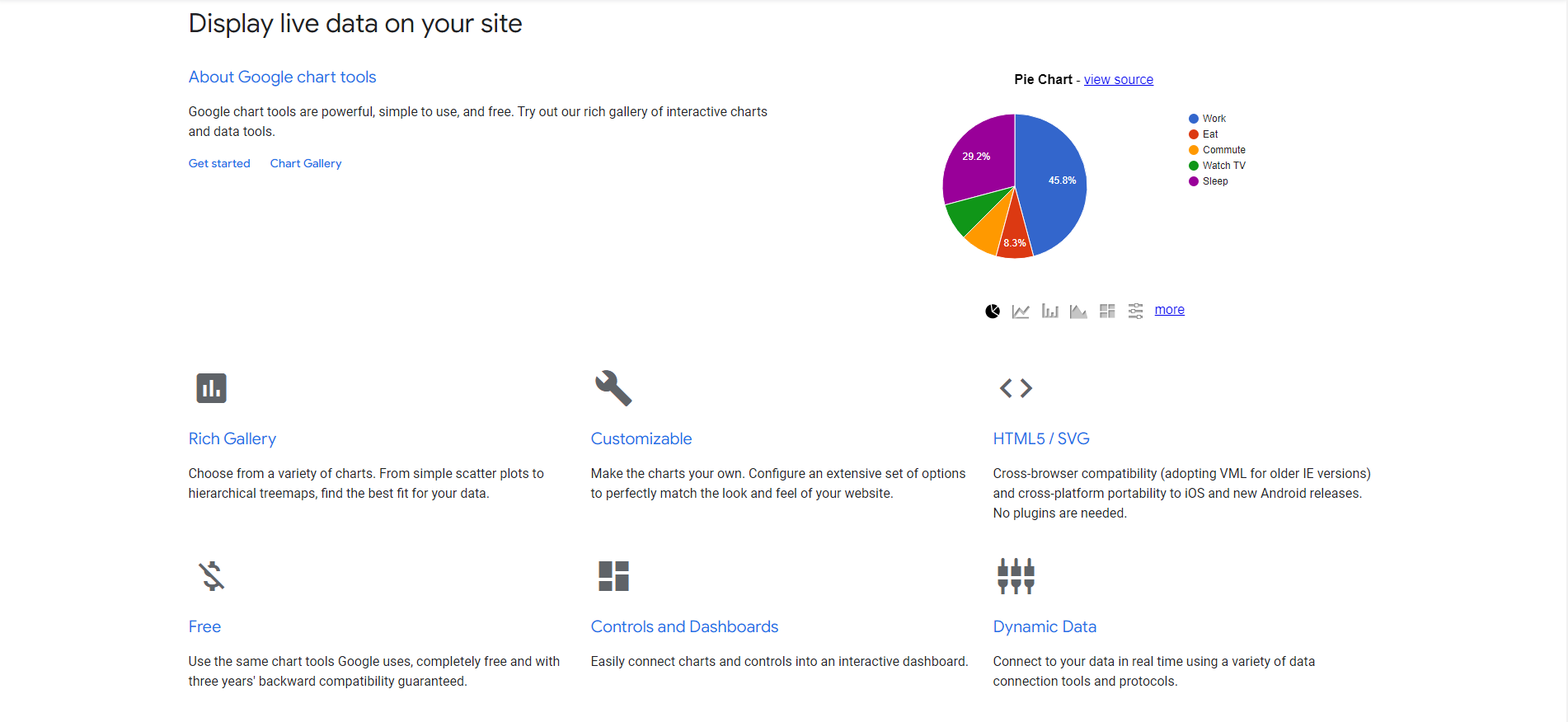
Google Charts landing page
Google Charts is a very efficient tool you can use to visualize or display data on a website. It is commonly used with JavaScript.
The documentation guides show how you can create different chart types like bar charts, bubble charts, calendar charts, histograms, maps, pie charts, and so much more.
Features
Built for developers. Knowledge of JavaScript is required.
Wide range of pre-built chart types to choose from.
No plugins required.
Real-time data update.
Cross-browser compatibility.
Cross-platform portability to iOS and Android.
Chart types are easily customizable.
Can be connected to dashboard to display dynamic charts to users.
Availability/Pricing
Google Charts is a completely free product.
3. Zoho Analytics
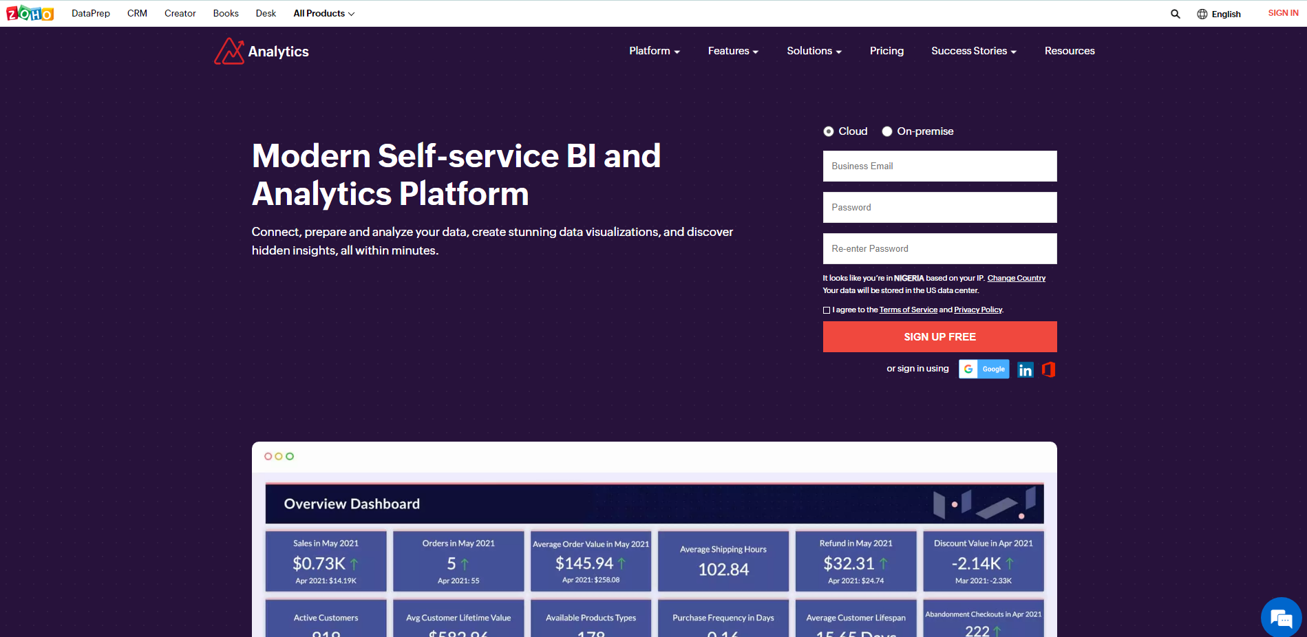
Zoho Analytics landing page
Zoho Analytics transforms raw data into insights and dashboards. You can connect different sources files, cloud databases, custom apps, and popular business apps to Zoho.
This product is great for businesses because it lets you prepare, analyze, and visualize data.
Features
Automated insights and predictive analytics with the help of AI and ML.
Supports low-code and no-code integrations.
Supports integration with many popular apps like Twitter, YouTube, Mailchimp, Shopify, and many others.
Collaboration feature.
Flexible deployment options.
Data storytelling feature for presentations using slideshows, web portals, and an embedded AI assistant.
Availability/Pricing
Zoho Analytics offers the following cloud plans:
Basic => $22/month billed yearly.
Standard => $50/month billed yearly.
Premium => $125/month billed yearly.
Enterprise => $495/month billed yearly.
The cloud plan has a free 15-day free trial with no credit card required.
The on-premise plan for users who handle all the deployment and hosting themselves offers these options:
Local server:
Personal => Free forever.
Professional => $30/month billed annually.
Minimum of 5 users.
AWS:
Personal => Free forever.
Professional => $0.25/hour of AWS usage.
Minimum of 5 users.
Azure:
Personal => Free forever.
Professional => $0.4/hour Azure infrastructure fee.
Minimum of 5 users.
Docker:
Personal => Free forever.
Professional => $30/month billed annually.
Minimum of 5 users.
4. Microsoft Power BI
Microsoft Power BI landing page
Microsoft Power BI lets you connect to, model, and visualize your data.
Features
AI generated answers based on your data.
Integration to popular apps and features.
Real-time analytics.
Secure data analytics.
Availability/Pricing
Microsoft Power Bi has two main plans – Power BI Pro and Power BI Premium at $13.70 and $27.50 per user/month, respectively.
The Power BI Premium plan has a per capacity feature for much larger organizations. This feature starts at $6,858.10 per capacity/month.
5. Qlik Sense
Qlik Sense landing page
Qlik Sense, like the other tools we've listed, has some cool features that makes it a good option for data visualization.
Features
AI generated insights.
Automated data preparation.
Real-time data analytics.
Interactive dashboards.
Fully customizable analytics.
Availability/Pricing
Qlik Sense Business plan starts at $30 per user/month billed annually. Their Enterprise and client-managed plans can be assessed by contacting their sales team.
6. Plotly
Plotly landing page
Plotly is a low-code tool for building data visualization apps using the Python programming language.
Features
Knowledge of Python is required.
This product is open source and has an active community.
Can be used offline.
Open source graphing library for creating line plots, area charts, bar charts, histograms, and more.
Availability/Pricing
Plotly is free and open source.
It also has the Dash Enterprise feature which comes with automated delivery of reports, alerts, and an app manager. This feature is not free.
7. Domo
Domo landing page
Features
Real-time data analytics.
Interactive dashboards.
Data sharing.
Data apps built for businesses.
Availability/Pricing
According to Domo:
Pricing is based on several components related to your usage of the platform, including data storage, data refresh rates, volume of data queries, and the number of users...
While it's not known exactly what their pricing plans are, you can reach out to them through their pricing page to find out more.
8. Infogram
Infogram landing page
Inforgram is a great tool for creating infographics, reports, dashboards, slides, social media posts, email headers, and more easily.
Features
Interactive charts.
Real-time team collaboration.
Access to project version history.
Great for creating and tracking social media content.
Custom tracking links.
Availability/Pricing
Infogram has the following plans:
Basic => Free forever.
Pro => $19/month.
Business => $67/month.
Team => 149/month.
Enterprise => Contact the Infogram team through their pricing page.
9. D3.js
D3.js landing page
D3.js is a JavaScript library for manipulating and visualizing data on the web using HTML, SVG, and CSS.
Features
Knowledge of HTML, CSS, SVG, and JavaScript is required.
Gallery of different code examples for creating infographics.
Good documentation for learning how to use the library.
Availability/Pricing
D3.js is free and open source.
10. Databox
Databox landing page
Databox is primarily a dashboard tool. It can be used to track and visualize data from any source.
Features
Automated reports.
Alerts and notifications.
Supports integration popular apps and platforms.
Customizable templates.
Availability/Pricing
Databox has a free-forever plan that comes with 3 data source connections, all standard features and over 60 integrations.
Here are the other plans:
Starter => $72/month.
Professional => 135/month.
Performer => $231/month.
11. Datawrapper
datawrapper landing page
Datawrapper is a good tool for creating visualization for content like articles, reports, and publications.
Features
No code or design skills required.
Live visualization update from data source.
Responsive on different devices.
PNG, SVG, PDF export.
Print-ready graphics.
Customizable charts.
Team collaboration through shared folder, Slack, and Teams integration.
Wide range of visualizations to choose from.
Availability/Pricing
Datawrapper has the following plans:
Free plan.
Custom => $599/month.
Enterprise => Contact the Datawrapper team through their pricing page.
12. Highcharts
Highcharts landing page
Highcharts makes it easy for web and mobile developers to create charts.
Built on JavaScript and TypeScript, Highcharts' libraries work with any back-end database, and can be used for Javascript, Angular, React, VueJS, iOS, R, .NET, Python, Java, Android projects.
Features
Supports popular tech stacks.
Easily customizable.
Documentation and learning resources.
Availability/Pricing
Highcharts has the JS, Stock, Maps, and Gantt plans with the following pricing features:
Web => $152 per seat annually.
SaaS => $300 per seat annually.
SaaS+ => $750 per seat annually.
OEM => Contact the Highcharts team.
There is also a Highcharts Editor plan that points to a code repository on GitHub. This is currently in Beta.
Summary
If you cant visualize and represent your data graphically, it becomes very difficult to understand as the data grows.
There are so many data visualization tools you can choose from. Some require coding experience while others don't. There are also free and premium tools.
Choosing the right one all comes down to the features you are looking for and how much you're willing to spend if it's not free.
This article should help you narrow it down by listing some of the popular data visualization tools, their features, and pricing plans.
Thank you for reading!