By Allan Campopiano
In your native tongue, you are not aware of the translation between thought and speech. You think about what you want to say and say it. The pathway from thought to speech feels direct. It's an instantaneous, 1:1 mapping.
When it comes to data visualization, however, there are often many stages of conscious translation between your idea of a chart to the actual graphics on the screen.
Consider these common examples of translation:
- The dataset that undergirds your hypothesis requires transformation before you can display it as a chart.
- Your mental image of the chart has to be translated into drop-down menus and checkboxes in Excel.
- You feel yourself scrolling through a mental database of function signatures and APIs (how do I make a pie chart in Matplotlib again?). Good thing you bookmarked the docs, but still...
Is there a way we can think less about the process of producing charts? Are there heuristics we can follow that make data visualization feel more like speaking our first language?
Thanks to the pioneering work of the late Leland Wilkinson, the answer to these questions is Yes.
In 1999, Leland wrote the book "The Grammar of Graphics" which not only introduced a fresh way of reasoning about charts but it also provided the mathematical underpinnings we need to write powerful, high-level data visualization programs.
Leland forever changed how we think about data visualization.
In this article, I will show by example how to approach data visualization using the concepts of The Grammar of Graphics. The goal is to provide a structured and reusable way of thinking that supports getting from the chart in your mind's eye to the chart on the screen.
In addition, I provide a this notebook in Deepnote that contains 30 challenges, with increasing difficulty, to help you test your new data visualization knowledge. The notebook runs in the cloud so it's ready to use immediately (no installation or setup required).
Comparing Visualization Paradigms
When thinking of data visualization, consider the following paradigms, especially in terms of how they affect data exploration.
For the sake of example, suppose you wanted to plot three categories as points on the X-Y plane (that is, a colored scatter chart).
Imperative visualization specifies how something should be done. For example, begin by instantiating a blank canvas. Use a for loop statement to cycle through a list that maps categories to colors. Draw onto the canvas with each iteration, selecting the correct data based on the mapping. Set the axis labels and legend location.
Here's an example of imperative visualization using Matplotlib:
Declarative visualization specifies what should be done. For example, tell the program that you want to represent two quantitative columns as X-Y points. A third categorial column will be used to encode color.
Here's an example of declarative visualization using Altair:
As you can see above, both examples represent the data in similar ways. The path to getting there, however, is very different.
The imperative paradigm is low level. It provides fine-grained control over the chart at the cost of being verbose. Notice that many details have to be specified manually (for example, legend location, axis labels, and so on).
The declarative paradigm, by contrast, is high level. It does not require much information in order to produce a chart (notice that sensible defaults are chosen by the underlying program rather than having to be explicitly written in code).
This may come at the cost of having ultimate control over every detail on the canvas. But a good implementation of The Grammar of Graphics can produce a staggering variety of charts for many use cases. High-level, declarative visualization libraries allow users to get from thought to chart with fewer programmatic steps.
As you will see in the next section, the benefits don't stop at reducing the lines of code. They extend to the way we think about visualization to begin with.
Declarative visualization lets you think about data and relationships, rather than incidental details. – Jake VanderPlas (source)
Why You Should Avoid Taxonomies of Charts
A taxonomy of charts is a way of organizing charts into groups based on their function and appearance. They may seem helpful at first, but chart taxonomies can be insidious. They way in which they group charts together is inconsistent, though, perceptually this isn't clear at first sight.
Put another way, this method of grouping charts does not follow a well-defined set of logical (mathematical) rules. I will explain why this matters, but first, let me provide two canonical examples of how a chart taxonomy fails.
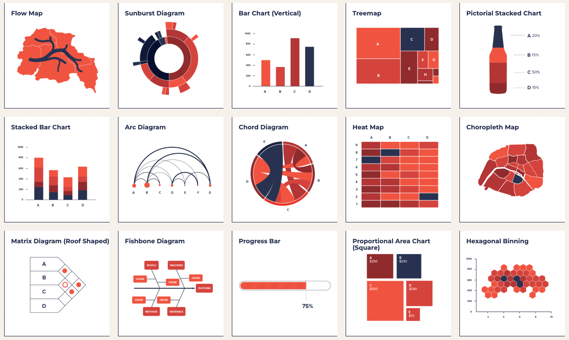 Chart taxonomy (source)
... and I came to realize that these taxonomies of charts are not only useless, they're harmful. – Leland Wilkinson (source)
The following two charts are considered different according to chart taxonomies:
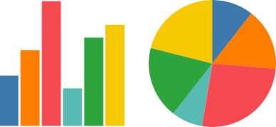
However, both charts are actually more similar than they are different. The left chart uses Cartesian coordinates and the top chart uses polar coordinates. That's the only difference.
Let's look at the opposite problem. The following two charts are considered similar according to chart taxonomies:
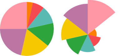
However, upon closer inspection, these charts are not similar at all in terms of how they represent data. The left chart uses angles to represent quantities in the data. The right chart, instead, uses the length of the segments to represent the data while keeping the angles the same.
Why does this matter?
Imagine a visualization program that uses its own idea of a chart taxonomy to map onto GUI menus and/or function calls. For each arbitrarily defined type of chart, the program would have to have a corresponding menu/function (for example, a function for a pie chart, a function for a bar chart, a function for a histogram, and so on).
Sure, some of these functions could be combined but the devil's in the details (that is, which rules govern whether or not to give charts their own function?). Such a program will eventually become inconsistent and bloated, as noted by Wilkinson.
If, on the other hand, we follow The Grammar of Graphics approach, which provides rigorous, mathematical rules for reasoning about data visualization, we may just end up with libraries and GUIs that are more internally consistent and less bloated. This makes them easier to use and maintain.
For example, take a look at these two charts and their associated code:
Both charts are based on the same underlying data. Despite the charts having a very different visual appearance (one is a scatter chart, one is a bar chart with aggregation), they are produced with remarkably similar code.
Notice that the API is not governed by a chart taxonomy that maps onto a set of function calls. As a result, if implemented well, the grammar-based approach allows for consistent and easy-to-remember APIs.
For example, for many statistical charts in Altair, it is often enough to remember only two statements for translating thought into charts.
Which geometric shape do I want?
Bar, circle, line, arc, etc...
How do I want to represent the columns in my data?
Color, shape, size, position, etc...
Using the scatter chart example above, you could say the following:
I want to use a circle as my geometric shape
I want to represent petalLength on the X axis, petalWidth on the Y axis, and species as color
If you compare the associated code to these statements, you can see that they map naturally onto each other, without the need for much translation between thought, code, and chart.
alt.Chart(df).mark_circle().encode(
    x='petalLength',
    y='petalWidth',
    color='species'
)
Call To Action
Grammar-based visualization is not a panacea. But once you learn to think in this way, making charts can feel a lot more like speaking a language.
The graphics you see in your mind can end up on the screen without first having to go through several stages of translation where the resulting code ends up looking very different from how you would describe the chart with words.
Once The Grammar of Graphics is a part of your repertoire, you'll not only be faster at data exploration but your reasoning about data visualization will change, becoming more efficient and consistent.
This is not just about learning a new tool but rather, it's about changing the way we think about data visualization. After all, extending an idea from a famous quote:
A language that doesn't affect the way you think about programming, is not worth knowing. – Alan J. Perlis
To get you started with this new way of thinking, I've prepared this notebook in Deepnote. The notebook runs in the cloud so it's ready to use immediately (no installation or setup).
You'll find 30 Grammar Of Graphics challenges, with increasing difficulty, waiting for you. Good luck!