
When you start learning graphic design theory, you may be surprised to find out that there are specific rules you need to follow when designing.
Those rules are known as design principles, and in this article, you will learn the basics of the 13 design principles.
Knowing what design principles are will give you a better understanding of how to go about creating more harmonious designs and better user experiences.
Here is what we will cover in this guide:
What Are Design Principles?
Design principles are a strict set of rules.
Designers adhere to those rules to create pleasant user experiences and visually appealing end products.
These rules are tools and guidelines that help the designer create a sense of harmony and balance in their designs.
They guarantee usability and an overall pleasing effect for viewers and users.
The 13 Principles Of Design
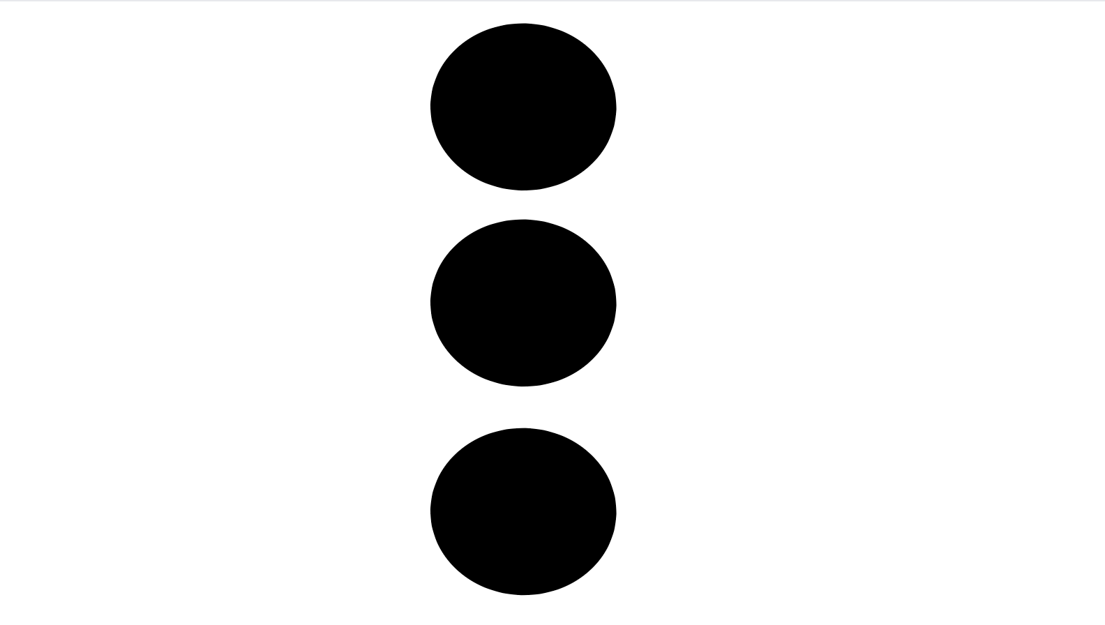
Balance
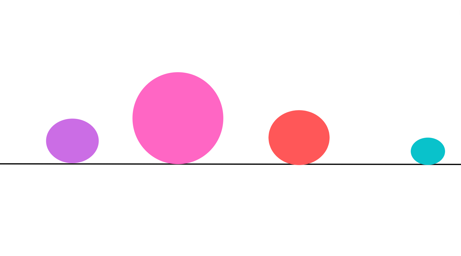
Every design element on a page has a different weight, depending on its size, shape, or color.
That weight is known as visual weight.
Balance in design is how you arrange and position elements in a composition, and it's about distributing the weight of those elements.
A composition lacking in balance means that one element overpowers all the rest.
To create balance, you need to position elements properly.
For example, this could be that an element on one side is much 'heavier' than the rest and is overpowering, thus making the design look unstable.
There are two types of balance:
- Symmetrical balance
- Asymmetrical balance
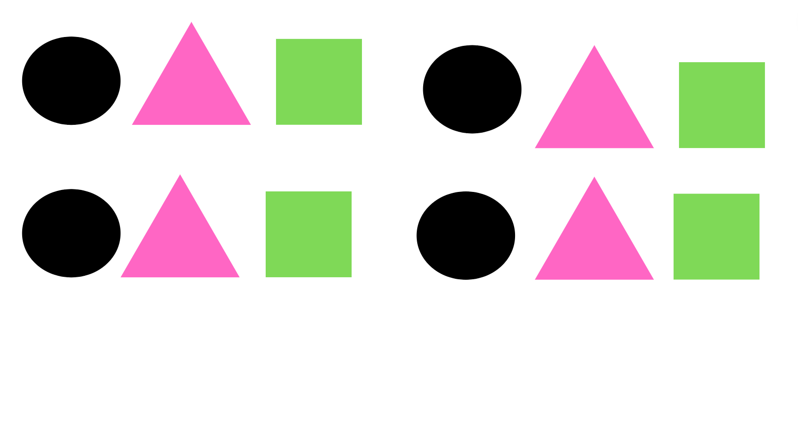
With Symmetrical balance, think of drawing an invisible, vertical line down the center of the page and splitting the page into two sides.
The items on both sides of the line have evenly distributed visual weight and create a mirrored image.
The order, the position, and the alignment of elements are equal on both sides, creating consistency in the design.
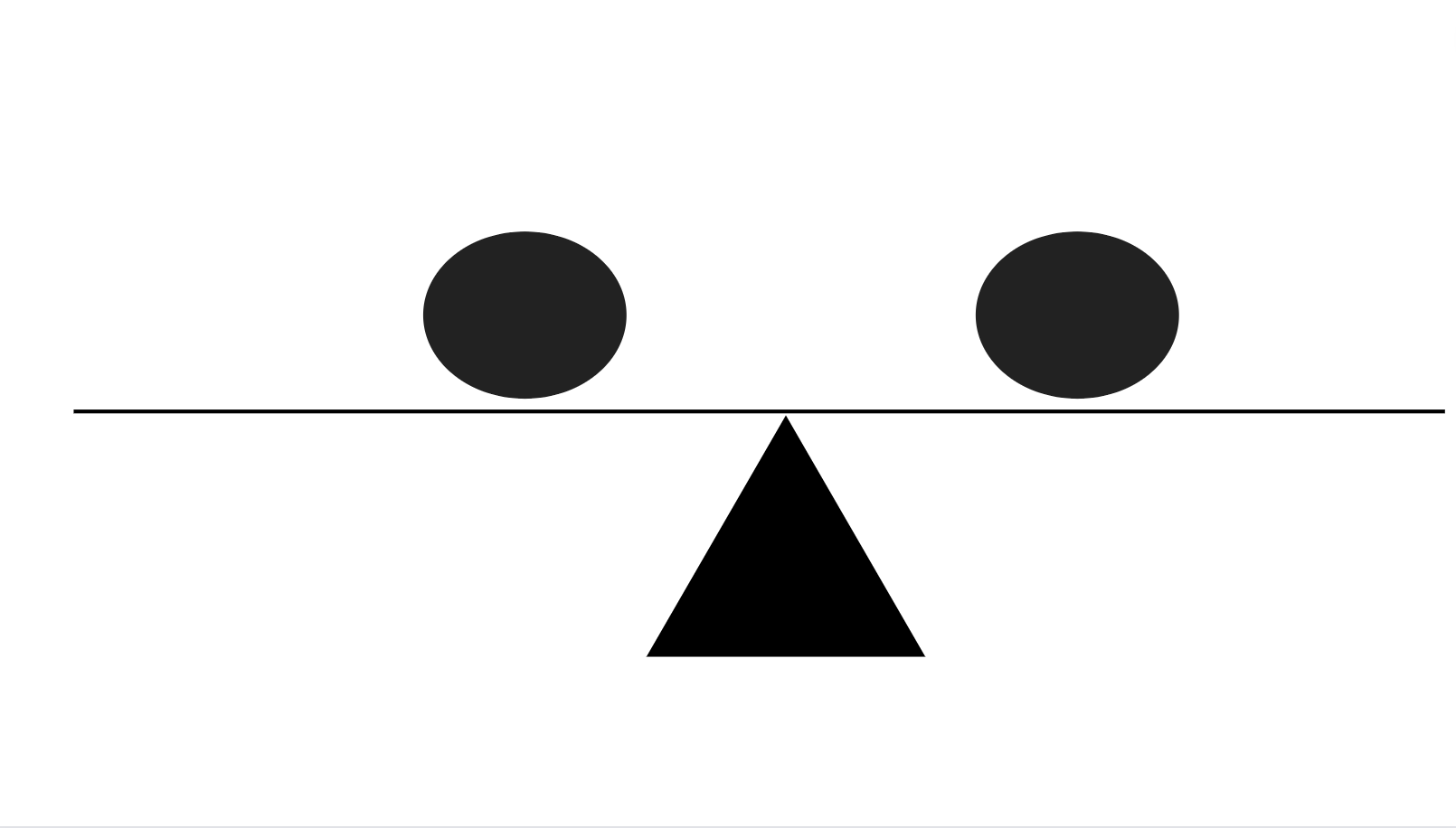
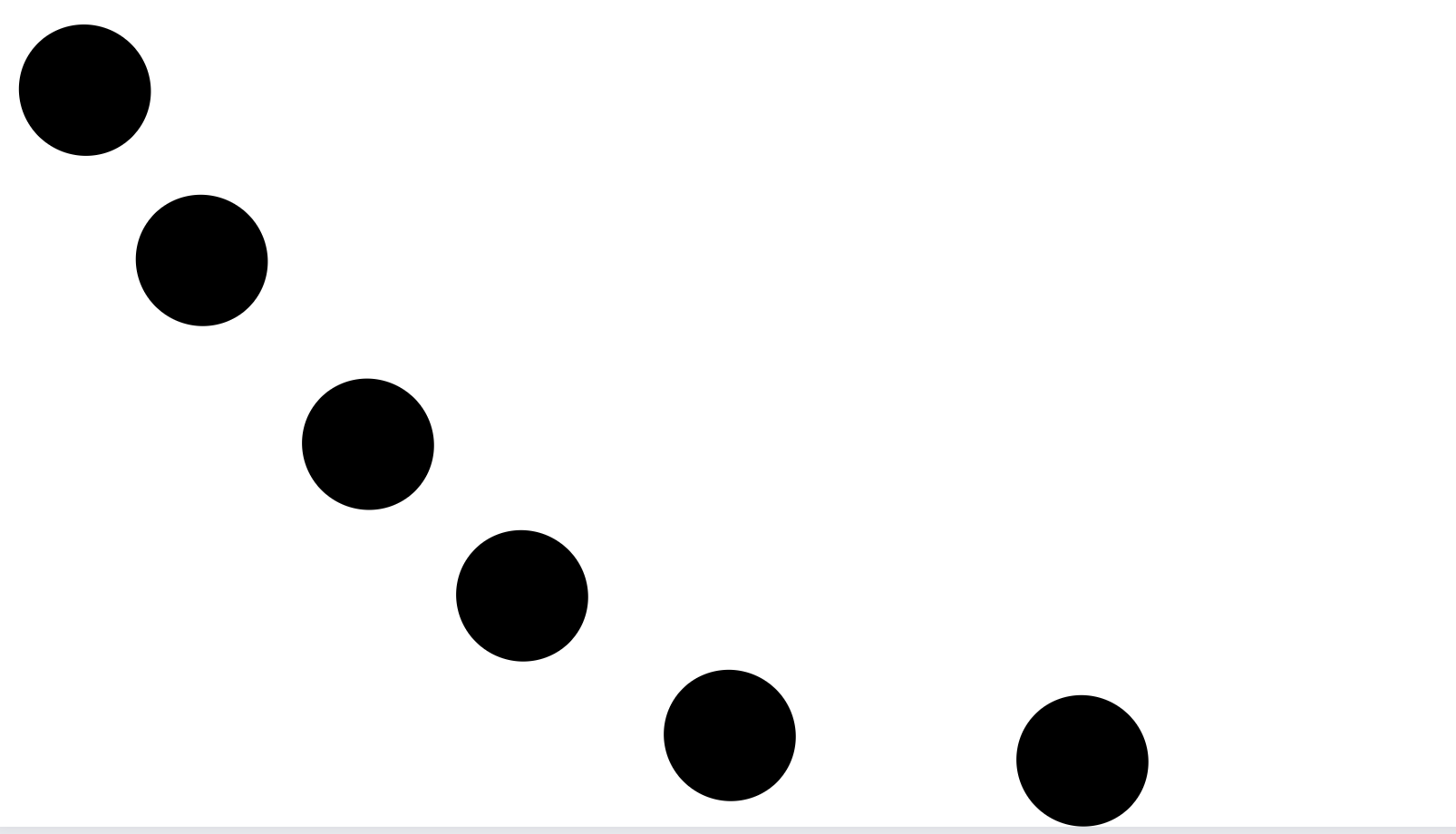
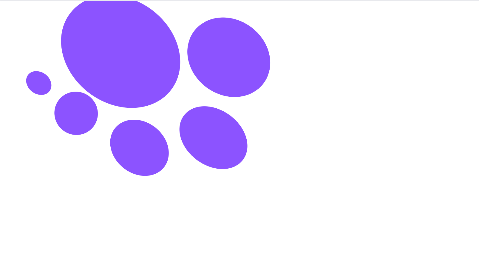
Asymmetrical balance is the opposite of symmetrical balance.
Elements on both sides have different arrangements, as they also have an order and positioning that varies in the composition.
Even though each side has a different visual weight, the overall design maintains an equal visual weight on both sides.
There is no mirrored image, and both sides look different, but the design is still stable.
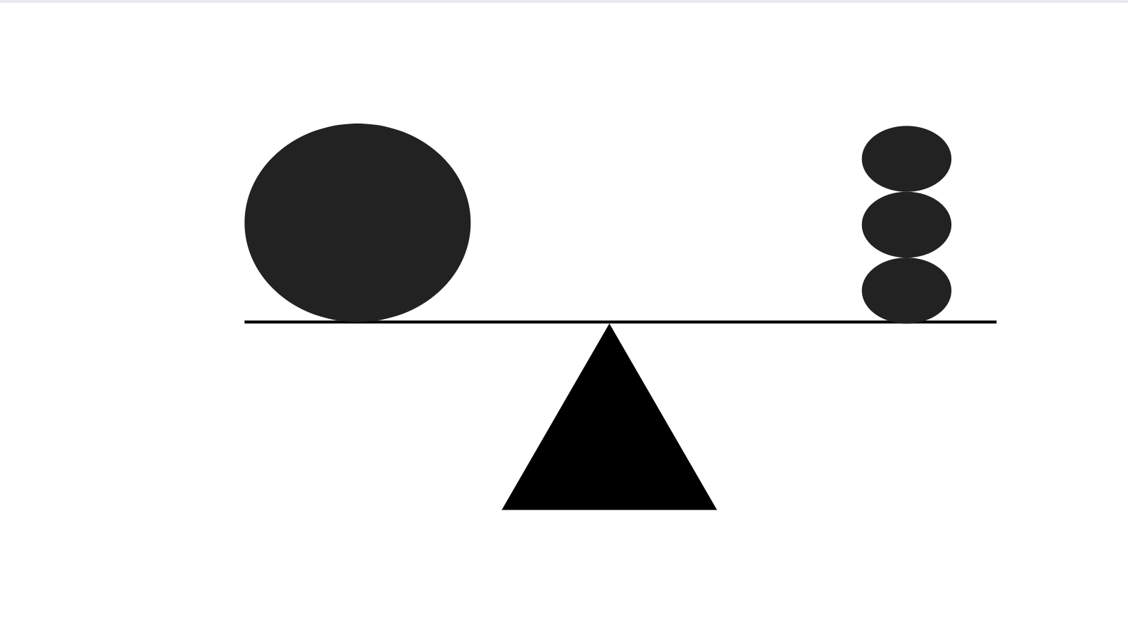
For example, asymmetrical design can be when three lighter elements stacked on top of one another on one side balance out one single heavier item on the opposite side.
Asymmetrical balance creates visual interest and adds a modern feel to the design.
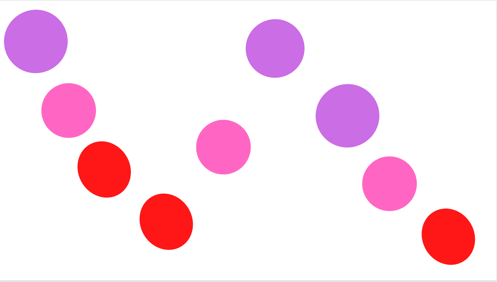
Variety
Variety creates visual interest and prevents the design from becoming monotonous and predictable.
Variety is created by using elements that are not similar to one another.
With the use of the variety, you have a good chance of maintaining the interest and engagement of viewers.
Variety in design is achieved with the use of many different things, a few of which are:
- Varying sizes,
- Varying shapes,
- Varying colors,
- Varying textures,
- Varying typography.
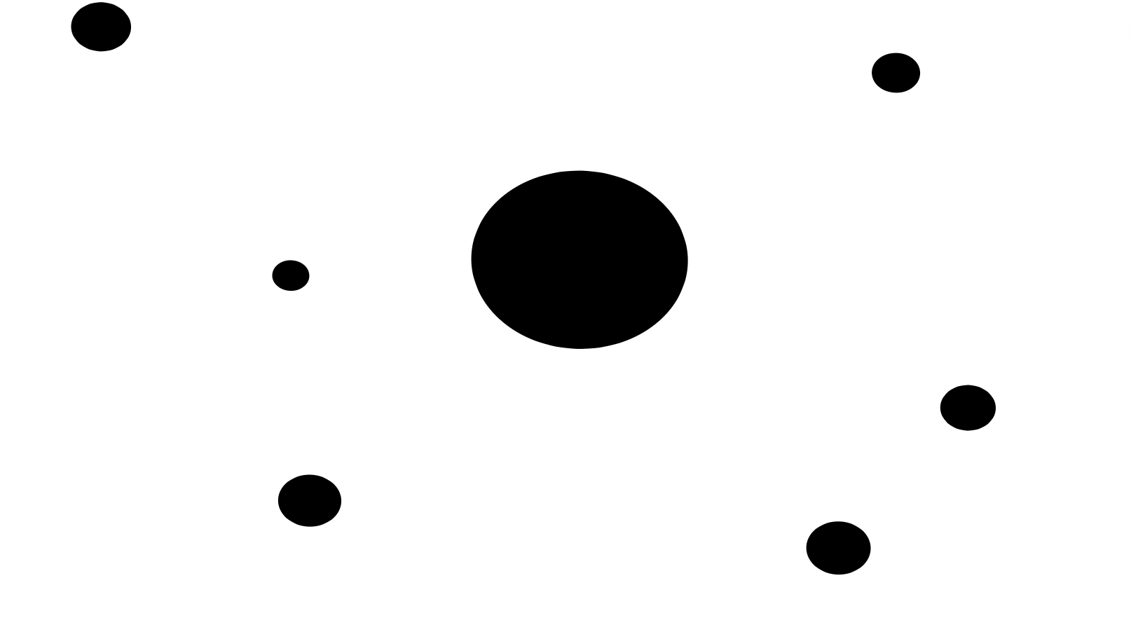
Emphasis
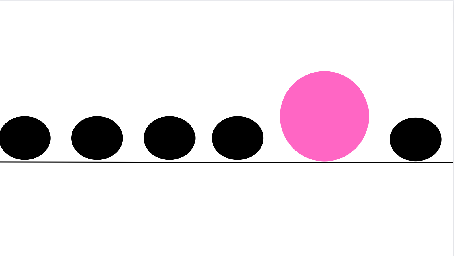
The purpose of emphasis is to create a focal point.
A focal point is an object that stands out instantly and grabs the viewer's or user's attention at first sight.
When there is an emphasis on a design element, it means that the specific object is highlighted from the rest and is therefore of great significance and importance.
For example, you can think of emphasis as some text with all-caps and a bold type.
Emphasis can be the main heading on a website.
It can also be a message of some kind.
You may want to convey something crucial or cautionary to your viewers and need to make sure that your audience is aware of it and focuses on that first.
Emphasis can also be a large button with a bright color under an item for purchase - this can act as a call to action for visitors.
It's what you want others to notice first - the essential information someone needs to be aware of and pay attention to upon first viewing your work.
It's a specific piece of content that needs to stand out from the rest of the design.
Besides text and color, emphasis is achieved with size, shape, weight, texture, and position, to name a few.
When creating emphasis, make sure that you do it without disturbing the overall balance of the composition and without creating an overpowering and jarring effect.
Contrast
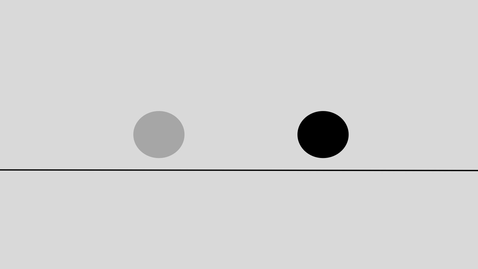
While emphasis is about accentuating one single element, contrast has to do with the apparent, stand-out degree of difference between two or more design elements that are close together.
This difference can be that one element has a dark background color, and the other has a light one.
It can also be that one element has a cooler tone, whereas the other has a warmer tone. Or that one element is larger and the other is smaller in size. Or using a serif font on some text and a sans-serif text on another piece of text.
For example, take this webpage.
When browsing the page from a desktop computer or a laptop, you will see that at the top right corner, there are two buttons you can click on:
- the 'Forum' button has a dark background color that is the same as the rest of the navigation bar,
- the 'Donate' button has a bright yellow background color that makes it stand out.
That is considered contrast. There are two very different elements next to one another, but one catches the eye the most and demands your attention.
All-in-all, contrast highlights two totally opposing elements with highly different characteristics. The difference has to be a noticeable one.
There are different types of contrast, such as color contrast or size, shape, or texture contrast.
The purpose is to create variation and interest and therefore create focus and emphasis while maintaining balance in the design.
Good contrast goes hand in hand with accessibility best practices and creating usable products and services for everyone. It's necassary to take into consideration people with visual impairments.
Think of another example.
Say there is an element with a light grey background and some dark grey text. Then, there is another element with the same background color, but there is some black text.
Which one is easier to read? The second one with the black text.
There is a higher color contrast between the background color and foreground (text) color.
There is a lack of contrast in the first element - this makes reading the text much harder.
Hierarchy
Hierarchy organizes visual elements in order of importance.
The role of hierarchy in design is to create a visual ranking system according to the logical priority of content. It helps guide viewers from the most important information to the least important by creating a logical flow and arrangement of that content.
Think of the typical order of elements on a webpage.
We read from top to bottom, so the viewer's eye must be first drawn immediately to essential information before they start scrolling down the page.
So this means that the crucial information needs to be at the top of the page - it needs to be the most prominent and rank the highest on the page.
Take the following example.
At the top of a webpage, there is typically the company logo first.
Then, there is a navigation bar or dropdown menu, which helps users decide the area of the site they want to interact with.
There can also be a search bar for users to enter keywords to search for a specific topic and save time.
Then, there can be a call to action or the main heading that reinforces the purpose of the page and its content.
Then, there can be the main area that would contain a subheading with some text, then another subheading with more text, and so on.
This order creates visual organization and helps viewers distinguish what content appears to be the most important and deserves their attention.
It guides viewers from the start of the content to the end - from highest priority to least priority.
The position of elements signifies importance - the most important information is always higher on a page, whereas if something is at the bottom, it is not as important.
Other ways to create hierarchy in design are using colors to create contrast and alternate the sizing of elements in different ways.
Without hierarchy, all content would appear the same, and nothing would stand out and signal importance, which would lead to confusion for viewers.
Repetition
Repetition is when a specific element is repeated multiple times throughout the design.
The role of repetition in design is to create consistency and unity.
Repetition creates relationships and associations between seemingly separate and different elements and creates a bond between them - a common link that ties everything together.
To achieve repetition, you use the same particular color or the same color scheme multiple times throughout the design.
Or stick to a specific font type or use a recurring phrase throughout the page.
A commonly repeated element in designs is a logo, which plays a critical part in creating a brand identity.
A logo will make viewers and users familiar with the brand. They will recognize and distinguish its voice and tone from other brands.
Users will memorize and identify the logo with the company's vision and mission.
They will know what the brand is all about.
Pattern
Pattern at first glance appears to be very similar to repetition since it implies that elements reoccur multiple times throughout the page.
However, they have significant differences.
While repetition deals with the same element repeating throughout the design, a pattern focuses on multiple and different design elements repeating in the same way throughout the composition.
A pattern in design is all about the repetition of more than one element.
An example of a pattern in everyday life is floor tiles and wallpapers.
An example of a pattern on the web is the use of backgrounds in websites and applications to create harmony and a cohesive feel.
Movement
 Movement is how the eyes move when viewing and interacting with a composition.
Movement refers to the way the viewer's eye travels and the path it takes throughout a design.
The designer uses movement to guide the viewer around different design elements.
They create different focal areas for each point in time to effectively capture the viewer's attention, moving from one element to another in a well-thought-out directed sequence.
Typically, the viewer's eye first sees the most important element, then the second most important, then the third one, and so on.
An example of movement can be viewing a spiraling staircase when you are standing at the top - your eye will move along the different lines and edges.
Movement on the web can be created by:
- The use of animated effects,
- The use of blurring effects,
- The use of spiraling effects,
- The use of lines and edges,
- The use of different direction signs that provide guidance, indicating to the viewer to move their focus to the left, right, or look downwards or upwards.
Rhythm
Rhythm involves the combination of repetition, variety, and movement.
Rhythm is how multiple design elements that are different from each other repeat in a particular order.
Repeating or alternating a group of different elements in the same order and at specific intervals is a way to create rhythm in design.
There are five different types of rhythm in design, depending on the type of interval:
- Random rhythm,
- Regular rhythm,
- Flowing rhythm,
- Progressing rhythm,
- Alternating rhythm.
The elements follow a tempo and move and flow in an organized way.
It resembles the feeling of following a dance choreography or moving to the beat of some music.
Instead of bringing the attention to only one area of the design or guiding the viewer from one different part to another, rhythm focuses on moving the viewer's eyes across the whole composition.
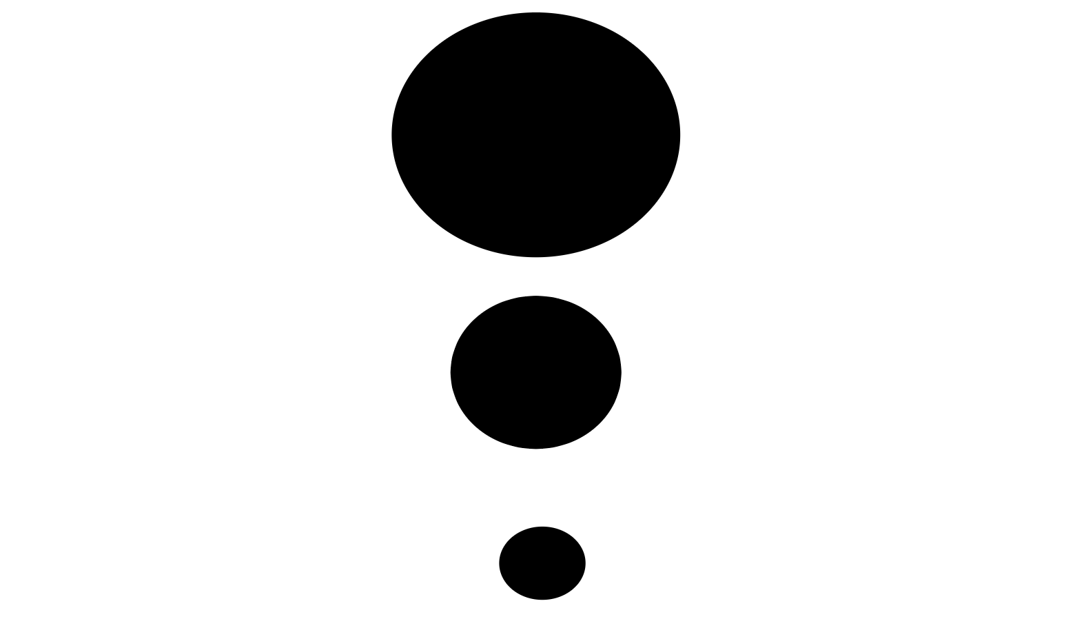
Proportion
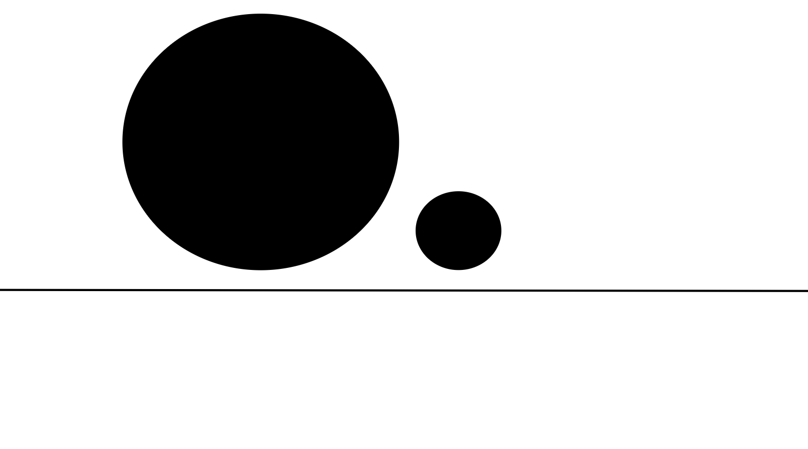
Proportion in design refers to the size and visual weight of two or more visual elements.
Proportion is also the relationship between those visual elements.
The relationship is based on size. It's how the size of one object compares and is correlated to the size of the other object.
Essentially, it is how elements scale in size in relation to each other.
For example, proportion compares and measures the importance of elements to one another.
Say there are two objects - one is bigger and the other is much smaller.
The bigger element will be more noticeable, which indicates that it is more important than the smaller one.
A well-proportioned design means that the size of all the elements preserves balance, unity, and harmony for the whole design.
Good proportion means that all elements relate well to each other.
Alignment
Alignment refers to how visual elements are lined up, ordered, and structured in comparison to one another and in comparison to the whole design.
It is a way to create a connection and visual flow between related objects and create a more unified result in the design.
By aligning the different visual objects, you help guide your viewer throughout the design.
The most common forms of alignment are left-aligned, right-aligned, and center-aligned.
Unity
Unity in design is how different visual elements come together to create cohesion and completeness in the design and a harmonious effect.
With unity, seemingly different items create a sense of 'oneness'. This can be achieved in a few different ways.
For example, elements of different sizes can all have the same color and be near one another.
This makes them appear as if they belong together or as if they are related and are similar in some way.
White Space
White space is also known as negative space.
Essentially, white space refers to areas that lack visual elements, and areas with unused, empty space around already existing elements in a design.
White space doesn't necessarily mean that the empty space is white in color - it can be any color. It more so refers to the emptiness and available room in your design and the fact that some areas don't contain anything.
White space is about not adding any elements to the composition and takes a more minimalistic and simplistic approach to design. Sometimes, less is indeed more.
White space creates breathing room in the design.
When a lot is going on on a page, viewers can easily become overwhelmed with all the information they need to take in. White space helps to prevent that from happening. It makes any available text more readable and creates an all-around better user experience.
White space eliminates any unnecessary clutter and creates a focal point. So, use white space around important elements to make them stand out.
Conclusion
Hopefully, now you have a high-level understanding of design principles and have a better idea of how to implement them in your future designs.
Thanks for reading!