
By James Y Rauhut
Last week was my last week at Pingboard as a UX designer and engineer. But I still believe the product includes the world's best org chart solution.
Using a mouse, you can quickly drag-and-drop any org structure and employee data stays synced with your other tools. The most impressive aspect is how the org chart is alive. Employees can explore the org chart on their own and even make it available to the public.
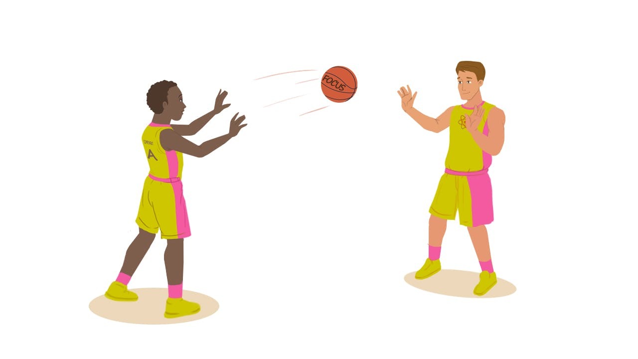
But what happens if a user is not able to navigate the org chart with their mouse? Three out of ten Americans have some sort of disability. A lot of those disabilities restrict people to browsing the web with only their keyboard.
If a user tried to navigate the org chart with the tab key, the focus used to jump across nodes in an unpredictable manner.
And forget about editing the org chart without a mouse: many of the editing actions were hidden within inaccessible overflow menus and modals. We spent the span of a year making the org chart fully keyboard accessible.
The solution wasn't one sprint. It was many releases spread out over a year‘s time.
In this blog post I'm first going to detail the design process of these interactions. The next section will go into detail about implementing these interactions in React.
I hope by the end you will learn how to handle common problems for adding keyboard accessibility to complex experiences!
How to Design an Inclusive Experience
You always need to know what aspect of accessibility you are are solving for. Accessibility solutions rarely are a 1:1 fix for a specific disability.
For instance, adding keyboard accessibility can help people with a wide variety of motor and visual disabilities. Keyboard accessibility won't do much for color blindness though, which is a visual disability. This is why I say we are making the org chart keyboard accessible instead of generally accessible.
One of the best aspects about accessibility for the web is that we have internationally-accepted guidelines. The W3C has a document called the WAI-ARIA Authoring Practices. I know that's a mouthful, but here's why it is so great: The free resource includes detailed design patterns for common UI elements.
Want to know how accordions, dropdown menus, modals, and popovers should work? The document specifies the exact keyboard interactions needed with coded examples. These patterns made updating our common components a breeze.
How to Find the Right Mental Model

The tricky part of designing keyboard accessibility for the org chart was the card-to-card navigation. There was no pattern in the document for org charts. So what do we do?!
Well, one of the best attributes of interaction design is familiarity. We started studying the document for the closest mental model of org chart navigation. Mental models are representations derived from other experiences:
“Design with people’s interaction models in mind. If there is a standard mental model for how something works, try to design leveraging that model. When this is not possible, (e.g., the system is new and novel), create an interaction experience that draws from common mental models as much as possible...” – Universal Principles of Design by Lidwell, Holden, and Butler
So what was the most similar pattern people interact with everyday? The answer was a finder window for navigating files and folders, formally known as a tree view. The mental model of navigating between parallel files and digging deeper into folders was a match for users!
The only alteration we had to make was flipping the axis of arrow keys. In folder navigation, you are moving deeper when you press the right arrow key, but it felt more natural in the org chart using the down arrow key. We ended up with the following keyboard controls:
- Left and Right Arrow – Moves focus to an adjacent node in the data structure.
- Down Arrow – When focus is on a closed node, opens the node, and focus does not move. When focus is on an open node, moves focus to the first child node. When focus is on an end node, does nothing.
- Up Arrow – When focus is on an open node, closes the node. When focus is on a child node that is also either an end node or a closed node, moves focus to its parent node. When focus is on a root node that is also either an end node or a closed node, does nothing.
- Home and End – Moves focus to first and last nodes.
- a-z, A-Z – Focus moves to the next node with a job or department title that starts with the typed character. Search wraps to first node if a matching name is not found among the nodes that follow the focused node. Search ignores nodes that are descendants of closed nodes.
- (asterisk) – Expands all closed sibling nodes that are at the same level as the focused node. Focus does not move.
How to Translate Hover Interactions to the Keyboard
A pleasant aspect of our org chart is how clean the cards look when browsing. Each card can potentially have eight buttons attached to it, but we hide those until you hover your mouse cursor over the card.
So how to you accommodate keyboard navigation when all of the buttons are hidden?
We decided to reveal all card actions (buttons) when you select a card with the enter key. From that point on, we switch the keyboard interactions to what is called a layout grid.
The closest mental model we found for layout grids is navigating a spreadsheet with your arrow keys.
A tricky part of implementing a layout grid is interaction layout. You visually know where items are in the layout, but interaction layouts require you to place the actions in a strict column and row grid.
Interaction layouts are a clear technical document that tells a developer exactly where focus will go based on which arrow key is pressed.
Speaking of focus, let's pivot to talking about the technical implementation...
How to Code Accessible Focus States with React
When you are talking about keyboard accessibility on the web, you are mostly talking about focus state.
A browser can only have one focused item at a time. We're used to navigating the browser with our keyboards using the tab key to go forward and the shift + tab key to go backwards.
As we saw in the previous section on interaction design, different experiences call for more complex keyboard controls to move the focus state around.
If React is the library we are using to render the UI, we need to think about focus states in that context. There are four common challenges when handling focus state in React:
- Creating Custom Keyboard Interactions
- Focus Trapping Appropriate Components
- Passing Focus to Other Components
- Passing Focus to Components Not Yet Mounted
Quick Tip: In a lot of the examples below, we're going to be working on a modal (dialog). Honestly, there's a million open-source solutions for accessible modals that you should consider before making your own. The reason the examples are valuable is that they will allow you to recognize and solve common focus state problems in React.
How to Create Custom Keyboard Interactions in React
For common components, I can't recommend Reakit enough. It's a keyboard accessible, un-styled component library with dialogs, popovers, and much more. I use it for all of my personal projects nowadays. Combined with Framer Motion for animation and Styled Components for styling, it's a killer mix.
What if you need to make a custom keyboard interaction in React, though? Well while it's smart to have background knowledge of keyboard events, they're pretty easy with React hooks!
Here's a simple keyboard interaction using a React hooks library called React-Use:
That's it. That's the solution.
Above, we're matching the modal spec to close a modal using the esc key. Not only is this great for accessibility, it's great for any helpful keyboard shortcuts!
How to Trap the Focus Inside Components in React
Head's Up: The next two demos may be buggy on this page because they fight each other for the focus state. You should either only have one demo's modal open at a time or click "Open Sandbox" to check them out in separate windows for the best experience.
Now here's the bad news about the above modal component: Nothing gained focus when the modal was opened. In reality, the first focusable element inside the modal should gain focus and focus state should never be able to escape the modal.
We're going to solve this by adding a focus trap via React Focus Lock to the modal. Focus will not be able to escape the focus trap until it is unmounted and the first focusable item will automatically focus:
There's lots of different dependencies out there that will solve focus trapping. It's also pretty easy to implement in custom situations. You need to think about all that's necessary:
- Find the first and last focusable element with the UI you want trapped
- If the user presses tab while focused on the last item, focus the first item
- If the user presses shift + tab while focused on the first item, focus the last item
How to Pass Focus to Other Components
Another common issue we ran into was putting components with keyboard shortcuts inside of other components that use the same shortcut keys.
For example, what if you have a dropdown inside of a modal? When the dropdown is expanded, the esc key should close the dropdown, but not the modal.
We can pause the modal's shortcuts with a hook state:
There's two important props we included in our new overflow menu component: onClose and onOpen. Whenever the menu is opened or closed, we fire the respective prop. This allows the modal component to pause and resume its own focus trap when needed and let the overflow menu focus trap take over.
How to Pass Focus to Components Not Yet Mounted
There are some big companies out there with big org charts. That means for our org chart experience to be performant, we have to do a lot of async loading of the org chart. When users uncollapse manager's cards, we then load more data into the org chart.
So how do we pass focus down to cards that don't exist yet? I'd hate to add a setTimeout to delay firing the handoff. It would be great if the focus knew where the card was going to be and could meet it there when it's ready.
Let's talk about polling. This is when an external system is continuously asked its status. In web development, we commonly use polling for web apps to ask the server if they are done with some sort of data.
We can also use a really simple example of polling to ask if the org chart card that needs focus has rendered yet:
let polling = null;
let pollCount = 0;
polling = setInterval(() => {
 if (pollCount > 20) {
  clearInterval(polling)
  return;
 }

 const nodeInDOM = getNodeInDOM(node);

 if (nodeInDOM) {
  nodeInDOM.focus();
  clearInterval(polling);
  return;
 }

 pollCount =+ 1;
}, 100);
Now you need to provide your own node identifier and getNodeInDOM, but this is all polling to focus boils down to. We're checking every tenth of a second for up to two seconds whether or not the card has appeared yet. Could you call it a hack? Sure. But it's proved to be a gosh darn reliable hack.
Making the World a Better Place*
I have gotten to be a part of a lot of great releases at Pingboard, but this one feels the most impactful.
It feels great ensuring everyone can utilize the same tools. Working on an older experience has also trained us to ship new experiences with accessibility in mind also.
I hope your company considers both the ethical and legal ramifications of leaving experiences inaccessible.
If you need help convincing your company of the need for accessibility, I have a free presentation and walkthrough available. Please feel free to reach out on Twitter if you have any questions about this post!