By ZAYDEK
tl;dr don’t just use px
CSS Unit Battle: EMs Vs. REMs…FIGHT! ?
“Two units enter! One unit leaves…” –ThunderDOM
Before I get to the article, I just want to share that I’m building a product, and I would love to collect some data about how to better serve web developers. I created a short questionnaire to check out before or after reading this article. Please check it out — thanks! And now, back to our regular scheduled programming.
I’m collecting some data about what web developers need from web-based education tools, and I’d love to get your answers. In the description for each question, I’ve included my own answers so you can get to know me better, too! There’s ~15 questions ? https://t.co/qvGU3dF0DB.
— username[ZAYDEK] (@username_ZAYDEK) March 8, 2019
Who would win in a FIGHT?
— username[ZAYDEK] (@username_ZAYDEK) April 13, 2018
Hi! ? I’m Zaydek, and I’m here to give a hand in learning HTML and CSS. In this article, we’ll explore the difference between the “em” and “rem” units, and derive understanding from first principles.
When I first learned HTML and CSS, it was a world of pain because I misunderstood the basics. Having learned me some web, I’d like to share some insight and encouragement because it can be easier than you imagine.
 _[Click here](https://scrimba.com/g/gbuildablog" rel="noopener" target="blank" title=") to open in Scrimba
I also taught a free HTML/CSS course on Scrimba where I teach how to build a beautiful blog from scratch. Click here to enroll! ?
Scrimba.com is an interactive front-end platform where websites are recorded as events — not videos — and can be edited! ?
The em unit
Em has an interesting etymology. em unsuspectingly stands for “M”.
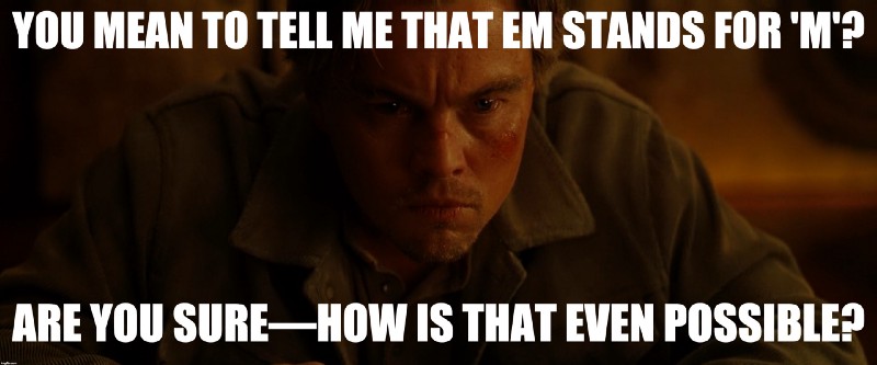 EMCEPTION
This seems recursive, doesn’t it? How can em be self-referencing? It’s so cunning… so subtle. Well em—as we know it in CSS—does not represent the “m” character, but a relationship with its parent’s font-size.
Say we define:
<!DOCTYPE html>
<html>
    <head>
        …
        <style>

.a { font-size: 40px; }
.b { font-size: 30px; }

        </style>
    </head>
    <body>
        <div class="wrapper">
            <span class="a"></span>
            <span class="b"></span>
        </div>
    </body>
</html>
Here we’ve defined a wrapper with two span elements, each with no content. So our website is terrible! But what we can do is give our span elements some text to demonstrate how em works:
    …
    <body>
        <div class="wrapper">
            <span class="a">hello from inside .a</span>
            <span class="b">hello from inside .b</span>
        </div>
    </body>
    …
 _[Click here](https://scrimba.com/c/cKLrDA8" rel="noopener" target="blank" title=") to open in Scrimba’s playground
We’ve just added text to our span elements. And the text renders at different sizes, 40px and 30px. Let’s set the wrapper font-size to 20px, and then refactor our .a and .b font-size using em.
        …
        <style>
.wrapper { font-size: 20px; }
.a { font-size: 1.5em; }
.b { font-size: 2.0em; }
        </style>
        …
 _[Click here](https://scrimba.com/c/c8v7DcK" rel="noopener" target="blank" title=") to open in Scrimba’s playground
What? Our paragraphs’ font-size has flipped! Now we can begin to explore how em works. Had we defined font-size as 20px, 1em would mean 1 * 20px. So 1em is sort of meaningless.
However in our CSS, we defined .a font-size as 1.5em and .b font-size as 2.0em. Given that their parent is 20px, these expressions therefore evaluate to 30px and 40px . So, the opposite!
There is an objection to using em.Had we defined multiple parents, such as elements inside of elements, each with their own em defined font-size, it becomes unintuitive to determine what the child’s font-size is.
The rem unit

rem is for root em. And grem is for Groot em—which doesn’t exist.
So an em is a multiplier of its parent element’s font-size whereas rem is a multiplier of its root element’s font-size. Root?
   html <- root
   /  \
head  body
 /      \
…        …
This is what our website is—a tree!—an “upside-down” tree!
        …
        <style>
html { font-size: 20px; }
.a { font-size: 1.5rem; }
.b { font-size: 2.0rem; }
        </style>
        …
Here we’ve replaced .wrapper with html, because now we’re using rem. Given this, .a and .b now inherit their font-size from the html element, as supposed to our .wrapper.
Note that nothing’s changed—our website is identical, but we’ve broken an em parent-child relationship with a rem root-child relationship.
Even more, we can replace the html element with a pseudo-class:
:root { font-size: 20px; }
Again—identical, but semantic. So, rem differs from em because instead of inheriting the parent’s font-size, it jumps to the html or :root element. What if we were to change :root font-size:
:root { font-size: 15px; }
 _[Click here](https://scrimba.com/c/cpK9WCa" rel="noopener" target="blank" title=") to open in Scrimba’s playground
What happened? Our span is 25% smaller — evaluating to 22.5px and 30px— because we changed the :root font-size. And this is an awesome idea. Because we can write CSS not in rules but relationships.
Let’s recap: we use em to create a shallow relationship with an element’s closest parent that evaluates a font-size whereas we use rem to create a deep relationship with the :root.
The em and rem + media queries
An even more awesome idea than how we use em and rem is using them in tandem for media queries. Media queries allow us to override CSS in some circumstance, such as the website’s width.
For example:
        …
        <style>
p { color: green; }
@media (max-width: 8.5in) { p { color: blue; } }
        </style>
        …
Here p renders green, but if the width is at or less than 8.5in, the same p reads blue. And we can go a step further than this: instead of using media queries for color, we can use them for font-size:
        …
        <style>
:root { font-size: 20px; }
.a { font-size: 1.5rem; }
.b { font-size: 2.0rem; }
@media (max-width: 650px) { :root { font-size: 3vw; } }
        </style>
        …

 _[Click here](https://scrimba.com/c/cyM3RSr" rel="noopener" target="blank" title=") to open in Scrimba’s playground
If our website is rendered at or less than 650px, our em and rem inherit their font-size not as 20px but 3vw, or 3% our viewport’s width. Having done so, we’ve connected our CSS as opposed to siloing it.
A final note: em and rem are not limited to font-size. We can use em and rem to describe width, height—wherever CSS expects a size. Compounding this with media queries makes us CSS superheroes.
Learning HTML and CSS doesn’t have to be painful—it can be subtle and these languages can be quite powerful. And em, rem, and grem are some of the most powerful units at our disposal we can use to design websites.
Don’t forget there’s a free course on Scrimba where I teach how to make the same website from scratch. Click here to enroll! ?