

Frontend automation is moving fast. Tools like Figma MCP and Kombai can read design context and generate working UI code. I wanted to see what you actually get in practice, so I decided to compare them.
Figma MCP exposes design metadata to AI clients, while Kombai is a frontend-first agent that integrates with editors and existing stacks.
In this article, we’ll feed the same two Figma files into both tools, review how close the output is to the designs, and look at the code structure in a real editor.
Table of Contents
What's the Deal?
Cloning complex Figma designs by hand isn’t fun anymore, nor is writing your CSS line by line with exact precision.
And sure, you can attach a screenshot or whatever to GPT, but it often ends up with something that barely looks like your design. That's where Kombai or the Figma MCP come in.
They actually get your Figma design metadata and give you frontend code that's super close to the real thing.
So now, instead of spending hours rebuilding what's already in your design file, you can focus more on small tweaks and what actually matters.
Meet the Tools
Kombai
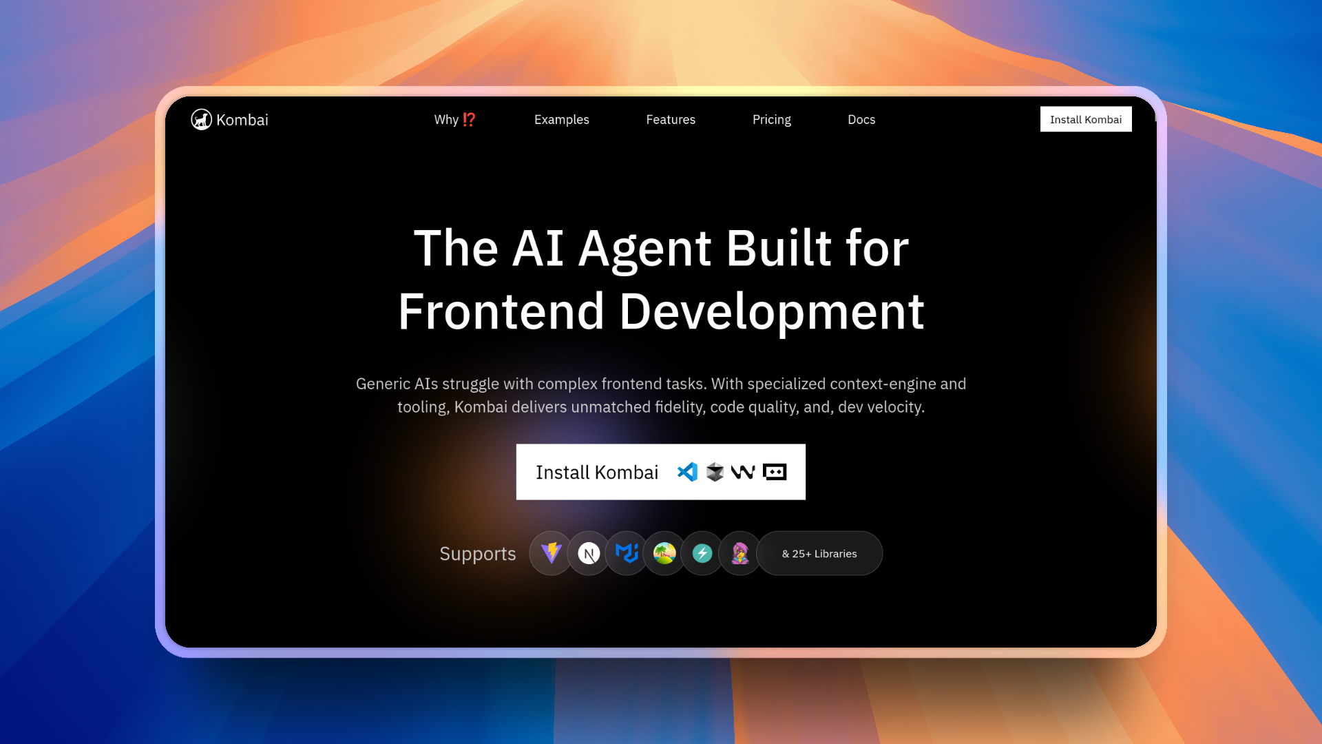
Kombai is an AI agent designed for frontend work. It takes input from Figma (like text, images, or your existing code), understands your stack, and converts it into clean, production-ready UI.
💡 It’s made specifically for frontend work, so you can expect it to be very good at that (unlike more generic tools like ChatGPT or Claude).
Kombai also handles large repositories easily. It doesn't just convert Figma designs into code. It actually understands your entire frontend codebase, even if it's huge.
So, even if you're working on a small side project or a very large production app, it can read, change, and write code that fits perfectly into your existing project.
Note: Kombai isn’t just good at cloning Figma designs and writing clean code. It actually understands your whole repo, too. You can chat with it like GPT, but it already knows your frontend. It can help refactor code, clean things up, or make changes without ever touching your backend logic.
Pretty handy, right?
No backend code is ever touched, which ensures none of your business logic is mistakenly changed.
You can also add Kombai right inside your editor. It works with VSCode, Cursor, Windsurf, and Trae. Just grab it from the extension marketplace, launch it, and you’re ready to go.
With Kombai, you can:
Turn Figma designs into code (React, HTML, CSS, and so on) using the component library your project already uses.
Work with a frontend-smart engine that understands 30+ libraries including Next.js, MUI, and Chakra UI.
Stay in your editor, follow your own conventions, and ship faster with good accuracy.
And most importantly, preview the changes in a sandbox so you can approve or reject the change before committing it to the files.
You can be up and running in under a minute. Here are the steps to get started:
Install the extension for your editor
Sign in and connect your project
Paste a Figma link or describe what you want to build
Review the output and commit your code
You can find it in the Extension marketplace of your IDE.

Now, using it is just as simple as accessing it from the left sidebar and having a chat similar to how you would with ChatGPT. (Optionally, you can add your tech stack, but Kombai handles it automatically.)

Head to the docs to get started and find the setup for your editor.
Pricing Note: Kombai is a paid tool but gives you a free plan with 300 credits per month, which is great for personal projects. For more advanced workflows, you can move up to the Pro plan or the Enterprise plan.
If you spend most of your time on the frontend, Kombai may be a good fit.
Figma MCP
Figma MCP (Model Context Protocol) lets AI agents connect directly to your Figma files. It closes the gap between your designs and your AI tools by giving them structured access to real design data instead of relying on screenshots or rough estimates.
It works by exposing your design's node tree, styles, layout rules, and component structure so the model can build the UI with actual design data.
That means tools like Claude Code, Gemini CLI, Cursor, and VSCode can actually read your designs, including layers, components, colors, spacing, and text, and use that context to generate accurate, production-ready code or design updates.
With Figma MCP, you can:
Let AI tools pull live data from your Figma files, so your code suggestions always match your latest designs
Ask your AI assistant to inspect components, layouts, or styles directly from Figma
Generate UI code that reflects real design and structure instead of guessing from an image
Keep designers and developers in sync without constantly sending files back and forth.
Setting it up is simple:
Run the Figma MCP server locally
Authorize your Figma workspace
Connect your editor or AI tool (Cursor, Claude Code, Gemini CLI, and so on)
For this test, I'll be using Figma MCP inside Claude Code in Linux, and setting it up is as simple as adding the following JSON in your Claude configuration file ~/.claude.json:
{
  "mcpServers": {
    "Framelink MCP for Figma": {
      "command": "npx",
      "args": ["-y", "figma-developer-mcp", "--figma-api-key=YOUR-KEY", "--stdio"]
    }
  }
}
For Windows users:
{
  "mcpServers": {
    "Framelink MCP for Figma": {
      "command": "cmd",
      "args": ["/c", "npx", "-y", "figma-developer-mcp", "--figma-api-key=YOUR-KEY", "--stdio"]
    }
  }
}
Pricing Note: To use Figma MCP, you need to have a paid Figma plan, either Professional, Organization, or Enterprise. But there's a community-maintained open-source MCP server, Figma-Context-MCP, that you can test out for free – which I'll be using for this test.
Once it’s running, any MCP-supported tool can understand your design files, making frontend coding development much more accurate.
Check the Figma MCP Guide to get started.
Frontend Comparison with Figma
For this test, we'll be comparing Kombai with Figma MCP using two Figma designs: one is a simple portfolio design, and the other is a more complex learner dashboard.
NOTE: For this test with Figma MCP, I'll be using Sonnet 4, which, in my experience, has been the best model for coding the frontend. I've also tested with the recent GPT-5 and Opus 4, but Sonnet 4 seems to be the best for frontend work. If you want to try other models, feel free to do so and see if you notice much difference in the results.
💁 Prompt: Clone this Figma design from this Figma frame link attached. Write clean, maintainable, and responsive code that matches the design closely. Keep components simple, reusable, and production-ready.
Quick note about the videos in the next section: The demo recordings are pretty long because I kept them raw. The idea is to show how the tools behave in real time. If you only care about the final output, feel free to skip to the end of each video.
Test 1: Simple Portfolio Design
Let's start with a simpler design that doesn't have much going on in the UI.
You can find the Figma design template here: Personal Portfolio Template
Figma MCP
Here's the response from Figma MCP:
This is pretty decent. The overall UI looks good, and the colors and fonts are all accurate. The biggest visual issues are with the hero image and a few icon placements, which are a bit off compared to the original Figma file.
The overall implementation took just about 5 minutes of coding and achieved this entire result in one go, as you see in the video demo. The time it takes isn't really dependent on the MCP itself but mostly on the model, so the timings will vary based on the model you choose to work with. The timing is something you can simply ignore here.
The whole page is split into sensible components (Header, Hero, Projects, ProjectCard, Footer) and composed in a clean page.tsx.
export default function Home() {
  return (
    <div className="min-h-screen bg-bg-gray">
      <Header />
      <main>
        <Hero />
        <Projects />
      </main>
      <Footer />
    </div>
  );
}
That is a nice, readable starting point for a Next app.
You can find the code it generated here.
But here are some issues I noticed right away:
- The hero decoration is positioned with pretty brittle absolute values:
<div className="hidden lg:block absolute right-0 top-0 w-[720px] h-[629px] pointer-events-none">
  <div className="relative w-full h-full">
    <div className="absolute left-0 top-0 w-[777px] h-[877px] -translate-y-[248px] bg-brand-yellow" />
    <div className="absolute left-0 top-0 w-full h-full">
      <img
        src="/images/hero-decoration-58b6e4.png"
        alt="Decorative"
        className="w-full h-full object-cover"
      />
    </div>
  </div>
</div>
This achieves the desired look at one screen size, but it can easily become misaligned when you resize. When compared side by side with the Figma frame, the hero image and yellow shape do not align as they should.
- Fixed Header
For a simple portfolio page with a short hero, a fixed header is not always worth the complexity.
The problem here is that since the header is fixed to the top, the rest of the content also starts from the top. On smaller devices, this might cover parts of the content when scrolling.
return (
  <header className="fixed top-0 left-0 right-0 bg-bg-gray z-50 h-14">
    {/* ... */}
    <button
      onClick={() => scrollToSection("about")}
      className="font-raleway ..."
    >
      About
    </button>
    {/* more buttons */}
  </header>
);
This is still a great head start, though it is not quite at the level where I would add it to a production repo without tidying up some of the layout changes.
Kombai
Here's the response from Kombai:
Visually, this one is extremely close to the Figma template. Apart from the hero image being slightly off from the Figma design, I see no other differences. It actually feels like the design is exactly copy-pasted.
Notice that the font, images, and icons are exactly the same, which to me is insane.
You can find the code it generated here.
Here are the specific things it does better in this simple example.
- It mirrors the Figma typography and colors as real tokens
Kombai sets up globals.css with Figma-like tokens and even defines utility classes for the text styles:
:root {
  /* ... */
}

@theme inline {
  /* ... */
}

@utility text-heading-large {
  /* ... */
}

@utility text-subtitle {
  /* ... */
}
That is very similar to how a designer would set up styles in Figma, and it means you can reuse these utilities in new screens instead of retyping Tailwind font sizes everywhere.
- Components are cleaner and more reusable
All the other components, like Hero or some smaller button components, use the same styles set up in styles.css.
const baseClasses =
  "text-button px-6 py-3 rounded-sm transition-all hover:opacity-90";

const variantClasses =
  variant === "primary"
    ? "bg-(--primary-yellow) text-(--foreground)"
    : "bg-transparent border-2 border-(--foreground) text-(--foreground) hover:bg-(--foreground) hover:text-white";
The footer pulls each icon into its own component:
import InstagramIcon from "./icons/InstagramIcon";
import LinkedInIcon from "./icons/LinkedInIcon";
import MailIcon from "./icons/MailIcon";
In practice, that means if the designer swaps the mail icon or tweaks the size, there is a single place to update it.
So for this simple test, Kombai’s output is both closer to the visual design and a bit nicer structurally for a real project. I would still tweak naming and some minor details, but I would happily keep most of this as is. How crazy is that?
Test 2: Complex Learner Dashboard
So, for the second one, let's create a slightly more complex design with a lot happening in the UI.
You can find the Figma design template here: Learning Dashboard
Figma MCP
Here's the response from Figma MCP:
This is good, considering the complexity of the design. It’s able to put all the images and assets in place. This is much better than what I expected. But there's a slight inconsistency in the placement of images between the original design and the implementation, as you can see for yourself.
If I compare the time, this got it done super fast, in just about 8 minutes, whereas Kombai took over 15 minutes to get it done (but with a better result).
You can find the code it generated here.
Here's what I like and dislike about a few things it did here:
- Great smaller components, but everything is still quite page-centric
It does break things into logical components like Sidebar, Input, Button, StatCard, CourseCard, and Icons. The main page then stitches them together:
export default function Home() {
  const mentors = [
    {
      id: 1,
      name: "John Doe",
      subject: "UI/UX Design",
      color: "bg-purple-500",
    },
    // ...
  ];

  return (
    <div className="flex items-center gap-8 w-full max-w-[1440px] h-[933px] bg-white rounded-[20px] mx-auto overflow-hidden">
      {/* Sidebar */}
      <Sidebar />

      {/* Main content */}
      <main className="flex flex-col items-center gap-6 pt-5 pb-0 flex-1 h-full overflow-hidden">
        {/* Search, hero, cards, mentor table */}
      </main>
    </div>
  );
}
The separation into components is nice, but everything is still wired directly inside one big page component with inline mock data. For a real app, I would want that data in its own module, ideally typed, so it is not mixed with layout logic.
- Hard-coded dimensions tied to the original frame
The outer container is pinned to a specific height:
<div className="flex items-center gap-8 w-full max-w-[1440px] h-[933px] bg-white rounded-[20px] mx-auto overflow-hidden">
That’s fine if you are literally recreating a 1440 by 933 frame for a screenshot, but in a live app, it means:
You get weird empty space on taller screens.
Anything that grows vertically (longer course titles, more mentors) will either overflow or get clipped.
The hero banner has the same kind of pixel-exact positioning:
<div className="relative w-full h-[181px] bg-primary rounded-[20px] overflow-hidden">
  <Image
    src="/images/star1.svg"
    alt="Star"
    width={80}
    height={80}
    className="absolute top-[45px] left/[683px] opacity-25"
  />
  {/* four more star images with fixed top/left */}
</div>
This is great for matching the specific Figma design, but as soon as the width changes, these positions stop lining up perfectly.
So overall, I would call this result surprisingly good for a single prompt, but a bit rigid and template-like once you start thinking about real data and using it in production.
Kombai
Here's the response from Kombai:
You will see in the video that I had to fix a small error with an extra prompt, but after that, it produced a fully working dashboard. The visual match is very strong, given how complex the layout is.
You can find the code it generated here.
Here is what stands out compared to the MCP output.
- It treats the Figma file like a real product, not just a static screen.
Instead of wiring everything in a single page with inline arrays, Kombai creates proper domain types and a mock-data.ts:
import { UserProfile, Friend, Course, ProgressCard, Mentor } from "./types";

export const courses: Course[] = [
  {
    id: "1",
    title: "Beginner's Guide to becoming a professional frontend developer",
    category: "Frontend",
    thumbnail: "/images/course-coding.jpg",
    instructor: {
      name: "Prashant Kumar singh",
      role: "software Developer",
      avatar: "/images/avatar-prashant.jpg",
    },
  },
  // ...
];
That looks much closer to what you would expect in a production codebase: clear types, data separated from layout, and a page component that just composes everything.
- Better mapping of the smaller UI pieces
The course card is similar to the MCP one, but now it is fully driven by a Course object:
export function CourseCard({ course }: { course: Course }) {
  return (
    <div className="flex flex-col gap-2.5 rounded-[20px] bg-white shadow-[0px_14px_42px_rgba(8,15,52,0.06)] overflow-hidden min-w-[268px]">
      <div className="relative">
        <Image
          src={course.thumbnail}
          alt={course.title}
          width={244}
          height={113}
          className="w-full h-28 object-cover rounded-t-xl"
        />
        <button className="absolute top-3 right-3 w-2 h-2 bg-white rounded-full" />
      </div>
      <div className="px-3 pb-4 flex flex-col gap-2.5">
        <span className="text-[8px] font-normal uppercase text-primary px-3 py-1 bg-purple-50 rounded w-fit">
          {course.category}
        </span>
        <p className="text-[14px] font-medium text-text-primary leading-tight">
          {course.title}
        </p>
        <div className="w-full h-1.5 bg-gray-100 rounded-full overflow-hidden">
          <div
            className="h-full bg-primary rounded-full"
            style={{ width: "60%" }}
          />
        </div>
        {/* instructor avatar and name */}
      </div>
    </div>
  );
}
The structure and text styles are very close to the original design, and because the card is fully data-driven, you can plug in real data without touching the JSX.
- Design tokens and typography utilities again
Just like in the portfolio example, Kombai sets up a proper token layer for the dashboard:
:root {
  /* ... */
}

@utility heading-section {
  /* ... */
}

@utility text-caption {
  /* ... */
}
The components then reuse these utilities, which keeps the code close to the design system instead of scattering font sizes and colors everywhere.
- Things I would still tweak
It is not perfect:
The Next
layout.tsxis still using the default Geist fonts and “Create Next App” metadata, so you would want to align that with the Inter font and real app title.Some of the mock data has inconsistent casing in names and roles, which you would clean up in a real project.
The play button on the course card is just a white dot button for now, so you would still plug in the real icon.
But even with those issues, it is very close to something I would actually keep in a production repo after a quick pass.
Now, this is not as perfect as the previous Kombai implementation, and it did not run into errors. But considering how complex this design is, with multiple different cards with images and all, it's still really impressive to me.
For this one, it took a bit longer to code, but in my opinion, the extra time was worth it.
Imagine you're building something similar and get a response this good already. Then it's not that big of a deal to iterate a little bit, right? You don't have to start from scratch. Just make a few changes if required, and you're done.
What You Should Know Before Using These Tools
As good as these tools are, they’re not something you can just trust blindly. They’ll get you off to a solid start, but you’ll still need to tweak a few things before calling it production-ready.
Kombai does a great job cloning Figma designs and writing clean, modular code. It breaks components into smaller files and generally follows good structure.
The only issue I noticed is that it sometimes slips on naming conventions. Since it scans your entire codebase to stay consistent with your setup, it can be a bit slower to generate code, but that’s also what makes it smarter. You’re not just getting a Figma cloner, you’re getting an assistant that actually understands your frontend.
Figma MCP is fast and does a decent job matching the UI, although the results depend a lot on the model you use for generation. If your main goal is to clone Figma designs quickly and you don’t mind refining the output, it’s a good option.
In short, both tools can save you a ton of time, but they’re not plug-and-play replacements for a frontend workflow. Treat them as part of your toolkit, and you’ll get the best results.
Final Verdict, and What's Next?
Now that you’ve got the gist of what these tools can do, go ahead and try them out. You can turn your Figma designs into working frontends in just a few minutes without all the endless play with CSS.
To sum up, here’s the quick rundown:
If you want production-ready code that actually looks like your Figma design and you mostly live in VS Code, Cursor, or any GUI IDE, go with Kombai. It nails the details and even understands your codebase, which is completely missing in Figma MCP.
If you just want to clone a Figma design quickly and don’t mind if things are slightly off, Figma MCP is totally fine. It gets the job done pretty well.
Basically, choose Kombai if you care about precision and code quality with codebase understanding.
Choose Figma MCP if you want something quick, that works and looks decent enough. 🤷♂️
Conclusion
So, what do you think? Pretty cool, right? This was a fun little experiment to see how close tools like Figma MCP and Kombai can get to cloning real frontends straight from Figma.
If you’re into building frontends and want to save yourself a few hours of CSS pain, definitely give them a try. Just don’t expect them to be perfect in one try – their output still needs review and likely a little refining.
That’s all for this one. Thank you for reading! ✌️