
Flexbox can help you simplify the process of creating both basic and advanced layouts. And it's pretty straightforward to create side and bottom navigation menus with CSS flexbox or Grid.
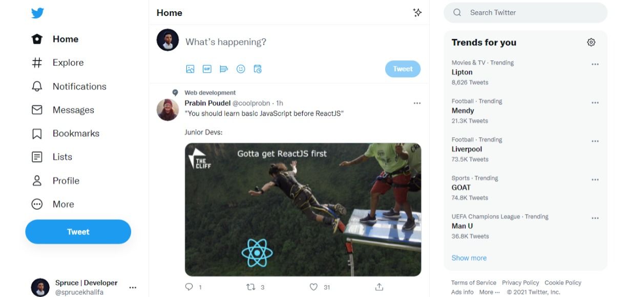
These layouts are so popular that they appear almost everywhere on the web. For example, check out Twitter's sidebar, which inspired this article:
Normally, to create a fixed menu with CSS you would have to use the position property with a value of either fixed or sticky.
The problem with this approach is that it takes the entire element out of the document flow like it was never there at all. This is one of those frustrating moments in CSS for beginners and sometimes even experts.
In this tutorial you'll learn how to create a fixed sidebar and fixed bottom navigation menu with CSS flexbox instead. I'll host all code and demos on Codepen so you can see a live preview of what we'll build.
Getting Started
To create a fixed element with Flexbox, you first need to disable scrolling on the parent element of the item you want to make fixed. In our case, the parent element is the body:
body {
    overflow: hidden;
    height: 100vh;
}
The Mark-up
We'll use HTML to create a two column layout wrapped in a div called wrapper.
<body>
<div class="wrapper">
  <aside>
    <ul>
      <li>Item</li>
      ...
    </ul>
  </aside>
  <main>
    <div class="wrapper_inner">
      <p>
        ...
       </p>
     </div>
   </main>
 </div>
</body>
The CSS
To make the sidebar fixed, we just need to disable scrolling on the parent body and make the main element scrollable.
body {
  overflow: hidden;
  height: 100vh;
}
main {
  overflow-y: auto;
}
aside {
  flex: 1 0 10%;
}
.wrapper {
  display: flex;
  height: 100%;
}
Let's break down this code a bit.
First we made the body non-scrollable and hid the scrollbars with this code:
body {
    overflow: hidden;
}
Then using overflow: auto, we added the scrollbars back to the main element.
And then finally, we created a flex container wrapper and gave it a height equal to the parent using height: 100%:
.wrapper {
    display: flex;
    height: 100%;
}
How to Make it Mobile-friendly
But on a mobile screen with a width less than 500px we'll want the sidebar to be fixed to the bottom or top as the case may be. To do that you'll add the following CSS:
@media (max-width: 500px) {
  .wrapper {
    flex-direction: column-reverse;
  }
  ul {
    display: flex;
    align-items: center;
    justify-content: space-between;
  }

}
Here on a mobile screen we change the direction of our flex wrapper to column instead of row. Then to make it fix to the bottom, we add the following:
.wrapper {
    flex-direction: column-reverse;
}
To make it fixed to the top, on the other hand, you just have to remove the column-reverse and change it to column like so:
.wrapper {
    flex-direction: column;
}
You can see a live preview in the pen created with Codepen below. You can resize the window to see the fixed bottom nav:
Conclusion
In this tutorial you learned how to create a responsive fixed sidebar with flexbox. Here are some important steps to remember:
To make an element fixed with flexbox, you have to disable scrolling on the parent element with
overflow: hiddenThen you need to create a flex container with height equal to parent
Add
overflow: autoto the element you don't want fixed
And that's it!
If you found this tutorial useful or have any questions, please feel free to connect with me on Twitter (don't forget to hit the follow button) @sprucekhalifa.
Oh and happy Coding!