
Flex Basis
The flex-basis property defines the size of the flex-item along the main axis of the flex container. The main axis is horizontal if flex-direction is set to row and it’ll be vertical if the flex-direction property is set to column.
Syntax
flex-basis: auto | content | <width> | <height>;
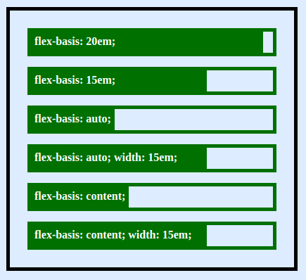
flex-basis: auto
flex-basis: auto looks up the main size of the element and defines the size. For example, on a horizontal flex container, auto will look for width and height if the container axis is vertical.
If no size is specified, auto will fall back to content.
flex-basis: content
flex-basis: content resolves the size based on the element’s content, unless width or height is set through normal box-sizing.
In both the cases where flex-basis is either auto or content, if main size is specified, that size will take priority.
flex-basis:
This is just as specifying width or height, but only more flexible. flex-basis: 20em; will set the initial size of the element to 20em. Its final size will be based on available space, flex-grow multiple and flex-shrink multiple.
The specification suggests use of flex shorthand property. This helps write flex-basis along with flex-grow and flex-shrink properties.
Examples
Here is rows of individual flex containers and individual flex elements showing how flex-basis affects the box-sizing.
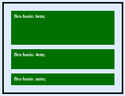
When the flex-direction is column, the same flex-basis will control the height property. You can see it in the example below:
More Information:
You can fund additional references about the flex basis property on the following pages:
- CSS specification level 1
- Mozilla Developer Network page on flex-basis