By Fabrice Dubois
So, apparently the next iPhone won’t have a physical Home button. There’s been much speculation already about what that means for the user. The bottom area of the device, for some, will be used to host the navigation bar items, as well as a virtual Home button.
This article describes another possibility.
Some recent findings in some leaked code may invalidate what I’m about to write below, but anyway.
Update 28 August: Part 2 of this story is now online.
Why a Home button?
To address a design problem it’s good to start with the right questions. We seem to use the Home button for two dominant reasons:
- To go to a place where we can choose another app
- To ‘close’ the current app because we’re done with it
Of course, several other functions rely on the current Home button too (Siri users, shoot me!) but for now please allow me to simplify a bit and assume an alternative can be found for every edge case.
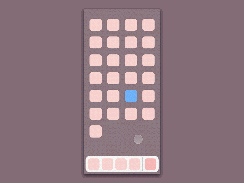
When I tried the first iOS 11 beta on iPad, what struck me most was the new app switcher. Swiping from the bottom edge not only reveals the control centre as it did in previous iOS versions; now it comes with the favorite apps dock and the app switcher too, all on the same screen.
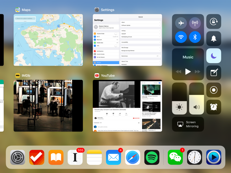
From there, it’s interesting to note that tapping anywhere on the blurred background instantly takes you back to the home screen. After a while I realized I wasn’t pressing the Home button that much anymore. The dock with my favorites apps, along with the list of recent apps, seemed sufficient for me to continue my workflow — at least most of the time. And my subconscious need for ‘closing’ the current app seemed fulfilled too.
I began to wonder if this new interface, triggered with a simple swipe, could be Apple’s secret weapon to replace the Home button for good.
What would it take to adapt it for the iPhone? That’s what I tried to do.
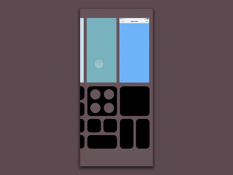
The concept
That’s it. Let’s decompose the movie into separate clips to discuss the different states.
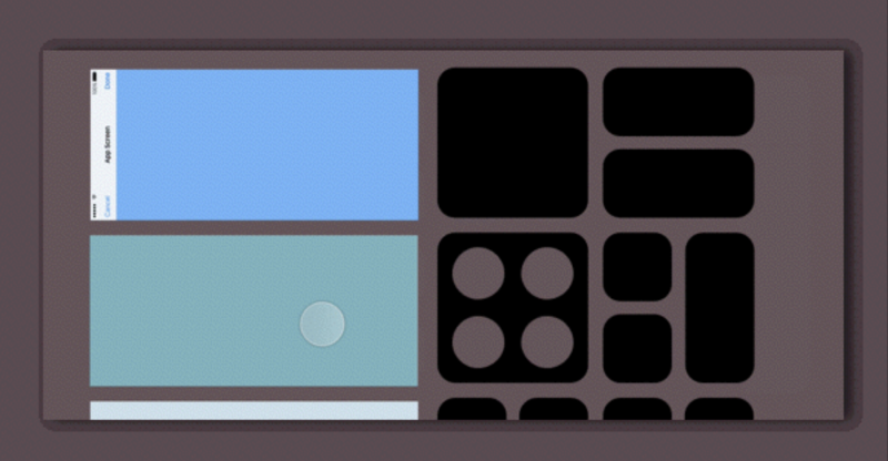
Dock state
The favorite apps bar, as on iPad and on macOS, is called Dock and can be revealed (alone, without transitioning to the full app switcher) on top of any app. There may even be room to include an extra suggestion in the right part of it. This is your level-1 cache to switch to your next app.
App switcher state

The level-2 cache, that you access if you continue swiping up. I nickname it level-2 cache because it has more apps to offer than the dock, but still less than the home screen. Here the current app has been ‘parked’ temporarily. And this is key. That’s basically what we have in mind when (we think that) we close an app. I assume most people are now aware the app isn’t killed, it’s just parked. The concept is consistent with that of the iPad (I really invented nothing here), except that the iPhone version would use two separate rows due to the elongated display ratio.
Dismissing the app switcher
Here the design relies on a common reflex: if we can’t find what we’re looking for in a view, we tend to look for a way to escape the view. And if we can’t find any concrete affordance to escape, then we tend to tap where we can! I may be over-simplifying, granted. But over-simplification is often more manageable than over-complication.
Once again, this is what the iPad implementation does anyway. In order to ensure a comfortable dismiss zone at the bottom, however, the dock doesn’t persist in the app switcher state (on iPad it does because there’s enough room for it). I’m not too happy with that aspect though, it would deserve refinement.
Opening an app
Once the app is open, the dock goes away so the app can make the most of the available real estate, which is apparently massive on the upcoming iPhone; but as you can see it is taken down with a slight delay. This is to improve discoverability of the app switcher. Maybe overkill, maybe not.
Now let’s discuss issues and advantages.
Issues
Discoverability, as well as two steps to go to home screen, may still be a problem in the eyes of many. I personally find it surprisingly smooth to use, having tried and tweaked the proto on a real device, but I appreciate it may not be convincing at first sight.
How to access the other Home reliant functions? Touch ID is strongly expected to be replaced with a better authentication method, such as advanced face recognition. I haven’t thought through all needed workarounds — that’s a full time job — and indeed, that‘s problematic. Accessibility, Siri, screenshot: any idea anyone?
The recent apps carousel is not as good as the existing one: it’s smaller. And the Control Centre isn’t as good as the existing one either: it easily needs to be scrolled. That is the cost of simplification.
The proposed approach may disappoint those who expect some kind of rich function bar at the bottom, possibly along the lines of the Macbook’s Touch Bar, or other deep functions that Apple would want to bring right under our thumb. But isn’t the iPhone a Touch Bar already? Apps have always been able to use the bottom of the screen to provide contextual functionalities. As to system functions, there’s a reasonable place for them: Control Centre. So yes, the solution proposed here is about simplification (at least in terms of mental model), not about adding function.
Advantages
First, the elegance of not having a Home button at all. This is more striking, purer, than virtualizing it. Removing the button completely would be the ultimate refinement.
Overlay based solutions such as a virtual button have their own issues: how to make sure the button will contrast well with the app view behind it? How to manage touch conflicts with the app? Can we move it around? etc. Getting rid of it completely removes these concerns.
The metaphor used here is more consistent with what really happens in the phone: when you ‘close’ an app, what really happens is that you push it in the background. That’s precisely what the new app switcher UI shows. Literally: You can see and feel that you’re pushing the app on a background.
No impact on the app UI level. Apps remain unaware of any button or whatever rumored function bar and therefore shouldn’t need to adapt their behaviour or layout in any way. When an app is brought to the foreground, the entire floor is its.
Software complexity is kept low. Again, my experiment simply reuses what they’ve already built for iPad. We’re not talking about yet another mechanism made just for the new iPhone. For the user, that guarantees a certain level of familiarity, too.
The design could work surprisingly well in landscape. The layout wouldn’t rotate or reconfigure itself. Only each individual item would rotate 90 degrees. Think camera UI, what rotates and what doesn’t, and you’ll see what I mean immediately. The new Control Centre grid looks flexible enough for the required item rotations. And since we’d still swipe up from the bottom, the dock would still show at the bottom, but with such a massive width, I imagine it could offer lots of extra app suggestions.
Summary
The takeaway is that the new app switcher in iOS 11 for iPad may be even smarter than we think. There is a possibility they didn’t design it specifically for iPad, after all. If perfectly tuned, it makes for a compelling way to switch contexts, and can be seen as an efficient cache between the current app and the home screen.
And, how coincidental, it doesn’t rely on a Home button.
My point with this article is not to speculate; I don’t really care how Apple tackles the removal of the physical Home button, I trust it will be good. And some speculations around have good points too, in their own way. I just saw a very interesting and irresistible design exercise here.
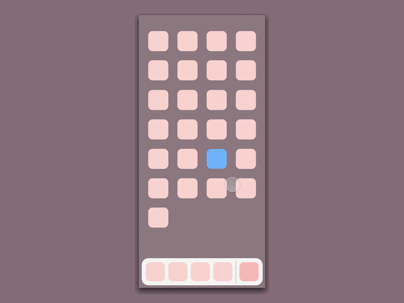
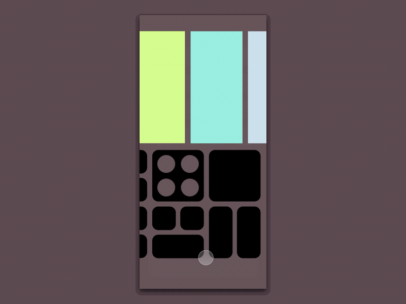
For the prototypes, made with Principle, I used realistic proportions, for both the display (expected 375 * 812 pt resolution) and known components such as the Control Centre items.
This article’s also available in Chinese, thanks to Fred Jame.
You may also want to read Part 2, on the design process.