
If you create websites, chances are you have been asked to create a horizontal scrolling component. It is extremely easy to implement this using just a few lines of Flexbox. Let me show you how.
Project Layout
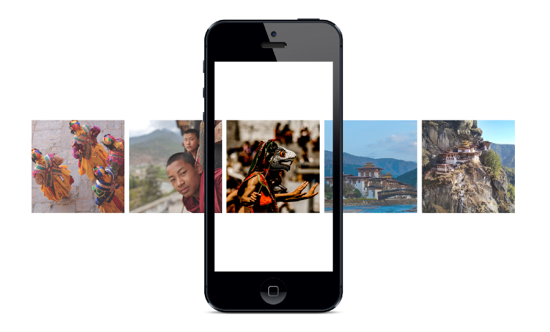
We need to create a container that will contain all the images that we want to scroll. Here is the code:
<div class="container">
  <img src="images/bhutan1.jpg" alt="Bhutan" />
  <img src="images/bhutan2.jpg" alt="Bhutan" />
  <img src="images/bhutan3.jpg" alt="Bhutan" />
  <img src="images/bhutan4.jpg" alt="Bhutan" />
  <img src="images/bhutan5.jpg" alt="Bhutan" />
  <img src="images/bhutan6.jpg" alt="Bhutan" />
  <img src="images/bhutan7.jpg" alt="Bhutan" />
</div>
Styling the Project
Next step is to add styling so that the container scrolls horizontally. To do this I make the container display as Flexbox. In addition I am setting the overflow-x value to auto. Here is the style:
.container {
  display: flex;
  overflow-x: auto;
}
This is what the horizontal scroll looks like:
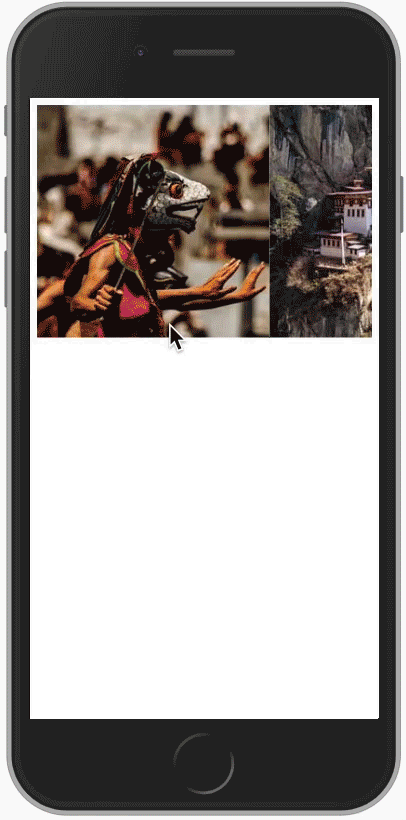
That does provide our requirement of a horizontal scroll area. I am not satisfied with how it looks. There are three things I want to change:
- Add white space between the images
- Get rid of the horizontal scrollbar
- Place the scroller in the middle of the screen
The images are touching. Let’s add some white space between them. Here is the CSS for this:
.container img {
  margin-right: 15px;
}
Next I want to get rid of the horizontal scrollbar which I can do with this code:
.container::-webkit-scrollbar {
  display: none;
}
The last change that I want to do is to center the scrolling are in the center of the screen. By default, the hight of the html is the height of the elements. I need to make the height to be 100% of the viewport. Flexbox provides a way to center items with the align-items setting. To use this functionality, I am going to convert the body to display as Flexbox. Here is the code that I am going to add for the body:
body {
  display: flex;
  align-items: center;
  height: 100vh;
}
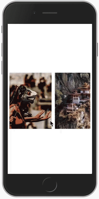
With these changes, here is what our final horizontal scroll area looks like.
Conclusion
It is very easy to create a horizontal scroll area using Flexbox. Thanks for reading.
Here are some more articles you might like to read:
Here are 5 Layouts That You Can Make With FlexBox
_The CSS Flexible Box Layout — Flexbox — provides a simple solution to the design and layout problems designers and…_hackernoon.com
Think outside the box with CSS shape-outside
_CSS is based off a box model. If you have an image that is a circle that you want to wrap text around, it will wrap…_hackernoon.com
Learn the CSS border-radius property by building a calculator
_Have you ever seen a button on a web page that has rounded edges? Have you ever seen an image that fits within a…_medium.freecodecamp.org