
If you've ever had to use a date picker in a web frontend project, chances are that you've used flatpickr.
For the unacquainted, flatpickr is one of the most popular date picker libraries in the open source-verse. It's framework-agnostic, highly customizable, and lightweight.
I recently had to use it in a Next.js codebase and there was a peculiar use case I had. The built-in behavior is that dates are applied immediately when selected, and thereafter the date picker disappears.
What I really wanted, however, was to be able to pick dates and not have the modal disappear the moment I did so. I wanted to be able to keep picking dates and only have it applied when I clicked on an "Apply" button. I also wanted a "Clear" button to clear applied dates.
Ordinarily, flatpickr's API has methods you can work with to get these functionalities, but you won't get buttons on the date picker itself.
Even while there is a plugin that adds a button to the date picker to manually apply dates, it doesn't work for date ranges (which was what I needed it for) and the button's look didn't really blend with the overall theme of the app I was building.
I had no other option but to come up with my own solution. But how do you get your own buttons to appear on flatpickr's date picker?
How to Set Up flatpickr
First things first, install the package:
npm install flatpickr
Next, you need a DatePicker component that will encapsulate the custom date picker and make it reusable. This component should have an onChange prop which will be passed a callback that will be called whenever a date is applied:
// DatePicker.tsx

const DatePicker: React.FC<DatePickerProps> = ({ onChange }) => {
  return <div></div>
}

export default DatePicker

interface DatePickerProps {
  onChange: (date: Date[]) => void
}
Next, you'll need to set up flatpickr itself. You're going to bring in some exports from the flatpickr package. In the markup, you'll add a text input element, which will be the date picker input, and pass it an element ref variable that'll be used to instantiate the flatpickr instance with a couple of configuration options:
// DatePicker.tsx

import { ElementRef, useEffect, useRef, useState } from "react"
import flatpickr from "flatpickr"

import { Instance as Flatpickr } from "flatpickr/dist/types/instance"
import "flatpickr/dist/flatpickr.min.css"

const DatePicker: React.FC<DatePickerProps> = ({ onChange }) => {
  const [flatpickrInstance, setFlatpickrInstance] = useState<Flatpickr>()
  const datePickerRef = useRef<ElementRef<"input">>(null)

  useEffect(() => {
    if (datePickerRef.current) {
      const flatpickrInstance = flatpickr(datePickerRef.current, {
        static: true,
        closeOnSelect: false,
      })

      setFlatpickrInstance(flatpickrInstance)
    }

    return () => flatpickrInstance?.destroy()
  }, [])

  return (
    <div>
      <input ref={datePickerRef} type="text" placeholder="Select date..." />
    </div>
  )
}
...
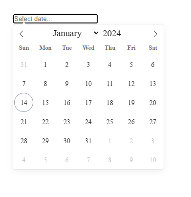
For the configuration options, static is set to true so the date picker modal is anchored to the date picker input and closeOnSelect is false so the date picker modal doesn't disappear when a date is selected.
This is how the date picker looks so far:
How to Add the Buttons
We've arrive at the main attraction of the day. From the snippet below, you'll notice two new imports: createPortal from react-dom and a pre-styled Button component. createPortal is going to play a very special role as you'll see.
// DatePicker.tsx

import { ElementRef, useEffect, useRef, useState } from "react"
import { createPortal } from "react-dom"
import flatpickr from "flatpickr"
import Button from "./Button"

import { Instance as Flatpickr } from "flatpickr/dist/types/instance"
import "flatpickr/dist/flatpickr.min.css"

...
Moving on to the body of the DatePicker component, you'll notice some changes too.
There's dates which will store selected date(s) (or an empty array if no date is selected) and applyDate which will hold the callback to call when the 'Apply' button is clicked.
In the configuration object, you'll find two flatpickr hooks: onChange that gets triggered whenever a date is picked and receives an array of the currently selected dates, and onClose that gets triggered when the date picker modal is closed.
Within the body of these hooks are implementations that specify the date picker's behavior.
// DatePicker.tsx

...
const DatePicker: React.FC<DatePickerProps> = ({ onChange }) => {
  const [flatpickrInstance, setFlatpickrInstance] = useState<Flatpickr>()
  const datePickerRef = useRef<ElementRef<"input">>(null)
  const dates = useRef<Date[]>([])
  const [applyDate, setApplyDate] = useState(() => () => {})

  useEffect(() => {
    if (datePickerRef.current) {
      const flatpickrInstance = flatpickr(datePickerRef.current, {
        static: true,
        closeOnSelect: false,
        onChange: (selectedDates) => {
          if (selectedDates.length === 0) {
            onChange([])
            dates.current = []
          }

          setApplyDate(() => {
            return () => {
              dates.current = selectedDates
              onChange(selectedDates)
              flatpickrInstance.close()
            }
          })
        },
        onClose: () => {
          flatpickrInstance.setDate(dates.current)
        },
      })

      setFlatpickrInstance(flatpickrInstance)
    }

    return () => flatpickrInstance?.destroy()
  }, [])


  return (
    <div>
...
We've gotten to the part where you finally put the custom buttons inside the date picker. This is where createPortal comes to shine.
The flatpickrInstance has a property, calendarContainer, which holds a reference to the date picker's containing div element. This is where you'll project the custom buttons, just beneath the calendar part of the date picker, using react portal.
// DatePicker.tsx

...
  return (
    <div>
      <input ref={datePickerRef} type="text" placeholder="Select date..." />
      {flatpickrInstance &&
        createPortal(
          <div className="flex justify-center gap-3 py-2">
            <Button
              text="Clear"
              bgColor="#F8F8F8"
              textColor="#292A2E"
              onClick={() => {
                flatpickrInstance.clear(true)
                flatpickrInstance.close()
              }}
            />
            <Button
              text="Apply"
              bgColor="#569ff7"
              textColor="#FFF"
              onClick={applyDate}
            />
          </div>,
          flatpickrInstance.calendarContainer
        )}
    </div>
  )
}

export default DatePicker
...
Put together, this is the final code output:
// DatePicker.tsx

import { ElementRef, useEffect, useRef, useState } from "react"
import { createPortal } from "react-dom"
import flatpickr from "flatpickr"
import Button from "./Button"

import { Instance as Flatpickr } from "flatpickr/dist/types/instance"
import "flatpickr/dist/flatpickr.min.css"

const DatePicker: React.FC<DatePickerProps> = ({ onChange }) => {
  const [flatpickrInstance, setFlatpickrInstance] = useState<Flatpickr>()
  const datePickerRef = useRef<ElementRef<"input">>(null)
  const dates = useRef<Date[]>([])
  const [applyDate, setApplyDate] = useState(() => () => {})

  useEffect(() => {
    if (datePickerRef.current) {
      const flatpickrInstance = flatpickr(datePickerRef.current, {
        static: true,
        closeOnSelect: false,
        onChange: (selectedDates) => {
          if (selectedDates.length === 0) {
            onChange([])
            dates.current = []
          }

          setApplyDate(() => {
            return () => {
              dates.current = selectedDates
              onChange(selectedDates)
              flatpickrInstance.close()
            }
          })
        },
        onClose: () => {
          flatpickrInstance.setDate(dates.current)
        },
      })

      setFlatpickrInstance(flatpickrInstance)
    }

    return () => flatpickrInstance?.destroy()
  }, [])

  return (
    <div>
      <input ref={datePickerRef} type="text" placeholder="Select date..." />
      {flatpickrInstance &&
        createPortal(
          <div className="flex justify-center gap-3 py-2">
            <Button
              text="Clear"
              bgColor="#F8F8F8"
              textColor="#292A2E"
              onClick={() => {
                flatpickrInstance.clear(true)
                flatpickrInstance.close()
              }}
            />
            <Button
              text="Apply"
              bgColor="#569ff7"
              textColor="#FFF"
              onClick={applyDate}
            />
          </div>,
          flatpickrInstance.calendarContainer
        )}
    </div>
  )
}

export default DatePicker

interface DatePickerProps {
  onChange: (date: Date[]) => void
}
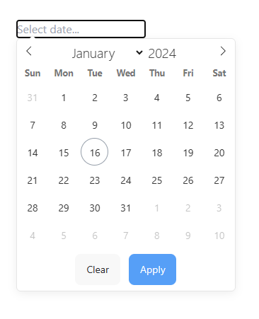
And this is how the date picker now looks with the custom buttons:
Conclusion
The date picker is now fully functional and can work for all mode options. There are tons of potential customizations you could possibly do using this technique. Hopefully, this article has done a good job of showing how flatpickr customization can be achieved.
❤️Enjoyed this article?
See more of my content! You can find more articles on my blog.