
By Emma Coffinet
If you're learning Python, you've likely heard about sci-kit-learn, NumPy and Pandas. And these are all important libraries to learn. But there is more to them than you might initially realize.
There are numerous tips and tricks in the world of Python that can help you speed up your tasks in data science, improve your code, and also help you to write code more efficiently.
So I decided to compile some of the most valuable data analysis tips in this article for you.
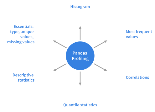
Profile dataframes in Pandas
The primary role or purpose of profiling is to get a clear understanding of the data. And this is what the Python package, Pandas Profiling, does. This method is straightforward and fast in performing data analysis of dataframes in Pandas.
The exploratory data analysis process includes the Pandas df.info()functions and df.describe() as the first steps. But you only get a basic data overview, which might not be very helpful if you're dealing with a large data set.
Pandas’s profiling function also extends the dataframe of Pandas with the df.profile_report(), which helps you quickly analyze data. It displays plenty of information in just one line of code, which also happens to be an HTML report that's interactive.
For a set of data, Pandas profiling computes these statistics:
Make pandas plots more interactive
The built-in plot() function of Pandas is also one of the Dataframe classes. However, this function offers visualizations that are not very interactive, and so do not appeal much to a data science audience.
On the other hand, it is easy to plot a chart with the Pandas.DataFrame.plot() function. The question then is, how do we plot interactive charts like Plotly using Pandas and without making significant changes to the code?
You can do this with the Cufflinks library, which binds Plotly’s power with Pandas's flexibility for plotting quickly.
You can see the result in the images below.
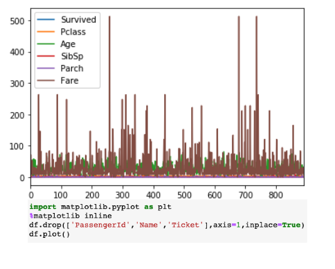
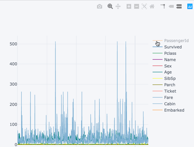
Both visualizations show the same things. The first visualization is a static chart, while the second one is a more interactive chart (and it also provides more details than the first one). Yet, we got this without making any significant changes to the syntax.
Magic commands
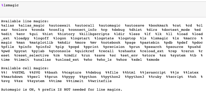
The tag ‘Magic Commands’ refers to a set of functions in Jupyter Notebooks. They created this set of features to solve the many common problems that are experienced in standard data analysis.
There are two kinds of Magic commands. First, there are the line magics - those that have a prefix of the % character. They also operate on one line of input.
The second kind are the cell magics - denoted by the double %% prefix. They work on more than one input line. If you set it to 1, you'll call the magic functions without needing to type the initial %.
Some of these commands might come in handy when you're doing everyday tasks in data analysis. Some of them are:
%pastebin
This function returns the URL and also uploads the code to Pastebin. Pastebin is a content hosting service online where it's possible to store plain text (such as source code snippets) and then share the URL with other people.
As a matter of fact, a Github gist is very similar to Pastebin, but has version control.
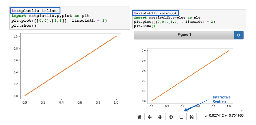
%matplotlib notebook
You can use this inline function for rendering static Matplotlib plots within Jupyter notebooks. You have to try and replace the inline part with a notebook. This will get you resize-able and zoom-able plots quickly.
But make sure you call the function before you start to import the Matplotlib library.
%run
You can use this function to run a Python script in a notebook.
%%writefile
This function writes the cell content into a file. You then write the code into another file named foo.py before saving it into the current directory.
%%latex
This function makes the cell content appear as LaTeX. It comes in handy when writing mathematical equations and formulae in a cell.
Find and remove errors
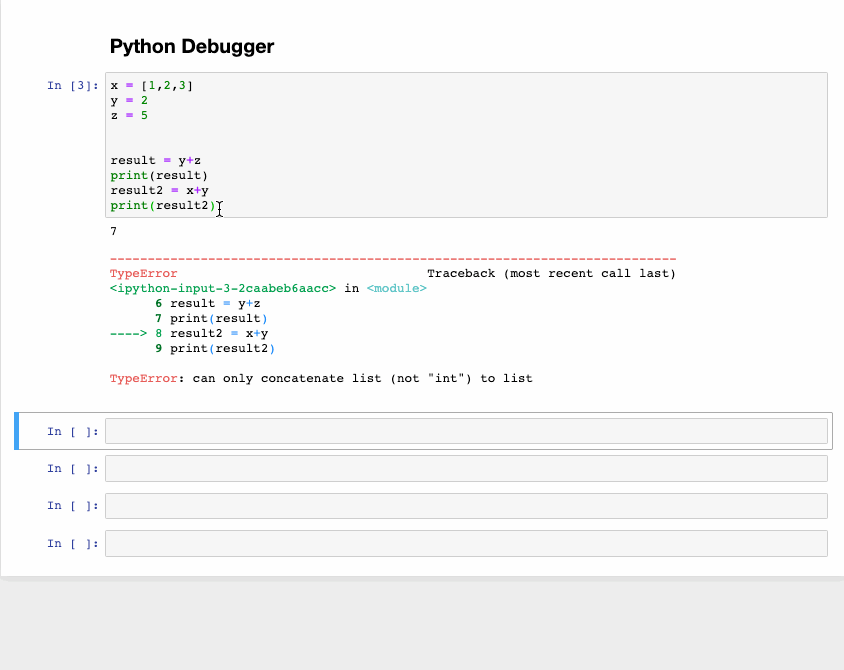
The function known as the interactive debugger is another magic feature. However, for this article, it has a different category all its own.
If you are running a code cell and get an exception, type %debug under a new line and then run it. This will open up an environment for interactive debugging that takes you back to the point where the exception happened.
You can also check the values of the different variables that they assigned within the program and, at the same time, perform operations there. After that, if you want to exit the debugger, press q.
Use the ‘I’ option when running Python scripts
One way to typically run a Python script from the command line is with hello.py. But if you add an -i and run the same Python script, (Python -i hello.py), you get more benefits. How?
First of all, after you get to the program end, Python does not close the interpreter. This means that we can check for the values of the different variables and how correct the functions defined in the program are.
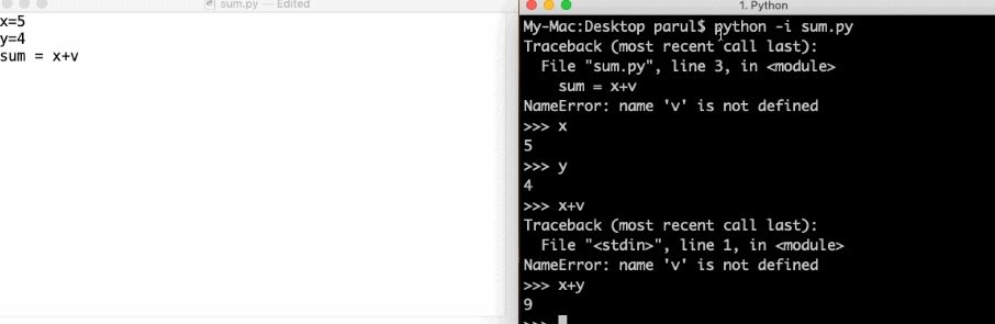
Second, it is then easy to invoke the Python debugger, especially since the interpreter is still available by:
- Import pdb
- Pdb.pm()
From here, we can quickly get to the point where the exception happened and then work on the code.
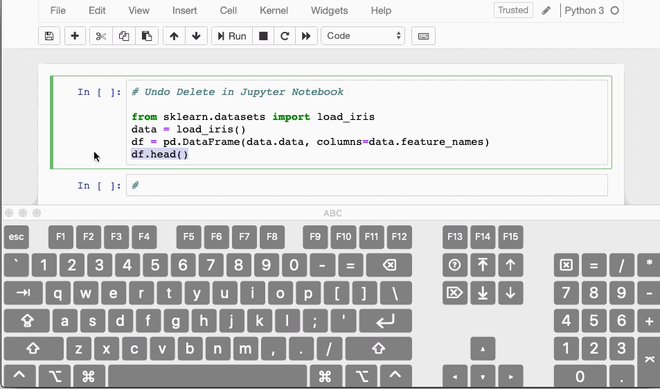
Delete and restore
So what do you do when you mistakenly delete one cell within your Jupyter Notebook? Luckily there is a shortcut for you to undo that action.
You can recover or undo your deleted content by hitting CTRL/CMD+Z.
If you have deleted an entire cell that you want to recover, press ESC+Z, or EDIT > Undo Delete Cells.
Conclusion
This article shared some tips to boost your data analysis skills with Python. These hacks should come in handy for you at some point in your Python data analysis journey.