By Manu Arora
If you're a web developer, it's important for you to have a personal portfolio website – especially when you're applying for jobs.
If you have a nice online portfolio site, you'll have a better chance of getting attention from recruiters than if you don't.
Instead of sending your CV and asking a recruiter to have a look, a portfolio website can help you stand out by directly showcasing your skills, projects, education, and your personal brand.
You can use your portfolio to showcase your projects, your education, share re-usable code snippets with the world, provide helpful resources, and write your own blogs. There are countless things that you can do with your own website.
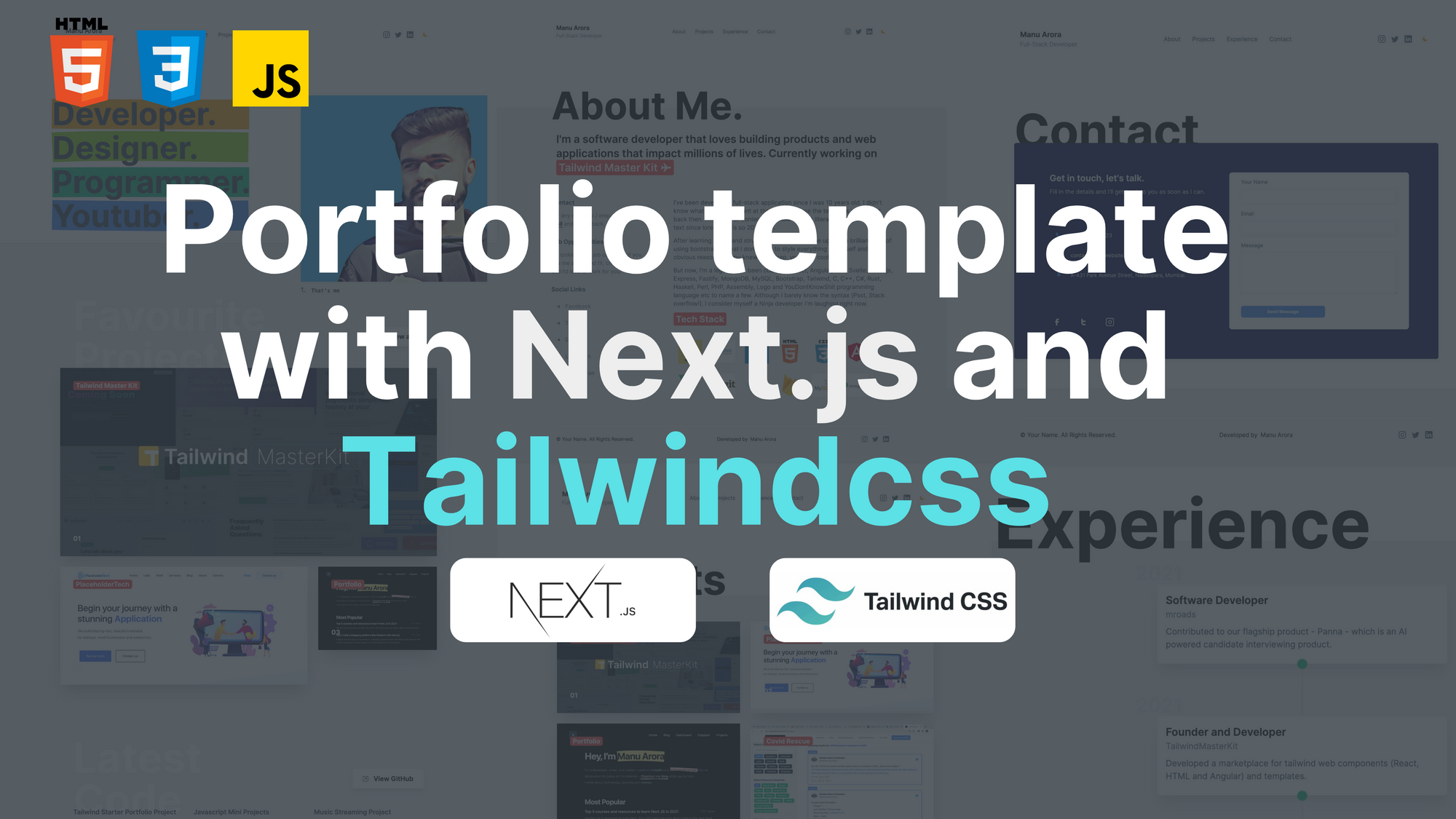
I built a template that you can use to create, edit, and deploy your own portfolio website for free on the internet in no time. And if you want to build your own version from scratch, I'll show you how in this article.
So let's dive in – I'll show you what technology I used, how I structured the portfolio, and I'll break it down by section so you can see how each part works.
Tech Stack
Let's talk about the tech stack I used to build this template:
- Next.js - a React framework used for building blazing-fast websites along with server-side rendering, which makes it easier for people to find your site on the internet.
- tailwindcss - a CSS framework to that lets you quickly prototype and style your web applications.
- Rough Notation - a styling library used in the Hero section, great for highlighting important text on your webpage.
Why Next.js? Because it is a React framework with Server-Side Rendering, which is good for SEO (Good for us if we get found on Google, right?).
Also, Next.js helps us build blazing-fast websites along with benefits such as Image optimization.
Why tailwindcss? Because TailwindCSS is a framework which reduces a lot of styling efforts. It has low level CSS classes that you can directly embed into the HTML code.
Not only that, it comes with amazing support for responsiveness. For example <div className="text-sm md:text-xl"></div> signifies that text will be small on smaller screens and xl on medium to large screens.
Finally, we are going to deploy the application on Vercel. Vercel gives us an easy way to deploy our application with CI/CD. The code is pushed to a remote GitHub repository and with every push, it's deployed.
Portfolio Site Features
The website includes what I consider to be the absolute minimum you should have in your portfolio website, along with some extra features that are cool to have.
Dark Mode- Comes with dark mode support. Toggle the mode button to switch between dark and light mode.Built with Next.js- The website is built with Next.js which comes with awesome features out of the box like Image Optimization and SEO support.Customizable styling- Using TailwindCSS, I built this website in such a way that you can customize primary colors and change the look of your website according to your needs.Custom Meta Component- Every page is wrapped with a Meta Component tag which you can use to provide meta information for every separate page that you create.Responsive Design- Pages look beautiful on all the devices - desktop, tablet, and mobile.
Portfolio Pages We'll Build
We are going to include all the necessary pages you should have in your portfolio website, such as:
Homepage- A landing page for the visitor. This is what they'll see when they land on your website.About- A brief intro that includes what you do, your technical skills, and your social links.Experience- A history of your work, your personal projects that you've undertaken, and your relevant projects.Projects- A grid of all the projects you have built.Contact- A form where the recruiter / end-user can reach out to you.
Components and Layouts
The entire website is divided into components – small chunks of reusable code that you can use anywhere on the webpage. The folder structure is quite simple and self explanatory:
componentsis where all the components live, like the hero section, navbar, and layouts.publicis where all your static assets go, like images, fonts, and/or any external script for generating dynamic sitemaps.stylesis where your global styling lives. We will integrate Tailwind's base library here.pagesis where all your routes live, and it's one of the best features of Next.js. Just create a new file in thepagesfolder and it'll serve as a new route.
Container Block
<ContainerBlock /> is the parent of all the components. It provides a way for the user to have custom meta tags for every page. I designed the layout so that it accepts props as children and provides a Navbar, <meta> tags, and Footer for every page.
import React from "react";
import Head from "next/head";
import { useRouter } from "next/router";
import Navbar from "./Navbar";
import Footer from "./Footer";

export default function ContainerBlock({ children, ...customMeta }) {
  const router = useRouter();

  const meta = {
    title: "Manu Arora - Developer, Writer, Creator and YouTuber",
    description: `I've been developing websites for 5 years straight. Get in touch with me to know more.`,
    image: "/avatar.png",
    type: "website",
    ...customMeta,
  };
  return (
    <div>
      <Head>
        <title>{meta.title}</title>
        <meta name="robots" content="follow, index" />
        <meta content={meta.description} name="description" />
        <meta
          property="og:url"
          content={`https://yourwebsite.com${router.asPath}`}
        />
        <link
          rel="canonical"
          href={`https://yourwebsite.com${router.asPath}`}
        />
        <meta property="og:type" content={meta.type} />
        <meta property="og:site_name" content="Manu Arora" />
        <meta property="og:description" content={meta.description} />
        <meta property="og:title" content={meta.title} />
        <meta property="og:image" content={meta.image} />
        <meta name="twitter:card" content="summary_large_image" />
        <meta name="twitter:site" content="@mannupaaji" />
        <meta name="twitter:title" content={meta.title} />
        <meta name="twitter:description" content={meta.description} />
        <meta name="twitter:image" content={meta.image} />
        {meta.date && (
          <meta property="article:published_time" content={meta.date} />
        )}
      </Head>
      <main className="dark:bg-gray-800 w-full">
        <Navbar />
        <div>{children}</div>
        <Footer />
      </main>
    </div>
  );
}
After creating ContainerBlock.js, you can simply wrap your page component in a ContainerBlock tag, providing meta tags for title, description, and image:
import Head from "next/head";
import styles from "../styles/Home.module.css";
import ContainerBlock from "../components/ContainerBlock";
import FavouriteProjects from "../components/FavouriteProjects";
import LatestCode from "../components/LatestCode";
import Hero from "../components/Hero";

export default function Home() {
  return (
    <ContainerBlock
      title="Manu Arora - Developer, Writer, Creator"
      description="Building a template with Next.js and Tailwindcss - for FreeCodeCamp users."
    >
      <Hero />
      <FavouriteProjects />
      <LatestCode />
    </ContainerBlock>
  );
}
How to Enable Dark Mode
Dark mode support is provided by a npm package called next-themes. The aim is to wrap the parent container with a provider ThemeProvider through which the theme is available to the children at all times.
_app.js
import "../styles/globals.css";
import { ThemeProvider } from "next-themes";

function MyApp({ Component, pageProps }) {
  return (
    <ThemeProvider defaultTheme="light" attribute="class">
      <Component {...pageProps} />
    </ThemeProvider>
  );
}

export default MyApp;

To toggle the theme between light mode and dark mode, we need a button. You can reuse this button anywhere in the application, but we are going to integrate it in the Navbar so it's available for the end user at all times.
Navbar.js
import React, { useEffect, useState } from "react";
import Link from "next/link";
import { useTheme } from "next-themes";
import { useRouter } from "next/router";

export default function Navbar() {
  const router = useRouter();
  console.log(router.asPath);
  const { theme, setTheme } = useTheme();
  const [mounted, setMounted] = useState(false);

  useEffect(() => {
    setMounted(true);
  }, []);

  return (
    <div className="max-w-6xl  mx-auto px-4 py-10 md:py-20">
      <div className="flex  md:flex-row justify-between items-center">
        {/* Logo / Home / Text */}
         // Rest of the code
          <button
            aria-label="Toggle Dark Mode"
            type="button"
            className="w-10 h-10 p-3 rounded focus:outline-none"
            onClick={() => setTheme(theme === "dark" ? "light" : "dark")}
          >
            {mounted && (
              <svg
                xmlns="http://www.w3.org/2000/svg"
                viewBox="0 0 24 24"
                fill="currentColor"
                stroke="currentColor"
                className="w-4 h-4 text-yellow-500 dark:text-yellow-500"
              >
                {theme === "dark" ? (
                  <path
                    strokeLinecap="round"
                    strokeLinejoin="round"
                    strokeWidth={2}
                    d="M12 3v1m0 16v1m9-9h-1M4 12H3m15.364 6.364l-.707-.707M6.343 6.343l-.707-.707m12.728 0l-.707.707M6.343 17.657l-.707.707M16 12a4 4 0 11-8 0 4 4 0 018 0z"
                  />
                ) : (
                  <path
                    strokeLinecap="round"
                    strokeLinejoin="round"
                    strokeWidth={2}
                    d="M20.354 15.354A9 9 0 018.646 3.646 9.003 9.003 0 0012 21a9.003 9.003 0 008.354-5.646z"
                  />
                )}
              </svg>
            )}
          </button>
        </div>
      </div>
     //Rest of the code
  );
}
Once the button is clicked, the theme changes. Pretty cool, right? 😍
How to Build the Hero Section

The hero section lets you grab people's attention. If you do it right, it can help you land your first job.
I've used react-rough-notation, a library that dynamically highlights text with different colors and delays.
The good thing about this effect is that the end-user immediately pays attention to the text that's highlighted. You can put your best foot forward here and tell them WHO you are and WHAT you do.
The code for rough-notation is simple: we wrap the text to be highlighted in <RoughNotationGroup> and <RoughNotation> tags with additional parameters such as colors and delays.
Here, I'll create a custom component called RainbowHighlight which takes in a color and highlights the text enclosed which can be used everywhere.
RainbowHighlight.js
import React from "react";
import { RoughNotation } from "react-rough-notation";

export const RainbowHighlight = ({ color, children }) => {
  // Change the animation duration depending on length of text we're animating (speed = distance / time)
  const animationDuration = Math.floor(30 * children.length);

  return (
    <RoughNotation
      type="highlight"
      multiline={true}
      padding={[0, 2]}
      iterations={1}
      animationDuration={animationDuration}
      color={color}
    >
      {children}
    </RoughNotation>
  );
};
Hero.js
import React from "react";
import { RoughNotation, RoughNotationGroup } from "react-rough-notation";
import { RainbowHighlight } from "./RainbowHighlight";

export default function Hero() {
  const colors = ["#F59E0B", "#84CC16", "#10B981", "#3B82F6"];
  return (
    <div className="flex flex-row justify-center items-start overflow-hidden">
      {/* Text container */}

      <div className="w-full md:w-1/2 mx-auto text-center md:text-left lg:p-20">
        <RoughNotationGroup show={true}>
          <RainbowHighlight color={colors[0]}>
            <h1 className="text-4xl md:text-8xl font-bold text-gray-700 dark:text-gray-200 my-2">
              Developer.
            </h1>
          </RainbowHighlight>
       <RoughNotationGroup>
     </div>
     ....
     ....
     ....
   );
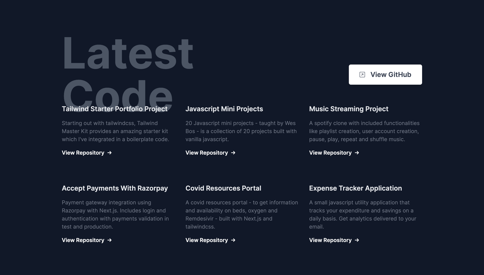
How to Fetch the Latest Repositories From GitHub

Fetching repositories with the GitHub API is quite easy.
The GitHub API comes with a provision to fetch the repositories with descending updated_time field, so that we get the latest repositories.
 const res = await axios.get(
      `https://api.github.com/search/repositories?q=user:${username}+sort:author-date-asc`
    );
Once we fetch the latest repository, we splice the array to only take into account the most recent 6 repositories.
let repos = res.data.items;
    let latestSixRepos = repos.splice(0, 6);
    return latestSixRepos;
So the entire function looks like this:
getLatestRepos.js
import axios from "axios";

const getLatestRepos = async (data) => {
  console.log("data", data);
  try {
    const username = data.githubUsername;

    const res = await axios.get(
      `https://api.github.com/search/repositories?q=user:${username}+sort:author-date-asc`
    );

    let repos = res.data.items;
    let latestSixRepos = repos.splice(0, 6);
    return latestSixRepos;
  } catch (err) {
    console.log(err);
  }
};

export default getLatestRepos;
Once the data is fetched from the function, we can then use it inside of our React Component <GetReposCard /> and pass the parameters accordingly.
<div className="grid grid-cols-1 md:grid-cols-2 lg:grid-cols-3 gap-8 max-w-6xl mx-auto px-10 lg:-mt-10 gap-y-20">
        {/* Single github Repo */}

        {repos &&
          repos.map((latestRepo, idx) => (
            <GithubRepoCard latestRepo={latestRepo} key="idx" />
          ))}
      </div>
const GithubRepoCard = ({ latestRepo }) => {
return (
<div className="github-repo">
<h1 className="font-semibold text-xl dark:text-gray-200 text-gray-700">
{latestRepo.name}
</h1>
<p className="text-base font-normal my-4 text-gray-500">
{latestRepo.description}
</p>
<a
href={latestRepo.clone_url}
className="font-semibold group flex flex-row space-x-2 w-full items-center"
>
<p>View Repository </p>
<div className="transform group-hover:translate-x-2 transition duration-300">
→
</div>
</a>
</div>
);
};
There is a small problem here – the GitHub API provides only a limited number of calls per IP address.
To resolve this issue, one can create a GitHub application and generate Auth Tokens, which we can embed with the GitHub API request and you'll get more requests per IP address. You can read the documentation here for more info about it.
How to Include Projects in Your Portfolio
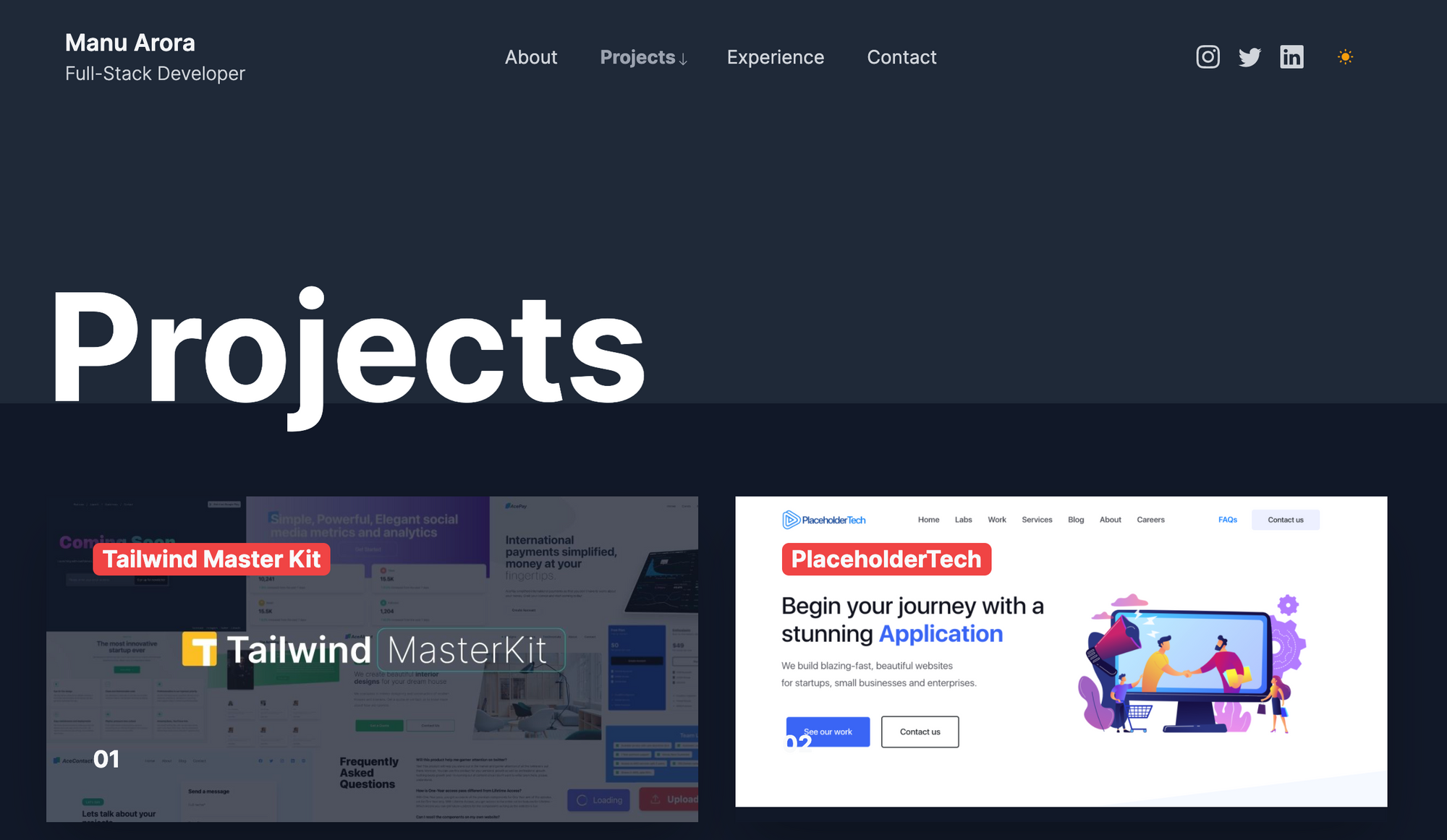
I've kept the projects section as simple as possible with a huge image area, because the recruiter / end-user is most interested in seeing what you've done. If it looks good, you already have an edge.
I've divided the page into Tailwind grids of two columns, which breaks on mobile screens into 1 column.
The image container contains a header text that displays the project's name and a number at the bottom.
The hover animations on the images are subtle. The image scales slowly to gather the user's attention. On click, it takes the user to the live website / GitHub repository of the project.
import React from "react";

export default function Projects() {
  return (
    <section className="bg-white dark:bg-gray-800">
      <div className="max-w-6xl mx-auto h-48 bg-white dark:bg-gray-800">
        <h1 className=" text-5xl md:text-9xl font-bold py-20 text-center md:text-left">
          Projects
        </h1>
      </div>
      {/* Grid starts here */}
      <div className="bg-[#F1F1F1] dark:bg-gray-900">
        <div className="max-w-6xl mx-auto grid grid-cols-1 md:grid-cols-2 gap-8 py-20 pb-40">
          {/* Single card */}
          <a
            href="https://tailwindmasterkit.com"
            className="w-full block shadow-2xl"
          >
            <div className="relative overflow-hidden">
              <img
                src="/tmk.jpg"
                alt="portfolio"
                className="transform hover:scale-125 transition duration-2000 ease-out"
              />
              <h1 className="absolute top-10 left-10 text-gray-50 font-bold text-xl bg-red-500 rounded-md px-2">
                Tailwind Master Kit
              </h1>
              <h1 className="absolute bottom-10 left-10 text-gray-50 font-bold text-xl">
                01
              </h1>
            </div>
          </a>
        </div>
      </div>
    </section>
    ...
    ...
    ...
  );
How to Build the Contact Page

I took the contact section directly from the Tailwind Master Kit, which is a components and templates marketplace for Tailwind web app projects. I didn't want spend more time styling a contact form myself and used some help.
The component is absolutely free and you can embed it into Tailwind related websites easily.
Contact.js
import React from "react";

export default function Contact() {
  return (
    <section>
      <div className="max-w-6xl mx-auto h-48 bg-white dark:bg-gray-800 antialiased">
        <h1 className=" text-5xl md:text-9xl font-bold py-20 text-center md:text-left">
          Contact
        </h1>
      </div>
      <div className="relative z-10 rounded-md shadow-md bg-[#02044A] p-4 md:p-10 lg:p-20 max-w-6xl mx-auto mb-20 -mt-4">
        <div className="grid grid-cols-1 md:grid-cols-2 gap-4">
          <div className="md:ml-4">
            <header className="">
              <h1 className="text-gray-50 font-semibold text-2xl">
                Get in touch, let's talk.
              </h1>
              <p className="font-light text-base text-gray-200 mt-2">
                Fill in the details and I'll get back to you as soon as I can.
              </p>
            </header>
            <div className="icons-container inline-flex flex-col my-20">
              <div className="flex flex-row items-center space-x-6 rounded-md border border-[#02044A] hover:border hover:border-blue-500 p-4">

                <p className="text-gray-50 font-light text-sm">
                  +91 9987384723
                </p>
              </div>
              <div className="flex flex-row items-center space-x-6 rounded-md border border-[#02044A] hover:border hover:border-blue-500 p-4">
                ....
                ....
                <p className="text-gray-50 font-light text-sm">
                  contact@yourwebsite.com
                </p>
              </div>
              <div className="flex flex-row items-center space-x-6 rounded-md border border-[#02044A] hover:border hover:border-blue-500 p-4">
                ....
                ....
          <form className="form rounded-lg bg-white p-4 flex flex-col">
            <label htmlFor="name" className="text-sm text-gray-600 mx-4">
              {" "}
              Your Name
            </label>
            <input
              type="text"
              className="font-light rounded-md border focus:outline-none py-2 mt-2 px-1 mx-4 focus:ring-2 focus:border-none ring-blue-500"
              name="name"
            />
            <label htmlFor="email" className="text-sm text-gray-600 mx-4 mt-4">
              Email
            </label>
            <input
              type="text"
              className="font-light rounded-md border focus:outline-none py-2 mt-2 px-1 mx-4 focus:ring-2 focus:border-none ring-blue-500"
              name="email"
            />
            <button
              type="submit"
              className="bg-blue-500 rounded-md w-1/2 mx-4 mt-8 py-2 text-gray-50 text-xs font-bold"
            >
              Send Message
            </button>
          </form>
        </div>
      </div>
    </section>
  );
}
How to Deploy the Portfolio
Deploying the application is fairly simple and just takes 8 simple steps.
Clone the repository
git clone https://github.com/manuarora700/simple-developer-portfolio-websiteInstall dependencies
npm install
- Start the local development server
npm run dev
Make modifications to the website. You should include all your projects, education, social links, and Meta information.
Push the code to your remote repository
git add *
git commit -m "add changes to the cloned repo"
git push
Create a Vercel account (or login to your Vercel account)
Add the newly created GitHub repository with the changes pushed and Vercel will automatically deploy it for you on a link.
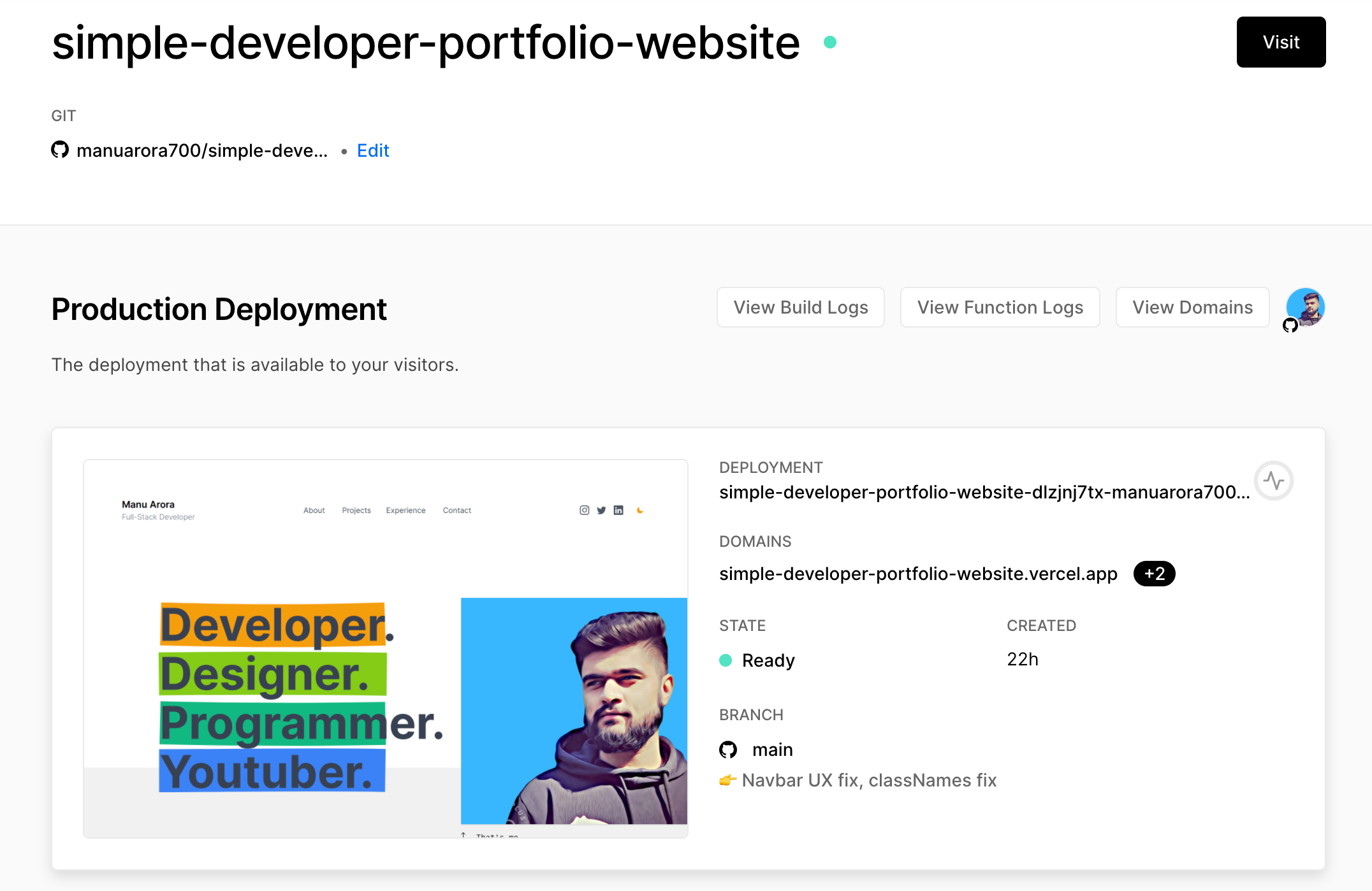
- Once the site is live, share the test link with your friends or add it in your résumé. You can also go ahead and connect a custom domain to make it more professional.
Conclusion
This portfolio site will give a recruiter or visitor everything they're looking for if they want to learn more about you and your work. The goal of your portfolio should be to showcase your skills in the best way possible.
Also, we've built the site with Next.js, which shows that you're comfortable with React and its frameworks. (Recruiters are looking for you! 😍)
The website uses tailwindcss for styling, which shows that you can work with a CSS framework and cut down on styling time.
The components are granular and each serves its own purpose. The folder structure is simple and easy to understand.
You can customize the website in any way you like - I've open sourced it and the code is linked to the GitHub repo below.
My personal website has helped me land interviews at big tech companies and it is one of the main reasons I've been able to get a job (along with practicing on freeCodeCamp and learning how to code).
I really enjoyed building this website. If you liked it, leave a star on the GitHub repo and help spread the word. ⭐️