
In this article, we will build an Image Gallery with Next.js using the Pexels API and Chakra UI v1, a modular and accessible component library.
We will also use the Next.js Image component to optimize the images fetched from the Pexels API.
If you want to jump right into the code, check out the GitHub Repo here.
And here's a link to the deployed version: https://next-image-gallery.vercel.app/.
What concepts & topics will we cover in this article?
- How to install and use Chakra UI v1 with Next.js
- How to fetch data in Next.js from an API
- How to use the Next.js Image Component
- How to setup Dynamic Routes in Next.js
Table of Contents
- Prerequisites
- How to Setup and Install Next.js
- How to Generate the Pexels API Key
- How to Add a Heading to the Gallery
- How to Fetch Data from the Pexels API
- How to Display Photos on the Page
- How to Style Images with Chakra UI
- How to Add Search Functionality to the Gallery
- How to Add Dynamic Routes to Images
- Conclusion
Now let's get started.
Prerequisites
Before we get started, you should have:
- Knowledge of HTML, CSS, and JavaScript.
- Basic knowledge of React and Next.js.
- Node and NPM installed on your local dev machine.
- Any code editor of your choice.
- React Dev Tools (optional)
If you feel like your progress is hindered because you don't know enough about these subjects, check out https://www.freecodecamp.org/learn. The awesome modules there will get you started in no time.
How to Setup and Install Next.js
We will use Create Next App to initialize a Next.js project quickly. In your project's root directory, run the following commands in the terminal.
npx create-next-app next-image-gallery
cd next-image-gallery
npm run dev
The last command, npm run dev, will start the development server on your system's port 3000.
Navigate to http://localhost:3000 in the browser. Here is what your app will look like.
 Welcome to Next.js - http://localhost:3000
Run the following command to install Chakra UI:
npm i @chakra-ui/react @emotion/react @emotion/styled framer-motion @chakra-ui/icons
The next step is to clean the sample code generated by create-next-app and configure the project to use Chakra UI.
- Delete the
stylesandpages/apifolder. - Update your
pages/_app.jslike this:
// pages/_app.js
import { ChakraProvider } from "@chakra-ui/react";

function MyApp({ Component, pageProps }) {
  return (
    <ChakraProvider>
      <Component {...pageProps} />
    </ChakraProvider>
  );
}

export default MyApp;
- Modify
pages/index.jslike this:
// pages/index.js
import Head from "next/head";

export default function Home() {
  return (
    <div>
      <Head>
        <title> NextJS Image Gallery</title>
        <link rel="icon" href="/favicon.ico" />
      </Head>
    </div>
  );
}
Again head over to http://localhost:3000. You will see that the app is blank, but the title has changed to NextJS Image Gallery.
You can now close the development server.
How to Generate the Pexels API Key
We will use the Pexels API to fetch images for our Gallery. You will need to create a Pexels API key to authenticate your API requests. The API itself is completely free to use.
You can make as many as 200 requests per hour and 20,000 requests per month to the Pexels API.
Head over to https://www.pexels.com/join-consumer/ and create a new account on Pexels.
 Create New Account
After filling in your details, you will also need to confirm your account before applying for an API key. So check your inbox and confirm your Pexels account.
Navigate to https://www.pexels.com/api/new/ and fill in the details for a new API key and click Request API Key
 Request API Key
Remember to follow the API guidelines. Now copy the API key shown on the next page.
 API Key
In your project's root directory, create a new file named .env.local to store this API key securely. Run the following commands to create the file:
touch .env.local
Inside this .env.local file, create a new environment variable named PEXELS_API_KEY and paste the API key there.
NEXT_PUBLIC_PEXELS_API_KEY = ''
Next.js has built-in support for loading environment variables from .env.local into process.env.
By default, all environment variables loaded through .env.local are only available in the Node.js environment. This means that they won't be exposed to the browser. Using the NEXT_PUBLIC_ prefix exposes the environment variable to the browser.
You can read more about it here.
How to Add a Heading to the Gallery
In this section, we will add a heading to our Gallery.
Import and add the Box component to index.js like this:
//pages/index.js
import Head from "next/head";
import { Box } from "@chakra-ui/react";
export default function Home() {
  return (
    <div>
      <Head>
        <title> NextJS Image Gallery</title>
        <link rel="icon" href="/favicon.ico" />
      </Head>
      <Box overflow="hidden" bg="purple.100" minH="100vh"></Box>
    </div>
  );
}
Navigate to http://localhost:3000. You will see that your app has a background color of light purple.
 Blank Page with light Purple background
Here's what we are doing:
- In Chakra UI,
bgis the shorthand prop forbackgroundproperty. By passingbg="purple.100", the background of the app changes to light purple. The number after the color represents the shade of the color where the lightest is50, and the darkest is900.
Here is an image from the Chakra UI docs to better illustrate this point.
 Shades of Purple
- Setting
minH="100vh"makes the app at least 100% of the parent's element height.minHis the shorthand prop for themin-heightproperty. - To get rid of extra scroll bars in case the content overflows the parent element,
overflow="hidden"is passed.
To add a heading, we will use the Text and Container component available in Chakra UI.
Modify the Box import in index.js like this:
import { Box, Container, Text } from "@chakra-ui/react";
Now, add the Container component inside the Box component.
<Box overflow="hidden" bg="purple.100" minH="100vh">
  <Container></Container>
</Box>
You will see no change in your app, but the Container component has added some horizontal padding in your app, which will be more apparent after adding the Text component.
Add the following code inside the Container component:
<Container>
  <Text
    color="pink.800"
    fontWeight="semibold"
    mb="1rem"
    textAlign="center"
    textDecoration="underline"
    fontSize={["4xl", "4xl", "5xl", "5xl"]}
  >
    NextJS Image Gallery
  </Text>
</Container>
Let's break down the above code and discuss it.
coloris used to set the color of the text topink.900.fontWeightis used to set the thickness of the character.mbis a shorthand prop formargin-bottomand1rem=16px.textAlign="center"aligns the text in the center.textDecoration="underline"adds a line under the text.fontSize, as the name suggests, sets the size of the text.
Here is how your app will look:
 Heading - NextJS Image Gallery
xs: "12px"
sm: "14px"
md: "16px"
lg: "18px"
xl: "20px"
You might ask why there are four values of fontSize as an array inside curly braces?
The {} are used to tell the JSX parser to interpret the expression within {} as JavaScript. Here, {} is used to pass an array for fontSize's value. This array is a shorthand for media queries in Chakra UI.
The values are passed in an array to make the text responsive and change the font size according to the devices – that is, the heading will be larger on the desktop.
Each index of the array corresponds to a specific breakpoint and the property's value. This means that font-size changes according to the breakpoint. You can read more about it here.
const breakpoints = {
  sm: "30em",
  md: "48em",
  lg: "62em",
  xl: "80em",
}
It follows the "mobile-first" approach, so the first value is for smaller devices, and the last value is for desktop devices.
The above code will generate CSS like this:
.css-px6f4t {
 text-align:center;
 -webkit-text-decoration:underline;
 text-decoration:underline;
 font-size:2.25rem;
 color:#702459;
 font-weight:600;
 margin-bottom:1rem;
}
@media screen and (min-width:30em) {
 .css-px6f4t {
  font-size:2.25rem;
 }
}
@media screen and (min-width:48em) {
 .css-px6f4t {
  font-size:3rem;
 }
}
@media screen and (min-width:62em) {
 .css-px6f4t {
  font-size:3rem;
 }
}
Here is the side by side difference in heading size as seen in Polypane.
 Polypane
How to Fetch Data from the Pexels API
You have generated the API key so let's write the code to fetch data from the API. We will create a separate file and define the functions to fetch data inside it.
In your project's root directory, create a folder named lib. Inside it, create a file named api.js.
Run the following command in the terminal:
mkdir lib
cd lib
touch api.js
This is the Pexels API base URL for photos: https://api.pexels.com/v1/.
The Pexels API has three endpoints:
/curatedto receive real-time photos curated by the Pexels team./searchto search for photos based on a query./photos/:idto get a single photo from its id.
We will use the /curated endpoint to show photos curated by the Pexels team on the app's landing page.
Add the following code to api.js:
const API_KEY = process.env.NEXT_PUBLIC_PEXELS_API_KEY;

export const getCuratedPhotos = async () => {
  const res = await fetch(
    `https://api.pexels.com/v1/curated?page=11&per_page=18`,
    {
      headers: {
        Authorization: API_KEY,
      },
    }
  );
  const responseJson = await res.json();
  return responseJson.photos;
};
Let's discuss the above code:
- We start by creating a variable named
API_KEYthat accesses theNEXT_PUBLIC_PEXELS_API_KEYenvironment variable usingprocess.env. - Then we create an asynchronous function named
getCuratedPhotos()that uses thefetch()method to fetch the data from the API. - If you take a closer look at the fetch URL, you will notice that we have added
?page=11&per_page=18after/curatedendpoint. These are the optional parameters that you can pass to the/curatedendpoint as query strings. Herepage=11means send the 11th page, andper_page=18means that send 18 photos per page. - You can also remove these optional parameters, in which case the API endpoint will send you 15 pictures from the first page. You can get as many as 80 photos in a single request.
- The Pexels API key is passed in the
Authorizationfield under theheaders. res.json()parses the response in JSON format.responseJsoncontains fields like thepage,per_page, and so on, which are not used by our app. So only thephotosfield of the response is returned, which looks like this:
[
  {
    id: 4905078,
    width: 7952,
    height: 5304,
    url: "https://www.pexels.com/photo/ocean-waves-under-blue-sky-4905078/",
    photographer: "Nick Bondarev",
    photographer_url: "https://www.pexels.com/@nick-bondarev",
    photographer_id: 2766954,
    src: {
      original:
        "https://images.pexels.com/photos/4905078/pexels-photo-4905078.jpeg",
      large2x:
        "https://images.pexels.com/photos/4905078/pexels-photo-4905078.jpeg?auto=compress&cs=tinysrgb&dpr=2&h=650&w=940",
      large:
        "https://images.pexels.com/photos/4905078/pexels-photo-4905078.jpeg?auto=compress&cs=tinysrgb&h=650&w=940",
      medium:
        "https://images.pexels.com/photos/4905078/pexels-photo-4905078.jpeg?auto=compress&cs=tinysrgb&h=350",
      small:
        "https://images.pexels.com/photos/4905078/pexels-photo-4905078.jpeg?auto=compress&cs=tinysrgb&h=130",
      portrait:
        "https://images.pexels.com/photos/4905078/pexels-photo-4905078.jpeg?auto=compress&cs=tinysrgb&fit=crop&h=1200&w=800",
      landscape:
        "https://images.pexels.com/photos/4905078/pexels-photo-4905078.jpeg?auto=compress&cs=tinysrgb&fit=crop&h=627&w=1200",
      tiny:
        "https://images.pexels.com/photos/4905078/pexels-photo-4905078.jpeg?auto=compress&cs=tinysrgb&dpr=1&fit=crop&h=200&w=280",
    },
    liked: false,
  },
];
In the src field we are given many different image formats to choose from. In this tutorial we will use portrait type images on our landing page. You are free to explore other formats too.
As we develop our app, we will write the functions to search for a photo and get a single photo in api.js. For now, we will use this function to display an image on our landing page or homepage.
How to Display Photos on the Page
Now that we have created the function to fetch data, let's display them on our page.
First, import the getCuratedPhotos() function in index.js.
import Head from "next/head";
import { Box, Container, Text } from "@chakra-ui/react";
import {getCuratedPhotos} from "../lib/api"
We will use the getServerSideProps() function available in Next.js and use the getCuratedPhotos() function inside it to fetch data from Pexels API and inject it in our page. You can read more about getServerSideProps() here.
Add the following code at the bottom of your index.js file:
export async function getServerSideProps() {
  const data = await getCuratedPhotos();
  return {
    props: {
      data,
    },
  };
}
The above async function uses getCuratedPhotos() to fetch images from the Pexels API and store it in the data variable. This data variable is made available as a prop in the props property.
This data is available as a prop so add it as an argument in the Home component function.
export default function Home({data}) {
...
}
Restart your development server, and inside your Home component, console.log this data:
export default function Home({data}) {
  console.log(data)
  return (
 ...
 }
Head over to http://localhost:3000/ and open the console by pressing CTRL + Shift + J in Chrome or CTRL + Shift + K in Firefox.
 console.log(data)
Remove the console.log and add the following code to the top of your index.js file to import the useState() hook from react.
import React, { useState } from "react";
We will store the data from the Pexels API inside a state named photos. Add the following code before the return statement:
const [photos, setPhotos] = useState(data);
To display images, map over the photos array and pass src.original in the src attribute of the img element.
Add the following code after the Container component:
{
  photos.map((pic) => (
    <img src={pic.src.original} width="500" height="500" />
  ))
}
Your app will now look something like this:
 Displaying images using img element
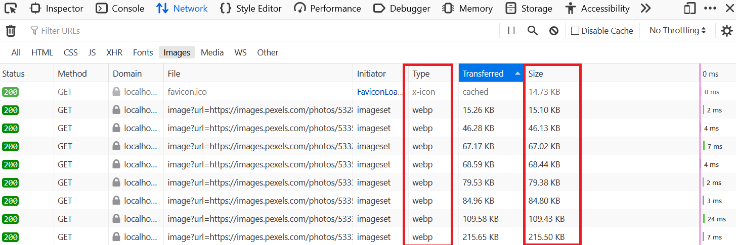
Aside from the fact that the images are not properly sized, there is another issue with us using <img> to display the images.
Head over to http://localhost:3000/ and open Developer tools and then the Network tab ( Ctrl+ Shift + E in Firefox and Ctrl + Shift + J in Chrome). It will look something like this:
 Network tab
Now reload your page. You will see that the empty Network tab is now filled with data.
 Single request
As you can see in the above image, the requested file is sized over 11 MB, and this is for a single file or image. The sizes can vary anywhere from 10 to 100 MB or more based on the quality of the image.
Imagine you have 80 images on your app's landing page. Does it make sense to transfer around 800 MB of files every time someone visits your Gallery or website? It does not.
 Multiple requests
This is why today, most of the images on the web are served in WebP format. This format significantly reduces the size of the image, and you can hardly detect any visual difference.
So, we need to change the image format to webp, but the question is, how? Do you need to do it manually? If yes, won't it be time consuming and tiresome?
No, you don't need to do it manually.
Next.js version 10 comes with built-in support for Image Optimization using the Image component. You can read more about this update here.
So, let's replace the img element with the Next.js Image component. First, import this component inside your index.js like this:
import Image from "next/image";
But wait, before we use this component in our code, we need to tell Next.js that our images are coming from an external resource, like from Pexels.
Stop your development server and create a next.config.js file by running the following command:
touch next.config.js
Add the following code to next.config.js:
module.exports = {
  images: {
    domains: ["images.pexels.com"],
  },
};
And that's it. There are other configurations like path, imageSizes, deviceSizes, and so on that you can add in the images field. But in this tutorial, we will leave them as default. You can read more about the configuration here.
Replace img with the Image component and pass the props, as shown below:
{
  photos.map((pic) => (
    <Image
      src={pic.src.portrait}
      height={600}
      width={400}
      alt={pic.url}
    />
  ))
}
As discussed above, the Pexels API provides different formats or sizes of the same image, like portrait, landscape, tiny, and so on, under the src field.
This tutorial uses the portrait images on the landing page, but you are free to explore other sizes.
src: {
    original: "https://images.pexels.com/photos/4905078/pexels-photo-4905078.jpeg",
    large2x: "https://images.pexels.com/photos/4905078/pexels-photo-4905078.jpeg?auto=compress&cs=tinysrgb&dpr=2&h=650&w=940",
    large: "https://images.pexels.com/photos/4905078/pexels-photo-4905078.jpeg?auto=compress&cs=tinysrgb&h=650&w=940",
    medium: "https://images.pexels.com/photos/4905078/pexels-photo-4905078.jpeg?auto=compress&cs=tinysrgb&h=350",
    small: "https://images.pexels.com/photos/4905078/pexels-photo-4905078.jpeg?auto=compress&cs=tinysrgb&h=130",
    portrait: "https://images.pexels.com/photos/4905078/pexels-photo-4905078.jpeg?auto=compress&cs=tinysrgb&fit=crop&h=1200&w=800",
    landscape: "https://images.pexels.com/photos/4905078/pexels-photo-4905078.jpeg?auto=compress&cs=tinysrgb&fit=crop&h=627&w=1200",
    tiny: "https://images.pexels.com/photos/4905078/pexels-photo-4905078.jpeg?auto=compress&cs=tinysrgb&dpr=1&fit=crop&h=200&w=280",
  }
As you can see in the above sample src field, the portrait format of the image has a width of 800 and a height of 1200. But it is too large to show on the webpage, so we will scale it down by dividing it by 2. So 600 and 400 are passed in for the height and width of the Image component.
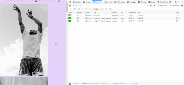
Restart your development server and head over to http://localhost:3000/. You will see that the app itself looks exactly the same. But this time if you open the Network tab and reload the page, you will see something truly magical.
Your images are now in webp format, and their sizes have been reduced.
 Network tab
The Next.js Image component has also added lazy loading to images. Here is an example to explain how and why you should use lazy loading if you are unfamiliar with it.
Even though the images are now in webp format, is it necessary to load all the images whenever someone visits your website? And if the visitor just comes and leaves without scrolling, does it make sense to load the images at the bottom of the page?
There is no need to load the images that a user or visitor is not going to see in most situations.
And that's where Lazy Loading comes to save the day. It delays the requests to images as to when they are needed or, in this situation, when images come into view. This significantly helps reduce the initial page weight and increases website performance.
If you head over to http://localhost:3000/ and scroll through all the images, you will see that the images that are not in the viewport are not loaded initially. But as you scroll down, they are transferred and loaded.
 Lazy Loading
By default, the layout prop of the Image component has the value of intrinsic, which means the image will scale the dimensions down for smaller viewports but maintain the original dimensions for larger viewports.
There are many props that you can pass to the Image component to modify this component further. You can read about them here.
How to Style Images with Chakra UI
To style the images, we will use Chakra UI's Wrap component.
Wrap is a layout component that adds a defined space between its children or images in this scenario. It 'wraps' its children automatically if there is not enough space to fit any child.
Import Wrap and WrapItem from Chakra UI.
import { Box, Container, Text, Wrap, WrapItem } from "@chakra-ui/react";
WrapItem encloses the individual children while Wrap encloses all the WrapItem components.
Modify the expression to display images like this:
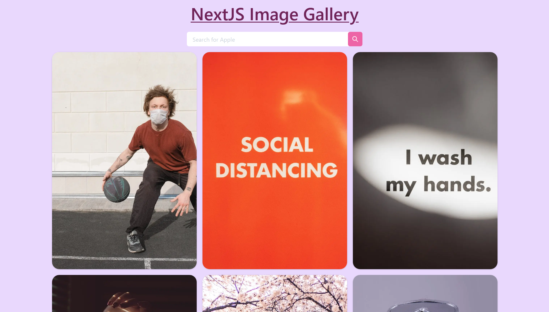
<Wrap px="1rem" spacing={4} justify="center">
  {photos.map((pic) => (
    <Image src={pic.src.portrait} height={600} width={400} alt={pic.url} />
  ))}
</Wrap>
Here's what's happening in the above code:
px="1rem"is the shorthand prop forpadding-leftandpadding-right.This adds horizontal padding of 1 rem.spacing={4}applies spacing between each child. This will be seen once each image is wrapped withWrapItem.justify="center"justifies the images in the center.
 Wrap
Wrap
Now wrap each image with WrapItem. Add the following code inside the JavaScript expression:
<Wrap px="1rem" spacing={4} justify="center">
  {photos.map((pic) => (
    <WrapItem
      key={pic.id}
      boxShadow="base"
      rounded="20px"
      overflow="hidden"
      bg="white"
      lineHeight="0"
      _hover={{ boxShadow: "dark-lg" }}
    >
      <Image src={pic.src.portrait} height={600} width={400} alt={pic.url} />
    </WrapItem>
  ))}
</Wrap>
Let's discuss the props passed to WrapItem one by one:
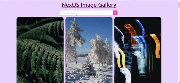
key={pic.id}gives each image a unique key so that React can differentiate between the children or pictures.boxShadow="base"adds shadow toWrapItem.rounded="20px"adds aborder-radiusof 20px.overflow="hidden"make sure the image doesn't overflow theWrapItemand is seen rounded.bg="white"adds a white background to theWrapItem.lineHeight="0"setsline-heightproperty to zero._hover={{ boxShadow: "dark-lg" }}changes theboxShadowwhen you hover over the image.
 GIF
GIF
You will see that spacing={4} has also come into effect since we added WrapItem to images.
How to Add Search Functionality to the Gallery
The next step is to add a feature to allow users to search for images and show those images to them. For this, we will use the /search endpoint in the Pexels API.
In lib/api.js create a new function getQueryPhotos() to search for images based on the user's search input.
export const getQueryPhotos = async (query) => {
  const res = await fetch(`https://api.pexels.com/v1/search?query=${query}`, {
    headers: {
      Authorization: API_KEY,
    },
  });
  const responseJson = await res.json();
  return responseJson.photos;
};
The above function getQueryPhotos() is similar to getCuratedPhotos but here we have added a query parameter to the function and modified the API endpoint to include this query.
`https://api.pexels.com/v1/search?query=${query}`
Import the getQueryPhotos() function in index.js.
import { getCuratedPhotos, getQueryPhotos } from "../lib/api";
Now, we will create a form to take user input and search for the same.
We will import and use Input, IconButton, InputRightElement, and InputGroup from Chakra UI to create this form.
Modify the Chakra UI import like this and add an import for SearchIcon:
import {
  Box,
  Container,
  Text,
  Wrap,
  WrapItem,
  Input,
  IconButton,
  InputRightElement,
  InputGroup,
} from "@chakra-ui/react";
import { SearchIcon } from "@chakra-ui/icons";
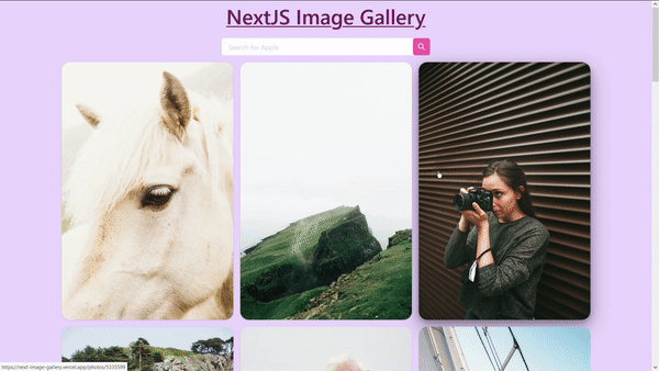
Add the following code for the input form inside the Container component in index.js file:
<InputGroup pb="1rem">
  <Input placeholder="Search for Apple" variant="ghost" />

  <InputRightElement
    children={
      <IconButton
        aria-label="Search"
        icon={<SearchIcon />}
        bg="pink.400"
        color="white"
      />
    }
  />
</InputGroup>
Here's what we are doing.
InputGroupis used to group theInputandInputRightElementcomponents. Herepbis shorthand forpadding-bottom.Inputis the input field where users will type their queries. It has a placeholder of "Search for Apple".InputRightElementis used to add an element to the right of theInputcomponent. An icon button with the icon of search is passed to thechildrenprop ofInputRightElement.IconButtonis a component in Chakra UI which is useful when you want an icon as a button. The icon to render is passed inside theiconprop.
Here's how the input field will look.
 Input field
This form doesn't do anything yet. Let's change that.
Define a new state named query to store a user's inputs:
export default function Home({ data }) {
  const [photos, setPhotos] = useState(data);
  const [query, setQuery] = useState("");

...
}
Modify the Input component to create a two-way bind between the input field and query state using the value method and onChange event:
<Input
  placeholder="Search for Apple"
  variant="ghost"
  value={query}
  onChange={(e) => setQuery(e.target.value)}
/>
Now, create a function named handleSubmit() to handle the click event of search icon. For now we will just console.log the input query and clear the field afterwards.
export default function Home({ data }) {
  const [photos, setPhotos] = useState(data);
  const [query, setQuery] = useState("");

  const handleSubmit = async (e) => {
    await e.preventDefault();
    await console.log(query);
    await setQuery("");
  };

...
}
Add this function to the onClick event of IconButton:
<InputRightElement
  children={
    <IconButton
      aria-label="Search"
      icon={<SearchIcon />}
      onClick={handleSubmit}
      bg="pink.400"
      color="white"
    />
  }
/>
Head over to http://localhost:3000/ and type something in the input field and click the search button.
 console.log(query)
But this form is still missing something: if you try to search for something by hitting Enter instead of the search button, it will refresh the page, and the query is not logged.
To fix this, enclose the InputGroup with the form element and pass the handleSubmit function to the onSubmit event like this:
<form onSubmit={handleSubmit}>
  <InputGroup pb="1rem">
    <Input
      placeholder="Search for Apple"
      variant="ghost"
      value={query}
      onChange={(e) => setQuery(e.target.value)}
    />

    <InputRightElement
      children={
        <IconButton
          aria-label="Search"
          icon={<SearchIcon />}
          onClick={handleSubmit}
          bg="pink.400"
          color="white"
        />
      }
    />
  </InputGroup>
</form>
You will notice hitting Enter will work now.
Now update the handleSubmit function like this to fetch the images based on the user's query:
const handleSubmit = async (e) => {
  await e.preventDefault();
  const res = await getQueryPhotos(query);
  await setPhotos(res);
  await setQuery("");
}
The above function passes the query variable to the getQueryPhotos() function and the data returned from the function overrides the previous value in the photos variable using setPhotos(res).
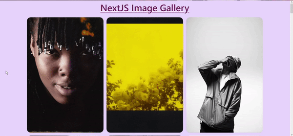
And it's done! You can now search images in your app.
 Searching for Apple
There's still something missing. What is it?
What if the user tries to search without any query, like with empty strings? The current code will still try to make request using "" and we will run into the following error.

To handle this issue, we will use Toast from Chakra UI.
Import useToast from Chakra UI:
import {
  Box,
  Container,
  Text,
  Wrap,
  WrapItem,
  Input,
  IconButton,
  InputRightElement,
  InputGroup,
  useToast
} from "@chakra-ui/react";
Add the following code jut below where you defined states to intialize Toast.
export default function Home({ data }) {
  const [photos, setPhotos] = useState(data);
  const [query, setQuery] = useState("");
  const toast = useToast();

...
}
Modify the handleSubmit() function like this:
const handleSubmit = async (e) => {
  await e.preventDefault();
  if (query == "") {
    toast({
      title: "Error.",
      description: "Empty Search",
      status: "error",
      duration: 9000,
      isClosable: true,
      position: "top",
    });
  } else {
    const res = await getQueryPhotos(query);
    await setPhotos(res);
    await setQuery("");
  }
};
In the above code, we check if the query is empty or not with a simple if/else statement. And if it is empty, then we display an error toast with Empty Search text.
Try hitting Enter without typing anything in the input field. You will see a toast like this:
 Empty Search toast
How to Add Dynamic Routes to Images
We will create a dynamic route for each image so users can click on images to get more information on them.
Next.js has a very cool feature where you can create a dynamic route by adding brackets to a page ([param]), where param can be URL slugs, pretty URLs, an ID, and so on.
Here the param is id, since to get a specific photo from Pexels API you need to provide its id.
Run the following commands in your project's root directory to create [id].js in the photos directory under pages.
mkdir pages/photos
cd pages/photos
touch [id].js
Import Link from next/link in index.js. Link helps in client-side transitions between routes. You can read more about Link here.
import Link from "next/link"
Add this Link to each image like this:
<Link href={`/photos/${pic.id}`}>
  <a>
    <Image src={pic.src.portrait} height={600} width={400} alt={pic.url} />
  </a>
</Link>
Head over to your app and try clicking any image. It will show an error since we have created photos/[id].js but didn't add any code in it.
But if you notice the URL of this page, it will be something like this:
http://localhost:3000/photos/2977079
We will now create a third function named getPhotoById() in lib/api.js to get a specific photo based on its id.
Add the following code to api.js:
export const getPhotoById = async (id) => {
  const res = await fetch(`https://api.pexels.com/v1/photos/${id}`, {
    headers: {
      Authorization: API_KEY,
    },
  });
  const responseJson = await res.json();
  return responseJson;
};
The above code uses the /photos endpoint to get a single image from Pexels API. You will notice that unlike getCuratedPhotos and getQueryPhotos, getPhotoById returns the responseJson and not responseJson.photos.
Add the following code to photos/[id].js:
import { getPhotoById } from "../../lib/api";
import {
  Box,
  Divider,
  Center,
  Text,
  Flex,
  Spacer,
  Button,
} from "@chakra-ui/react";
import Image from "next/image";
import Head from "next/head";
import Link from "next/link";
import { InfoIcon, AtSignIcon } from "@chakra-ui/icons";

export default function Photos() {

    return (
      <Box p="2rem" bg="gray.200" minH="100vh">
        <Head>
          <title>Image</title>
          <link rel="icon" href="/favicon.ico" />
        </Head>

      </Box>
    )
  }
We have added a background color of light gray using the bg prop and Box component. To save time, we have imported all the components and icons beforehand.
Create a getServerSideProps() function in [id].js to fetch data from the Pexels API.
export async function getServerSideProps({ params }) {
  const pic = await getPhotoById(params.id);
  return {
    props: {
      pic,
    },
  };
}
Restart your development server.
You might ask how getServerSideProps() is getting the id of the image from the params argument?
Since this page uses a dynamic route, params contain the route parameters. Here the page name is [id].js , so params will look like { id: ... }.
You can try console.log(params) – it will look something like this.
{ id: '4956064' }
Pass this pic prop to the Photos component function as an argument.
export default function Photos({ pic }) {
...
}
Add the following code to the Box component:
<Box p="2rem" bg="gray.200" minH="100vh">
  <Head>
    <title> Image: {pic.id}</title>
    <link rel="icon" href="/favicon.ico" />
  </Head>

  <Flex px="1rem" justify="center" align="center">
    <Text
      letterSpacing="wide"
      textDecoration="underline"
      as="h2"
      fontWeight="semibold"
      fontSize="xl"
      as="a"
      target="_blank"
      href={pic.photographer_url}
    >
      <AtSignIcon />
      {pic.photographer}
    </Text>
    <Spacer />
    <Box as="a" target="_blank" href={pic.url}>
      <InfoIcon focusable="true" boxSize="2rem" color="red.500" />{" "}
    </Box>{" "}
    <Spacer />
    <Link href={`/`} >
         <Button
            as="a"
            borderRadius="full"
            colorScheme="pink"
            fontSize="lg"
            size="lg"
            cursor="pointer"
          >
            🏠 Home
         </Button>
    </Link>
  </Flex>
  <Divider my="1rem" />

  <Center>
    <Box as="a" target="_blank" href={pic.url}>
      <Image
        src={pic.src.original}
        width={pic.width / 4}
        height={pic.height / 4}
        quality={50}
        priority
        loading="eager"
      />
    </Box>
  </Center>
</Box>
Here is how your page will look now:
 Photo page
Let's break this code down piece by piece.
- We first modify the title of the page, by passing the id of the image after the
Imagetext.
<Head>
  <title> Image: {pic.id}</title>
  <link rel="icon" href="/favicon.ico" />
</Head>
- We then create a navbar using the
Flexcomponent.
<Flex px="1rem" justify="center" align="center">
...
</Flex>
Here px is shorthand prop for padding-left and padding-right, and justify and align are for justify-content and align-items, respectively.
- We then add a link to the photographer using the
TextandAtSignIconicons. You can also use the@sign instead ofAtSignIcon.
<Text
  letterSpacing="wide"
  textDecoration="underline"
  as="h2"
  fontWeight="semibold"
  fontSize="xl"
  as="a"
  target="_blank"
  href={pic.photographer_url}
>
  <AtSignIcon />
  {pic.photographer}
</Text>
The as prop is a feature in Chakra UI that allows you to pass an HTML tag or component to be rendered.
Here we are using it with the <a> tag so the Text component will be rendered as <a> tag on the page.
The target="_blank" makes sure that the link opens in a new window or tab.
 Photographer link
- Then we add a
Spacercomponent that, when used withFlex, distributes the empty space between Flex's children. You can read more about it here.

- Next, we add an information icon that links to the photo on Pexels.
<Box as="a" target="_blank" href={pic.url}>
  <InfoIcon focusable="true" boxSize="2rem" color="red.500" />
</Box>
<Spacer />
 Info Icon
- Then we add
Homebutton in the nav to take the user back to the landing page of the app using theLinkcomponent fromnext/link.
<Link href={`/`}>
  <Button
    as="a"
    borderRadius="full"
    colorScheme="pink"
    fontSize="lg"
    size="lg"
    cursor="pointer"
  >
    🏠 Home
  </Button>
</Link>
 Home button
- Then we use
Dividercomponent to divide the navbar and the image.
<Divider my="1rem" />
Here my is shorthand prop for margin-top and margin-bottom.
- Finally, we add the image to the page using the
Centercomponent, which as the name suggests, centers its children.
<Center>
  <Box as="a" target="_blank" href={pic.url}>
    <Image
      src={pic.src.original}
      width={pic.width / 4}
      height={pic.height / 4}
      priority
      quality={50}
      loading="eager"
    />
  </Box>
</Center>
In the above code, we use the Box component to add a link to the original image on Pexels using the as prop.
You will also notice that we have passed a few additional props in the Image component.
src: We are passing theoriginalimage this time.- We scale the image by dividing the original width and height by 4.
- By passing
priority, the image is considered high priority and is preloaded. - By default, the
Imagecomponent reduces the quality of optimized images to 75%, but since the image is still too big, we further decrease its quality to 50%, by passingquality={50}. - By default, loading behavior is lazy in the
Imagecomponent, but here we want the image to be displayed immediately, and hence we passloading="eager".
Here is the above code in action.
 Next Image Gallery
You did it! 🎉
Congrats 👏 on building this Next Image Gallery project.
Conclusion
In this tutorial, we learned how to build an Image Gallery with Next.js using the Pexels API and Chakra UI.
We discussed how to install and use Chakra UI v1 in any Next.js project. We also saw how to fetch data from an API and create dynamic routes in Next.js.
Here are some other APIs that you can explore and use in your project:
Here are some additional resources that can be helpful:
Would you like a second part of this tutorial, where we add animations to images using Framer Motion? Let me know on Twitter.
What other projects or tutorials would you like to see? Reach out to me on Twitter, and I'll cover them in my next article!
If you're inspired to add features yourself, please do share and tag me – I'd love to hear about them :)