By Michael Xavier
A couple years back I wrote a short article on building a responsive progress bar. My techniques have developed since then, and so an update is in order.
The biggest change is that pseudo-elements (before, after) are no longer required. Now the CSS is more straightforward, the DOM is easier to read, and it’s much more dynamic.
So let’s try this again.
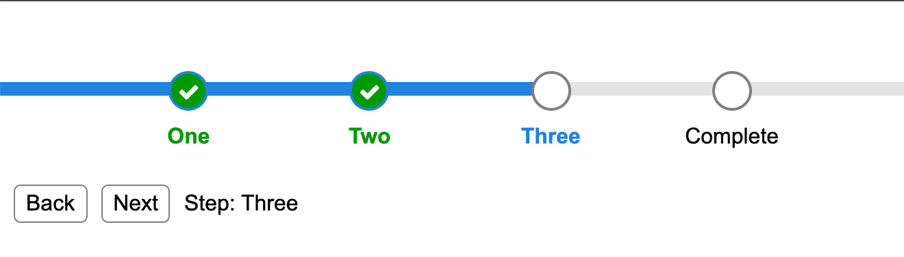
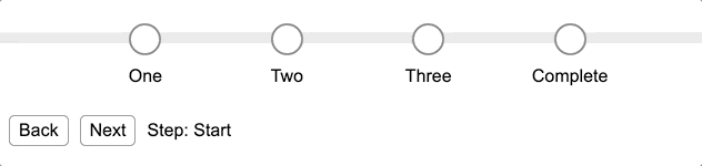
Our goal is to build a simple and effective responsive progress bar that does the following:
- Has four steps to completion.
- Each step has a
default,active, andcompletestate. - Can progress from step to step until completion.
Check out the CodePen here for a live example.
The HTML
To reduce redundancy and increase reusability, we track all state in a Vue component. In the DOM, this dynamically generates any number of required steps.
Note: Native JavaScript (ECMAScript) or any other framework can accomplish this. The use of Vue is for demonstrative purposes.
The progress bar uses basic markup. There is:
- a container with computed classes based on the current step:
progressClasses - a static background track:
progress__bg - a loop that iterates through each step and applies
stepClassesbased on the current step.
Each step has:
- a
progress__indicatorthat contains a check icon that’s visible if the step is complete. - a
progress__labelthat contains the label text for that step.
```html vue
For simplicity, the `progress__actions` which control the direction of travel are nested within the progress bar itself.

## The CSS (SCSS)

This is where we do the heavy lifting. The classes defined here will be applied dynamically by the JS based on the current step.

First, let’s select some colours to work with:

```scss
$gray:  #E5E5E5;
$gray2: #808080;
$blue:  #2183DD;
$green: #009900;
$white: #FFFFFF;
Now define the .progress class: the container that holds the progress bar's contents together.
.progress {
  position: absolute;
  top: 15vh;
  width: 0%;
  height: 10px;
  background-color: $blue;
  transition: width .2s;
}
Our progress bar needs a .progress__bg that the progress steps will run over like a track. This will be grey, covered over by the coloured bar as it advances to the next step.
.progress__bg {
  position: absolute;
  width: 100vw;
  height: 10px;
  background-color: $gray;
  z-index: -1;
}
Each .progress__step contains the round step that will highlight and fill as the progress bar advances.
.progress__step {
  position: absolute;
  top: -8px;
  left: 0;
  display: flex;
  flex-direction: column;
  align-items: center;
  text-align: center;

  @for $i from 1 through 5 {
    &.progress__step--#{$i} {
      left: calc(#{$i * 20}vw - 9px);
    }
  }
}
It also contains the round .progress__indicator and label text .progress__label. Their default styles are defined outside of the .progress__step.
.progress__indicator {
  width: 25px;
  height: 25px;
  border: 2px solid $gray2;
  border-radius: 50%;
  background-color: $white;
  margin-bottom: 10px;

  .fa {
    display: none;
    font-size: 16px;
    color: $white;
  }
}

.progress__label {
  position: absolute;
  top: 40px;
}
Let’s now continue to nest inside .progress__step again and define the step in its active state.
&.progress__step--active {
  color: $blue;
  font-weight: 600;
}
Next, define the step in its complete state. Note: the default styles for .progress__indicator and .progress__label are overwritten when in the complete state.
&.progress__step--complete {
  .progress__indicator {
    background-color: $green;
    border-color: $blue;
    color: $white;
    display: flex;
    align-items: center;
    justify-content: center;
  }

  .progress__indicator .fa {
    display: block;
  }

  .progress__label {
    font-weight: 600;
    color: $green;
  }
}
The JavaScript
As mentioned earlier, this will differ based on how you implement the step logic, the larger context it’s implemented in, what frameworks and patterns you use, and so on.
This example uses a Vue component to demonstrate:
- calculation of classes for the progress bar based on the current state.
- calculation of classes for each step based on the current state.
```javascript vue var app = new Vue({ el: '#app',
data: { currentStep: null, steps: [ {"label": "one"}, {"label": "two"}, {"label": "three"}, {"label": "complete"} ] },
methods: { nextStep(next=true) { const steps = this.steps const currentStep = this.currentStep const currentIndex = steps.indexOf(currentStep)
// handle back
if (!next) {
if (currentStep && currentStep.label === 'complete') {
return this.currentStep = steps[steps.length - 1]
}
if (steps[currentIndex - 1]) { return this.currentStep = steps[currentIndex - 1] }
return this.currentStep = { "label": "start" }
}
// handle next if (this.currentStep && this.currentStep.label === 'complete') { return this.currentStep = { "label": "start" } }
if (steps[currentIndex + 1]) { return this.currentStep = steps[currentIndex + 1] }
this.currentStep = { "label": "complete" }
},
stepClasses(index) {
let result = progress__step progress__step--${index + 1}
if (this.currentStep && this.currentStep.label === 'complete' ||
index < this.steps.indexOf(this.currentStep)) {
return result += 'progressstep--complete'
}
if (index === this.steps.indexOf(this.currentStep)) {
return result += 'progressstep--active'
}
return result
}
},
computed: {
progressClasses() {
let result = 'progress '
if (this.currentStep && this.currentStep.label === 'complete') {
return result += 'progress--complete'
}
return result += progress--${this.steps.indexOf(this.currentStep) + 1}
}
}
})
```
Conclusion
At the end of it all you have this:
Check out the CodePen for a live example.
If you find my articles useful please consider becoming a member of my Patreon :)
Or if you just want to buy me coffee (I love coffee):