By Victor Eke
Navigation bars are essential components used a lot in websites and web apps. As a web developer, you will need to be able to customize them, either for a client project or a basic portfolio site.
In this guide, you'll learn how to build a navigation bar for yourself from scratch using just HTML, CSS, and JavaScript. You'll also learn how to make it accessible.
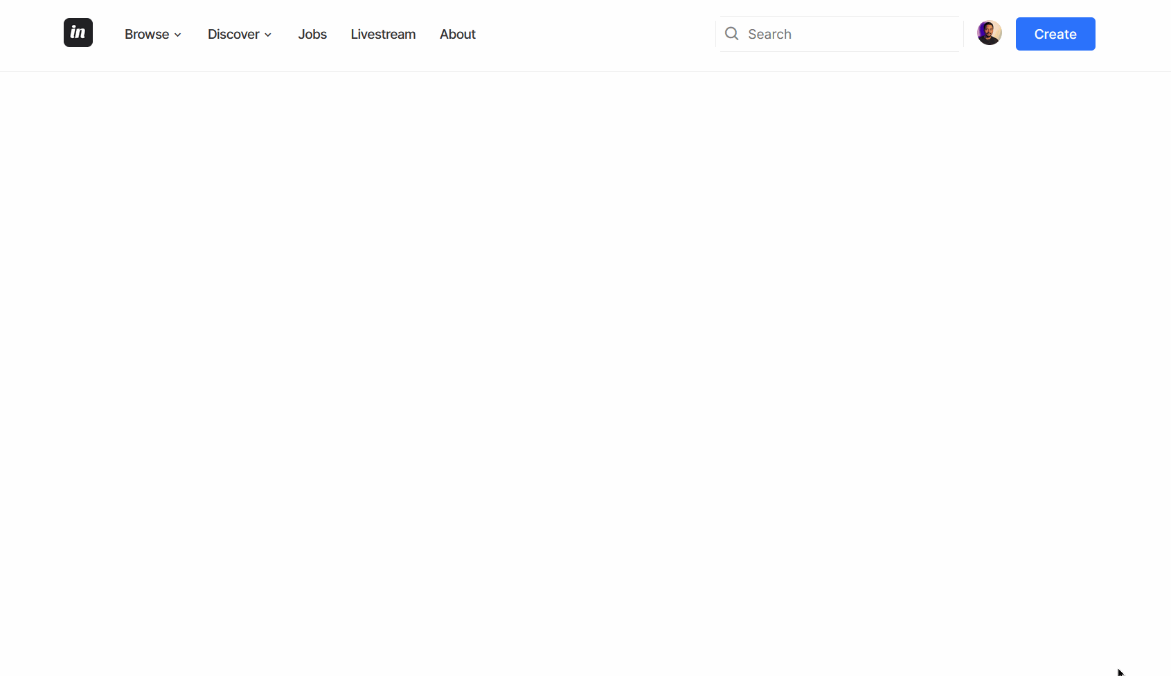
Here's a screenshot of what this navigation bar will look like:
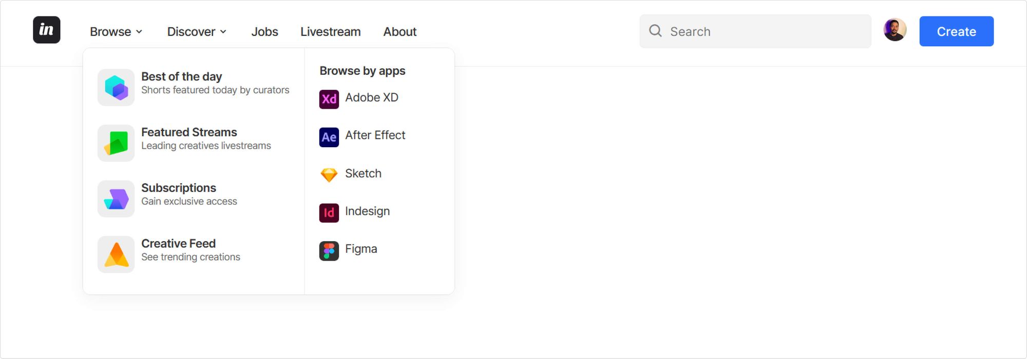 Final result of navigation bar
This design is inspired by Tran Mau Tri Tam's Minimal Navigation bar on Dribbble.
Step 1 – Add the HTML Markup
For brevity's sake, we'll be using an icon library called boxicons to import certain icons for this navbar. I highly recommend using inline SVGs instead.
To make use of this library, insert the snippet below in the head of your HTML file:
<link href='https://unpkg.com/boxicons@2.1.4/css/boxicons.min.css' rel='stylesheet'>
The markup is divided into three main parts:
- A
divelement with a class ofnav-start - Another
divelement with a class ofnav-end - A
buttonelement with an id ofhamburger
All these elements will be enclosed within a header tag. To explain this better, copy the markup below and I'll explain what's happening after.
<header id="nav-menu">
  <div class="container">
    <div class="nav-start">
      <a class="logo" href="/">
        <img src="https://github.com/Evavic44/responsive-navbar-with-dropdown/blob/main/assets/images/logo.png?raw=true"
             width="35"
             height="35"
             alt="Inc Logo"
          />
      </a>
      <nav class="menu"></nav>
    </div>

    <div class="nav-end">
      <div class="right-container">
        <form class="search" role="search">
          <input type="search" name="search" placeholder="Search" />
          <i class="bx bx-search" aria-hidden="true"></i>
        </form>

        <a href="#profile">
          <img src="https://github.com/Evavic44/responsive-navbar-with-dropdown/blob/main/assets/images/user.jpg?raw=true"
               width="30"
               height="30"
               alt="user image"
            />
        </a>
        <button class="btn btn-primary">Create</button>
      </div>
    </div>
  </div>
</header>
For the nav-start, we have the following elements:
- An
<img>element for the logo wrapped with an anchor<a>tag. - A
<nav>element with a class ofmenuwhich will contain all the navigation links. We'll define these links later using a combination of<ul>,li>and<a>tags.
The nav-end has the following elements:
- A
<form>element with a role of search that contains a search input and search icon. - A button element with a class of
btn. We'll use this class to style the button.
Here's the resulting output:
Navigation menu
The navigation menu <nav> is where the navigation links will be. Replace the nav element you added earlier with this markup below:
<nav class="menu">
    <button id="hamburger" aria-expanded="false">
      <i class="bx bx-menu" aria-hidden="true"></i>
    </button>
    <div class="menu">
        <ul class="menu-bar">
            <li>
                <button
                  class="nav-link dropdown-btn"
                  data-dropdown="dropdown1"
                  aria-expanded="false">
                    Browse
                  <i class="bx bx-chevron-down" aria-hidden="true"></i>
                </button>
                <div id="dropdown1" class="dropdown"></div>
            </li>
            <li>
                <button
                  class="nav-link dropdown-btn"
                  data-dropdown="dropdown2"
                  aria-expanded="false">
                    Discover
                  <i class="bx bx-chevron-down" aria-hidden="true"></i>
                </button>
                <div id="dropdown2" class="dropdown"></div>
            </li>
            <li><a class="nav-link" href="/">Jobs</a></li>
            <li><a class="nav-link" href="/">Livestream</a></li>
            <li><a class="nav-link" href="/">About</a></li>
        </ul>
    </div>
</nav>
Here you have a nav tag that contains a button and an unordered list of five li elements representing each navigation menu item: browse, discover, jobs, livestream, and about.
The button serves as a hamburger menu, and is a button with an id and aria-expanded set to "false". The aria-expanded attribute will enable us make this button more accessible to screen readers.
The first two list elements, browse and discover, are button elements and will be used to toggle their individual dropdown menu. The remaining elements Jobs, livestream, and about, are just regular links.
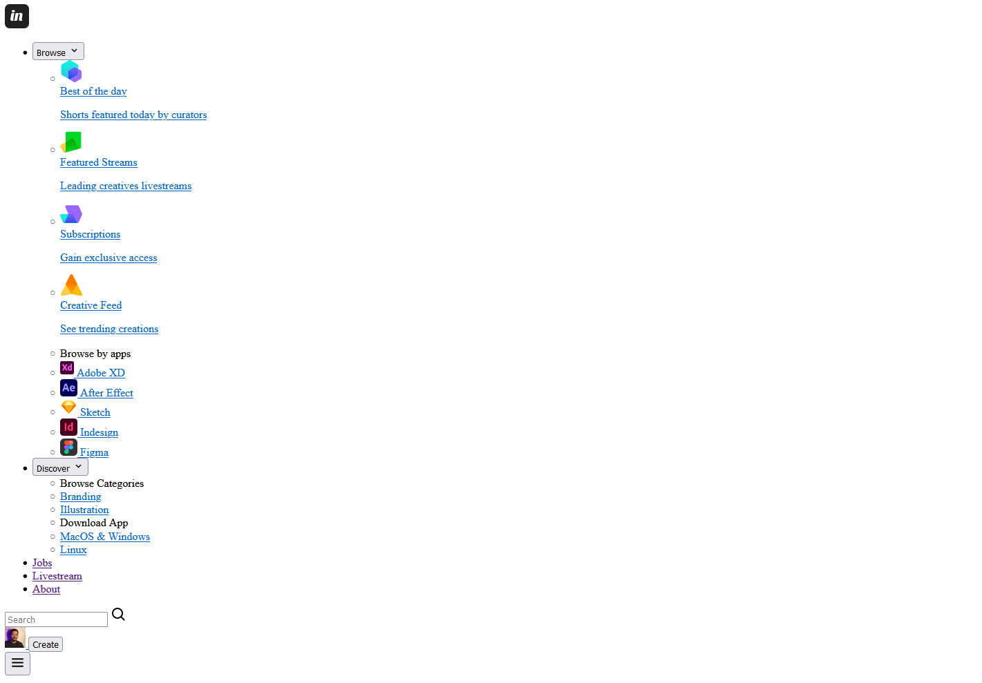
With the code so far, your result should look like this:
Dropdown Element
Next up, let's define the dropdown element for each navigation button. Here's the markup for the first dropdown. Replace the first li element in your markup with this:
<!-- markup truncated for brevity-->
<li>
    <button
      class="nav-link dropdown-btn"
      data-dropdown="dropdown1"
      aria-expanded="false"
    >
      Browse
      <i class="bx bx-chevron-down" aria-hidden="true"></i>
    </button>
    <div id="dropdown1" class="dropdown">
      <ul>
        <li>
          <a class="dropdown-link" href="#best-of-the-day">
            <img src="./assets/icons/botd.svg" class="icon" alt=""/>
            <div>
              <span class="dropdown-link-title"
                >Best of the day</span
              >
              <p>Shorts featured today by curators</p>
            </div>
          </a>
        </li>
        <li>
          <a class="dropdown-link" href="#featured-streams">
            <img src="./assets/icons/fs.svg" class="icon" alt=""/>
            <div>
              <span class="dropdown-link-title"
                >Featured Streams</span
              >
              <p>Leading creatives livestreams</p>
            </div>
          </a>
        </li>
        <li>
          <a class="dropdown-link" href="#subscriptions">
            <img src="./assets/icons/sp.svg" class="icon" alt=""/>
            <div>
              <span class="dropdown-link-title">Subscriptions</span>
              <p>Gain exclusive access</p>
            </div>
          </a>
        </li>
        <li>
          <a class="dropdown-link" href="#creative-feed">
            <img src="./assets/icons/cf.svg" class="icon" alt=""/>
            <div>
              <span class="dropdown-link-title">Creative Feed</span>
              <p>See trending creations</p>
            </div>
          </a>
        </li>
      </ul>

      <ul>
        <span id="apps- class="dropdown-link-title">Browse by apps</span>
        <li>
          <a class="dropdown-link" href="#adobe-xd">
            <img src="./assets/icons/xd.svg" alt=""/>
            Adobe XD
          </a>
        </li>
        <li>
          <a class="dropdown-link" href="#after-effect">
            <img src="./assets/icons/ae.svg" alt=""/>
            After Effect
          </a>
        </li>
        <li>
          <a class="dropdown-link" href="#sketch">
            <img src="./assets/icons/sketch.svg" alt=""/>
            Sketch
          </a>
        </li>
        <li>
          <a class="dropdown-link" href="#indesign">
            <img src="./assets/icons/indesign.svg" alt=""/>
            Indesign
          </a>
        </li>
        <li>
          <a class="dropdown-link" href="#figma">
            <img src="./assets/icons/figma.svg" alt="" />
            Figma
          </a>
        </li>
      </ul>
    </div>
  </li>
You can get the SVG icons here.
To breakdown this markup, we added the following:
- A
divelement with an id ofdropdown1and class ofdropdown. - Two
ulelements. - A
spanelement with a class ofdropdown-link-titlefor the header of eachmenucollection. - A collection of links defined using
liandatags. The links each have a class ofdropdown-link. - Inside each anchor tag, an icon is added via the
imgtag.
Note: Since the icons added via the img tag are strictly declarative, I highly suggest you add them as SVG elements directly. I am only doing this to make the code more readable.
Here's the markup for the second dropdown element dropdown2:
<!-- markup truncated for brevity-->
<li>
    <button
      class="nav-link dropdown-btn"
      data-dropdown="dropdown2"
      aria-expanded="false"
    >
      Discover
      <i class="bx bx-chevron-down" aria-hidden="true"></i>
    </button>
    <div id="dropdown2" class="dropdown">
      <ul aria-labelledby="categories-title">
        <span id="categories-title" class="dropdown-link-title">Browse Categories</span>
        <li>
          <a class="dropdown-link" href="#branding">Branding</a>
        </li>
        <li>
          <a class="dropdown-link" href="#illustrations">Illustration</a>
        </li>
      </ul>
      <ul aria-labelledby="download-title">
        <span id="download-title" class="dropdown-link-title">Download App</span>
        <li>
          <a class="dropdown-link" href="#mac-windows">MacOS & Windows</a>
        </li>
        <li>
          <a class="dropdown-link" href="#linux">Linux</a>
        </li>
      </ul>
    </div>
  </li>
The final result should look like this:
The full markup will be provided at the end of this tutorial.
Step 2 – Style the Navigation Bar
As always, we'll start by resetting the default margin and padding of every element on the page, add global variables, and some basic styling to a few elements.
/* style.css */
@import url("https://fonts.googleapis.com/css2?family=Inter:wght@200;300;400;500;600;700&display=swap");

* {
  margin: 0;
  padding: 0;
  box-sizing: border-box;
  font-family: "Inter", sans-serif;
}

:root {
  --dark-grey: #333333;
  --medium-grey: #636363;
  --light-grey: #eeeeee;
  --ash: #f4f4f4;
  --primary-color: #2b72fb;
  --white: white;
  --border: 1px solid var(--light-grey);
  --shadow: rgba(0, 0, 0, 0.05) 0px 6px 24px 0px,
    rgba(0, 0, 0, 0.08) 0px 0px 0px 1px;
}

body {
  font-family: inherit;
  background-color: var(--white);
  color: var(--dark-grey);
  letter-spacing: -0.4px;
}

ul {
  list-style: none;
}

a {
  text-decoration: none;
  color: inherit;
}

button {
  border: none;
  background-color: transparent;
  cursor: pointer;
  color: inherit;
}
Next, add some reusable styles.
.btn {
  display: block;
  background-color: var(--primary-color);
  color: var(--white);
  text-align: center;
  padding: 0.6rem 1.4rem;
  font-size: 1rem;
  font-weight: 500;
  border-radius: 5px;
}

.icon {
  padding: 0.5rem;
  background-color: var(--light-grey);
  border-radius: 10px;
}

.logo {
  margin-right: 1.5rem;
}

#nav-menu {
  border-bottom: var(--border);
}

.container {
  display: flex;
  align-items: center;
  justify-content: space-between;
  max-width: 1600px;
  margin: 0 auto;
  column-gap: 2rem;
  height: 90px;
  padding: 1.2rem 3rem;
}
Now that you've gotten this basic styling out of the way, you can focus on styling the core navigation bar itself.
Navigation menu styles
Here's the markup to style the navigation bar container:
.menu {
  position: relative;
  background: var(--white);
}

.menu-bar li:first-child .dropdown {
  flex-direction: initial;
  min-width: 480px;
}

.menu-bar li:first-child ul:nth-child(1) {
  border-right: var(--border);
}

.menu-bar li:nth-child(n + 2) ul:nth-child(1) {
  border-bottom: var(--border);
}

.menu-bar .dropdown-link-title {
  font-weight: 600;
}

.menu-bar .nav-link {
  font-size: 1rem;
  font-weight: 500;
  letter-spacing: -0.6px;
  padding: 0.3rem;
  min-width: 60px;
  margin: 0 0.6rem;
}

.menu-bar .nav-link:hover,
.dropdown-link:hover {
  color: var(--primary-color);
}

.nav-start,
.nav-end,
.menu-bar,
.right-container,
.right-container .search {
  display: flex;
  align-items: center;
}
Dropdown Menu Styles
In addition to styling the dropdown menu, it will be hidden using a combination of visibility and opacity properties. The idea is to show the menu only when the individual button has been clicked.
.dropdown {
  display: flex;
  flex-direction: column;
  min-width: 230px;
  background-color: var(--white);
  border-radius: 10px;
  position: absolute;
  top: 36px;
  z-index: 1;
  visibility: hidden;
  opacity: 0;
  transform: scale(0.97) translateX(-5px);
  transition: 0.1s ease-in-out;
  box-shadow: var(--shadow);
}

.dropdown.active {
  visibility: visible;
  opacity: 1;
  transform: scale(1) translateX(5px);
}

.dropdown ul {
  display: flex;
  flex-direction: column;
  gap: 0.5rem;
  padding: 1.2rem;
  font-size: 0.95rem;
}

.dropdown-btn {
  display: flex;
  align-items: center;
  justify-content: space-between;
  gap: 0.15rem;
}

.dropdown-link {
  display: flex;
  gap: 0.5rem;
  padding: 0.5rem 0;
  border-radius: 7px;
  transition: 0.1s ease-in-out;
}

.dropdown-link p {
  font-size: 0.8rem;
  color: var(--medium-grey);
}
Later on, the menu can be toggled by reverting the visibility and opacity properties back to the default state using the active class. But we'll do this via JavaScript.
If you prefer to hide the menu completely, substitute the opacity and visibility properties with display: none;. Although this property is not animatable using transition in CSS.
Right menu styles
Next, add the styling for the search input, button, and profile image and then hide the hamburger button on desktop screens.
.right-container {
  display: flex;
  align-items: center;
  column-gap: 1rem;
}

.right-container .search {
  position: relative;
}

.right-container img {
  border-radius: 50%;
}

.search input {
  background-color: var(--ash);
  border: none;
  border-radius: 6px;
  padding: 0.7rem;
  padding-left: 2.4rem;
  font-size: 16px;
  width: 100%;
  border: var(--border);
}

.search .search-icon {
  position: absolute;
  left: 10px;
  top: 50%;
  transform: translateY(-50%);
  opacity: 0.6;
}

#hamburger {
  display: none;
  padding: 0.1rem;
  margin-left: 1rem;
  font-size: 1.9rem;
}
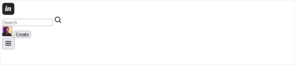
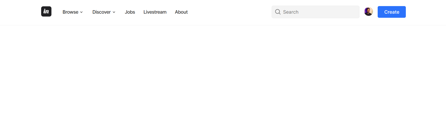
Here's what it should look like:
To finish up the styling, add the media query styling:
@media (max-width: 1100px) {
  #hamburger {
    display: block;
    position: relative;
    left: calc(100vw - 9rem);
  }

  .container {
    padding: 1.2rem;
    margin-right: 3rem;
  }

  .menu {
    display: none;
    position: absolute;
    top: 87px;
    left: 0;
    min-height: 100vh;
    width: 100vw;
  }

  .menu-bar li:first-child ul:nth-child(1) {
    border-right: none;
    border-bottom: var(--border);
  }

  .dropdown {
    display: none;
    min-width: 100%;
    border: none !important;
    border-radius: 5px;
    position: static;
    top: 0;
    left: 0;
    visibility: visible;
    opacity: 1;
    transform: none;
    box-shadow: none;
  }

  .menu.show,
  .dropdown.active {
    display: block;
  }

  .dropdown ul {
    padding-left: 0.3rem;
  }

  .menu-bar {
    display: flex;
    flex-direction: column;
    align-items: stretch;
    row-gap: 1rem;
    padding: 1rem;
  }

  .menu-bar .nav-link {
    display: flex;
    justify-content: space-between;
    width: 100%;
    font-weight: 600;
    font-size: 1.2rem;
    margin: 0;
  }

  .menu-bar > li:not(:last-child) {
    padding-bottom: 0.5rem;
    border-bottom: var(--border);
  }
}

@media (max-width: 600px) {
  .right-container {
    display: none;
  }
}
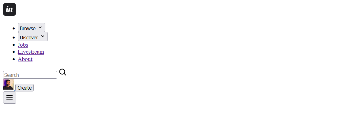
First, this arranges the elements, and most importantly, it targets the hamburger class and hides it. Now on tablet and mobile screens, the navigation bar is responsive and the hamburger button is visible.
This completes the navigation bar styling. Let's work on the functionality in the next section.
Step 3 – Add JavaScript Functionality
For the JavaScript functionality, we'll focus on the following categories:
- Toggling the dropdown menu visibility
- Closing the dropdown menu
- Toggling the hamburger menu visibility
- Toggling the aria-expanded attribute
First, select your classes using the DOM's querySelector method and store them in variables so they are reusable.
// script.js
const dropdownBtn = document.querySelectorAll(".dropdown-btn");
const dropdown = document.querySelectorAll(".dropdown");
const hamburgerBtn = document.getElementById("hamburger");
const navMenu = document.querySelector(".menu");
const links = document.querySelectorAll(".dropdown a");
Next add the functions below in your code. I'll explain their uses a bit later.
function setAriaExpandedFalse() {
  dropdownBtn.forEach((btn) => btn.setAttribute("aria-expanded", "false"));
}

function closeDropdownMenu() {
  dropdown.forEach((drop) => {
    drop.classList.remove("active");
    drop.addEventListener("click", (e) => e.stopPropagation());
  });
}

function toggleHamburger() {
    navMenu.classList.toggle("show");
    hamburgerBtn.setAttribute(
        "aria-expanded",
        hamburgerBtn.getAttribute("aria-expanded") === "false" ? "true" : "false"
    );
}
Get dropdown menu ID
The next step is getting the dropdown menu ID. Since there are two dropdown menus, the value will be based on what dropdown button is clicked.
To get the ID, you'll utilize the dataset property and then store the value into its own variable.
dropdownBtn.forEach((btn) => {
  btn.addEventListener("click", function (e) {
    const dropdownIndex = e.currentTarget.dataset.dropdown;
    const dropdownElement = document.getElementById(dropdownIndex);
    console.log(dropdownElement);
  });
});
To break this snippet down:
- The
forEachmethod loops through the collection of buttons - The
addEventListener()method attaches a click event to each button - The
currentTarget.datasetproperty fetches the current dropdown of the button clicked. - Each of the ids are used to target the corresponding dropdown element
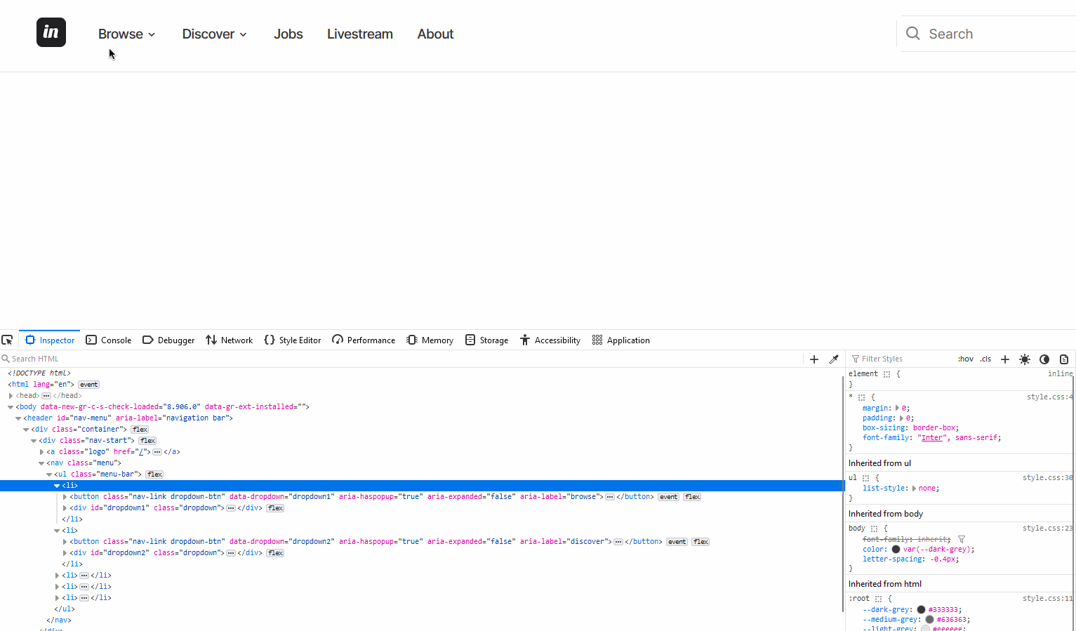
What this means is that when the button with a dataset of dropdown1 is clicked, the div element with an id of dropdown1 is logged to the console, and inversely for the dropdown2 button.
 dynamically getting each dropdown element using the button dataset property
Toggle the dropdown menu
Toggling the menu is fairly easy now that you have the dropdown element ID stored into a variable called dropdownElement. By targeting this variable, you can toggle the active class on each dropdown element.
dropdownBtn.forEach((btn) => {
  btn.addEventListener("click", function (e) {
    const dropdownIndex = e.currentTarget.dataset.dropdown;
    const dropdownElement = document.getElementById(dropdownIndex);

    dropdownElement.classList.toggle("active");
    dropdown.forEach((drop) => {
      if (drop.id !== btn.dataset["dropdown"]) {
        drop.classList.remove("active");
      }
    });
    e.stopPropagation();
  });
});
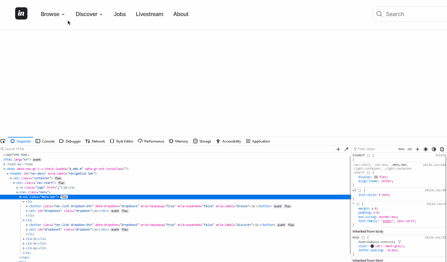
In addition to toggling the dropdown menu, we added a condition to check if the current dropdown element id matches with the active button. This makes sure only one dropdown element is expanded at a time.
 toggling the dropdown menu
Toggle aria-expanded property
The aria-expanded property allows assistive technologies to announce whether an interactive menu is expanded or collapsed. To toggle this property, insert this code inside the btn code block under e.stopPropagation():
btn.setAttribute(
    "aria-expanded",
    btn.getAttribute("aria-expanded") === "false" ? "true" : "false"
);
Now anytime the dropdown menu is visible, the aria-expanded property is set to true and when collapsed, it's set to false.
 toggling the aria-expanded property
Collapse dropdown menu
So far the dropdown collapses only when the buttons are clicked. Other instances it should be collapsed include:
- When the links inside the dropdown menu are clicked
- When you hit the ESC key
- When you click on the document body – essentially, outside of the dropdown container.
By calling the functions created earlier, closeDropdownMenu and setAriaExpandedFalse, the dropdown menu can be collapsed and the aria-expanded attribute set to false.
// close dropdown menu when the dropdown links are clicked
links.forEach((link) =>
  link.addEventListener("click", () => {
    closeDropdownMenu();
    setAriaExpandedFalse();
  })
);

// close dropdown menu when you click on the document body
document.documentElement.addEventListener("click", () => {
  closeDropdownMenu();
  setAriaExpandedFalse();
});

// close dropdown when the escape key is pressed
document.addEventListener("keydown", (e) => {
  if (e.key === "Escape") {
    closeDropdownMenu();
    setAriaExpandedFalse();
  }
});
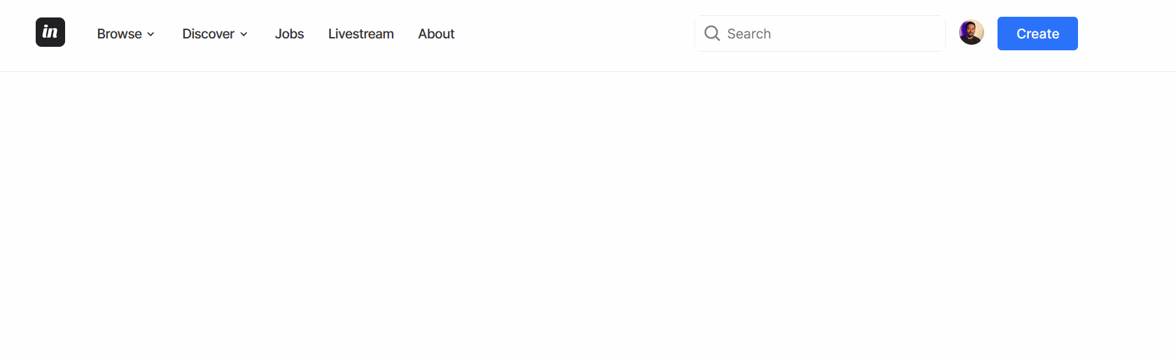
Here's the resulting output:
Toggle hamburger menu
To see the navigation bar on tablet and mobile screens, attach the toggleHamburger function as a callback on the hamburger button and then call the function inside the links code block.
links.forEach((link) =>
  link.addEventListener("click", () => {
    closeDropdownMenu();
    setAriaExpandedFalse();
    toggleHamburger();
  })
);
hamburgerBtn.addEventListener("click", toggleHamburger);
This will essentially toggle a different class called show that controls showing the navigation bar or hiding it, and update the aria-expanded attribute accordingly.
Note that to truly make the hamburger menu accessible, you would need to make it automatically close when it loses focus (either by a change in keyboard focus or a mouse click).
Here's the final output:
Add More Dropdown Menus
You can add more dropdown menus by simply replacing any of the list items with a link to the one with a button and dropdown menu. In other for it to work, make sure you update the following:
- The dropdown ID according to how many menus you need. For example a third menu will have an id of
dropdown3 - The button will have its
data-dropdownvalue set todropdown3
Here's an example that converts the Jobs link into a dropdown menu.
Before:
<li><a class="nav-link" href="/">Jobs</a></li>
After:
<li>
    <button
      class="nav-link dropdown-btn"
      data-dropdown="dropdown3"
      aria-expanded="false"
    >
      Jobs
      <i class="bx bx-chevron-down" aria-hidden="true"></i>
    </button>
    <div id="dropdown3" class="dropdown">
      <ul>
        <li><span class="dropdown-link-title">Software</span></li>
        <li>
          <a class="dropdown-link" href="#frontend">Frontend</a>
        </li>
        <li>
          <a class="dropdown-link" href="#backend">Backend</a>
        </li>
        <li>
          <a class="dropdown-link" href="#ai-ml">AI/ML</a>
        </li>
        <li>
          <a class="dropdown-link" href="#mobile-dev">Mobile Development</a>
        </li>
      </ul>
      <ul>
        <li>
          <span class="dropdown-link-title">Others</span>
        </li>
        <li>
          <a class="dropdown-link" href="#ui-ux">UI/UX</a>
        </li>
        <li>
          <a class="dropdown-link" href="#writing">Technical Writing</a>
        </li>
      </ul>
    </div>
  </li>
Here's the final result:
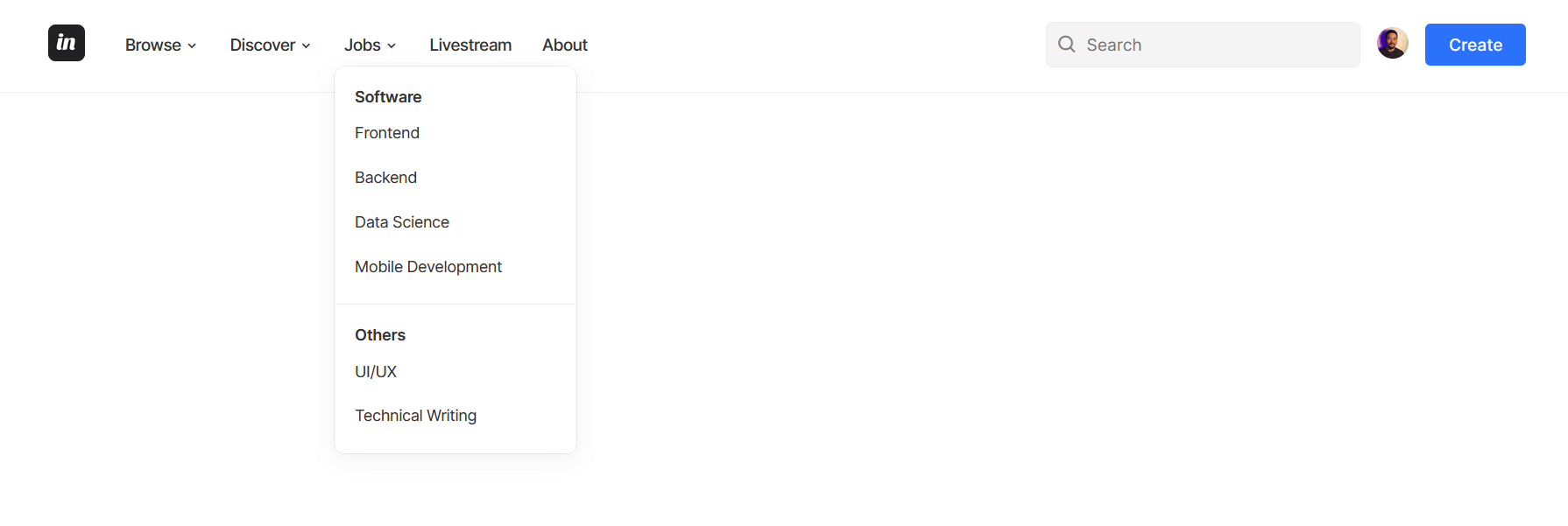 Final result after adding the third dropdown (Jobs)
Following this process, you can add as many dropdown menus as you want.
And with this, you’ve successfully built a responsive navigation bar with dropdown menus using just HTML, CSS, and JavaScript. You also learned how to make the menu accessible using a few aria attributes including the aria-expanded property.
Here’s the codepen file to test this navigation bar in action:
Get code files from GitHub using this link
Conclusion
I sincerely hope you found this post interesting or useful. If you did, kindly share with your friends or subscribe to my blog so you won't miss any future postings. Thanks for reading.