By Veronika Rovnik
Hi, the freeCodeCamp community!
In this tutorial, I’d like to share with you an approach to data visualization in Python which you can further apply in the Django development.
If you ever encountered the necessity to build an interactive dashboard or you’d like to try doing it, you’re welcome to walk through the steps from this tutorial.
If you have any questions regarding the process, please ask them in the comments. I'll be happy to assist you.
Here is the list of skills you’re going to master upon the tutorial completion:
- How to create a basic Django app
- How to host remote MongoDB data in MongoDB Atlas
- How to import JSON and CSV data to MongoDB
- How to add a reporting tool to the Django app
Let’s start! ??????
Prerequisites
- Basic knowledge of web development
- Confident knowledge of Python
- Basic experience with NoSQL databases (e.g., MongoDB)
Tools
- Django - a high-level Python web framework.
- MongoDB Atlas - a cloud database service for modern applications. Here we’ll host our MongoDB database.
- Flexmonster Pivot Table & Charts - a JavaScript web component for reporting. It will handle data visualization tasks on the client side.
- The MongoDB connector for Flexmonster - a server-side tool for fast communication between Pivot Table & MongoDB.
- PyCharm Community Edition - an IDE for Python development.
- Kaggle data
Establish a Django project
If you’re new to Django development, that’s alright. In a step-by-step manner, we’ll set up everything to make our application outstanding.
- Make sure you've previously installed Django on your machine.
- First, open the directory where you want your project to be created. Open the console and run the following command to create a new shiny Django project:
_django-admin startproject django_reporting_project_
- Next, navigate to this project:
_cd django_reporting_project_
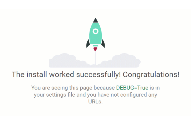
- Let’s check if everything works as expected. Run the Django server:
python manage.py runserver
Unless specified otherwise, the development server starts at port 8000. Open http://127.0.0.1:8000/ in your browser. If you can see this cool rocket, we are on the right track!
Create an app
Now it’s time to create our application empowered with reporting features.
If you don’t feel confident about the difference between projects and applications in Django, here’s a quick reference to help you figure it out.
- Let’s call it
dashboard:
python manage.py startapp dashboard
- Next, open the project in your favorite IDE. I highly recommend using PyCharm since it makes the whole process of programming in Python a bliss. It also conveniently manages the creation of a project-specific isolated virtual environment.
- After an app is created, it’s necessary to register it at the project’s level. Open the _
django_reporting_project/settings.pyfile and append the app’s name to the end of theINSTALLED_APPS_ list:
INSTALLED_APPS = [
    'django.contrib.admin',
    'django.contrib.auth',
    'django.contrib.contenttypes',
    'django.contrib.sessions',
    'django.contrib.messages',
    'django.contrib.staticfiles',
    'dashboard',
]
Hooray! Now the project knows about your app’s existence and we’re ready to move on to the database configuration.
Set up MongoDB database using MongoDB Atlas
Let’s set the app aside until we’re done with arranging our database. I suggest we practice creating the remote MongoDB database by hosting it on MongoDB Atlas - a cloud database service for applications. Alternatively, you can prepare a local database and work with it in any convenient way (e.g., via MongoDB Compass or the mongo shell).
- After you've signed in your MongoDB account, create our first project. Let’s name it
ECommerceData:

- Next, add members (if needed) and set permissions. You can invite users to participate in your project via email address.
- Create a cluster:
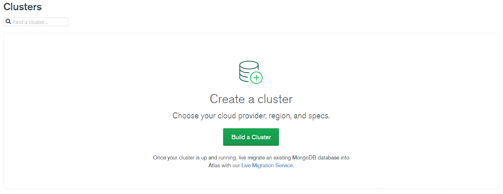
- Choose the plan. Since we’re on our learning path, the simplest free plan will be sufficient for our needs.
- Select a cloud provider and region. The recommended regions are inferred via your location and marked with stars.
- Give a meaningful name to our brand-new cluster. Note that it can’t be changed later. Let’s name it
ReportingData:

Prepare data
While you’re waiting for your cluster to be created, let’s take a closer look at the data we’ll be working with. For this tutorial, we’re going to use the Kaggle dataset with transactions from a UK retailer. Using this data, we’ll try constructing a meaningful report which can serve for exploratory data analysis within a real organization.
Additionally, we’re going to use mock JSON data about marketing. It will help us to achieve the goal of establishing different reporting tools within the same application. You can choose any data of your preference.
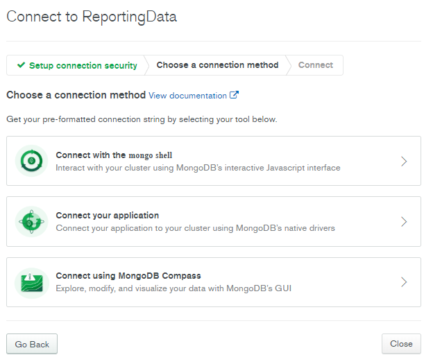
Connect to your cluster
Now that our cluster is ready, let’s connect to it!
- Whitelist your current IP address or add a different one.
- Create a MongoDB user. The first one will have atlasAdmin permissions for the current project which means possessing the following roles and privilege actions. For security reasons, it’s recommended to auto-generate a strong password.
- Choose a connection method that suits you best. To test the connection, we can use the connection string for the mongo shell first. Later we’ll also use a connection string for an application.
- Connect to it via the mongo shell. Open the command line and run the following:
mongo "mongodb+srv://reportingdata-n8b3j.mongodb.net/test" --username yourUserName
The interactive prompt will ask you for a password to authenticate.
Check cluster metrics
Phew! We’re almost there.
Now get back to the page with the cluster summary and see how it came to life! From now, we can gain insights into write and read operations of the MongoDB database, the number of active connections, the logical size of our replica set - all this statistical information is at your hand. But most importantly now it’s possible to create and manage databases and collections.
Create a database
Create your first database and two collections. Let’s name them ecommerce, transactions, and marketing correspondingly.
Here’s how our workspace looks like now:
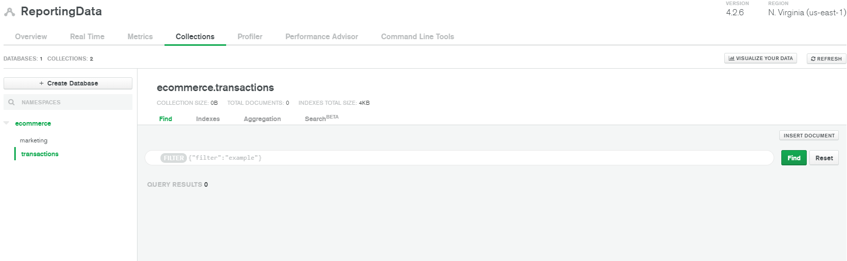
Looks quite empty, doesn’t it?
Import data to MongoDB
Let’s populate the collection with data. We’ll start with the retail data previously downloaded from Kaggle.
- Unzip the archive and navigate to the directory where its contents are stored.
- Next, open the command prompt there and import the data to the transactions collection of the ecommerce database using the
mongoimportcommand and the given connection string for the mongo shell:
mongoimport --uri "mongodb+srv://username:password@reportingdata-n8b3j.mongodb.net/ecommerce?retryWrites=true&w=majority" --collection transactions --drop --type csv --headerline --file data.csv
❗Please remember to replace username and password keywords with your credentials.
Congrats! We’ve just downloaded 541909 documents to our collection. What’s next?
- Upload the dataset with marketing metrics to the marketing collection. Here’s the JSON file with the sample data we’re going to use.
Import the JSON array into the collection using the following command:
_mongoimport --uri "mongodb+srv://username:password@reportingdata-n8b3j.mongodb.net/ecommerce?retryWrites=true&w=majority" --collection marketing --drop --jsonArray marketing_data.json_
If this data is not enough, we could dynamically generate more data using the mongoengine / PyMongo models. This is what our next tutorial of this series will be dedicated to. But for now, we’ll skip this part and work with the data we already have.
Now that our collections contain data, we can explore the number of documents in each collection as well as their structure. For more insights, I’d recommend using MongoDB Compass which is the official GUI tool for MongoDB. With it, you can explore the structure of each collection, check the distribution of field types, build aggregation pipelines, run queries, evaluate and optimize their performance. To start, download the application and use the connection string for Compass provided by MongoDB Atlas.
Map URL patterns to views
Let’s get back to Django.
- Create
urls.pyin the app’s folder (insidedashboard). Here we’ll store URL routes for our application. These URL patterns will be matched with views defined indashboard/views.py:
from django.urls import path
from . import views

urlpatterns = [
    path('report/retail', views.ecommerce_report_page, name='retail_report'),
    path('report/marketing', views.marketing_report_page, name='marketing_report'),
]
- The application’s URLs need to be registered at the project’s level. Open
django-reporting-project/urls.pyand replace the contents with the following code:
from django.contrib import admin
from django.urls import path, include

urlpatterns = [
    path('admin/', admin.site.urls),
    path('', include('dashboard.urls')),
]
Create views
A view is simply a function that accepts a web request and returns a web response. The response can be of any type. Using the render() function, we’ll be returning an HTML template and a context combined into a single HttpResponse object. Note that views in Django can also be class-based.
- In
dashboard/views.pylet’s create two simple views for our reports:
from django.shortcuts import render


def ecommerce_report_page(request):
   return render(request, 'retail_report.html', {})


def marketing_report_page(request):
   return render(request, 'marketing_report.html', {})
Create templates
Firstly, create the
templatesfolder inside your app’s directory. This is where Django will be searching for your HTML pages.Next, let’s design the layout of our application. I suggest we add a navigation bar that will be displayed on every page. For this, we’ll create a basic template called
base.htmlwhich all other pages will extend according to business logic. This way we'll take advantage of template inheritance - a powerful part of the Django’s template engine. Please find the HTML code on GitHub.
As you may have noticed, we’re going to use Bootstrap styles. This is to prettify our pages with ready-to-use UI components.
Note that in the navigation bar, we’ve added two links that redirect to the report pages. You can do it by setting the link's href property to the name of the URL pattern, specified by the name keyword in the URL pattern. For example, in the following way:
_href="{% url 'marketing_report' %}"_
It's time to create pages where the reports will be located. Let me show you how to create a retail report first. By following these principles, you can create as many other reporting pages as you need.
In templates, create _
marketing_report.html_.- Add an extends tag to inherit from the basic template:
{% extends "base.html" %} - Add a block tag to define our child template's content:
{% block content %} {% endblock %} - Within the block, add Flexmonster scripts and containers where the reporting components will be placed (i.e., the pivot table and pivot charts):
<script src="https://cdn.flexmonster.com/flexmonster.js"></script> <div id="pivot"></div> <div id="pivot_chart"></div> - Add
<script>tags where JavaScript code will be executed. Within these tags, instantiate two Flexmonster objects using init API calls.
var pivot = new Flexmonster({
    container: "#pivot",
    componentFolder: "https://cdn.flexmonster.com/",
    height: 600,
    toolbar: true,
    report: {}
});
var pivot_charts = new Flexmonster({
    container: "#pivot_charts",
    componentFolder: "https://cdn.flexmonster.com/",
    height: 600,
    toolbar: true,
    report: {}
});
You can place as many Flexmonster components as you want. Later, we’ll fill these components with data and compose custom reports.
Set up the MongoDB connector
To establish efficient communication between Flexmonster Pivot Table and the MongoDB database, we can use the MongoDB Connector provided by Flexmonster. This is a server-side tool that does all the hard work for us, namely:
- connects to the MongoDB database
- gets the collection’s structure
- queries data every time the report’s structure is changed
- sends aggregated data back to show it in the pivot table.
To run it, let’s clone this sample from GitHub, navigate to its directory, and install the npm packages by running npm install.
- In
src/server.tsyou can check which port the connector will be running on. You can change the default one. Here, you can also specify which module will handle requests coming to the endpoint (mongo.tsin our case). - After, specify the database credentials in
src/controller/mongo.ts. Right there, add the connector string for application provided by MongoDB Atlas and specify the database’s name.
Define reports
Now we’re ready to define the report’s configuration on the client side.
- Here’s a minimal configuration which makes the pivot table work with the MongoDB data via the connector:
var pivot = new Flexmonster({
    container: "#pivot",
    componentFolder: "https://cdn.flexmonster.com/",
    height: 600,
    toolbar: true,
    report: {
        "dataSource": {
            "type": "api",
            "url": "http://localhost:9204/mongo", // the url where our connector is running
            "index": "marketing" // specify the collection’s name
        },
        "slice": {}
    }
});
- Specify a slice - the set of hierarchies that will be shown on the grid or on the chart. Here’s the sample configuration for the pivot grid.
"slice": {
        "rows": [
            {
                "uniqueName": "Country"
            }
        ],
        "columns": [
            {
                "uniqueName": "[Measures]"
            }
        ],
        "measures": [
            {
                "uniqueName": "Leads",
                "aggregation": "sum"
            },
            {
                "uniqueName": "Opportunities",
                "aggregation": "sum"
            }
        ]
    }
Run your reporting app
Now that we’ve configured the client side, let’s navigate to the MongoDB connector’s directory and run the server:
npm run build
npm run start
- Next, return to the PyCharm project and run the Django server:
python manage.py runserver - Open
http://127.0.0.1:8000/report/marketing. To switch to another report, click the report’s name on the navigation bar.
It’s time to evaluate the results! Here you can see the report for the marketing department:
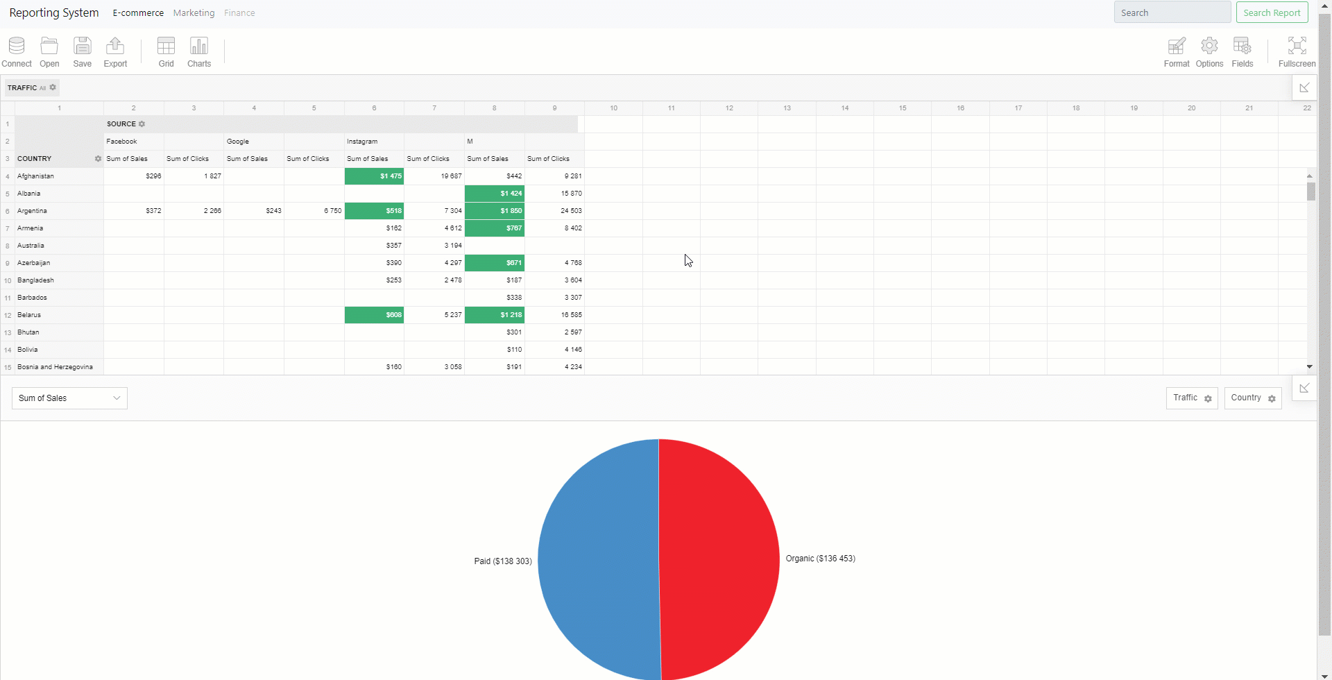
Try experimenting with the layout:
- Slice & dice the data to get your unique perspective.
- Change summary functions, filter & sort the records.
- Switch between classic and compact form to know what feels better.
Enjoy analytics dashboard in Python
Congratulations! Excellent work. We’ve brought our data to life. Now you have a powerful Django application enabled with reporting and data visualization functionality.
The thing your end-users may find extremely comfy is that it’s possible to configure a report, save it, and pick up where you left off later by uploading it into the pivot table. Reports are neat JSON files that can be stored locally or to the server. Also, it’s possible to export reports into PDF, HTML, Image, or Excel files.
Feel free to tailor the app according to your business requirements! You can add more complex logic, change the data source (e.g., MySQL, PostgreSQL, Oracle, Microsoft Analysis Services, Elasticsearch, etc), and customize the appearance and/or the functionality of the pivot table and pivot charts.
Further reading
- Full code on GitHub ⭐
- A comprehensive guide on how to get started with MongoDB Atlas
- Getting started with Flexmonster Pivot Table & Charts
- Getting started with Django
- Introduction to the MongoDB connector
- The MongoDB connector API
- How to change report themes
- How to localize the pivot table component
Extra settings to prettify your report
Here's an additional section for curious minds!
To prettify the hierarchies’ captions and define field types, we’ll add mapping - a special object in the data source configuration of the report. Mapping helps us define how to display field names by setting captions. Plus, it’s possible to explicitly define types of fields (numbers, strings, different types of dates). Every piece of configuration depends on your business logic.
Generally speaking, mapping creates an additional level of abstraction between the data source and its representation.
Here’s an example of how it can be defined for the retail dataset:
"mapping": {
    "InvoiceNo": {
        "caption": "Invoice Number",
        "type": "string"
    },
    "StockCode": {
        "caption": "Stock Code",
        "type": "string"
    },
    "Description": {
        "type": "string"
    },
    "Quantity": {
        "type": "number"
    },
    "InvoiceDate": {
        "type": "string",
        "caption": "Invoice Date"
    },
    "UnitPrice": {
        "type": "number",
        "caption": "Unit Price"
    },
    "CustomerID": {
        "type": "string",
        "caption": "Customer ID"
    },
    "Country": {
        "type": "string"
    }
}
##