
By Nick McCullum
Linear regression and logistic regression are two of the most popular machine learning models today.
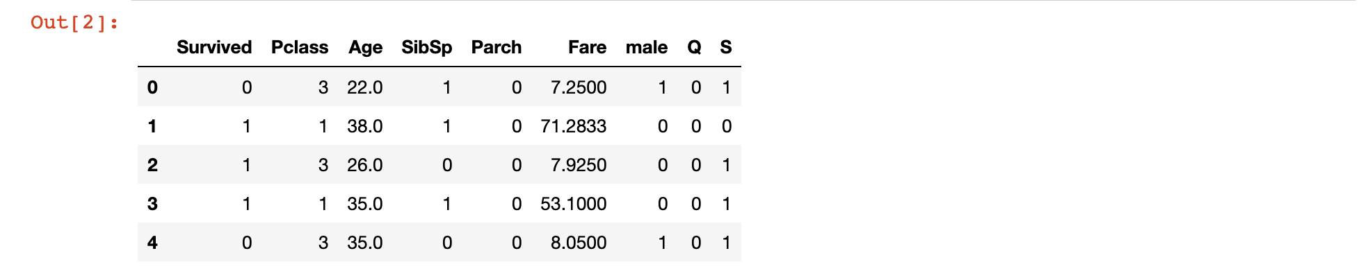
In the last article, you learned about the history and theory behind a linear regression machine learning algorithm.
This tutorial will teach you how to create, train, and test your first linear regression machine learning model in Python using the scikit-learn library.
Section 1: Linear Regression
The Data Set We Will Use in This Tutorial
Since we're just starting to learn about linear regression in machine learning, we will work with artificially-created datasets in this tutorial. This will allow you to focus on learning the machine learning concepts and avoid spending unnecessary time on cleaning or manipulating data.
More specifically, we will be working with a data set of housing data and attempting to predict housing prices. Before we build the model, we’ll first need to import the required libraries.
The Libraries We Will Use in This Tutorial
The first library that we need to import is pandas, which is a portmanteau of “panel data” and is the most popular Python library for working with tabular data.
It is convention to import pandas under the alias pd. You can import pandas with the following statement:
import pandas as pd
Next, we’ll need to import NumPy, which is a popular library for numerical computing. Numpy is known for its NumPy array data structure as well as its useful methods reshape, arange, and append.
It is convention to import NumPy under the alias np. You can import numpy with the following statement:
import numpy as np
Next, we need to import matplotlib, which is Python’s most popular library for data visualization.
matplotlib is typically imported under the alias plt. You can import matplotlib with the following statement:
import matplotlib.pyplot as plt

%matplotlib inline
The %matplotlib inline statement will cause of of our matplotlib visualizations to embed themselves directly in our Jupyter Notebook, which makes them easier to access and interpret.
Lastly, you will want to import seaborn, which is another Python data visualization library that makes it easier to create beautiful visualizations using matplotlib.
You can import seaborn with the following statement:
import seaborn as sns
To summarize, here are all of the imports required in this tutorial:
import pandas as pd

import numpy as np

import matplotlib.pyplot as plt

%matplotlib inline

import seaborn as sns
In future articles, I will specify which imports are necessary but I will not explain each import in detail like I did here.
Importing the Data Set
As mentioned, we will be using a data set of housing information. We will use
The data set has been uploaded to my website as a .csv file at the following URL:
https://nickmccullum.com/files/Housing_Data.csv
To import the data set into your Jupyter Notebook, the first thing you should do is download the file by copying and pasting this URL into your browser. Then, move the file into the same directory as your Jupyter Notebook.
Once this is done, the following Python statement will import the housing data set into your Jupyter Notebook:
raw_data = pd.read_csv('Housing_Data.csv')
This data set has a number of features, including:
- The average income in the area of the house
- The average number of total rooms in the area
- The price that the house sold for
- The address of the house
This data is randomly generated, so you will see a few nuances that might not normally make sense (such as a large number of decimal places after a number that should be an integer).
Understanding the Data Set
Now that the data set has been imported under the raw_data variable, you can use the info method to get some high-level information about the data set. Specifically, running raw_data.info() gives:
<class 'pandas.core.frame.DataFrame'>

RangeIndex: 5000 entries, 0 to 4999

Data columns (total 7 columns):

Avg. Area Income                5000 non-null float64

Avg. Area House Age             5000 non-null float64

Avg. Area Number of Rooms       5000 non-null float64

Avg. Area Number of Bedrooms    5000 non-null float64

Area Population                 5000 non-null float64

Price                           5000 non-null float64

Address                         5000 non-null object

dtypes: float64(6), object(1)

memory usage: 273.6+ KB
Another useful way that you can learn about this data set is by generating a pairplot. You can use the seaborn method pairplot for this, and pass in the entire DataFrame as a parameter. Here is the entire statement for this:
sns.pairplot(raw_data)
The output of this statement is below:
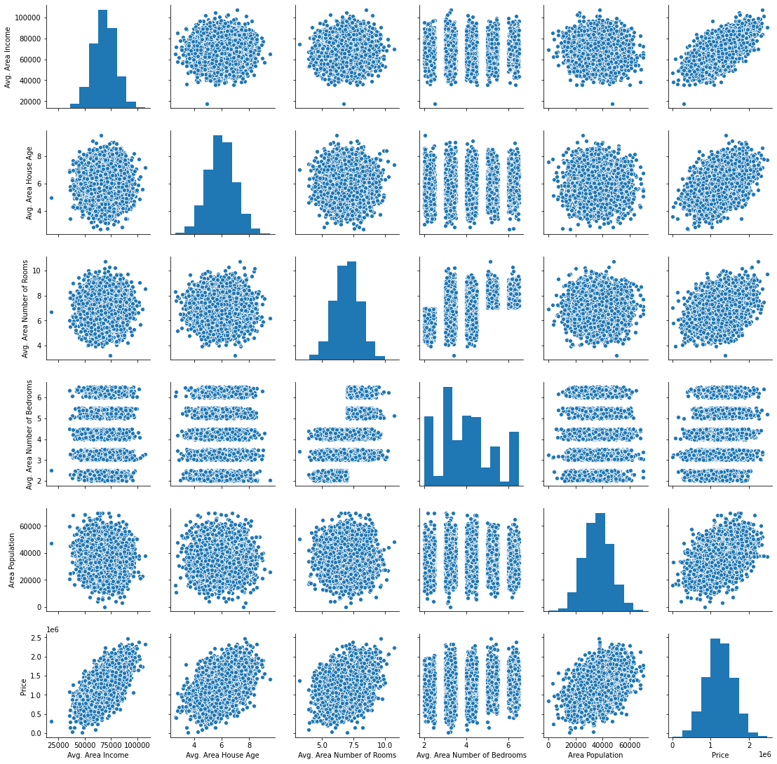
Next, let’s begin building our linear regression model.
Building a Machine Learning Linear Regression Model
The first thing we need to do is split our data into an x-array (which contains the data that we will use to make predictions) and a y-array (which contains the data that we are trying to predict.
First, we should decide which columns to include. You can generate a list of the DataFrame’s columns using raw_data.columns, which outputs:
Index(['Avg. Area Income', 'Avg. Area House Age', 'Avg. Area Number of Rooms',

       'Avg. Area Number of Bedrooms', 'Area Population', 'Price', 'Address'],

      dtype='object')
We will be using all of these variables in the x-array except for Price (since that’s the variable we’re trying to predict) and Address (since it is only contains text).
Let’s create our x-array and assign it to a variable called x.
x = raw_data[['Avg. Area Income', 'Avg. Area House Age', 'Avg. Area Number of Rooms',

       'Avg. Area Number of Bedrooms', 'Area Population']]
Next, let’s create our y-array and assign it to a variable called y.
y = raw_data['Price']
We have successfully divided our data set into an x-array (which are the input values of our model) and a y-array (which are the output values of our model). We’lll learn how to split our data set further into training data and test data in the next section.
Splitting our Data Set into Training Data and Test Data
scikit-learn makes it very easy to divide our data set into training data and test data. To do this, we’ll need to import the function train_test_split from the model_selection module of scikit-learn.
Here is the full code to do this:
from sklearn.model_selection import train_test_split
The train_test_split data accepts three arguments:
- Our
x-array - Our
y-array - The desired size of our test data
With these parameters, the train_test_split function will split our data for us! Here’s the code to do this if we want our test data to be 30% of the entire data set:
x_train, x_test, y_train, y_test = train_test_split(x, y, test_size = 0.3)
Let’s unpack what is happening here.
The train_test_split function returns a Python list of length 4, where each item in the list is x_train, x_test, y_train, and y_test, respectively. We then use list unpacking to assign the proper values to the correct variable names.
Now that we have properly divided our data set, it is time to build and train our linear regression machine learning model.
Building and Training the Model
The first thing we need to do is import the LinearRegression estimator from scikit-learn. Here is the Python statement for this:
from sklearn.linear_model import LinearRegression
Next, we need to create an instance of the Linear Regression Python object. We will assign this to a variable called model. Here is the code for this:
model = LinearRegression()
We can use scikit-learn’s fit method to train this model on our training data.
model.fit(x_train, y_train)
Our model has now been trained. You can examine each of the model’s coefficients using the following statement:
print(model.coef_)
This prints:
[2.16176350e+01 1.65221120e+05 1.21405377e+05 1.31871878e+03

 1.52251955e+01]
Similarly, here is how you can see the intercept of the regression equation:
print(model.intercept_)
This prints:
-2641372.6673013503
A nicer way to view the coefficients is by placing them in a DataFrame. This can be done with the following statement:
pd.DataFrame(model.coef_, x.columns, columns = ['Coeff'])
The output in this case is much easier to interpret:
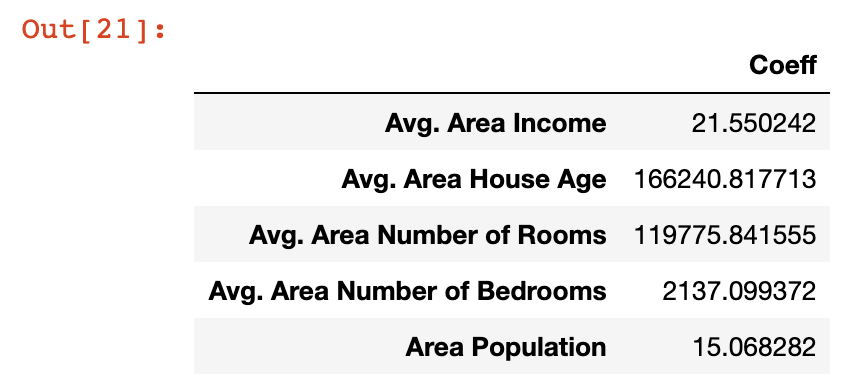
Let’s take a moment to understand what these coefficients mean. Let’s look at the Area Population variable specifically, which has a coefficient of approximately 15.
What this means is that if you hold all other variables constant, then a one-unit increase in Area Population will result in a 15-unit increase in the predicted variable - in this case, Price.
Said differently, large coefficients on a specific variable mean that that variable has a large impact on the value of the variable you’re trying to predict. Similarly, small values have small impact.
Now that we’ve generated our first machine learning linear regression model, it’s time to use the model to make predictions from our test data set.
Making Predictions From Our Model
scikit-learn makes it very easy to make predictions from a machine learning model. You simply need to call the predict method on the model variable that we created earlier.
Since the predict variable is designed to make predictions, it only accepts an x-array parameter. It will generate the y values for you!
Here is the code you’ll need to generate predictions from our model using the predict method:
predictions = model.predict(x_test)
The predictions variable holds the predicted values of the features stored in x_test. Since we used the train_test_split method to store the real values in y_test, what we want to do next is compare the values of the predictions array with the values of y_test.
An easy way to do this is plot the two arrays using a scatterplot. It’s easy to build matplotlib scatterplots using the plt.scatter method. Here’s the code for this:
plt.scatter(y_test, predictions)
Here’s the scatterplot that this code generates:
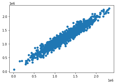
As you can see, our predicted values are very close to the actual values for the observations in the data set. A perfectly straight diagonal line in this scatterplot would indicate that our model perfectly predicted the y-array values.
Another way to visually assess the performance of our model is to plot its residuals, which are the difference between the actual y-array values and the predicted y-array values.
An easy way to do this is with the following statement:
plt.hist(y_test - predictions)
Here is the visualization that this code generates:
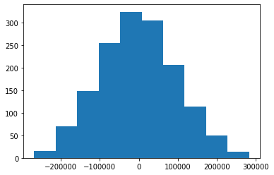
This is a histogram of the residuals from our machine learning model.
You may notice that the residuals from our machine learning model appear to be normally distributed. This is a very good sign!
It indicates that we have selected an appropriate model type (in this case, linear regression) to make predictions from our data set. We will learn more about how to make sure you’re using the right model later in this course.
Testing the Performance of our Model
We learned near the beginning of this course that there are three main performance metrics used for regression machine learning models:
- Mean absolute error
- Mean squared error
- Root mean squared error
We will now see how to calculate each of these metrics for the model we’ve built in this tutorial. Before proceeding, run the following import statement within your Jupyter Notebook:
from sklearn import metrics
Mean Absolute Error (MAE)
You can calculate mean absolute error in Python with the following statement:
metrics.mean_absolute_error(y_test, predictions)
Mean Squared Error (MSE)
Similarly, you can calculate mean squared error in Python with the following statement:
metrics.mean_squared_error(y_test, predictions)
Root Mean Squared Error (RMSE)
Unlike mean absolute error and mean squared error, scikit-learn does not actually have a built-in method for calculating root mean squared error.
Fortunately, it really doesn’t need to. Since root mean squared error is just the square root of mean squared error, you can use NumPy’s sqrt method to easily calculate it:
np.sqrt(metrics.mean_squared_error(y_test, predictions))
The Complete Code For This Tutorial
Here is the entire code for this Python linear regression machine learning tutorial. You can also view it in this GitHub repository.
import pandas as pd

import numpy as np

import matplotlib.pyplot as plt

import seaborn as sns

%matplotlib inline

raw_data = pd.read_csv('Housing_Data.csv')

x = raw_data[['Avg. Area Income', 'Avg. Area House Age', 'Avg. Area Number of Rooms',

       'Avg. Area Number of Bedrooms', 'Area Population']]

y = raw_data['Price']

from sklearn.model_selection import train_test_split

x_train, x_test, y_train, y_test = train_test_split(x, y, test_size = 0.3)

from sklearn.linear_model import LinearRegression

model = LinearRegression()

model.fit(x_train, y_train)

print(model.coef_)

print(model.intercept_)

pd.DataFrame(model.coef_, x.columns, columns = ['Coeff'])

predictions = model.predict(x_test)

# plt.scatter(y_test, predictions)

plt.hist(y_test - predictions)

from sklearn import metrics

metrics.mean_absolute_error(y_test, predictions)

metrics.mean_squared_error(y_test, predictions)

np.sqrt(metrics.mean_squared_error(y_test, predictions))
Section 2: Logistic Regression
Note - if you have been coding along with this tutorial so far and built your linear regression model already, you'll want to open a new Jupyter Notebook (with no code in it) before proceeding.
The Data Set We Will Be Using in This Tutorial
The Titanic data set is a very famous data set that contains characteristics about the passengers on the Titanic. It is often used as an introductory data set for logistic regression problems.
In this tutorial, we will be using the Titanic data set combined with a Python logistic regression model to predict whether or not a passenger survived the Titanic crash.
The original Titanic data set is publicly available on Kaggle.com, which is a website that hosts data sets and data science competitions.
To make things easier for you as a student in this course, we will be using a semi-cleaned version of the Titanic data set, which will save you time on data cleaning and manipulation.
The cleaned Titanic data set has actually already been made available for you. You can download the data file by clicking the links below:
Once this file has been downloaded, open a Jupyter Notebook in the same working directory and we can begin building our logistic regression model.
The Imports We Will Be Using in This Tutorial
As before, we will be using multiple open-source software libraries in this tutorial. Here are the imports you will need to run to follow along as I code through our Python logistic regression model:
import pandas as pd

import numpy as np

import matplotlib.pyplot as plt

%matplotlib inline

import seaborn as sns
Next, we will need to import the Titanic data set into our Python script.
Importing the Data Set into our Python Script
We will be using pandas’ read_csv method to import our csv files into pandas DataFrames called titanic_data.
Here is the code to do this:
titanic_data = pd.read_csv('titanic_train.csv')
Next, let’s investigate what data is actually included in the Titanic data set. There are two main methods to do this (using the titanic_data DataFrame specifically):
- The
titanic_data.head(5)method will print the first 5 rows of the DataFrame. You can substitute5with whichever number you’d like. - You can also print
titanic_data.columns, which will show you the column named.
Running the second command (titanic_data.columns) generates the following output:
Index(['PassengerId', 'Survived', 'Pclass', 'Name', 'Sex', 'Age', 'SibSp',

       'Parch', 'Ticket', 'Fare', 'Cabin', 'Embarked'],

      dtype='object'
These are the names of the columns in the DataFrame. Here are brief explanations of each data point:
PassengerId: a numerical identifier for every passenger on the Titanic.Survived: a binary identifier that indicates whether or not the passenger survived the Titanic crash. This variable will hold a value of1if they survived and0if they did not.Pclass: the passenger class of the passenger in question. This can hold a value of1,2, or3, depending on where the passenger was located in the ship.Name: the passenger’s name.`Sex: male or female.Age: the age (in years) of the passenger.SibSp: the number of siblings and spouses aboard the ship.Parch: the number of parents and children aboard the ship.Ticket: the passenger’s ticket number.Fare: how much the passenger paid for their ticket on the Titanic.Cabin: the passenger’s cabin number.Embarked: the port where the passenger embarked (C = Cherbourg, Q = Queenstown, S = Southampton)
Next up, we will learn more about our data set by using some basic exploratory data analysis techniques.
Learning About Our Data Set With Exploratory Data Analysis
The Prevalence of Each Classification Category
When using machine learning techniques to model classification problems, it is always a good idea to have a sense of the ratio between categories. For this specific problem, it’s useful to see how many survivors vs. non-survivors exist in our training data.
An easy way to visualize this is using the seaborn plot countplot. In this example, you could create the appropriate seasborn plot with the following Python code:
sns.countplot(x='Survived', data=titanic_data)
This generates the following plot:
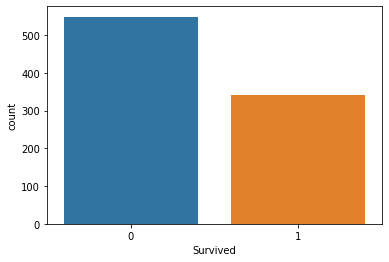
As you can see, we have many more incidences of non-survivors than we do of survivors.
Survival Rates Between Genders
It is also useful to compare survival rates relative to some other data feature. For example, we can compare survival rates between the Male and Female values for Sex using the following Python code:
sns.countplot(x='Survived', hue='Sex', data=titanic_data)
This generates the following plot:
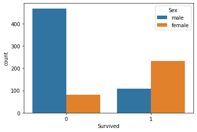
As you can see, passengers with a Sex of Male were much more likely to be non-survivors than passengers with a Sex of Female.
Survival Rates Between Passenger Classes
We can perform a similar analysis using the Pclass variable to see which passenger class was the most (and least) likely to have passengers that were survivors.
Here is the code to do this:
sns.countplot(x='Survived', hue='Pclass', data=titanic_data)
This generates the following plot:
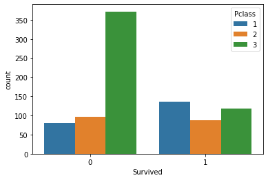
The most noticeable observation from this plot is that passengers with a Pclass value of 3 - which indicates the third class, which was the cheapest and least luxurious - were much more likely to die when the Titanic crashed.
The Age Distribution of Titanic Passengers
One other useful analysis we could perform is investigating the age distribution of Titanic passengers. A histogram is an excellent tool for this.
You can generate a histogram of the Age variable with the following code:
plt.hist(titanic_data['Age'].dropna())
Note that the dropna() method is necessary since the data set contains several nulls values.
Here is the histogram that this code generates:
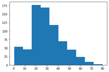
As you can see, there is a concentration of Titanic passengers with an Age value between 20 and 40.
The Ticket Price Distribution of Titanic Passengers
The last exploratory data analysis technique that we will use is investigating the distribution of fare prices within the Titanic data set.
You can do this with the following code:
plt.hist(titanic_data['Fare'])
This generates the following plot:
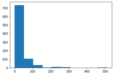
As you can see, there are three distinct groups of Fare prices within the Titanic data set. This makes sense because there are also three unique values for the Pclass variable. The difference Fare groups correspond to the different Pclass categories.
Since the Titanic data set is a real-world data set, it contains some missing data. We will learn how to deal with missing data in the next section.
Removing Null Data From Our Data Set
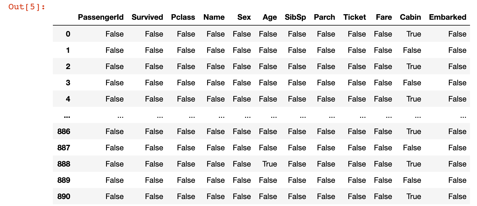
To start, let’s examine where our data set contains missing data. To do this, run the following command:
titanic_data.isnull()
This will generate a DataFrame of boolean values where the cell contains True if it is a null value and False otherwise. Here is an image of what this looks like:
A far more useful method for assessing missing data in this data set is by creating a quick visualization. To do this, we can use the seaborn visualization library. Here is quick command that you can use to create a heatmap using the seaborn library:
sns.heatmap(titanic_data.isnull(), cbar=False)
Here is the visualization that this generates:
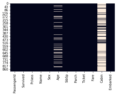
In this visualization, the white lines indicate missing values in the dataset. You can see that the Age and Cabin columns contain the majority of the missing data in the Titanic data set.
The Age column in particular contains a small enough amount of missing that that we can fill in the missing data using some form of mathematics. On the other hand, the Cabin data is missing enough data that we could probably remove it from our model entirely.
The process of filling in missing data with average data from the rest of the data set is called imputation. We will now use imputation to fill in the missing data from the Age column.
The most basic form of imputation would be to fill in the missing Age data with the average Age value across the entire data set. However, there are better methods.
We will fill in the missing Age values with the average Age value for the specific Pclass passenger class that the passenger belongs to. To understand why this is useful, consider the following boxplot:
sns.boxplot(titanic_data['Pclass'], titanic_data['Age'])
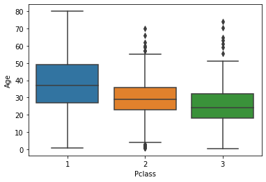
As you can see, the passengers with a Pclass value of 1 (the most expensive passenger class) tend to be the oldest while the passengers with a Pclass value of 3 (the cheapest) tend to be the youngest. This is very logical, so we will use the average Age value within different Pclass data to imputate the missing data in our Age column.
The easiest way to perform imputation on a data set like the Titanic data set is by building a custom function. To start, we will need to determine the mean Age value for each Pclass value.
#Pclass value 1

titanic_data[titanic_data['Pclass'] == 1]['Age'].mean()

#Pclass value 2

titanic_data[titanic_data['Pclass'] == 2]['Age'].mean()

#Pclass 3

titanic_data[titanic_data['Pclass'] == 2]['Age'].mean()
Here is the final function that we will use to imputate our missing Age variables:
def impute_missing_age(columns):

    age = columns[0]

    passenger_class = columns[1]


    if pd.isnull(age):

        if(passenger_class == 1):

            return titanic_data[titanic_data['Pclass'] == 1]['Age'].mean()

        elif(passenger_class == 2):

            return titanic_data[titanic_data['Pclass'] == 2]['Age'].mean()

        elif(passenger_class == 3):

            return titanic_data[titanic_data['Pclass'] == 3]['Age'].mean()


    else:

        return age
Now that this imputation function is complete, we need to apply it to every row in the titanic_data DataFrame. Python’s apply method is an excellent tool for this:
titanic_data['Age'] = titanic_data[['Age', 'Pclass']].apply(impute_missing_age, axis = 1)
Now that we have performed imputation on every row to deal with our missing Age data, let’s investigate our original boxplot:
sns.heatmap(titanic_data.isnull(), cbar=False)
You wil notice there is no longer any missing data in the Age column of our pandas DataFrame!
You might be wondering why we spent so much time dealing with missing data in the Age column specifically. It is because given the impact of Age on survival for most disasters and diseases, it is a variable that is likely to have high predictive value within our data set.
Now that we have an understanding of the structure of this data set and have removed its missing data, let’s begin building our logistic regression machine learning model.
Building a Logistic Regression Model
It is now time to remove our logistic regression model.
Removing Columns With Too Much Missing Data
First, let’s remove the Cabin column. As we mentioned, the high prevalence of missing data in this column means that it is unwise to impute the missing data, so we will remove it entirely with the following code:
titanic_data.drop('Cabin', axis=1, inplace = True)
Next, let’s remove any additional columns that contain missing data with the pandas dropna() method:
titanic_data.dropna(inplace = True)
Handling Categorical Data With Dummy Variables
The next task we need to handle is dealing with categorical features. Namely, we need to find a way to numerically work with observations that are not naturally numerical.
A great example of this is the Sex column, which has two values: Male and Female. Similarly, the Embarked column contains a single letter which indicates which city the passenger departed from.
To solve this problem, we will create dummy variables. These assign a numerical value to each category of a non-numerical feature.
Fortunately, pandas has a built-in method called get_dummies() that makes it easy to create dummy variables. The get_dummies method does have one issue - it will create a new column for each value in the DataFrame column.
Let’s consider an example to help understand this better. If we call the get_dummies() method on the Age column, we get the following output:
pd.get_dummies(titanic_data['Sex'])
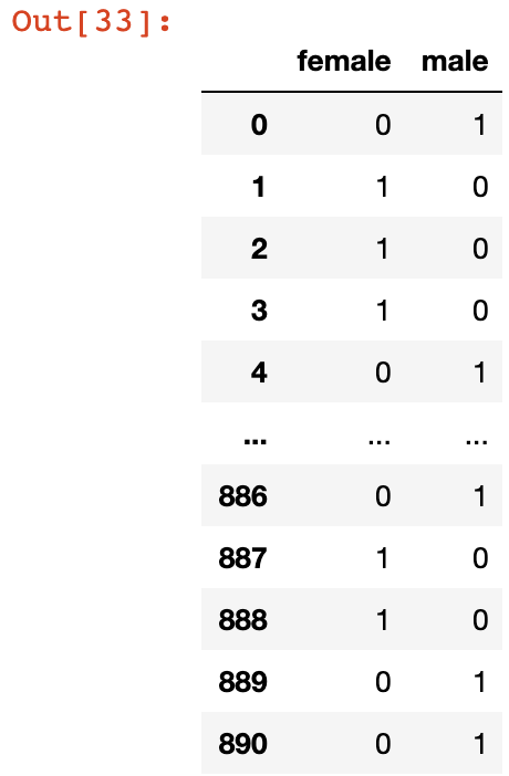
As you can see, this creates two new columns: female and male. These columns will both be perfect predictors of each other, since a value of 0 in the female column indicates a value of 1 in the male column, and vice versa.
This is called multicollinearity and it significantly reduces the predictive power of your algorithm. To remove this, we can add the argument drop_first = True to the get_dummies method like this:
pd.get_dummies(titanic_data['Sex'], drop_first = True)
Now, let’s create dummy variable columns for our Sex and Embarked columns, and assign them to variables called sex and embarked.
sex_data = pd.get_dummies(titanic_data['Sex'], drop_first = True)

embarked_data = pd.get_dummies(titanic_data['Embarked'], drop_first = True)
There is one important thing to note about the embarked variable defined below. It has two columns: Q and S, but since we’ve already removed one other column (the C column), neither of the remaining two columns are perfect predictors of each other, so multicollinearity does not exist in the new, modified data set.
Adding Dummy Variables to the pandas DataFrame
Next we need to add our sex and embarked columns to the DataFrame.
You can concatenate these data columns into the existing pandas DataFrame with the following code:
titanic_data = pd.concat([titanic_data, sex_data, embarked_data], axis = 1)
Now if you run the command print(titanic_data.columns), your Jupyter Notebook will generate the following output:
Index(['PassengerId', 'Survived', 'Pclass', 'Name', 'Sex', 'Age', 'SibSp',

       'Parch', 'Ticket', 'Fare', 'Embarked', 'male', 'Q', 'S'],

      dtype='object')
The existence of the male, Q, and S columns shows that our data was concatenated successfully.
Removing Unnecessary Columns From The Data Set
This means that we can now drop the original Sex and Embarked columns from the DataFrame. There are also other columns (like Name , PassengerId, Ticket) that are not predictive of Titanic crash survival rates, so we will remove those as well. The following code handles this for us:
titanic_data.drop(['Name', 'Ticket', 'Sex', 'Embarked'], axis = 1, inplace = True)
If you print titanic_data.columns now, your Jupyter Notebook will generate the following output:
Index(['Survived', 'Pclass', 'Age', 'SibSp', 'Parch', 'Fare',

       'male', 'Q', 'S'],

      dtype='object'
The DataFrame now has the following appearance:
As you can see, every field in this data set is now numeric, which makes it an excellent candidate for a logistic regression machine learning algorithm.
Creating Training Data and Test Data
Next, it’s time to split our titanic_data into training data and test data. As before, we will use built-in functionality from scikit-learn to do this.
First, we need to divide our data into x values (the data we will be using to make predictions) and y values (the data we are attempting to predict). The following code handles this:
y_data = titanic_data['Survived']

x_data = titanic_data.drop('Survived', axis = 1)
Next, we need to import the train_test_split function from scikit-learn. The following code executes this import:
from sklearn.model_selection import train_test_split
Lastly, we can use the train_test_split function combined with list unpacking to generate our training data and test data:
x_training_data, x_test_data, y_training_data, y_test_data = train_test_split(x_data, y_data, test_size = 0.3)
Note that in this case, the test data is 30% of the original data set as specified with the parameter test_size = 0.3.
We have now created our training data and test data for our logistic regression model. We will train our model in the next section of this tutorial.
Training the Logistic Regression Model
To train our model, we will first need to import the appropriate model from scikit-learn with the following command:
from sklearn.linear_model import LogisticRegression
Next, we need to create our model by instantiating an instance of the LogisticRegression object:
model = LogisticRegression()
To train the model, we need to call the fit method on the LogisticRegression object we just created and pass in our x_training_data and y_training_data variables, like this:
model.fit(x_training_data, y_training_data)
Our model has now been trained. We will begin making predictions using this model in the next section of this tutorial.
Making Predictions With Our Logistic Regression Model
Let’s make a set of predictions on our test data using the model logistic regression model we just created. We will store these predictions in a variable called predictions:
predictions = model.predict(x_test_data)
Our predictions have been made. Let’s examine the accuracy of our model next.
Measuring the Performance of a Logistic Regression Machine Learning Model
scikit-learn has an excellent built-in module called classification_report that makes it easy to measure the performance of a classification machine learning model. We will use this module to measure the performance of the model that we just created.
First, let’s import the module:
from sklearn.metrics import classification_report
Next, let’s use the module to calculate the performance metrics for our logistic regression machine learning module:
classification_report(y_test_data, predictions)
Here is the output of this command:
             precision    recall  f1-score   support

           0       0.83      0.87      0.85       169

           1       0.75      0.68      0.72        98

    accuracy                           0.80       267

   macro avg       0.79      0.78      0.78       267

weighted avg       0.80      0.80      0.80       267
If you’re interested in seeing the raw confusion matrix and calculating the performance metrics manually, you can do this with the following code:
from sklearn.metrics import confusion_matrix

print(confusion_matrix(y_test_data, predictions))
This generates the following output:
[[145  22]

 [ 30  70]]
The Full Code for This Tutorial
You can view the full code for this tutorial in this GitHub repository. It is also pasted below for your reference:
import pandas as pd

import numpy as np

import matplotlib.pyplot as plt

%matplotlib inline

import seaborn as sns

#Import the data set

titanic_data = pd.read_csv('titanic_train.csv')

#Exploratory data analysis

sns.heatmap(titanic_data.isnull(), cbar=False)

sns.countplot(x='Survived', data=titanic_data)

sns.countplot(x='Survived', hue='Sex', data=titanic_data)

sns.countplot(x='Survived', hue='Pclass', data=titanic_data)

plt.hist(titanic_data['Age'].dropna())

plt.hist(titanic_data['Fare'])

sns.boxplot(titanic_data['Pclass'], titanic_data['Age'])

#Imputation function

def impute_missing_age(columns):

    age = columns[0]

    passenger_class = columns[1]


    if pd.isnull(age):

        if(passenger_class == 1):

            return titanic_data[titanic_data['Pclass'] == 1]['Age'].mean()

        elif(passenger_class == 2):

            return titanic_data[titanic_data['Pclass'] == 2]['Age'].mean()

        elif(passenger_class == 3):

            return titanic_data[titanic_data['Pclass'] == 3]['Age'].mean()


    else:

        return age

#Impute the missing Age data

titanic_data['Age'] = titanic_data[['Age', 'Pclass']].apply(impute_missing_age, axis = 1)

#Reinvestigate missing data

sns.heatmap(titanic_data.isnull(), cbar=False)

#Drop null data

titanic_data.drop('Cabin', axis=1, inplace = True)

titanic_data.dropna(inplace = True)

#Create dummy variables for Sex and Embarked columns

sex_data = pd.get_dummies(titanic_data['Sex'], drop_first = True)

embarked_data = pd.get_dummies(titanic_data['Embarked'], drop_first = True)

#Add dummy variables to the DataFrame and drop non-numeric data

titanic_data = pd.concat([titanic_data, sex_data, embarked_data], axis = 1)

titanic_data.drop(['Name', 'PassengerId', 'Ticket', 'Sex', 'Embarked'], axis = 1, inplace = True)

#Print the finalized data set

titanic_data.head()

#Split the data set into x and y data

y_data = titanic_data['Survived']

x_data = titanic_data.drop('Survived', axis = 1)

#Split the data set into training data and test data

from sklearn.model_selection import train_test_split

x_training_data, x_test_data, y_training_data, y_test_data = train_test_split(x_data, y_data, test_size = 0.3)

#Create the model

from sklearn.linear_model import LogisticRegression

model = LogisticRegression()

#Train the model and create predictions

model.fit(x_training_data, y_training_data)

predictions = model.predict(x_test_data)

#Calculate performance metrics

from sklearn.metrics import classification_report

print(classification_report(y_test_data, predictions))

#Generate a confusion matrix

from sklearn.metrics import confusion_matrix

print(confusion_matrix(y_test_data, predictions))
Final Thoughts
In this tutorial, you learned how to build linear regression and logistic regression machine learning models in Python.
If you're interested in learning more about building, training, and deploying cutting-edge machine learning model, my eBook Pragmatic Machine Learning will teach you how to build 9 different machine learning models using real-world projects.
You can deploy the code from the eBook to your GitHub or personal portfolio to show to prospective employers. The book launches on August 3rd – preorder it for 50% off now!
Here is a brief summary of what you learned in this article:
- How to import the libraries required to build a linear regression machine learning algorithm
- How to split a data set into training data and test data using
scikit-learn - How to use
scikit-learnto train a linear regression model and make predictions using that model - How to calculate linear regression performance metrics using
scikit-learn - Why the Titanic data set is often used for learning machine learning classification techniques
- How to perform exploratory data analysis when working with a data set for classification machine learning problems
- How to handle missing data in a pandas DataFrame
- What
imputationmeans and how you can use it to fill in missing data - How to create dummy variables for categorical data in machine learning data sets
- How to train a logistic regression machine learning model in Python
- How to make predictions using a logistic regression model in Python
- How to the
scikit-learn’sclassification_reportto quickly calculate performance metrics for machine learning classification problems