
By Christian Sepulveda
Microinteractions guide a user through your application. They reinforce your user experience and provide delight.
You may have seen some of the slick examples of microinteractions on Dribble or CodePen. But do you know how to build your own library of similar UI widgets?
In this article, I’ll focus on animated microinteractions using React, Facebook’s popular, component-oriented UI framework. I’ll build three interactions for a searchbox:
- open and close the text box
- move to the top of the screen
- shake (indicating an error)

I’ll use a few different implementations:
Here’s a live demo and the code that powers it.
This is one of several posts about Higher Order (HOC) and Stateless Functional Components. The first post is about code reuse in React and React Native, via these techniques.
What is a Microinteraction?
Dan Saffer (who wrote the book) gives us this definition: “Microinteractions are contained product moments that revolve around a single use case — they have one main task.”
Examples might be clearer. Some microinteractions are everywhere, such as a cursor change when hovering over a link or the vibration of your phone when you switch to silent mode. Others, such as an item being added to a shopping cart, aren’t so common (yet).
Why should I care about Microinteractions?
Microinteractions can provide feedback and make your application memorable. When users have so many app choices, better microinteractions might be the clichéd better mousetrap you should build.
But I am not a UX designer. So I suggest reading Nick Babich’s post about microinteractions.
Getting Started
I’ll use create-react-app to bootstrap a React application, but any React setup method will work. Also, I like Material-UI, so I’ll import that too. (This choice is arbitrary — you could use another widget library or manually style your elements.)
create-react-app search-box-animation
cd search-box-animation
npm install --save material-ui react-tap-event-plugin
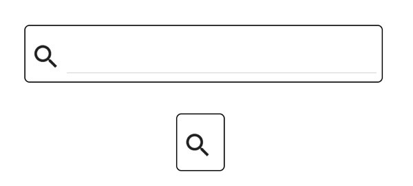
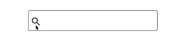
The Component: a Simple Search Box
I’ll create a simple search box. It will comprise two elements: a search icon button and a text box. I’ll create a stateless functional component for the search box. (Stateless functional components are functions that render React components and do not maintain state, i.e. use setState. You can learn more in this tutorial or my previous post.)
SearchBox.js
import React from 'react';
import {TextField, IconButton} from 'material-ui'
import SearchIcon from 'material-ui/svg-icons/action/search';
const SearchBox = ({isOpen, onClick}) => {
    const baseStyles = {
        open: {
            width: 300,
        },
        closed: {
            width: 0,
        },
        smallIcon: {
            width: 30,
            height: 30
        },
        icon: {
            width: 40,
            height: 40,
            padding: 5,
            top: 10
        },
        frame: {
            border: 'solid 1px black',
            borderRadius: 5
        }
    };
const textStyle = isOpen ? baseStyles.open : baseStyles.closed;
const divStyle = Object.assign({}, textStyle, baseStyles.frame);
    divStyle.width += baseStyles.icon.width + 5;
return (
        <div style={divStyle}>
            <IconButton iconStyle={baseStyles.smallIcon} style={baseStyles.icon} onClick={() => onClick()}>
                <SearchIcon />
            </IconButton>
            <TextField name='search' style={textStyle}/>
        </div>
    );
};
export  default SearchBox;
(I’ll use the onClick callback later.)
The isOpen prop sets the SearchBox open or closed rendering.
Using Higher Order Components to Separate Concerns
I could change SearchBox to a regular component and add code that would open and close the text box when clicked, for example.
But I prefer to separate the animation from the core purpose of the search box. The search box shows/captures a query value and submits this query to some other controller. This is a subjective design decision, but it has practical benefits: I can reuse the microinteraction logic with another user input component.
Higher Order Components (HOC) are functions that return a new component. This component wraps a component(s) and adds functionality. I will create an HOC to add the open/close behavior to the SearchBox.
Create expanding-animation.js
import React, {Component} from 'react';
const makeExpanding = (Target) => {
    return class extends Component {
        constructor(props) {
            super(props);
            this.state = {isOpen: false};
        }

        onClick = () => {
            this.setState({isOpen: !this.state.isOpen});
        };

        render() {
            return (
                <Target {...this.props}
                        isOpen={this.state.isOpen}
                        onClick={this.onClick}
                />
            );
        }
    }
};
export default makeExpanding;
Update App.js as follows:
import React, {Component} from 'react';
import MuiThemeProvider from 'material-ui/styles/MuiThemeProvider';

// (Make material-ui happy)
// Needed for onTouchTap
// http://stackoverflow.com/a/34015469/988941
import injectTapEventPlugin from 'react-tap-event-plugin';
injectTapEventPlugin();

import SearchBox from './SearchBox'
import makeExpanding from './expanding-animation';

const ExpandingSearchBox = makeExpanding(SearchBox);

class App extends Component {
    render() {
        //https://css-tricks.com/quick-css-trick-how-to-center-an-object-exactly-in-the-center/
        const style = {
            position: 'fixed',
            top: '50%',
            left: '50%',
            transform: 'translate(-50%, -50%)',
        };

        return (
            <MuiThemeProvider>
                <div style={style}>
                    <ExpandingSearchBox/>
                </div>
            </MuiThemeProvider>
        );
    }
}
export default App;
If you run npm start, you’ll have a search icon that you can click to open and close the text box.
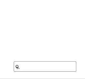
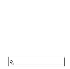
It works, but the opening and closing is jarring. An animation can smooth the effect.
Animations
There are three general approaches to animations.
- CSS transitions
- CSS animations
- rapid and repeated rendering of an element to simulate motion (manual key framing)
CSS transitions change a property value (like width) over some time duration. The change doesn’t have to be linear; you can specify functions for changing the values.
CSS animations change the style for an element (like size, color, and position). Each incremental style is a keyframe. You create a keyframe series to achieve a desired effect.
Both CSS tactics repeatedly render elements to simulate motion. You can do the calculations yourself, i.e. option (3). Several Javascript animation frameworks use this approach, managing the calculations. (I’ll use react-motion in a later example.)
I will use all these techniques in the examples below, but I’ll start with CSS transitions.
Expanding the Search Box
The expanding text box animation needs one CSS property: transition
Change expanding-animation.js as follows,
import React, {Component} from 'react';
const animationStyle = {
    transition: 'width 0.75s cubic-bezier(0.000, 0.795, 0.000, 1.000)'
};
const makeExpanding = (Target) => {
    return class extends Component {
        constructor(props) {
            super(props);
            this.state = {isOpen: false};
        }

        onClick = () => {
            this.setState({isOpen: !this.state.isOpen});
        };

        render() {
            return (
                <Target {...this.props}
                        isOpen={this.state.isOpen}
                        onClick={this.onClick}
                        additionalStyles={{text: animationStyle, frame: animationStyle}}/>
            );
        }
    }
};
export default makeExpanding;
Looking at the change in line 21, additionalStyles, SearchBox will merge this style with it’s existing styles in line 29 and 31 below. (I’ll return to the transition CSS property in line 2 in a moment.)
Update SearchBox.js
import React from 'react';
import {TextField, IconButton} from 'material-ui'
import SearchIcon from 'material-ui/svg-icons/action/search';
const SearchBox = ({isOpen, onClick, additionalStyles}) => {
    const baseStyles = {
        open: {
            width: 300,
        },
        closed: {
            width: 0,
        },
        smallIcon: {
            width: 30,
            height: 30
        },
        icon: {
            width: 40,
            height: 40,
            padding: 5,
            top: 10
        },
        frame: {
            border: 'solid 1px black',
            borderRadius: 5
        }
    };

    let textStyle = isOpen ? baseStyles.open : baseStyles.closed;
    textStyle = Object.assign(textStyle, additionalStyles ? additionalStyles.text : {});

    const divStyle = Object.assign({}, textStyle, baseStyles.frame, additionalStyles ? additionalStyles.frame : {});
    divStyle.width += baseStyles.icon.width + 5;

    return (
        <div style={divStyle}>
            <IconButton iconStyle={baseStyles.smallIcon} style={baseStyles.icon} onClick={() => onClick()}>
                <SearchIcon />
            </IconButton>
            <TextField name='search' style={textStyle}/>
        </div>
    );
};
export  default SearchBox;
With the styles merged, the animation will take effect.

The result is a smooth expansion of the text box width, giving the appearance it opens. The CSS transition property controls this (from line 2 in expanding-animation.js).
transition: 'width 0.75s cubic-bezier(0.000, 0.795, 0.000, 1.000)'
I encourage you to read the documentation for the CSS transition property, as there are a variety of options. In the example, there are three parameters:
- property to change:
width - duration of transition:
0.75s - function to control timing:
cubic-bezier(0.000, 0.795, 0.000, 1.000)’
While I chose cubic-bezier as the function, linear or ease are among other options. There are interactive tools that help you select these values, such as this cubic-bezier builder.
Moving the Search Box
Check out the following concept animation I found on Dribble:
There are multiple elements in the interaction; but I’d like to focus on the movement of the search box to the top of the screen.
I can move my humble search box with a CSS transition. Create a new HOC, move-up-animation.js
import React, {Component} from 'react';
const animationStyle = {
    transform: 'translateY(-150px)',
    transition: 'transform 1s ease'
};
const makeMoveUp = (Target) => {
    return class extends Component {
        constructor(props) {
            super(props);
            this.state = {moveTop: false};
        }

        onClick = () => {
            this.setState({moveTop: !this.state.moveTop});
        };

        render() {
            return (
                <Target isOpen={true}
                        onClick={this.onClick}
                        additionalStyles={{text: {}, frame: this.state.moveTop ? animationStyle : {}}}/>
            );
        }
    }
};
export default makeMoveUp;
view rawmove-up-animation.js hosted with ❤ by GitHub
This is like the makeExpanding HOC function, except does a translation (move up). Also, the animation style applies only to the outer frame (div).
Update App.js,
import React, {Component} from 'react';
import MuiThemeProvider from 'material-ui/styles/MuiThemeProvider';

// (Make material-ui happy)
// Needed for onTouchTap
// http://stackoverflow.com/a/34015469/988941
import injectTapEventPlugin from 'react-tap-event-plugin';
injectTapEventPlugin();

import SearchBox from './SearchBox'
import makeMoveUp from './move-up-animation';
const MoveUpSearchBox = makeMoveUp(SearchBox);
class App extends Component {
    render() {
        //https://css-tricks.com/quick-css-trick-how-to-center-an-object-exactly-in-the-center/
        const style = {
            position: 'fixed',
            top: '50%',
            left: '50%',
            transform: 'translate(-50%, -50%)',
        };

        return (
            <MuiThemeProvider>
                <div style={style}>
                    <MoveUpSearchBox/>
                </div>
            </MuiThemeProvider>
        );
    }
}
export default App;
view rawApp.js-2 hosted with ❤ by GitHub
and you should see
Perhaps you want a bouncy effect. You could use react-motion. It is a popular React library which uses spring dynamics to control animations. (A good introduction, by Nash Vail, is here.)
npm install --save react-motion
Create spring-up-animation.js
import React, {Component} from 'react';
import {Motion, spring, presets} from 'react-motion'
const makeSpringUp = (Target) => {
    return class extends Component {
        constructor(props) {
            super(props);
            this.state = {moveTop: false};
        }

        onClick = () => {
            this.setState({moveTop: !this.state.moveTop});
        };

        render() {
            const style = {
                translateY: this.state.moveTop ? spring(-150, presets.wobbly) : spring(0)
            };
            return (
                <Motion style={style}>
                    {({translateY}) => (
                        <Target isOpen={true}
                                onClick={this.onClick}
                                additionalStyles={{
                                    text: {},
                                    frame: {
                                        transform: `translateY(${translateY}px)`
                                    }
                                }}/>
                    )}
                </Motion>
            );
        }
    }
};
export default makeSpringUp;
view rawspring-up-animation.js hosted with ❤ by GitHub
As this isn’t a react-motion tutorial, I will briefly summarize how this works. React-motion wraps the animated component, Target, with its own component, Motion. (There are other react-motion components, such as [TransitionMotion](https://github.com/chenglou/react-motion#transitionmotion-) and [Staggered Motion](https://github.com/chenglou/react-motion#staggeredmotion-).)
React-motion interpolates, using spring dynamics, a series of interim values. It provides the values to the animated component as a style. This style determines the visual transition in the animation.
The image below shows the result (with a wobbly spring to highlight the effect).
You could use react-motion for a range of effects. For example, you could change the text box to expand like a spring.
(spring-up-animation.js and move-up-animation.js have the same onClick state logic, so I refactored the common parts. Details are here.)
Shaking the Search Box
I want to provide feedback to the user about erroneous queries. You could use error messages, but I’d like to do something more whimsical: shake the search box.
I could use react-motion, but I’d like to look at another technique: keyframe animation.
React-animations is a React library for keyframe animations. It injects CSS keyframes into a DOM style sheet. (The other examples have only used inline styles.)
npm install --save react-animations
I also need a library, like Radium or Aphrodite, to handle the CSS style sheet injection. I’ve chosen Aphrodite, as I’ve used it before.
npm install --save aphrodite
Create another HOC, shake-animation.js
import React, {Component} from 'react';
import {headShake} from 'react-animations';
import {StyleSheet, css} from 'aphrodite';
const styles = StyleSheet.create({
    headShake: {
        animationName: headShake,
        animationDuration: '1s'
    }
});
const makeValidationErrorAnimation = (Target) => {
    return class extends Component {
        constructor(props) {
            super(props);
            this.state = {shouldShake: false};
        }

        onClick = () => {
            this.setState({shouldShake: true}, () => {
                const self = this;
                setTimeout(() => self.setState({shouldShake: false}), 1000);
            });
        };

        render() {
            return (
                <Target isOpen={true}
                        onClick={this.onClick}
                        additionalStyles={{text: {}, frame: {}}}
                        frameClass={this.state.shouldShake ? css(styles.headShake) : ''}/>
            );
        }
    }
};
export default makeValidationErrorAnimation;
There are a few key sections. Line 4 uses Aphrodite to create the style sheet for the react-animations effect, head-shake. Line 29 sets the CSS class for the animation on Target. (This requires a tweak to SearchBox to use the CSS class. Look at the use of frameClass in the source of SearchBox.js.) The onClick handler on line 17 is more complicated.
Restarting an Animation
I’d like to do the ‘head shake’ on each validation error (or whatever trigger is used). But since the animation is a CSS class, I can’t simply set the same class again; it would have no effect. This CSS Tricks post outlines a few options. The simplest is a timeout that removes the CSS animation class. When you add it again (for a new event), you’ll see the ‘head shake’.
Putting It Together: Composing a Complex Component
I’ve created several HOCs for different animations. But you can also chain the HOCs to create a compound component. It will open the text box when clicked and shake on erroneous input.
First, you’ll need to make a few changes toSearchBox
import React from 'react';
import {TextField, IconButton} from 'material-ui'
import SearchIcon from 'material-ui/svg-icons/action/search';
const baseStyles = {
    open: {
        width: 300,
    },
    closed: {
        width: 0,
    },
    smallIcon: {
        width: 30,
        height: 30
    },
    icon: {
        width: 40,
        height: 40,
        padding: 5,
        top: 10
    },
    frame: {
        border: 'solid 1px black',
        borderRadius: 5
    }
};
const SearchBox = ({isOpen, query, onClick, onSubmit, onQueryUpdate, additionalStyles, frameClass}) => {
    const handleKeyDown = (event) => {
        const ENTER_KEY = 13;
        if (event.keyCode === ENTER_KEY) {
            event.preventDefault();
            onSubmit();
        }
    };
    let textStyle = isOpen ? baseStyles.open : baseStyles.closed;
    textStyle = Object.assign(textStyle, additionalStyles ? additionalStyles.text : {});
    const divStyle = Object.assign({}, textStyle, baseStyles.frame, additionalStyles ? additionalStyles.frame : {});
    divStyle.width += baseStyles.icon.width + 5;
    return (
        <div style={divStyle} className={frameClass ? frameClass : ''}>
            <IconButton iconStyle={baseStyles.smallIcon} style={baseStyles.icon} onClick={() => onClick()}>
                <SearchIcon />
            </IconButton>
            <TextField name='search'
                       style={textStyle}
                       value={query}
                       onKeyDown={handleKeyDown}
                       onChange={(event, value) => onQueryUpdate(value)}/>
        </div>
    );
};
export  default SearchBox;
SearchBox is now a controlled component (fancy term for using React to manage the text box’s input value). It also provides a callback, onSubmit, for submitting the search query (when a user presses the Enter key).
You also need to change shake-animation.js. Clicking the search icon should not cause the shake. Instead, I want another component to determine when to ‘shake’. This separates the validation logic from code that controls the animation.
startShake is a flag to reset the animation. But this is an implementation detail. It should be encapsulated, as internal state, in the makeShakeAnimation HOC.
import React, {Component} from 'react';
import {headShake} from 'react-animations';
import {StyleSheet, css} from 'aphrodite';
const styles = StyleSheet.create({
    headShake: {
        animationName: headShake,
        animationDuration: '1s'
    }
});
const makeShakeAnimation = (Target) => {
    return class extends Component {
        constructor(props) {
            super(props);
            this.state = {startShake: props.shouldShake};
        }

        componentWillReceiveProps(nextProps) {
            this.setState({startShake: nextProps.shouldShake}, () => {
                const self = this;
                setTimeout(() => self.setState({startShake: false}), 1000);
            });
            //https://css-tricks.com/restart-css-animation/ for discussion on restart
        }

        render() {
            return (
                <Target {...this.props}
                        frameClass={this.state.startShake ? css(styles.headShake) : ''}/>
            );
        }
    }
};
export default makeShakeAnimation;
startShake is dependent on shouldShake. I can use componentWillReceiveProps to respond to prop changes. (It’s parent, the validation component, provides these props.) So I moved the previous onClick logic to componentWillReceiveProps.
The change in line 27, {...this.props}, passes all props to the wrapped component, Target. (I need to similarly change the render method in expanding-animation.js. The details are here.)
I can now add a component that will control when to shake.
Create search-box-controller.js
import React, {Component} from 'react';

import makeExpanding from './expanding-animation';
import makeShakingAnimation from './shake-animation';

const makeAnimatedValidationSearchBox = (Target) => {
    const WrappedComponent = makeShakingAnimation(makeExpanding(Target));

    return class extends Component {
        constructor(props) {
            super(props);
            this.state = {query: '', hasError: false};
        }

        onQueryUpdate = (value) => {
            this.setState({query: value, hasError:false});
        };

        onSubmit = () => {
            this.setState({hasError: true});
        };

        render() {
            return (
                <WrappedComponent
                    onQueryUpdate={this.onQueryUpdate}
                    query={this.state.query}
                    onSubmit={this.onSubmit}
                    shouldShake={this.state.hasError}
                />
            );
        }
    }
};

export default makeAnimatedValidationSearchBox;
This is another HOC. It does not have visual elements, but it controls the logical behavior of the wrapped component. (Dan Abramov has a good post explaining such separation.) In this case, all queries as erroneous, but in a real application, I’d validate queries and connect to APIs.
Lastly, I want to highlight that makeAnimatedValidationSearchBox is an HOC that chains two other HOCs.
const WrappedComponent =makeShakingAnimation(makeExpanding(Target));
Another small update toApp.js
import React, {Component} from 'react';
import MuiThemeProvider from 'material-ui/styles/MuiThemeProvider';

// (Make material-ui happy)
// Needed for onTouchTap
// http://stackoverflow.com/a/34015469/988941
import injectTapEventPlugin from 'react-tap-event-plugin';
injectTapEventPlugin();
import SearchBox from './SearchBox'

import makeAnimatedValidationSearchBox from './search-box-controller';
const AnimatedSearchBox = makeAnimatedValidationSearchBox(SearchBox);

class App extends Component {
    render() {
        //https://css-tricks.com/quick-css-trick-how-to-center-an-object-exactly-in-the-center/
        const style = {
            position: 'fixed',
            top: '50%',
            left: '50%',
            transform: 'translate(-50%, -50%)',
        };
        return (
            <MuiThemeProvider>
                <div style={style}>
                    <AnimatedSearchBox/>
                </div>
            </MuiThemeProvider>
        );
    }
}
export default App;
(Line 12 uses the new HOC)
and execute run npm start

I’ve created a compound component that uses multiple microinteractions. They are reusable and discrete.
Wrapping Up
I’ve sampled each of the approaches: CSS transitions, react-motion and react-animations. I wish you could pick one approach, but it’s hard to contort a single approach for all use cases. Thankfully, you can mix-and-match libraries and techniques. And you can encapsulate the details in reusable HOCs.
You might want to check out libraries such recompose, that make HOC creation easier.
The GitHub repo for this project is here.
Please ♡ this post and follow me for future stories. Thanks for reading.