
In this tutorial we are going to build a modern sign up form with floating labels and smooth transitions using plain HTML and CSS.

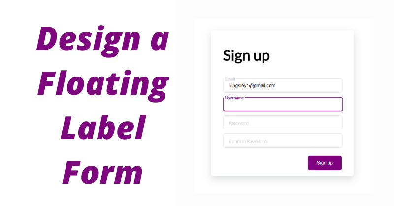
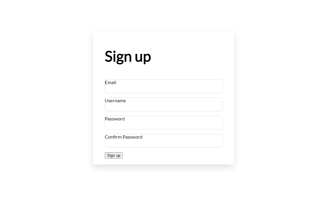
A view
As you can see in the above image, when an input within the form gains focus, its label floats to the top and a semi-thick border appears around the input. If text gets typed into the input and the input loses focus, the label remains on top. Otherwise, the label drops back down into the input.
Many modern forms have some sort of transition applied to them. Not only do these transitions make the form more dynamic, but they also help guide the user on the state of the input (that is whether it has focus or not) and what kind of data each input is expected to handle.
In this tutorial, you will learn about some cool CSS features like transitions, selectors like :placeholder_focus ,and many other CSS properties you should know.
Let's dive in!
The HTML Markup
We are going to define the markup for our sign up form. But before that, we have to set up our HTML boilerplate and correctly link to our stylesheet from the head tag. You can easily do this with the Emmet plugin by typing ! then tab in your IDE/Code editor.
You can also copy this boilerplate and paste it into your index.html file:
<!DOCTYPE html>
<html lang="en">
<head>
  <meta charset="UTF-8">
  <meta name="viewport" content="width=device-width, initial-scale=1.0">
  <meta http-equiv="X-UA-Compatible" content="ie=edge">
  <title>Document</title>
  <link rel="stylesheet" href="styles.css">
</head>
<body>

</body>
</html>
Within the body tag, we define the markup for our sign up form:
<div class="signupFrm">
    <form action="" class="form">
      <h1 class="title">Sign up</h1>

      <div class="inputContainer">
        <input type="text" class="input" placeholder="a">
        <label for="" class="label">Email</label>
      </div>

      <div class="inputContainer">
        <input type="text" class="input" placeholder="a">
        <label for="" class="label">Username</label>
      </div>

      <div class="inputContainer">
        <input type="text" class="input" placeholder="a">
        <label for="" class="label">Password</label>
      </div>

      <div class="inputContainer">
        <input type="text" class="input" placeholder="a">
        <label for="" class="label">Confirm Password</label>
      </div>

      <input type="submit" class="submitBtn" value="Sign up">
    </form>
  </div>
We create a container div to hold the form element. Each of the form's inputs, along with its text label, are wrapped inside a container div. The labels serve the purpose of informing the user what information each input should take in.
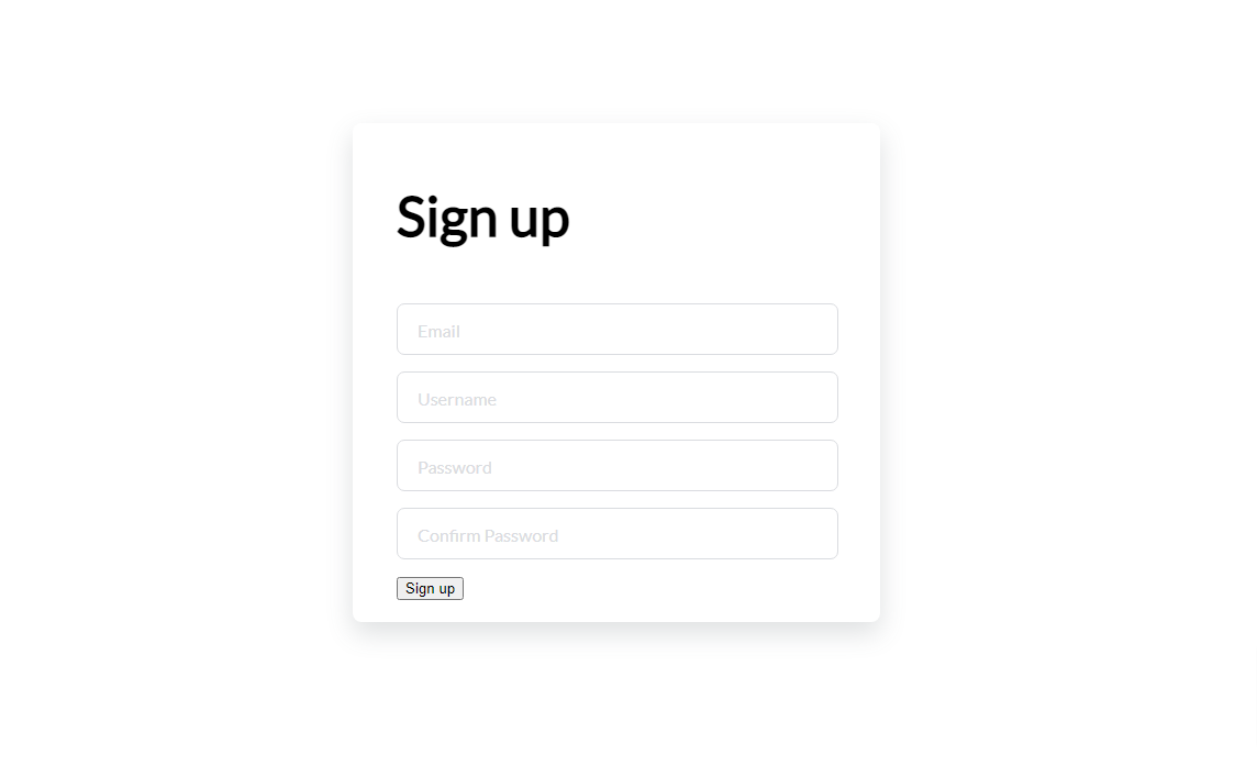
And our page will look like this:
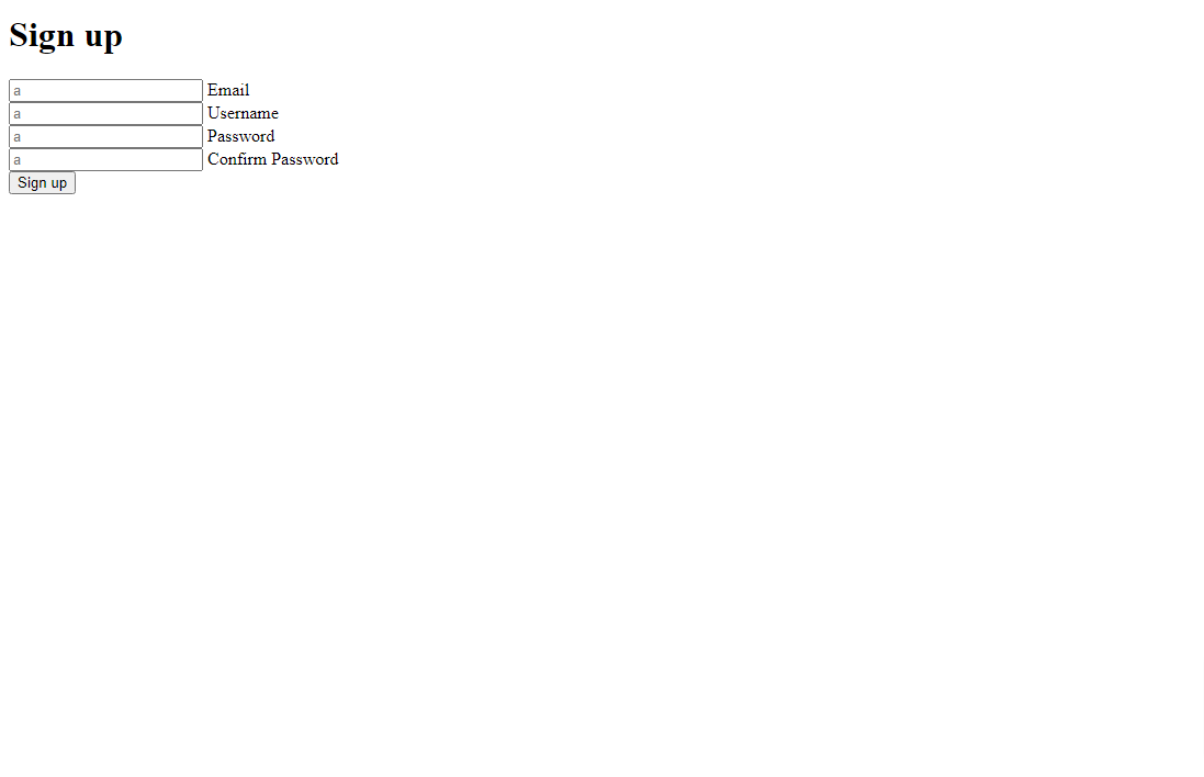
HTML Form of four inputs and four labels
You may notice that the placeholder value we have assigned to all inputs is "a". This will be helpful later in the tutorial when we start to apply some dynamic logic.
How to Style the Form
Our form is pretty basic, so let's add some styling to make it look nicer.
First, we need to perform some resets and set the background color:
@import url('https://fonts.googleapis.com/css2?family=Lato&display=swap');

/* Get rid of all default margins/paddings. Set typeface */
body {
  box-sizing: border-box;
  margin: 0;
  padding: 0;
  background-color: white;
  font-family: "lato", sans-serif;
}
Here's what our page will look like:
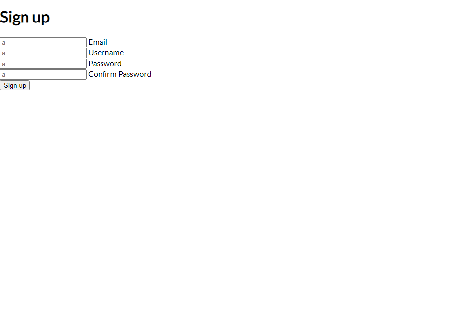
Without any styling yet
After stying the body, we'll set the display mode of the content to flex. This makes sure that all the direct children inside a container element div are displayed side-by-side by default.
In our case, there's only one child inside the container signupFrm. The only reason we use display: flex here is to use the align-items and justify-content properties to help center everything vertically and horizontally:
/* Puts the form in the center both horizontally and vertically. Sets its height to 100% of the viewport's height */

.signupFrm {
  display: flex;
  justify-content: center;
  align-items: center;
  height: 100vh;
}
The vh property, which stands for viewport height, ensures that the form takes up 100% of the height of the browser window, regardless of the screen size or orientation. That will make it more responsive.

Our form is now aligned to the center
Now we'll style the form a bit:
.form {
  background-color: white;
  width: 400px;
  border-radius: 8px;
  padding: 20px 40px;
  box-shadow: 0 10px 25px rgba(92, 99, 105, .2);
}

.title {
  font-size: 50px;
  margin-bottom: 50px;
}
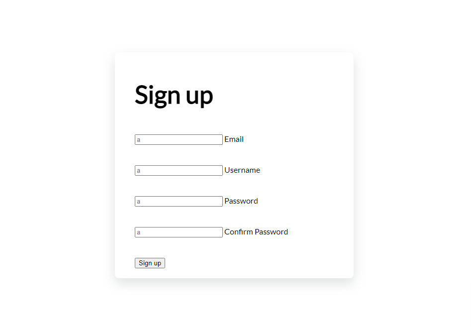
In the first style targeted on the form, we set the background to white, we give it a width of 400px, we add some curve around the form, and finally we set a shadow around the box. We also set the font size of the title and some space below the element.
And the result should look like this:

The form is now inside a card, with a box shadow
Next, we'll style the div which contains the form inputs and form labels.
.inputContainer {
  position: relative;
  height: 45px;
  width: 90%;
  margin-bottom: 17px;
}
We set the position property of our input's container div to relative. This will enable us position the children input and label however we want. We also set the width to take up 90 percent of the entire container width.
This is how our form will be rendered in the web browser.
Looks better
Now we need to style our inputs.
We first set the position to absolute. This will allow us to move each of them to the top-left part of the relatively positioned container parent.
We also need to hide our arbitrary placeholder text (the "a" characters mentioned earlier), so they don't overlap with the text within each label. The placeholder text will be needed when we implement the transition:
/* Style the inputs */

.input {
  position: absolute;
  top: 0px;
  left: 0px;
  height: 100%;
  width: 100%;
  border: 1px solid #DADCE0;
  border-radius: 7px;
  font-size: 16px;
  padding: 0 20px;
  outline: none;
  background: none;
  z-index: 1;
}

/* Hide the placeholder texts (a) */

::placeholder {
  color: transparent;
}
With the styles applied, our form should now look like this:
The placeholder "a" is no longer visible
Next, we style the text labels:
/* Styling text labels */

.label {
  position: absolute;
  top: 15px;
  left: 15px;
  padding: 0 4px;
  background-color: white;
  color: #DADCE0;
  font-size: 16px;
  transition: 0.5s;
  z-index: 0;
}
The label shows text that tells which information is expected inside the input. We start by setting its position to absolute. And by setting the top and left properties, we can move the text upwards relative to its container.
Next we set a transition of 0.5 seconds. This is how long it will take the text to move up when hovered on.
Finally, we also set a z-index of 0. The low z-index ensures that the label is positioned behind other "higher-placed" elements if they ever overlap.
Here is what gets rendered on the page:
The result
Now we are going to focus on the buttons.
We'll add some smooth animations with the CSS transform property, which moves the button up a little and changes the color once it's hovered over:
.submitBtn {
  display: block;
  margin-left: auto;
  padding: 15px 30px;
  border: none;
  background-color: purple;
  color: white;
  border-radius: 6px;
  cursor: pointer;
  font-size: 16px;
  margin-top: 30px;
}

.submitBtn:hover {
  background-color: #9867C5;
  transform: translateY(-2px);
}
Here is the result:

The button scales up and changes color when hovered over
Next, we need to perform some state changes.
When an input gains focus, we want to position its label beyond the top of the container (-7px), 3 pixels from the left, reduce the font-size to 14, and change the color to purple:
.input:focus + .label {
  top: -7px;
  left: 3px;
  z-index: 10;
  font-size: 14px;
  font-weight: 600;
  color: purple;
}
Here's the result:
Labels go up when input gains focus
We also need to add a purple border around the input when it gains focus.
.input:focus {
  border: 2px solid purple;
}
Purple border added
Finally, we have to do something very important.
Currently, when you type some text into the form and move focus (your mouse) away from it, the label text and the text within the input collide:

Collision between label and input value
With the following CSS, we'll specify that, when we type a value into the input and change focus, we want the label to remain floating. Also, well specify that we want the label text to lose its purple color:
.input:not(:placeholder-shown)+ .label {
  top: -7px;
  left: 3px;
  z-index: 10;
  font-size: 14px;
  font-weight: 600;
}
And with that, here is the final look of our sign up page.
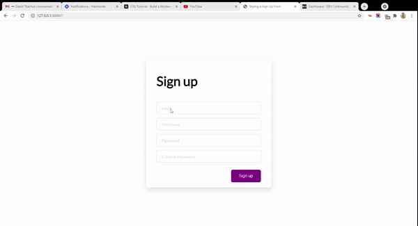
Final look
Wrapping Up
I hope you learned some new things about CSS from this tutorial. CSS transitions bring life to your website, and in this guide we have made our form much more lively with them.
You can get all the code from this tutorial from this GitHub repository.
I recently created a newsletter where I provide practical tips and resources on learning web development. Subscribe to my newsletter and get tips right in your inbox.
Thanks for following along.
P/S: If you are learning JavaScript, I created an eBook which teaches 50 topics in JavaScript with hand-drawn digital notes. Check it out here.