
By Dimitris Kiriakakis
Each year on February 14th, many people exchange cards, candies, gifts or flowers with their special “valentine”. The day of romance we call Valentine’s Day is named for a Christian martyr and dates back to the 5th century, but has origins in the Roman holiday Lupercalia.
Ok so far so good. But what can a programmer do for their Valentine?
My answer is: use CSS and be creative!
I really love CSS. It’s not a really sophisticated language (it’s not even considered a programming language most of the time). But with some geometry, mathematics and some basic CSS rules, you can turn your browser into a canvas of your creativity!
So let’s start. How would you create a heart with pure Geometry?
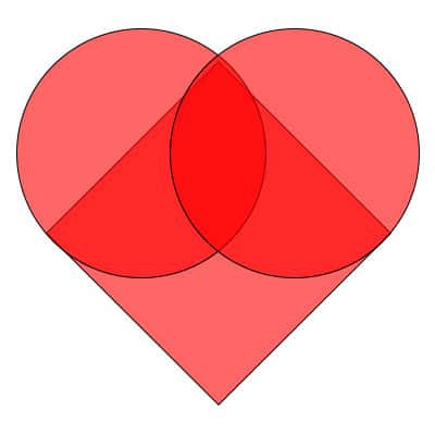 A heart made of a square and two circles
You just need a square and two circles. Right?
And we can draw that with a single element, thanks to the ::after and ::before pseudo elements. Speaking about pseudo elements, ::after is a pseudo element which allows you to insert content into a page from CSS (without it needing to be in the HTML). ::before is exactly the same, only it inserts the content before any other content in the HTML instead of after.
For both pseudo elements, the end result is not actually in the DOM, but it appears on the page as if it would be.
So let’s create our heart.
.heart {
  background-color: red;
  display: inline-block;
  height: 50px;
  margin: 0 10px;
  position: relative;
  top: 0;
  transform: rotate(-45deg);
  position: absolute;
  left: 45%; top: 45%;
  width: 50px;
}

.heart:before,
.heart:after {
  content: "";
  background-color: red;
  border-radius: 50%;
  height: 50px;
  position: absolute;
  width: 50px;
}

.heart:before {
  top: -25px;
  left: 0;
}

.heart:after {
  left: 25px;
  top: 0;
}
You can easily notice that we define the square and its positioning by using the main ‘heart’ class and the two circles with the ::before and ::after pseudo elements. The circles are actually just 2 more squares that have their border-radius reduced to the half.
But what is a heart without beating?
Let’s create a pulse. Here we are going to use the @keyframes rule. The @keyframes CSS at-rule is used to define the behaviour of one cycle of a CSS animation.
When we are using the keyframes rule, we can divide a time period to smaller parts and create a transformation/animation by splitting it into steps (each step corresponds to a percentage of the completion of the time period).
So let’s create the heartbeat. Our heartbeat animation consists of 3 steps:
@keyframes heartbeat {
  0% {
    transform: scale( 1 );
  }
  20% {
    transform: scale( 1.25 )
      translateX(5%)
      translateY(5%);
  }
  40% {
    transform: scale( 1.5 )
      translateX(9%)
      translateY(10%);
  }
}
- On 0% of the time period we start with no transformation.
- On 20% of the time period we scale our shape to 125% of its initial size.
- On 40% of the time period we scale our shape to 150% of its initial size.
For the remaining 60% of the time period we leave time for our heart to return to its initial state.
Finally we have to assign the animation to our heart.
.heart {
  animation: heartbeat 1s infinite; // our heart has infinite heartbeat :)
  ...
}
That’s it!
We have a beating heart that will beat forever.
Or maybe as long as your own love lasts…
Feel free to check out the related Codepen:
I wish you a wonderful Valentine’s day!