

In Excel, pivot tables let you analyze and visualize your data in an easy way.
With pivot tables, you can make comparisons and create calculations more quickly. You can even create charts to visualize your data.
Creating pivot tables might be intimidating if you're doing it for the first time. But in this article, I’m going to explain everything you need to start creating pivot tables.
It doesn’t end there – I will also show you how to add charts so you can visualize your data.
In addition, the version of Excel you’re using doesn’t matter. You can even create a Pivot table in Excel 2013. In fact, I used Excel 13 to get set for this article.
What We'll Cover
- How to Create a Pivot Table in Excel
- How to Implement Graphical Visualization for a Pivot Table
- Wrapping Up
How to Create a Pivot Table in Excel
To show you how to create a pivot table, I have created a table of some fictional footballers showing:
- their names
- the number of matches they've played
- their assists and goals
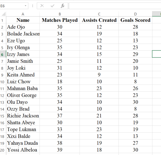
I will be creating extra rows of Goal Contributions and Goal Ratio, also called Goals per Game.
In football (Soccer), goal contributions is the total number of goals and assists. The goal ratio is derived when the number of goals is divided by the number of matches played.
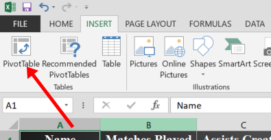
To create a pivot table, follow the steps below:
Step 1: In the menu bar, click “Insert” and select “Pivot Table”:
Step 2: Leave everything as it is and select “OK”:
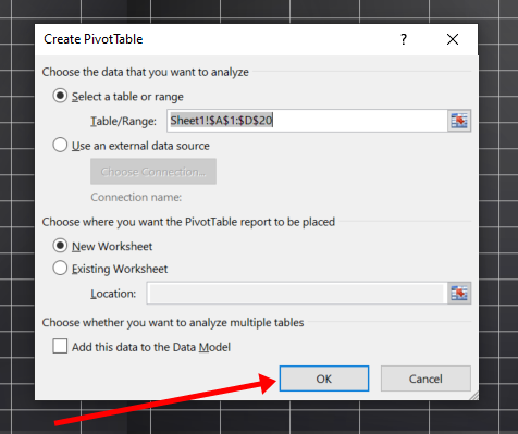
You should use a new worksheet so you can have a dedicated sheet for your pivot table.
The next interface you’ll see looks like this:
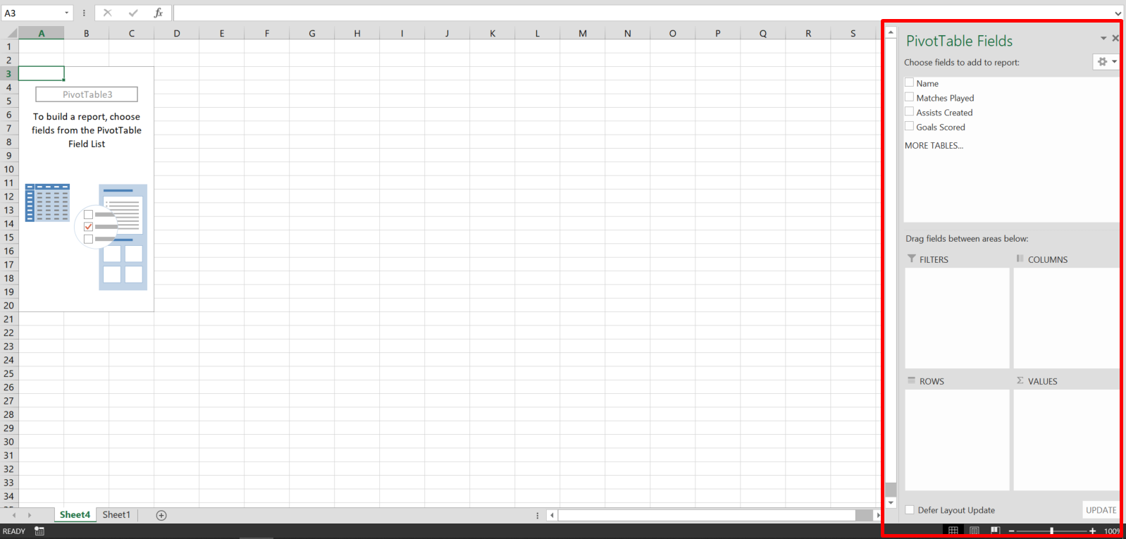
You’ll be working with the part where you see “PivotTable Fields”. You will even see the columns of your table there.
How to Create Rows and Make Calculations with a Pivot Table
This is the part where you can create rows, columns, and make calculations.
To create rows for your pivot table, drag one of the rows in the existing table to the part where you see “ROWS”.
For instance, I want to create a row for the pivot table with the name row of the original table. That means I have to drag the name row to the ROWS area:
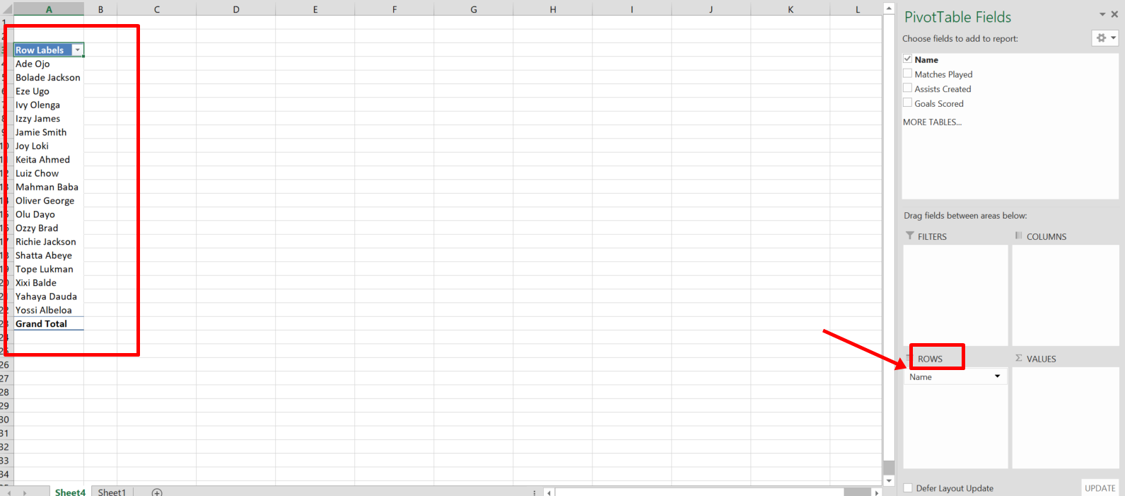
You can see I’ve created a row with the name row of the original table.
To make calculations easily, you can use the “VALUES” area.
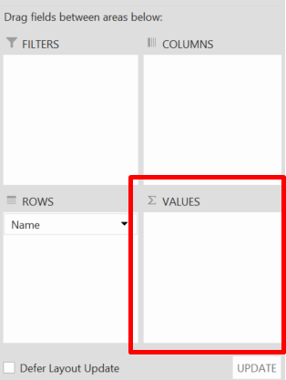
I want to see the number of goals scored by each player. So, I’ll drag the “Goal scored” row to the “VALUES” area:
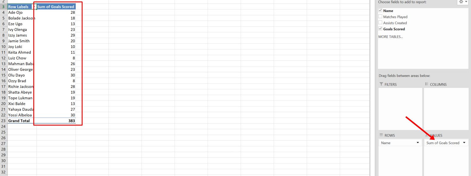
You can see I can directly visualize the number of goals scored by each footballer.
You can also make other calculations in the Values area. Just click the dropdown in front of the column right there and select “Value Field Settings…”:

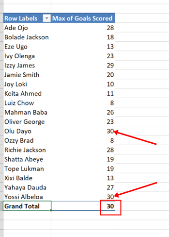
I want to see the highest goal scored instead of the total goals scored by all the players. So I’ll select “MAX” and click “OK”:
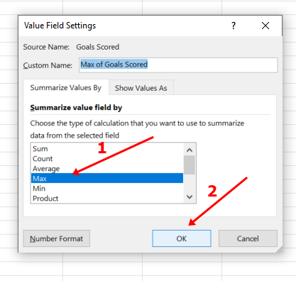
Now I can see the maximum goals scored instead of the total of all goals scored:
How to Create Entirely New Rows with a Pivot Table
Remember I said I would create extra rows of Goal Contributions and Goal Ratio, also called Goals per Game? So, let’s do it.
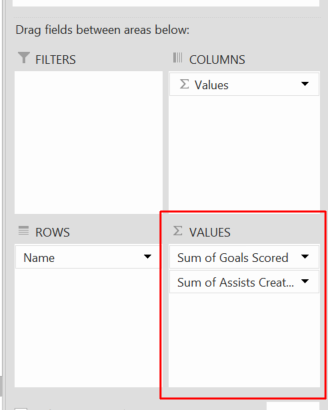
I need the Assists Created and Goal Scored rows to calculate goal contributions. So, I’ll make sure both of them are in the Values area:
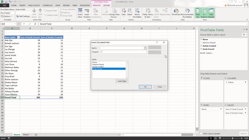
Now, I’ll make sure the “Analyze” tab is selected, click “Fields, Items, & Sets”, then select “Calculated Field…”:
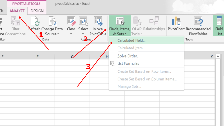
The next interface you’ll see looks like this:
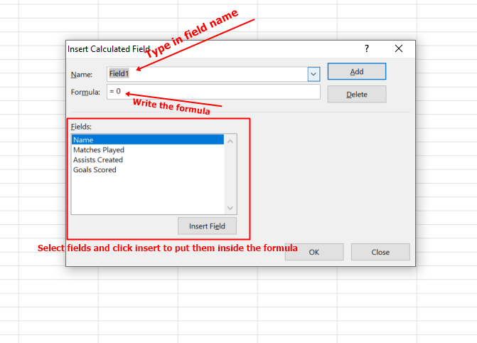
Here, I’ll do three things:
- type the name of the row in the name field
- write the formula – in this case, “Assists Created + Goal Scored”
- click Add and OK

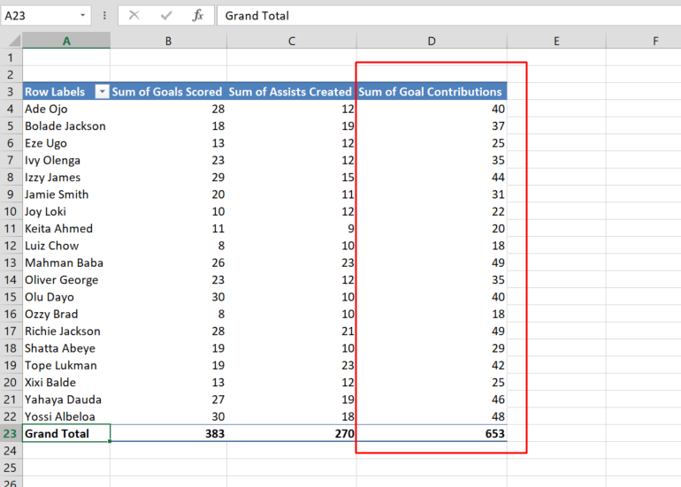
Now, I have successfully created the Goal Contributions row:
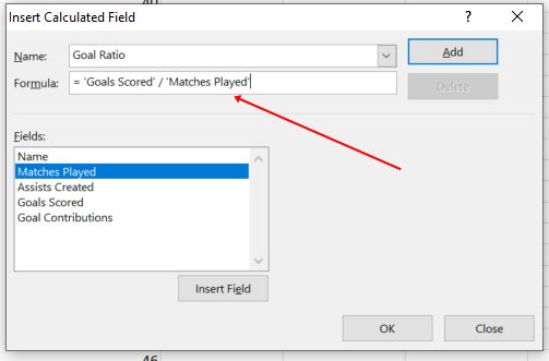
To create the Goal Ratio, I have to make sure the matches played row is in the VALUES area:

The formula I’ll use is Goal Scored / Matches played. So, I’ll implement calculated fields again:
I can now see the goal ratio of each footballer:

How to Implement Graphical Visualization for a Pivot Table
It’s nice to create a pivot table and implement calculations easily, but it’s nicer to see the graphical representation of that pivot table in a chart.
To represent the pivot table in a chart:
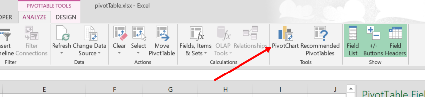
Step 1: Make sure the “Analyze” tab is selected, then select PivotChart:
Step 2: Select the type of chart you want on the right. It could be a column, pie chart, or bar chart. Also, select the format in the upper part. It could be 2D or 3D.
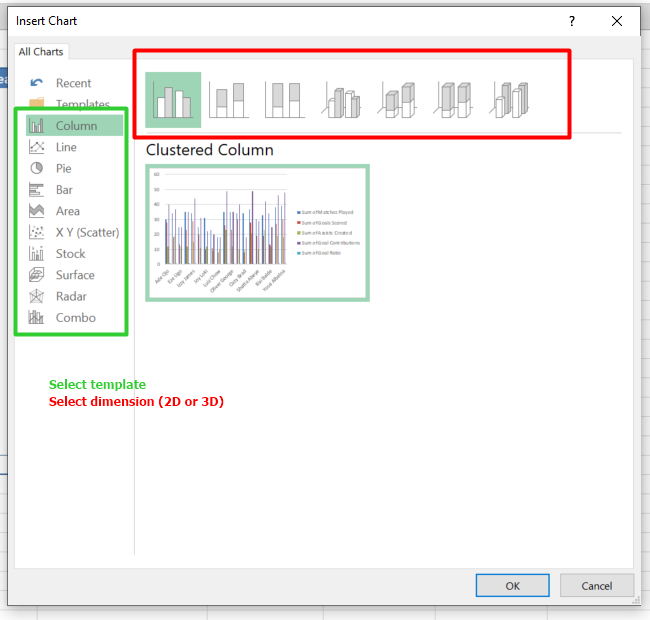
Click OK when you are satisfied.
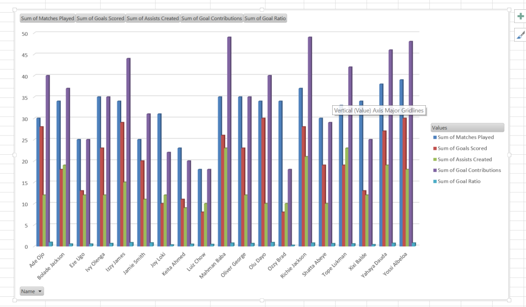
That’s the chart representing the data.
Wrapping Up
Pivot tables are one of the most powerful features of Excel. If you have large datasets you have to work with, a pivot table can save you a lot of time when it comes to analysis and visualization.
Pivot tables are nice, but being able to create different types of charts to represent the data is really helpful, too.
I hope this article helps you create a pivot table and charts for the data you’re working with.
If you find this article helpful, don’t hesitate to pass it along to others.