By Nick McCullum
Python is an excellent programming language for creating data visualizations.
However, working with a raw programming language like Python (instead of more sophisticated software like, say, Tableau) presents some challenges. Developers creating visualizations must accept more technical complexity in exchange for vastly more input into how their visualizations look.
In this tutorial, I will teach you how to create automatically-updating Python visualizations. We'll use data from IEX Cloud and we'll also use the matplotlib library and some simple Amazon Web Services product offerings.
Step 1: Gather Your Data
Automatically updating charts sound appealing. But before you invest the time in building them, it is important to understand whether or not you need your charts to be automatically updated.
To be more specific, there is no need for your visualizations to update automatically if the data they are presenting does not change over time.
Writing a Python script that automatically updates a chart of Michael Jordan's annual points-per-game would be useless - his career is over, and that data set is never going to change.
The best data set candidates for auto-updating visualizations are time series data where new observations are being added on a regular basis (say, each day).
In this tutorial, we are going to be using stock market data from the IEX Cloud API. Specifically, we will be visualizing historical stock prices for a few of the largest banks in the US:
- JPMorgan Chase (JPM)
- Bank of America (BAC)
- Citigroup (C)
- Wells Fargo (WFC)
- Goldman Sachs (GS)
The first thing that you'll need to do is create an IEX Cloud account and generate an API token.
For obvious reasons, I'm not going to be publishing my API key in this article. Storing your own personalized API key in a variable called IEX API Key will be enough for you to follow along.
Next, we're going to store our list of tickers in a Python list:
tickers = [
            'JPM',
            'BAC',
            'C',
            'WFC',
            'GS',
            ]
The IEX Cloud API accepts tickers separated by commas. We need to serialize our ticker list into a separated string of tickers. Here is the code we will use to do this:
#Create an empty string called `ticker_string` that we'll add tickers and commas to
ticker_string = ''

#Loop through every element of `tickers` and add them and a comma to ticker_string
for ticker in tickers:
    ticker_string += ticker
    ticker_string += ','

#Drop the last comma from `ticker_string`
ticker_string = ticker_string[:-1]
The next task that we need to handle is to select which endpoint of the IEX Cloud API that we need to ping.
A quick review of IEX Cloud's documentation reveals that they have a Historical Prices endpoint, which we can send an HTTP request to using the charts keyword.
We will also need to specify the amount of data that we're requesting (measured in years).
To target this endpoint for the specified data range, I have stored the charts endpoint and the amount of time in separate variables. These endpoints are then interpolated into the serialized URL that we'll use to send our HTTP request.
Here is the code:
#Create the endpoint and years strings
endpoints = 'chart'
years = '10'

#Interpolate the endpoint strings into the HTTP_request string
HTTP_request = f'https://cloud.iexapis.com/stable/stock/market/batch?symbols={ticker_string}&types={endpoints}&range={years}y&token={IEX_API_Key}'
This interpolated string is important because it allows us to easily change our string's value at a later date without changing each occurrence of the string in our codebase.
Now it's time to actually make our HTTP request and store the data in a data structure on our local machine.
To do this, I am going to use the pandas library for Python. Specifically, the data will be stored in a pandas DataFrame.
We will first need to import the pandas library. By convention, pandas is typically imported under the alias pd. Add the following code to the start of your script to import pandas under the desired alias:
import pandas as pd
Once we have imported pandas into our Python script, we can use its read_json method to store the data from IEX Cloud into a pandas DataFrame:
bank_data = pd.read_json(HTTP_request)
Printing this DataFrame inside of a Jupyter Notebook generates the following output:

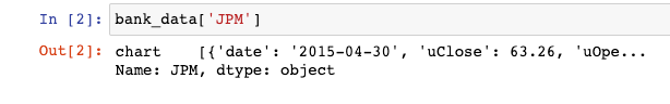
It is clear that this is not what we want. We will need to parse this data to generate a DataFrame that's worth plotting.
To start, let's examine a specific column of bank_data - say, bank_data['JPM']:
It's clear that the next parsing layer will need to be the chart endpoint:
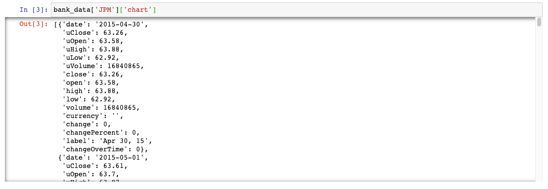
Now we have a JSON-like data structure where each cell is a date along with various data points about JPM's stock price on that date.
We can wrap this JSON-like structure in a pandas DataFrame to make it much more readable:
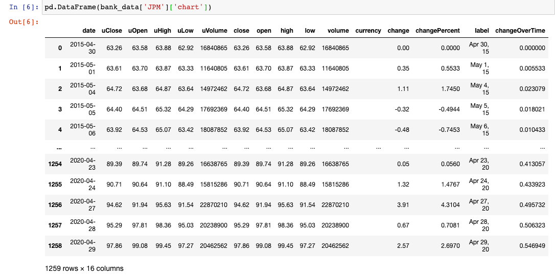
This is something we can work with!
Let's write a small loop that uses similar logic to pull out the closing price time series for each stock as a pandas Series (which is equivalent to a column of a pandas DataFrame). We will store these pandas Series in a dictionary (with the key being the ticker name) for easy access later.
for ticker in tickers:
    series_dict.update( {ticker : pd.DataFrame(bank_data[ticker]['chart'])['close']} )
Now we can create our finalized pandas DataFrame that has the date as its index and a column for the closing price of every major bank stock over the last 5 years:
series_list = []

for ticker in tickers:
    series_list.append(pd.DataFrame(bank_data[ticker]['chart'])['close'])

series_list.append(pd.DataFrame(bank_data['JPM']['chart'])['date'])

column_names = tickers.copy()
column_names.append('Date')

bank_data = pd.concat(series_list, axis=1)
bank_data.columns = column_names

bank_data.set_index('Date', inplace = True)
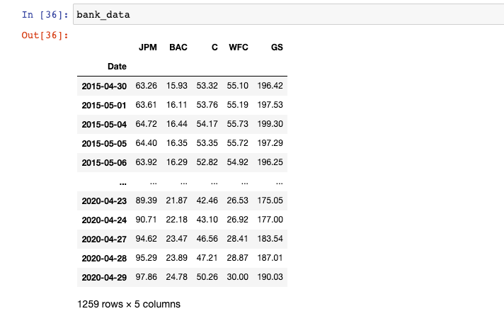
After all this is done, our bank_data DataFrame will look like this:
Our data collection is complete. We are now ready to begin creating visualizations with this data set of stock prices for publicly-traded banks. As a quick recap, here's the script we have built so far:
import pandas as pd
import matplotlib.pyplot as plt

IEX_API_Key = ''

tickers = [
            'JPM',
            'BAC',
            'C',
            'WFC',
            'GS',
            ]

#Create an empty string called `ticker_string` that we'll add tickers and commas to
ticker_string = ''

#Loop through every element of `tickers` and add them and a comma to ticker_string
for ticker in tickers:
    ticker_string += ticker
    ticker_string += ','

#Drop the last comma from `ticker_string`
ticker_string = ticker_string[:-1]

#Create the endpoint and years strings
endpoints = 'chart'
years = '5'

#Interpolate the endpoint strings into the HTTP_request string
HTTP_request = f'https://cloud.iexapis.com/stable/stock/market/batch?symbols={ticker_string}&types={endpoints}&range={years}y&cache=true&token={IEX_API_Key}'

#Send the HTTP request to the IEX Cloud API and store the response in a pandas DataFrame
bank_data = pd.read_json(HTTP_request)

#Create an empty list that we will append pandas Series of stock price data into
series_list = []

#Loop through each of our tickers and parse a pandas Series of their closing prices over the last 5 years
for ticker in tickers:
    series_list.append(pd.DataFrame(bank_data[ticker]['chart'])['close'])

#Add in a column of dates
series_list.append(pd.DataFrame(bank_data['JPM']['chart'])['date'])

#Copy the 'tickers' list from earlier in the script, and add a new element called 'Date'.
#These elements will be the column names of our pandas DataFrame later on.
column_names = tickers.copy()
column_names.append('Date')

#Concatenate the pandas Series together into a single DataFrame
bank_data = pd.concat(series_list, axis=1)

#Name the columns of the DataFrame and set the 'Date' column as the index
bank_data.columns = column_names
bank_data.set_index('Date', inplace = True)
Step 2: Create the Chart You'd Like to Update
In this tutorial, we'll be working with the matplotlib visualization library for Python.
Matplotlib is a tremendously sophisticated library and people spend years mastering it to their fullest extent. Accordingly, please keep in mind that we are only scratching the surface of matplotlib's capabilities in this tutorial.
We will start by importing the matplotlib library.
How to Import Matplotlib
By convention, data scientists generally import the pyplot library of matplotlib under the alias plt.
Here's the full import statement:
import matplotlib.pyplot as plt
You will need to include this at the beginning of any Python file that uses matplotlib to generate data visualizations.
There are also other arguments that you can add with your matplotlib library import to make your visualizations easier to work with.
If you're working through this tutorial in a Jupyter Notebook, you may want to include the following statement, which will cause your visualizations to appear without needing to write a plt.show() statement:
%matplotlib inline
If you're working in a Jupyter Notebook on a MacBook with a retina display, you can use the following statements to improve the resolution of your matplotlib visualizations in the notebook:
from IPython.display import set_matplotlib_formats

set_matplotlib_formats('retina')
With that out of the way, let's begin creating our first data visualizations using Python and matplotlib!
Matplotlib Formatting Fundamentals
In this tutorial, you will learn how to create boxplots, scatterplots, and histograms in Python using matplotlib. I want to go through a few basics of formatting in matplotlib before we begin creating real data visualizations.
First, almost everything you do in matplotlib will involve invoking methods on the plt object, which is the alias that we imported matplotlib as.
Second, you can add titles to matplotlib visualizations by calling plt.title() and passing in your desired title as a string.
Third, you can add labels to your x and y axes using the plt.xlabel() and plt.ylabel() methods.
Lastly, with the three methods we just discussed - plt.title(), plt.xlabel(), and plt.ylabel() - you can change the font size of the title with the fontsize argument.
Let's dig in to creating our first matplotlib visualizations in earnest.
How to Create Boxplots in Matplotlib
Boxplots are one of the most fundamental data visualizations available to data scientists.
Matplotlib allows us to create boxplots with the boxplot function.
Since we will be creating boxplots along our columns (and not along our rows), we will also want to transpose our DataFrame inside the boxplot method call.
plt.boxplot(bank_data.transpose())

This is a good start, but we need to add some styling to make this visualization easily interpretatable to an outside user.
First, let's add a chart title:
plt.title('Boxplot of Bank Stock Prices (5Y Lookback)', fontsize = 20)

In addition, it is useful to label the x and y axes, as mentioned previously:
plt.xlabel('Bank', fontsize = 20)
plt.ylabel('Stock Prices', fontsize = 20)
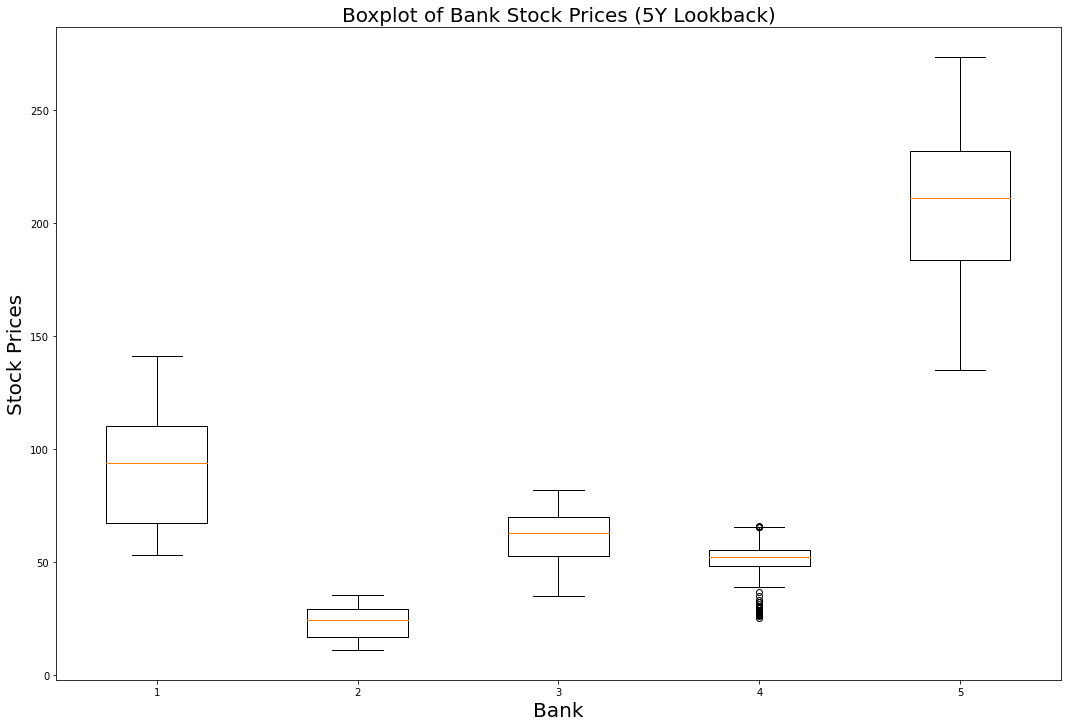
We will also need to add column-specific labels to the x-axis so that it is clear which boxplot belongs to each bank.
The following code does the trick:
ticks = range(1, len(bank_data.columns)+1)
labels = list(bank_data.columns)
plt.xticks(ticks,labels, fontsize = 20)

Just like that, we have a boxplot that presents some useful visualizations in matplotlib! It is clear that Goldman Sachs has traded at the highest price over the last 5 years while Bank of America's stock has traded the lowest. It's also interesting to note that Wells Fargo has the most outlier data points.
As a recap, here is the complete code that we used to generate our boxplots:
########################
#Create a Python boxplot
########################

#Set the size of the matplotlib canvas
plt.figure(figsize = (18,12))

#Generate the boxplot
plt.boxplot(bank_data.transpose())

#Add titles to the chart and axes
plt.title('Boxplot of Bank Stock Prices (5Y Lookback)', fontsize = 20)
plt.xlabel('Bank', fontsize = 20)
plt.ylabel('Stock Prices', fontsize = 20)

#Add labels to each individual boxplot on the canvas
ticks = range(1, len(bank_data.columns)+1)
labels = list(bank_data.columns)
plt.xticks(ticks,labels, fontsize = 20)
How to Create Scatterplots in Matplotlib
Scatterplots can be created in matplotlib using the plt.scatter method.
The scatter method has two required arguments - an x value and a y value.
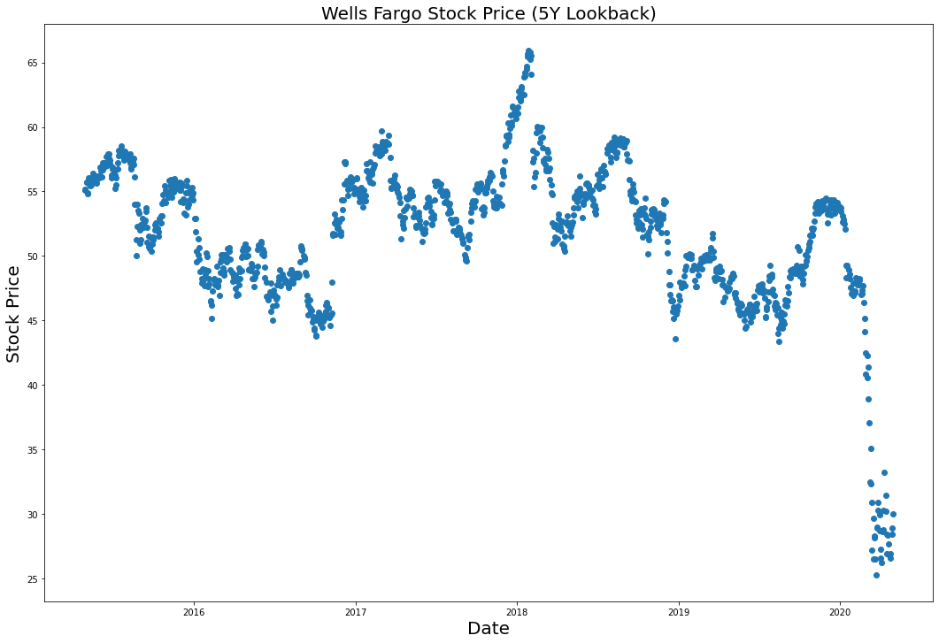
Let's plot Wells Fargo's stock price over time using the plt.scatter() method.
The first thing we need to do is to create our x-axis variable, called dates:
dates = bank_data.index.to_series()
Next, we will isolate Wells Fargo's stock prices in a separate variable:
WFC_stock_prices = bank_data['WFC']
We can now plot the visualization using the plt.scatter method:
plt.scatter(dates, WFC_stock_prices)

Wait a minute - the x labels of this chart are impossible to read!
What is the problem?
Well, matplotlib is not currently recognizing that the x axis contains dates, so it isn't spacing out the labels properly.
To fix this, we need to transform every element of the dates Series into a datetime data type. The following command is the most readable way to do this:
dates = bank_data.index.to_series()
dates = [pd.to_datetime(d) for d in dates]
After running the plt.scatter method again, you will generate the following visualization:

Much better!
Our last step is to add titles to the chart and the axis. We can do this with the following statements:
plt.title("Wells Fargo Stock Price (5Y Lookback)", fontsize=20)
plt.ylabel("Stock Price", fontsize=20)
plt.xlabel("Date", fontsize=20)
As a recap, here's the code we used to create this scatterplot:
########################
#Create a Python scatterplot
########################

#Set the size of the matplotlib canvas
plt.figure(figsize = (18,12))

#Create the x-axis data
dates = bank_data.index.to_series()
dates = [pd.to_datetime(d) for d in dates]

#Create the y-axis data
WFC_stock_prices =  bank_data['WFC']

#Generate the scatterplot
plt.scatter(dates, WFC_stock_prices)

#Add titles to the chart and axes
plt.title("Wells Fargo Stock Price (5Y Lookback)", fontsize=20)
plt.ylabel("Stock Price", fontsize=20)
plt.xlabel("Date", fontsize=20)
How to Create Histograms in Matplotlib
Histograms are data visualizations that allow you to see the distribution of observations within a data set.
Histograms can be created in matplotlib using the plt.hist method.
Let's create a histogram that allows us to see the distribution of different stock prices within our bank_data dataset (note that we'll need to use the transpose method within plt.hist just like we did with plt.boxplot earlier):
plt.hist(bank_data.transpose())
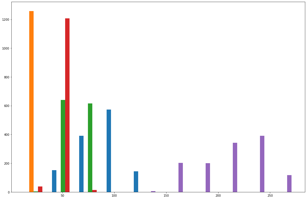
This is an interesting visualization, but we still have lots to do.
The first thing you probably noticed was that the different columns of the histogram have different colors. This is intentional. The colors divide the different columns within our pandas DataFrame.
With that said, these colors are meaningless without a legend. We can add a legend to our matplotlib histogram with the following statement:
plt.legend(bank_data.columns,fontsize=20)

You may also want to change the bin count of the histogram, which changes how many slices the dataset is divided into when goruping the observations into histogram columns.
As an example, here is how to change the number of bins in the histogram to 50:
plt.hist(bank_data.transpose(), bins = 50)
Lastly, we will add titles to the histogram and its axes using the same statements that we used in our other visualizations:
plt.title("A Histogram of Daily Closing Stock Prices for the 5 Largest Banks in the US (5Y Lookback)", fontsize = 20)
plt.ylabel("Observations", fontsize = 20)
plt.xlabel("Stock Prices", fontsize = 20)

As a recap, here is the complete code needed to generate this histogram:
########################
#Create a Python histogram
########################

#Set the size of the matplotlib canvas
plt.figure(figsize = (18,12))

#Generate the histogram
plt.hist(bank_data.transpose(), bins = 50)

#Add a legend to the histogram
plt.legend(bank_data.columns,fontsize=20)

#Add titles to the chart and axes
plt.title("A Histogram of Daily Closing Stock Prices for the 5 Largest Banks in the US (5Y Lookback)", fontsize = 20)
plt.ylabel("Observations", fontsize = 20)
plt.xlabel("Stock Prices", fontsize = 20)
How to Create Subplots in Matplotlib
In matplotlib, subplots are the name that we use to refer to multiple plots that are created on the same canvas using a single Python script.
Subplots can be created with the plt.subplot command. The command takes three arguments:
- The number of rows in a subplot grid
- The number of columns in a subplot grid
- Which subplot you currently have selected
Let's create a 2x2 subplot grid that contains the following charts (in this specific order):
- The boxplot that we created previously
- The scatterplot that we created previously
- A similar scatteplot that uses
BACdata instead ofWFCdata - The histogram that we created previously
First, let's create the subplot grid:
plt.subplot(2,2,1)

plt.subplot(2,2,2)

plt.subplot(2,2,3)

plt.subplot(2,2,4)

Now that we have a blank subplot canvas, we simply need to copy/paste the code we need for each plot after each call of the plt.subplot method.
At the end of the code block, we add the plt.tight_layout method, which fixes many common formatting issues that occur when generating matplotlib subplots.
Here is the full code:
################################################
################################################
#Create subplots in Python
################################################
################################################

########################
#Subplot 1
########################
plt.subplot(2,2,1)

#Generate the boxplot
plt.boxplot(bank_data.transpose())

#Add titles to the chart and axes
plt.title('Boxplot of Bank Stock Prices (5Y Lookback)')
plt.xlabel('Bank', fontsize = 20)
plt.ylabel('Stock Prices')

#Add labels to each individual boxplot on the canvas
ticks = range(1, len(bank_data.columns)+1)
labels = list(bank_data.columns)
plt.xticks(ticks,labels)

########################
#Subplot 2
########################
plt.subplot(2,2,2)

#Create the x-axis data
dates = bank_data.index.to_series()
dates = [pd.to_datetime(d) for d in dates]

#Create the y-axis data
WFC_stock_prices =  bank_data['WFC']

#Generate the scatterplot
plt.scatter(dates, WFC_stock_prices)

#Add titles to the chart and axes
plt.title("Wells Fargo Stock Price (5Y Lookback)")
plt.ylabel("Stock Price")
plt.xlabel("Date")

########################
#Subplot 3
########################
plt.subplot(2,2,3)

#Create the x-axis data
dates = bank_data.index.to_series()
dates = [pd.to_datetime(d) for d in dates]

#Create the y-axis data
BAC_stock_prices =  bank_data['BAC']

#Generate the scatterplot
plt.scatter(dates, BAC_stock_prices)

#Add titles to the chart and axes
plt.title("Bank of America Stock Price (5Y Lookback)")
plt.ylabel("Stock Price")
plt.xlabel("Date")

########################
#Subplot 4
########################
plt.subplot(2,2,4)

#Generate the histogram
plt.hist(bank_data.transpose(), bins = 50)

#Add a legend to the histogram
plt.legend(bank_data.columns,fontsize=20)

#Add titles to the chart and axes
plt.title("A Histogram of Daily Closing Stock Prices for the 5 Largest Banks in the US (5Y Lookback)")
plt.ylabel("Observations")
plt.xlabel("Stock Prices")

plt.tight_layout()

As you can see, with some basic knowledge it is relatively easy to create beautiful data visualizations using matplotlib.
The last thing we need to do is save the visualization as a .png file in our current working directory. Matplotlib has excellent built-in functionality to do this. Simply add the follow statement immediately after the fourth subplot is finalized:
################################################
#Save the figure to our local machine
################################################

plt.savefig('bank_data.png')
Over the remainder of this tutorial, you will learn how to schedule this subplot matrix to be automatically updated on your live website every day.
Step 3: Create an Amazon Web Services Account
So far in this tutorial, we have learned how to:
- Source the stock market data that we are going to visualize from the IEX Cloud API
- Create wonderful visualizations using this data with the matplotlib library for Python
Over the remainder of this tutorial, you will learn how to automate these visualizations such that they are updated on a specific schedule.
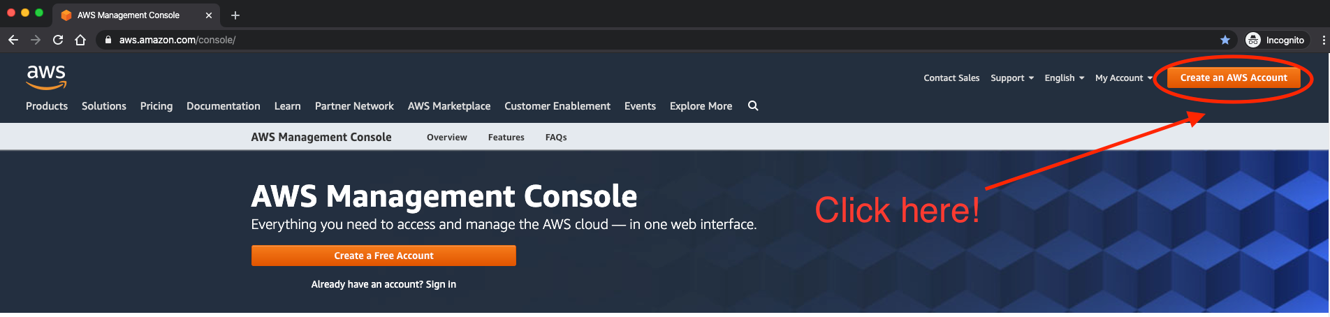
To do this, we'll be using the cloud computing capabilities of Amazon Web Services. You'll need to create an AWS account first.
Navigate to this URL and click the "Create an AWS Account" in the top-right corner:
AWS' web application will guide you through the steps to create an account.
Once your account has been created, we can start working with the two AWS services that we'll need for our visualizations: AWS S3 and AWS EC2.
Step 4: Create an AWS S3 Bucket to Store Your Visualizations
AWS S3 stands for Simple Storage Service. It is one of the most popular cloud computing offerings available in Amazon Web Services. Developers use AWS S3 to store files and access them later through public-facing URLs.
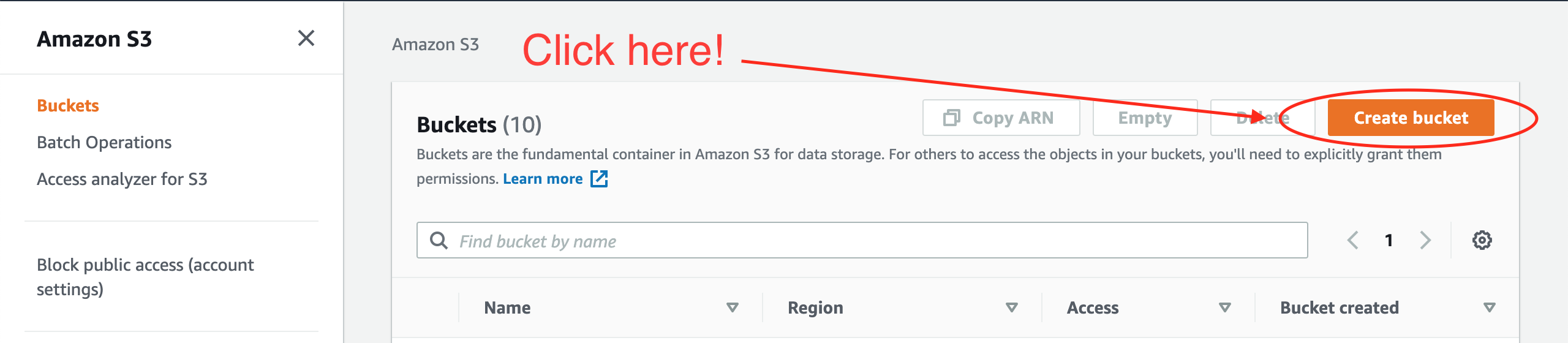
To store these files, we must first create what is called an AWS S3 bucket, which is a fancy word for a folder that stores files in AWS. To do this, first navigate to the S3 dashboard within Amazon Web Services.
On the right side of the Amazon S3 dashboard, click Create bucket, as shown below:
On the next screen, AWS will ask you to select a name for your new S3 bucket. For the purpose of this tutorial, we will use the bucket name nicks-first-bucket.
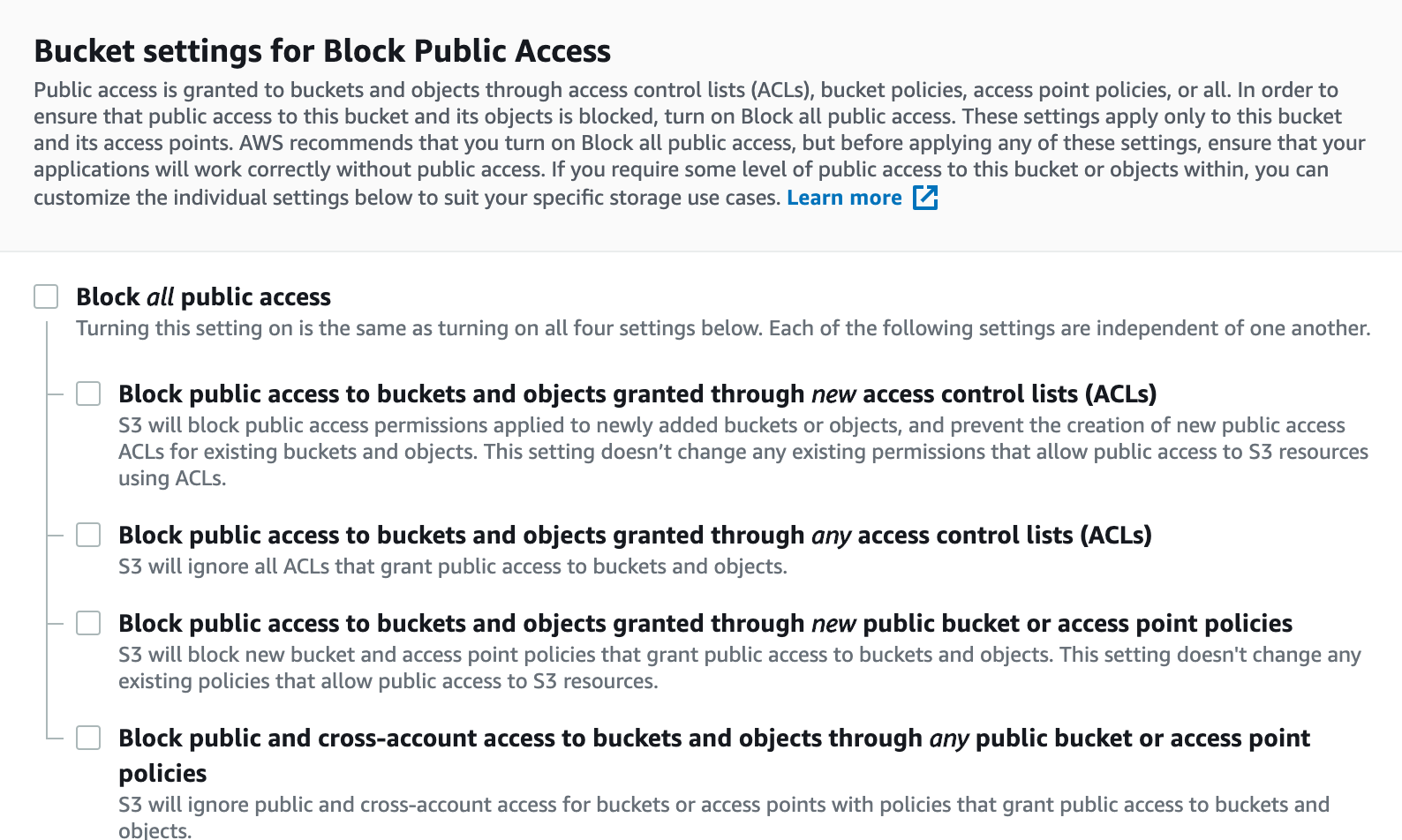
Next, you will need to scroll down and set your bucket permissions. Since the files we will be uploading are designed to be publicly accessible (after all, we will be embedding them in pages on a website), then you will want to make the permissions as open as possible.
Here is a specific example of what your AWS S3 permissions should look like:
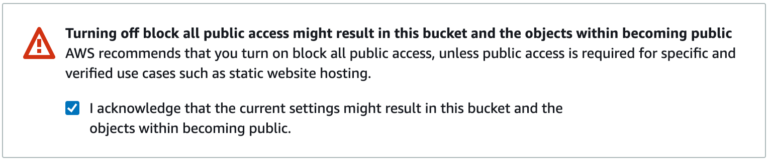
These permissions are very lax, and for many use cases are not acceptable (though they do indeed meet the requirements of this tutorial). Because of this, AWS will require you to acknowledge the following warning before creating your AWS S3 bucket:
Once all of this is done, you can scroll to the bottom of the page and click Create Bucket. You are now ready to proceed!
Step 5: Modify the Python Script to Save Your Visualizations to AWS S3
Our Python script in its current form is designed to create a visualization and then save that visualization to our local computer. We now need to modify our script to instead save the .png file to the AWS S3 bucket we just created (which, as a reminder, is called nicks-first-bucket).
The tool that we will use to upload our file to our AWS S3 bucket is called boto3, which is Amazon Web Services Software Development Kit (SDK) for Python.
First, you'll need to install boto3 on your machine. The easiest way to do this is using the pip package manager:
pip3 install boto3
Next, we need to import boto3 into our Python script. We do this by adding the following statement near the start of our script:
import boto3
Given the depth and breadth of Amazon Web Services' product offerings, boto3 is an insanely complex Python library.
Fortunately, we only need to use some of the most basic functionality of boto3.
The following code block will upload our final visualization to Amazon S3.
################################################
#Push the file to the AWS S3 bucket
################################################

s3 = boto3.resource('s3')
s3.meta.client.upload_file('bank_data.png', 'nicks-first-bucket', 'bank_data.png', ExtraArgs={'ACL':'public-read'})
As you can see, the upload_file method of boto3 takes several arguments. Let's break them down, one-by-one:
bank_data.pngis the name of the file on our local machine.nicks-first-bucketis the name of the S3 bucket that we want to upload to.bank_data.pngis the name that we want the file to have after it is uploaded to the AWS S3 bucket. In this case, it is the same as the first argument, but it doesn't have to be.ExtraArgs={'ACL':'public-read'}means that the file should be readable by the public once it is pushed to the AWS S3 bucket.
Running this code now will result in an error. Specifically, Python will throw the following exception:
S3UploadFailedError: Failed to upload bank_data.png to nicks-first-bucket/bank_data.png: An error occurred (NoSuchBucket) when calling the PutObject operation: The specified bucket does not exist
Why is this?
Well, it is because we have not yet configured our local machine to interact with Amazon Web Services through boto3.
To do this, we must run the aws configure command from our command line interface and add our access keys. This documentation piece from Amazon shares more information about how to configure your AWS command line interface.
If you'd rather not navigate off freecodecamp.org, here are the quick steps to set up your AWS CLI.
First, mouse over your username in the top right corner, like this:
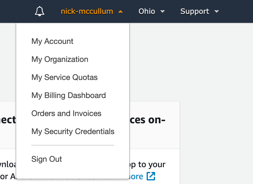
Click My Security Credentials.
On the next screen, you're going to want to click the Access keys (access key ID and secret access key drop down, then click Create New Access Key.
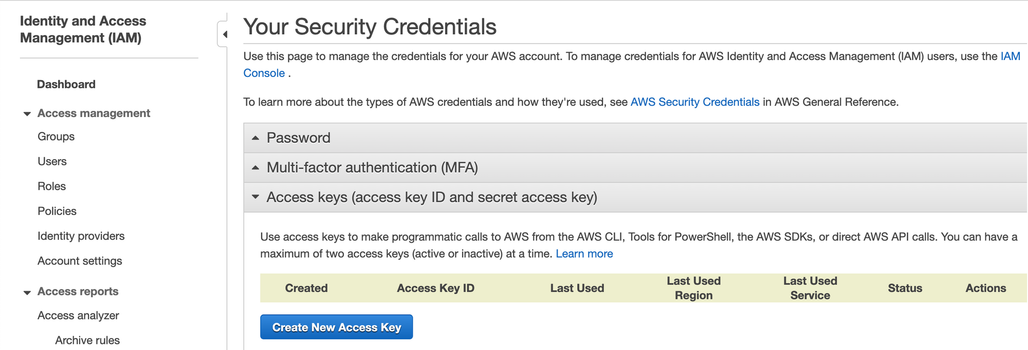
This will prompt you to download a .csv file that contains both your Access Key and your Secret Access Key. Save these in a secure location.
Next, trigger the Amazon Web Services command line interface by typing aws configure on your command line. This will prompt you to enter your Access Key and Secret Access Key.
Once this is done, your script should function as intended. Re-run the script and check to make sure that your Python visualization has been properly uploaded to AWS S3 by looking inside the bucket we created earlier:
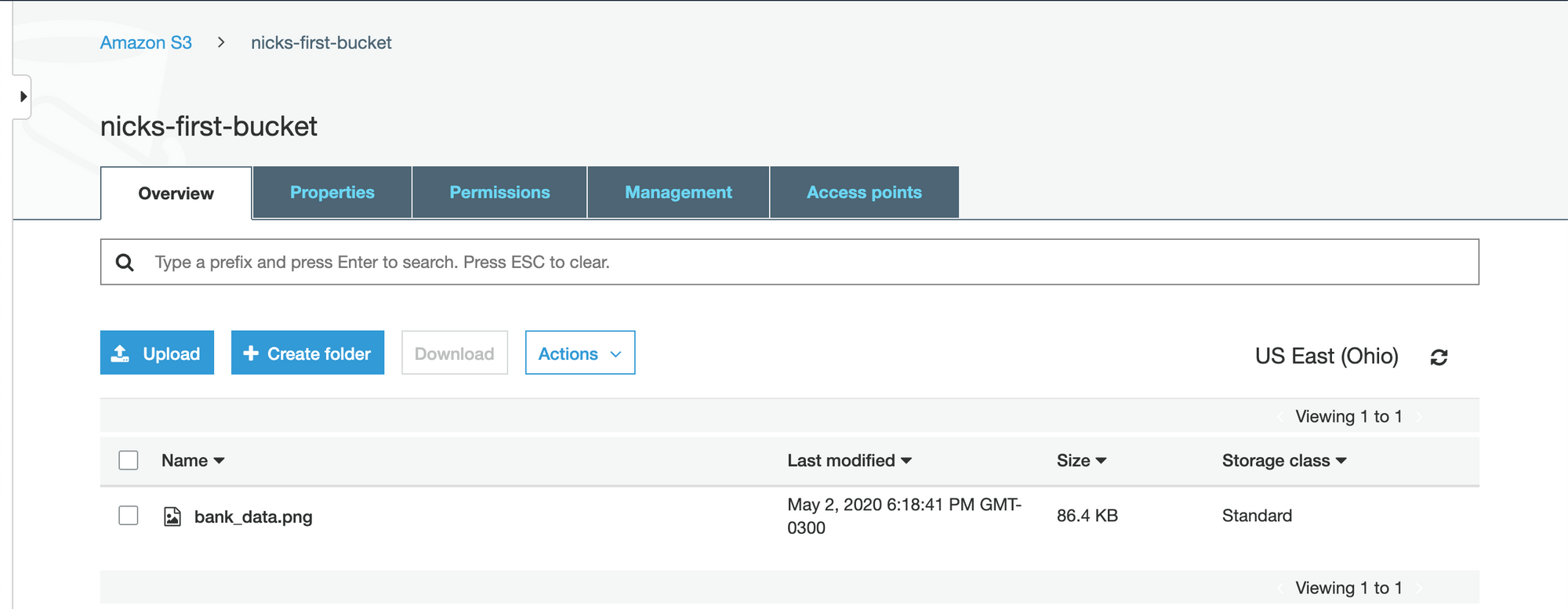
The visualization has been uploaded successfully. We are now ready to embed the visualization on our website!
Step 6: Embed the Visualization on Your Website
Once the data visualization has been uploaded to AWS S3, you will want to embed the visualization somewhere on your website. This could be in a blog post or any other page on your site.
To do this, we will need to grab the URL of the image from our S3 bucket. Click the name of the image within the S3 bucket to navigate to the file-specific page for that item. It will look like this:
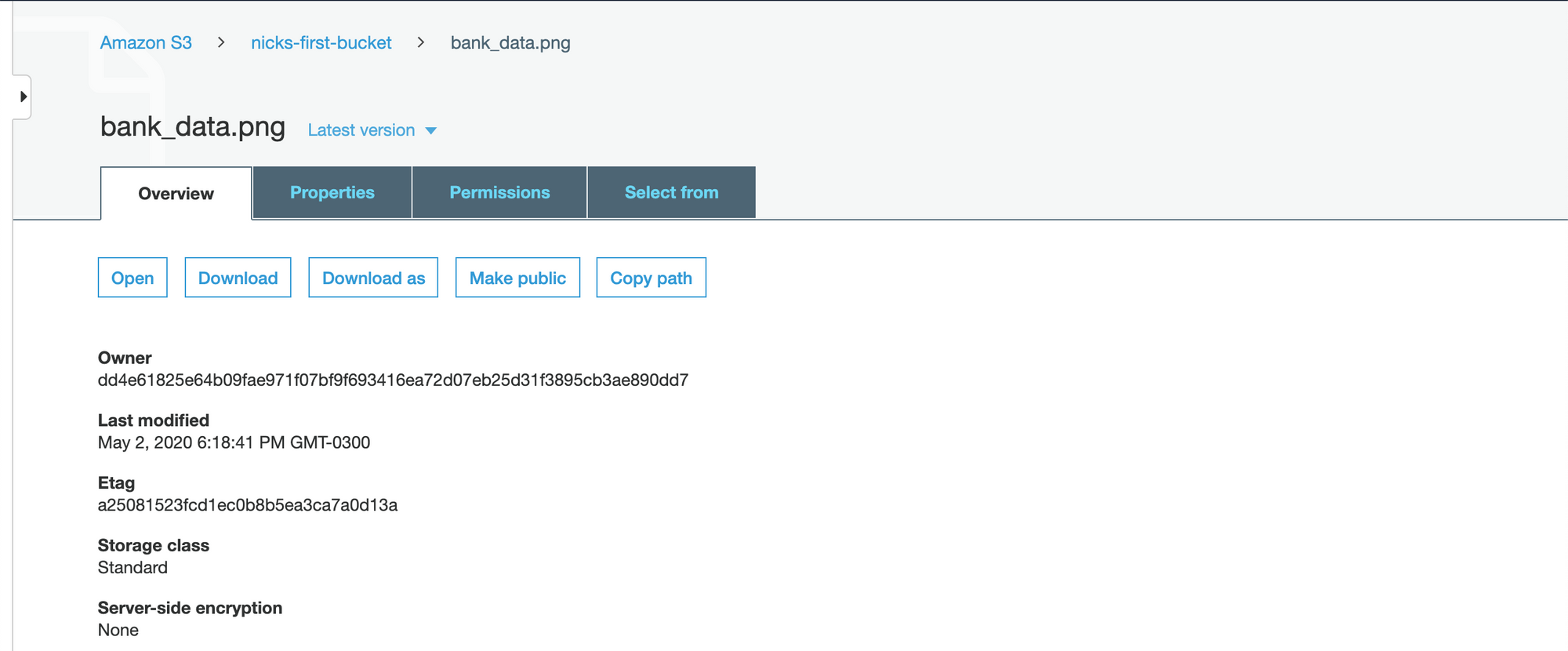
If you scroll to the bottom of the page, there will be a field called Object URL that looks like this:
https://nicks-first-bucket.s3.us-east-2.amazonaws.com/bank_data.png
If you copy and paste this URL into a web browser, it will actually download the bank_data.png file that we uploaded earlier!
To embed this image onto a web page, you will want to pass it into an HTML img tag as the src attribute. Here is how we would embed our bank_data.png image into a web page using HTML:
<img src="https://nicks-first-bucket.s3.us-east-2.amazonaws.com/bank_data.png">
Note: In a real image embedded on a website, it would be important to include an alt tag for accessibility purposes.
In the next section, we'll learn how to schedule our Python script to run periodically so that the data in bank_data.png is always up-to-date.
Step 7: Create an AWS EC2 Instance
We will use AWS EC2 to schedule our Python script to run periodically.
AWS EC2 stands for Elastic Compute Cloud and, along with S3, is one of Amazon's most popular cloud computing services.
It allows you to rent small units of computing power (called instances) on computers in Amazon's data centers and schedule those computers to perform jobs for you.
AWS EC2 is a fairly remarkable service because if you rent some of their smaller computers, then you actually qualify for the AWS free tier. Said differently, diligent use of the pricing within AWS EC2 will allow you to avoid paying any money whatsoever.
To start, we'll need to create our first EC2 instance. To do this, navigate to the EC2 dashboard within the AWS Management Console and click Launch Instance:

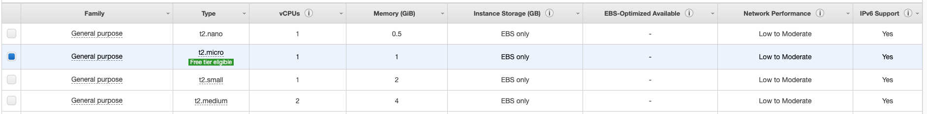
This will bring you to a screen that contains all of the available instance types within AWS EC2. There is an almost unbelievable number of options here. We want an instance type that qualifies as Free tier eligible - specifically, I chose the Amazon Linux 2 AMI (HVM), SSD Volume Type:

Click Select to proceed.
On the next page, AWS will ask you to select the specifications for your machine. The fields you can select include:
FamilyTypevCPUsMemoryInstance Storage (GB)EBS-OptimizedNetwork PerformanceIPv6 Support
For the purpose of this tutorial, we simply want to select the single machine that is free tier eligible. It is characterized by a small green label that looks like this:
Click Review and Launch at the bottom of the screen to proceed.
The next screen will present the details of your new instance for you to review.
Quickly review the machine's specifications, then click Launch in the bottom right-hand corner.
Clicking the Launch button will trigger a popup that asks you to Select an existing key pair or create a new key pair.
A key pair is comprised of a public key that AWS holds and a private key that you must download and store within a .pem file.
You must have access to that .pem file in order to access your EC2 instance (typically via SSH). You also have the option to proceed without a key pair, but this is not recommended for security reasons.
Once this is done, your instance will launch! Congratulations on launching your first instance on one of Amazon Web Services' most important infrastructure services.
Next, you will need to push your Python script into your EC2 instance.
Here is a generic command state statement that allows you to move a file into an EC2 instance:
scp -i path/to/.pem_file path/to/file username@host_address.amazonaws.com:/path_to_copy
Run this statement with the necessary replacements to move bank_stock_data.py into the EC2 instance.
You might believe that you can now run your Python script from within your EC2 instance. Unfortunately, this is not the case. Your EC2 instance does not come with the necessary Python packages.
To install the packages we used, you can either export a requirements.txt file and import the proper packages using pip, or you can simply run the following:
sudo yum install python3-pip
pip3 install pandas
pip3 install boto3
We are now ready to schedule our Python script to run on a periodic basis on our EC2 instance! We explore this in the next section of our article.
Step 8: Schedule the Python script to run periodically on AWS EC2
The only step that remains in this tutorial is to schedule our bank_stock_data.py file to run periodically in our EC2 instance.
We can use a command-line utility called cron to do this.
cron works by requiring you to specify two things:
- How frequently you want a task (called a
cron job) performed, expressed via a cron expression - What needs to be executed when the cron job is scheduled
First, let's start by creating a cron expression.
cron expressions can seem like gibberish to an outsider. For example, here's the cron expression that means "every day at noon":
00 12 * * *
I personally make use of the crontab guru website, which is an excellent resource that allows you to see (in layman's terms) what your cron expression means.
Here's how you can use the crontab guru website to schedule a cron job to run every Sunday at 7am:

We now have a tool (crontab guru) that we can use to generate our cron expression. We now need to instruct the cron daemon of our EC2 instance to run our bank_stock_data.py file every Sunday at 7am.
To do this, we will first create a new file in our EC2 instance called bank_stock_data.cron. Since I use the vim text editor, the command that I use for this is:
vim bank_stock_data.cron
Within this .cron file, there should be one line that looks like this: (cron expression) (statement to execute). Our cron expression is 00 7 * * 7 and our statement to execute is python3 bank_stock_data.py.
Putting it all together, and here's what the final contents of bank_stock_data.cron should be:
00 7 * * 7 python3 bank_stock_data.py
The final step of this tutorial is to import the bank_stock_data.cron file into the crontab of our EC2 instance. The crontab is essentially a file that batches together jobs for the cron daemon to perform periodically.
Let's first take a moment to investigate that in our crontab. The following command prints the contents of the crontab to our console:
crontab -l
Since we have not added anything to our crontab and we only created our EC2 instance a few moments ago, then this statement should print nothing.
Now let's import bank_stock_data.cron into the crontab. Here is the statement to do this:
crontab bank_stock_data.cron
Now we should be able to print the contents of our crontab and see the contents of bank_stock_data.cron.
To test this, run the following command:
crontab -l
It should print:
00 7 * * 7 python3 bank_stock_data.py
Final Thoughts
In this tutorial, you learned how to create beautiful data visualizations using Python and Matplotlib that update periodically. Specifically, we discussed:
- How to download and parse data from IEX Cloud, one of my favorite data sources for high-quality financial data
- How to format data within a pandas DataFrame
- How to create data visualizations in Python using matplotlib
- How to create an account with Amazon Web Services
- How to upload static files to AWS S3
- How to embed
.pngfiles hosted on AWS S3 in pages on a website - How to create an AWS EC2 instance
- How to schedule a Python script to run periodically using AWS EC2 using
cron
This article was published by Nick McCullum, who teaches people how to code on his website.