By Ben Robertson
It’s easy to think about a layout as being a primarily visual concern. The header goes up top, the sidebar is over here, the call to action is in an overlay on top of the content (just kidding). Grids, borders, spacing and color all portray valuable visual data, but if these hints to the structure of a page are only visible, some users may find your content unintelligible.
You can experience this first hand if you try using a screen reader on the web. When I fired up VoiceOver on my Mac and took it out for a test drive, I realized that to a screen reader user, a lot pages are just a big heap of ‘content’, missing helpful organizational cues.
The experience can be kind of like listening to a long rambling story without any indication to what details are important or related to the main thread of the story. Halfway through the story, you aren’t sure whether it’s worth it to keep listening because you don’t know if you’ll even find what it is you’re looking for.
In the context of a website, your screen reader might be halfway through reading you a list of 50 sidebar links when you start wondering if there is any valuable content on the site at all.
Experiences like this are caused by websites that are built with layouts that are only visual. Ideally, however, our visual layouts should point to an underlying organizational model of our content. They should be visual indicators for a conceptual model. The visual indicators are just one way of revealing this model. The Web Accessibility Initiative’s ARIA (Accessible Rich Internet Applications) project provides alternative indicators to users who may need them.
I’ll walk through how to make use of these indicators to make a simple web page easy to use, navigate and read for users of assistive technology. All the example code is available on GitHub.
Initial Layout
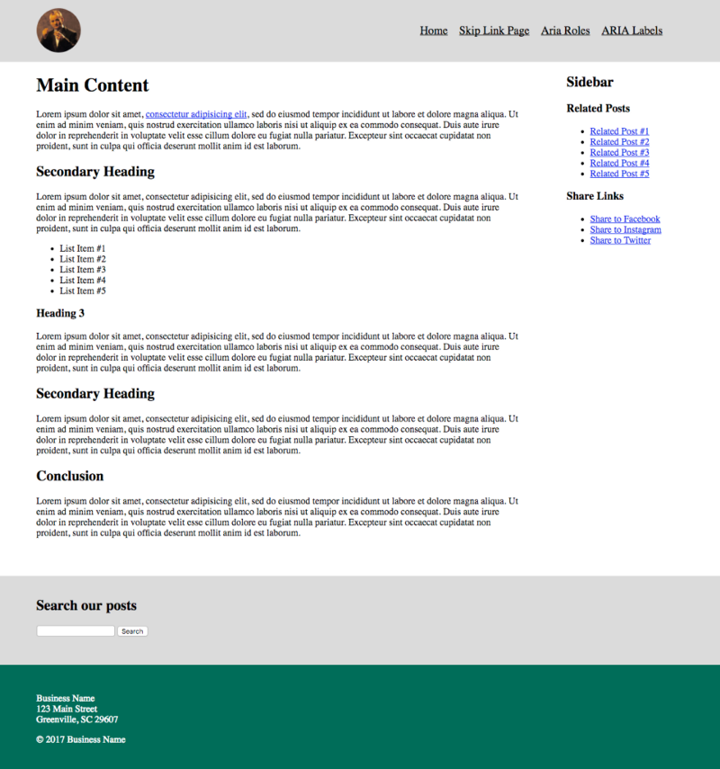
Here’s an example of a page with a pretty simple layout. We’ve got a header at the top containing a logo and navigation, some body content, a sidebar off to the right with a related posts list and a list of social media sharing links, a search box below the content, and a footer containing the contact info of our business.

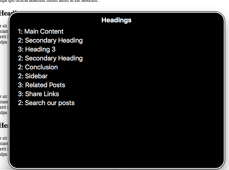
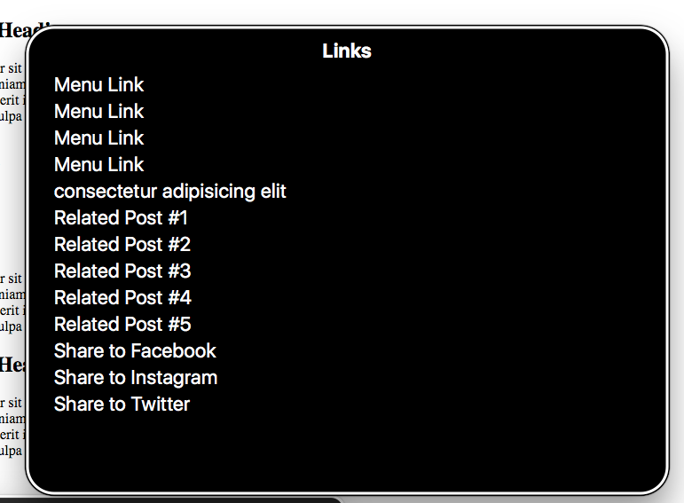
Visually, the content is pretty well divided, using a simple grid and background colors to distinguish the different elements. If you fire up VoiceOver on this page, you can navigate through the page pretty well using the next element command. The order of elements in the markup pretty much follows the visual order of elements. First we read the header, then the body copy, then the sidebar, then the search box, then the footer. That’s pretty good. If I press CAPS + U to pull up the VoiceOver menus, I can get a list of all the headers on the page and all the links, and navigate directly to them.


Just by using well-structured HTML, simple grouping with <div> elements and a good use of heading tags we’ve got a decent experience. It’s better than the rambling story websites I mentioned above, but it could be even better.
Skip Link
First we’ll add a skip-link as the first item of the page. A skip link is a very common accessibility feature that allows users to skip past lengthy lists of links and other information repeated on every web page directly to the main content of the current page. It’s a link that is the first element in the tab order of the page.
Right inside the opening body tag, let’s add:
<a href="#main" class="skip">Skip to main content</a>
We’ll also want to hide this link visually, but make it appear on-screen when it receives focus. To visually hide the link, we’ll add the following CSS:
.skip {
    clip: rect(1px, 1px, 1px, 1px);
    position: absolute !important;
    height: 1px;
    width: 1px;
    overflow: hidden;
    word-wrap: normal !important; /* Many screen reader and browser combinations announce broken words as they would appear visually. */ }
/* Display the link on focus. */
.skip:focus {
    background-color: #fff;
    border-radius: 3px;
    box-shadow: 0 0 2px 2px rgba(0, 0, 0, 0.6);
    clip: auto !important;
    color: #888;
    display: block;
    font-weight: bold;
    height: auto; left: 5px;
    line-height: normal;
    padding: 15px 23px 14px;
    text-decoration: none;
    top: 5px;
    width: auto;
    z-index: 100000;
}
The link location of the skip link needs to be an id pointing to the main content of the page. In our case, I added id="main" to the <div class="content"> section and gave the skip link a url of href="#main".
If you visit the skip link page and hit your Tab key, the link should display. If you fire up VoiceOver and start navigating through the page, the skip link should be the first thing you come across, and clicking it should trigger VoiceOver to start reading the main content of the page.
WCAG Techniques Used
With this step, we’ve allowed users to skip straight to the meat of our page, but beyond easily accessing the main content, they still don’t have a good conceptual map of the rest of the page.
ARIA Roles and Landmarks
One way to provide users with a conceptual map of the page is by using semantic HTML5 elements like <header>, <nav>, <main>;, <section>, and
