
By Swatej Patil
In this tutorial we will learn how to create simple bar and line charts using the Chart.js library in an Angular application.
But first of all, what is Chart.js and what does it do?
What is Chart.js?
Chart.js is a JavaScript library for building charts. It's designed to be intuitive and simple, but powerful enough to build complex visualizations. It has a wide range of chart types including bar charts, line charts, pie charts, scatter plots, and many more.
ChartJs is open-source and you can use it without any restrictions on private or commercial projects. It's written in pure JavaScript and has no dependencies on other libraries such as jQuery or D3.
It also provides options for animating data updates and adding interactivity to charts such as tooltips and click events.
It was created by the team at Plotly and it’s free to use.
Now we can move on with creating our first bar graph in Chart.js
##Prerequisites Before we get started making the charts, just make sure you meet the following prerequisites:
- You have a basic understanding of HTML, CSS, and TypeScript, especially Object Oriented concepts of TypeScript classes and methods.
- You have Node.js version 10 or higher and NPM or Yarn package manager. You can download Node.js from here.
How to Install Angular CLI
Angular CLI is an official tool from the developers of Angular. It is a command-line interface tool which is very useful for initialising and developing Angular applications.
You can install Angular CLI by executing the following command in a terminal or powershell window:
npm install -g @angular/cli
How to Create an Angular Application
Now let’s create an Angular application that will hold our graphs. In a terminal, execute the following commands:
ng new angular-chartjs
Now that you've created your angular application, navigate to the project folder and start the local development server using the following command:
cd angular-chartjs
ng serve -o
A browser window will open on http://localhost:4200/ and you can see your running Angular application there.
Now open a new terminal window in the same directory and install the Chart.js library using the following command:
npm install chart.js
Now we need to create two angular components: one for the Bar graph and the other for the line chart.
You can create them easily with the Angular CLI by executing the following commands:
ng generate component bar-chart
ng generate component line-chart
How to Create a Bar Graph with Chart.js
A bar graph is a graphical representation of data, in which the horizontal and vertical axes represent the values, and the length of each bar represents the values specified on the axis.
Bar graphs are one of the most common forms of graphs when it comes to representing data visually. We use them to identify trends and patterns in various data sets.
When to use bar charts:
- To show multiple values at once
- To provide a graphical representation of data
- To compare datasets
- To examine relationships between different variables.
A bar chart is often used in business and economics to show comparisons between products, services, or companies. In our example, we have taken the data of sales and profits made on each day during an 8-day period.
Now that we have created the components, we will move on with creating the bar chart.
Inside the bar-chart component, open the bar-chart.component.html file and paste the following code:
<div class="chart-container">
      <canvas  id="MyChart" >{{ chart }}</canvas>
</div>
We have simply created a container and inside that container a canvas with an id of MyChart. We have used Angular’s string interpolation to render the chart variable, which we will create in the canvas.
Inside the bar-chart component, open the bar-chart.component.ts file and import the Chart.js library using the following commands:
import Chart from 'chart.js/auto';
//or
import Chart from 'chart.js';
Now let’s make the chart veritable we mentioned earlier. This variable will hold the information of our graphs.
public chart: any;
Now we will create a method for the bar chart. This will include the data and labels for our bar chart. Copy the following code and paste it in the bar-chart.component.ts file below the ngOnInit() function:
createChart(){

    this.chart = new Chart("MyChart", {
      type: 'bar', //this denotes tha type of chart

      data: {// values on X-Axis
        labels: ['2022-05-10', '2022-05-11', '2022-05-12','2022-05-13',
                                 '2022-05-14', '2022-05-15', '2022-05-16','2022-05-17', ],
           datasets: [
          {
            label: "Sales",
            data: ['467','576', '572', '79', '92',
                                 '574', '573', '576'],
            backgroundColor: 'blue'
          },
          {
            label: "Profit",
            data: ['542', '542', '536', '327', '17',
                                     '0.00', '538', '541'],
            backgroundColor: 'limegreen'
          }
        ]
      },
      options: {
        aspectRatio:2.5
      }

    });
  }
The above code might look daunting at first, but it's quite simple. We are providing the type of chart, the labels, and the data.
We want our createChart() function to run as soon as the page loads. In order to do that we need to call the function in the ngOnInit() like this:
ngOnInit(): void {
    this.createChart();
  }
Finally, we need to add the HTML selector of the bar-chart component to the app.component.html file.. Remove the initial Angular template code and add the following:
<app-bar-chart></app-bar-chart>
Congratulations! If you have followed along carefully then you shouldn’t run into any errors and your output may look like the following:

How to Create a Line Graph with Chart.js
Line charts similar to bar charts are often used to show trends in data over time, such as economic growth or changes in stock prices.
Line charts are also useful for showing changes in quantities, such as population over time or weight loss over a period of weeks.
With a line graph, as opposed to a bar graph, you draw individual points on the two axes and connect nearby points with straight lines.
When to use bar charts:
- When the differences in data points are smaller
- To show trends over the course of time
If you have created the bar graph, then creating a line graph is quite simple. Just follow the same steps you have done so far (and make sure to do them on the line chart component).
Paste the same code for createChart() method on the line-chart.component.ts file below the ngOnInit() function. You just need to change the keyword for type of chart from bar to line.
Your code should look like the following:
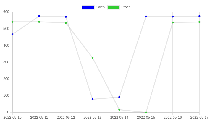
createChart(){

    this.chart = new Chart("MyChart", {
      type: 'line', //this denotes tha type of chart

      data: {// values on X-Axis
        labels: ['2022-05-10', '2022-05-11', '2022-05-12','2022-05-13',
                                 '2022-05-14', '2022-05-15', '2022-05-16','2022-05-17', ],
           datasets: [
          {
            label: "Sales",
            data: ['467','576', '572', '79', '92',
                                 '574', '573', '576'],
            backgroundColor: 'blue'
          },
          {
            label: "Profit",
            data: ['542', '542', '536', '327', '17',
                                     '0.00', '538', '541'],
            backgroundColor: 'limegreen'
          }
        ]
      },
      options: {
        aspectRatio:2.5
      }

    });
  }
Call the createChart() function in ngOnInit() and your line chart is ready.
ngOnInit(): void {
    this.createChart();
  }
Finally, we need to add the HTML selector of the line-chart component to the app.component.html file.
<app-line-chart></app-line-chart>
Your output may look like the following:
The full code for this Angular application is hosted on my GitHub Repo.
I hope you found this tutorial helpful. Thank you for reading!
Photo by Luke Chesser | Unsplash