By Nabeena Mali
With just 24 app icon slots on the first page of an iPhone home screen, or 28 if you have a fancy iPhone 7, creating the perfect app icon is a vital step in user adoption.
I once met someone who had an app icon containing every letter of the alphabet on his homescreen, but that zany aesthetic is hardly for everyone — for the average downloader, app icons represent the first encounter users have with a new app. So it needs to be a good one!
If your app icon is ugly, users will either delete the app or hide it away in a folder somewhere that they might forget about it. Unfortunately, this is one area in which looks really do matter. So what can you do to make sure that your app’s icon is the homecoming queen and not the shy girl next door?
Stick to Popular Colours
There are various articles out there dedicated to the science behind choosing a colour(s) for your app icon. One helpful soul has even created the follow diagram of the most popular colours for app icons:
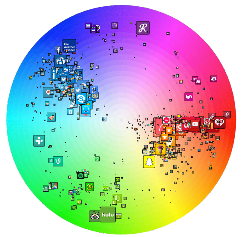
The implications of this are twofold: using primarily red, blue or maybe green for your app icon is a fairly safe way to go. On the flip side, you could choose a pink, purple, or yellow hue to stand out from the crowd a little more.
Obviously, there are advantages and disadvantages to each of these routes. What’s safe and familiar also risks being forgettable, while breaking the mould carries the risk of looking too different and not blending well with other apps.
Use a Letter (or Don’t…)
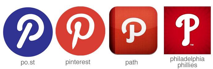
From Facebook’s ‘F’ and Hotels.com’s ‘H’ to Dailymotion’s ‘D’ and Skype’s ‘S’, there’s no shortage of apps out there that use the first letter of the company’s name in their app icon.
While that’s undoubtedly a smart and straightforward move, it’s not without its risks if the name of your app starts with a very popular letter.
Think about the apps already out there, particularly if you’ll be competing directly with them, and go a different route if you’re concerned about being confusing or overly similar.
Maybe, given Skype’s longstanding associated with the letter ‘S’ in a cloud, that’s what prompted Skyscanner to come up with this neat little abstract symbol for their app icon.

Using a letter is a very safe choice, especially if your app logo has a distinctive font associated with it.
Take that distinctive Facebook ‘f’, for example, which is instantly recognisable thanks to the company logo’s ongoing association with a modified version of the Klavika Bold font.
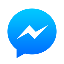
But as a company, it seems even Facebook can’t decide whether letters or symbols are best for app icons. Why else would they have channelled their inner Harry Potter when coming up with a icon for Messenger instead of using an ‘m’ in a speech bubble?
Use a Coherent Colour Scheme
If there’s one thing worse than an ugly app icon, it’s a beautiful app icon that opens up to reveal an unappealing or dated looking app. First impressions are important but, if you can’t live up to the high standards set by them, you’ll fail anyway.
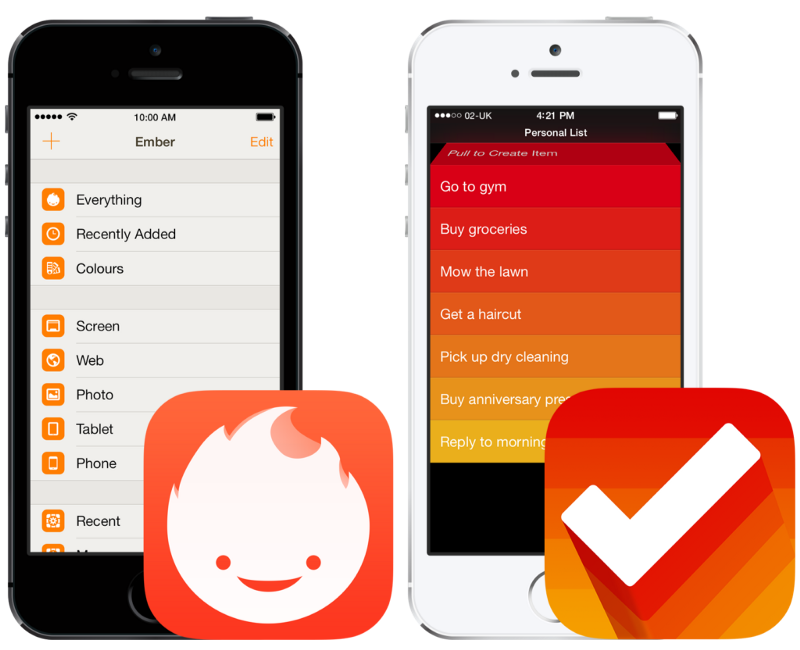
Hat tip to Dan Counsell, who gave the following examples of how Ember and Clear keep their experience consistent all the way from opening the app to actually using it:
But that’s not to say that everything has to be exactly the same, though.
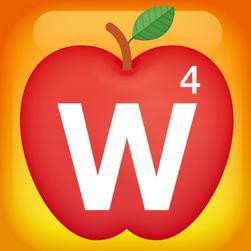
Take Words With Friends, for example, which added a heart and shamrock to their app icon for Valentine’s Day and St Patrick’s Day respectively. A nice way to stay relevant, for sure… as long as users update their apps regularly enough to see it in time.
And then there’s their educational offering:
Reflect Your App’s Purpose
Do you remember when Instagram changed their icon? I do, not least because it’s something I was asked to write about for Crazy Egg. But a lot of people don’t know that Instagram had another app icon before they changed it to the brown rainbow one that everyone knew and loved:
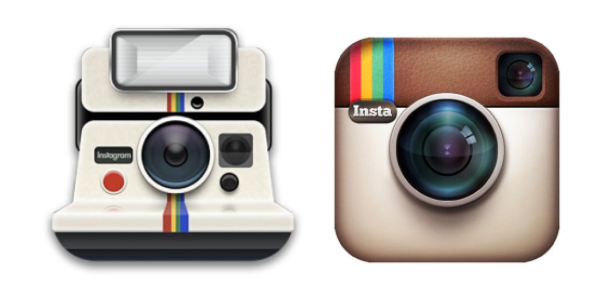
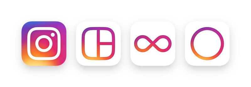
The founder gave the following reason for the first logo change: “The old icon had nothing to do with Instagram.” With that sentiment in mind, it’s actually pretty easy to understand why Instagram decided to change their suite of logos to this:
The vintage brown camera icon had everything to do with nostalgia, like that evoked by the flapping of a Polaroid picture, and nothing to do with the future of photography. And, with 80 million photos shared every day on Instagram, that’s exactly — whether you like it or not — what Instagram is.
Conclusion
Disappointingly, but predictably, there’s no straightforward route to creating the perfect app icon. Hence there being such a wide array of different looking icons out there!
The above tips are useful, but they’re not something you can set your watch by — an app aimed at children or teenagers will, for example, look very different to one that’s used mostly by, say, businessmen or retirees.
There’s another good place to start when you’re trying to find inspiration for app icons, and it’s probably either in your pocket or lying on your desk. Or maybe you’re reading this article on it. I’m talking about your smartphone!
Most founders, app creators etc. build products or apps to address a problem that they’ve identified in their own lives. In other words, you are probably a pretty good representation of your target market. Think about app icons you find attractive, or at least are willing to make room for on your home screen, and you’ll be on your way to app icon success.
And hey, even if you do end up creating a really ugly app icon, it could always end up generating notoriety on Reddit.
You can read more of my writing on appinstitute.com.