
Modals can be a tricky topic in React because of the way React structures the DOM. If you’re familiar with the basics of React, you will know that the entire App is a component, usually called <App/> that gets gets appended as a child <div> called #root. The index.html file looks like this:
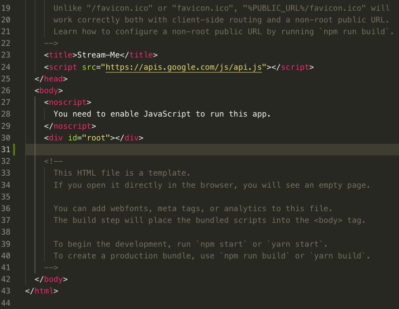
create-react-app’s public/index.html file
Once the <App/> Component gets rendered to the DOM, the actual <div> element with id “#root” gets the entire React App rendered inside it.
Consequently, it’s quite common that React App Components get very deeply nested. We are talking dozens of levels deep, and often more. So if one of those deeply nested Components needs to show a modal, it’s going to face some serious CSS issues.
Modals put an overlay on the screen, and therefore take a higher visual precedence over all other elements. If you had to put it in z-index terms, it would need to be the highest number of all the elements on screen. But since it is so deeply nested, the parent elements way up the tree take CSS precedence.
Rather than touching the CSS which may be finely tuned, and so fiddling there could break the App, we need to find a way to render to the DOM — but outside of the deep nesting.
Solution — React Portals
One strategy is to use ReactDOM portals, and put the modal in a div that is a sibling component to the div with id “#root”. By doing so, the CSS styles applied to the modal’s div wrapper will apply only in relation to its sibling (the “#root” div), and that will not break the CSS styling of “#root”.
To do so we need to use the createPortal() method of ReactDOM. A portal is effectively such a sibling div, that bends the rule that all React components must be descendants of <div id=”root">. To do so we need to do the following:
- In index.html, inside the
<bod**y>**tag:
<body>
    <noscript>
      You need to enable JavaScript to run this app.
    </noscript>

    <div id="root"></div>

    <div id="modal"></div> .   //ADD THIS

  </body>
</html>
2. Create a Modal.js Component (classNames are from semantic-UI):
import React from "react";
import ReactDOM from "react-dom";

const JSX_MODAL = (
  <div className="ui dimmer modals visible active">
    <div className="ui standard modal visible active">
      THIS IS SOME TEXT IN THE MODAL // add some UI features here
    </div>
  </div>
);


function Modal(props) {
  return ReactDOM.createPortal(JSX_MODAL, document.querySelector("#modal"));
}


export default Modal;
You will see that createPortal takes two arguments: some JSX that gets rendered, and similar to ReactDOM.render, the target element under which the JSX gets rendered.
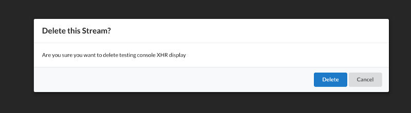
If you render the Component and navigate to it, you should find it shows up quite well. You now need to add the appropriate onClick() handler to handle click events inside the inner modal UI as well as to navigate away from the modal if the user clicks outside the inner modal UI.
You’d want to do this by listening for clicks in the right area and then stopping propagation so that the right behaviors arise depending on the region where the user clicks.
Reusability
The above example is extremely basic, and is not intended to be a ready to use code snippet. Rather, this is a solution to tackling modals. You should absolutely customise the component according to your needs. Use the React principles of reusability to ensure that you’re not hard coding data in the Modal, and pass down the content and even smaller widgets as needed.
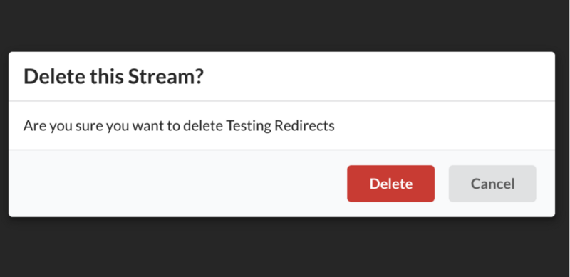
For example, in one of my projects, I present a modal when the user is going to delete something from the database. So my component is, say, called <DeleteThis />. It renders <Modal />, which is the overlay that dims the underlying <DeleteThis /> screen.
render() {
    return (
      <div>
        <Modal
          content={this.renderContentProp()}
          header="Delete this?"
          actions={this.renderActionButtons()}
          onDismiss={this.onDismiss}
        />
      </div>
    );
  }

  renderActionButtons = () => {
    //return JSX that renders action buttons...
    return (
      <div>
        <div className="ui button primary">Delete</div>
        <div className="ui button">Cancel</div>
      </div>
    );
  };
Within <Modal /> is an inner component called <InnerModal /> and this has the actual interactive component, with headers, content and text.
So my <DeleteThis /> component creates props to pass down into <;Modal /> which in turn gets drilled down into <;InnerModal />, and so the render method in looks like:
…with the actual Modal Component looking like:
import React from "react";
import ReactDOM from "react-dom";
import ModalInner from './modal-inner'

function Modal(props) {
  return ReactDOM
    .createPortal(
       <ModalInner {...props} />,
       document.querySelector("#modal")                      //target DOM element
     );
}
export default Modal;
and now, you’re finally able to render:
Voilà, there you have it! Modals, with React Portal! Hope you enjoyed this!
And hope it saved you some time…
If you would like to learn more about my journey into code, check out episode 53 of the freeCodeCamp podcast, where Quincy (founder of freeCodeCamp) and I share our experiences as career changers that may help you on your journey. You can also access the podcast on iTunes, Stitcher, and Spotify.
I will also hold a few AMAs and webinars in the coming months. If this is of interest to you please let me know by going here. And of course, you can also Tweet me at @ZubinPratap.