

Carousels or image sliders are an integral part of many web applications. They help you group multiple elements in a single view.
Using carousels, you can implement image slides, video slides, text slides, interactive image galleries, product catalogs, team profiles, and more.
Swiper.js comes with powerful functionalities that make it easy to create functional, reusable carousel components with stunning effects and functionality. You can enable zooming in and out from images, horizontal and vertical image scrolling, parallax slide effects, and infinite loop slides, just to mention a few.
In this tutorial, we’ll be focusing on the new version of Swiper, 11.0.6, and the new Swiper Element that is recommended for building slides in Swiper.js.
By the end of this guide, you should be able to implement the new Swiper Element from Swiper.js to create responsive, dynamic slides with pre-made effects in your React project.
Table of Contents
- What is Swiper.js?
- Installations
- How to Set Up Swiper
- Swiper Parameters as Attributes
- Responsive Breakpoints in Swiper Element
- Pagination and Navigation
- Lazy Loading Images
- Effects in Swiper Element
- Vertical Sliders
- How to Style Swiper Element
- How to Build a Custom Slider Element
- Summary
- References
Prerequisites
Before you get started, you'll need to have basic knowledge of React.js.
If you need a refresher, you can check out this React handbook for beginners.
What is Swiper.js?
Swiper is a free, modern JavaScript library for building touch sliders (Carousels) with hardware transitions and amazing native behaviors.
Swiper is built for mobile websites, mobile web apps, and mobile native/hybrid apps. Swiper also comes with great support and functionalities for Desktop websites and web applications.
As of the time of writing, Swiper v11.0.6 recommends migrating to Swiper Element instead of Swiper React Components, which will likely be removed in future versions. In this tutorial, we’ll be focusing on Swiper Element and its use cases.
Installations
To get started, generate some React boilerplate code with Vite.js. Next, navigate to the project directory in your Terminal and type the command below to install Swiper.js:
npm i swiper
Next, type the command below to launch your React.js boilerplate code:
npm run dev
Click on the port URL on the Terminal to open up your React boilerplate code on the browser.
How to Set Up Swiper
To use Swiper in a React project, you can use the following methods.
Node Modules
If you install Swiper via npm i swiper, then import the custom element from node_modules and register it.
├─ main.jsx

// import function to register Swiper custom elements
import { register } from 'swiper/element/bundle';
// register Swiper custom elements
register();
This should be done once directly on the main.jsx file to install it globally.
Swiper Custom Elements from CDN
To enable Swiper Element, include the CDN link in the script tag as indicated below:
├─ index.html
<head>
    <script src="https://cdn.jsdelivr.net/npm/swiper@11/swiper-element-bundle.min.js"></script>
</head>
Do this once directly on the index.html file to enable it globally.
Swiper Custom Elements
If you’ve successfully set up Swiper Element, and call the register() method. To create a slider, you'll need to use <swiper-container> and <swiper-slide> from Swiper.js.
export default function Usage() {
  return (
    <>
    <main>
        <swiper-container>
            <swiper-slide>Slide1</swiper-slide>
            <swiper-slide>Slide2</swiper-slide>
            <swiper-slide>Slide3</swiper-slide>
            <swiper-slide>Slide4</swiper-slide>
            <swiper-slide>Slide5</swiper-slide>
        </swiper-container>
    </main>
    </>
  )
}
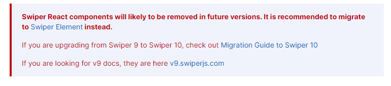
The code above shows how to structure slides using Swiper Custom Elements.
<swiper-container>: This is the parent element that serves as a container to the<swiper-slide>Custom Element and other HTML Elements that make up the slides. Any Element that is nested inside the<swiper-container>Custom Element is treated as a slide.<swiper-slide>: This is the direct child of the<swiper-container>Custom Element. The<swiper-slide>serves as the individual slide of the slider components.
For clarity purposes, I have added some custom CSS styles to make it visually appealing and easy to understand. Copy the code below: 👇
*,*::before, *::after {
    margin: 0;
    padding: 0;
    box-sizing: border-box;
    font-family: calibri;
}

body {
    display: flex;
    justify-content: center;
}

swiper-container {
    width: 800px;
    height: 200px;
    line-height: 200px;
    text-align: center;
}

swiper-slide {
    background-color: rgb(4 47 46);
    color: #fff;
    font-size: 25px;
}

swiper-slide:nth-child(2) {
    background-color: rgb(15 118 110);
}

swiper-slide:nth-child(3) {
    background-color: rgb(45 212 191);
}

swiper-slide:nth-child(4) {
    background-color: rgb(153 246 228);
}

swiper-slide:nth-child(5) {
    background-color: rgb(34 197 94);
}
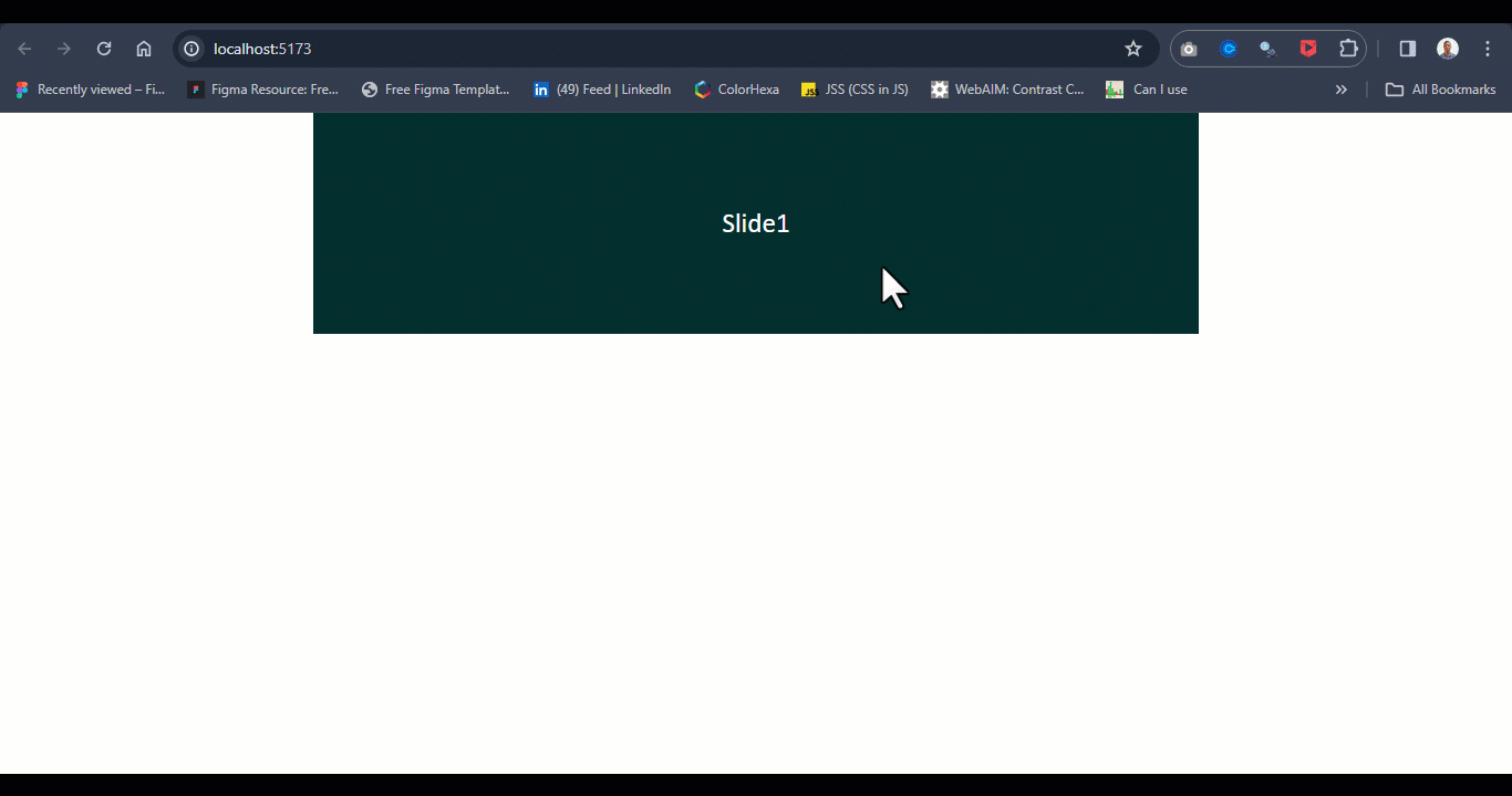
Your code should look just like this in your browser:
Swiper Parameters As Attributes
Parameters in Swiper are key and value or key, subkey, and value pairs as indicated below.
const swiper = new Swiper('.swiper', {
  scrollbar: {
    el: '.swiper-scrollbar',
    draggable: true,
  },
mousewheel: {
    invert: true,
  },
slidesPerView: 3,
spaceBetween: 20,
scrollbar: {
    clickable: true,
});
The above code is valid if we are working directly on the index.html file and we're using the swiper and swiper-slide classes on div elements.
For Swiper Custom Elements, you can write the same code as follows: 👇
export default function Usage() {
return (
    <>
    <main>
    👉  <swiper-container slides-per-view="3" space-between="20" scrollbar-clickable="true" mousewheel-invert="true">
            <swiper-slide>Slide1</swiper-slide>
            <swiper-slide>Slide2</swiper-slide>
            <swiper-slide>Slide3</swiper-slide>
            <swiper-slide>Slide4</swiper-slide>
            <swiper-slide>Slide5</swiper-slide>
        </swiper-container>
    </main>
    </>
)
}
All Swiper parameters are written in the form of kebab-case attributes on the <swiper-container> Custom Elements.
Parameters with subkeys and values are written as a single attribute and value. For example, scrollbar-clickable=”true” is a parameter with subkey (clickable) now written as a single attribute with a value.
If you run the code above, you should get the same result as below:
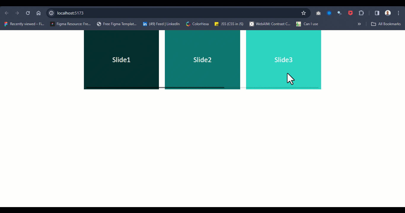
From the browser out, we’ve been able to split the view to three-column views instead of the one-column view we previously had. We were able to do this using the slide-per-view attribute parsed to the <swiper-container> Custom Element. For the full available list of parameters, see the Swiper APIs.
Responsive Breakpoints in Swiper Element
Swiper Custom Element requires attributes to parse parameter objects. Where complex object properties are required in the case of breakpoints, we can use JSON.stringify() to convert objects to strings, making the breakpoints object properties readable values to the <swiper-container>.
Consider the code example below:
export default function Usage() {
return (
    <>
    <main>
        <swiper-container breakpoints={
            JSON.stringify({

                640:{
                    slidesPerView: 1,
                    spaceBetween: 20,
                },

                768: {
                    slidesPerView: 3,
                    spaceBetween: 40,
                },

                1024: {
                    slidesPerView: 4,
                    spaceBetween: 50,
                }
            })
        }>
            <swiper-slide>Slide1</swiper-slide>
            <swiper-slide>Slide2</swiper-slide>
            <swiper-slide>Slide3</swiper-slide>
            <swiper-slide>Slide4</swiper-slide>
            <swiper-slide>Slide5</swiper-slide>
            <swiper-slide>Slide6</swiper-slide>
            <swiper-slide>Slide7</swiper-slide>
            <swiper-slide>Slide8</swiper-slide>
            <swiper-slide>Slide9</swiper-slide>
        </swiper-container>
    </main>
    </>
)
}
Here, we are adding three different breakpoints 640, 768, and 1024 respectively for three different screen sizes (media queries), where 640 means (max-width:640px) for small screens.
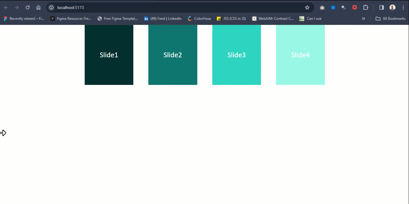
Your code should look like this when you run it on the browser:
Keep in mind that breakpoints respond as soon as the components mount (that is, React renders the components for the first time). So if you happen to resize your Desktop browser while learning this, you will need to reload the entire page by clicking on the reload icon to see the breakpoints changes.
Pagination and Navigation
Swiper comes with navigation and pagination parameters for adding controls to sliders. With navigation, you can move from the current slide to the previous or next slide, while with pagination you can jump to a specific slide within the slider container.
To enable this on the swiper custom element, apply each parameter as an attribute on the <swiper-container> with a value of true.
export default function Usage() {

return (
    <>
    <main>
    <swiper-container space-between="10" slides-per-view="3" pagination="true" navigation="true" >
            <swiper-slide>Slide1</swiper-slide>
            <swiper-slide>Slide2</swiper-slide>
            <swiper-slide>Slide3</swiper-slide>
            <swiper-slide>Slide4</swiper-slide>
            <swiper-slide>Slide5</swiper-slide>
        </swiper-container>
    </main>
    </>
)
}
Your code should look just like this on the browser:
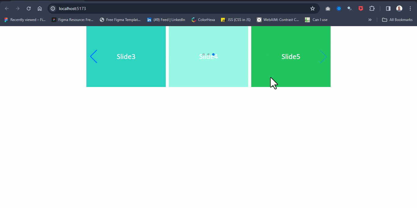
To move the slides, click on the navigation arrow or pagination bullet points.
Lazy Loading Images
We can implement lazy loading on image sliders in Swiper Custom Elements. Apply the lazy=”true” and loading=”lazy” as attributes on the <swiper-slide> and the <img /> tag, respectively.
export default function Usage() {

return (
    <>
    <main>
    <swiper-container style={
        {
        "--swiper-navigation-color": "#fff",
        "--swiper-pagination-color": "#fff"
        }
    }
    pagination-clickable="true"
    navigation="true"
    className="mySwiper">
            <swiper-slide lazy="true">
                <img src="https://source.unsplash.com/slightly-opened-silver-macbook-mP7aPSUm7aE" loading="lazy" alt="" />
            </swiper-slide>

            <swiper-slide lazy="true">
                <img loading="lazy" src="https://source.unsplash.com/macbook-y0_vFxOHayg" alt="" />
            </swiper-slide>

            <swiper-slide lazy="true">
                <img loading="lazy" src="https://source.unsplash.com/black-macbook-near-black-iphone-7-plus-and-black-apple-watch-HY3l4IeOc3E" alt="" />
            </swiper-slide>

            <swiper-slide lazy="true">
                <img loading="lazy" src="https://source.unsplash.com/apple-products-on-table-tdMu8W9NTnY" alt="" />
            </swiper-slide>

            <swiper-slide lazy="true">
                    <img loading="lazy" src="https://source.unsplash.com/turned-on-ipad-Im8ylpB8SpI" alt="" />
            </swiper-slide>
        </swiper-container>
    </main>
    </>
)
}
Implementing lazy loading on images will require the lazy preloader element to be added to each slide on the <swiper-slide> component when lazy="true" is set on the element.
I added some CSS styles to clean things up a bit, so you can just copy the below code:
*,*::before, *::after {
    margin: 0;
    padding: 0;
    box-sizing: border-box;
    font-family: calibri;
}

body {
    display: flex;
    justify-content: center;
}

swiper-container {
    width: 800px;
    height: 400px;

}

swiper-slide {
   width: 100%;
   height: 100%;
}

swiper-slide img {
    width: 100%;
    height: 100%;
    object-fit: cover;
}
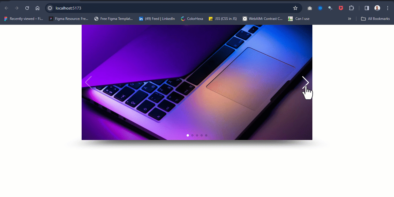
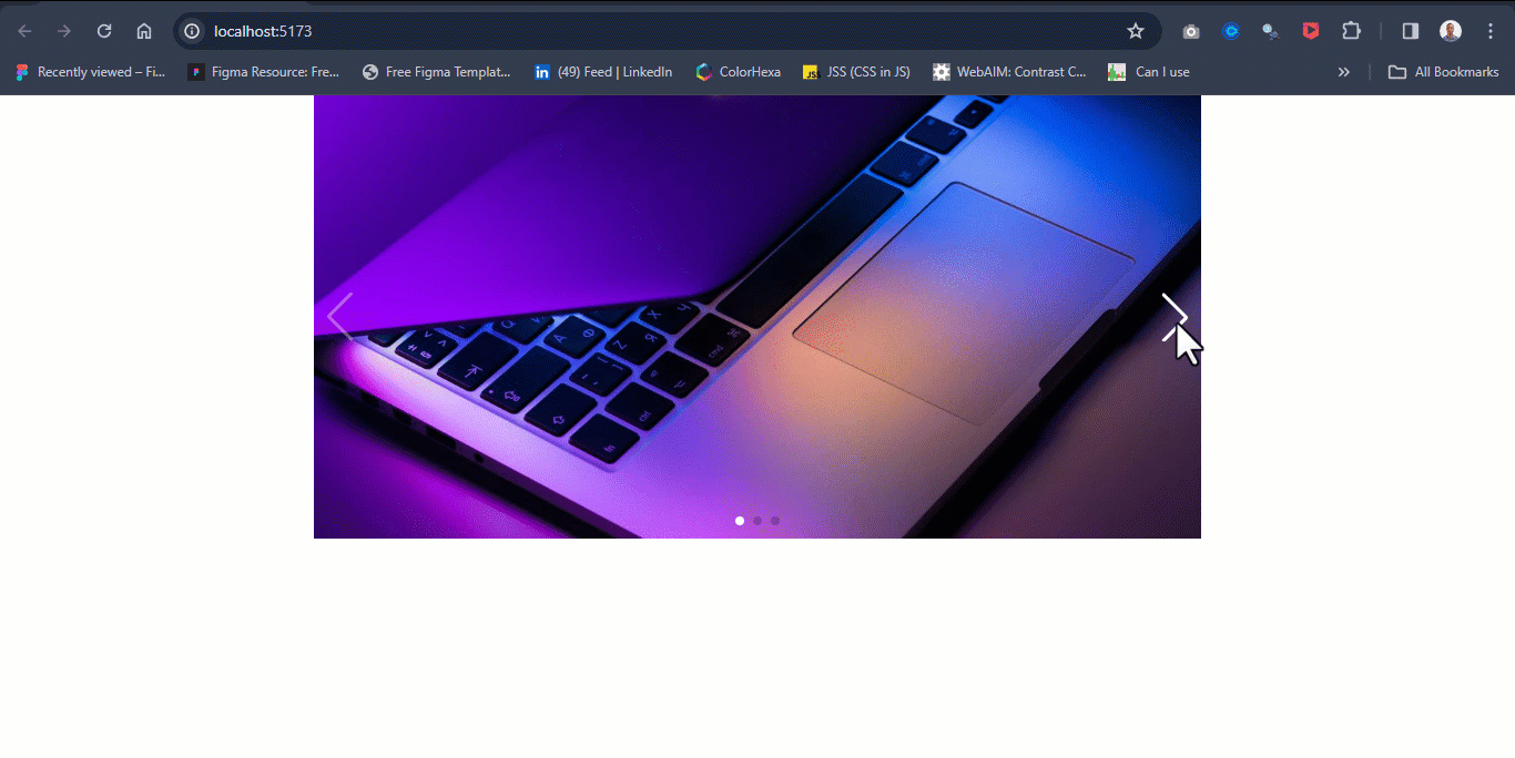
Your code should look like this when you run it on the browser:

Effects in Swiper Element
You can add effects in Swiper Element by setting the effect attribute to the desired value you need for your project. For example, we implemented a cube effect to create a 3D-like slide display.
export default function Usage() {

return (
    <>
    <main>
    <swiper-container style={
        {
        "--swiper-navigation-color": "#fff",
        "--swiper-pagination-color": "#fff"
        }
    }

    pagination-clickable="true"
    navigation="true"
    effect="cube"
    grab-cursor="true"
    cube-effect-shadow="true"
    cube-effect-slide-shadows="true"
    cube-effect-shadow-offset="20"
    cube-effect-shadow-scale="0.94"

    className="mySwiper">
            <swiper-slide >
                <img src="https://source.unsplash.com/slightly-opened-silver-macbook-mP7aPSUm7aE"  alt="" />
            </swiper-slide>

            <swiper-slide>
                <img src="https://source.unsplash.com/macbook-y0_vFxOHayg" alt="" />
            </swiper-slide>

            <swiper-slide>
                <img src="https://source.unsplash.com/black-macbook-near-black-iphone-7-plus-and-black-apple-watch-HY3l4IeOc3E" alt="" />
            </swiper-slide>

            <swiper-slide>
                <img src="https://source.unsplash.com/apple-products-on-table-tdMu8W9NTnY" alt="" />
            </swiper-slide>

            <swiper-slide>
                    <img src="https://source.unsplash.com/turned-on-ipad-Im8ylpB8SpI" alt="" />
            </swiper-slide>
        </swiper-container>
    </main>
    </>
)
}
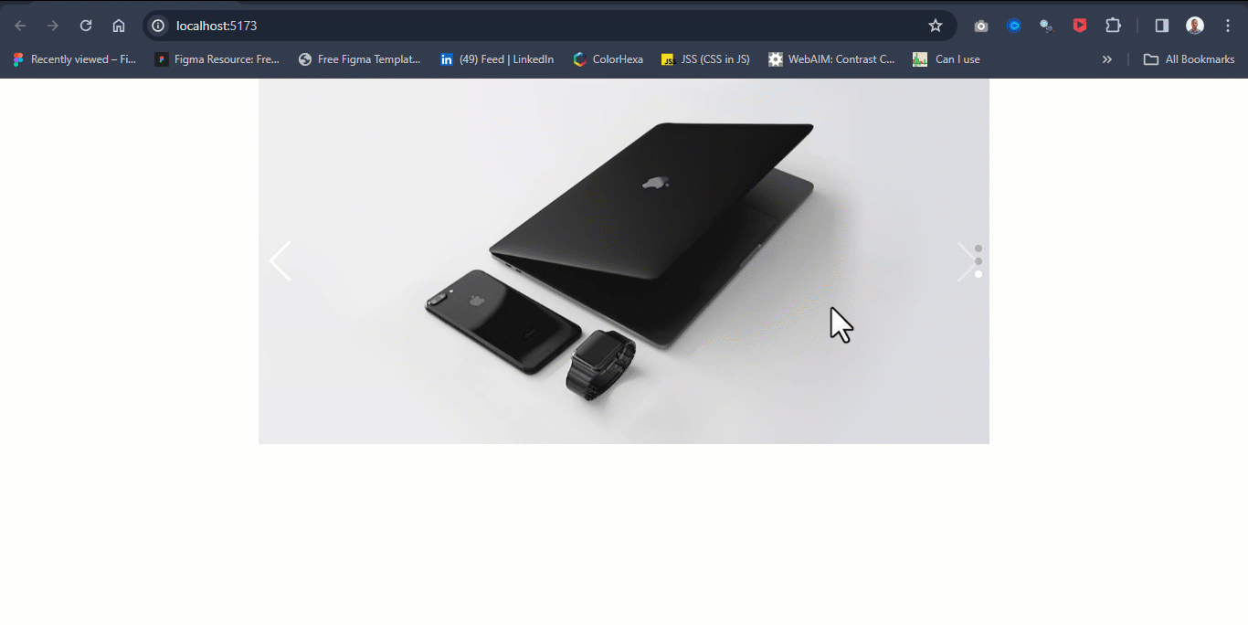
Your code should look like this on the browser:
Here, we apply the cube effect's attributes as follows:
- effect=”cube”: sets the slider to a cube
- grab-cursor=”true”: changes the cursor to a grabbable icon.
- cube-effect-shadow=”true”: sets the shadow to the main slide component
- cube-effect-slide-shadows=”true”: sets the shadow to the slide element
- cube-effect-shadow-offset=”true”: sets the offset direction of the shadow
- cube-effect-shadow-scale: sets the size of the shadow
Aside from the cube effect, you can specify other values as you can find listed in the Swiper API here.
Vertical Sliders
To apply vertical slides, simply apply the direction="vertical” attribute on the <swiper-component> as you can see in the code below:
export default function Usage() {

return (
    <>
    <main>
    <swiper-container style={
        {
        "--swiper-navigation-color": "#fff",
        "--swiper-pagination-color": "#fff"
        }
    }

    pagination-clickable="true"
    navigation="true"

    direction="vertical"

    className="mySwiper">
            <swiper-slide >
                <img src="https://source.unsplash.com/slightly-opened-silver-macbook-mP7aPSUm7aE"  alt="" />
            </swiper-slide>

            <swiper-slide>
                <img src="https://source.unsplash.com/macbook-y0_vFxOHayg" alt="" />
            </swiper-slide>

            <swiper-slide>
                <img src="https://source.unsplash.com/black-macbook-near-black-iphone-7-plus-and-black-apple-watch-HY3l4IeOc3E" alt="" />
            </swiper-slide>

        </swiper-container>
    </main>
    </>
)
}
Your code should look like this when you run it on the browser:
How to Style Swiper Element
Styling Swiper Element is very straightforward. Swiper comes with lots of premade classes that are applied to Swiper parameters (Attributes in Swiper Custom Elements). We can overwrite the default style rules on these classes with the HTML style attribute or external CSS rules.
Swiper Custom Elements can be styled in two ways: you can reset the default styles on the Swiper Custom Elements and the Custom CSS Classes, or create a new class name on the Swiper Element and style it.
Reset Swiper Custom Styles
To reset the Swiper Custom Element styles, target the specific Swiper Custom Elements or classes that the default styles are applied to and change them to your desired styles.
export default function Usage() {

return (
    <>
    <main>
    <swiper-container style={
        {
        "--swiper-navigation-color": "#fff",
        "--swiper-pagination-color": "#fff"
        }
    }

    pagination-clickable="true"
    navigation="true"

    className="mySwiper">
            <swiper-slide >
                <img src="https://source.unsplash.com/slightly-opened-silver-macbook-mP7aPSUm7aE"  alt="" />
            </swiper-slide>

            <swiper-slide>
                <img src="https://source.unsplash.com/macbook-y0_vFxOHayg" alt="" />
            </swiper-slide>

            <swiper-slide>
                <img src="https://source.unsplash.com/black-macbook-near-black-iphone-7-plus-and-black-apple-watch-HY3l4IeOc3E" alt="" />
            </swiper-slide>

        </swiper-container>
    </main>
    </>
)
}
From the code sample above, the --swiper-navigation-color and --swiper-pagination-color are set to the #fff color to change the default colors on the navigation and pagination buttons from the #007aff light blue color. Depending on what you are working on, you can customize this further using other custom classes from the Swiper APIs.
Additionally, the <swiper-container> and <swiper-slide> are styled as follows:
*,*::before, *::after {
    margin: 0;
    padding: 0;
    box-sizing: border-box;
    font-family: calibri;
}

body {
    display: flex;
    justify-content: center;
}

swiper-container {
    width: 800px;
    height: 400px;

}

swiper-slide {
   width: 100%;
   height: 100%;
}

swiper-slide img {
    width: 100%;
    height: 100%;
    object-fit: cover;
}
From the code sample above, the swiper-container is set to width: 800px and height: 400px to give the swiper-container a defined width and height. The swiper-slide is set to 100% on both width and height to intrinsically set any child element of the swiper-slide to the default size of the swiper-container.
Also, the swiper-container does not have a specific width and height set. This makes it take the default size of the content within the swiper-slide.
Also, note that the swiper-container and swiper-slide are styled as an actual HTML element without a period (.) for class or hash sign (#) for id.
Your code should look like this when you run it on your browser:
Create a New Class Name
Sometimes, a single page can contain multiple <swiper-container> that solve different problems, and each may require its own styles. Creating a new class name might be very useful to provide different styling options.
<swiper-container className="image-swiper" >
            <swiper-slide >
                <img src="https://source.unsplash.com/slightly-opened-silver-macbook-mP7aPSUm7aE"  alt="" />
            </swiper-slide>

            <swiper-slide>
                <img src="https://source.unsplash.com/macbook-y0_vFxOHayg" alt="" />
            </swiper-slide>
 </swiper-container>
The image-swiper class indicates that the Swiper Element is an image slider.
How to Build a Custom Slider Element
Swiper has default controls such as navigation and pagination, which makes it easy to control the slides within the swiper-container. The navigation and pagination come with some default icons for user interaction.
For example, you have the left and right angle icons for navigation and small bullet icons for pagination. But based on your design or UI requirements for a specific website or application, this might need to change.
Below is a simple way of implementing custom SVGs as navigation icons and customizing the pagination for better user interaction.
export default function Usage() {

return (
    <>
    <main className="slider-main-container">
        <swiper-container

            navigation-next-el=".custom-next-button"
            navigation-prev-el=".custom-prev-button"
            pagination-clickable="true"
            pagination-dynamic-bullets="true"
            autoplay-delay="2000"
            autoplay-disable-on-interaction="false"
            center-slides="true"

            style={
                {
                "--swiper-pagination-color": "#fff",
                "--swiper-pagination-bullet-size": "15px",
                }
            }
        >
            <swiper-slide>
                <img src="https://source.unsplash.com/white-lamborghini-aventador-parked-in-building-7_OQMgoGzDw"  alt="" />
            </swiper-slide>

            <swiper-slide>
                <img src="https://source.unsplash.com/shallow-focus-photo-of-white-sedan-oN661Kw9ZOY" alt="" />
            </swiper-slide>

            <swiper-slide>
                <img src="https://source.unsplash.com/black-car-interior-4xM5cytsdMo" alt="" />
            </swiper-slide>

            <swiper-slide>
                <img src="https://source.unsplash.com/turned-on-monitor-inside-vehicle-tU-L__PI7gw" alt="" />
            </swiper-slide>

            <swiper-slide>
                <img src="https://source.unsplash.com/black-and-blue-vacuum-cleaner-rHfTdK9YU2Q" alt="" />
            </swiper-slide>

            {/* Navigations */}
        </swiper-container>

        <div className="nav-btn custom-prev-button">
          {/* <!-- https://feathericons.dev/?search=arrow-left&iconset=feather --> */}
          <svg xmlns="http://www.w3.org/2000/svg" viewBox="0 0 24 24" width="24" height="24" className="main-grid-item-icon" fill="none" stroke="#fff" strokeLinecap="round" strokeLinejoin="round" strokeWidth="2">
            <line x1="19" x2="5" y1="12" y2="12" />
            <polyline points="12 19 5 12 12 5" />
            </svg>
        </div>

        <div className="nav-btn custom-next-button">
             {/* <!-- https://feathericons.dev/?search=arrow-right&iconset=feather --> */}
             <svg xmlns="http://www.w3.org/2000/svg" viewBox="0 0 24 24" width="24" height="24" className="main-grid-item-icon" fill="none" stroke="#fff" strokeLinecap="round" strokeLinejoin="round" strokeWidth="2">
            <line x1="5" x2="19" y1="12" y2="12" />
            <polyline points="12 5 19 12 12 19" />
        </svg>
        </div>
    </main>
    </>
)
}
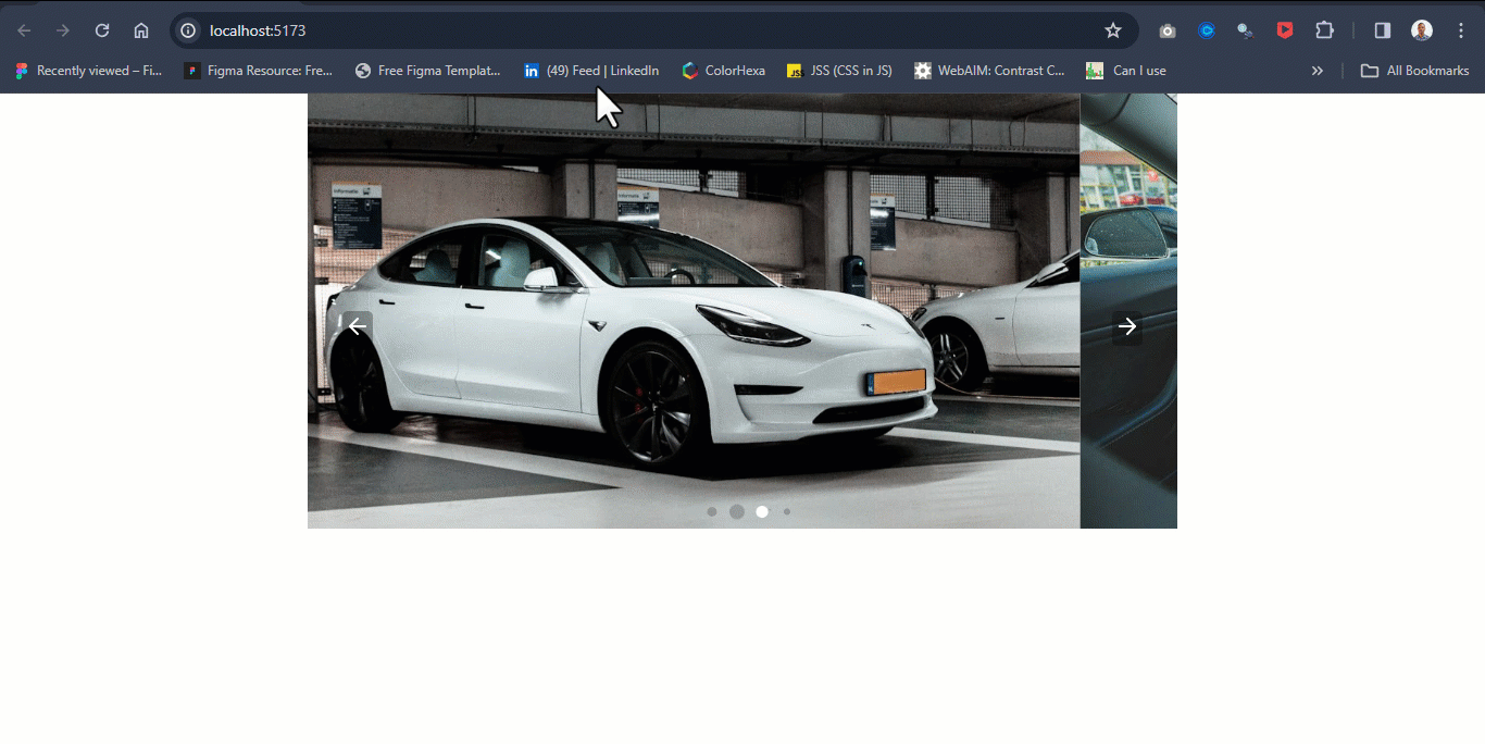
Here's what's going in in the above code:
- navigation-next-el=".custom-next-button": used to specify the custom element for next navigation icon.
- navigation-prev-el=".custom-prev-button": used to specify the custom element for prev navigation icon.
- pagination-clickable="true": enables and sets the pagination to a clickable button.
- pagination-dynamic-bullets="true": used to the change design presentation of the pagination button.
- autoplay-delay="2000": enables slides to automatically play themselves and repeat.
- center-slides="true": sets the active slide to center.
The SVG icons are declared outside the swiper-container element to prevent it from clipping to the first slide. The <main> tag is set to a class of slider-wrapper to wrap both the custom slider elements and the custom SVGs icons.
I added some CSS for styling. You can copy it here.
*,*::before, *::after {
    margin: 0;
    padding: 0;
    box-sizing: border-box;
    font-family: calibri;
}

body {
    display: flex;
    justify-content: center;
}

swiper-container {
    width: 800px;
    height: 400px;

}

.slider-main-container {
    position: relative;
}

swiper-slide {
   width: 100%;
   height: 100%;
}

swiper-slide img {
    width: 100%;
    height: 100%;
    object-fit: cover;
}

.nav-btn {
    display: block;
    position: absolute;
    z-index: 20;
    user-select: none;
    -webkit-user-select: none;
    background-color: rgba(0, 0, 0, 0.3);
    cursor: pointer;
    padding: 2px;
    border-radius: 5px;
    transition: background 0.5s ease;
}

.nav-btn:hover {
    background-color: rgb(255, 165, 0);
}

.nav-btn.custom-prev-button {
    top: 50%;
    left: 2em;
}

.nav-btn.custom-next-button {
    right: 2em;
    top: 50%;
}
Your code should look like this when you run it on the browser:
Summary
Swiper Element is a new way of creating sliders in Swiper.js from the new version 11.0.6.
In this tutorial, I explained how to create and implement the new Swiper Custom Element in a React Application.
You saw some use cases for Swiper.js such as navigation, pagination, slides, effects, and properties. You also learned how to customize Swiper from the default design to give it a more professional style.
Thank you for reading!