Using CSS Animations
CSS animations add beauty to the webpages and make transitions from one CSS style to the other beautiful.
To create a CSS animation sequence, we have different sub-properties in the animation property in CSS :
animation-delayanimation-directionanimation-durationanimation-iteration-countanimation-nameanimation-play-stateanimation-timing-functionanimation-fill-mode
Sample CSS animation sequence to move text across the screen
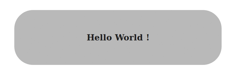
In the HTML part we will have a div with class container and a h3 with the text Hello World:
<div class="container">
    <h3> Hello World ! </h3>
</div>
For the CSS part:
.container {
    /* We will define the width, height and padding of the container */
    /* The text-align to center */
    width: 400px;
    height: 60px;
    padding: 32px;
    text-align: center;

    /* Use the animation `blink` to repeat infinitely for a time period of 2.5s*/
    animation-duration: 2.5s;
    animation-iteration-count: infinite;
    animation-direction: normal;
    animation-name: blink;

    /* The same can be written shorthand as     */
    /* --------------------------------------   */
    /* animation: 2.5s infinite normal blink;   */
}
@keyframes blink {
    0%, 100% {              /* Defines the properties at these frames */
        background: #333;
        color: white;
    }

    50% {                   /* Defines the properties at these frames */
        background: #ccc;
        color: black;
        border-radius: 48px;
    }
}