
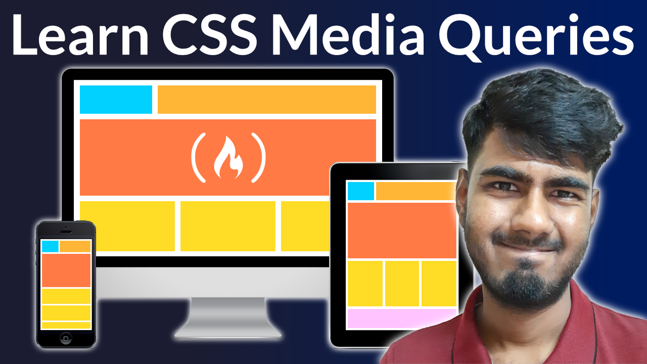
CSS Media Queries allow you to create responsive websites that look good on all screen sizes, from desktop to mobile.
We just released a course on the freeCodeCamp channel that will teach you how to create CSS Media Queries. After learning the basics, you will learn how to use media queries to create three practical projects.
Joy Shaheb created this course. In addition to creating many helpful video tutorials, Joy has also written many great technical articles on freeCodeCamp News.
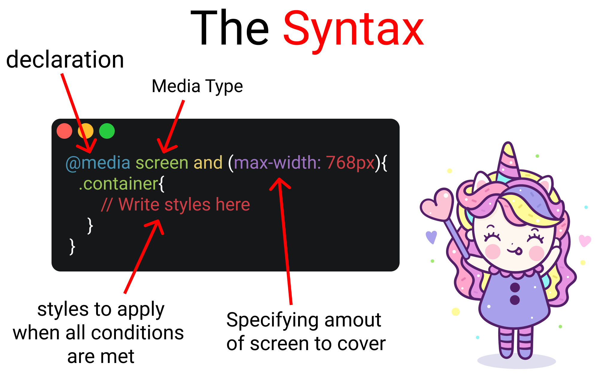 The syntax of a media query.
Here are the sections covered in this course:
- Setup
- Project 1
- @ media rule
- And operator
- Media Type
- Max-Width
- Min-Width
- Project 2 Desktop
- Project 2 Mobile
- Project 3 Desktop
- Project 3 Mobile
- Conclusion
Watch the full course on the freeCodeCamp.org YouTube channel (90 minute watch).