By Miracle Ugorji
When you're building a React web application, chances are you are going to use icons. Icons are graphical representations of a concept, an idea, a file, a program, an app, a business, and so on.
You can use icons to represent the identity of a feature. Where you do not want to write out a program's name, an appropriate icon can stand in for the program or an application for easy identification.
There are many different icon libraries out there – so how do you add them to your React app? We'll learn that, along with a lot more, in this article.
In this article you will learn:
- What is the react-icons library?
- What are Font Awesome icons?
- How to set up the development environment
- How to install React icons
- How to import React icons
- How to use React icons in your apps
- How to use more than one icon
- How to render multiple icons from different icon libraries
- How to display icons inline
- How to style Font Awesome icons in a React app
- Bonus: All icon library import codes for React icons
- Conclusion
What is react-icons?
React-icons is a small library that helps you add icons (from all different icon libraries) to your React apps. It delivers the icons to your app as components so they're easier to work with, and it lets you style them so they're consistent with the overall style of your app.
React-icons uses ES6 features to import the icons into your React app. And it makes it so that only the icons you actually use from each library get imported.
With React-icons, you only need to run one command to use any icons you want from a certain library. You just need to pick the correct import code and your icon is set.
React-icons works with a bunch of different icon libraries like Font Awesome, Material UI, Bootstrap icons, and many others.
What are Font Awesome icons?
There are many different icon libraries, but one of the most popular is Font Awesome. Font Awesome is a library or toolkit of graphics that are created to behave like fonts.
Font Awesome icons are like regular fonts but you get graphics instead of letters. They are scalable vector graphics (SVGs) which means that you can change their colors, resize them, and so on without compromising the quality.
But without react-icons, to use Font Awesome icons in a React web application, you have to go through a long process of installing the different packages using several command lines.
Sometimes you might need to install the pro package too. Then, you have to import them universally or into individual files. All this processes, just to get a few icons on your web page?
This is where react-icons comes in. In this article, I will show how to use react-icons to add Font Awesome icons to your React web app. Let's get started.
How to set up the development environment
Follow these steps below to set up your development environment.
Note: If you already have your setup done, there is no need to repeat it. Just skip to the next section.
- Head over to Node.js to download and install it if you don't have it already.
- Open your device's terminal.
- Type this command:
npm i -g create-react-app fonts-app. This will install a React app with all the packages needed for your project. - Next, type
cd fonts-app/.fonts-appis the name of your project folder. You can choose any name you want.cd fonts-apptakes you to your project folder. - Then run
npm startwhich will start the project on your development server. - From your code editor open the project src folder and find the
App.jsfile. - Remove the original React element rendered there and add your own div or h1 or any element you prefer (just for example purposes).
Now you are all set.
How to Install React Icons
To install the react-icons library, do the following:
- In your project folder, open the terminal of your code editor.
- Run the command
npm install react-iconsto install the library in your project folder.
This might take some time depending on the speed of your system. Once it's done, you are set to use your React icons.
How to Import Icons with React-Icons
Go to the React-icons page. You will see a number of icon libraries that you can use. Each library of icons has an import code for it. For this tutorial, we will be focusing on the Font Awesome icon library.
Font Awesome's import code is import { IconName } from "react-icons/fa";.
Code example
import { IconName } from "react-icons/fa";
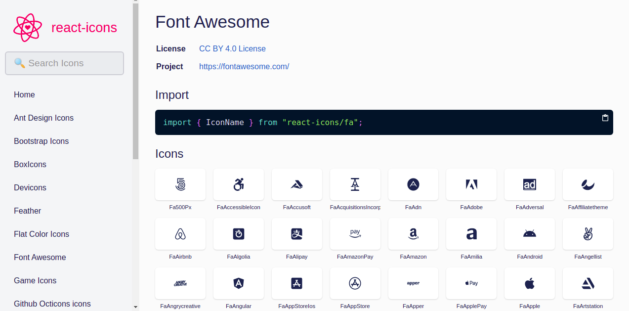 Font Awesome icons on React icons page
How to use icons in your apps
Follow these steps below to use the Font Awesome icons in your app.
- In
App.js, paste the import code at the top of the file after the React import code - Go back to the React icons page and choose any icon from the Font Awesome icons
- Click on the icon to copy it
- Go back to your import code in the
App.jsfile - Paste and replace the
IconNamein the curly braces with the copied icon - Render the icon name as a React element.
Code example
import React, { Component } from 'react';
import { FaHeart } from "react-icons/fa";

class Like extends Component {
  render() {
    return <FaHeart />
  }
}

export default Like;
 Rendered Font Awesome heart icon
Adding the <FaHeart /> icon to the render method displays the icon on your web page. This is possible because we already imported the icon at the top of the file.
Note: You must match any icon copied to its import code. So you cannot paste a Bootstrap icon in a Font Awesome icon import code. Doing this will not give you the right result.
How to use more than one icon
Since you already imported the icon library you want, you will not need to import it a second time. All you have to do is go back to the React icons page. Copy another icon that you want and paste it in the curly braces.
This is how you can use as many icons as you need from the Font Awesome library.
Code example
import React, { Component } from 'react';
import { FaHeart, FaRegHeart } from 'react-icons/fa';

class Like extends Component {
  render() {
    return (
    <div>
      <FaHeart />
      <FaRegHeart />
    </div>
    )
  }
}

export default Like
 Two font awesome heart icons rendered
How to render multiple icons from different icon libraries
There are some subtle differences between different icon libraries. And sometimes you might not be able to find all the icons you need in one library.
In that case, you can use icons from more than one icon library. You only need to import the icon libraries you want. For example, you can import both Bootstrap and Font Awesome. Then you just need to render the icons as before.
Code example
import React, { Component } from 'react';
import { FaHeart, FaRegHeart } from 'react-icons/fa';
import { BsHeartFill, BsHeart } from "react-icons/bs";

class Icons extends Component {
  render() {
    return (
    <div>
      <FaHeart />
      <FaRegHeart />
      <BsHeartFill />
      <BsHeart />
    </div>
    )
  }
}

export default Icons
The ability to import different icon libraries gives you access to a wide range of icons. You can always find what you need by the time you search through all the icon libraries.
 Rendered hearts from font awesome and bootstrap icon libraries
Note: Only use icons from multiple libraries if it's absolutely necessary, as it may slow down your app.
How to display icons inline
You might have noticed that the icons display in block layout. This is because we placed the icon elements one after the other. If you want them displayed inline, then simply place them side by side. Check out the code example below:
import React, { Component } from 'react';
import { FaHeart, FaRegHeart } from 'react-icons/fa';
import { BsHeartFill, BsHeart } from "react-icons/bs";

class Like extends Component {
  render() {
    return (
    <div>
      <FaHeart /> <FaRegHeart /> <BsHeartFill /> <BsHeart />
    </div>
    )
  }
}

export default Like
 Four hearts inline
How to style Font Awesome icons in a React app
Generally, icons come in a bland color and basic size that you might not like for your page. So you will need to style the icons to your preferences.
React icons are quite easy to style. You can use the following styles to style a React Icon:
- Inline styles
- Resize with HTML heading tags
- Object styles
- CSS stylesheet
- Icon context
How to use inline styles to style icons
You can style a React icon using inline CSS styles. This means that you'll style the icon from the element's self-closing tag.
Use this method when you have just one or two icons to style. You can also use it when you need icons in different styles. Check out the code example below:
Code example
import React, { Component } from 'react';
import { FaHeart, FaRegHeart } from 'react-icons/fa';

class Like extends Component {
  render() {
    return (
    <div>
      <FaHeart style={{color: 'red', fontSize: '50px'}}/>
      <FaRegHeart style={{color: 'green', fontSize: '50px'}}/>
    </div>
    )
  }
}

export default Like
 colored font awesome hearts
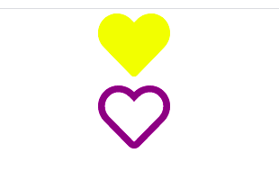
From the example above, we are passing color and font size to the style property. The first icon is solid red. The second icon is outlined in green.
Notice that font size is written in camel case. CSS properties with two words are written in camel case as opposed to using - to separate them in vanilla CSS. This is the convention in React.
How to resize icons with HTML heading tags
You can also use HTML heading tags to make your icons assume the same size as the heading tag used.
To do this, add the icon element in between the heading's opening and closing tags.
import React, { Component } from 'react';
import { FaHeart, FaRegHeart } from 'react-icons/fa';

class Like extends Component {
  render() {
    return (
    <div>
      <h1><FaHeart style={{color: 'red'}}/></h1>
       <h6><FaRegHeart style={{color: 'green'}}/></h6>
    </div>
    )
  }
}

export default Like

In the code above we added the two icon tags between the HTML heading tags respectively.
How to style icons with object styles
You can store and use the styles you want for your icons in a variable as object properties. Just declare an object and assign all the styles you want for the icons to it.
Use this method when you have a number of styles to pass to the icons. You can also use this style when targeting a specific icon. Check out the code example below:
Code example
import React, { Component } from 'react';
import { FaHeart, FaRegHeart } from 'react-icons/fa';

const fontStyles = {color: 'blue', fontSize: '80px'};

class Like extends Component {
  render() {
    return (
    <div>
      <FaHeart style={fontStyles}/>
      <FaRegHeart style={fontStyles}/>
    </div>
    )
  }
}

export default Like

In the code example above, we stored the styles we wanted in an object. Then we passed the object as a value to the style property on the icon.
All the icons that have the object styles passed to them assume the same styling. So in the above example, both icons now have same blue color and size of 80px.
How to style icons with CSS stylesheets
You can use a CSS stylesheet to style your icons as well. Using a stylesheet is most suitable when you have multiple styles and icons to incorporate into your app.
To use a style sheet, you have to import the style sheet to the file where you have the icons. Pass a class on the icon elements you want. Style the icon elements using the class in the stylesheet. Check out the code examples below:
Code example
//style.css file
.yellow{
font-size: 80px;
color: yellow
}

.purple{
font-size: 80px;
color: purple
}
import React, { Component } from 'react';
import { FaHeart, FaRegHeart } from 'react-icons/fa';
import "./style.css";

class Like extends Component {
  render() {
    return (
    <div>
      <FaHeart className='yellow'/>
       <FaRegHeart className='purple'/>
    </div>
    )
  }
}

export default Like
 Yellow and purple icons
The code examples are showing a CSS stylesheet with styles on two classes. We imported this stylesheet into our React file. We passed these classes to the styles on the React elements where we want them.
How to style icons with icon context
You can also import the React Icon context rather than adding multiple class names on different icons. Give the icon context the values you want. Add your icon elements inside the context as shown below:
Code example
import React from 'react';
import { IconContext } from "react-icons";

const Like = () => {
  return (
    <IconContext.Provider
      value={{style: { color: '#f4a200', fontSize: '50px' }}}
    >
      <div>
        <FaHeart />
        <FaRegHeart />
      </div>
    </IconContext.Provider>
  );
}

export default Like;
 Two yellow hearts in line
In the code example, we imported the React icon context. We then used a stateless function to render the icons in the icon context.
Notice that the icon context has given the icons an inline display by default. If you want the icons to maintain a block display, then add display: 'block' as one of the properties. In other words, you can pass in any styles you want for the fonts in the icon context tag.
All icon library import codes for React-icons
In case you want to use icons from other libraries (besides those we've discussed here), here are their import codes so you can get started with them quickly:
import { IconName } from "react-icons/ai"; //Ant Design Icons
import { IconName } from "react-icons/bs"; //Bootstrap Icons
import { IconName } from "react-icons/bi"; //Boxicons
import { IconName } from "react-icons/di"; //Devicon Icons
import { IconName } from "react-icons/fi"; //Feather
import { IconName } from "react-icons/fc"; //Flat Color Icons
import { IconName } from "react-icons/fa"; //Font Awesome Icons
import { IconName } from "react-icons/gi"; //Game Icons
import { IconName } from "react-icons/go"; //Github Octicons Icons
import { IconName } from "react-icons/gr"; //Grommet-Icons
import { IconName } from "react-icons/hi"; //HeroIcons
import { IconName } from "react-icons/im"; //IcoMoon Free
import { IconName } from "react-icons/io"; //Ionicon4
import { IconName } from "react-icons/io5"; //Ionicon5
import { IconName } from "react-icons/md"; //Material Design Icons
import { IconName } from "react-icons/ri"; //Remix Icons
import { IconName } from "react-icons/si"; //Simple Icons
import { IconName } from "react-icons/ti"; //Typicons
import { IconName } from "react-icons/vsc"; //VS Code Icons
import { IconName } from "react-icons/wi"; //Weather Icons
import { IconName } from "react-icons/cg"; //css.gg
All the icon libraries available on the React-icons page are used same way as discussed in this article.
Conclusion
React icons are highly optimized, scalable, and easy to use. I hope I have been able to help you learn the basics of using them. You can read the documentation for react-icons to learn more.