By Gosha Arinich
Controlled inputs enable simple things, like disabling the Submit button when some fields are missing or invalid.
But we’re not stopping there, of course.
While a disabled button is nice, the user might not know why they can’t click that button. They might not know what mistake they made that disabled it or even which field is causing it.
And that ain’t pretty. We absolutely have to fix that.
The basics of controlled inputs
Using controlled inputs implies we are storing all the input values in our state. We can then evaluate a particular condition with every value change, and do something based on it. Previously, all we did was disable the button.
We used a simple expression to compute whether the button should be disabled (for example, when either the email or password field was empty):
const { email, password } = this.state;const isEnabled = email.length > 0 && password.length > 0;
<button disabled={!isEnabled}>Sign up<;/button>
It got the job done. Now, to mark the bad inputs, we need to ask ourselves a couple of questions.
How will the errors be shown?
This is an important question to ask yourself, as different requirements might warrant different error representations.
There are many ways to show input errors. For example, you could:
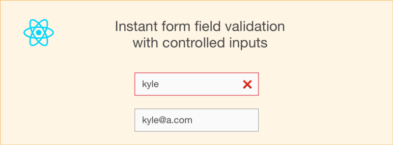
- Display an ❌
- Mark the inputs red that contain bad data
- Display errors right next to the relevant inputs

- Display a list of errors at the top of the form
- Any combination of the above, or something else!

Which one should you use? Well, it’s all about the experience you want to provide. Pick what you want.
For the purpose of this post, I’m going to use the simplest one — marking the bad inputs red, without anything else.
How will the errors be represented?
The way you want to display errors influences how you might represent them.
To indicate whether a particular input is valid, without any additional information as to why it might be invalid, something like this will suffice:
errors: { name: false, email: true,}
false means no errors or entirely valid; true means a field is invalid.
In the future, if we decide we need to store the reason something was invalid, we can replace the true/false with a string containing an error message.
But how is this error object created?
Now that we know how we want to display the errors AND know how to represent them, there’s something crucial missing.
How to actually create errors.
Or, put another way: how do we take existing inputs, validate them, and get the error object we need?
We are going to need a validation function for that. It will accept the current values of the fields and return the errors object to us.
We’ll continue with the sign-up form example. Recall that we had this:
const { email, password } = this.state;const isEnabled = email.length > 0 && password.length > 0;
We can, in fact, turn that piece of logic into a validation function that will:
- Have
email: trueif email is empty, and - Have
password: trueif password is empty
function validate(email, password) { // true means invalid, so our conditions got reversed return { email: email.length === 0, password: password.length === 0, };}
The remaining piece
There’s one piece of the puzzle remaining.
We have a validation function and we know how we want to show errors. We also have a form.
Now it’s time to connect the dots.
Step 1: Run the validator in render.
It’s no use having the validate function if we never call it. We want to validate the inputs every time (yes, every time) the form is re-rendered — perhaps there’s a new character in the input.
const errors = validate(this.state.email, this.state.password);
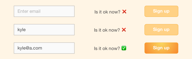
Step 2: Disable the button.
This is a simple one. The button should be disabled if there are any errors (that is, if any of the errors values are true ).
const isEnabled = !Object.keys(errors).some(x => errors[x]);
Step 3: Mark the inputs as erroneous.
This can be anything. In our case, adding an error class to the bad inputs is enough.
<input className={errors.email ? "error" : ""} .../>
We can also add a simple CSS rule:
.error { border: 1px solid red; }
One more thing
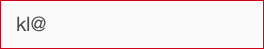
If you look at the JS Bin above, you may notice something odd. The fields are marked red by default, because empty fields are invalid.
But we never even gave the user a chance to type first! Also, the fields are red when focused on for the first time.
This is not great for UX.
We are going to fix this by adding the error class if the field was in focus at least once but has since been blurred. This ensures that the first time a user focuses on the field, the error won’t appear right away. Instead, it will only pop up when the field is blurred. On subsequent focuses, though, the error would appear.
This is easily achievable by using the onBlur event and state to keep track of what was blurred.
class SignUpForm extends React.Component { constructor() { super(); this.state = { email: '', password: '', touched: { email: false, password: false, }, }; }
// ...
handleBlur = (field) => (evt) => { this.setState({ touched: { ...this.state.touched, [field]: true }, }); }
render() const shouldMarkError = (field) => { const hasError = errors[field]; const shouldShow = this.state.touched[field];
return hasError ? shouldShow : false; };
// ...
<input className={shouldMarkError('email') ? "error" : ""} onBlur={this.handleBlur('email')}
type="text" placeholder="Enter email" value={this.state.email} onChange={this.handleEmailChange} /> }}
Not so hard, right?
Final touches
Note that shouldMarkError only affects field presentation. The status of the submit button still depends only on validation errors.
Want to add a nice final touch? You could force display of errors in all fields, regardless of whether they have been in focus, when the user hovers or clicks a disabled submit button. Now go try it out for yourself.
I originally published this on my blog at goshakkk.name
If you are digging this, give me some claps and check out my series on handling forms with React. You can also subscribe to get new posts straight in your inbox.