
Icons are a way to visually communicate concepts and meaning without the use of words. This could be for categorization, an action, or even a warning.
How can we add icons using SVG to our React apps to improve our visual communication?
- What is SVG?
- What makes SVG great for the web?
- Part 0: Creating a React app
- Part 1: Adding SVG icons with react-icons
- Part 2: Manually adding SVG files to a React component
What is SVG?
SVG stands for Scalable Vector Graphics. It’s a file format based on a markup language similar to XML that allows developers and designers to create vector-based images using path definitions.
What makes SVG great for the web?
SVG was born for the web. It’s an open standard that was created by W3C to provide a better way to add images to the web. If you open an SVG file on your computer, you might be surprised to find that it’s all code!
This plays a part in the small file size. Typically when using SVG, you can take advantage of its smaller size compared to larger image files that might be required to deliver the same high resolution.
Additionally, since we’re defining SVG as paths, they can scale as large or as small as we want. This makes them extra flexible for web usage, especially when making experiences responsive.
What are we going to create?
We’re first going to walk through using a package called react-icons that will allow us to easily import icons from popular icon sets like Font Awesome right into our app.
We’ll also take a look at how we can manually add SVG files right into our app by copying the code of an SVG file right into a new component.
Part 0: Creating a React app
For this walkthrough, you can use any React framework you’d like whether that’s Create React App or Next.js. You can even use an existing project.
Because we don’t need anything special to add our icons, I’m going to use create-react-app.
To get started with create-react-app, you can create a new project using the following command in your terminal:
yarn create react-app [project-name]
# or
npx create-react-app [project-name]
Note: replace [project-name] with the name you want to use for your project. I’m going to use my-svg-icons.
Once you have your new app or your existing app, we should be ready to go!
 New Create React App
Part 1: Adding SVG icons with react-icons
Adding react-icons to your project
To get started with react-icons, we want to install it in our project.
Inside of your project, run the following command:
yarn add react-icons
# or
npm install react-icons --save
Once it’s completed, we should be ready to use it in our project.
Selecting icons for a project
One of the cool things about react-icons is the extensive library they make available within the single package.
Not only do we have Font Awesome immediately available, we have GitHub’s Octicons, Heroicons, Material Design Icons, and a whole bunch more.
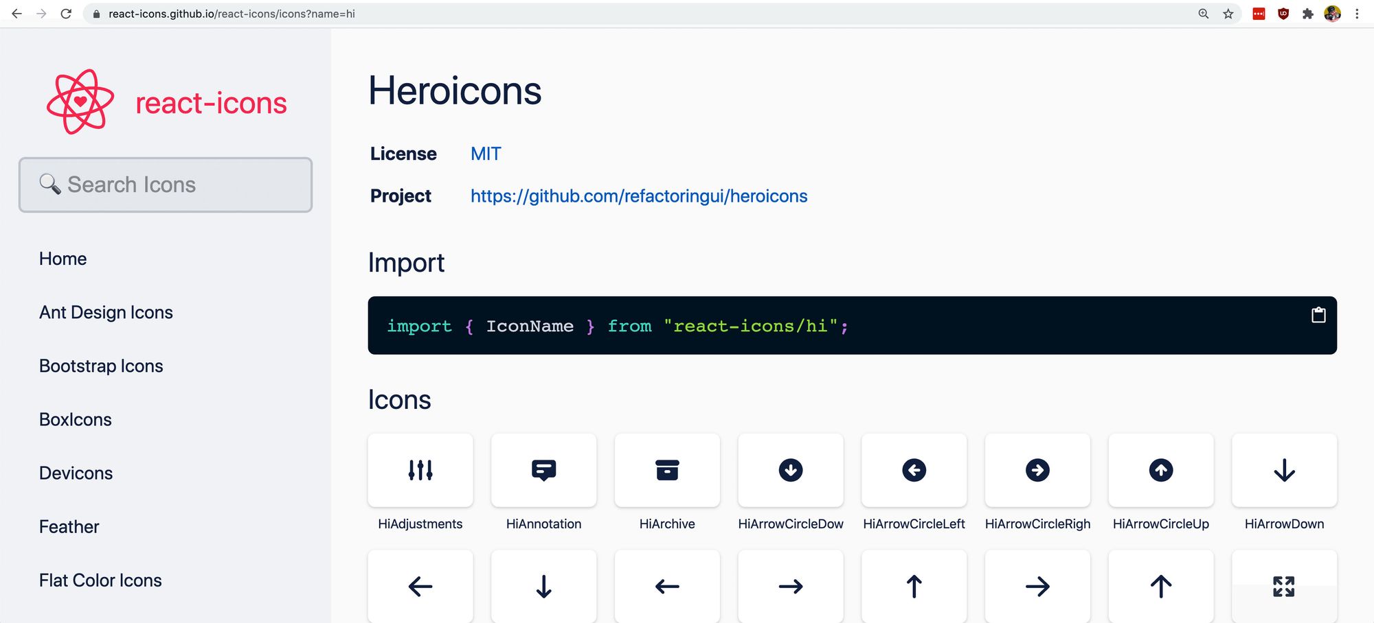 react-icons Heroicons
When choosing icons, you pretty much have the ability to use any icon you want at any time. That said, I would recommend trying to keep a consistent look and feel with your icons.
If you primarily use Font Awesome for your website, it might look a bit strange and inconsistent if you were to start adding Flat Color Icons to the mix. You ultimately want to provide an experience that people will be able to easily identify the patterns that you create.
Using react-icons in your project
Once you’ve found the icons you want to use, we can now add them to our project.
react-icons’s website makes it easy for us to look up the name of the icon we want to use to import to our project.
If we wanted to use the Font Awesome rocket icon, we can navigate to Font Awesome in the sidebar, search the page for “rocket” (CMD+F or CTRL+F), and then click the icon which will copy its name to your clipboard.
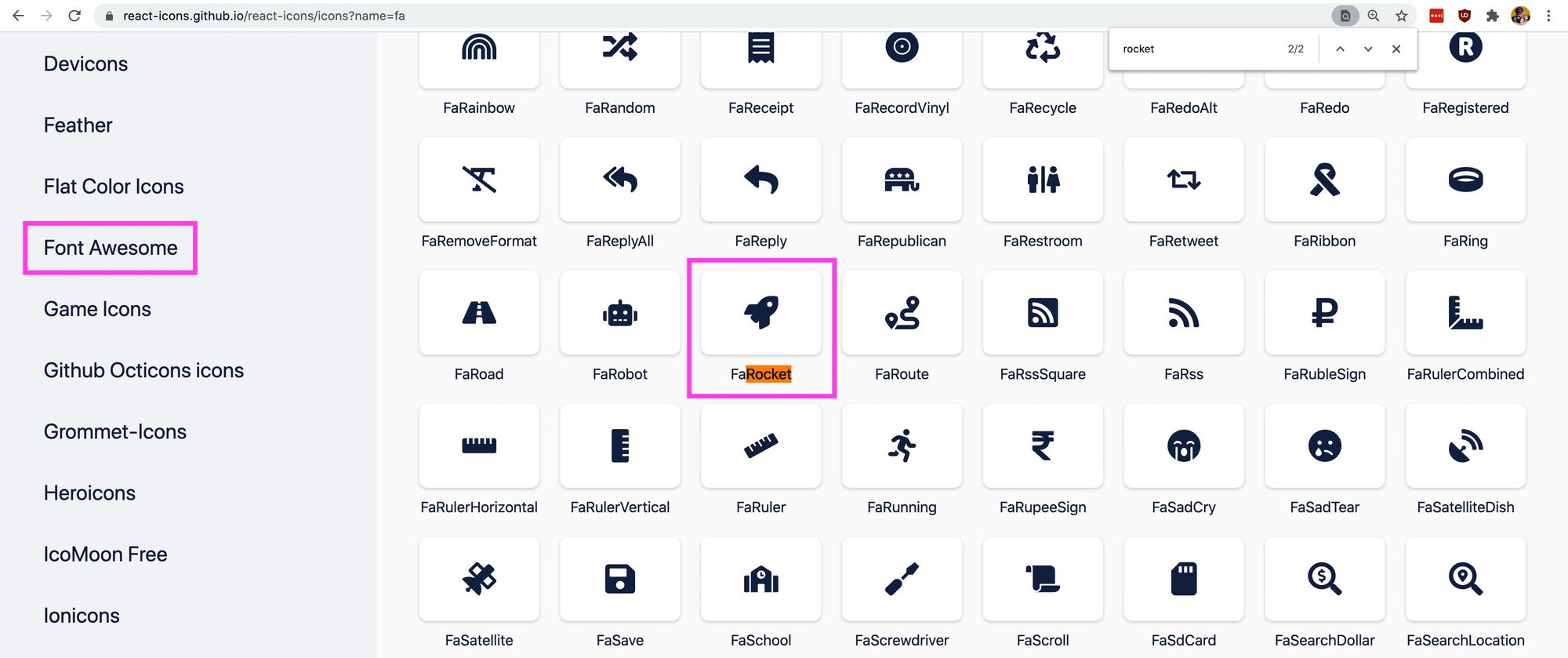 Font Awesome rocket icon
We could also search for “rocket” in the search form at the top left of the page, which shows us the result “rocket” throughout all icon sets.
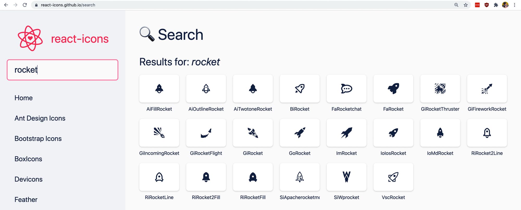 Rocket icons in react-icons
Inside of our project, we can now import that icon. Similar to the instructions at the top of the react-icons page, we want to import that specific icon from the react-icons/fa, which refers to the Font Awesome module of react-icons.
Add the following to the top of the file you want to import the icon in. If using a new create-react-app project, you can add it to the top of src/App.js.
import { FaRocket } from 'react-icons/fa';
To test this out, let’s replace the React logo with our icon.
Remove the <img component and instead add:
<FaRocket />
And if we reload the page, we can see our rocket!
 Rocket icon in React app
Our rocket isn’t spinning like the React logo though, so let’s fix that.
Add the class .App-logo to the FaRocket component:
<FaRocket className="App-logo" />
And the rocket should now be spinning!
 Spinning rocket icon in React app
But it’s also a little small. If we look inside of src/App.css, we’re setting the height of .App-logo to 40vmin. While that’s working, for our icon to fill the space, we need to also provide a width for it to fill.
Add the following to the .App-logo class to add a width:
width: 40vmin;
And while it’s probably a little too big now, we’re at a more appropriate size and we have our icon!
 Increased size of spinning rocket icon in React app
Part 2: Manually adding SVG files to a React component
Sometimes you don’t want to add a new library just to get an icon. Sometimes it’s a custom icon that’s not available in a public library.
Luckily with React, we can create a new SVG component pretty easily that allows us to add our custom SVG icons anywhere we want.
First, let’s find an icon.
While all Heroicons are available inside react-icons, let’s use it as an example since it’s easy to find and copy some SVG code.
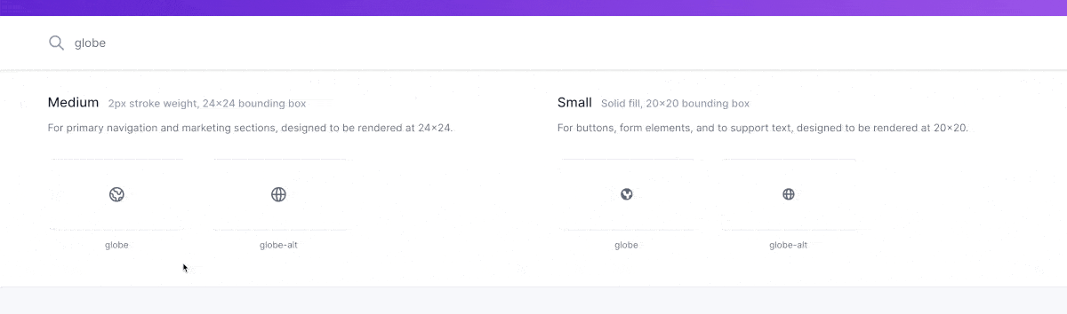
Go to heroicons.com and search for an icon that you’d like to use for this example. I’m going to use “globe”.
After finding the icon you want, hover over that icon, where you’ll see options to copy that icon as SVG or JSX, and copy it as JSX.
 Copy as JSX in Heroicons
With that icon copied, create a new file under src called Globe.js.
Inside of that file, we’re going to create a new component called Globe and paste in our SVG within that component.
import React from 'react';

const Globe = () => {
  return (
    <svg xmlns="http://www.w3.org/2000/svg" fill="none" viewBox="0 0 24 24" stroke="currentColor">
      <path stroke-linecap="round" stroke-linejoin="round" stroke-width="2" d="M3.055 11H5a2 2 0 012 2v1a2 2 0 002 2 2 2 0 012 2v2.945M8 3.935V5.5A2.5 2.5 0 0010.5 8h.5a2 2 0 012 2 2 2 0 104 0 2 2 0 012-2h1.064M15 20.488V18a2 2 0 012-2h3.064M21 12a9 9 0 11-18 0 9 9 0 0118 0z" />
    </svg>
  )
}

export default Globe;
Note: when copying normal SVG to a React component, it might not work "as is". Sometimes SVG files include CSS classes or element attributes that aren't valid with JSX.
If you run into errors, try fixing the attributes and looking at the web console to see the warnings and errors React throws. Because we copied as JSX, we were able to make it work right away.
Now, go back to src/App.js and import our new component:
import Globe from './Globe';
Then we can replace our rocket icon with our new component:
<Globe />
And if we open up our browser, we can see our globe!
 Large globe icon in REact app
Though, it’s a little big.
We want to apply our .App-logo class to our Globe component, so we need to update that component to take a className prop.
Back at src/Globe.js, add a className prop argument:
const Globe = ({ className }) => {
Then, add a new prop with that className to the <svg component:
<svg className={className}
Now, we can update our Globe component in src/App.js to include that class:
<Globe className="App-logo" />
And if we reload the page, we can see our logo is back at the right size and it’s spinning again!
 Spinning, normal size globe icon in React app
Why don’t we include it as an img file?
While we can include it as an image file just like React does in the default create-react-app code, we get a few benefits from adding our SVG files “inline”.
For one, when adding SVG inline, we can access the different paths with CSS properties. This gives us more flexibility for customizing it dynamically.
It’s also going to provide fewer HTTP requests. The browser will know how to load that SVG, so we don’t need to bother the browser to request that file to include in the page.
That said, it’s still a valid option for adding an SVG file to the page.