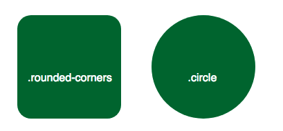
With CSS3, you can give any element “rounded corners” by using the border-radius property. The value can be in any valid CSS length unit.
  .rounded-corners {
    border-radius: 20px;
  }

  .circle {
    border-radius: 50%;
  }
Note: The border-radius property is actually a shorthand property for the border-top-left-radius, border-top-right-radius, border-bottom-right-radius and border-bottom-left-radius properties.
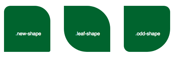
If just one value provided, the border-radius will be the same for all four corners, as in the examples above. But you also have the option to specify different values for each corner.
.new-shape {
  border-radius: 20px 50px 5px 0; /* top left, top right, bottom right, bottom left */
}
If only two values are provided, the first value applies to the top-left and bottom-right corner, and the second value applies to the top-right and bottom-left corner.
.leaf-shape {
  border-radius: 0 50%;
}
If three values are set, the first again applies to the top-left radius, the second value indicates top-right and bottom-left, leaving the third value to indicate the bottom-right corner.
.odd-shape {
  border-radius: 0 20px 50%;
}
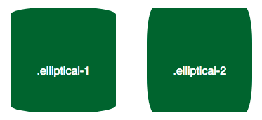
The rounding of a corner does not have to be perfectly symmetrical. You may specify both the horizontal and vertical radiuses using a slash (”/”) to achieve a corner with an elliptical shape.
.elliptical-1 {
  border-radius: 50px/10px; /* horizontal radius / vertical radius */
}
.elliptical-2 {
  border-radius: 10px/50px;
}
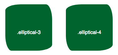
Since only one pair of values is given in the above examples, all four corners are the same. But, of course, if you want a more complex shape, you may supply up to four values for the horizontal radiuses and four for the vertical radiuses.
.elliptical-3 {
  border-radius: 50px 20px 50px 20px/20px 50px 20px 50px; /* horizontal top-left, horizontal top-right, horizontal bottom-right, horizontal bottom-left / vertical top-left, vertical top-right, vertical bottom-right, vertical bottom-left */
}
Notice how the shorthand above produces the same result as specifying individual properties below. Be aware that when corners are set individually the values are space-separated instead of slash-separated.
.elliptical-4 {
  border-top-left-radius: 50px 20px; /* horizontal radius, vertical radius */
  border-top-right-radius: 20px 50px;
  border-bottom-right-radius: 50px 20px;
  border-bottom-left-radius: 20px 50px;
}