By Jennifer Bland
Have you ever seen a button on a web page that has rounded edges? Have you ever seen an image that fits within a circle? If so, you have seen the impact of using the CSS border-radius property.
You can give any element “rounded corners” by applying a border-radius through CSS.
Border-radius syntax
As with many CSS properties relating to margins, padding, and borders, there are four individual properties — one for each corner of a box element — and one shorthand property. Each of the corner attributes will accept one or two values.
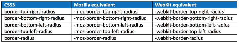
The border-radius property is accepted in every major browser, but they have browser-specific attributes. Here are the CSS and browser-specific attributes:
Each of the individual corner CSS3 properties take either one or two length values (generally ‘px’ or ‘em’ values). If a single value is supplied, then that becomes the radius of a rounded corner. If two values are supplied, then they become the horizontal and vertical radii for an elliptical corner.
The border-radius property by itself accepts one or two values and uses them to style all four corners making a nice symmetrical shape.
Do you need to use border-prefixes anymore?
Now that I have shown you the browser-specific border prefixes, the question is do you really need to use them, or can you get away with just using the CSS3 properties?
The simple answer to that question depends on what version of browsers your website supports.
Firefox 3.6 requires the use of the -moz- prefix. From 4 up, using the CSS3 properties are fine.
Safari 4 needs the -webkit- prefix. Safari 5 and above accepts the CSS3 properties.
iOS3 needs the -webkit- prefix. This applies only to an iPhone 3GS or iPad 1 that have never been upgraded.
Basic Demonstration of the border-radius property
Here are two demonstrations of the border radius. The value supplied for the property can be in px, rem, em or %.
div { width: 100px; height: 100px; background-color: #7db9e8;}#demo-one { border-radius: 20px;}#demo-two { border-radius: 50%;}
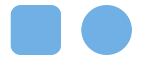
For the first div, a rounded corner of 8px is applied to every corner of the div. In the second example, every corner has a rounded corner of 50% applied which creates a circle.
With just one value, the border-radius will be the same on all four corners of an element as shown above. You do have the option of specifying a different value for each corner.
When you specify individual values, then they are applied in this order: top left, top right, bottom right, bottom left. Here is an example:
#demo-three { border-radius: 10em 20em 10em 20em;}#demo-four { border-radius: 40px 5px;}
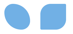
Elliptical Edges
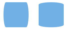
The edges do not have to be circular, but can be elliptical, too. To create an elliptical edge, you put a slash (“/”) between two values. Here is an example:
#demo-five { border-radius: 10% / 50%;}#demo-six { border-radius: 50% / 10%;}
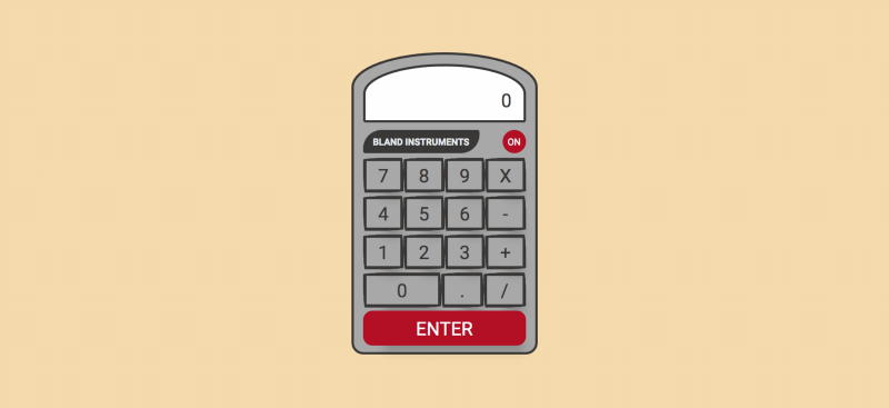
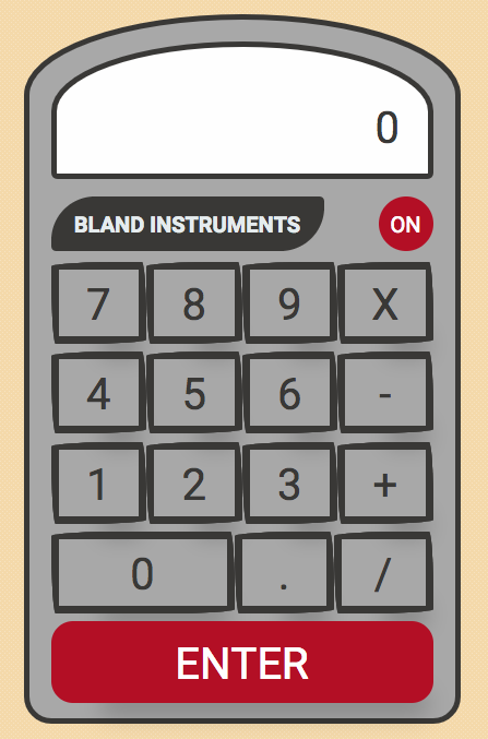
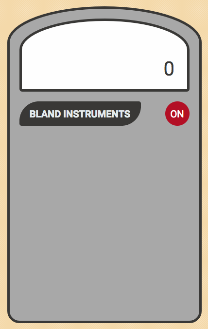
Creating our calculator
We are going to apply what we have just learned about border-radius to create this calculator:
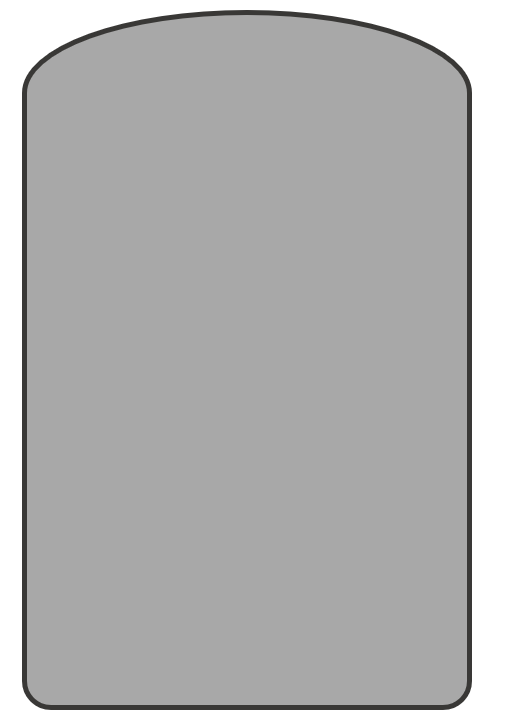
Calculator Frame
First we need to create the frame for our calculator. The top of the calculator will have an arch and the bottom will have rounded edges. To create this design we will specify a value for each individual corner like this:
.calc-frame { display: flex; flex-direction: column; align-items: center; max-height: 650px; max-width: 400px; width: 90%; padding: 20px; border: solid 5px #41403E; border-top-left-radius: 270px 100px; border-top-right-radius: 270px 100px; border-bottom-right-radius: 35px; border-bottom-left-radius: 35px; background: #b1b1b1;}
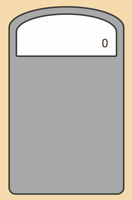
Calculator result frame
The top of the calculator contains the total that has been calculated (the result). It is comprised of two parts: the outer frame and the input area that contains the total. The outer frame uses the exact same border-radius of the frame to have the same arch. Here is the styling for these two items:
.calc-result-frame { background: #fefefe; border: solid 5px #41403E; width: 100%; height: 150px; border-top-left-radius: 270px 100px; border-top-right-radius: 270px 100px; border-bottom-right-radius: 10px; border-bottom-left-radius: 10px; display: flex; justify-content: center; align-items: flex-end;}.calc-result-input { width: 85%; height: 70px; text-align: right; color: #41403E; overflow: hidden; font-size: 2rem;
Calculator Logo and Power Button
The next items to add to our calculator are the logo, “BLAND INSTRUMENTS,” and the power button. We will use the code in #demo-four for the logo and the code in #demo-two for the power button. It looks like this:
.calc-logo { background: #41403e; color: #e8eff0; border: solid px #41403E; border-radius: 40px 5px; width: 250px; height: 50px; line-height: 50px; font-weight: bold; text-align: center;}.calc-on { border-radius: 50%; border: none; background: #bb0f29; color: #fefefe; width: 50px; height: 50px;}
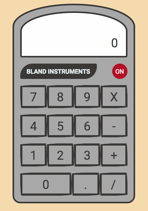
Calculator Buttons
Next we are going to create styling for each calculator button. We are going to specify a style for each individual corner, and then provide two values for each corner. This produces a hand-drawn look and feel for the buttons. Here is the code:
.calc-btn { background: transparent; color: #41403E; font-size: 2rem; width: 75px; height: 75px; outline: none; border-radius: 255px 15px 225px 15px/15px 225px 15px 255px; border: solid 7px #41403E; flex: 1; transition: all .5s ease;}
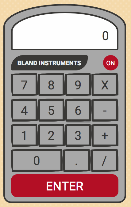
Enter button
The last thing we need to add to our calculator is the ENTER button. We will be using the code from #demo-one for this button. Here is the code:
.calc-enter { background: #bb0f29; color: #fefefe; border-radius: 20px; border: none;}
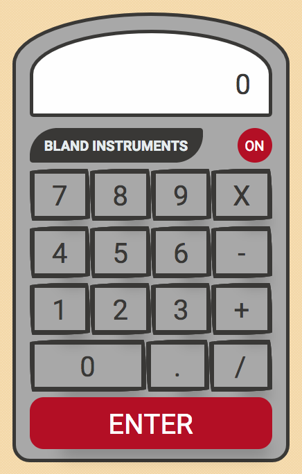
Button Animation
The last thing we are going to add to our calculator is animation for each button when a user hovers over the button. This simulates the action of the button actually being pressed.
To accomplish this we are going to add a box-shadow to our buttons. This is the shadow that will be shown for all buttons, and gives the buttons the appearance of being slightly raised from the calculator frame.
To provide the animation, we are going to add a transition to the button. Then we will supply a different box-shadow for the buttons when a user hovers over them. Here is the code:
.calc-btn { background: transparent; color: #41403E; font-size: 2rem; width: 75px; height: 75px; outline: none; border-radius: 255px 15px 225px 15px/15px 225px 15px 255px; border: solid 7px #41403E; flex: 1; box-shadow: 20px 38px 34px -26px hsla(0,0%,0%,.2); transition: all .5s ease;}.calc-btn:hover { box-shadow:2px 8px 4px -6px hsla(0,0%,0%,.3);}
And here is our finished calculator:
Get The Code
If you would like to see the complete code for the calculator you can get it from my GitHub repo here. Please star my repo when you get the code!
The code uses Flexbox for the layout of the calculator. If you are not familiar with Flexbox or want to review it, you can check out my free training course on Flexbox on in5days.tech.
Thanks for reading
Thank you for reading my article. If you like it, please click on the clap icon below so that others will find this article.
Here are more of my articles that you might find interesting:
Here are 5 Layouts That You Can Make With FlexBox
Think outside the box with CSS shape-outside
Why Company Culture is Important to Your Career as a Software Engineer