By Said Hayani
In the HTML and CSS world, it's all about the layout structure and the distribution of elements. We usually use HTML to define the markup and structure, while CSS helps us handle the styling and alignment of elements.
In this post we are going to learn a little bit about the different ways we can center HTML elements and handle vertical alignment with CSS.
First we going to learn how to align text with CSS.
Next, we will cover how to align a div and any other elements.
And finally we will learn how we can put text and a div together within a container.
How to center text
There are many way to center text using CSS.
Using the Float property
Float is an easy way to align text.
To place the text on the right side of the layout, we can simply use right as a value for float.
To place the text on the left side, we use left, like float:left. Look at the example below:
  .right {
        float: right;
      }

      .left {
        float: left;
      }
// HTML

    <span class="right">Right</span>
    <span class="left">Left</span>
To center the text using float we can use margin-left or margin-right and make it 50%, like below.
    .center {
    float: left;
    margin-left: 50%;
    }

/* HTML*/
<span class="center">Center</span>
You can learn more about the uses of Float here.
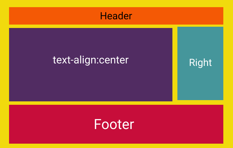
Using Text-align
text-align is a more convenient and more specific way to align text. It allows us to place the text at the center or to the left or right side, as the following example shows:
.right {
text-align: right;
}

.left {
text-align: left;
}
.center {
text-align: center;
}
/* HTML */

<p class="right">Right</p>
<p class="center">Center</p>
<p class="left">Left</p>
Learn more about [text-align](https://developer.mozilla.org/en-US/docs/Web/CSS/text-align).
How to align a div
Well, there are a plenty of ways to do that.
The same way we use Float to align text, we can use it to align a div element as well.
Float does the job, but CSS gives us better options that are more convenient and elegant. Have you heard of Flexbox? Or css-grid?
Well, these two methods provide very modern ways to align and work with your layout in CSS. Let's look at Flexbox in more in detail.
Flexbox
Flexbox offers an easy and straightforward way to align a div – and it's my favorite method so far to handle layouts in CSS (I use it everyday).
Let's look at what we'd do with Flexbox to see how it works by recreating the same example as above.
The example:
The code:
<!DOCTYPE html>
<html lang="en">
  <head>
    <meta charset="UTF-8" />
    <meta name="viewport" content="width=device-width, initial-scale=1.0" />
    <meta http-equiv="X-UA-Compatible" content="ie=edge" />
    <title>Flexbox</title>
    <style>
      .container {
        display: flex;
      }
      .container div {
        width: 33%;
        height: 60px;
      }

      .left {
        background: yellow;
      }
      .right {
        background: red;
      }
      .center {
        background: lightblue;
      }
    </style>
  </head>
  <body>
    <div class="container">
      <div class="left">Left div</div>
      <div class="center">centered div</div>
      <div class="right">right div</div>
    </div>
  </body>
</html>
let's break it down
- We always define a
divparent usingdisplay:flexto applyFlexbox. So we make all the div's children inside the parentdivable to be handled usingFlexboxproperties . - The
flex-directionuses therowdirection by default, which means the elements will be placed vertically within the container. - With the
justify-contentproperty we can align adiv's children(s) in different directions like the following example:
.container{
 display: flex:
 justify-content:center /* flex-start, flex-end, space-between, space-evenly, space-around etc */

}
justify-content:centerplaces the elements in the center of the container.justify-content:flex-startputs the elements at the beginning of the container on the left.justify-content:flex-endplaces elements at the end of the container on the right side.justify-content:space-aroundmakes the elements fit in the container and puts an equal gap between all the elements.justify-content:space-evenlydistributes the elements within the parent container equally with the same space, and same width.
The example above applies to all elements' children as a group.
Imagine if we wanted to align a single div inside the container. We can always use [align-self](https://developer.mozilla.org/en-US/docs/Web/CSS/align-self) to align a single element.
.container div{
 align-self:center /* can have: flex-start, or flex-end*/
}
We can apply the same thing to a text with Flexbox as in the following example:
<style>
.right{
    display: flex;
    align-items: flex-end;
    flex-direction: column;
}

</style>
<div class="right">
<span>right div</span>
</div>
This is a great tweet by Julia Evans which illustrates centering in CSS in general:

Wrap up
There are many way to center elements in CSS. And you will always learn new things over time as you practice more and more.
So I recommend that you work through some examples from what you learned today so it sticks.