By Thu Nghiem
If you want to make your website look attractive, you need to know CSS.
CSS, or Cascading Style Sheets, is a style sheet language that is used to style your web content.
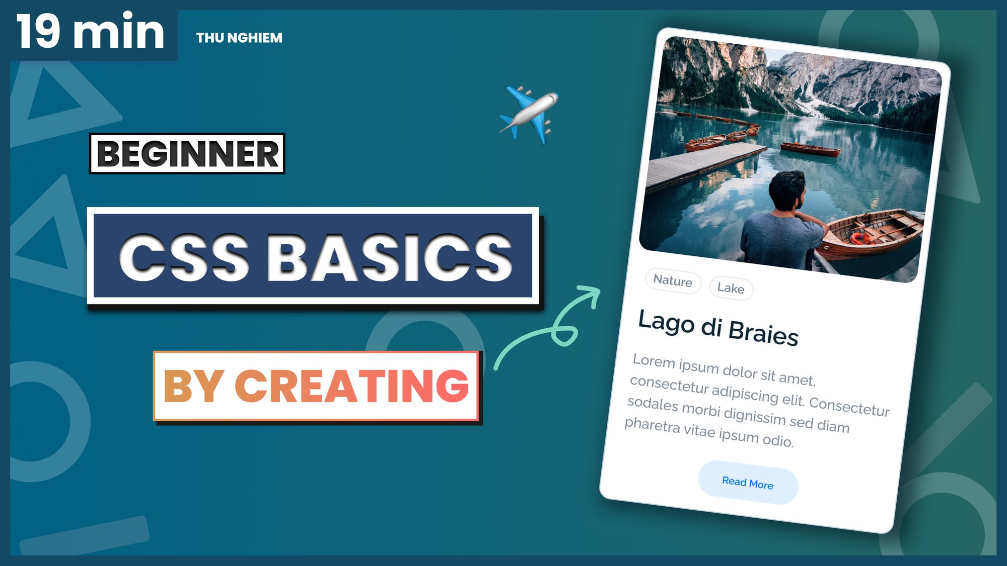
In this tutorial, we are going to learn about CSS basics by building a card component from scratch.
If you want to follow along, be sure to check out the design here.
Here's a video you can watch if you want to supplement this article:
If you are ready, let's get started.
How to build the skeleton with HTML
Before we start to work with CSS, we need some content to work with. In this section, we will quickly build a skeleton with HTML. If you are new to HTML, you can check out a tutorial here.
Alright, open VS Code. Then in the folder of your choice, create a new file and name it index.html.
In the file, type ! and press enter. Then you will have this HTML template:
<!DOCTYPE html>
<html lang="en">
<head>
  <meta charset="UTF-8">
  <meta name="viewport" content="width=device-width, initial-scale=1.0">
  <title>Document</title>
</head>
<body>

</body>
</html>
Our job is to build a card component that has an image, tags, name, description, and a button like this:

In index.html, first, change the title content from Document to be CSS Basics. And in the <body> element, add in all the elements we'll need:
...
<body>

  <!-- A div with container id to hold the card -->
  <div id="container">

    <!-- A div with card class for the card  -->
    <div class="card">
      <img src="https://images.unsplash.com/photo-1536323760109-ca8c07450053" alt="Lago di Braies">

      <!-- A div with card__details class to hold the details in the card  -->
      <div class="card__details">

        <!-- Span with tag class for the tag -->
        <span class="tag">Nature</span>

        <span class="tag">Lake</span>

        <!-- A div with name class for the name of the card -->
        <div class="name">Lago di Braies</div>

        <p>Lorem ipsum dolor sit amet, consectetur adipiscing elit. Consectetur sodales morbi dignissim sed diam
          pharetra
          vitae ipsum odio.</p>

        <button>Read more</button>
      </div>


    </div>
  </div>

</body>

...
Alright, now we have the skeleton for our component. If you want to see these changes live in the browser, you can use the Live Server extension.
Styling with CSS
Next, we need to style the component. This is the main part of the tutorial. While building the card component, I will also explain different concepts in this section.
How to Apply CSS to HTML
First, let's look into 3 ways to apply CSS to HTML:
- External stylesheets
An external stylesheet is the most common and useful way. It contains CSS in a separate file, which has a .css extension.
You can add an external stylesheet by creating a new file, style.css, in the same folder with index.html. And inside <head> element, you can import the stylesheet with the following:
<link rel="stylesheet" href="style.css">
With this method, the same stylesheet can be used to apply CSS to multiple pages.
2. Internal stylesheets
You can add an internal stylesheet by having CSS inside <style> element that is placed inside the <head> element. For example:
<head>
  <style>
    /* your style */
  </style>
</head>
This method is useful when you have to work with a system that blocks you from editing external stylesheets.
One downside to this method is that the styles cannot be applied to multiple pages.
3. Inline styles (avoid using)
You can also add style directly to an element by using the style attribute. For example, if you want to change color of the paragraph's text to red:
<p style="color:red;">paragraph</p>
This method is common when you have to work with a very restrictive system where you cannot edit the external or internal stylesheets.
Adding inline styling to your document is not a good practice – it is difficult to read and understand, therefore, you should avoid it when possible.
How to add an external stylesheet to card component
Alright, now you know how to apply CSS to HTML. For this exercise, let's use an external stylesheet.
Create a new file named style.css and add <link rel="stylesheet" href="style.css"> inside the <head> element.
CSS ruleset
If you want to give the image a width of 50%, you can do so by adding this:
img {
  width: 50%;
}
To select and style an element, you need to have a selector, the property that you want to style, and the value of the property.
The property should be inside the curly brackets and it should be separated by a colon and ended with a semicolon, this whole structure is called ruleset:

Styling our elements
- The
bodyelement
For the body element, we want to change the background color and the font family:
body {
  background-color: #eaeff1;
  font-family: "Raleway", sans-serif;
}
But, in order to have the Raleway font work, we need to import the font. We can do so by putting this in the first line of the stylesheet.
@import url("https://fonts.googleapis.com/css2?family=Raleway:wght@500;600&display=swap");
To learn more about Google fonts, you can visit fonts.google.com.
Alright, if the body background color and the font have changed, congratulations, you just added your first CSS 🎉
2. img element
At the moment the image is at its original width, but we want it to fit the screen. We can do so by giving it a width of 100%:
img {
  width: 100%;
}
We also want to give it a rounded border and give it a smaller height than the original:
img {
  ...
  border-radius: 12px;
  height: 214px;
}
Now you might see the image is distorted. We can fix it by adding object-fit: cover;:
img {
  ...
  object-fit: cover;
}
Alright, now you should have a responsive image with a height of 214px. So let's move on.
3. Styling the container
Next, we need to style the div element that has the id attribute of container. This will be the element that decides the width of the card and places it in the middle of the view.
To select the container, add:
#container {
  max-width: 300px;

  /* Center the container in middle on horizontal axis */
  margin: 0 auto;

  /* Add empty space above the container (20% of the view height) */
  margin-top: 20vh;
}
You can see that we use margin: 0 auto; to center the div element that has a max-width of 300px.
For now, you just need to remember this trick. In future tutorials we will go more into how margins work and how to center elements.
4. Styling the card
To style the card, we need to select the div element that has the class of card. We also want to give it a white background color, a border, and some space between the content and the border:
.card {
  /* Change background color */
  background-color: white;

  /* Add border */
  border: 1px solid #bacdd8;

  /* Add space between the border and the content */
  padding: 8px;

  border-radius: 12px;
}
Alright, now we are halfway through styling the complete component. Let's quickly style the rest of the elements:
/* Style div elements that have class equal to tag */
.tag {
  padding: 4px 8px;
  border: 1px solid #e5eaed;

  border-radius: 50px;
  font-size: 12px;
  font-weight: 600;
  color: #788697;
}

/* Style div elements that have class equal to name */
.name {
  font-size: 24px;
  font-weight: 600;

  margin-top: 16px;
}

/* Style p element */
p {
  font-size: 14px;
  color: #7f8c9b;
  line-height: 150%;
}

/* Style button element */
button {
  border: none;
  padding: 12px 24px;
  border-radius: 50px;

  font-weight: 600;
  color: #0077ff;
  background-color: #e0efff;

  /* Button is inline-block element by default, it need to have block display for margin: 0 auto; to work */
  margin: 0 auto;
  display: block;

  /* Button is a clickable element, therefore it should have a pointer cursor */
  cursor: pointer;
}

.card__details {
  /* Add space around the details */
  padding: 16px 8px 8px 8px;
}
5. Styling the button when focused or hovered
When the button is focused or hovered, it's good have some indication for usability. You can do so by switching the text and background colors of the button:
/* Add style when button is focused or hovered */
button:focus,
button:hover {
  background-color: #0077ff;
  color: #e0efff;
}
Alright, now we are done with styling the component. Let's take a quick look at how margin, padding, and border work in the next section.
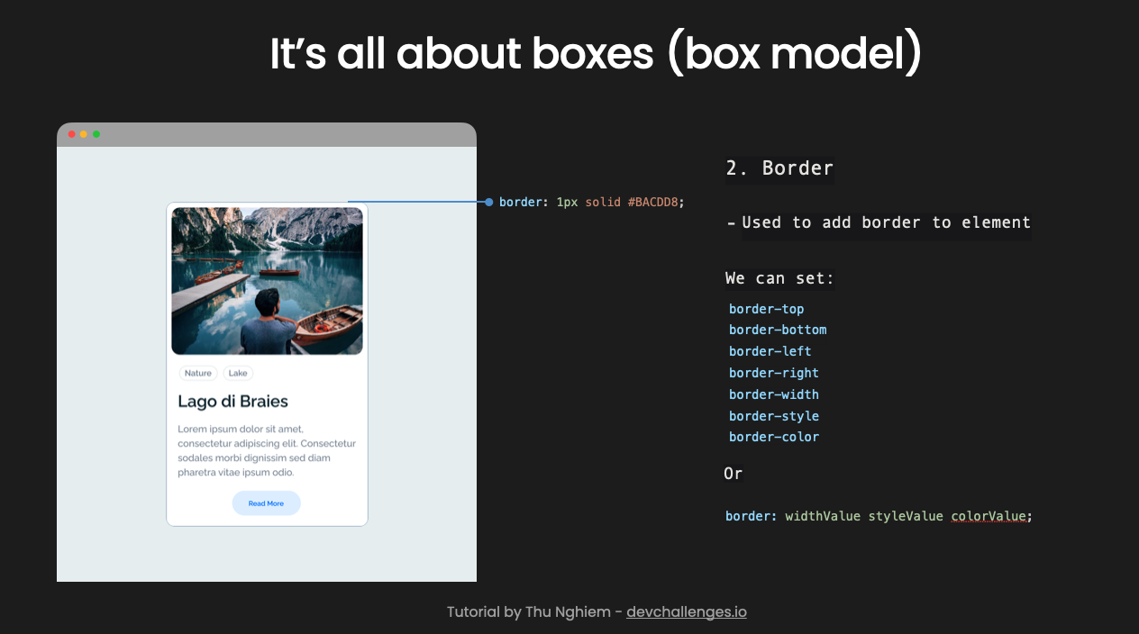
The CSS Box Model
In CSS, every element is a box. Each box has the following properties:
- Padding: Space outside the content
- Border: Lines outside the padding
- Margin: Space outside the border

Margin
We use margin to add invisible space outside an element that pushes other elements away.
For our card component, we used margin to add empty space above the container, space between the name and tags, and to center the card on the horizontal axis.
You can set margin-top, margin-bottom, margin-left and margin-right individually. Or you can use this shorthand:
margin: topValue rightValue bottomValue leftValue;
margin: verticalValue horizontalValue;

Border
The border property adds a border around an element. For our card component, we added a border around the card and each tag.
You can set border-top, border-bottom, border-left, border-right, border-width, border-style and border-color. Or you can also use the following shorthand:
border: widthValue styleValue colorValue;
Padding
Padding is used to add inner space between the border and its content. In our card component, we used padding in the card and button.
You can set padding-top, padding-bottom, padding-left and padding-right. Or you can use this shorthand:
padding: topValue rightValue bottomValue leftValue;
padding: verticalValue horizontalValue;

Conclusion
So that concludes the tutorial.
There are many other important CSS concepts to learn. But with this tutorial, you should be ready to use CSS in your next project to make it look great.
You can follow me on Twitter or YouTube for future videos and tutorials. But for now, happy coding and see you in future posts.
__ 👋 About me __
I am a full-stack developer, a UX/UI designer and a content creator.
I am also the founder of devChallenges. You can find more of these video tutorials at devchallenges.io/learn.