
With CSS Flexbox, you can easily create responsive websites that adapt to different screen sizes and devices. It's an essential skill for any modern web developer.
We just published a course on the freeCodeCamp.org Spanish YouTube channel that will teach you Flexbox from the fundamentals. By the end of the course, you will be able to design and implement responsive layouts.
If you have Spanish-speaking friends, you are welcome to share the Spanish version of this article with them.
This course was created by Leosbel Poll Sotomayor. Leosbel is a software engineer with more than 10 years of experience. He started creating more than 20 years ago in Cuba, and is now living in Canada thanks to his programming skills. He created this course for the freeCodeCamp community.
Are you ready? Let's see a quick overview of Flexbox and what you will learn during the course.
What is CSS Flexbox?**
CSS Flexbox stands for CSS Flexible Box Layout. It's a layout model that allows responsive elements to be rearranged within a container based on CSS properties that define how the children should "move" to fit the size of their container.
With Flexbox, you can align, distribute, and space elements using simple properties, so you can avoid complex computations in your CSS.
During the course, you will learn how to use these properties:
**flex-direction****justify-content****flex-wrap****align-items****align-content****flex-grow****flex-basis****flex-shrink**
And more! You will also learn how to combine them with media queries to create even more powerful responsive layouts.
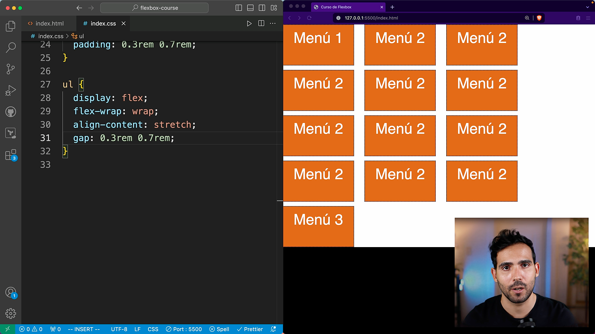 Flexbox layout. Wrapping elements automatically.
Career Opportunities
If your goal is to have a career in the field of web development, Flexbox will be super helpful for you. These skills are in high demand and widely sought by employers.
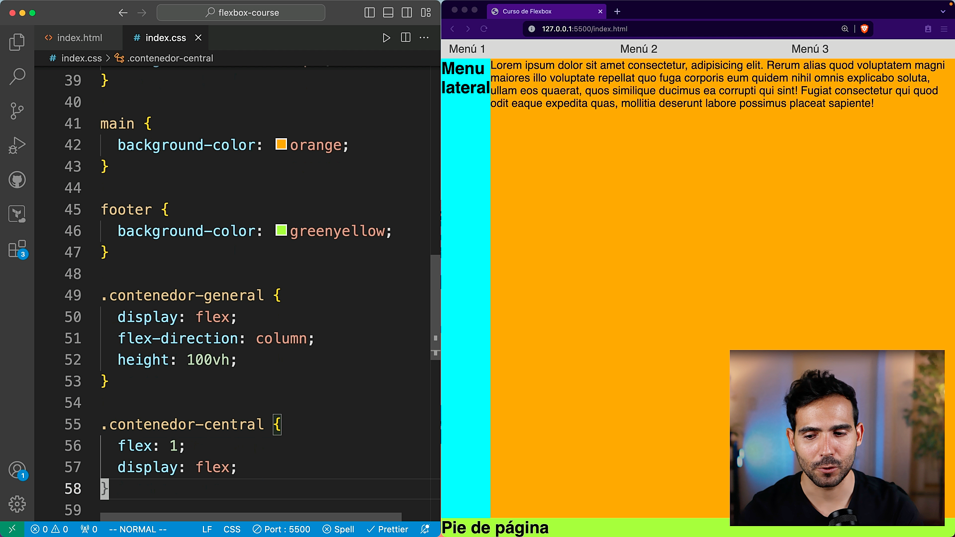 Flexbox layout. Classic design with a navigation bar, sidebar, main area, and footer.
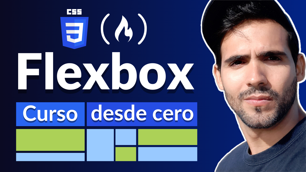
Flexbox Course in Spanish**
Awesome. Now that you know why Flexbox is so important, let's check out the topics that you will learn during the course:
- Introduction
- What is Flexbox?
- Importance of Flexbox
- Flexbox Fundamentals
- Tools that you will use during the course
- How to set up your development environment
- Properties related to containers
- Loss of data in CSS
- Properties related to children
- Use case: Navigation Bar
- Use case: Classic Design
- Flexbox vs. Grid
If you are ready to learn Flexbox, check out the course in Spanish on the freeCodeCamp.org Spanish YouTube channel:
✍️ Course created by Leosbel Poll Sotomayor.
- YouTube: LeoDev
- Twitter: @_LeoDev
- LinkedIn: Leosbel Poll Sotomayor