By Thu Nghiem
CSS Grid is a tool you can use to help create layouts for your website. It's especially useful if you need to think about the position, layers, or sizes of different elements.
CSS Grid is complicated and there are many things to learn. But the good news is that you don't need to know everything all at once.
In this tutorial, we will build 5 different layouts (which are explained as five separate tasks below) with CSS Grid. At the end of the tutorial, you will be ready to use CSS Grid in your next projects.
If you want to code along, be sure to download the resources:
Here's a video you can watch if you want to supplement this article:
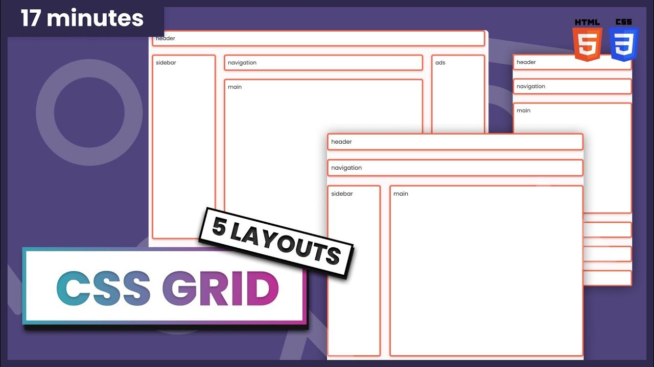
Here are the first two layouts we'll build:
 Task 1 and task 2
1: How to Build a Pancake Stack with CSS Grid
For task number one, we need to create a pancake stack layout. To create this layout, we can make three rows by using grid-template-rows: auto 1fr auto. The second row with a value of 1fr will expand as much as it can, whereas the other two only have enough space by wrapping their content.
So to achieve this layout, all we have to do is to give the container the following parameters:
.task-1.container {
  display: grid;
  height: 100vh;

  grid-template-rows: auto 1fr auto;
}
and you can see this layout everywhere, for example, in one of my tutorials:

Here's the YouTube link if you want to watch and code along.
2: How to Build a Simple 12 Column Grid Layout with CSS Grid
The basic 12 column grid layout has been around forever. And with CSS Grid, it's even easier to use. In this simple task we need to give item-1 four columns and items-2 six columns.
First, we need to create 12 columns. We can do that with grid-template-columns: repeat(12, 1fr);:
.task-2.container {
  display: grid;
  height: 100vh;

  grid-template-columns: repeat(12, 1fr);
  column-gap: 12px;

  align-items: center;
}
Notice here that we also have the 12px gap between every column. Similar to Flex, we also can use align-items and justify-content.
The next thing we need to do is to tell which column(s) the items should take up:
For item 1, we want it to start from column 2 and end at number 6. So we have:
.task-2 .item-1 {
  grid-column-start: 2;
  grid-column-end: 6;
}
Notice that the item will not include column number 6, only columns 2, 3, 4, and 5.
We can also have the same affect by writing:
.task-2 .item-1 {
  grid-column-start: 2;
  grid-column-end: span 4;
}
or
.task-2 .item-1 {
  grid-column: 2 / span 4;
}
With the same logic, we will have the following for item 2:
.task-2 .item-2 {
  grid-column: 6 / span 6;
}
You can see 12 column layout are everywhere – here is a tutorial where I use this technique.

Here's the YouTube link if you want to watch and code along.
3: How to Build a Responsive Layout with and without grid-template-areas
I am going to show you two options here. For the first option, we are going to use the 12 column grid that we learned from the 2nd task.
For the second option, we going to use a property called grid-template-areas.

The First option: How to Use the 12 Column Grid
Mobile
This is quite straightforward. We can use what we learned from task number one, and make the main section expand. We can also give the grid a gap: 24px as in desktop. There will be columns, not just rows:
.task-3-1.container {
  display: grid;
  height: 100vh;

  grid-template-rows: auto auto 1fr auto auto auto;
  gap: 24px;
}
Tablet
On a tablet, where the screen is wider than 720px, we want to have 12 columns and 4 rows. The third row will expand as much as it can:
@media (min-width: 720px) {
  .task-3-1.container {
    grid-template-columns: repeat(12, 1fr);
    grid-template-rows: auto auto 1fr auto;
  }
}
Now that we have 12 columns, we need to tell how many columns should each item take up:
@media (min-width: 720px) {

  // The header section takes 12 columns
  .task-3-1 .header {
    grid-column: 1 / span 12;
  }

  // The navigation section also takes 12 columns
  .task-3-1 .navigation {
    grid-column: 1 / span 12;
  }

  // The main section takes 10 columns start from column 3
  .task-3-1 .main {
    grid-column: 3 / span 10;
  }

  // The sidebar takes 2 columns start from column 1
  .task-3-1 .sidebar {
    grid-column: 1 / span 2;
    grid-row: 3;
  }

  // The ads section takes 2 columns start from column 1
  .task-3-1 .ads {
    grid-column: 1 / span 2;
  }

  // The footer section takes 10 columns start from column 3
  .task-3-1 .footer {
    grid-column: 3 / span 10;
  }
}
Notice here that we need to give .task-3-1 .sidebar grid-row: 3; because sidebar is after the main section in the DOM.
Desktop
For the desktop view, we will work with a screen that is bigger than 1020px. As we already have 12 columns, now we only need to tell how many columns it should use:
@media (min-width: 1020px) {

  // The navigation takes 8 columns starting from column 3
  .task-3-1 .navigation {
    grid-column: 3 / span 8;
  }

  // The main section takes 8 columns starting from column 3
  .task-3-1 .main {
    grid-column: 3 / span 8;
  }

  // The sidebar starts from row 2 and ends at row 4
  .task-3-1 .sidebar {
    grid-row: 2 / 4
  }

  // The ads section takes 2 columns starting from column 11
  // it also takes 2 rows starting from row 2 and ending at row 4
  .task-3-1 .ads {
    grid-column: 11 / span 2;
    grid-row: 2 / 4;
  }

  // The footer section takes 12 columns start from column 1
  .task-3-1 .footer {
    grid-column: 1 / span 12;
  }
}
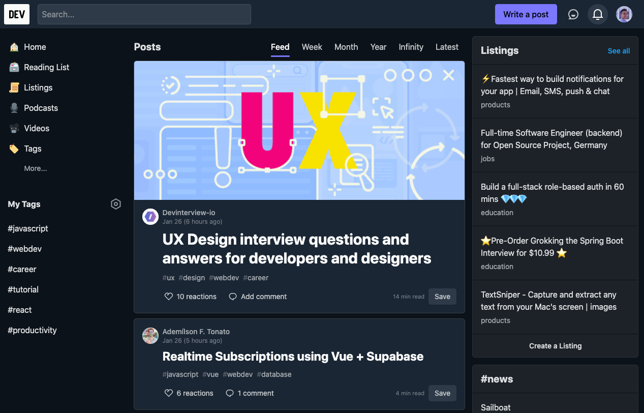
Real life example
You can actually find a similar layout on Dev.to's homepage:
The Second Option: How to Use grid-template-areas
Before using grid-template-areas, we need to define the area of the item using grid-area:
.task-3-2 .header {
  grid-area: header;
}

.task-3-2 .navigation {
  grid-area: nav;
}

.task-3-2 .ads {
  grid-area: ads;
}

.task-3-2 .sidebar {
  grid-area: sidebar;
}

.task-3-2 .main {
  grid-area: main;
}

.task-3-2 .footer {
  grid-area: footer;
}
After the item areas are defined, all we have to do is to give the container the position by using grid-template-areas:
Mobile
.task-3-2.container {
  display: grid;
  height: 100vh;

  gap: 24px;

  // Creating 6 rows and 3rd row expands as much as it can
  grid-template-rows: auto auto 1fr auto auto auto;

  // Defining the template
  grid-template-areas:
    "header"
    "nav"
    "main"
    "sidebar"
    "ads"
    "footer";
}
So on mobile, we create 1 column and 6 rows. And row number 3, which is the main row, should expand as much as it can.
This also makes it easy if, later on, you want to change the order/position of the item. For example, if we want to have navigation before the header we can do:
...
 grid-template-areas:
    "nav"
    "header"
    "main"
    "sidebar"
    "ads"
    "footer";
...
Tablet
@media (min-width: 720px) {
  .task-3-2.container {
    // Creating 4 rows and the 3rd row expands as much as it can
    grid-template-rows: auto auto 1fr auto;

    // Defining the template (3 columns)
    grid-template-areas:
      "header header header"
      "nav nav nav "
      "sidebar main main"
      "ads footer footer";
  }
}
With the code above, if the screen is wider than 720px we want to create 3 columns and 4 rows. The header and the navigation both take up 3 columns.
On the third and fourth row, the sidebar and ads take 1 column, whereas, the main and footer take 2 columns.
Desktop
@media (min-width: 1020px) {
  .task-3-2.container {
    // Creating 4 rows and the 3rd row expands as much as it can
    grid-template-rows: auto auto 1fr auto;

    // Defining the template (4 columns)
    grid-template-areas:
      "header header header header"
      "sidebar nav nav ads"
      "sidebar main main ads"
      "footer footer footer footer";
  }
}
Here we find similar logic to tablet view. For the desktop, we create 4 columns and 4 rows and the placement according to the value of grid-template-areas.
Which should you choose?
Using the 12 Column Grid:
➕ Easy and fast to start ➕ Easy to maintain for column-focused layouts ➖ Difficult to arrange items in complex layouts
You should use 12 Column Grid for less complex layouts that focus mainly on the arrangement of the columns.
Using **grid-template-areas**:
➕ Flexible for complex layouts ➕ Easy to visualize ➖ Takes more time to implement
You should use grid-template-areas for more complex layouts where you need to care about positions or sizes of many elements.
Both options have pros and cons, but you should choose the one that's easier for you and makes sense in your particular scenario.
4: How to Build a Responsive Layout Without Media Queries in CSS Grid

It is surprisingly simple to do this. We can make it happen with one line of code: grid-template-columns: repeat(auto-fill, minmax(150px, 1fr));, like this:
.task-4.container {
  display: grid;
  gap: 24px;

  grid-template-columns: repeat(auto-fill, minmax(150px, 1fr));
}
We just created a flexible column layout and specified that the column should never be less than 150px and should share the space evenly.
5: How to Build a 12 x 12 Chess Grid with CSS Grid
For the last task, I want to show you that, not only we can define the number of columns, but we can also define the number of rows using CSS Grid.
.task-5.container {
  display: grid;
  height: 100vh;

  grid-template-columns: repeat(12, 1fr);
  grid-template-rows: repeat(12, 1fr);
}
Now, we can place the items anywhere we want. So to create this layout:
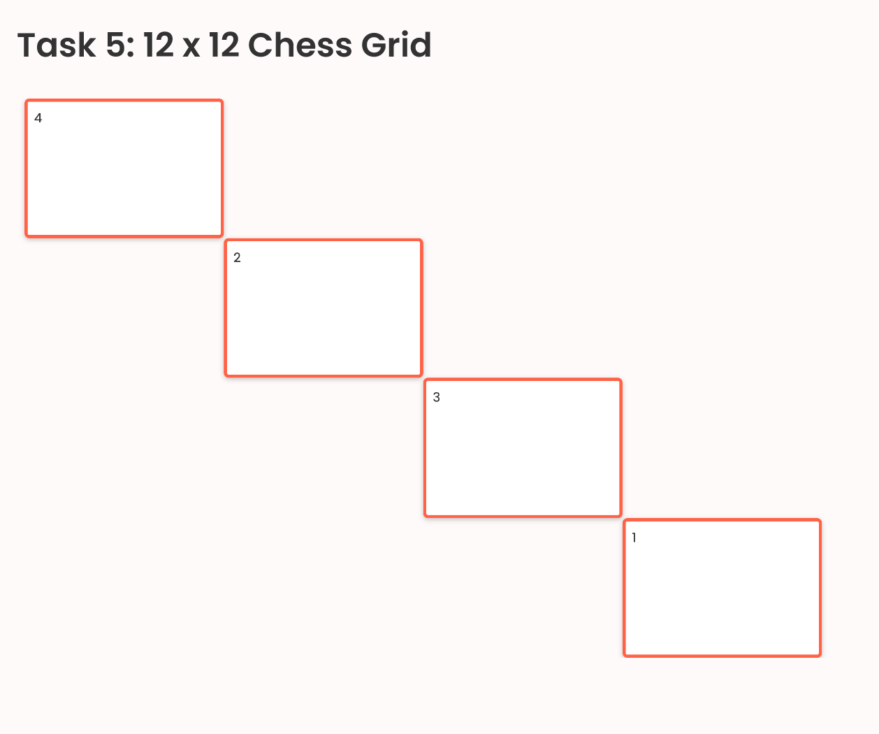
We can do this:
...
// First item starts from column 1 and expand 3 columns
// and from row 1 and expand 3 columns
.task-5 .item-1 {
    grid-row: 1 / span 3;
    grid-column: 1 / span 3;
}

// Second item starts from column 4 and expand 3 columns
// and from row 4 and expand 3 columns
.task-5 .item-2 {
    grid-row: 4 / span 3;
    grid-column: 4 / span 3;
}

// First item starts from column 7 and expand 3 columns
// and from row 7 and expand 3 columns
.task-5 .item-3 {
    grid-row: 7 / span 3;
    grid-column: 7 / span 3;
}

// First item starts from column 10 and expand 3 columns
// and from row 10 and expand 3 columns
.task-5 .item-4 {
    grid-row: 10 / span 3;
    grid-column: 10 / span 3;
}
Conclusion
Thanks for reading this article. This topic belongs to the series of videos that I will update on Learn.DevChallenges.io. So to say updated, follow me on social media or subscribe to my Youtube Channel. Otherwise, happy coding and see you in the next video and articles 👋.
__ 🐣 About me __
I am a full-stack developer, a UX/UI designer and a content creator. You can get to know me more in this short video:
- I am the founder of DevChallenges
- Subscribe my Youtube Channel
- Follow my Twitter
- Join Discord