
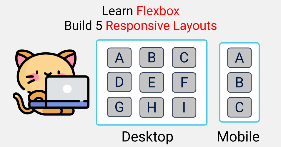
Here's a practical guide to help you learn CSS Flexbox in 2021 by building 5 responsive layouts. Let's dive right in.🥇
Table of Contents
You can check out the Figma design here
You can also watch this tutorial on my YouTube channel here:
What is Flexbox?

We need a blueprint when constructing a house. In the same way, we need a blueprint to layout our content across our browser. At the same time, we need to make responsive layouts for various screen sizes.
This is what Flexbox helps us do – create responsive layouts.
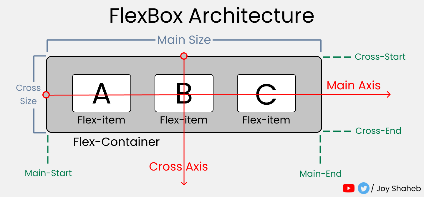
Flexbox Architecture
So how does Flexbox architecture work? The flex-items [Contents] are distributed along the Main Axis and Cross Axis. And, depending on the flex-direction property, the layout position changes between rows and columns.
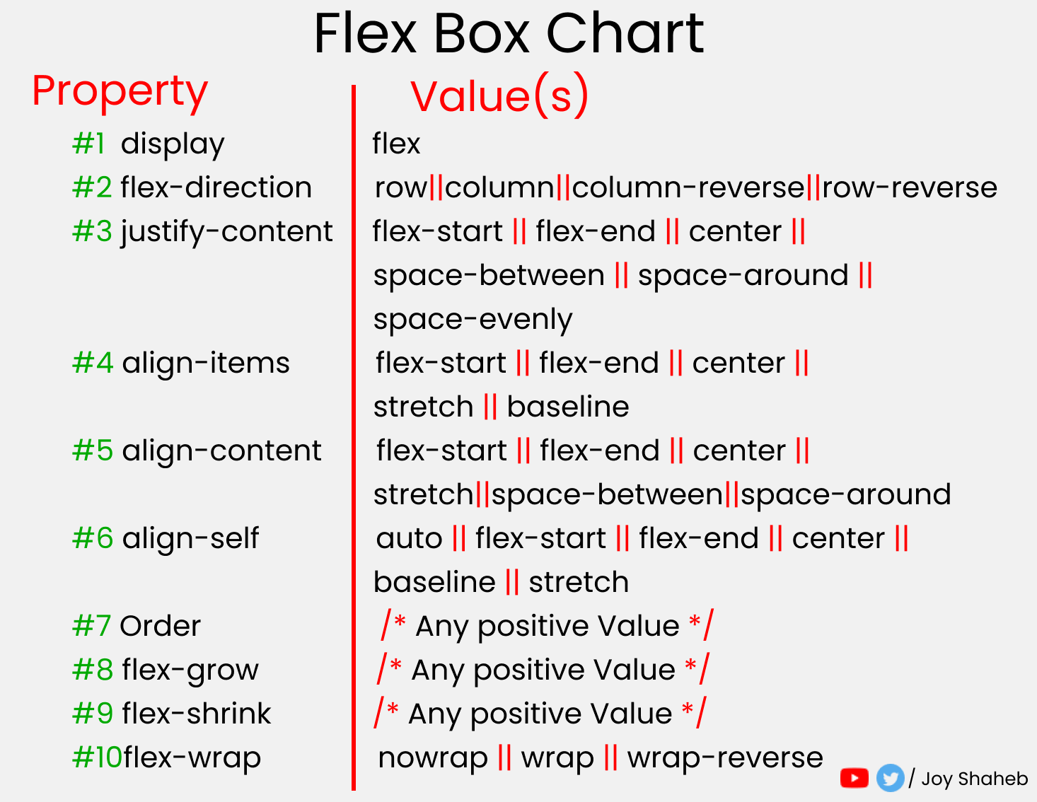
Flexbox Chart
This chart contains every possible property and value you can use when using flexbox. You can reference it while doing the project and experimenting with different values.
Before We Get Started...

You need to know a little bit of HTML and CSS. Throughout this tutorial, you'll learn how Flexbox works, how its various properties and values work, and how media queries work (which help us make responsive websites).
Project Setup
Before coding, we need to save some values in variables and clear the default browser styles. Along with that, we will define some media query mixins to save time and avoid code repetition.
SCSS
SCSS is a preprocessor of CSS which gives us much more functionality than regular CSS.
For example, we can nest child classes inside their parent class, store values in variables, and much more. It really helps us save time.
Let's start playing around with SCSS. Open CodePen or any code editor and go through this with me, these step by step.👇
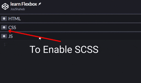
How to Enable SCSS in Codepen 👇
First, define the border color, gap, and padding values in your variables.
$gap : 4vh;
$padding : 4vh;
$color : #48CAE4;
Next, define various screen breakpoints in the SCSS map. Remember, on our SCSS map, [mobile, tablet, and desktop] are keys and the pixels are values.
$bp : (
  mobile : 480px,
  tablet : 768px,
  desktop : 1440px,
);
To save time and code, when defining media queries we'll use mixins and loop the breakpoints we defined above. 👆
@mixin query($display){
  @each $key, $value in $bp{

    //  defining max-width
    @if ($display == $key){
      @media (max-width: $value){@content;}
    }
  }
}
Now we have to change the default styles of our browser. We remove the margin and padding and set the box-sizing to border-box.
//Changing The Default Settings..

*{
  margin:0px;
  padding: 0px;
  box-sizing: border-box;

// Changing the body here

  body{
    width: 100%;
    min-height: 100vh;
    font-family: sans-serif;
    font-size: 45px;
  }
}
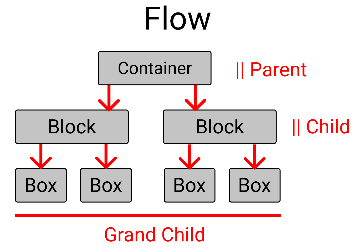
Let's talk about the relationship between the HTML classes we're going to use. Always remember that Flexbox works on child classes.
For example, Flexbox properties defined on the Container class work on Block, and properties defined on the Block class work on the Box class. Here's an illustrated explanation of what I mean: 👇
Now let's create these layouts. We'll start with an easier difficulty level and move to more advanced layouts.
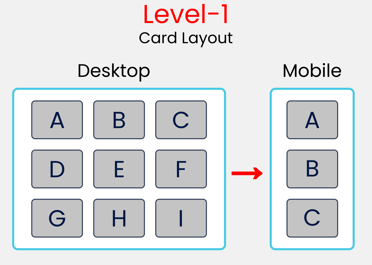
Layout Difficulty Level-1 – How to Build a Card Layout
HTML
The container class will hold 3 children -> block-1, block-2, and block-3.
The block-1 class will carry 3 boxes -> box-1, box-2, and box-3.
The same rules apply for the block-2 and block-3 classes, but the values will be changed.
<div class="container">

<!--block-1 has 3 children, box-1,box-2,box-3 -->

  <div class="block-1">
    <div class="box-1"> A </div>
    <div class="box-2"> B </div>
    <div class="box-3"> C </div>
  </div>

<!--similar to block-1, values are changed -->

  <div class="block-2">
    <div class="box-4"> D </div>
    <div class="box-5"> E </div>
    <div class="box-6"> F </div>
  </div>

<!--similar to block-1, values are changed -->

  <div class="block-3">
    <div class="box-7"> G </div>
    <div class="box-8"> H </div>
    <div class="box-9"> I </div>
  </div>
</div>
SCSS
Now, we're going to style our container class. Remember, to trigger Flexbox and access all its powers, you need to write display: flex; like this:
// Style rules for container class

.container{
  display: flex;

//to lay .block-* classes in a column
  flex-direction: column;

//Setting gap between the .block-* classes
  gap: $gap;

// to set some padding & border inside
  padding: $padding;
  border: 1vh solid $color;
}
Select all the .block-* classes and style them together. At the same time, at the bottom, we will define our media query using the mixin we created during the setup phase.
[class ^="block-"]{

//To lay the boxes in a row.
  display: flex;
  flex-direction: row;

//Removing border(1vh+1vh), gap, & padding from the height
// And then equally distributing spaces between the
// .block-* classes by dividing it by 3

  height: (100vh-2vh -$gap*2-$padding*2) / 3;

// putting gap between .box-* classes
  gap: $gap;

// Style rules for mobile display

  @include query (mobile){
    flex-direction: column;

// you can pick any value you wish.
    height: 500px;
  }

}
Alright then, next select all the .box-* classes and style them together like this:
[class ^="box-"]{

// To set the text at center of every box
  display: flex;
  justify-content: center;
  align-items: center;

// To divide spaces among the boxes
// try flex-gap:1; you can see the difference.
// flex-grow: 1; // 1+1+1 =3 => 1/3 X 100% => 33.33% each

  flex-basis: (100%)/3; // 33.33% each
  border : 2px solid black;
  border-radius: 10px;
  background-color: #c1c1c1;
}
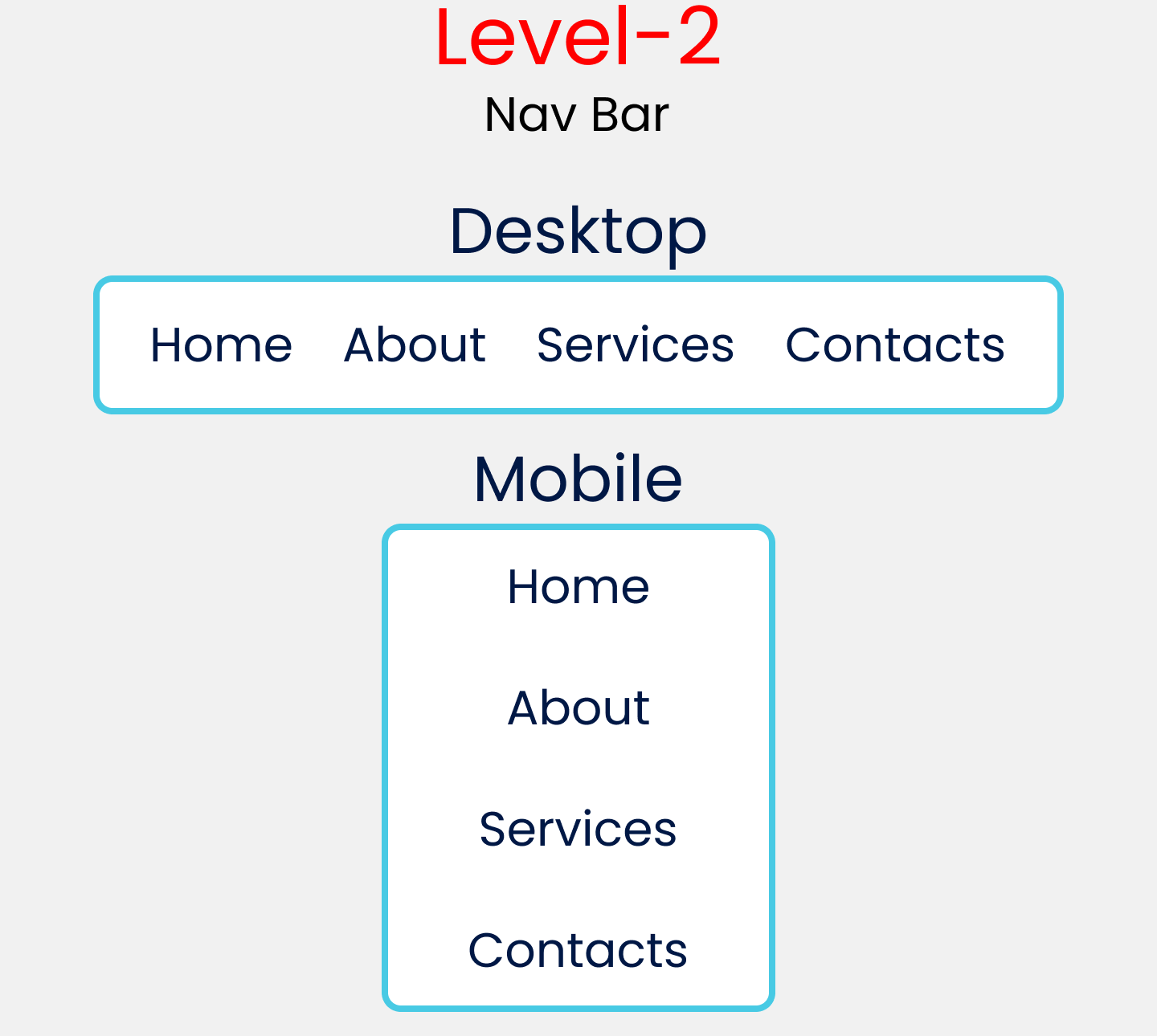
Layout Difficulty Level-2 – How to Build a Nav Bar Layout
HTML
Remove the HTML code of level-1 and write this code instead. Basically it's 1 parent class with 4 child classes.
<div class="container">
  <div class="item-1"> Home </div>
  <div class="item-2"> About </div>
  <div class="item-3"> Services </div>
  <div class="item-4"> Contact </div>
</div>
SCSS
Here are the style rules for the container class for level-2. At the bottom, we will set up a media query using the mixin.
.container{
  font-size: 35px;
  display: flex;

//To set orientation of the items
  flex-direction: row;

// To distribute available space
  justify-content: space-evenly;
  padding: $padding;
  border : 1vh solid $color;

// style rules starts from Tablet Screens
  @include query(tablet){
    height : 100vh;
//Changing orientation of the items
    flex-direction: column;
    align-items: center;

//Setting gap for items Vertically
    gap: $gap
  }
}
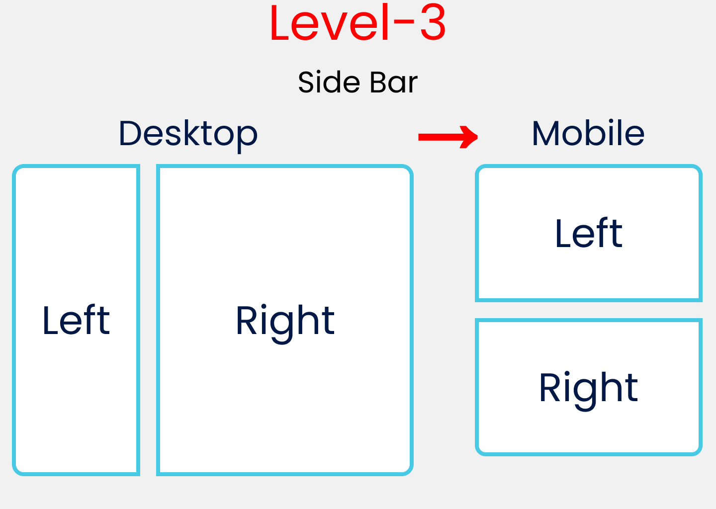
Layout Difficulty Level-3 – How to Build a Sidebar Layout
HTML
Now, we'll work with this code block:
<div class="container">
  <div class="block-1"> Left </div>
  <div class="block-2"> Right </div>
</div>
SCSS
The Style rules of the container class with the media query mixin are included at the bottom for level-3:
.container{
  display: flex;
  flex-direction: row;
  gap: $gap;
  padding: $padding;

// Style Rules for Mobile Display

  @include query(mobile){
    flex-direction: column;
  }
}
Here, we select and style all .block-* classes along with the media query for mobile display:
[class ^="block-"]{

//To put the left, right text at center
  display: flex;
  justify-content: center;
  align-items: center;

  border : 4px solid $color;
//Setting height of each block
  height: 100vh -$padding*2;

// Style Rules for Mobile Display
  @include query(mobile){
    height: 50vh -$padding*2;
  }
}
Now we individually target the block-1 and block-2 classes. We also change the flex-grow value in order to distribute screen space.
// Style Rules Left Block

.block-1{
//will occupy 20% of the Available width
  flex-grow: 2;
}

// Style Rules Right Block

.block-2{
//will occupy 80% of the Available width
  flex-grow: 8;
}
Take A Break :D

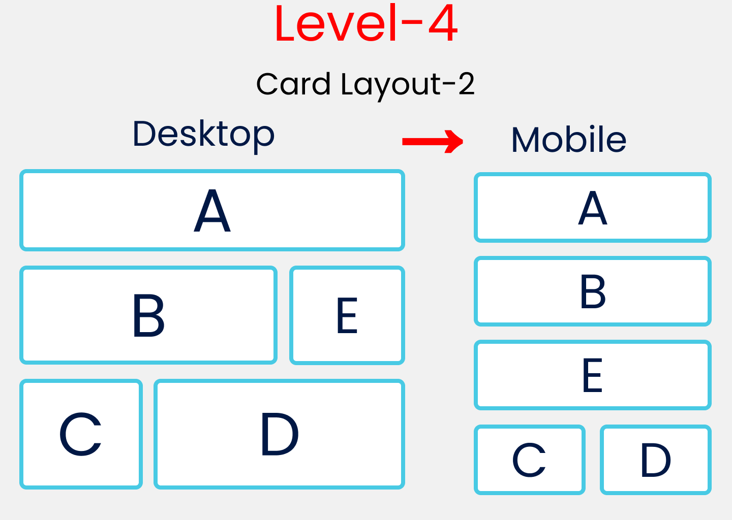
Layout Difficulty Level-4 – How to Build a Card Layout #2
HTML
The HTML rules here are similar to level-1 with a few changes:
<div class="container">

  <div class="block-1">
    <div class="box-1"> A </div>
  </div>


  <div class="block-2">
    <div class="box-2"> B </div>
    <div class="box-3"> E </div>
  </div>


  <div class="block-3">
    <div class="box-4"> C </div>
    <div class="box-5"> D </div>
  </div>

</div>
</div>
SCSS
Style the container class like this:
.container {
  display: flex;
  flex-direction: column;
  padding: $padding;
  gap: $gap;
}
Next, select and style all the block-* classes together along with the media query mixin at the bottom for mobile devices:
[class ^="block-"]{
  display: flex;
  flex-direction: row;
  gap: $gap;

// Removing Padding, Gap & divide by 3
  height: (100vh -$gap*2 -$padding*2)/3;

// Style Rules for Mobile Version
  @include query(mobile){
    flex-direction: column;
  }
}
Now select and style all the box-* classes together:
[class ^="box-"]{

// To place the letter at center
  display: flex;
  justify-content: center;
  align-items: center;

// Border, Border-radius & background-color
  border : 1vh solid $color;
  border-radius: 10px;
  background-color: #c1c1c1;
}
Now, we'll individually target the boxes and use flex-basis to distribute screen space.
//A
.box-1{
  flex-basis: 100%;
}

//B & D
.box-2, .box-5{
  flex-basis: 70%;
}
//E  & C
.box-3,.box-4{
  flex-basis: 30%
}
Finally, we will include the media query mixin for the mobile version.
// Style Rules for Mobile Version

@include query(mobile){
  .block-2{
    height: (100vh*2)/3; // 66.66vh
  }
  .block-3{
    flex-direction: row;
  }

//   Selecting B, E, C, D
  .box-2,.box-3,.box-4,.box-5{
    flex-basis: 50%;
  }
}
Are you winning yet? Let's turn up the heat. 🥵
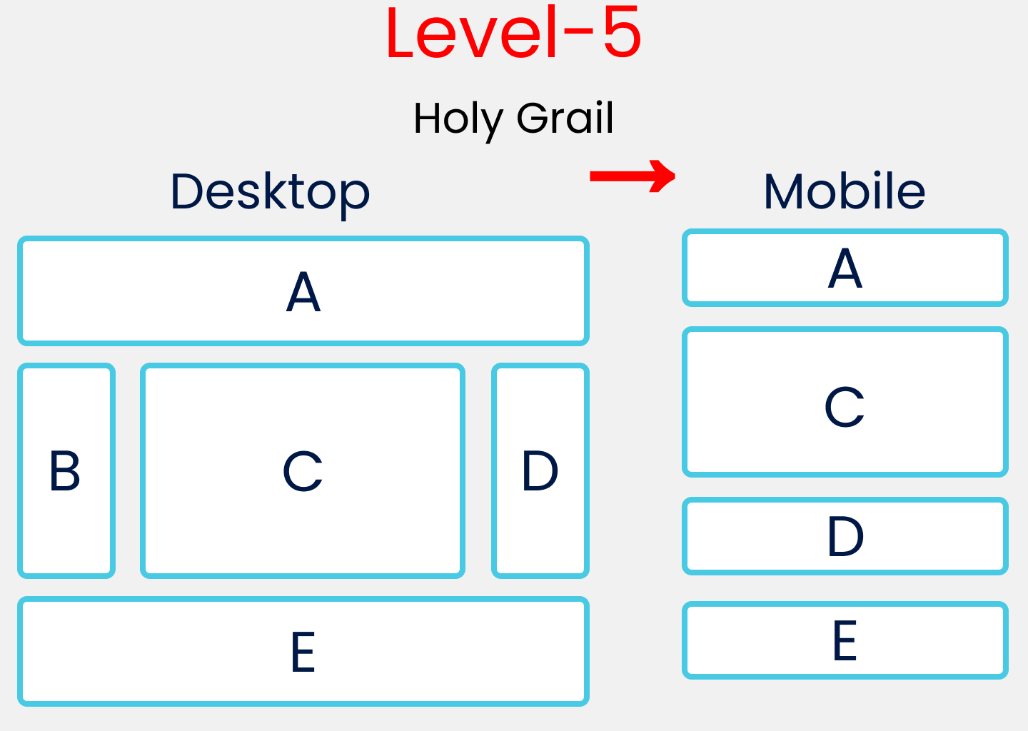
Layout Difficulty Level-5 – The Holy Grail of Layouts
HTML
The HTML rules here are similar to level-1 and level-4 with a few changes:
<div class="container">

  <div class="block-1">
    <div class="box-1"> A </div>
  </div>

  <div class="block-2">
    <div class="box-2"> B </div>
    <div class="box-3"> C </div>
    <div class="box-4"> D </div>
  </div>

  <div class="block-3">
    <div class="box-5"> E </div>
  </div>
</div>
SCSS
First, change the container class styles like this:
.container{
  display: flex;
  flex-direction: column;
  gap: $gap;
  padding: $padding;
}
Then, target and style all block-* classes together.
// Style rules of all .block-*

[class ^="block-"]{
  display: flex;
  flex-direction: row;
  gap: $gap;
}
Next, target and style all box-* classes together.
// Style rules of all .box-*

[class ^="box-"]{
  display: flex;
  justify-content: center;
  align-items: center;
  border : 1vh solid $color;
  border-radius: 10px;
}
Then individually target the boxes and use flex-basis to distribute screen space.
// Defining A & E Together
.box-1,.box-5{
  flex-basis: 100%;
  height: 20vh;
}

// Defining C here
.box-3{
  flex-basis: 60%;
//   Removing Gap & padding
  height: 60vh -$gap*2-$padding*2;
}

// Defining B & D Together
.box-2,.box-4{
  flex-basis: 20%;
}
Lastly, include the media query mixin for the mobile version. Notice that we are hiding box-2 for the mobile version.
// Media query for mobile Screen

@include query(mobile){
  .block-2{
    flex-direction: column;
    height: 60vh;
  }
// Hiding our B block
  .box-2{
    display: none;
  }
// Increasing Height of C
  .box-3{
    flex-basis: 80%;
  }
}
Conclusion
Thanks for following along! Hopefully now you understand the basics of Flexbox. Here's your medal for reading till the end. ❤️
Suggestions and criticisms are highly appreciated ❤️ Do get in touch with me via the social media links below if you have any questions.
Image Credits
Kitty Avatar Kitty with duck Cute Rabbit Cute Bear
YouTube / Joy Shaheb
Twitter / JoyShaheb
Instagram / JoyShaheb