
A design system is a set of standards, reusable components, and patterns used to create visual consistency throughout different projects and pages. Figma is a vector graphics editor and prototyping tool.
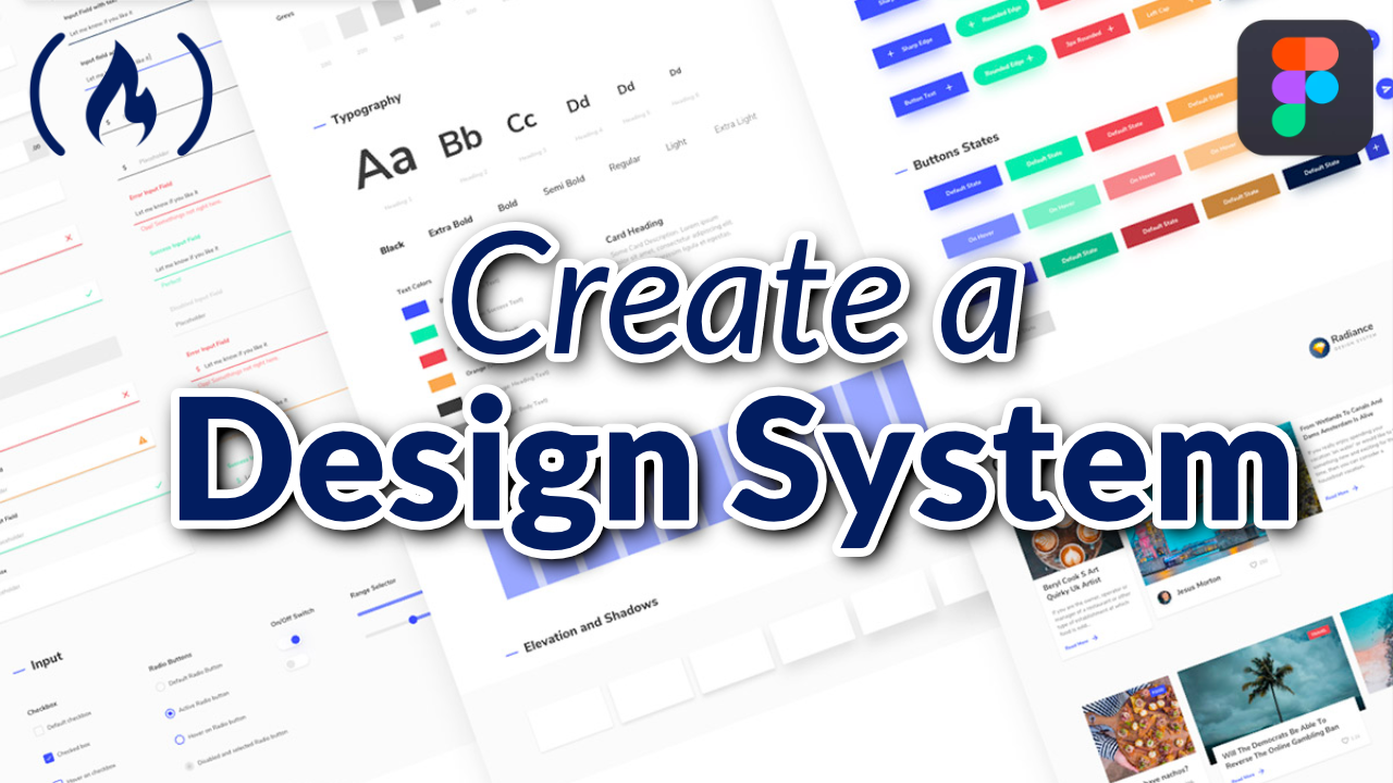
We just released a course on the freeCodeCamp.org channel that will teach you how to build a design system in Figma.
Tim Sullivan created this course. Tim is a former Airbnb Designer and he is a great teacher.
If you want your project to look professional, it is important to create a design system so there is a consistent style.
Here are the topics covered in this course:
- Introduction
- Creating a Color System
- Building a Type System in Figma
- Elevation
- Product & System Icons
- Text Legibility
- States
- Selection (Interaction)
- Understanding Layout
- Pixel Density
- Spacing Methods
- Responsive Grid Layout
- App Bar - Bottom
- App Bar - Top
- Backdrop
- Banners
- Bottom Navigation
- Buttons - Floating Action Button
- Buttons
- Cards
- Chips
- Dialogs
- Date Pickers
- Dividers
Watch below or on the freeCodeCamp.org YouTube channel (8-hour watch).
Video Transcript
(Autogenerated)
A design system is a set of standards, reusable components and patterns used to create visual consistency throughout pages and projects.
Figma is a vector graphics editor and prototyping tool. In this course, Tim Sullivan will teach you how to create a design system using figma.
What is going on you guys Tutorial Tim here.
And today, I'm gonna give you a brief overview of what we're going to be covering in this series to come, I'm going to be creating a design system.
And this design system is going to be materials design system in figma.
And I'm going to do my best to translate what is currently being displayed on this website into figma itself as a design system.
So we'll be going over First, the foundation.
And the foundation entails things such as the layout, and what is layout, like a response to creating these responsive grid layouts of styles and figma.
Understanding how to build these out using proper space spacing methods, and how components will be laid out on them.
So we'll be going over that.
And we'll also be going over how to apply a color system utilizing material designs color system and implementing that into figma, as well as style color styles.
And also, we're going to be going over typography and building out the typography system that is specified here in material design.
But in figma, how do we do that and translate this into figma.
Also, we'll be going over iconography.
And with iconography in figma, we're going to be basically applying the structure for the letter specified in the product icons.
I'll have this set of icons already in figma when we go over, but I'm gonna show you how to organize it and access it via the instance drop down menu.
So you can swap amongst common components and other component icons, which are components as well.
And also, we're going to be going over a portion of interaction, which is states states being states for certain components.
So in that portion of building design system, we'll go over foundation.
And then moving on from that, we'll go to components.
And we'll literally build every single component on this page from scratch and utilizing the foundation that we've created in figma.
So we'll start with the app bars, app bar bars, bottom at bars top all the way down to the very last component being tooltips.
And we'll go over how to, like construct it via its anatomy, right.
So we have all this information, how to use it the placement and behavior.
And basically, I'll teach you how to basically view this file and build it out in figma, from scratch and apply the proper constraints.
So it's responsive, just in case designers need to modify it.
And that is basically going to be the design system that we'll be building in figma, which is material design.
And that's the brief overview.
I'm gonna start off with a color system is Yeah, so it's gonna kind of start off with referencing the website to give you guys an understanding what we're going to be building out in in figma.
And what we're going to be doing in figma, is basically translating, I'm going to give you a brief overview right now what we're going to be doing throughout the whole course of the video, to give you a general understanding.
So we're gonna start with the color system, implementing colors, and then adding that into figma as a library, so you can see them here.
For those of you who have, for those of you who are able to utilize libraries, you can see this color palette here.
And all the styles that have been created in that library.
So with my material design, system colors file and rename that real quick material design.
And we got materials on here.
And now, if I go here, we're going to be able to add it to this library that will publish eventually, with all these colors, but this current files already published.
But what I'm going to do is delete all these real quick.
All right, so we have these colors, we have color styles, but we haven't added into the library, I'm gonna show you how to do that.
But I'm gonna show you how to do that by developing the developing book creating this color system, we're gonna use the baseline material color theme, to showcase how to build out these colors as styles and figma for your whole team to utilize in figma.
If you're working for an organization, for example, or just a team, it's a much more effective way of working.
So basically, what I'm going to do is screenshot this to have all these values, so I don't want to go back and forth between browsers.
And once I have that done, I'm just going to remove everything here.
Don't need that.
Don't need that.
And I'm going to start this is like a brand spanking new file so you guys can follow.
Follow me from scratch.
I already have one page and I'm actually gonna label this primitives because This, this component is a primitive component.
So the way we're going to structure all these components, in terms of its complexity is from like its very simplest form, that being labeled as a primitive, all the way to components, and then patterns, which are composed of several components.
And we'll get more into that later.
But let's just get started with the colors.
So now I have the screenshot pasted here.
And what I'm going to do is basically translate all these colors into styles.
So without any further ado, I'm just going to create some rectangles.
And actually, I'm going to hit Ctrl, C, to copy this value here.
Notice that when I use Ctrl, C, the hex value isn't what's indicated in the screenshot that I've selected to copy the value and apply to the rectangle.
So I'll have to manually input and put that value that's indicated there.
And I'm just going to keep doing this until I have completed all of the color values.
And I'll see you when that is done.
Right, so I've now completed creating all these color blocks for you in figma, just to kind of visually show you and apply the correct color rows, because actually, what I wanted to originally do was use a control picker and apply these values, but it doesn't actually reproduce the exact hex values specified in the image, because of the screenshot that I grabbed.
And anyways, long story short, let's make these color styles now.
So now we're going to add the this into our color system.
Currently, we don't have anything in our color system.
So basically, what, what you can do is, we already have the naming convention set for our color styles.
So we can go to our color and select style, add new style, and it will basically grab the hex value of the rectangle we selected, and then we can label it as primary.
And when we click Create style, it'll create that style.
And when you hover over it, a tooltip will appear below it.
And it will state the name of the style that you're trying to look for.
And also, if you want to add labeling on let's say, if we create a like primary variant, whoops, and we select this little, these little four icons, and then click Add style.
And then we do primary slash variant, this will actually add labeling.
So we'll go and it'll, you'll start to see that with with us utilizing the slash in the name of your color style, that slash actually creates this label for you to really easily parse information in your color styles, which is very good for, like ease of use, as opposed to just like generating all of these colors.
And then just having them side by side and hovering, to access the name of the color you're looking for exactly.
And at least divide them into sections to get you one step closer to finding the color you need.
And I'm gonna unlink that, because it's not exactly how I want to approach it.
I'm actually going to go here, and if you if you'll notice, too, and your color styles, if you haven't published them, there'll be under local styles.
And then you can access your library by going to, if you hit Command Shift, question mark, you can type in library, and then it'll switch you to Team library.
There's also a shortcut key, option three, that'll take you there and also a shortcut key option command o to access the libraries.
And you'll notice that I have 19 unpublished changes to publish.
And I can publish those, but we'll publish that once we have completed this.
And I'm going to continue to create the rest of the colors as I go and label them accordingly.
Secondary, create style.
And then I'm going to create this as a primary variant.
Create style.
And one thing you can do as well in the color styles is you can actually drag and drop to reorder the styles.
So I'm going to actually right click on this one and delete style.
And one thing you can do with color styles as well is you can go in edit and add description and say this secondary color is used for x component, x meaning the name of the component or the or like also on surfaces for x component as an example.
And then once you're once you've completed that you can hit back and it'll save your changes.
And then you can go back into the components like that style and you notice those changes are now there.
Which is another nice thing about colors to get an understanding of usages behind them when using them across like, say you're designing for a product, for example, I'm going to pause this video and generate the rest of these colors.
And I'll see you in a bit.
So now I got everything done.
You can see my color styles has local styles.
So I got the baseline of the material theme in its colors, right, and I got them all labeled here.
From the screenshot, I snapped from the website.
And I basically just translated that into figma.
And then I applied those styles all the way from primary to the on error surface, a lot of them are very similar.
But one thing I do not like about this approach that I'll show you.
And the next approach of applying color styles with a consistent naming convention that clearly labels everything, when you try and access it via the drop down menu is that this isn't very clear what I'm trying to change the color, right, I just have to hover to find the values.
And a description will appear for for components that do have a description there, which is why that tooltip was rather large for that color style in this instance, just to provide some context behind that.
And anyways, this is just isn't clear enough for me to add color styles.
So what I'm going to do is in material design 2014 established right down here in 2014, their color palette, and it's just comprised of colors to work together harmoniously.
And basically, this is where I'm going to use like a consistent naming convention and structure based off of the, the colors given here with, with what I like to call the variables and their hex values, which I'll then apply in figma.
And I'm gonna show you how to do that with the top three.
So I'm gonna go back to figma.
And I'm going to show you before, I'm going to show you, I'm going to remove all this, because I don't want this anymore, I am going to actually just leave it.
And so you can see the difference between how to navigate colors with a consistent naming convention, utilizing the slash when naming these colors and the styles when creating them of styles.
And anyways, I'm going to go here, grab my rectangle.
And I'm literally just gonna actually copy this block here on background label at Red, red, red 50 to kind of mimic the layout that we have here.
And then I'm gonna hit Command D to duplicate and then option D to snap that to the right, and then type in this hex value.
And this whole process you're seeing from me is, I'm going to do it once and then I'm going to pause the video and do it for the rest.
And then I'll show you how to properly label everything as a color style in figma.
And, and then I'll be back.
Alright, so I have now replicated this screenshot I've taken from the website with the color palette holds a portion of the color palette that material design has to offer either utilize.
And I've just done the red, pink and purple.
So now what I'm going to do is start to show you the difference and how helpful it can be by doing applying this consistent naming convention to all the color styles we're about to create for red, pink and purple, which you can apply to your system.
So I'm going to start with red, we got this red 50 value, so we got red 50, we already have the hex value, it's gonna click add color style, I'm gonna label it read because we're gonna have a section of rats, ranging from values of one through 900, from light to dark, and then also a 100 to a 700.
Not exactly sure what those values represent.
But uh, you get where we're going with this.
And I'm going to do red 100, and then specify the hex value as well.
And the color style, which is always helpful, so you don't have to actually go in and manually apply the style and then unlink it to view the hex value, which I find quite annoying.
So we got this format, I'm gonna click Create style, hit enter.
Now we got red one.
So on hover, we'll see red 100 and then the hex value.
And then if you click away, you also see the way we named it is red slash 100 dash, the hex value, which is nice and easy to parse.
And again, this is up to you and your team to decide on how you label this in terms of like doing this for an organization for teams to utilize.
Now I'm going to go in and create the rest of these Use for, for red.
It's the same process.
So we got, what do we got, we created red 100 was actually supposed to be labeled red 50 actually wrote the wrong hex value as well.
So I'm just gonna edit that.
And it's red 50 good to go hit enter tab, go back.
Now we see that it's refined and reflects the actual value.
Okay going to do on a couple more, so you get the idea of how to name your color styles.
Now, I'm going to pause it and finish reds and then do a couple of pink and then do a couple of purple to see how effective utilizing the slash and your color styles can parse the information when trying to access the colors to apply to your components moving forward, when we continue to implement more of this system as it becomes more dense.
So we got red 100 here, gonna add color style.
Red 100, good to go create color styles.
And we got two that fall under the red category, because we're utilizing red space slash keeping the naming convention consistent.
So I'm just gonna copy this hex value, Command click on my rectangle with the color that I want to be a style.
And then I'm going to paste red 100.
But change that to 200 and then reapply the hex value for red 200 and create that style.
So now I'm going to move on to creating another category which is pink.
We got I'm going to copy this again, Command click and add color style.
And I'm going to go with pink space slash space 50 and then dash and then the hex value.
Create that style.
And you'll notice in the color styles now, we have our new our own pink section to reflect what we'd like to mimic visually, but in our color styles, which will be accessible to everyone once you publish this, because currently these are local styles.
As you can see, when you click somewhere random on the canvas, the blank canvas, you'll see the color styles here.
But they sitting there only local but we'll push them once we're done completing this stew.
I'm going to do purple now, because I'm pretty sure by this time you guys already know how to do this.
As I've done it multiple times, I'm going to copy this hex value, select the background, add the color style, and I'm going to go purple space slash add the hex value there and then type in fifth 50 did that.
Okay, enter.
Now we have our sections of red, pink and purple.
The other sections we haven't implemented from the material design website, which I will do on my own are, are the following.
As you can see, I scrolled through a lot of them, it will take a lot of time, but is the same exact process.
But I will pause this video and complete that and show you and then we'll publish it once I'm done.
And that'll be the end of the video bareback.
All right, all right.
All right, I finished creating the rest of the color styles using the method I specified for pausing this video.
And you can kind of see how dense this, the styles became.
So each one of these is now a color style organized here from red, pink, and purple.
And there's plenty more to go, I will have all of them created for you to reference as well, in that, by that I mean all of these, which are screenshots that will convert into this figma file.
Take a little bit of time, but uh, it's not an issue.
So now, the final step is publishing this.
So what do we what? How do we do this? Well, there's a few ways I'll show you, we can select assets, we can click on this library icon and this little, that little blue icon right there in the top right corner indicates that there are publishers to be made changes, that publishers to be made or whatever, you can select it and you can see that you can publish 69 changes, the 69 changes being all the color styles that we have applied to this library.
One thing I want to show you is the the differentiation between the way we labeled these colors in the beginning and then the way we labeled these three sections in a much more organized and clear concise manner.
So if we go here, create a rectangle and apply a color style to it.
We just like this little icon here and you'll see that the we have these colors right The only way you can really tell what they are labeled as is if we hover over a mother wait to see that tooltip pop up as well.
And what we did with the colors that we use the slash to indicate what the label was, to the left of the slash being the Read, and then the value being applied to the style, which is read 50.
And then also on hover, being able to view the hex value as well.
And we did that and split up red, pink and purple in a much more clear and concise manner for the user to navigate and use.
And again, this is still somewhat troublesome because of how dense this color palette is.
But this is the best solution I think figma has created for this and myself.
If there's any other better ways to do this, please let me know in the comment section below.
I hope you guys found this video extremely helpful.
Thank you for your time, please leave a like, comment, and subscribe and follow me on GitHub.
If not, I'll catch you in the next one.
What is going on you guys, I almost forgot, we still got to publish the library.
So I showed you multiple ways of how to publish it and use Go to View switch to Team library or you can select this icon in the assets panel.
And another way is my favorites.
My shortcut key is option command zero.
And then you can select Publish changes.
And then you can view every style that was either modified.
So in this case, there's a bunch of removed ones, you know, colors that weren't very explicit.
And then the colors we added, of course, and I'm gonna hit and then you can also add a description as to what you added.
So I'm just going to be it's like a kind of like a message like a git commit message in a way, which will display in the version control history, once you publish this.
So I'm adding colors, adding a portion of color into the curial.
Sign, color system to library.
And then you have a message, kind of explaining what you did, and then publish.
And then it'll add this to your library, a little snack bar indicating the the process successfully updated.
And then you can view your assets.
And the nice thing about it is you can view now if you go to material design, you can view all your colors here.
And on hover, you can view everything.
It's not as nice laid out as the colors panel here.
But yeah, that's how you publish the colors to your library.
That is the final step.
Today I'm going to show you how to create a type system figma specifically material designs type system, link will be in description to reference the type system material has created.
And basically just going to give you a general idea of how to really develop a type system that is utilize for your content, specifically your components and the patterns we'll be creating here in figma.
I also recommend messing around with this type, this type school generator, they have this nice little interactive element to the web page that allows you to really see the type skill and different fonts specific maybe more than likely a font family you're using, you could see what that looks like at scale.
And if it's a great resource, figured I'd share it.
And again, I recommend going through all this.
So basically, we're going to be going over creating this from scratch and developing them into type textiles in figma that are easily reasonable crasher design system and the one we'll be building.
So let's get started.
So I got figma open here, and you can also access this exercise file if you don't want to do it and just want to grab the values, I'll have that figma file, a link in description.
So we got our our examples of the properties summed up here for all of our headers or subtitles, body and content, such as button caption over line, and we're basically just going to be applying all of these properties to our textile.
So without any further ado, let's get started.
Alright, so now that we got this, I'm gonna open up my type tool here, and I'm just gonna select type in h1.
I'm gonna set this to auto width because I don't like any unnecessary out of line space other than what's specified for the type.
And I'm just going to set this size to 96, which it already is, the line height is set to auto, but the letter spacing we're going to modify to negative 1.5 as specified.
When I make sure I select that here, select my type, and then type in negative 1.5.
Hit enter it tightened here, the kerning and or our letter spacing better word for it, as indicated here.
But anyways, I'm going to continue to build these type styles here.
I'm going to type in h2, select my typography, ensure that I got the letter spacing right so I don't forget and set that to negative 0.5.
Hit Enter And, again, if you are confused with anything and want to understand the properties more, you can click on this icon here with your text selected, the more icon and view all the properties that this typeface has to offer.
And one important thing to note that is if you're using a different typeface, but creating this type system, there are features and specific fonts that are offered and aren't offered.
So if you are seeing some features here, that aren't offered in a separate font you're using in in context of this video, it's probably because it doesn't offer the functionality.
So just note that I also recommend kind of reading through all this is very great information.
But that is for another video, if you'd like me to make it, leave a comment in the comment section below.
And anyways, we got our letter spacing specified, we need to change the sizing here.
And the weight is good.
And so the line height, and you can kind of start to see this process, very straightforward.
And you repeat that, moving forward.
The only intricate details I'd say, before I zip through this is the button property.
So if I go ahead and type in all lowercase, I can actually apply the all caps sentence casing in the text properties, which is fantastic.
I'm going to do that by selecting the uppercase property.
And there are other properties such as lowercase title case, small caps, and for small caps.
And I just want to note that, because I think that is very important for these textiles, to really optimize them.
So we're gonna go to letter spacing, and implement add in 1.25, we've got the letter spacing set.
Now we're just gonna change the size and weight set to medium.
And now we have our all caps in the button, we don't even have to hold down Shift, which is fantastic.
And one other minute change here.
For this textiles, we're going to of course, change the size and weight.
But most of all, we go to the text properties we're gonna change the case to for small caps to be in line with the case here, just because the font size is so small set to 10.
And other than that you guys can go ahead and make the rest of these also will have this file and the description below.
So I'll be right back with all these textiles.
Alright, so now I know I've got all the textiles created with a proper properties.
I hope you did that exercise too.
And anyways, now we're gonna go about organizing our styles and then publishing them, and that'll be the rest of the video.
So we're gonna be utilizing the way figma structures accessing textiles, there's a really nice way to like, thoroughly separate all the header content from the subtitles from the body as well as the textiles for other types of content, such as buttons, and captions and over lines.
So I'm just going to go here, select my textile, click on this icon, click the plus button to create a style.
And I'm going to type in headers slash.
And with the slash naming convention, it's actually going to allow me to separate out my textiles by category.
So we're going to have our headers and subtitles and body and separate as well as the content such as buttons, caption or lines.
So I'm going to specify this h1 here.
And then it's going to add this little dot here to separate it.
So I got my h1.
And you can also specify the weight of the font, which is this h1 is a light h1 in case you have variants of h1 later on down the road for specific reasons.
And one thing we can also specify is the size here are sizes 96.
And I like to what that you can do is use this divider and specify the line height in relation to the size of your font, which is also very important.
But I have all of these set to auto here in figma.
But for example, you could write auto or specify the line height.
And again, when you create that style, it will now appear under headers whenever you're trying to apply a style.
Say I want to apply style now.
It's under this category name headers.
And once this is more fleshed out, it'll be much easier to see the organization of a The content.
So I'm going to go ahead here and create the same exact thing for my headers, the rest of my headers again using the slash convention, specifying that it's an h2.
And it uses the weight light.
And the font size is 60.
And the line height is set to auto.
And again, for your systems are probably going to be more specific the line height, but in this example, I'm not going to get to the gritty in that regard.
So create that style, you notice that it updates here, we're gonna populate that again, got that h3, specify the weight again, and specify the size.
And of course, the line height.
So you can see continues to populate.
And now I'm going to go ahead and finish the rest of this.
I'll create one subtitle to so you can see the differentiation of categorization between two different categories, which will be our headers and subtitles.
So I'm gonna go get here, add the style, label, subtitle, subtitle and one, specify the weight, just regular.
And then of course, the size of that font.
And I don't know, off the top of my head, but I will leave it set to six subtitle set to 16, which it is, and the line height set auto.
So here you can see now that your textiles are organized.
Here, clearly, and I'm gonna go ahead and finish the rest of this.
And I'll be right back.
All right, so now we got all our content set up and organized.
So you can see that I've now spliced these into what does that 344 categories, we got the headers with the subtitles, and we've got the body and the content.
And one textile I'm actually missing is this subtitle, what's going on here, let me just above this real quick.
We've got subtitle, subtitle, subtitle wanted to, oh, there we go.
I'm just going to organize that real quick.
There we go.
So in the order in which you create your textiles is how it will appear in the hierarchy.
So you may have to organize that.
And now when we go ahead and create a textile, I mean create, when we need to apply a textile, we can go here, look at our textiles.
And now they're beautifully organized in a clear, concise manner.
And not only are they organized, each textiles named in such a way that it it's easy to specify the size, and the line height as well.
And again, I just have that set auto.
Um, you could also make that the letter spacing here if you wanted to depends on how technical you really need to be.
And that's how you do that.
And now our last step is publishing this to our library.
So now I got 26 changes to publish here.
And for those who do not know how to use this, this is basically like a git commit.
For those of you who are developers ignore all of these removed textiles, these are old.
And at here, you'll be able to see all the changes that you've created, which are all the textiles you've added.
And we can write a description.
adding text styles to design system.
This is very vague, but give you a general idea how to do that.
And again, you can view all the changes made, and everything that is unchanged here below.
And then and you can publish.
And the nice thing about leaving comments is that it leaves a trail to track any history.
So if we go to show version history here, by clicking this carrot, click Show version history, we can see that we just published our textiles and we left that message.
So we can actually go to that point in time by clicking on it.
And it will take us there.
Or we could go even further back to a point in time where these weren't even created.
So if I click on 6:47pm, it's going to load and I'm viewing the time this autosave at 6:47pm.
And you can see that there are no textiles here.
And you can't edit this version.
But say you needed to, you could duplicate this and then go to that duplicate file and grab what you need and then bring it into the current version.
And if you hit escape, you can get back to your current version or you can click the button edit current version.
And if you're lost, I'd hit two under keyboards the shortcut key to fit everything, everything in your canvas to your frame and Now we found ourselves back here, with all our textiles here, not local anymore.
Now published.
So now designers can actually access this in their panel here, we go to, I got mine set to materials on here with all my colors published and my textiles.
Today we're talking about elevation and material design and how it's utilized.
So we'll be doing an overview of elevation, which will entail elevation depicting, understanding depicting elevation, the elevation hierarchy, and the default elevation set for components.
And I have some documentation that I grabbed off of material designs website, which you can also access by clicking on this and the exercise file and clicking open link.
And then you'll then get access to the elevation page in material design, where it discusses all of this, and as covered in the contents here in depth.
And essentially, elevation is the relative distance between two surfaces along the z axis.
So what is the z axis? Well, we go ahead and Google search that.
And for those of you who are beginners to this and don't understand the z axis, it is the third access usually representing depth on a three dimensional grid.
It can be used in charts or graphs, and whatnot, typically, in a Cartesian coordinate system, and the z axis is perpendicular to both the x and y axis, and is used to plot the value of z, the third and unknown in mathematics, which is, which is good to know.
And anyways, how this translates in figma is basically the hierarchy.
And in the in the layers, you can think of as like the hierarchy in the Layers panel, say, for example, I have a frame here.
And then I have a couple of shapes.
And I'm going to offset this color here.
And currently, the shapes are being basically utilize the Z index.
And you notice that because this rectangle, when I overlap it over the rectangle above it visually, this gray rectangle, and I add this red rectangle there, you'll notice that this red rectangle is higher up on the Z index in and also you can think of that in the layer order as well, I can even change that and drag it below this gray rectangle, meaning that it's now lower on the Z index the red rectangle, and you can go ahead and move that around and understand that that is the Z index that is representing the layer order here.
And basically, what material design does is that it has a set of components.
And here you can see a set of default elevation values for all kinds of components.
And here, we have all of the elevations.
Values that will turn into styles as they already are in this figma file locally.
And we're gonna go ahead and create a couple of them from scratch so you understand how they're built as styles.
And we'll also go ahead and do a brief overview about how those are made based off of reading the documentation.
So here, again, elevation is measured in dips.
And in elevation elevation material design is measuring the distance between surfaces.
As you can see here, they're giving you a representation of what this z index looks like, by us utilizing this graph here, this format to indicate how far a surface is from one another.
But again, to us, it looks horrible to us visually it is we're seeing this horse on this flat surface on the screen.
But if you were to tilt that view sideways, you could say, this is what that would look like in the scenario where this example number two indicates that there's a surface that is one dip set to one dip elevation, and then the other surface is set to eight dip elevation, as viewed from from the side view here.
And the difference between the two surfaces is seven dips as viewed from the side angle.
And you can represent that with using a drop shadow.
And that will indicate the elevation and the distance between these two surfaces.
So here's the one dip here in this rectangle, and then which is represented from the side view.
And then here is elevation being expressed at a higher elevation, using eight dips with much more visual emphasis on the drop shadow as you can see, and that's also represented here from the side.
And there's that distance Express there.
And there's another more complicated example are both surfaces A and B are at the same elevation a nBw are set to eight dip elevation, and they cast different shadows because surface B is in front of another surface that already has elevation.
As you can see, the surface c already has elevation set to four dips.
And then on top of that surface B is set to eight dips, as you can see as represented from the side here, whereas the surface a is just doesn't have anything below it.
And it is set to eight dips of elevation.
So a and b are essentially on the same axis elevation, it's just that it doesn't have any other surface below it.
And you can understand the elevation system, again, is utilized in components and all material design surfaces and components have elevation values, and surfaces at different elevations do different things.
And those things being allowing surfaces to move in front of and behind other surfaces such as content scrolling behind app bars, and reflecting spatial relationships such as how floating action buttons shadow indicates it is separate from a card and focusing attention on the highest elevation.
This is commonly seen in components such as dialogues, which temporarily appear in front of other surfaces.
And we're gonna go ahead and look at some great examples of how these components are in some motion examples.
But here is a great example of resting elevation, where the by default, this card component here has elevation at the by default app set to one dip.
And then once it is once there's an action taken upon it, sometimes the elevation can change.
So it is important to know so for example with a button, the elevation will change based upon when you press it.
So here in this example, when it when someone is pressing on this button, you'll see that from the side, it goes from two dips to eight dips based on that action which raises it to the surface, making this a much more immersive experience and interactive, also conveying certain key interactions and progression to the user as they are communicating with their product, which is built on top of material design, for example.
And here you can talk you can see other examples of elevation here with this card, as it is being dragged, it goes from one dip elevation to eight, and is then revisit and then rises above the previous card as it's above it in the Z index.
And here's another example of when you would utilize elevation where these cards are scrolling.
And being on that elevation based system is allowed to scroll over the surface that it is currently above that you can see there.
And you can also read other important things, such as understanding the surface overlaps on top of other surfaces, and when to use them, which is really important.
And also when to use a scrim background in the UI to express that the content above it is at a higher elevation also to provide more emphasis on the most primary calls to action in that moment in time.
And again, more great in depth analysis on elevation.
And when it when you can use motion elevation together, as for example, showing changes in shadow or displaying overlap, or pushing content around or scaling that content or using parallax scrolling.
And what we're going to get to now is understanding elevation hierarchy.
And basically going over the diagram of default elevation values, which is super important.
And we have that in figma.
Now that we went over all that.
So we have this set of elevation values, which tells us exactly what components have default elevation values.
And this will be super important to implement into our color styles.
So in this figma file I've already created.
I've already created a set of elevation values and they're already effect styles in in your figma file, this exercise file.
And again, this is the final result of what we'll be baking, but I don't just want to just hand this off to and actually show you how to create these effects style.
So we'll go ahead and create a few of them and then and then I'll pause this video and have you built the rest by yourself.
So first I need to teach you how to actually evaluate the values within each of these drop shadows.
So here you can see these are all the elevation values used in material design.
And again, this one isn't.
This one's at the the surface level, this doesn't utilize elevation as you can see, set to 00 dip.
And that then can't be in effect style because it doesn't use any effects.
That is just the flat the baseline, just think of 00 as the baseline.
And then, of course, one dip is used for the search bar cards at a rested elevation state by default, as well as the search bar at a rested elevation state.
And also switch components.
And text buttons are set to zero and standard side sheet components are set to zero as well.
So let's go ahead and make this I'm going to copy this.
And you'll notice that it is attached to the style, I'm going to go ahead and detach that.
And you'll notice that these styles are all drop shadow.
So I'm gonna go ahead and remove all these.
So now this is flat here on the right, and one thing we can do is we can manually go in and click on these individual styles, which is very tedious.
And we can go ahead and do it that way.
So if I click on this value, so for example, I could screenshot all of these, because I wouldn't want to go back and forth, clicking on all these drop shadows, and copying, pasting these properties.
So I'm going to show you the long way of doing this.
And then I'm going to show you the fast way, so you never do that approach again.
So let me just undo that there.
Then I'm going to paste this, here we go.
So I'm going to grab this last drop shadow style.
And then with that drop shadow style set, I have all three drop shadows, and I'm going to recreate the elevation set for 01 dips.
So I'm going to go ahead and click on effects.
Whoops, I'm gonna click the Create effect style icon I have, by default, it selects drop shadow, and it'll give you some default values.
So I'm gonna go ahead and create this one here.
So I'm going to change the blur to one, and this and that, I'm going to set the y axis value to one here.
And then I'm going to keep the spread at zero and change the opacity to 14%.
And it's using a color of black, which is 000000.
And then now I have that first drop shadow style created, you can start to see that this drop shadow is being applied here, but it's very light in the drop shadow color compared to this one where it's much more sharp and darker on the edges of the rectangle.
And I'm gonna go ahead and create that second drop shadow.
And with that, I'm going to just mimic the properties in this drop shadow.
And that's set to one on the blur, zero on the spread, and two on the y axis and an opacity of 12% going to hit enter, I know that second property of drop shadows applied, then I'm going to go ahead and delete these two, so I don't get confused and create my last effect, which is another set of drop shadow, I'm gonna go ahead and apply these values again.
So one on the y axis, three on the blur, zero spread and 20% opacity.
Once I've created that, you'll notice I now have an exact replica of the drop shadow.
Here.
The only difference is that this drop shadow is brand new, it's still the drop shadow from material design system.
It's just that it's not attached to a style for learning purposes, specifically, so you know how to create these drop shadows.
And we can go ahead and turn this into a style.
But before we turn this into a style, let's go ahead and show you the easy way to do this.
So if we now that we have this style, maybe we go ahead and duplicate the eight dip based version of this, and it's still attached to a, an effect style.
So I'm going to detach that style.
I'm going to duplicate this rectangle.
And I'm going to delete all these drop shadows.
And what I'm gonna do is make sure I have my rectangle selected, and I'm going to hold down Option Command C.
And what that allows me to do is copy all of the styles associated with the object I selected, which is the rectangle and then I can paste those over to my new style new object by clicking on this rectangle and then hitting option Command V.
And it pastes those exact drop shadow values.
You notice that when I pasted it, it implemented those new drop shadow values.
And that is much quicker than going in and implementing the manually like I did, and referencing screenshots.
So I didn't have to individually click on each drop shadow property panel and then do that one by one.
That's very annoying.
So with that being said, let's utilize That approach now.
So here, we can just copy over, I'm command clicking on all the command clicking to select the rectangle specifically, and then holding Shift Command click on all of these rectangles here.
And basically what I'm doing is grabbing all of these, and then I'm going to hold down Option and drag these over to copy all of them.
And you'll notice what we have here is all of these elevation values, or effects, all of these rectangles are attached to effects styles.
But we don't want to do that we want to utilize the method of creating drop shadows quickly make copies of properties and pasting them.
And to do that, we need to go ahead and unlink detach all these drop shadow styles.
So here we go, we're going to continue to detach these styles, I'm just selecting each one individually, as you can't bulk select these and detach, unfortunately, for effect styles.
But you can do that with color styles.
So now that we have that applied, I know that these are all in sequential order or proper order.
So it goes from one dip, elevation, 234-689-1216, and 24.
So all I'm going to do is duplicate this real quick.
And before I detach all these drop shadow values, and I'm gonna duplicate that again, and keep duplicating them on the rectangles I have not created.
drop shadows for yet.
And you'll notice that they're all very flat, which would mean that they're using the zero dip elevation essentially.
And I'm just gonna go ahead and click on these command options, option C, and then select the object I want to paste the drop shadow to and then click Command Option v.
And you'll notice that I am now just essentially copying and pasting these effects style properties.
So holding down option, Command C, selecting the new object and then do an option Command V.
And I'm just grabbing all of these drop shadow properties and pasting them very quickly.
And this is something you can use for colors as well.
So if I change the color of this, it would copy that color value, it still has the drop shadow, but if I option Command C, and then select my new object, and then option Command V, it also copies over that fill value.
So it copies all the properties not just the effect styles, which are the drop shadows in our case.
So do take note of that object, Command C, select menu object object, Command V, and then do the same thing for the last set of elevation.
And this is very important to note.
And now that we built all of this out, we can go ahead and create effect styles out of these.
And as you can see, we already have them created.
So we can go ahead and mimic a couple.
And I'm going to go ahead and this is our zero to dip effect style.
So I'm gonna go ahead and click on my style icon and click add new style.
And then I'm going to type in zero to dip.
And this is our new effect style.
And we now will have two variants of that.
And then it gets created and it's set at the bottom.
The newest styles are then generated at the bottom of this list in the effect styles and the Properties panel, I can even go ahead and just create another one, you'll notice that this is now linked to a style.
And these aren't yet because I haven't created the color styles.
I'm gonna go ahead and click on another one, and click on the style icon and create new style.
And this is my 24 dip elevation base value.
So I got 24 dip there, we'll click Create style, I now have zero to dip and 24 dip created.
But this is solely to showcase you to showcase to you how to create styles out of these elevation values because you're going to reuse them time and time again.
So I'm just gonna actually delete these since we already have them in our file.
Now that you know how to create effect styles in figma.
And with that being said, the only thing missing from these effects styles is documentation.
And basically what I'm referencing is that in these effects styles, we can go ahead and label where this elevation would apply.
So I'm going to click on 24 dip and since we have the table of default elevation values, it tells me where what components use that set of elevation.
So I can go ahead and click on this edit style icon and add a description.
You and I can type in use for dialogue components and I'm going to hit tab and it'll save that change, I'm going to hit back, I'm going to go ahead and select my 16 dip, the fix style, click Edit style.
And I'm going to continue to add the description.
And currently met navigation drawer components and modal bottom sheet.
And modal side sheet components use this default elevation value.
So I'm going to actually go ahead and input that used for these components and have been the navigation drawer.
And modal bottom sheet and modal side sheet.
And now that I have that input, it will save that and you can even go back into your, your style and edit it and check to see if it saved the description.
I'm going to going to continue to input the description so that way when you publish this and other designers start to use these styles, they can go ahead and and click on this scription understand where you would actually apply this elevation style, which is great, useful tool to communicate to your designer, especially when you don't designers don't remember where these styles are being utilized.
And here you can see that a lot of components use the default elevation value of eight dips.
And I'm going to go ahead and pause this video and I want you to go ahead and for the rest of these for the eight dips 64321 dip melt effects styles, I want you to go ahead and reference this table here and input that into the description like we just did for for the following effects styles.
I'm going to pause this video and I'll catch you when this is done.
So now I have completed inputting all the descriptions for the rest of the elevation values.
As you can see here, it's a direct reflection of what is labeled in the table of default elevation values and material design.
And again, I got these screenshots off of the material design elevation page, which is also a link here and exercise file if you want to double check things, and also soak in more information on on elevation itself.
Because this is not only applicable to material designs design system, but great principles for you to utilize as a foundation for implementing new systems.
So that is also something important to take into consideration.
And here again, if I go to the editing the styles, I'm just double checking all my descriptions here.
And everything is good to go.
Today, we're going to be talking about product and system icons and talking about why they're different.
And the distinctions between them.
And we'll go over also the principles around how icons are made in material design, just we're going to briefly go over that.
And then we're also going to be using a tool that you'll use throughout the course where if I go ahead and select on this link here in our exercise file Material Design icons, I can go ahead and click that checkbox and click on the link.
And you'll notice that we have this resource for actually accessing these icons.
So for in this exercise file, I've went ahead and imported some but not all of the system icons in material design.
And I did that on purpose, because I want you to be able to do this yourself.
And not only do this yourself, but understand how to utilize two ways of doing so.
So in your exercise files, you'll have a zip folder called Material Design icons.
And in this folder, there is a set of icons for Android, for developing for Android.
So if you're designing for Android, you have these icons here available in their proper format, as you can see in the dot XML file format.
And also, we have the font base version of these icons.
And then we have the iOS based versions.
And then we also have them exported as PNGs at all sizes, all different sizes and from 18 dips, 2436 and 48 dips at 1x and 2x respective to each size, as you can see there.
And this is very helpful.
But also this is a lot of material in this file.
So if that seems to be too much for you, you can actually go ahead and use this resource here.
Again, this resource can be accessed by clicking on this material design icons link in figma.
And opening that and it'll give you access to this amazing resource that we'll both be using as we build out components in this course just in case we've missed some icons here in figma.
From my initial export as you can see, I have these icons categorized visually.
And not only that in the Layers panel they are as they're exported.
These are the The names of each icon, which is great, so we don't have to go ahead and label those ourselves.
But we can also tweak the naming later on, if we'd like to.
Maybe we want to get get rid of those underscores.
And we'll get to that when we actually publish these components to utilize across our designs.
And here we have a set of 10 categories, user actions, icon, font icons, icon specific to devices.
So here, you can see that that this is definitely heavily used in Android and iOS devices here indicating the state of batteries, airplane mode, whether it's on or off, or if you've set alarms, or if your Bluetooth is enabled, connected or disabled, and other things of that nature.
And that is this device category.
And then we have some other categories, such as some editor icons, which can see commonly used and other Google products like Google Docs, like some of these are options, when you select text and edit them in terms of alignment here, some alignment icons and whatnot.
Also some hardware icons, content, icons, file icons, and some other icons such as communication alert icons.
And again, this is only touching on the surface of icons, because in this tool, there's an important functionality.
Under this themes category.
And top left, you'll see that there are different variants of all these icons.
So there's the filled version.
And there's the outline version there.
And you'll notice that the this filled version, the is definitely different from the outline version, you can utilize these two versions of the same icon to indicate state.
And there's also a rounded version of these icons where the corners are much more rounded, as you can see here, compared to the outlined variant, elements become more rounded, and smooth, you could say, we also have this two tone variant, you'll notice that there's this second tone of color implemented, that is a sort of light gray, as the background color on several elements in the interface.
And then we have our sharp variant of icons, where the corners are most definitely very much sharp on the edges, and whatnot.
So with those variants in mind, we can also toggle the categories specific specifically actions or if I only want alerts to appear, or only a V icons to appear, or only communication icons to appear.
So basically have the ability to view all of these icons individually or view all of them at once as there are a ton of icons, I recommend you kind of just skimming through this understanding what you think you will and won't use and why not would be a good test, a meant to your understanding of material design, and the icons needed when we develop the component library moving forward.
And again, if we don't have these inner figma file, don't worry about it.
If it's not here already, we can go ahead and just create a new category here.
And of course, say I don't have icons in the from the social category, as there are a lot of social icons, it's as simple as just clicking on this icon.
And then in the bottom left hand corner in your browser, you'll notice that you have the ability to actually export this icon.
And it tells you what size you would be exporting it as and what format so this is the SVG based format of this icon.
And I can also click on that, to open up this, this panel.
And you can either download the SVG format, or the PNG based format, we're going to be sticking to the SVG based formats.
And there's also some instructions on how to style your icons using CSS, it gives you a little example here.
And you can also change the size, which you download this, SVG will be downloading them in 24 dips.
So and you can also get the black version of the icon or the white version of the icon, we're going to stick with the black version of the icon.
As we'll be designing for light theme in our content, such as typography, and icons will be dark as opposed to light.
And you also can download the iOS based version, the Android version of this.
And again, you have all these icons already in your your file in your exercise files that you've downloaded under, you can get them under source or whatever device you are designing for you have all of these icons here in all formats, the outline round sharpen twotone variants and the filled variant as well.
So with that being said, we can go ahead and talk about now that we've talked all about system icons, which is what we just covered, we just covered all the system icons, again, which is also in this documentation here which will be accessible in the figma file as well.
I'll make sure that's in there.
So you can click on this link.
So basically, this symbolizes common actions for files, devices and directories.
And the whole concept is to be simple, modern, friendly, and sometimes quirky as each icon is reduced to its minimal form expressing essential characteristics for the action you're trying to take with that design element the icon is associated with.
And you can see, if you were to create your own icons as well, it teaches you how to even create icons with the proper parameters in regards to the construction of the file, utilizing the specifications of the grid and key line shapes here, and how to use them on dense layouts are, and just the layout of the icon itself, which is really interesting.
And also just other specs as well in regards to breaking down what an icon consists of, and discussing color as well, and the states for an icon.
And we have these icons, states on light backgrounds specified here, which is great, and we can incorporate that into our system moving forward.
And it talks about the variance as well.
The icon themes, which we had went over in the tool here, the themes being filled, outlined, rounded to tone and sharp.
And that is all discussed here in system icons.
And we have now we can also play with them in figma.
If you'd like go ahead and click on them, copy, paste them, throw them into components.
But we'll do that with much more attention moving forward when we start building out our component library.
And I recommend you going through this and reading it taking notes as this will definitely inform you on how to utilize icons in a systematic way.
And also just up your game as a designer.
So with that being said, we can go ahead and discuss product icons now.
So product icons are separate from system icons.
Because these are this is the visual expression of a brand's product and the services and tools that they offer.
So for example, in Google Chrome, if you have a Google account or Gmail account, you'll notice that these are product icons, these aren't system icons, like like, like in this browser.
These are system icons, which are crafted for common actions and items on an interface.
Whereas these product icons here represent the product itself, the service or the tool.
So that is something important to to note or to apply distinction to.
Because if we go back and talk about the product icons, it talks about how it expresses that product and how its associated to the company it's made by so here you can see that being spoken up here, where the icons in this regard Gmail, Google Calendar, and and a couple other icons communicate the core idea and intent of a product and they simple, bold and friendly way, while each icon is still distinct.
And all product icons for a brand should be unified through those concepts and and in its execution.
And here you can see the approach where they actually view their design as material being a physical quality, such as paper, where, where each piece was cut, folded, and lit.
And that utilizes light as well in association to the icon and represented in this digital format, to really bring out those surfaces to interact with light.
And you can see the subtle highlights here and the consistent shadowing applied in these product icons.
So if we go ahead and go back to Google's suite of product icons here, you can see that in the Gmail icon, and you can see the the shadows being applied here on these edges, and lighting really being implemented, executed consistently in all product icons.
And you can get specifications on how these icons are built and whatnot.
But this isn't super specific to what we'll be doing but I highly recommend you go through it.
If you ever want to develop your own icons in the future, this is very helpful talks about how to treat icons, and how they should be flush with an element surface, etc, etc.
and how to apply proper attention to an icon by not convoluting the icon with excessive accordion folds.
For example in this scenario where you see these accordion folds or it looks like this papers folding or this icon is folding as opposed to having too many accordion folds utilize no more than two accordion folds or just one.
Two really provide a clear focal point to your icon.
And of course not distorting or transforming your icons whether they are product or system icons.
As that is is not an intended approach to designing.
So that is pretty much all I have for you today on product icons.
I recommend you just kind of practicing clicking on one of these, downloading it as an SVG, and then saving it in a folder somewhere that makes sense for you.
And again, you already have these icons.
But I recommend getting into the habit of this as well, because maybe I'm missing an icon here.
And we can save that SVG, I can go ahead and open up figma and access the Downloads folder, my finder, and just drag this icon onto the canvas.
And now that I have this icon, which is actually already here, you'll notice that I have the filled version of this icon, as it states here.
So I got the 3d rotation icon at a frame size of 24 by 24, the width and height the set to 24 dips, or in this case pixels.
Or, as thigma calls it points, but not to confuse you there, just call them dips here, and reference material designs, measurement terminology.
And that is it you just added you can add it into your library and organize it accordingly.
And I will go ahead and continue to build this library as well as we move forward in this course.
But that is all I have for you when it comes to talking about iconography.
Today, we're going to be talking about building out the foundation and specifically going over text legibility and how important that really is to ensure we're using the proper color values.
So in this tutorial, we'll be overviewing the text legibility on material designs website.
So here, it discusses the legibility standards.
And in our previous in the previous video, we went over the Leonardo color tool, and we discussed briefly about the setting contrast ratios, or utilizing this tool to get the proper contrast ratios.
And we're going to talk about why that's important in depth.
And here we have some very important article that I recommend you reading.
And this relator article is on material designs website covering accessibility in general, I highly recommend we, you go through that, and in its entirety.
So here talks about color contrast, can be used to help users see and interpret apps content and how it's used heavily across any and every interface for applications you'll be building.
And not only the color and contrast, but also talking about the layout and typography as well.
I recommend you reading through that on your own.
And we'll be touching on the WCAG standards and WCAG stands for the Web Content Accessibility Guidelines.
And for those of you who do not know, this requires double a compliance to be ca g double a compliance for with a ratio 4.5 to one color contrast between text and backgrounds on normal typography, normal typography being your body copy, such as the body copy in, in this website that I'm highlighting.
And also, a ratio of three to one with utilizing large texts, a large text could be these headers, ensuring that they have a contrast ratio of three to one.
And here you can see it's practically black on a white background.
So those contrast ratios will be very, very strong.
And we'll go ahead and just kind of go through text on background since that's basically what our typography will be on.
It'll be on a background on a variety of components.
As you can see here in this image, this text is on a app bar, and it's on the app bars background color.
And you'll notice as well, here we have a notification banner of sorts, where typography is overlaid on the background color of the notification.
And one thing to cover that is very important is talking about how the text Opacity is applied in material design as they heavily rely on it to indicate states.
So again, black text is recommended for use on light backgrounds and white text on dark backgrounds.
Which is important to note, especially if you're building your app for a light theme or dark theme.
Just make sure that the text is available with proper contrast ratios as stated up here.
And we're going to go ahead and talk about building some of this out some examples.
And now that we've kind of went over using text opacity, or over how it's used in the screenshot and how to avoid utilizing it.
Here you can see this typography doesn't change the opacity of the text is color.
But here you can see that the opacity has been modified, therefore, giving off an opaque gray color, which isn't legible and very difficult to see on colored surfaces, as you can see.
And next we'll talk about dark text on light backgrounds.
So material utilizes these principles.
So for the, you could think of this as the active state if you want to, or if you want to apply a high emphasis on certain information, maybe you want to apply high emphasis on headers, for example, such as this website, utilize the color black, with an 87% opacity.
And then if you want to apply medium emphasis, which could be medium emphasis, such as typography, or a default state for, for type higher fee within a component, you utilize the color black at a 60% opacity.
And then the disabled state utilizes an opacity of 30 38% with the color black.
And we'll go ahead and talk about how to sparsely use colored texts on top of backgrounds.
So colored text typically isn't used everywhere.
And it's used selectively to draw attention and apply.
very selective emphasis is ideally color text should be reserved for text elements such as headlines, buttons, and links.
And here you can see cautious usage of, of color.
Across the typography.
Here you can see yellow and black and this Pink Purple background is just highly not recommended.
I wouldn't even recommend this, as opposed to being cautious.
Just be aware, if if you're questioning certain design elements such as this, it's better off not utilizing that, and sticking to standards.
And here you can see large headlines and short tech snippets are best for color text.
And next we'll go ahead and talk about helper text.
And helper text basically gives context about a fields input, such as how the input will be used, and it can adopt brand colors as well but should be legible.
By all means, according to WCAG standards.
And again, it utilizes the same principles.
The only differences helper Tex utilizes a 60% opacity of the color black, and then error text uses 100% opacity of the color red.
And you can see that hex value right there.
So where would you actually see this? Well, you can see this in material designs text input field.
So if we actually go to components here, and go to whoops, and we search for text input.
Let's see if we can find that text field here text fields.
And we can select the specs, you'll notice that there is an error message here for this image for this text input field, which is utilizing the the error text here this this color property applied to typography to give context about that fields input, which is right here.
So this was the wrong input by the user in this example, and there's some error message that appears.
And then in this text field, it has some helper text that is indicated right there, which is reflected right here.
And this text type this variant of helper text, which is very important.
And we can also discuss selected text next, so selected text can reflect your brand.
And it can utilize an accent of your primary or secondary color in this should be legible against the selection color and the selection color should contrast the background color.
So that is something important to note here you can see that material designs using the primary variant color for the highlight for the text selection color, highlighting all the selected text.
And also, another important thing to note is that icons and other symbols utilize the same principles for for representing icons and other symbols as typography.
And when I say typography, I am referring to dark texts on light backgrounds and light text on dark backgrounds utilizes the same principles.
And it just adheres to a specific opacity levels.
And they are the same opacity levels where they all use the same color black at different levels of opacity.
So the active state is a set to a black of 87% and active is 60%.
And the disabled state is 38%.
And one thing you might be asking yourself as to how do you actually apply this state to your typography.
So one thing we can do is grab these screenshots here.
So I can grab a screenshot of this and then go ahead and open up our exercise file.
Text legibility sudden they're gonna go ahead and also reference the text types here.
And basically with all of these screenshots, we're going to be justifying how many types of color styles we'll need to provide the proper emphasis in components as we create them, and then build them out as color styles, which will then publish later to reuse.
so here we can see, I said iterator before.
Both icons and symbols have the same principles for dark text on light backgrounds and light texts on dark backgrounds.
It's uses the same principles and levels of opacity.
So, meaning we only need to actually create three styles here.
It's the active, inactive and disabled for icons and symbols, excuse me.
Also, just providing the high emphasis, medium emphasis and disabled state for dark text on light background.
So what we can do is let this all live under a content section of color styles as well.
So we can go ahead and define that as extend iconography.
So that is basically what is covered in all three of these screenshots.
So what we can do is just create a textile.
So we can start off with this screenshot, I'm gonna move these out of the ways, so I don't confuse any of you.
Since there's a lot of information in that area, I'm actually just going to grab a textile and material design just uses Roboto.
It doesn't matter what the type settings are.
I'm just going to change that up real quick.
And and now, all we're going to want to do is define the color.
And this active state is set to 87%.
Currently, the color is set to 100.
So I'm just going to change that input field, what we can do is just select that style icon.
And you'll notice that we can go ahead and click on Create style.
And then I'm going to type in text, and iconography.
And this is going to be this naming convention is going to be the header.
So we know how to utilize that in the color panel.
So I'm going to just select active active here.
And then you can also specify the percentage if you want designers to be able to read that right off the bat as they're looking at the name of the color style, or you can remove it, I'm just going to remove it and select Create style, I've now created that text style, which is exactly what I want for any active icons or other symbols.
And then we're going to go ahead and duplicate this.
And once that is duplicated, I'm going to detach the style.
And just specify the inactive state, which is very simple.
All we have to do is change the path city once more to 60%.
And that represents the inactive state of any icons or other symbols.
And I'm gonna go ahead and create another style.
And again, I just labeled that text and iconography, the category uses flash naming convention.
And now I am going to specify inactive.
And then we can also specify that this inactive state is if I click on this edit style icon, I can add a description and go ahead and state that utilized for icons and other symbols as specified here.
In case designers want to know what that color style is for if they're not sure how to use it.
That is very important.
You can go ahead and modify those properties as well later on down the road as well.
I'm going to go ahead and duplicate this and detach the style and set this to the opacity of 38%.
And we now have the disabled state for our not only icons and other symbols, but we have the disabled state for our typography as well.
So I'm gonna go ahead and click style icon again, create that style, and label it text and iconography.
And now that we have that, we can go ahead and label this disabled.
And now we have our three color styles.
If I go ahead and select some text again, and I go to my color styles, you'll notice that I have the text and iconography section and hear it not only gives me the name of that color style, but it'll also give me the description if there is a description, as you can see here in the tooltip, as you hover over the color style, so you can understand what the uses usage is, or description is for that color style.
So that is awesome.
And now, now that we have this active state here, it could be a matter of, we could do a various, there are various decisions you can make with your team as you're building out your design system as nomenclature is extremely important when you start implementing these foundational elements in your design system.
So one question that I am posing, and that you might be asking yourself as well right now is that if these are the same values, same hex values, same opacity, and for everything, here are dark text on light backgrounds and icons and other symbols, should I recreate other styles? Well, the answer is no, you don't have to, what you could do is go ahead, edit this and specify that this in the description, you could specify that this is also high emphasis, right.
So you could specify that that is high emphasis for for dark text on light backgrounds.
Or, better yet, what we can do is, instead of having users go to the description of the color style to identify exactly what the usage is, for this color style, I'm going to go ahead and just modify the name of this.
So what I'm going to do is specify that this is high emphasis.
And I'm going to go ahead and put in parentheses, the active state, or you could do it vice versa.
And then I'm just going to save that, now that has been saved, that is high emphasis, I'm going to go ahead and select the inactive state and ensure that I edit the name as well.
And then specify medium emphasis.
And once I have specified that, I will save that.
And now I'm going to go ahead and select this, and disabled is just disabled.
So that is fantastic.
We don't actually have to rename that.
And these are important decisions to make and to understand, as you can see that quickly a design system could be very polluted in terms of how you name things, not only in your design system or designs, but also in development, it's very important to really sync with your engineers and understand what they've implemented in their in their color palette, or that wherever that that CSS file is that sass less file, wherever that color palette is in react for examples, that's a very popular framework right now, really trying to understand where those hex values lie.
If they even are hex values or the RGBA.
Base.
These are very important questions to ask your developers if you haven't already, and to really start aligning your system with what is currently in development to really enhance the workflow amongst designers and engineers and really start to solidify and create a unified language across design and engineering.
So that is all for the dark text on light backgrounds and icons and other symbols.
Next, we're going to go ahead and talk about the the text types.
So one thing we did miss is that we've labeled this medium emphasis and inactive for that for this state here, medium emphasis.
And inactive, we can also specify in the scription that this is utilized for helper text.
So I can go ahead and specify that there.
And that solves my problem.
And then we can the last text color style we need is the error text.
So we need to go ahead and duplicate this.
Detach the style, set the opacity back to 100%.
And then go ahead and set that color to red.
And now that we have the color set to read, we are good to go.
All we have to do is click on the style icon Click Create style, and then ensure that it is under the same category as the rest of the color styles and type in air, text and create style.
And we are rocking and rolling folks, we have created all the color styles that we'll need to utilize as we continue to build out the foundation of our material design system.
So if we go ahead and check these color styles out locally, and say I pull out like a rectangle, and go and look at my color palette.
It all lives under text and iconography and my color Styles panel And drag that over.
And you can see that now I have this text, high emphasis, color style, the medium emphasis, which is also the inactive state.
We also have the high emphasis, which is the active state for icons and symbols and high emphasis pertaining to the dark text on light backgrounds.
So we're ensuring that all of this content is reused and simplified.
So there's no duplication of color styles, which is not necessary, nor Is that necessary in development either, if you can solidify that and simplify it, and we have our error text as well, and our disabled text, which is all covered here, and that is all I have for you in the text legibility.
And I do recommend that you go over the web content accessibility guidelines to really just understand this, I know a lot of information.
But the more you read this and take notes on it, the more it'll pay off and give you an edge as a designer, as accessibility is extremely important.
We're going to be covering States under the interaction portion of this section in the foundation.
As we continue to build our foundation, we're going to go over viewing states, if you go ahead and click on this link in this exercise file to open up a link and give you access to these states here.
And once you have that page visible, you can see that states are visual representations used to communicate the status of a component or an interactive element.
And we're going to be covering the we're going to overview of the contents within this page and how that translates into figma.
That is translated here.
And then we're going to cover the usage of states and when to apply them, get an understanding of that.
And we're going to go over all the type of states as well.
And then we're going to break down the anatomy of a state and understand the usage and some foundational guidelines to follow along.
And also, again, implementing states and figma, and how they're utilized as color styles or Yes, color styles in figma.
And I'll go over in these examples I've created for you how to implement them.
And we'll go ahead and build those a few of those out as well.
And without any further ado, let's get started on the usage of states.
So states communicate the status of UI elements.
Here, you can see a hover state on this component, which is a row of tabs.
Here, you can see the pressed state on a button here.
And here you can see the drag state of a chip component.
And here you can see the focus state of a button.
And here you can see the selected state of a line item.
And there are other states, of course here as well.
And again, this communicates status UI elements to the user.
And each status state should be visually similar and not drastically alter a component, but must have clear affordances that distinguish it from other states and the surrounding layout.
So with that in mind with to accomplish that the material design adheres to these three principles distinction, ensuring that these states are have an additive principle to it, where states occur at once, such as selection and hover.
And both state indicators are displayed when taking those actions, whether it's a selection or hover.
And of course, consistency is another principle where states should be applied consistently across components in order to increase usability.
And of course, they states are distinct, or they have clear affordances, distinguishing them from one another.
In regards to the surrounding UI, it is associated with emphasizing according to their level, their priority levels.
And now we're going to cover all the these type of states.
So here you can see that there is an enabled state.
And it's utilizing a button example for the first four states where an enabled state communicates an interactive component or element.
So essentially, an enabled state is just the default state of a component.
So you can think of enabled as default.
Just communicate stuff, this is a button that you can click.
And the disabled here is a disabled state of a button, which just states that a it's a non interactive component or element, so you can't actually click on it as it is disabled.
And here, we have a hover state for a button.
And that communicates when a user has placed a cursor above an interactive element.
And we also have a focus state where it communicates when a user has highlighted an element using an input method such as a keyboard or voice.
So if I hit tab, you'll notice that I can tab through this interface here.
I'm tabbing to this this anchor link and I'm tabbing To this button here, that is the focus state on this button.
So that is an example of that.
If we go back here to the type of states whoops, one second.
So if we go back to these type of states, here, we have the selected state, which communicates a user's choice where they selected a, a line item, or you call that a list item as well.
And here, we have an activated state, which communicates a highlight a destination, whether initiated by the user or by default.
And here we have a press state which communicates a user's tap.
And you can see a ripple effect, which is what that circle is called a ripple, which is created when you use when you press a button or an element.
And a press state, it just communicates a user's click or tap.
And here we have a drag state, which communicates when a user presses and moves in element.
And we also have the on state, which is typically used for buttons, checkboxes, and radios, or switches, radios and checkboxes, excuse me.
And that on state communicates a toggle between two options, which is and the two options are on and off.
And off is the other state, which just communicate to toggle between two options here, you can see that the off state is indicated in the switch, radio and checkbox component.
And also, we have error states.
And the air state communicates a user or system mistake, as you can see, which is indicated with the color red.
And the label in this icon, this informative icon and the red underline of this text input field and also some helper texts to indicate the air whether a user created made the air or the system had created a mistake.
So how are these states communicated? That is an important question.
Now that we've went over all the type of states, we're going to break down the anatomy.
So states in figma, are communicated through an overlay.
So you can see these states here.
And in this section, it represents states for content on the surface on surface color.
And also states inherited from content.
And it's essentially an overlay is just a semi transparent covering on an element that indicates its state.
And the overlays provide a systematic approach to visualizing states by using opacity.
So here, you can see that this state utilizes a black overlay.
And this is the focus state.
And it gives you the the overlays, percentage base value, the opacity, and it uses the color black here for this focus state overlay for content on the surface.
And the structure of the overlay lives right in between the container, which you could just think of as the surface.
So this is the surface here.
And then the overlay lives right in between the content and the container.
So it starts off with the content being on top, and then the overlay, which is where the state is represented, which is right in the middle.
And then at the very bottom is the container in which both the Overlay and content lie upon.
So that is important to note.
And that that same structure in this diagram is applied throughout the rest of these containers.
Here you can see the surface container states, whether it's on primary content, what that state would look like, and what that state looks like inherited from content, and then the surface itself and what that state would look like when it's selected.
And you'll notice that in the disabled state.
Despite the surface container, whether it's on the primary surface, or on the generic surface, the white surface, you'll notice that the content, the content being the typography is the state that is actually manipulated, not the backgrounds itself in the disabled state.
So in for that, that text is set to disabled.
And again, just to continue to break down the anatomy of the overlay which represents the state in our designs.
It it provides a systematic approach to visualizing states by using opacity and can be applied to an entire element or in a circular shape.
As you can see here, it's applied in the circular shape the state when being pressed, and the overlay color matches the color of the text or icon on the element that it's applied to.
So here you can see in the third example that the radio list that is selected is utilizing the primary color which is set to a blue purple and then The state associated with it is a no uses the same color, but an opaque opaque value of that color.
And as you can see that here as well in figma, where the state layer uses the primary overlay the primary color as an overlay, and uses different opacities to indicate the hovered focused press dragged and selected states of that color.
And you can see that the depending on the type of component and state, so in this line item, the selected checkbox is using the primary color.
And you'll notice that the selected state of this line item also uses that color, but an opaque value of that color.
So that is important to know.
And you'll notice the same exact thing in this checkbox, where this is using the the outline of the checkbox itself and the enabled state is set to black.
And then the hover state of that checkbox uses an opaque value of black.
And you can see that here in figma, where on hover that uses an overlay of 4%, which is just a black overlay on hover, which is what we're seeing here in this checkbox.
Which is very important to note, and only one state layer is applied at a time.
As you can see here, for example, if an element is first focus and then hovered, the hover state layer will be shown only until the hover is complete, then returning to the focus state layer if the element is still focused, so you can't do two things at once or two states at once.
And with that being said, there are also overlay opacity values applied here, which we can implement ourselves in figma.
So I could even redo the surfaces, go to figma paste the screenshot.
And with the screenshot, I can actually recreate the states as layers here, I can go ahead and create a rectangle for example.
And I know that the hover state is utilizing a the the color black set to 4% opacity, so I can go ahead and apply the color black, which is a hex value of 0000, set the opacity of 4%.
I can then turn this into a frame and label this the hover state the on surface hover state.
And that rectangle represents exactly that.
Maybe I can ungroup that frame actually and apply that name to the rectangle itself, we have that we can add some text here, just type in hover, go ahead and increase the size of that.
And once that is all done, I can go ahead and actually just group that into a frame.
Again, vertically align this text and go ahead and specify the opacity and I could specify the hex value as well, just so no one gets confused.
So users will know that this is an overlay state hover state, but what is the actual color first, designers would actually have to click on the the rectangle shape to understand the hex value and the Opacity applied to it.
Or we could specify it here.
And just have it labeled as such, if you'd like.
And I'm going to go ahead and stretch this out.
So that is a good example.
Here.
That is one example of how you could indicate your states, I can go ahead and even duplicate this, change that to the focus state and then add the 12% Overlay and utilizes the same color of black again.
And then there's a selected state.
So I can even do the selected state where the utilizes the on primary color value, the primary color value, but I'm gonna detach this style.
And it only uses 8% opacity of the primary color value as you can see there.
And I might, I'm going to want to copy that.
Paste that hex value in right here.
And you'll start to see that we're specifying the states here in our system, which is Fantastic.
And then we can go ahead and do the same thing for the activated state.
So you're starting to see how we create exactly our states for our components here in figma, which is great.
No, getting you into the habit.
So the activated state, I can go ahead and change the opacity to 12%, slightly darker shade.
And I can even go ahead and represent the press state, which is actually a ripple effect.
So what we can do for the ripple effect is just create a circle.
So on the prostate, the color is just set to, to white at 100% opacity.
But the, we're going to use the, we're going to create a circle here, and ellipse to represent, I'm going to put that behind the typography here and ensure that lives in this layer, I'm going to clip the content so that the circle doesn't go outside of the frames bounds.
It's hidden, if it exceeds the frames bounds.
And with that circle, I'm going to just go ahead and change that color to black, and then set the opacity to 12%.
And here we have our pressed state, which is awesome.
And then we can even do a drag to state where the drag state utilizes an 8% overlay.
Whereas the focus and hover states have different hover, use a 4% overlay in the focus, use a 12% overlay.
I'm going to go ahead and create that dragged overlay, change the opacity to 8%.
Hit Enter and is now a darker shade.
And I'm just going to specify that make sure it's accurate in the text here.
And I've now created all my states.
And the next thing you'll want to do is actually command clicks to deep select and select the triangle with the actual state you're trying to create.
You can go to the style icon and click Create style.
And what you would want to do is ensure that you're properly labeling these.
And you can either check this documentation ensure that you're creating the right state.
Or you can reference how I've already built out all of these states.
So you'll notice it starts with states.
And then it uses the slash naming convention to categorize these states accordingly.
And it has the these black states labeled as black overlay.
And then it has these primary states which are purple, labeled as primary overlays.
And then we have the white overlays for when you're using when you're creating states on top of pri on primary content, which utilizes the purple background.
So that is important to note, which is where these white overlay states are utilized.
And I recommend you going ahead and building up the rest of these states in exercise, I'm going to pause this video and create them myself.
And I challenge you to create them for yourself as well.
Note that I am missing the enabled state.
So go ahead and add that enabled state here for this one.
And then for the on primary as well for this section, creating those as well.
And pause this video and I'm going to create them and I'll see you when I'm done.
So now I that I created all these states for when you're on when your content is on the on primary surface utilizing this color here of 62 double zero double e x phi, which is just like this purple variant as color of purple.
And anyways, point being is that you'll notice what I what I ended up doing.
If you achieve a similar result actually end up copying all these and then pasting them right over here, I added a background to represent what that looks like on the on primary surface.
And once I did that, all I had to do was actually change these values to white and you'll notice a couple things that are are different in the system when it comes to utilizing the opacity for states on the on primary surface as opposed to the on a surface, which is just a white background on surface being the white background on primary using this purple color that the opacities are much stronger when it comes to the activated state in the on primary states for activated impressed and also the drag state you'll notice that there I've doubled here and the drag state from 8% opacity to 16 utilizing a white color overlay as opposed to a black one and is set to 32% here And 24% there, which is something important to note.
And that is pretty much it, I ended up creating these this color styles here, I challenge you to create those color styles by selecting these rectangles and clicking on style, create style.
And then the naming convention, you'll use a state's and then space slash space.
And then this is a white overlay.
And the the type of white overlay it is as the focus state.
So I could just hit focus, hit Create style, and I've created the focus state style, I'm actually going to right click and delete that style from my local styles, which will appear at the very bottom since it's a new style created.
And that appears in that order from based on when it was created.
Right click and delete it, since I already have it.
And again, you have these styles to reference I recommend you going in and making these and then creating them as needed.
We're gonna be going over selection, this should be brief, we're mainly just going to be discussing and overlooking examples of material designs website, because the selection will be discussed heavily once we start talking about states, which is our next video in the interaction portion of the foundation section of this course.
So if we go ahead and click on in our exercise file selection, it is a link that we can access.
And essentially in selection, it just talks about how it refers to how users indicate specific items they intend to take action on.
And when they're taking action on item, there are several ways to take an action on an item.
And we'll cover that deeply in the states portion, which is the next video in this course, that you'll be watching next.
So we're just going to be doing a brief overview right now.
And you'll notice that a lot of this documentation covers interaction on mobile devices, but we're specifically going to be talking about the desktop portion.
But I will in in figma when we develop when we create our components.
But here you'll notice I touch on both talking about selection in mobile and on desktop.
And I would heavily pay attention to the desktop portion, although the mobile portion is just as important if not more important.
And anyways, let's get started.
So on touch devices, select items require you to either do a long press touch on your device or a two finger touch.
Or you can utilize a selection shortcut if that is available, such as tapping an avatar.
And on desktop items with checkbox.
checkboxes shouldn't display their checkboxes by default, or permanently unless the item selection is the primary activity in the UI.
Instead, these checkboxes should only be displayed on hover as a single checkbox for that item, or upon selection of the first item after which checks boxes are displayed for remaining items in that set.
so here we can see that the user is tapping, and then they do a, they're tapping to select an item.
As you can see here, they were selecting that first item here.
And they were entering a selection mode, where they selected an item enter selection mode.
And then was then tapped again to exit out of that mode.
And here's some other examples as well.
It's just the user selecting multiple cards.
And once each item is selected, they can tap them to toggle it selection state.
So the user selects all the cards individually, one at a time.
And then they select them again, to then D select those items.
So those are all selections.
And then that is another example here we can see another example of selection where users are long pressing and dragging across multiple items to quickly select several items at once.
And you'll notice that they're selecting several items, because in the top left hand corner and the app bar, it is then updating the selection as the user is utilizing the selection.
By long pressing and dragging across multiple items, the items being photos, and this example here.
So that is a great example.
And then on desktop, which is very important.
It where you will see much more complicated variants of states, you'll see that the user is making a selection on and you'll see that on hover, it'll reveal that checkbox.
So he there now D selecting and you'll notice that when the user hovers again, that the item reveals a checkbox, and the check checkbox can then be clicked and clicked once again to D select that row, that line item.
And that is very important to note and we can also see that there are other variants of of this here documented.
This is a short and sweet article.
I highly recommend you reading through all of it just briefly Understand selection.
Today we're going to be talking about understanding layout in material design.
And we're going to go over some very simple principles that we're going to be using throughout the entirety of this course moving forward.
And we're going to go over some examples and components.
And here I have a couple links.
So we're gonna start off by going ahead and opening this link, if you'd like to read through the information, or you can just follow along with me, I already have these links open, and essentially material design in order to ensure consistency across all the platforms or environments, and screen sizes that they designed for, they adhere to three simple principles.
Ensuring that when you are implementing a layout that is predictable, consistent and responsive across all those platforms, and here, you can see those definitions.
So they ensure that they are predictable by using intuitive and predictable layouts with consistent UI regions and spatial organization by using these measurements here, and of course, consistent layouts, while using the grids, key lines, and padding.
So we'll heavily be using grids, and padding, of course, and of course, ensuring that these layouts are adaptive.
And they react to input from a user, whether it's a device, or some other screen elements.
So here you can see some of the baseline measurements, material uses and materials line layouts are visually balanced.
And to achieve that balance, most of their measurements are components when they're designed, aligned to an eight dip grid that is applied, which aligns both spacing, and it aligns to the overall layout as well.
And smaller components, such as icons, or typography can align to a four dip grid.
And also think of that as four pixels.
So what is that exactly? So if we go to figma, we can go ahead and build a frame, maybe we want to choose a generic MacBook Pro screen layouts, I just choose the macro pro pro screen layout, I'm gonna go ahead and add a grid.
And typically most of the content aligns to an eight pixel grid or eight dip grid.
So I can do that by just choosing having this grid type here for my lab grid and set that size to eight.
And that is my eight.
That's my baseline grid grid here set to eight dips, or eight pixels, you could say.
So there's an eight, here's your eight pixel grid here, and you can start designing your whatever it is to the grid, which is very essential.
And we will use that as needed.
And of course, when you're designing several elements, so we have some text here, this is very low level and not accurate, just this is just to give you a general idea, this typography of will of course aligned to the grid here.
And then I can ensure to space it by eight pixels, as you can see here.
And then if I duplicate into that space by eight pixels, and notice that when you're designing and you break down the spacing, and as you design components, it will always be divisible by eight or four.
So here, we have some measurements here starting from zero, and, and then incrementing by four dips every time.
So 04 812, all the way to 80.
And more often than not, you're going to be using the spacing up here in the top spacing, which is either set to 816 20 430-240-4856 647 to an ad, and every now and then you'll probably use for when you need to apply tighter spacing to smaller components such as icons or typography.
So with that being covered, we'll go ahead and talk about those measurements in the in the next page.
But right before that, we're gonna talk about the responsive login route.
So mature designs responsive layout grid is an overarching guide to the placement of components and elements so that they adapt to screen sizes and orientation, ensuring consistency across layouts.
And the three things that they implement in their responsive grid layout is of course, columns gutters and margins.
So here, you can see that margins are to the very far right and very far left of the screen in this in this green color here.
And then we have our columns, which are this shade of red here that's not red, I must be colorblind, so I apologize.
And that is our column label there.
And then our gutters, of course, is the spacing between the columns, which are on the far right far left of the screen, which are the of course margin.
So I'm gonna actually build an example of that out in figma here really quick, so we have this eight dip baseline grid here, so I'm just gonna label that frame.
So we have the eight dip baseline grid, and then I'm gonna go ahead and duplicate that.
It's on a Mac Book.
Pro screen.
And I'm going to go ahead and create a responsive grid layout, I'm going to remove this, I could keep this if I wanted to add another grid layout, and change that to columns.
And what we can do is ensure that this type of grid is set to stretch because that means it will be a responsive layout grid or you could call it adaptive.
Or you could say fluid.
That is another common term.
I'm going to add 12 columns here, or we could check how many columns were implemented in this grid 368 columns, when it looks like they're potentially designing for a tablet, here we have a grids, you'll notice that all the columns here are set to read.
And I can change the opacity of that to really point that out.
So we have eight columns here, but we don't actually have margins yet this, what we're trying to achieve here is add these margins, which are labeled in green here.
And we'll set that to 24 pixels, we have the margin parameter and figma there.
So I've set that 24 pixels.
And you'll notice that it kind of squished those columns in so I squish those columns in.
And now I'm going to change this gutter from the default 20 pixels or points to 16.
Because that is commonly used as well.
And it also perfectly aligns with our our grid are eight pixel baseline grid as well.
So that is an example of how to build this out.
But now, I'm going to actually stretch the screen because this is responsive.
So you'll notice as I move this frame, essentially, the components you design that will be attached on the screen, and adhering to the column layout or the grid layout on the screen will also be responsive as you as you start to stretch it around.
Because as you all know, we have web browsers and we can stretch those around and it becomes responsive figma itself, the tool is responsive, as you can see.
But that is an example there a responsive grid layout.
So now that we have that specified, that is fantastic.
We'll go ahead and start to see how the measurements are implemented in components.
So in our in our exercise file, if we click on app bar components, we can go ahead and open that link, which will open a a material design page.
And if you go ahead and follow me and click on the specs here in the contents category, you'll see that we have a bunch of bottom app bars, which are mobile only components.
And what the important thing to get out of this is that we're seeing a bunch of specs provided on how to design these elements.
So here you can see that this is this hamburger menu is wrapped in a 24 by 24 frame.
And we have a floating action button that is set to 56 by 56, dips in width and height, which utilizes elevation on the Z index to rise above this bottom app bar as you can see here, and then you can see the spacing between these icons as well is such 24 dips, and then it has some padding or you could say margins on the right set to 16 dips.
And it the height of the of these elements, which are these icons are centered within this bottom app bar.
And the height of that is set to 24 dips.
So there's some measurements there.
And you can continue to scroll down and view other variations of this floating action button.
As you can see here, there are other variations with more specifications provided here.
So there's eight dips between this floating action button and the whitespace there to the bottom app bar background.
Again, more, notice that all of this is divisible by eight or four.
So understanding that this is all very consistent at a very low level.
So it all starts from the ground up.
Or you could say very primitive level, as these are primitive, such as icons, everything is divisible by eight or four.
And also the spacing amongst all these elements is divisible by eight or four.
And as well as the sizing of other components that are overlaid on top of this bottom app bar, which is fantastic and a great source of information for you to soak through.
And we'll be getting into this very much soon.
And that is all I have for you and understanding layouts.
We're going to be talking about pixel density.
And what that is exactly.
So we're going to have an overview of that and then understand pixel density across different platforms such as iOS, Android, and for the web.
And what that means for each platform.
And I have the resource here, we can click on this link and just open it up.
And once you have it opened up, you'll notice that it takes you to material designs documentation.
And we're just going to be reading through this and I'll be explaining this to you and certain scenarios in which you would need to understand this and also just to all broaden your horizons as a designer if you already don't understand pixel density.
So once you have to design for specific platform, you know exactly how to communicate measurements, for example.
So say, communicating measurements for Android is completely different than communicating measurements for developers on the web, you know, or iOS, or Android.
So understanding how to do conversions, for example, you may have, say, for example, I was building a Splunk.
product for, which is the company I worked for, and this products already been released.
And it was a application shipping for iOS.
And I, myself had been a designer for the web.
And I was not aware of how to translate pixel density from the web to iOS at the time.
And essentially, that is a scenario where you would need to understand this.
So I was providing that example.
So let's, let's dive in.
And we'll get into the rest later.
So what is Hanks pixel density, screen pixel density and resolution vary depending on the platform and pixel density is just the number of pixels that fit into an inch is referred to as pixel density.
So it's the pixels per inch, how many pixels per inch.
So you may have seen, if you've printed paper out before, or printed out some graphics or something, it asks you in the settings before you print to specify how many pixels per inch, you want that to be printed at.
So the lower the amount of pixels per inch, the lower the density is.
And the more pixels per inch, the higher the density is, when you see that printed, or if when you see on a display, and they give you here in this documentation, a basically a formula on how to calculate pixel density.
And it's just this equation where your screen density equals the screen width or height and pixels divided by the screen width or height in inches.
And if you do that, you'll get your pixel density.
So there's an example here visually, which is a really good example where this high density display has more pixels per inch than the low density display here, and it zooms in on it.
And you'll notice that the you this UI element, as pixel dimensions appear larger on low density screens, and smaller on high density screens.
So the more pixels you have, the smaller it'll appear on high density screens.
And the lower that the pixel dimensions are, the larger it'll appear.
So with that being said, we can jump on to talking about density independence, which refers to the uniform display of UI elements, on screens with different densities, and density independence.
In material design is commonly pronounced as dips, which is the abbreviation dp here written as dp, and pronounces Dibs, they're flexible units that scale to have uniform dimensions on any screen.
And they can provide a flexible way to accommodate a design across platforms.
So for example, Material Design not only designs for the web, but also Android and iOS.
So they use this terminology dips, which is their way to have a common language in design and engineering to accommodate designs across several platforms.
And material, UI wise, use of density independent pixels, is to display elements consistently across screens, with different densities on those different platforms.
So here, you can see a low density screen displayed with density independence here, where the low density makes it much more apparent, where you can see all these pixels here, which are all the squares, it's much more apparent on low density.
And it is less, it is still apparent, but it is harder to see on high density, all the squares due to the high density screen displayed.
And we now we can start to talk about the pixel density on it on a per platform basis where this pixel density on Android when you're developing on Android, or designing for Android use dips to display elements uniformly on screens with different densities.
So that's how you would measure it.
And it dip is, is equal to one physical pixel on a screen with a density of 160.
And essentially what that and there's the equation here, again, being utilized.
So essentially, a dip is one dip is one pixel.
So don't let me confuse you.
You could think of it as simple as that.
One dip is one pixel.
But dips are used for measuring on Android.
So that is important to note.
And also scalable pixels.
The abbreviation for that as SP serves the same function as density independent pixels which are dips.
But for fonts, the default value of a scalable pixel is the same as the default value for a dip.
But for fonts, the primary difference between a scalable pixel and a density independent pixel is that scale will pixels preserve a user's font setting, which is super important.
users who have larger text settings for accessibility will see font sizes match their text size preferences.
And again, pixel density on iOS.
The iOS based platform determines density using logical resolution, which means it just measures its units in points as opposed to pixels or dips, it uses points for measurement.
And here, with their logical resolution, the points are scaled using a native scale factor, which is some technical knowledge for you to understand if you like, which just maps to a device's native resolution.
So for example, if you're designing for the iPhone x, you would design for a logical resolution of 375 points by 112 points.
And when it's rendered elements are processed by the graphics hardware.
Now using this native scale factor functionality to fill in the iPhone Xs, dimensions, since the screen is much bigger.
So it has the capabilities of understanding those points and scaling them accordingly to the device it's being displayed on.
And units, again, for iOS use points, which remember that and then, of course, pixel density on the web scales to the devices, screen resolution, but when you're designing for the web, replace dips with pixels.
So you can when you're designing products on the web, unless specified otherwise, by say engineers you work with and whatnot, you can just measure things in pixels.
We're gonna go over some spacing methods, once more in material design, hear how they approach spacing, their elements, and they use terminology that is very useful that we're going to go over in the documentation.
And in our exercise file here, we can go ahead and click on this link and figma, where we'll have access to opening the spacing methods page in figma.
And we're going to go over everything in the contents here.
And spacing methods are essentially just the use of baseline grids, key lines, padding, and incremental spacing to adjust certain ratios, containers and touch targets.
A lot of this is very important.
I know, it might be slightly boring.
But this is very, this is a great resource for us learning, not only spacing for materials design system, but also applying this to any other systems we create or products we get to design moving forward.
And here we have our baseline grid, where it just discusses how all components align to an eight dip square baseline grid for mobile tablet, and desktop.
So we can go ahead and replicate that here.
So here, you can see that the square is eight by eight dips, which is essentially just eight by eight pixels.
If you were to design for the web, and here in figma, we're going to go ahead and create a screen that is set to the size of a MacBook Pro screen.
And I'm just going to label this a div baseline grid.
So and then I'm gonna apply a layout grid.
So and then set the size to eight here and I now have a eight dip baseline grid that I can always that I can utilize to measure my elements here on this frame.
So that is very important to note.
And it's great to have.
So that is a direct translation of how that is written out in the documentation, how to create that in figma.
And we also have a four dip grid, where that is utilized in more dense areas such as icons type, and some elements with components that can align to a four dip grid.
And if we wanted to create a four dip grid, honestly, all we have to do is duplicate this one, I can rename that to four dips.
And then from there, I would need to Whoops, I had that set to 18 that should be at eight.
So now that said eight, my apologies.
And now that that's set to eight, I can go ahead and change this one to four.
And now we have a four dip baseline grid and the eight to baseline grid.
And the usages for those for those are specified here.
So typography aligns to the four digit baseline grid.
And this typography can be placed outside of the four dip grid when it's centered within a component, such as a button or list item.
When it's placed outside of the grid, but centered within a component text can still appear vertically center aligned.
As in this scenario, you can see that as well, it is a vertically aligned in the center of this list item right here.
All although the type is placed outside of the four dip grid, so that is something important to note there.
And then we're going to talk about some terminology that we'll be using frequently throughout the course when we build these components from scratch.
So they're using these buttons as examples.
So the spacing methods are more granular than the responsive grid layout, where it is a set of rules around how to place elements within layouts and components.
So padding refers to the spacing here, between elements within a component.
So you can see that there's padding to the left and right on this icon, and there's padding to the left and right of this button on the right.
And that and that it is has alignment that is vertically centered within this button, which is expressed in this example.
And this alignment spacing method example where the button with the plus icon is vertically aligned to the center within the button component.
And of course, we have two mesh dimensions, which we'll be going over very much soon, where it describes the width and height of the components elements.
So we'll know exactly how to size our components and the elements within them accordingly, by utilizing the dimensions, and then now it talks about specifically padding, and how it refers to the space between UI elements and how it is an alternative spacing method to key lines and as measured in increments of eight dips, or four.
So again, you'll notice that it's always divisible by eight or four.
And padding can be measured both vertically and horizontally, and does not need to span the whole height of the layout.
And of course, we have the dimension specified here for the component, the height here is set at eight as you can see, and it gives you the specs for the height of the app bar, which is set to 56 dips, and then the status bar height is set to 24 dips.
And of course this list items at 88 dips.
So this is important to refer to when we really need to ensure that our elements are pixel perfect, or in this case density independent pixel perfect.
And then, of course, we have the alignment, which is the placement of elements in here, it's just giving you examples of elements being highlighted and discussing how they are centered.
So that is great.
And then we also have key lines.
And it's a tool that enables consistent placement of elements outside of a layout grid.
And they are vertical lines that show where elements are placed when they don't align to the grid key lines help you determine the distance between elements from the edge of the screen.
And you can also measure in increments of eight and then also move helps you a lot in figma.
So if I open up figma, and I create some text here.
And once I have that text created, I can go ahead and even create a rectangle.
Here, if I hold down Option, you'll notice that key lines appear.
And I see that this is 240 pixels away to the left and this text.
And I can measure from the edges of the screen.
From the top edge, the distance between and the left edge and the bottom edge and even the very far right edge, as well as this two by just holding down option.
Or Alt on Windows option on Mac.
And those are my key lines that helps me specify the distance between elements.
And we're going to be using this shortcut key all the time we're building components to ensure they're pixel perfect.
So that is what key lines are.
And you can also use rulers in figma.
If I hit Shift R, you'll notice that in the canvas this, these set of rulers appear and you can measure to the distance between the rulers as well.
And you can create a vertical or horizontal by just dragging from within the ruler and onto the canvas.
And you can measure the distance between as long as you hold option hover over that read that ruler line or key lines, we could call it and you can hide them by hitting shift R.
And those are how we'll use key lines.
And next we'll talk about containers and ratios.
And essentially containers a term that refers to an enclosed area.
And essentially containers are composed of UI elements, such as images, icons or surfaces.
So here we have an image container.
Here we have an icon container and we have of course a surface container, which encapsulates a button and containers can Be rigid and restrict the size of, or cropping of elements within them.
So you can utilize containers to crop images if they were in an image container, or even an icon container.
But that, but it's typically utilized more often with image containers where you'll need to crop an image.
But they can be flexible and grow to support the size of the content that it holds.
As you can see, in these examples, we have a rigid image container, an example number one, which crops the original size of the image, or we have a flexible image container.
And example number two, that holds the original image size as it scales.
And then there are some important things to understand here where we talked about aspect ratios where the aspect ratio is a proportion of an element, its width to its height.
And its aspect ratio is written as such width to height.
And to maintain consistency, and your layout material design uses a consistent set of aspect ratios on elements like images, surfaces and screen sizes.
And it is recommended for us to use this these set of aspect ratios across our UI.
And you can see them here.
So you can see some landscape formats where this ratio is graded.
And then some some portrait formats as well.
And it talks about flexible ratios, which is determined by the layout grid, where the container width is determined by the screen layout and grows to fill the maximum space available.
So it's just referring to a responsive screen.
And a container height is determined by the height of the image in the container with these flexible ratio principles, and you can use a flexible ratio to allow content form determine the height of the container, which is very common.
And one of the most important things to understand is touch targets, and how touch targets apply to any device that receives both touch and non touch input.
And this is these principles are used to balance information density and usability all in one.
And touch targets should at least be a size of 48 by 48 dips, or 48 by 48 pixels with at least eight dips of space between each target.
So you see that the dimension specified here.
Although see this icon container is set to 40.
By 40 dips, the tap target is set to 48 by 48 dips.
So that is very important.
And if you were to have another icon container next to it or any or a button, for example, it would have to be at least eight dips of space between the target so I can go ahead and do that.
So say I had an icon here set to 40 by 40.
I can I can specify this I can create a frame and then hold on option command to scale this to 48 by 48.
And then I can center this and you'll notice that I'll change the background here to white, maybe a little slight red.
And that red ref references the tap target.
And the icon here is this circle and the tap target set to 48 or 48.
But the icon itself is 40 by 40.
So those are the dimensions for the tap target.
And then if you were to create another element next to it, you would at least have to have a spacing of eight dips.
So that is essentially what this is referencing here.
And you can see that this button has a height of 36 dips, but the tap targets height is set to 48 tips.
So that's very important.
And you can see in the second example that there's an icon set to 24 by 24 dips, but the tap target is set to 48 by 48 dips.
So that is a standard principle for accessibility, just to ensure that you can actually tap these elements on the interface correctly, and adheres to not only balancing information on your screen and usability, especially for impaired users, but it just allows for a more cohesive design.
Today, we're going to go over the responsive grid layouts in material design.
And we're going to be creating those in figma and as styles so that we can systematically reuse them across all our designs as needed and implementing them into our system.
So here you can see that I've taken some screenshots off of material designs website, which references all of the the breakpoints, so it discusses the breakpoint system here and also the breakpoints for how they designed for iOS devices.
And we'll be going over not only creating Those istyles and figma.
But before we jump into that, we're going to be talking about some key concepts and stuff to apply to our mental model and creating grids and designing.
And some of those things being columns, margins and gutters when you're creating your grid, which we already know and have covered.
And we'll go over that, again, to reiterate that, and ingrain that in your brain, and also some ways to customize the grid, whether it's horizontally or vertically, customize on the grid layout on those accesses, and discussing what you can and can't do, or at least some good best practices and not so good practices.
And then of course, creating the styles, understanding grid behavior, mainly the differences between a fixed grid layout and a responsive grid layout, and then discussing UI regions.
And what those are some examples on their web page, and then what white frames are, so we can go ahead and click on this resource here, open the link, and it will open up this responsive layout grid page on material designs website.
And essentially, this responsive layout grid allows our designs to adapt to several screen sizes and orientations, ensuring consistency across all the layouts.
And the general diagram describes what a responsive grid layout or just a grid layout in general it consists of.
and it consists of columns, as you can see here, and gutters which are which are the which is the spacing between columns.
And then the margins, which are on the very far left and far right of the screen laid out in green here.
Those are the margins.
And it talks in depth about columns, and how the content is placed in the areas of the screen that contained column.
So you'll notice that generally, when you're designing on a grid layout that your designs or your components, snap to these columns.
So as you can see, here, it snaps to the left and right edges of these two columns.
So this, you could say this card takes up two columns, as well as the one to the right of it.
And it utilizes that spacing in between, and the gutters to provide that consistent spacing.
And so things are categorized in an organized fashion.
So column width is defined using percentages rather than fixed values, which allows content to flexibly adapt to any screen size.
So you'll notice when we create up create these grids here in figma, they're going to be very responsive.
And the number of columns displayed in the grid is determined by the break point range.
And the break point range here is specified.
So from zero dips to 359 tips, or you could call those pixels if you're designing for the web.
And you can see that we have ranges all the way for mobile devices here all the way to massive screens.
And we'll be creating all of these.
And here, we'll be creating all of these iOS grid layouts as well.
And that is that for columns, and here are some examples on mobile at a 360 dip breakpoint using a four column grid layout here, as you can see four columns, Scott scoters, and margin specified as well.
And you can see that on a tablet at a breakpoint of 600 dips wide, it uses a layout grid of eight columns.
So as this screen expands, it goes from four columns to eight columns, which also allows for more content to be implemented on that screen.
So you can see that this row only has two cards.
And then when expands to a wider screen size, which is 600 dips in this example, it goes from two cards to four cards on that row.
And here where it discusses gutters, and those are the spaces between the columns as it's highlighted here, and they help separate content.
And those gutter widths are fixed values at each breakpoint.
And to better adapt to the screen size.
gutter width can change at different breakpoints.
So wider gutters are more appropriate for larger screens as they create more whitespace between columns.
So that way, information on the screen isn't as isn't as dense and cluttered as it can be if there are not wide enough gutters that larger screen sizes.
So here you can see on a on mobile device at the breakpoint of 360 dips.
This layout grid uses 16 dip gutters and on tablet on the breakpoint 600 dips wide.
The layout grid uses 24 dip gutters specified here, and it's using those 24 dip gutters to separate the content.
And now we can discuss margins which is a space between the content on the left and right edges of the screen as highlighted in green here on the left and right and these margin widths are defined as fixed values at each break.
point.
And this allows you to better adapt to the screen and the margin width can change at different breakpoints.
Wider margins are more appropriate for larger screens as they create more whitespace around the perimeter of the content, as you can see here.
So here's an example of margins on mobile on a small device using a layout grid of 16, dip margins.
And then on a tablet at on a lot slightly larger device, the mobile, you'll notice that the margin increases from 16 to 24, dips here on the left and right margins.
And now we can go ahead and talk about the customization of the grid and ways you can customize it, which allows you to meet the needs of both your product and the various device sizes you're designing for.
So sometimes, you might need to customize gutters to have more space between content to create more to just to create more consistency.
If spacing gets too tight at times, or, or if there's too much spacing, as you can see here, in this lab grid, it's using eight dip gutters here, very tight spacing, the tighter spacing may suggest images are closely related to one another so that they're perceived as a part of a collection.
And here you can see that this layout grid uses much larger gutters set to 32 dips to create more separation between columns.
And that extra space helps the album be perceived as individual entities within a collection.
And one thing you shouldn't do that is recommended is to not make gutters too large, such as the same width as the columns too much space doesn't leave enough room for content and prevents it from appearing unified, and it just looks weird.
All the spacing is just way too much.
And also you can customize margins, margins can be adjusted to create more or less space between content.
And the edge of the screen margins use a fixed value for each breakpoint.
And it gives an example of typography here text, the ideal length for body copy is 40 to 60 characters per line.
So if you're going beyond that many characters per line, it could be an indication of you having to add more depth to your margins, increasing the margin space.
And don't make margins so large that there isn't sufficient room for content.
So you have to find that balance.
So here's an example on mobile on a mobile breakpoint size 64 dip margins to limit the width and the content still looks proportionate, but doesn't doesn't overwhelm the user.
Whereas this is very dense and thin, just not good use of whitespace and too much space in the margins.
That example.
And here, we can talk about also the utilization of horizontal grids where Material Design layout grids can be customized for touch you eyes that scroll horizontally.
So if you're for example, looking through a photo album or just scrolling on a browser on a tablet, or mobile device, columns, gutters and margins are laid out from left to right, rather than top to bottom, when you're creating a horizontal layout grid.
In here, you can see that the margins are at the top and bottom of the horizontal grid layout, and the columns here set to four columns with a 400 height in depth 400 dips in height, which is great, we got that specified.
And then we have the gutters as well, those same principles just a different orientation.
And horizontal grids can be positioned to accommodate different heights allowing space for app bars and other UI regions or other content that is fixed on the screen to begin with.
So you can squeeze that in there.
And now that we've discussed all that, we're going to be talking about building breakpoints in figma.
At the very end, a couple more things to cover are UI regions.
And essentially, UI regions are a layout, which is made of several UI regions such as side navigation that is fixed.
So UI regions are typically fixed content, like the side navigation, the content area, and this app bar.
These regions can display actions, content or navigation destinations.
And these UI regions should be consistent across devices.
And you'll notice that it gives you an example of that as it scales down.
So it starts to like a desktop layout, and then a tablet layout, and then a mobile layout, and it talks about it shows you how it isolates the UI regions as it scales down, which is very important to increase familiarity of how this is done across devices as you scale up and down.
When you're designing so you can ensure that you're properly adapting to different breakpoints have different screen sizes.
And, again, I'll be touching upon how these UI regions are fixed.
You can think of them as permanent UI regions that can be displayed outside of the responsive grid as well, like navigation drawer, where these regions cannot be collapsed.
As you can see here, in this example above.
And then we have persistent UI regions that can be displayed upon a command such as a hamburger menu where a menu slides in when you press it, and they can remain visible, or they can be toggled on or off to appear disappear.
And when they appear, they condense both content.
They condense both content and the grid.
So you'll notice that it condenses that grid once that persistent UI region is toggled on, user presses it in this example, and then the content gets condensed.
And which adheres to the grid, which is why the content is condensed.
And then there's temporary UI regions, which do not affect the responsive grid.
So this is an overlay example, when it's visible, they can be hidden by tapping an item in the region, or any space outside of the region.
So this temporary region only appears temporarily and does not affect the responsive grid.
And then we have this concept of white frames, which are structured layouts that provide a consistent approach to layout, and layering and shadows.
And it's a great starting point meant to be modified to meet the specific needs of a product.
So for example, you could think of this as a template.
So you don't have to design the entire bare bones structure of a design, you can just grab a white frame to get started.
Or this just gives you a really good start to designing your product, as opposed to building out all of this from scratch.
So here you can see a mobile example of a white frame, which you can think of as a template, where you can then go in and plug in what you need into that interface.
It's already built out for you from from the bare bones structure, and also a desktop example of that.
So now with all that being said, and allows a lot to cover, we can go ahead and open up figma and start creating these these grid styles.
So we can start by, I can grab this screenshot, and we'll do a couple together.
And then the rest of this exercise, you'll be implementing these on your own as well.
So here we have the first breakpoint, which is set from zero to 359, dips, I'm going to create a frame specify that the width is set to 359, which is really thin size is set to portrait.
And I don't really care about the height right now, because this is the we're just developing the grid layout for this width, not the height.
So I'm going to click on Create style here, this grid style, click on that layout grid settings icon and change that to columns.
And you can see that it's set to four columns.
And the margins and gutters are set to 16.
And it is going to be responsive.
So I'm going to set that type to stretch.
So I'm going to set the margin to 16.
And notice that my margins have now increased, there are now margins and then change the gutters to 16 as well which thickening the columns and tighten the spacing between content when we align it on this grid lab.
So now we have this grid layout for this breakpoint range.
And I can go ahead and now I can actually turn this into a style.
So with that this lab group created, I can click on this style icon and click on the Create style.
And what I can do is specify that this is an extra small grid layout.
And I can even specify extra small at zero to 359 dip.
And I can even specify I can categorize this because here you can see that we have a range of screen sizes from extra small in this column to small to medium to large.
So I'm going to specify this as extra small x small is a slash naming convention to categorize this.
And now I can go ahead and name this as as such, so now it's extra small, and it's the first breakpoint from zero to 359 dips.
This is what the grid will look like I can create that style.
I can even go in edit and add a description and discuss that this is used for small hands sets.
And yeah, that's all the information I really need to communicate to designers who are needing to understand what this grid layouts used for.
So now I have that grid layout applied.
Now I'm going to duplicate this frame and remove this layout grid and ensure that I have this set to 360 pixels or so I can have a frame any wide, anywhere from 360 to 399 dips.
So I can even just change this from 359 to 360.
And width, or I can just increase it to 399 doesn't matter as long as it's within that range.
And because since this is a fluid layout, it will automatically maintain and calculate the four columns between this bait breakpoint range and ensure that these margins and gutters are set to 16 at all times, and also four columns for this breakpoint range.
So I can go ahead and create another layout grid style, click on the grid settings, specify the column, select the columns, ensure that there's four, I can even change the color of this, if I wanted to, I could change that to a blue and ensure that the type is set to stretch at 16.
pixels are 16 dips to my margin and gutters and I now have that specified.
And I can go ahead and close that out and create this as another grid style under the extra small category using that slash naming convention.
And then from there, I'm going to go ahead and specify the break point range which is 360 to 399.
And I'm going to write dp.
So people understand that this is the format for material design, which is dips, density independent pixels, I'm going to create that style, I now have two grid styles here.
And I'm going to go ahead and create one more with you.
And then I'm going to challenge you to make another one the rest by yourself.
So I'm going to duplicate this and detach this style, create one from scratch, change this two columns.
And here, I need to specify the width anywhere from 400 dips to form 79.
So I'm just going to select 479 lipsi 479 on the width.
Now that I have 479 specified, I'm gonna click on my grid settings, and ensure that there are four columns, change the color of this grid again, to another shade of blue, just because I like blue, and then change the margin of 16 and the gutters to 16 as well.
And it is set to stretch.
So it will be responsive.
And now I can turn this into a grid style, and specify that this is an extra small, whoops, extra small grid style.
And then I can specify the breakpoint range.
So it's 400 dips to 479.
And quick, great stop.
And I can even go ahead and add a description.
So this one's typically used for large handsets, meaning large devices, large handset.
And then now that I have that description there, I have my three styles.
And now I challenge you to go ahead and make the rest of these styles here from 480 dips downward.
And I'm going to make pause this video and make them myself.
So I'll be right back.
Alright, so now that I've created all the styles, you can compare what you've created with me, compared to the grid styles.
Here, I have all of the format specified here in this screenshot.
And all these breakpoint ranges are clearly being reflected directly in the single file as grid styles, you can see that all these breakpoints are split by window size.
So we have four extra small breakpoint sizes specified as grid sizes with the proper columns and margins.
And of course, this is already in the exercise file for you to to view.
And if you didn't make them from scratch, I highly recommend you do it's a great way to practice building grid styles.
And I can almost guarantee you that by the time you finish creating this many grid styles, you'll know how to do that.
And it'll be just something very, very simple for you to do and you have that skill as a designer from here on out which is very useful.
You know, it's like the back of your hand.
And as you can see here, I have all these styles all the way up to the extra large size wishes for any breakpoints at the size, the width of nine 1920 pixels or wider.
And we have all of those examples specified here in this file.
And as a bonus exercise, you can go ahead and even create all the iOS breakpoints, if you like, as those are specified here.
And one tip is if you create a frame, and you go to frames, you have all sorts of formats for your iPhone formats here.
So you can just select an iPhone format, and then implement a grid layout.
And just selecting your column layout, specifying how many columns are necessary, the majority of them utilize four columns for the for this compact version here are just for the the first three set of sets of iPhones are the first for both.
In portrait and landscape, you'll notice that the orientations are different.
So you would probably you'll need to create a grid for a horizontal landscape as well.
So do take that into consideration where you'll not use columns, but you'll use rows to specify your grids.
So that is very important to take into consideration.
As you're building these, I recommend you challenging yourself, and doing that and creating those styles as well.
So you could even go ahead and create that grid style.
And you can specify that this is an iOS grid layout by providing that naming convention, they're using the slash to categorize them as grid styles for the iOS breakpoint.
And then you can just specify iPhone portrait.
And you now have that iOS variant grid style.
So if I go in and create a frame, and I go to my grid styles, you'll notice that I've categorized them, I have extra small grids have small grid styles, choose from medium grid cells, and large ones, and extra large and of course, an iOS one.
So you can go ahead and build those out as well, which is very helpful.
good exercise for you.
And you'll notice to some of you may have question, Why make so many grid styles.
If, say, for example, all these small extra small formats, all use the same amount of columns and gut margins and gutters.
That's a great question.
And since this is a responsive layout, technically, you don't even need to make all four of these, I was solely making all four of them to replicate the preciseness of this break point system in this table specified by material design.
So if you want to go ahead and actually consolidate these to the minimum amount of grid styles necessary, you can go ahead and do that.
And in reality, you would actually only need three grid styles, you would need the extra small and the small.
Actually, you'll need three grid style.
So you would need the grid style that is for these breakpoints for these first four breakpoints here, these extra smalls with the four columns, and margin and gutter set to 16 dips.
And then you'd have a second one for the small breakpoint for the small tablet where the it's set to eight columns and 16 margin and gutters.
And then you have a third one set to breakpoint for large tablets where the columns are eight.
But the margins of gutters are set to 24.
And then for every other device, you would have 12 columns and 24 dip margin and gutters.
So essentially, you only have 1234 grid styles, you could consolidate those, and even go in and if you consolidated them, you could write a description for what breakpoints they applied to, which is also a great exercise, I recommend you doing that as well.
Today, we're going to be building out all of the variants for the app bar, specifically the bottom portion of the app bar, which is where you can think of as some bottom navigation.
And we have a link to the description of this.
And it's a bottom map, app bar, which displays navigation and key actions at the bottom of the mobile screens.
And since you've been getting the hang of actually building this out with me, and even by yourself, I hope so you already have I hope you already have this down by now.
That'd be awesome.
If not, we're going to go through this.
You'll notice that we have four variations of this app bar.
This bottom app bar, we have labeled as there's one with no floating action button.
It's just a bunch of icons to access the different actions and we have the floating action buttons centered and you'll notice that there's some spacing here some intricate spacing there that will help to accommodate for newer designs.
You And then we also have the floating action buttons center over the bottom app bar and those actions.
So what we'll do is in figma, have all the screenshots, what we're going to do is create this one.
And I'm going to challenge you to create these two as it's very simple.
We're going to create this one, get all the spacing, right, and then I want you to, I'm going to pause the video, build these up by myself, and then have you build those out, challenge yourself to understand the, the specs here to build those out.
And then we'll go over that.
And then we're going to build out the center cut variant together as this might be challenging.
But nothing is too challenging for us as we will be fig maestro's once this course is complete.
So let's get started with creating this variant that the floating action buttons centered.
So for those of you who don't know, this, this is probably this is generally designed for Android as this is materials design system.
And the specs are set to 360.
Width by 640.
But essentially, you don't have to worry about the actual size of the background, where you do need to understand in your head have the mental model of responsiveness.
So it will adhere to this spacing and whatnot, as it is being expanded in regards to width as you can see here.
Just as an example, interactive example there.
So let's get started by specifying the height of the background for this center, this app bar, so I'm going to go ahead and now that we have the height of this, the width of the Android device specified, I can go ahead and change the height to 56.
Now that we have that set of 56, I'm going to change the background color.
One thing we need to do not forget is enable our material design system library.
And with that specified, go to my background colors and select on primary.
And we need our icons now.
So if we go to our assets panel, we can either search for them or type in hamburger, no results for hamburger, that's disappointing.
Go to our material design system, check out our icons, and we can look for them.
So there's the icon I need there, it's called reorder apparently, I can go ahead and click on this frame, hit Command V and it will paste it, what we need to do is remove this fill color, detach the style, select the style icon and apply the proper color, which is content on primary.
And then I'm going to hold on option A on this once I have this icon selected, Option A will snap it to the left of the frame.
And then I'm going to apply the proper spacing, it's set to 24 there.
So I'm just going to move this over a couple times.
Now that spacing set 24 centered.
And I can even just duplicate this icon to slowly showcase the the usage of placeholders.
As you can see, if I go ahead, set that set to 16.
I've not duplicated it again.
And I'll ensure the spacing is set to 16, again, between these two icons.
So we have those set to eight to the right, which we want to set to 16.
So I push that over.
And we're good to go.
We have our icon grants, if you want to be particular by our icons, you can search for them, we can look for them as well, in this library, I'm gonna pause this and find those icons for you real quick.
If you can't find icons, you can either search and the material design icons tool for the icon.
So I downloaded all those individually as svgs just by clicking on them and then selecting download, but I've already downloaded them for you and they're in this exercise file.
So we can actually in your folder, so if you go to the proper section or components, so 2.1, you will have that that will be accessible.
And what we can do is open up our finder and drag all three of these components onto the canvas.
And we can go ahead and add the appropriate components now.
But before I do that, I'm going to change those colors, remove that fill there, go to selection colors, click on the style icon and set these to content on primary.
And we'll be good to go.
So I can go ahead and actually replace these two.
So what I can do is individually drag these into the canvas shift click on this.
And you'll notice that with the famous smart selection, I can hold down Option W and it'll snap this layer to the top and then I can swap them which is very helpful.
So I can so I don't have to do all that resizing again there.
The resizing is maintained.
I can go ahead and drag these two Under the canvas, and individually swap these as well, I'm going to hit option w so that the spacing is not there, and they both align on that axis.
And then I'm going to switch them, then delete.
And just, I'm going to center this one Shift, click it, and then I'm going to swap those.
Now I have all the desired icons that are reflected here.
And we can go ahead and even pull in our neck our, our floating action button.
And we want the regular one, which is this one and it's bigger and the thumbnail, as you can see, we can actually go ahead and drag this in onto our canvas.
And with that done, what we're going to want to do is make sure that it's snapped, and it's horizontally centered here.
So if we group it into our frame and, and then what we're going to want to do is click clip, uncheck clip content, click this and then hold down Option H.
And that will center this because it was not centered option h now centered.
We have these icons properly implemented.
And we want these icons to have constraints that snap to the right and center vertically, because they are on the right side of this bottom app bar.
And I'm going to set this to instead of left and top left and center it vertically on the axis.
So that way, when I resize this, the back the elements are, are vertically staying proportional in size, with the background, so it's all balanced, the icons are horizontally, proportionate, the sizing is there, and then vertically, it will stay proportionate as well as it scales in height.
And then we have this one action button.
The specs are all good, because we already built this component.
And since it's part of our library, we just use the assets panel and drag it in build the component, which is super convenient.
And we know that it's a part of this component, because I'm actually clicking on the parent layer, holding down Command Shift H and hiding everything.
So everything that's hiding is associated with the parent layer selected, which lets me know that this is an icon that I want.
I mean, the component I want and it's layered accordingly.
And again, these should all actually be icons.
So what I can do is copy these go to my material design system, I can paste them in my system as needed.
I'm and then I can just apply this generic default color as the fill, so I can type in gray one.
If you needed to long story short, this should just be set to I could just set it to that.
And what I'm essentially trying to get at is making sure that these are all main components, individually, publishing that to this library, can see I've added these three new icons click publish, I'll organize them later.
And we're going to actually swap those out.
With these, these components, I'm gonna show you a trick here.
So if I go ahead and type search, there's my search icon.
And if I hold down, up, if I go ahead and make all of these components, create multiple components.
And I go to my assets panel again, drag this Hold OPTION command, it should swap it in place, but it's not.
So we'll go ahead and manually do that my apologies.
So just grabbing all these icons here.
And then once we have everything, we'll go ahead and drag these into the canvas and do the same exact operation.
Once these have all been swapped, we would be good to go.
Okay, so now that that's all done, just apply the proper colors again, set the content on surface and we're good to go.
So now we just need to name this layer accordingly.
It is it falls under the app bars category.
So there's a couple of categories here at bars, space slash space and then it falls under the bottom category of app bar.
And this is the app bar with a floating action button, the bottom app bar with a floating action button that is centered.
So once that is done, we are good to go, we can even apply constraints here to the right.
So that always stays centered.
Or actually, we want that to center horizontally.
So it'll always stay center when we stretch the width.
So now we have the width stretching, what we need to do is apply the constraints again to right and center vertically, and then left and center vertically.
So now, when this element selected, and it stretches, it is stretching accordingly.
And generally, the height won't stretch, since we have those specs set perfectly or properly.
And then when we adjust the width, everything constraints accordingly, as if it were an app responsive layout.
So we can go ahead and make this a main component.
That's good to go.
Now, I'm going to pause this video, and I challenge you to make these two components here, it's actually really easy.
Don't make them from scratch, just duplicate this layer, and detach the instance and then start removing and adding what's necessary for these two variants.
And I'll be right back.
Okay, so now that I've created these, one, a couple things to point out is that you already have this in the exercise file, so you can check these and get up to speed or and just pay attention to the constraints.
If you build it from scratch.
Notice that this floating action buttons constraints at the top and right so it'll move accordingly.
And then these are set to left and center vertically on this, all these icons on the left here these actions so that they are constrained proportionally.
And then we have the bottom app bar with no floating action button.
And we'll want to ensure that the constraints are set properly.
So for example, if I click on this set of icons here, and set those to right and center, those will scale accordingly, horizontally and vertically.
As well as this, this menu or hamburger menu actions.
So those are the two I hope you enjoyed building by yourself.
And last but not least, we'll go ahead and build out the bottom app bar with a floating action button that has the center cut.
So it has this round cut in the middle of the background.
And that's actually really easy to replicate, all we have to do is create an ellipse that's set to 72 by 72.
Once that's once you specify those settings, ensure that it has the right background color, so surfaces on background but not for the stroke whoops, so that for the background itself of the fill.
And then what I did was I just ensured that I created a proper rectangle for the background color, which was set to primary.
And I set the proper dimensions to the width of an Android device and the proper height of this bottom app bar.
And what I did was I just grouped them.
And since they're grouped, and this is overlaid above, what we can do is utilize the subtract selection.
So when I click subtract, it will create the proper spacing here.
And the reason this ellipse is set to 72 is because it provides that eight pixel padding all the way around this white space right here, the swipe space is eight pixels all the way around.
And so when we go ahead and build this, now I have this background.
And I already have, what I did was I duplicated this component here and just attached it, it almost has all the same icons, except for the heart, which will swap later.
Well, I can go ahead and do is remove the bill and actually add in a rectangle because we have the background color applied to the frame.
But in this scenario, we can actually apply that subtract selection to the frame.
So what we're going to go ahead and do is add this into the parent layer.
So now it's a part of that frame, I can just go ahead and hit option A and W to snap option s Whoops, I need to undo real quick, I need to select my background.
Center, I'm gonna leave all that center cut background.
And I'm gonna hold down Command left bracket and that'll push all the way down to the bottom and hit option s and option W and that will snap it accordingly.
And I now have the achieved look as needed.
And we can go ahead and double check that set the pixels which it is the width is set to eight.
So that is awesome.
We have the proper spacing set all the way around.
And that is how we create our center cut floating action with the floating action button for our bottom app bar.
And just ensure that all of this is grouped properly, ensure that this spacing is correct.
And our can straights are applied properly.
And you'll notice that that background now needs to have constraints set properly.
So if I go ahead and stretch this now, it will maintain that spacing.
But with that center cut, it will be much easier for you to communicate in development, what is actually going on with that background.
So, that is something important to note, what we can do is, since this is a selection, we can make sure that centered horizontally and slick that rectangle mixture that's stretches to the left and right at all time.
So now, when we go ahead and move this around, it will actually move in alignment with the floating action button, which is awesome.
And now that that is done, we have just, all we need to do is name this properly.
So rename that fab center cut, and make that a main component.
And we're good to go folks, everything's scaling properly, we just need to add that heart icon, we can go ahead and check that to see if we actually have that inner library, I don't.
But again, we can just use the material design tool, icons, tool, materials, icons tool.
And it's as simple as just typing in heart, I can go ahead and click that you already have this in your finder accessible.
So with that, I'm going to go open up figma, open up my Finder.
And we have that favorite, I'm going to add this to my icon library could have my icons over here.
And I'll organize this later with that favorite, they're going to make that a main component, publish.
And actually, since I didn't, if I type in favorite, actually already have this in the library, my apologies.
So I have the favorite icon.
I'm gonna drag it in there, detach style, add the new on surface, content style content on primary, drag this into my component here, make sure it's vertically centered shift click and you smart selection to swap them quickly.
And I have now replicated this exact screenshot.
So we can go ahead and now organize all these.
So with that said, I'm just going to organize all these components and pause this video.
organized everything I am good to go.
I hope you enjoyed watching this video and understanding constraints more and again, later on in the auto layout section of this course, we will actually implement auto layout on the components as necessary.
And I'll show you how to define and figure that out.
We're gonna be talking about how to build out the top app bar component variants.
So we'll have two of these in to be specific.
And if we go ahead and click on the exercise file, here, we have the access to the documentation if you open that link, and once you open that link, and you'll notice that I'm already there.
And what this is used for is providing content actions related to the current screen, and also a great moment for utilizing your branding, screen titles navigation actions, which can then transform into a contextual action bar, which is just another set of actions.
Based on what you're interacting on.
In that screen.
Pan, there's two types of AP bars we're going to be creating.
And we're not going to build these from scratch, we're actually going to reference what we have already created, which are the bottom app bar buttons.
And we can go ahead and end this exercise file.
If you save it, you can go ahead and I publish this already.
And if you grab this exercise file, you will have to enable the material design system library once more.
And once you have that enabled, we can go ahead and just search for app bars.
And we have all the app bars.
So we can go ahead and be a little more specific about what type of app bar we need.
We clearly need the bottom app bar with no floating action buttons.
And now that we have this, we have all the proper color styles as this puts us ahead I'm just going to detach this style.
I've detached this instance My apologies I attached it from the main component.
And what we have is a great starting point.
And we have the page title here.
And we got all the specs.
So this menu is set at 24 pixels in the left, the height of this is set to 56.
And you'll notice that there's also this little top portion what this is referencing is the system UI bar and We won't need to design for that that is solely a placeholder in this screenshot.
So when we when engineers actually build this out, these components will just be snapped to the top, just below the system UI bar.
So ignore that, which is why the specs are specified here 256, and not taking into consideration the height of the system, UI bar, just for some context there.
And we got three icons here, got that more vertical icon, the search icon, this Share icon, I believe it is the title, this the page title, and then we got the Menu icon.
So I can go ahead and delete that fourth icon because we're not going to need it.
And I'm going to rename this.
So I don't get confused, because this is another set of app bars.
But instead of being on the bottom, it's on the top, and we're creating the regular, we're just going to label this regular, as we already know, this is the regular top app bar.
And with that being said, we need to go ahead and grab the prop the page style, understand what textile that's using, and we're going to just type in page obscures me, page title, add the proper style.
So if I go ahead and select headers, we have variation of headers and subtitles.
And we probably going to have to reference the documentation, I'm gonna go ahead and click on the fill, apply the on primary content color, ensure that the resizing is set to auto width there, and vertically align that to the canvas, I don't have the right color, style, or font style.
So I'm going to reference the documentation to find that exact font size of the typography here to gain a Joe, get a general idea of what that is, you'll notice if you pay close attention is that this type Pog Rafi is smaller.
And in this extended top app bar variant, it is a little bigger.
So with that being said, we need to do some snooping.
And there we have it, we have our category, the font size is set to h six in that scenario.
We have the typography referenced again, stating that it's set to h six, h six right there, there's a bunch of examples.
It's again, giving us the example of the H six.
So that is very important.
Now that we have that we can go ahead and just we have this as a color style.
So I can go ahead and just select that, go to our textiles and select h six.
So we have our h6 here.
And we'll go ahead and center this.
And this is set to 30 pixels to the left of this menu bar icon.
So now that's set to 32.
And we have it set to 16.
On the left, I believe it's set to 24 currently, so I'm going to shift click on the text and the I'm going to click on this shift click on the menu icon, move this over one, I have my nudge amount and my preferences set to eight on the small nudge and one on the big nudge.
So I can just quickly move things by increments of eight efficient effectively, as those are the measurement principles of this material design system.
So now I have that page title set right here.
And I'm just going to focus on the alignment here, make sure that padding to the right set to 16.
And the spacing between the icons is 24, which it is.
So if I go ahead and check that set to 24.
And I select these it's set to 16.
On the right, the padding, the constraints are good to go, I can go ahead and apply the proper constraints to this typography by setting the vertical axis to center.
And this icon already has left and center.
So we're good to go.
So if I were to scale this, it would all maintain its position or as the height increases, it would maintain that position on the y axis.
So we have this variant built out.
The only thing missing are the proper icons, which you can go ahead and add yourself.
I'm going to pause this and add them.
So I've identified all the proper icons.
And I was missing one icon it was the share icon which falls under the actions category.
So I just went to the material design icons tool, typed in share and I found it and I clicked on it saved it as an SVG, I saved you that step by just giving that to you in the exercise files.
So you can drag that into your canvas and figma publish it to your material design system library, which is exactly what I did.
I just published it, added it here made it a main component, published it and once I published it i was i since I have that library enabled in this exercise file, I was able to pull it from the assets panel here, and then I just swapped those accordingly.
So now that all those specs are good to go, you could double check the spacing and whatnot if you needed to and ensure the constraints are set properly.
And now we can go ahead and just check our layer, and it's labeled correctly.
And I'm going to make this a main component.
So now that this is a whoops, I'm going to select the top parent frame, and make that a main component, we now have our main component.
Once that's there, we can go ahead and even duplicate this.
And with that duplicated, I'm gonna detach it.
And we're going to specify the height of this element to be set to 128.
But before I do that, I'm gonna intentionally set some constraints.
So the constraints are going to be applied to all the icons.
So I'm going to Command click on all these icons, which allows you to click these individually and maintain selection of the previous icon.
So I have all these selected, and I'm going to set this to top, because I don't want these to move when I set the height.
And what I'm gonna do is set this to bottom, and I'm gonna shift click on this constraint to remove it and make sure that text is set to bottom.
So what's going to happen is that, when I change the height of this element, the icons stick to the top, and the text will stick to the bottom.
So I'm going to change the height to 128.
And it did exactly that.
So now that that has been created, what I want to do is ensure that the baseline spacing is set accordingly.
And you can see that they're specifying the baseline of the text, which is different from the bounding box of the text, it's set to 28 pixels.
And we can easily do that by hitting shift our adding a red line to the baseline of the typography.
And holding, we can hold down Option here, we can click the text, it's set to 16 here, but if we go ahead and create a textbox will notice that the height of this is set to 21.
So what we also need to ensure is that we're using the right text style for this extended top app bar.
So how do we do that, let's go ahead and reference our documentation on the top app bar.
And you'll notice that the typography just reference that this was an H six.
If we scroll down some more, this headline is an H six.
But what about the extended top app bar, it's different, it's a different font.
So we can go ahead and Google top app bar text size.
So we can go ahead and continue to figure out what the size of the typography is by just Google searching, if you ever confused but if not actually going to open that page up again, once that's open, we might want to be able to access the developer guidelines and kind of snoop around there.
And it'll give us access to the code.
But what we want is access to this here.
And understanding the topography.
So the text appearance, and we're just reading some properties here.
And what we really want to do is understand the textile being applied.
So I'm gonna pause this and look for that value.
So I was not able to identify the actual title by by snooping through this typography, or at least the print the code here, don't get confused.
Again, this practice I just went through this little exercise of searching for a specific attribute is a common practice, I'd recommend for you to start understanding because it will really help you try to dissect and understand how to identify certain elements of a design by going through different sets of documentation, which is a great skill to have, and will improve your implementation of design as you can better articulate it to developers, as well as you continue to dive deeper into these types of Google searches and trying to understand how it's implemented.
So I kind of just referenced the developer documentation and access that component page where it talks about top app bars.
And I'm kind of looking through the structure of this code.
So androids written in this format called XML.
That's the language in which they write their they write their code, or for the UI implementing implementing their UI.
And I'm looking at the prominent top app bar.
And with that prominent top app bar, I'm going and scrolling down and I found a set of properties that were communicated.
And it talks about the title attributes that they use.
So I went ahead and was looking for the top app bar, anything related to the top app bar attribute to see if I can then identify the size.
So there's a bunch of other settings here as well, that are communicated.
But specifically, we're looking for the type title attributes.
So that utilizes a title.
And the material toolbar title is set to an age six, which we've specified.
And then the material subtitle is set to subtitle one, and they also have a collapse title variant.
And then they also have an expanded title, as you can see here, but we're gonna go ahead and just maintain the title we currently have.
Again, if you know what that style is, do, please do go ahead and refine that.
So I'm going to go ahead and just I'm going to change that to subtitle since that is the one I was trying to identify.
And if we go ahead and ensure that the baseline set to 28, we should be good to go.
So I'm gonna increase this rectangle to 28 pixels, push this slightly up, so the baseline is aligned now.
So when I do my red lines, the baseline of the topography is now 28 pixels away from the bottom, which is what is specified in the extended top app bar, right here, 28 pixels, this green horizontal line.
So now we are good to go.
And all of the spacing is correct already on the icons above.
And we just set constraints so that it would stay that way.
So with that page title set there, I'm going to make sure that the constraint set to left as well.
So when we type in a new title, we're good to go.
And with that said, I'm just going to ensure that my spacing is set to on the left is set accordingly.
So it's set to 72.
We're good to go.
And we're going to go ahead and name this extended, because it's our extended top app bar variant.
And now that all the constraints are set, and we're good to go long, I'm going to go ahead and make this a main component.
And you can go ahead and organize this in this frame.
And that is how we build out the top app our components.
Today, we're going to be making some backdrop components.
So we'll be building out the backdrop components over viewing them first building them out applying the proper constraints, and really going to need to understand and consume these components first.
So if we go ahead and click on the backdrop documentation there, that'll open up in your default browser.
And a backdrop appears behind all other surfaces in an app displaying contextual and actionable content.
And one thing no currently, as of the date of this recording, September 10 2020, Thursday, this is currently in beta.
Therefore, for developers referencing this.
Currently, there is no status around when this will be developed for the following platforms Android, iOS web and the flutter framework.
So that is important to note.
And also, the backdrop is composed of two surfaces, right, so we have the back layer, which is the the blue looking layer there, right here, this top bar element, which is what essentially looks like and then the front layer, which is that has this white background and utilizes a little bit of elevation, whether you can see it or not.
And the back layer displays actions and context and these control and inform the front layers content.
So whatever is on the background dictates the front layers content.
And that is important to note there.
And it also utilizes an optional divider under the subtitle right there as we continue to analyze this backdrop component.
And here's the anatomy breakdown of this backdrop component.
It consists of a back layer, the front layer, and an optional sub header and divider there as you can see, and either the back layer or the front layer can be active at a time.
So only one thing can be active, either the back layer or the front layer.
And when the back layer is active, this this front layer drops down, utilizing motion.
So here you can see that it's a fixed area, or at least, that's an optional way to utilize the sub header as a fixed area with content to scroll through and whatnot.
And I highly recommend going through the rest of this and reading it and understanding the behavior.
Right here.
You can see that the front layer, as the back layer just lies on the surface and the front layer, utilize elevation, it's one dip on the Z index.
one pixel on the Z index is also another way to reference it on the web.
So that is important to note for our front layer there.
And I've already grabbed these screenshots for what, for designing the specs here, and you'll notice that it utilizes some list items in this example, which we'll go ahead and kind of build.
So what we can do is go into figma here, what these screenshots reference, we'll, we'll go ahead and create this generic example.
Right, so we have is, we can search for app bar in our system, make sure your library is enabled the material design system library, and then you can search for app bar, and we have all these variants, right? So the variant we're gonna want to use is more than likely this one with page title, and you see that it has these other actions as well.
And what I wanted to actually do is place this on a parent frame, and that parent frame is going to be the utilize the dimensions of the Android phone.
So and I'm going to rename this Android phone.
So I'm gonna go ahead and drag this in here and snap this to the top and left of the parent frame.
So great, we have what we need to start.
And it also indicates that the background set to blue still, so what we can do is add a primary background color to represent that in our example.
And Android, Android phone backdrop, I'm just going to rename that real quick to be precise.
And what we can do is that this backdrop appears all the way to the top of this, this frame here.
So I'm going to go ahead and add a ruler here in figma.
that aligns with this selection here.
Get that pixel perfect there.
And now with that ruler specified, I can go ahead and create another frame.
And in this frame, is going to set the width to I'm going to set this to surfaces surface, the background color and the width to span the entire body of the of the screen, which is 360 dips, I'm going to snap this to the top.
And I'm gonna go ahead and select independent corners and ensure that the top and left are set to 16 pixels rounded.
So we're achieving that same look here, as you can see, right there, and it utilizes a subtitle that has a baseline of 32 dips from from the top of the front layer.
So I'm going to label this layer, this frame front layer, because that is the background and there's going to be some text that lives within it.
And I'm going to ensure I have the proper textile specified and that is sub title.
And I'm gonna ensure that the resizing set to auto width.
To keep that clear and concise, I can snap that to the top and left at 16 pixels 16 dips to the left.
And I can push this down.
And what I want to do is ensure that the baseline is set to 32 digits right there.
So I can go ahead and do is grab, whoops, grab a rectangle, grab a rectangle, specify 32 tips there.
And then I'm going to push this content up so that it aligns the baselines aligned.
And I can justify that double check with a ruler.
And we are good to go.
That baseline is there.
And one thing this optionally utilizes is a divider.
So we'll go ahead and add that from the get go.
I'm gonna go ahead and searched for divider in my assets.
And then I can go ahead and pull this divider in from my system.
And the divider is approximately 12 pixels 12 dips down from the subtitle.
And what I'm going to want to do is I'm holding option command and shrinking this so that it's set to has a padding of 16 dips on the left and right of this other sub header which is reflective in in our examples up above, as you can see here.
it aligns right there, that divider.
So that's great that that is consistent.
So now we have that and our textiles attached.
And everything looks good.
We're good to go.
We can do now is just specify this as our bare bones layout because designers will then go ahead and add in the actual The items necessary to this component.
So we have this this front layer here, if I go ahead and shrink this front layer expanded, and we now have a canvas for designer start adding content onto.
So that's super important to note.
So this in and of itself could be its very own component, what I'm going to do is ensure that this color style specified to active with our high emphasis also known as high emphasis, and ensure it has the proper elevation set to one dip.
So we can slightly see that elevation being utilized now.
And with this, I'm going to go ahead and make this a main component as this is one variation that designers could use this barebones layout, copy it, and then start adding their own elements on top of it, I can go ahead and specify the constraints because right now when I stretch it, this doesn't necessarily stick properly, it's always nice to specify that.
So I got to set the constraints left and right, so now when I stretch this, it will stretch properly, the divider that is, so now we have our front layer expanded, and you can kind of see the elevation being utilized here.
One thing that might be kind of confusing at first, creating this front layer that's expanded is that it's a blank canvas, right, so when a designer goes in and uses it, I'm gonna align this here.
So when a designer goes and uses this, it might be kind of misleading at first.
So because what a designer is going to need to do is copy this.
Whoops, I'm going to kind of a swap, I put the instance here.
But that's okay.
We can do is go ahead and move that master now to this frame, front layer expanded.
So that's, so with that expanded, we can go ahead and create the the concealed variant.
And what I was trying to get at first is designers will copy that, copy this subtitle, and go ahead and add other elements onto it.
So for example, the list items we created in the last video, I can go ahead, maybe I want to add into this component, right, I just need to ensure the proper spacing is specified.
So what I want to do is, I'm going to have to wrap this into a frame, right.
So it's going to be my front front layer, expanded with content, so you're gonna have to wrap it into a frame, ensure that everything is aligning accordingly.
And I'm going to stretch this out to span the full width of this.
And then what you can do is, then just continue to duplicate these items as needed.
So that's great, and ensure that clip content is specified.
And with clip content specified, you now have an example with content, just make sure that the proper padding is set to the top there.
So we can go ahead and check that to see what that padding specified to right here from this list to the top of that divider.
And what we can do is always reference our specs.
So with our specs referenced, it looks like there's some spacing here.
It's not necessarily specified.
But we can go ahead and eyeball it roughly looks like 24 pixels there.
And with that, we can go ahead and make sure that's set to 24, which it almost is entirely, I will just need to move this content down one more pixel.
And we should be good to go.
There.
And we have our example.
So as you can see, if we look at this frame, it wraps the front layer, which is the background with all these list elements added on top of it.
As there may be several scenarios and how you want to use the the expanded front layer, you may want to add other type of content onto this expanded front layer on this backdrop.
So we'll give you the bare bones layout and give you the freedom to add stuff on top of it.
And you can just do that by grouping and as a frame of that content.
And we'll go ahead and go check out the the concealed version and the concealed version refers to this, this front layer now being minimized, which is what I mean by concealed Material Design calls it concealed and the whole This is set to, let's see 48.
So the height set to 48, we can go ahead and specify that here and snap that to the bottom, we now have that set to 48.
And I'm still using the same version I just stripped it.
So I'm going to do is detach this and label this front layer concealed.
Remove that top constraint, set that to bottom left and right.
So that stretches respectively.
And there won't be a need for divider in this in this version, what there will need to be is an action, which is that carrot and I have one of those here, the up arrow, up keyboard arrow, so I'm going to select that paste it and sure that that is centered here centered.
And we have the padding set to 16 dips on the right, so we're good to go, we now have our concealed front layer variant, I'm gonna go ahead and make that a main component.
And duplicate this, grab the main component and drag it into our our canvas there.
And it's still utilizing the the one dip elevation.
So that's important to note.
And we can even throw it in as it's, as you can see, it's now an example here.
And what we haven't specified here is the content for this.
So I'm just renaming that.
And essentially what you could do is create add whatever content you need here.
So when this is concealed, there, the backdrop, the back layers being utilized.
So if we go ahead and pay attention to Material Design documentation again.
And we look at the anatomy of this backdrop, it has that back layer, right.
And the backdrop has a has the original actions.
And the front layer has actions respective to the actions on this back layer.
So we're going to we can go ahead and make examples here.
So we can go ahead and create these list items I can, I'm going to go ahead and pull.
I'm going to go ahead and change.
Let's see this to app name.
And I'm going to hide these icons here.
And I can even go ahead and swap out this icon to an X.
So I could find that exit icon.
Or better yet, it's probably labeled close.
Here we have that close icon.
And we want to double check to see if we already have that here, which we do.
So it's actually called clear.
So I'm going to look for clear here, my material design library.
And I'm going to drag this here and hold down Option command and hover over this icon and it'll swap it.
And I'll change that to the the active on primary color, since this is on the primary surface there.
And we're good to go to remove this hidden or turned off filler.
So we have that specified.
And what we want to go ahead and do now is we can bring in some some list items here, we can bring in the list item that utilizes a icon, this one line variant, right.
And what we can even do is remove the background, we can change the color of the text to a content on primary surface.
And now we have the ability to to we have the ability now to make push this content up a couple.
So now this directly snaps to the top app bar.
And we have the ability to swap the icons now.
So instead of using that placeholder, we can use for example male, I can go ahead and swap that icon in here.
Add the proper color to on primary.
And as you can see we have our items now.
And I want to actually make sure that that state is set to inactive My apologies.
So that would be the the it should be utilizing the medium emphasis which isn't a color style right now which we can go ahead and specify in our library.
So if we if we detach the style and hit 68 there, we now have our media emphasis color style.
So if I go ahead and specify that content on primary, medium emphasis that could be our new color style there, which would be associated with the others.
And long story short, now that we have this created, we need to change the height of this list item to 40.
So you're noticing how I'm starting to combine elements in our design system to to be utilized on top of other components such as these backdrops, which are like, which you can think of as these base layers, right.
So I'm gonna go ahead and just continue to duplicate this and we have now replicated our, our backdrop with the concealed front layer.
So this front layer is concealed there, we can even go ahead and make this a component as well.
Because more often than not, designers may be using this and if we make this a component, designers can go ahead and just swap these elements as needed and rename the text I these list items and whatnot, as mess deem necessary.
So or we can give them the we can also offer we can offer both variants essentially right so we have the, the front layer conceal which they can just drag and drop onto onto a design as needed or we can give them this whole this whole example which I'm going to go ahead and create.
So I'm going to I'm going to rename this so concealed, concealed.
I'm going to label this as concealed and then this is just the front layer concealed.
So now that that is good to go, it is a master component, and we are good to go and that is how you build out the backdrop variants for material design.
Today we're going to be building out banner components.
And the only further ado, the overviews is going to be discussing how to use these components by checking out the documentation.
And then we'll be creating them ourselves, applying the proper naming convention, and even adding the proper constraints and maybe a little bit of auto layout, but will actually save that auto layout and in depth video on auto layout, for the next section of the course will recover auto layout for all the components we've created in this section of the course.
But with constraints, the only difference will be that the components already made and we'll be implementing auto layout on them in the next section of the course.
So without any further ado, let's check out this banner documentation resource and once that opens in your browser, go ahead and click on that will check box doesn't show up again for this website, as you'll be checking it out frequently.
And here you can see that our got I got this little too zoomed in.
Whoops.
And with that, banners display opponent message and related optional actions.
So here we have that prominent prominent message appearing at the top and then we have related optional actions to take based upon what is said in that prominent message.
And you can go ahead and understand the usage here.
And it also discusses similar similar components, and based on the priority of the message being conveyed conveyed, you can utilize a certain type of components.
So for banners, typically when there is a prominent or our medium level type of priority based on the level of severity, if that priority is prominent or medium, it is typically you typically use a banner, and they will banners remain until dismiss by the user or if the state that caused the banner is resolved.
And there's some differences described here with snack bars, and then the dialog component as well.
And banner displays importance.
Importance succinct message and provides actions for users to address or dismiss that banner requires a user action to be dismissed.
And they should be displayed at the top of the screen below the top app bar.
And they are persistent and non modal, allowing the user to either ignore them or interact with them at any time, only one banner should be shown at the time.
Here are some principles and the anatomy of one of the most complex banner.
As you can see, the most complex banner has a container with a supporting illustration, which you can also reference as the leading icon or an informative icon.
Those are also common terms used.
So the supporting illustration.
And then here we have that container in encapsulating all of these elements in this design, and then we have the text, of course.
And then we have the buttons are optional, I mean our supporting actions.
And here are some examples of how to use it and how to not use it, only one banner should be shown at a time, any banner appears above content and below that bar.
So here's the content right here below those images, the collection of those images.
And then here we have the top app bar, and it fits right in between.
So you can always you can think of it as always below the top app bar is where it would appear.
And here's some more usages I recommend you going through to really understand the placement and behavior is that is very important.
And then I have these screenshots on the specs on how to implement this.
And we'll go ahead and reference the textile that we need.
And the textile we need, as you can see here is the body to textile.
And we'll go ahead and go into figma now and start building these out.
And the first thing we're going to want to do is enable our material design system.
So to start pulling in certain components that we've already built, so we built this text button.
And with that said, let's go ahead and build that.
So we have a frame.
And in this exercise file, I've already created the the naming convention on how we want to categorize these banners.
As you can see, there are mobile and desktop berets.
So we'll go ahead and create all these, I'm going to go ahead and create a, a one or two in each section.
And then I'll pause the video and have you test your skills and build them out by yourself in a systematized manner.
So utilizing as many of the assets we've created already in our material design system here.
So without further ado, let's get started.
So we have this mobile variant, right, so we have the text and the action inline, meaning that they're both on the same level.
They're not stacked on top of each other.
They're horizontally in line, right, they're both on the same axis, the x axis was just horizontal.
And what that said, we can go ahead and just create a frame and I'm going to rename this and since I've copied that naming convention in that, in that file, my layer will now be labeled it live under the mobile category as a one line list, which has a text and action, and it is in line, it's not stacked.
This is stacked.
But this is a two line example.
As you can see with the tech stack, the text is above those actions.
And what we're going to need first off is our text button.
So we just type in text, we can find that text button there.
And our assets panel, we can drag that in here, we can go ahead and re name this to action.
And you'll notice that we already have auto layout applied to this button.
So we're not to manually resize it, which is very convenient.
And we'll leave that off to the side for now.
And let's justify the width here, set that to 360, which adheres to mobile principles for Android as material design was created for Android in the beginning.
So with that specified, let's go ahead and specify the height to fit four pixels.
Now that we have the height specified, one thing we will also need later on is the divider.
So if I go in my assets panel and look for the divider that we've already created, I can drag that in here, and we already have the width specified, and it has the proper color style that we need, I can just remove, I'm gonna go to the main component real quick and detach this unnecessary turned off textile, fill style, fill color.
And I'm gonna go ahead and publish this.
And we'll be good to go.
Add real variance.
So, so now that that's published, and it's successfully published, I can go ahead and update the component here, as you can see, it's now updated, doesn't contain that, that background layer that fill, because it's unnecessary, we utilize a stroke here.
And we can just go ahead and as you if you pay attention closely to the designs, you may or may not need this banner, to have a divider, as you can see, there's a divider being communicated right there between the content and the top that bar right there.
So just keep that in mind.
And what we can do is we can offer this, and then designers can copy this component and then turn it off if if need be.
So we can offer that.
So I'm gonna, that's the first thing I'm going to add to all of them, I've just snapped that to the bottom of this frame, by holding down Command S, option s skews me, since that is a child element of the parent frame, I can easily snap this as needed to the top or the bottom.
So now that I have that set there, I'm gonna set the constraints are bottom left and right.
So that way, if this were to ever be stretched, that divider will will stretch with.
But we have this defined here, and we won't really need to, we won't need to modify that as we are developing the system for Android in this scenario.
So with that said, I'm gonna go ahead and drag in this button here snapped to the left, and it's eight pixels from the right and it is centered vertically on the y axis here.
So that is set accordingly.
And then I'm going to add the constraint to the right of the parent frame to the constraint will stick to the right of its parent frame and then it will be centered vertically.
So whenever it is stretched, it will always stay center in relation to the height either decreasing or increasing.
And then we'll go ahead and specify the text.
So the text again is using, we're going to add color style here first text and iconography and use the high emphasis text color style.
And then we'll go ahead and specify body to for this typography.
And then if we just type in one line, just mimic what is written there, and that spec one line string with one action websi can't type here with one action, we should be good to go.
So with that specified, I'm gonna go ahead and center this here, snap this to the left with my shortcut key option A and option B to center vertically.
And I'm gonna move this over to 16.
So the padding is set to 16 dips, right there, and that is center.
And with that centered, our content is good to go.
And you can see that material design specifies that the textbox is specifically 30 has a spacing of 36 pixels right here.
So what we can do is we right now it's set to 48.
From the text button itself, that so we can go ahead and hold down Command and stretch out that text box to be set to so the spacing is set to 36.
So now it's set to 36.
Here, the spacing we're going to need to do to ensure that that is fixed is that we can go ahead with constraints and set this to left and right.
So those constraints are maintained if this were to ever be stretched, and we don't necessarily have to worry about that right now.
I'm going to set the typography also to be centered vertically on the y axis so that is in alignment with the action that is in line to the right of it.
So if designers ever have a need for expanding this, that won't mess up their designs.
So with that specify we are good to go.
I'm not showing you autolab because I will show you that in the next section of the course, that will that will be its own focus, where you will master that I really want you to understand the concepts of constraints in this section of the course.
And just the the general construction of these components, as well as adding autolayout into the mix can can be very taxing confusing, on top of all of this dense knowledge you're learning currently.
So with this, all with the typography all specified and attached to their proper color styles and everything utilizing instances, we now need to go into the background of this frame and specify the color.
So the color is utilizing is the surface background, we can specify that as surface surface or surface background there was that that to surface surface surfaces surface, there we go, as that as the surface that is overlaid on top of the background, it's not the initial background for the entire page, it's just the the surface for that for that banner component.
So now that we've created this, we're going to go ahead and duplicate it.
And then we're gonna make this a component.
So a main component, now we have our main component, we have our first parent created.
And let's go ahead and build out the this two line variant with actions.
So one thing to note is that we have to probably modify the line height of our text elements, because in the beginning when I created these textiles in our system, which I did intentionally for us to modify, and pay attention to, to the line height of our typography, to ensure that it's done correctly, because if it's not done correctly, the spacing of our typography will be off in in components that are to line variants and whatnot.
So let's go ahead and create when I move this screenshot over, create a new one.
So I'm going to go ahead and copy this, that naming convention.
And when it grab, I'm going to create this from scratch a new frame, set to a width of 360 and a height of 112.
Then I'm gonna paste in the naming convention, we have the mobile version of the two line with text and actions, banner variant, which is great.
And now this uses a textile body to but I'm going to go ahead and copy this, this action button, paste it and hold down Option s, option D, and that'll snap to the bottom and right and then move that up until the padding is set to eight on the bottom.
And right.
Now I'm going to duplicate this and ensure that padding is set to eight there to the right from that element.
And we have both of these elements here sticking to the right.
And we want them to stick to the bottom as well of this component.
So if it were ever to be stretched out, it would stick to that bottom and right spacing respectively respective of its parent, which is the background.
And while we're at it, let's go ahead and change the fill to surfaces surface that background color.
And now we got to go in and just justify the proper spacing for how our typography will fit.
So I'm gonna create this text box here, select the body to color style.
And then I'm going to just kind of mimic what is in.
In this component, the text in that component.
One to two lines is favorable on mobile, and tablet.
Okay, great.
So we have the text we need.
Now we need to kind of specify a couple of things.
So what we need to specify is that the baseline of the first line of text in this two line text is set to 36 dips, and this padding left is set to 16.
As well as the padding on the right is set to we can say 16 here in this scenario.
So let's go ahead and snap that to the left there, push this content down slightly.
So we got that set to 16.
And I'm gonna go ahead and push this over and sure that that's set to 16.
On the right there, set the constraint to left and right and the top and bottom.
And then we're going to need to justify the spacing here between these buttons and the text there, which is where we'll start to modify the line height potentially.
So let's go ahead and pull out our rulers here, shift R, and then I'm going to create a 36 pixel high rectangle to just reference where the baseline needs to be for this text.
So I'm going to push this content down And essentially, it is right now currently stated that the text box has a padding on the top of 22 dips to achieve that three, six, dip baseline there from the top.
As you can see, and with that, we can even adjust this text box to ensure that it does not overlap or interfere with the actions below it.
And it showcases that there's a spacing of 12 pixels from the baseline to the top of the button.
So let's go ahead and double check that.
And if that isn't the case, that is an indication of potentially our line height being off on the typestyle.
So go ahead and create this set that to 12, we are very close, there was one pixel off the baselines one pixel off.
So essentially what we could do is go into our textile and modify that.
So it's set to 20.
So I go in and modify, go to the definition style, modify it to 20.
And then publish that to my library, publish, successfully published and then I can update this, once I update it pay attention to the text here dropping down one pixel, and it actually dropped down more than one pixel.
So I'm gonna go ahead and undo that style.
And reference my body to textile, ensure that that's there, I'm going to republish that change, and just ensure that that updates again, so that stays there.
And I'm going to live with that just one pixel off there, although I do think it's correct.
Um, and with that, achieved, look and feel and you have all the spacing set properly.
And that proper color style on the text, with the high emphasis textile applied, we should be good to go.
So all like I can even hide my rulers or just remove them specifically from this layer, one thing we are missing is a divider.
So I'm going to copy this divider here, and then paste it and then hit option s and that will snap to the bottom of this element.
And it has this has the constraints from the previous component we built.
And then once I've built that out, we can test the constraints there.
And you'll notice that the constraints are maintained and that spacing when I stretch out this element, and the divider sticks to where it needs to be.
And once I'm satisfied with the responsiveness of this component, I am good to go.
If you want to really be clear, concise, you can create the reordered the the elements in your component, which is a great thing to do is that will be easier to consume the components.
And I'm gonna go ahead and make this a, we can make that a master component, I'm going to duplicate it and pause this video and build out the the third variant for the mobile version.
So what you can do is modify this as needed, you can drag in a placeholder icon.
So we can type in placeholder.
And we have that placeholder.
And we can round out the edges.
So you could now that we have that round icon, and you have a you know a head start there, and a clue.
So I'll be right back.
Now created that third variant, I just had to increase the height to 120.
Add in that 40 by 40 dip icon, set that padding perspective in relation to what is indicated in the spec here.
And I kind of just it was very simple and straightforward.
Nothing, nothing difficult there, I just ensure I have those right constraints set.
And I and you should be good to go.
And with that said, I'm going to go ahead and make this a main component.
And we're going to go ahead and create the desktop version.
So with this one line variant here, we can go ahead and specify the height and I just duplicated, this first version that we created on mobile because it's essentially the same exact thing.
But for desktop, the width is specified at a much larger, it's much larger the width there.
And what we can do is set that width to 720.
Now, and the nice thing about this is our constraints will adapt accordingly.
So still have that spacing there needed.
So the texts can fill up a good majority of this message here, and we have the divider there for designers to utilize if need be to really make that message Such distinct.
And our typography properties stay the same or action still there with the same spacing on those elements, it's just that the width is now change.
And I need to change this to the naming convention of this component as well.
So it's desktop.
It's a one line, text and action in line for the desktop area, so I can go ahead and just change that to desktop, there's rename that, and we are good to go.
So with that, go ahead and make that a main component.
And we'll create the other one from scratch, here, so we have, we don't, the width for this three line element looks like it may be set to 80 pixels, it's not actually giving me that specified height, we're just going to throw them out.
So I'm going to reference that documentation again.
Yeah, it's cut off, it's hard to read, but I'm gonna, I'm pretty sure it's at as that is divisible by eight.
So for this three line list, let's go ahead and create a new frame.
And click, apply the proper surfaces surface color stuff in the background, I'm gonna go ahead and grab this naming convention they're in well organized and publish these components.
So I've got that naming convention set.
And I'm gonna go ahead and specify the width to 720.
And grab a divider, as that will grab up, put up, get all the generic things out of the way, specify that width to 720.
Set the constraints bottom left and right, that just use my shortcut keys to snap it to the very bottom, as you can see here.
And that's good to go.
And we just need to double check the height here, set that to 80.
And that divider still sticks stays there as need be.
And we can go ahead and add these two actions, get those out of the way.
So I'm going to copy this text button, paste it, snap it to the bottom and right and then move it up.
So the padding on the bottom right set to eight, duplicate this and ensure that that is eight pixels away from the button to the right, apply the proper constraints here.
And we should be good to go the action buttons.
Now we just needed to find our three line list of our three line text string.
So I'm gonna go ahead and create that select the body to textile.
And what we need, I'm going to go ahead and pause this video, copy this text real quick.
I wrote out the exact word for word, banner message here.
And I use the right textile.
And I need to actually hold down Command and ensure that this textile is wrapping the entirety of this message and then vertically center it and then check the spacing on the left here set to 24 dips.
So I have 25 right now push that over one dip, and we're good to go.
And the spacing between here and here.
And the and the text box is 90 dips.
So what I can do is stretch this out so that it's set to 90.
Right now I have 90 to push that over a couple.
That's not what 94 so now I've moved that over, it's set to 90.
Now we have that spacing of 90 between the text bounding box and the actions which is super important.
So now that we have that we're good to go, we've now defined that.
And I'm gonna go ahead and create this component.
And I'm going to challenge you to building out this last desktop banner message by yourself.
So just follow those specs, the height here says 72, just because that's cut off into that might be difficult.
And then the baseline of this text here is 20 pixels from the bottom, but just it's actually just eight.
So same specs as we've been doing here for those actual buttons.
Anyways, I'm gonna pause the video and make this and I hope you enjoyed this exercise.
Now created that third desktop variant for the banner message and we are good to go.
So now we have this component that designers can now go ahead and duplicate and then start replacing the imagery as needed for the icon placeholder modifying the typography with the proper text bounding box.
Apply specified there for this component and then also the proper placement for these buttons as well to Add and modify the text which is great.
Today we're going to be going over building out the bottom navigation and there are only two variants on the bottom navigation and it is the portrait version and the landscape.
version for the, we're going to be designing that for the Android based format.
And we have the resource to the documentation, so you can open up that link.
And if we go ahead and click on it, clearly at the bottom navigation allows movement between primary destinations and an application.
This is crucial and very common.
And it's used in every application, whether you're using Facebook mobile on your phone, whether it's iOS, or Android, or you're using YouTube, or you're using some sort of Google application within the Google suite.
And I highly recommend you just reading through all the contents, just like every other video to really understand in depth what these components do everything associated with those elements, and also the research behind that.
And also understanding the states and how you interact with this.
So in figma, I've taken screenshots of the specs.
And one thing to note that's very important is that the minimum width of the container for each button is set to 80 dips, and the maximum width is set to 168 dips in width.
So you'll notice that they're both utilizing the the minimum width specified here, 80, dips wide.
And on the portrait version, portrait being if we create a frame, and I go ahead and select Android, I now have my android version.
So I'm just going to type in, I'm going to label this properly.
So I'm going to go ahead and type in bottom navigation space slash base, portrait.
Once you've labeled that properly, I'm going to also duplicate that and set this type in landscape.
And once you specify landscape now that landscapes, this is landscape, so we're gonna design for landscape here.
And we're gonna go ahead and start by kicking off this party by specifying the height of this set to 56 pixels, and it has this bottom app bar the elevation in the diagram, you can look at it yourself to verify if you don't believe me, but the elevation by default set to eight dips.
So what you'll notice is that say I had another frame here, and I detach that, and I just went and re specified that this was the material design sized frame.
And I went ahead and just Android just labeled that Android portrait.
And you'll notice that this is the bottom navigation set to portrait here, and that the content is clipped.
Now because the parent frame has that checked, you won't see the drop shadow on the other sides.
So now we need to go ahead and start adding in the content.
So what do we have we have these three icons here, but those will live inside a specific containers.
So these icons are set to 24 dips wide and in height and are centered on the axis here.
So if I go ahead and select these three, I can go ahead and ensure that these are horizontally centered, and then space them accordingly.
And what you can do to ensure that is that it's it's centered within 120 pixel frame 120 dip wide frame.
So what we can do if you're confused, is, since this is 363 60 divided by three is 120 dips.
So all we have to do is wrap a frame around each of these icons, set the width to 120 and the height to 56.
And what we want to do is I hit option W and a to snap it to the top and left.
And then if I hit Enter, and hit option V and H it will center that perfectly on the screen.
And then we can do the same exact thing for this one as well.
So I can actually detach that now that it's centered, it's positioned with padding of 48 to the left and vertically on the y axis.
So all we got to do is wrap this in a frame, set that to 120 pixels wide, and the height to 56.
I'm going to hit option w so the snaps to the top, and then I'm going to act going to horizontally center this and then hit enter and hit option D and H to center that within this frame.
So you'll notice that this is 120 pixels wide and so is the section to the left of it.
And what we can do is now that that's centered it I can ungroup that frame.
And I could even apply just the spacing here, just to double check.
Or I could wrap this in a frame.
Again, if you're not that confident want to be extremely precise, set the width to 120, the height to 56, and then hit option D, so the snaps to the left hand, option W, so it snaps to the top of the parent frame that I'm going to enter.
Now I have my icon selected, hit option D, and then H.
Now that is centered within the 120 dips wide frame, and is 48 pixels away from the next icon.
And I can ungroup that now my Layers panel, and now everything is centered accordingly.
So now I have my icons properly centered in the bottom navigation.
So one thing we're missing, of course, is this typography.
So we can go ahead and reference the documentation once more.
And it shows you that this type, we can check the typography in the theming.
And it uses the caption style.
So with that caption being used, the the baseline is 12 dips away from the bottom of the icon frame, which is a great thing for us to reference.
So if we go ahead and now create a textile, I'm going to go ahead and create this textile and label that whoops.
I'm just going to type in featured set that resizing to auto width, apply the textile caption.
And ensure the fill is set to on primary and ensure that is in all caps.
And I'm going to double check whoops, it's not all caps.
And I wrote the wrong thing, excuse me, it's labeled favorites done should be paying attention here.
And essentially what I'm gonna do is with this line height set.
With this baseline, I'm going to just center this in the center of this by moving it you'll see that it snaps gives me that red arrow indication, I'm going to move this up and see I have this red line here that I'm going to apply to the bottom of the frame.
And I need the baseline to be set to 12 pixels right now.
It's set to a 11 on the baseline or our baseline set to 11.
So if we need to push that down one pixel, which leaves a pixel gap on the top of the icons, outer bounding box.
So now we have the baseline set to 12.
So that is fantastic.
And we can also reference a given hour, our typography here, what we're going to need to do is actually select this icon.
And we can go ahead and group this and then I can hold option v.
and this will actually center that content.
And then I'm going to ungroup it again.
And what I want to do is make sure that this a lot, the alignment of the text is at the center.
So whenever a user renames it, it just is automatically centered in that component.
So they don't have to deal with messing with alignment and whatnot, that could be very irritating.
So now that that is specified, we are good to go.
And you'll notice that when the text is applied, it pushes up the icon.
And the icons that aren't currently active stay vertical, vertically centered on the axis with that text being applied, takes that into consideration and calculates it, and then centers that vertically with icon plus text.
So now that we have that variant created, we can go ahead and just create that as a main component.
Now we have a our landscape or portrait main component.
So we can go ahead and actually duplicate this, throw this into our landscape variant, I'm going to rename this to landscape and detach this instance with the shortcut key option command B.
And what we can do is ensure that we have proper constraints applied to this.
So with this example, it's utilizing the entire width of the landscape version of the Android phone here in the six frame in this example.
So what we can do is manually ensure that this is correctly being applied.
And by doing that, we need to make sure that these we have three boxes set to 168 dips wide or if you have some other better way of calculating it.
Please do so.
As this is the best way.
I know Everything's vertically centered, as you can see, but what I'm gonna do is the same approach we do with the portrait version.
So I'm gonna set the width to 168 dips for the height 256 and snap that to the top and to the right, and select my icon, hold that option v h, make sure that's centered.
So we have this implemented correctly, I'm going to do the same exact thing for for this next one, and I'm going to separate the top and horizontally align it to the center.
So now, I just need to do that with the icon as well.
Now that that's applied, we can say we want to snap this, we want the edges of each of these frames to snap next to each other, because it's centered within the middle of this within the middle of this landscape variant, doing the same exact thing.
Tree applying these values, I'm going to make sure that this text and his favorites and icon are grouped as well, and center that within this frame.
And then I'm going to snap this to the top, and then push this over until it snaps to see that red line.
Now I have all three elements aligned accordingly.
And I can go ahead and ungroup these properties as needed.
So I'm going to ungroup those frames.
So just utilize this to measure this perfectly or properly.
And with that said, we now have all of this aligned properly, and we are good to go.
All we need to do is ensure that we make this a main component.
So that is our main component.
And now all we want to do is go ahead we can even throw this frame in here is an example of each format.
Or you could just actually, we just want to go ahead and throw this in there as is.
Today, we're going to be talking about how to build out components.
And it's going to be real simple, we're going to start off by in this file going to our team library, you can hold down Option three.
And turning on that library, the library you're going to want to access is labeled as material design system, ignore the one that is enabled above labeled material design, we want the material design system.
And I'm just going to turn that off so you do not get confused.
So now that we have this library enabled, it will have materializes some library unable to access in our assets panel.
And the first thing we're going to see is you can go ahead and click on the documentation here, this is a link in figma.
So you can go ahead and open up the the component page on material designs website to understand what this component actually does.
There's a lot of in depth information here that I totally recommend you consuming as this will only benefit you as a designer.
And you'll notice that we have this interactive floating action button that we're actually going to be building out ourselves.
There's a default version, and there's a mini version set to 40 dips, the default set to 56 dips, and it's 56 dips in width and height as well as the mini ones set to 40 dips in width and height as well.
And then we have an extended variant of this floating action button that either comes with or without an icon.
And we're going to be creating the majority of these components today.
And what I did was I grabbed the screenshots from the specs.
And this tells you actually how to construct these in figma.
And we'll turn them into main components to then publish into our library.
And it talks about placement.
And again, this is really important, because this will definitely teach you how to differentiate certain types of buttons as we create several types of buttons.
And this is only one set of those buttons.
These are a floating action button.
And as you can see, there are variants of this, we have one two, the leading and text variant.
And then we have two variants of the regular floating action buttons.
So we have a total of four variants there.
And now, you can view this as you wish to refer to.
And we're gonna go ahead and check our figma file.
And I have this exercise file set up with the screenshots for us to reference.
And the first thing we're going to need now that we've been able to library is the icon.
So that is a plus icon.
So if I type in plus, maybe we can just click on that and continue to search for that icon.
And if it's not appearing in your assets panel, you could also just extend all of the icons here and you can search by category as well.
If this is just too overwhelming for you, you'll notice that I'm slowly showing you this to show Guess the functionality.
And again, we can keep searching through this if we want.
But again, this is actually very tedious and not good for our design process.
So the best way to go about this is directly going to the file where all these components live.
So you can go ahead and drag any of those components into your canvas.
And if you drag that in, you could then go click on Go to main component, and that'll take you directly toward those master components live.
And since all of our components live in the same location, we're going to go ahead and search for it ourselves.
This, we're going to look for that plus icon, and it should live under our action category.
I know even here, it may be difficult to parse and find.
So I'm going to pause and look for this real quick.
Since I can't find this icon, it's actually not in our library.
And again, this is our library where I intentionally didn't put all the icons here, although over time it will.
And I did that because I actually want us to utilize the icon tool.
So I'm going to type in online on the internet Material Design icons tool.
And basically, this tool is a resource to download specific icons that we need.
And we can also search for categories, like I had discussed in the previous video.
And we can either look for it by scrolling through, although that may be difficult, or I can filter it by the name and I can just type in plus.
And you'll notice that under the actions category, these are all the plus variants of the icon.
So I kept I typed in plus.
And what I was actually looking for was the Add icon.
So if I can double check by going back to my library, and searching for add, and my icons, and you'll notice that it is there, it was just difficult for me to find as this is all very dense.
Oh, there it is.
Let me see, sometimes you can get overwhelmed by that content.
So I can go ahead and copy this.
And it's called content add.
And I'll go ahead and search that as an example content.
And if I type in slash add, it will even further compartmentalize that.
And again, we're good to go, I can drag this onto the canvas, I now have the proper dimensions for this icon, I'm just double checking that the width and height of this icon is set to 24 by 24.
dips in this case.
So you see that that's specified here in the Properties panel.
And all of these variants of the floating action button, all use a width of 24 by 24, width and height of 24 dips.
I'm here for the icon.
And we're going to go ahead and create the regular variant first.
So what we're gonna do is, now that we have this icon, I'm actually going to hold down Option Command G to create a frame.
And we're going to label this buttons, slash space slash space, floating action.
Whoops, action button, regular.
This is the regular variant of the floating action button.
And it lives under the category of buttons and under the category floating action button, and it is the regular variant.
So that is important to note that we get that naming convention set from the get go, it'll make our lives a lot easier.
And you'll know what I mean when we start to publish these components to the library.
And Okay, so now what I want to do is hold an option, imagine you turn this into a frame again, well, this is the frame.
And what I'm going to do is hold down Shift Option as I drag on the frame and ensure that that's set to 56 by 56.
And if not, if you don't want to do it that way, this is much quicker, you just set these to 56 by 56.
You'll notice that the icon set to top and left.
By default, as I scale that out, what I'm going to do is in the Layers panel, click on that icon, hold down Option V and then H and that will center my icon perfectly as needed for my floating action button in order to create that.
So now that I've created that, you'll notice that the spacing on the left and the right of the icon should be set to 16.
So the padding should be set to 16 dips on the left and right which it is on this frame.
And it might be hard for you to see because by default that that fill was off turned off and I'm holding down option to get these breadline measurements.
So you'll see that those specs are set properly.
And it is already vertically centered and horizontally centered as needed.
The frame size is correct.
And what I do need to do before I forget is ensure that the color of this icon is going to turn off that build icon and the selection color, which is the color applied to the icon here needs to be set properly.
So it needs to be set to content on primary.
And you can't see it right now but that's fine.
Because we're going to specify the background color of this fill by clicking style, going to our content.
And then we're going to select on should be on background or on surface.
They're all the same color value.
And again, if there's ever any confusion on what color to apply, we can always reference the documentation here and in material design, to understand the behavior better and get clues or hints on how to better construct these elements.
But now that I know what that is, I'm going to ensure that this component has rounded corners.
So I'm going to change the corner radius here and round that out.
You'll notice that it's now rounded out when I set this to 32 dips 32 on the corner radius, I now have my rounded circle.
And we have the desired colors applied.
And with this icon implemented as well, I, the last thing I need to do is add an effect style to this button.
And remember, when we worked on elevation, and I created a diagram of the elevation, one thing we can do is reference documentation again, and go to elevation on the material design website.
If we go to our components, or if we go to design, and we select the environment and select elevation, and we go to elevation hierarchy, or whoops, that's what's a default depicting elevation, I'm trying to find the good example of elevation and where it lies on a floating action button.
So a floating action button.
Let's find the example here.
Okay, so here we have, it's right here.
So you see this floating action button right here, the floating action button lies on when it raises to 12 dips in elevation.
And you'll notice that it lives in between four and eight dips on this axis here.
And it lives on the six dips on the y axis.
So that's where the floating action button is at by default.
So if we go ahead and actually go to our styles, go to effects and apply the six dip, which is it's already labeled to in a color system in the description, which is awesome, we have now created our floating our regular floating action button.
And once you've created the desired component as needed, we can go ahead and turn this into a main component.
And you can either click the Create component in the toolbar right there in the center.
But the I always use the shortcut key to create a main component and that's option command K.
If you pay attention your Layers panel, once I hit that shortcut key, I will now have a main component.
So that is awesome.
And what we need now is a mini floating action button, which is the which is what's FA B stands for, and all we actually have to do is we can go ahead and duplicate this, because essentially what this is, is a smaller version of the regular, it's just shrink shrunk down.
And what we are going to need to do is detach this element, I'm going to do option command B, I'm not attached that is a regular frame, or you can right click and click detach instance, which detaches it from the main component.
And what we'll need to do is now specify the spacing and tighten it.
So you'll notice that the padding all around is set to 16 dips.
And all you have to do is set the height and width of this to 40 dips here as specified in the specs, I can go ahead and hit this constraint proportions, type in 40.
And it will do that and what I can do is select the icon hit option V and then option H, I just hold down Option then hit D then H and then it will automatically center that in the within the parent frame.
So everything is now set to eight dips on the top, left, bottom and right specified here.
And we're good to go.
The only thing we need to do is actually go ahead and rename this and we're going to call it the mini fab instead of regular.
So we don't have to change the naming convention to the left of this layer, just the rightmost portion of it, which is regular.
So change that to mini fHb.
You can once you've done that, you can turn this into a master component, right click Create component or main component, I apologize.
And now we have those two variants.
Great, we're good to go.
And the next step is we're going to need to create another button and it's an extended floating action button.
And this is our last element that we'll need to create here.
And with this created, we're going to go ahead and reference this mini bind.
I'm going to duplicate this button and I'm going to detach it, detach this instance.
And I'm gonna go ahead and set the name convention.
And it's a long one.
So I'm going to type in x dented FA B.
So extended floating action button.
Now that we have that name properly, I'm going to go ahead and ensure that we specify the parent frame, we're going to utilize the parent frame to set the parameters of the button.
So all I did was I grabbed the right edge, held down command and stretched out this element.
And I need to make sure that I have my constraints set properly, maybe I want my constraints to center on the y axis.
So if I didn't center this, it set the top and left on constraints, this would just stick there.
And I don't want that because I need to set this height to 48.
And I still need this icon to be aligned centered vertically, I could just apply that property, go ahead and change the height to 48.
And that stays centered, you'll notice that it's what sets what pixels on the top and bottom proportionately.
And you can see how powerful utilizing the principles material design is specified.
Things will always be divisible by four or eight.
And now that I have that height specified, I need to set the spacing to 12 instead of eight on the left.
So now I have that set to 12.
So that spacing is now proportionate.
And I actually need to create some text.
And we have the color style already, because we enabled our library for the button color style.
And I'm going to specify, I'm going to create some text here, hit t on my keyboard, create the text tool.
And I'm going to type into create.
And I'm going to ensure that I have the content, color style set properly.
So I have content on primary.
So on primary, you'll notice that it's using the Roboto mano, so does not look like this textile yet, but we need to apply a style.
So with that text selected, I can click on the textiles icon.
And then go ahead and select button.
And I now have create set.
And with that created, I can go ahead and so one sec, once that's specified, I can go ahead and and specify what I'm going to need to do with this color style is ensure that I'm holding down command and grabbing the the edge of this text here.
And I can go ahead and center this.
So option v to vertically center this, my spacing set to 12 here and I need the spacing on the right to be set to 20.
Because that that is what specified, the text is centered as it's pointing here, through the content being the icon and the text is centered in this floating action button that is extended.
And I've now centered that here.
And we need to set the spacing to 20 here, so I can go ahead and click on this, I can hold down Option here, which will allow me to see the spacing and I hold down Command and push this to the left to see if I'm getting the right spacing, I was off by one pixel.
So now it's set to 20 there.
And I have now created the extended floating action button with all the proper properties.
So we can go ahead and double check that by just pulling this next to it.
And what we can see is that we have the icon set to 24 by 24 dips as specified here, the spacing set to the 12 on the left and right of the left of the edge of the button and the right of the text.
And it's vertically centered.
And the height of the button itself is set to 48 dips.
And the text has padding to the left set to 12 and spacing of padding to the right set to 20 dips.
And we're good to go.
That is our floating button floating action.
Floating extended floating action button sorry, a lot of words that are going on confusing myself.
So I'm going to create that as a main component.
And one thing you'll notice is that if I type into this component, I don't have essentially what I need, which is auto layout, because it will automatically adapt what I type and implement the proper spacing as needed as I type.
So what we're going to do is turn this into an auto layout component.
And the next section of the course will will go over specifically auto layout for implementing these components, which needs to be covered separately, I believe, because it's a lot of content to consume.
And understanding, providing the nomenclature here for this component by layering it accordingly naming it in the Layers panel accordingly.
And then also utilizing the tips and tricks to create the components themselves may take some time.
So we're going to specifically focus on that and constraints as needed.
So I'm going to actually center this and ensure that this sticks to the left and right but again, remember that when we finalize publishing these components, we're going to Use auto layout.
And we won't be using these constraints are solely using constraints for the practice of understanding constraints, which you'll be masters at once we build out all these components interactively together.
So that is all I have.
The last thing is organizing and publishing this so.
So now that we have all of this organized and published, well, now we need to organize it since we have these main components.
So what we can do is, with this regular floating action button here, we can go ahead and specify that make sure it's aligned accordingly, we can change, excuse me, the spacing as needed.
Whoops, I'm going to go ahead and drag this over here.
Got that set to 16.
spacing between the types set to 72.
And I'm going to go ahead and drag this one last button here and change this make sure that's set to 16.
And we now have our three button variants here for the floating action buttons, as directed here from the specs specified on the material design website.
So that is what we just created.
And you can go ahead and read the contents of this web page, which is accessible in our exercise file right here at the bottom, you just click on that link, select Open link.
And it'll open that page for you.
And you'll be good to go.
And again, I'm going to keep this here short and sweet.
Thank you so much for watching.
In the other videos, you'll notice that we'll actually publish these in the, to our material design system file as a whole.
But I'm going to save that for the end.
So we can do that all together in one go.
So that way, you're not your heads, not context switching between the types, the two separate processes, which is building out these components, and then organizing and publishing the components.
Today, we're gonna be talking about building just some generic buttons.
And if you click on the link here in our resources, we can go ahead and access the buttons documentation, I totally recommend going through all this in depth, but we're primarily going to be mostly focusing on constructing these buttons.
And what you'll notice is that we also have another interactive field here, nice little playground for us to see what we're going to be building.
And also we're going to be talking about, we got the different variants.
Here, we got the contained button, we got the outline button, and we got the text button.
And all of these buttons also have a leading icon.
So they all have that type as well.
So we have three, three regular variants.
So we're going to create well there.
And then we also have each of these variants with a leading icon.
So we're going to be creating six types of buttons today.
And as you can see, they're also states associated with that, which we'll cover later in the different section of the course.
And what we can do is just, we have all of the specs here.
So we can go ahead and check specs to see the dimensions of how to actually construct these buttons.
And one screen Yep, I got all the screenshots here, got all five variants.
And note that all of these variants have one with a leading icon, which will take into consideration, which is why we check the documentation.
As you can see here, they also have leading icons.
So I can go ahead and just screenshot this as well if I wanted to.
And I can go ahead and paste this to my canvas, and click on each type and just screenshot all these and for all of you Mac users out there.
If you hold down Ctrl Shift command for it will allow you to take a quick screenshot of your interface, and then you can paste it into the canvas and figma.
And now I have all those variants.
And we're gonna go ahead and start with the contained button.
And since auto layout was super easy to implement with these buttons, we'll go ahead and cover this.
But auto layout will be its own section of the course as well as creating these, these creating these components with just the sole understanding of how to construct them and utilize the color styles and whatnot is time consuming in and of itself is why there is a another section in the course for just auto layout and adding auto layout to these components we're currently building.
So now we can start with a generic frame.
I'm gonna go ahead and hit that.
So the frame has a height of 36 dips.
So I'll change that to 36.
And now that we have the height set to 36 steps, I'm going to go ahead and make sure that the on primary background colors specified if we go to effects and go to fill, hit the style icon.
And one thing we need to do that I forgot is that since these are individual exercise files, we'll have to re enable the library and we need to re enable the material design system library to access those color styles.
So now that we have that specified, I can go to my Phil and I have that library here viewable material design system.
And I'm going to go ahead and click On the primary color, which is the color of background color button, and again, we're going to need to double check the corner radius of this button, I can go, there's a few ways you could actually do this.
And the border radius, I just checked the code, the border radius is set to four pixels there.
So I can go ahead and change the corner radius here to four pixels.
Now that that's set, you'll notice that we need to add some text to this, once we add the text will adjust the width of this component.
So if I type in, apply the proper color style, go to content, and then select content on primary which is content from the on the primary surface.
So if I type in button, or apply the proper color style, I mean textile, select the button textile, I now have button.
And one thing I noticed with this style is that we had the click on the type Details button and to ensure that auto width is selected for the resizing, which is what we want.
And one thing I can do is hold down Option V and H which will center this horizontally and vertically.
But this won't really matter once we add auto layout.
So that's just a trick I frequently use to center items within the parent frame, horizontally vertically, which is Option A v.
So now that we have the coast selected for both the background and the text, I can go ahead and add auto layout.
So how do you do that? Well, I don't know it needs to be applied to both elements.
And what are those both? What are the two elements I'm referring to? Well, the two elements are the the text layer here and this frame, and I'm going to name this buttons.
Space slash space, and then label this contained button because this is our contained button.
And now that I have that properly labeled, I'm going to hit shift a, what that just did is that that just added auto layout.
And what I'm going to want to do is that by default, auto layout ads, horizontal and vertical padding by default, and we don't want that because we want this to stay vertically centered.
So I just hit option B again to vertically center it, and then ensure that this auto layout set to horizontal.
And then I'm going to select the parent layer and add auto layout to that as well.
And I just hit shift a to do that.
Or you notice that you can click on this frame, right click and select Add auto layout, or you can do it from the canvas as well.
I click on that right click and select Add auto layout.
And you'll notice that we have this set to vertical.
So what does vertical do if I type it it's some just the vertical parameter allows you to resize this vertically.
Whereas if I set this horizontally, I would be changing the I would be resizing this horizontally, I mean vertically, sorry for the confusion there.
So if I set this auto out to vertical, you'll notice that I'm only able to actually resize the width on the horizontal axis.
And if I select horizontal, I'm actually only able to specify modifying the heights.
But that doesn't matter.
We already have our height specified.
And recognize that and apply the proper vertical padding so that it was consistent and with the text there, so the Texas center.
And now all I need to do is ensure that the padding horizontal padding is not set to 162, which it is, as you can see there.
And it's set to 16.
So I got to just change that to 16.
Now what does autolayout do, I have this button now.
And if I use this button, if I type hello and just keep typing, it automatically adjusts the padding.
So that's what we need, it'll save you a lot of time as as the designer, it's a very helpful feature.
So with that created, the only thing missing if you pay attention closely, there is some elevation data these buttons, and we can go ahead and reference material design documentation once more.
And what we need to do is go ahead and access the environment, good elevation, and click on depicting elevation to scroll down a bit.
And we're going to go ahead and look for this diagram.
And what you'll see is that we need to find our buttons and our contained button lives on the two dips axis for the elevation, and when it is pressed, it rises to the eight dips, or eight pixels and the elevation axis.
So we can go ahead and apply the two dips effect style, which is right here.
Got the two dip set.
There.
So now we have the proper elevation set for this button.
And we are good to go with this button.
And we can go ahead and even create this as a main component.
Now we have this main component set.
Now we can create the other main component, which is a contained button with a leading icon.
And you'll notice that this icon is set to 18 by 18 pixels.
But we can also double check for go to our buttons, click on leading icon, we can inspect the code received in command, shift C, to view this button, I can break this down and try to view the specs of this button.
But if it's too hard for you, then don't do it.
But that's one way of looking at those specs.
But we already have that already.
So I hope I didn't confuse you, just providing some technical tips and tricks on how to analyze things if you are suspicious of them not being done properly.
So I've now removed the auto layout and the detached the instance.
So I can go ahead and resize this component accordingly.
So I need eight pixels in between my icon and the text.
So what I can do is actually use constraints here, set that to right, and center on the vertical axis right on the horizontal.
And I can stretch this out, and it will maintain that proper spacing on the right to 16.
And it's still centered, and it gives me some room to add in the new icon.
And all we actually need is a placeholder icon.
So we can go ahead and click on our assets.
You could literally type whatever you want, I just typed in star.
It can be anything like it could be the Add button, like we did in the floating Actions button.
And what we can do is one remove this fill layer because it's inactive, there's no purpose for that.
So that's just confusing.
And we can click on content and select on primary.
And if it's going to be on our on primary color style surface, that background.
And now, what we had to do is scale this down to 18.
By 18, all I did was I held Option Shift, which will proportionately scale this down as I drag the handles downward, I can plop this into my layer and ensure that this is vertically aligned by holding down Option v.
Since I know this isn't it's in the parent frame.
And just double check the spacing set to 12 dips there.
So now I can go ahead and move that over one pixel.
And what I could do is turn this into an auto layout as well.
And the parent frame into an auto layout.
And we can start to specify the spacing between items.
So what we can do here is remove that initial padding set by auto layout always adds one extra pixel horizontal and vertically, which is annoying.
And we want to make sure this is set to 12 on the left.
This might be tricky with auto layout, because it's not allowing us to specify each edge on on this layout here.
So that can be tricky.
And again, we can cover that in the next video.
If this is too hard for you.
What I'm going to do actually, since we're only focused on the construction of this component, and not autolayout is just disregard that so we get the specs perfect.
And we can focus on that in the next section of the course.
So we have that set of 12.
And I'm gonna move this over, make sure it's set to eight.
And make sure the padding to the right of this button is set to 16.
So now that that's set to 16, and in the parent frame is set to eight from the right and left 12 on the left.
This button has been constructed properly.
So once that's constructed properly, I'm going to just imply that this is a contained button with an icon.
So what we can do is specify that right there contain button with icon and make that a main component.
Now we have two components here specified.
And we're going to go ahead and create the outline version of both of these.
So I'm actually going to save us some time duplicate these two Once these two are duplicated, we know that these don't use elevation, so we can remove that.
And what we're gonna do is hold down Option command B, which will detach those styles.
And notice one of them has auto layout, which is this one.
So I'm going to hit Option Shift a to detach that from auto layout.
So it's just a frame, which is what we want.
We know that the heights are set properly.
And what we need is an outline of a border around this button.
So if I go ahead and type in, outlined button, I'm going to go ahead, do the same thing for this one.
And I just specify the spacing on this, make sure it's set to 16, I should be good to go, all we had to really do is modify the color and add a stroke.
So with that said, One thing to double check is the height on this button, the height has been modified.
So I'm going to change that to 36.
Again, to make sure that this content is still centered.
So that's one thing we should always look out for as we're building these elements is making sure that they're they're centered accordingly.
And as we implement these things, so I'm gonna ungroup that there that shouldn't be grouped, that should definitely be centered on our canvas, still set to eight, everything, this, this button has a frame because we add an auto layout.
So when I detach those things I forgot to add to remove this frame.
So that's why that occurred.
So now it's ensuring that pixels are perfect there.
So we're good to go.
And now I can go ahead and remove the bill style from both of these.
And what we're going to want to do is add a stroke and leave it at one pixel.
And for the color of this, we need to go ahead and actually view this outline button.
And you'll notice that the outline button is set to the on primary colors.
But in the specs, we we have a different color specified, but that's alright, so for the sole purpose of constructing these elements, we'll leave that outline to the on primary color, although that may not be the case at all times.
So we go ahead and click on the stroke, go to the style, select on primary, and we'll go and double check this button and the color style is set to on primary as well.
So I can Command click on that text and Command Shift click on the second set of text, and then go ahead and select on primary color style.
And I can do the same thing with this leading icon here, ensure that it's set to on primer as opposed to on surface.
So now we have those two button variants and just ensure that the spacing set to 16.
And it's vertically centered, which it is by holding down option.
And we can go ahead and rename this from contained button to outline button.
And now that we have that we're good to go.
And we can make that a main component.
You'll notice that this still resizes with all the proper parameters, which is great.
But to make that a main component by holding an option, command K.
And we are good to go with this component as well.
I'm gonna go ahead and hold down Option command K.
So we have those two variants.
And we only have three more button components to make next.
So we have our contained variants and our outline variants.
So we could even delete that screen.
We can't delete the screenshot.
But now we have our text button.
So our button is essentially just text, but not to confuse you.
For those of you questioning why we shouldn't just use text for this button.
Well, when you utilize the states of this button, like when you hover on this button, it actually has some parameters around it.
So that's why we need to make this that's why this isn't just a actual text button.
It actually has transparent parameters around it.
So when you hover on it, those colors appear and you can see that it's actually encapsulated in a rectangle.
So if we go back to figma we can create that variant and I'm just going to duplicate this button here.
No need to worry created from scratch that'll make your lives harder, no need to make your life harder or work smarter, not harder.
And then we'll detach the style because it doesn't utilize elevation, and will actually just remove the back the fill color, which is the background and will Command click on the text and set that text to on primary color style.
And we now have our text button, I'm going to label that as text button.
And the only difference is, we need to change the auto layout horizontal padding from 16 to eight, because there's less padding, so if we click on this, it's set to eight on the left and right the horizontal padding, and the text is centered vertically, and the height of this is set to 36.
And the mid the minimum width of a button in terms of its width can be set to 64 pixels.
So this would it work a button labeled A so because the minimum width of it as specified in the documentation is needs to have a min width of 64 bits, which is just 64 pixels.
In this scenario, we have one set to 100 tendons, so we're good to go.
And that is the construction out of our our text button.
And what I'm going to do is I need to actually detach this.
And I'm going to rename it text button.
So we have text button, I'm going to option command K to make that a main component.
And we are good to go.
only thing missing is another text button with a leading icon.
As you can see here is a text button with a leading icon.
So what I can do is duplicate this button here, this outline button with a leading icon, leading meaning that it's in front of the text here in terms of left to write.
And I'm going to detach this instance as it is a part of a different family.
And attach the instance and ensure that the padding is set to eight on the left and right.
Once that's done, I need to be very careful about my frames here and make sure this is nice and clean.
Just ungroup those frames there.
So we're good to go.
What I need to do is the padding here set to 12.
And that's set to 16.
So I can shrink that down.
But we can also reference the code here.
So here, you can clearly see that the padding still set to 12.
I mean eight on the right and left the left of this icon, set eight and right with buttons at eight.
And then it still maintains that spacing in between the icon and text as you can see.
So by just kind of tried to inspect that code there, it could give me a general idea of the spacing of the elements.
So the padding stayed there.
And we're good to go, let's, I'm going to just specify that as text button, gonna shrink by holding down Come in, shrink that to fourth set to eight.
And then this button is set to its proper parameters.
So now that it's good to go, we just need to rename it.
So it is a text button with icon and make that a main component.
And we are good to go.
The last buttons we need to create our is this toggle buttons variant.
So with that said, Okay, so now with this toggle button, what we're going to do is we have three sections here, these there's three buttons and this toggle button.
And they're all boxes set to 48 by 48 dips.
And then there's a stroke in between, we could call this the stroke and these two strokes here set to one pixel.
And then it also has a border around it as well, which is a stroke.
So we'll take that into consideration.
As we build this.
I'm going to go ahead and create a frame so we can just do the math.
So 48 times three is 144, we can specify that width to 144 and ensure that the height set to 48.
So we have that and make sure the background color of this fill is set to surfaces.
surface.
And once that's set to surface, we can go ahead and grab the we can grab placeholder icons right now we don't know if you want to get into the specifics and find those.
Now we you can by accessing your library of icons.
And actually yeah, we can go ahead and do that since it's free.
easy to find in our library.
And we have all of the format's needed to select for this example.
So I just went into our materials and system library, which is also enabled here.
And I pasted these three, and what I need to do is add the proper color style.
So add remove the fill that's turned off, that's hidden.
And now I can go to surfaces content, and then on on surface, since the background is set to surface, and they're already set to 24 by 24.
And what I need to do is set the corner radius as well.
So generally the core radius set.
For this scenario, it's set to two.
And with that set to two, we can go ahead and plop these in accordingly.
So this icon, I'm going to center vertically, since the heights proper, please set already, it's just padding is set to 12 pixels from the left here and 12 pixels from the right of this one pixel stroke here.
And one thing we need to do is add a border.
So what we can do is add a stroke and set that to triple E, hit Enter.
And it's already set to one pixel and we want it set to inside.
Because if we set it to the inside, that is the proper basting we want or else it'll set it in, it'll set it inside the frame, if we set it to outside the stroke is now outside of our frame.
We want that set to inside since that's what's specified here.
Now that set inside, I'm going to create a line that's one pixel in the hex values Triple E or six E's, the x value, then just set that to 48.
And one thing I'm going to do is flatten this by hitting command or Command Shift O, and then I'm going to hit option W and that will align it.
And then I'm just going to make sure the padding set to 12.
So now this icons got padding on the left and right at 12 and top and bottom.
And we can drag this in here, I can center that vertically, I can go ahead and duplicate this.
Make sure that's set to 12 as well.
So now set to 12 on the left and right.
And then all we have to do is drag this in here and make sure it's set to 12 as well.
So now it's set to 12 on the left.
And right one thing that isn't correct here is this last icon spacings padding of 10 on the left, make that 12.
And then we can stretch out this button by holding down command on the right handle, move it out twice.
And now that's set to 12 proportionately.
So now these are all good to go.
What we can do is go ahead and label this properly.
So we can label this if we rename this layer buttons, space slash space, label that toggle buttons.
Enter, we are good to go.
We can even make this a main component by just hitting option command K, and we are good to go.
And now we have all of our button variants.
Now we can just go ahead and add them into our file as needed.
And that is everything you need to have covered in this course.
Or for this video, excuse me.
So now I'm just dragging these.
So I'm gonna pause and organize these now bareback.
So now I have all of these organized in my buttons layer.
And they're named accordingly.
Today we're going to be going over building card components.
And and we're going to get an overview and understanding of the usage for the usage and need for cards, when to use them and how to build these cards out utilizing the components we've already made.
So we can go ahead and start off by opening up our team library modal here, and we need to turn on our material design system.
And then we have access to the cars documentation here in this exercise file.
So if we go ahead and open that link, what you'll see is that cards contain content actions about a single subject.
And here we have a great interactive demo, showcasing the types of cards.
There are several options for the elevated card, and then there's also an outline card and in our figma file.
We're going to go ahead and build out Four variants, three of them are elevated.
So the elevated type here you can see, within this there is a drop shadow being utilized here on this elevated variant.
And then on the outline variant, it's literally just an outline as opposed to using drop shadow.
So those are the differences between the two cards types.
And both those two card types, the elevated type and the outline type, have options with media supportive text, and buttons, and you can mix and match them go ahead and mess around with those get familiar with what's possible with these types of cards.
And there's a lot of great context around how to use cards and cards are technically surfaces that display content and actions on a single topic.
And they should be easy to scan for relevant and actionable information, elements like text and images.
As you can see, in the interactive demo, there's the text and the image example.
And we have some actions to some buttons are specifically about that single topic in the card.
And here are some principles where this card is contained.
They're identified as a single contained unit, it is independent and can stand alone without relying on surrounding elements for context.
And it is individual, a card cannot merge with another card or divided into multiple cards.
And here we have a breakdown of the anatomy.
And here, as you can see, the only the the card container is the only required element in a card.
All other elements shown are optional.
So this container here is the holds all the cart elements.
And that is actually the only required element.
So what this indicates is that card layouts are very to support the types of content they contain.
And it's really specific on your needs when when building out cards.
So when you try to implement this as a system in figma, all these optional variants should actually be their own elements when you publish them.
So you can then start to build out your into your own card individually.
So it has all the defined functionality.
Because if you just create these specific cards, maybe there are certain things you don't need from it, which you will need to remove, therefore, needing to create your own from scratch, which is why we want to build it from the ground up utilizing elements as opposed to refactoring one that's already been built.
It's more modular in that sense.
Here's some great, you know, breakdown of behavior usage and whatnot.
And I grabbed these screenshots of the specs.
And what I really like about the specs is that it states for cards, is that the section should not be read as prescriptive, or, or exhaustive, or also definite, these cards have no singular layout, type of graphic or image size.
So and So none of this is extremely specified.
So what they're trying to state is that it is designed to meet the needs of the content they present.
So, so the content the designer is trying to present.
So it is flexible in that sense that you can build out a card to your needs.
And it shows a variety of layouts that help showcase how flexible It really is.
So we'll go ahead with that said, jump into figma.
And now that we're in figma, we're gonna go ahead and create the first card type.
And one thing important about this is that the elevation for the rest of state of a car is set to one dip.
So in under my under the under elevation here in the material design guidelines, there's a table of default values, which have already gone over a few times before, and it shows that the card at the rested state is set to one dip on the right there.
And when it is picked up, when this card is being interacted with or picked up, it utilizes the eight dip default elevation value.
So just just a side note there, because we will need to know that to implement the elevated portion of the cards we build up.
So with that said, let's go ahead and get to cracking on this elevated card yours.
So we have is a title.
But we're gonna go ahead and define the frame here.
So we have the background color style of surfaces surface here, so it's just white, and the rounded corners are set to four are actually that set to eight.
And we're gonna go ahead and copy the name of this.
So I've already named these.
So these cards live under the elevated category and this has a title, some copy, body copy, and image and actions, which is all stated there.
So I'm gonna click on that rename this layer, or frame minaret.
And now we can go ahead and specify the width and height of this search set to 344 dips in terms of width 148 dips and height.
Now that we have that specified the The more I look at these Quarter this quarter as it should be set to four.
Now that we're good to go, it just looked different when we didn't resize it to its proper dimensions, which is fine.
So now what we know is that this utilizes two buttons.
And we can pull in a placeholder image from our assets.
To figure out what with our material design system library enable, we can go ahead and search in our assets panel for QA type, and I can just type in placeholder and there we go.
I can also use this icon placeholder as an image placeholder.
So if I drag this in here, I can set the width and height there to add dips.
And then I can ensure that I am positioning this properly, by 16, dips on top on the top and right, and I'm going to sure set the constraints to top and right so that it sticks, it stays it maintains that spacing on the top and right when resized.
Now we can go ahead in our assets panel and search for buttons.
And here we have the text button variant, all we can do is label this action one.
And I can select this again and just set the spacing properly.
So this spacing is set to 16 from the beginning of this text.
So what that means is I pull out my rulers and I moved this over 16 pixels.
Right now it's 16 pixels to the left or dips to the left of of the frame.
But it wants the typography to be the beginning of the text to be 16 dips away.
So what I can do with this space properly, in regards to the bounding box of the button, I can add this ruler here.
And with that ruler, I can go ahead and push this text inward.
So now that text is 16 dips to the left of the of the of the parent frame there.
And then I can go ahead and just duplicate this and it is set to eight dips to the right, the second action here the second button, or we label that action too.
And we should be good.
And now we just need to add in our body copy and a title.
So what I'm going to pull out my text here, ensure that that's set to text and text and iconography color style, which has had a high emphasis and I'm going to label this title whoops, I'm going to select the proper textile.
And that should be set to one let's see here, subtitle one I currently have specified.
So title goes here.
And with that specified, I'm gonna make sure the type in the type details the resizing is set to auto width, so it snaps accordingly, and adheres to the proper line height specified in our type system.
And I'm gonna use my shortcut keys option w n A to snap to the top and left, and then push this over twice, and down twice.
So I have, so I have padding top and left set to 16 because I've modified my nudge amount to eight on the small nudge as opposed to my big nudge.
So I've reversed this, I highly recommend you modifying your judgment to that so you don't have to move it incremented by one all the time.
Since this system is divisible by eight, I can just move it in increments of eight every time I use the arrow keys, which is very efficient.
So I'm going to duplicate this style here.
And what we have what we're seeing here is our textbox should, let's specify the body to body one there wo two, body two, and text to body two and then go ahead and apply medium emphasis to the color style.
And with that media emphasis applied, I'm going to just copy what's written in this spec component, secondary line text lorem ipsum.
De lor, sit omit.
Not sure if that's actually a word.
That's all right.
And now that I have that specified, I'm gonna push this up eight pixels.
And what I want to ensure is that the text box is 16 pixels to the right of the image right now it's set to 21.
So I can go ahead and increase that by five.
And now it's set to 16.
When I can do is set the constraints to top left and right and bottom if need be.
And then as you can see here, our buttons are eight dips from the top of this bount text bounding box and everything is divisible has the proper measurements and whatnot so that is fantastic.
Now all we have to do is just double check our parameters here, things are set to 16.
And we are good to go, we have now created our first card, actually, the last thing we need to do is go ahead and go to our effects and apply that elevation.
So that to one dip.
And now we're good to go.
So we've created our first card.
And we can kind of double check some things and see if this utilizes a different Subtitle by referencing materials documentation.
So if we go to our specs and just scroll up a bit, it'll tell you it, the title actually uses an h6 and it uses body one.
So if I say if I selected body one, whoops.
But that's for a certain theme.
So just take note of that, that we should adhere to the styles being used and referenced if, even though the properties may be different in another theme, it's still using those those styles.
So now I'm going to go ahead and change the subtitle to an age six.
And that is good to go.
I now have everything attached accordingly.
And yeah, we're good.
So apparently, this just uses Body Body one and met it for metadata, it uses body two.
So let's go ahead and modify this accordingly.
And now that we have modified that our card should be good to go.
But it actually doesn't look like that's a proper textile, that should be smaller, the font, so we'll leave it as is.
And we're going to go all the constraints and measurements are properly set.
And we can go ahead and duplicate this and publish this as a main component.
So we now have our first component created.
And we can even go ahead and create another version of this where it's actually an outline card.
So for the outline card, what we can do is we're going to want to do first is remove this elevation style, add a stroke, and it's set to one pixel as one dip, as you can see here, one dip, and the color set to undersurfaces surface overlay.
And that is the outline of the the card.
As you can see, there's zoomed in.
And with that a lot of these properties are actually the same, but the height of our card is is is taller.
And one thing I did mess up on this card is that that the spacing below these two buttons should be set to eight dips instead of 16 dips.
So I'm gonna go ahead and click on this Hold COMMAND as I as I change these dimensions here.
And now I have it set to eight deaths from the bottom.
And this card should be good to go.
Now go ahead and touch this up here.
I might just reduplicate this.
So I don't want to modify the dimensions or the spacing there and detach it holding option command B.
And then I'm going to re label this layer and remove that elevation.
And we're going to want to select outlined the naming convention I've specified here already beforehand.
And it this naming convention clearly states what type of card This is.
It's an outline card with an overline utilizing overline a title, which includes the body copy blood, and then an image and some actions being those actions being our buttons.
So now I'm gonna go ahead and reapply that stroke color style, which is surfaces surface overlay.
And that's set to one dip or pixel.
And what we're going to do is increase the height of this card real quick.
And we're going to need to push this content down because the baseline of this headline or this header is 40 dips away from the baseline of the overline text.
So what I can do is just push this content down, duplicate this textile, or this text and then change it to overline with overload specified.
I'm just going to write out oh line.
And then I'm going to ensure that it is 16 dips from the top, which it is.
So now that we have our overline specified, I'm going to go ahead and make sure that the baseline is 40 dips away from, from the typography here from the from the title here, and this title uses an h5.
So it's slightly bigger, as as you can see, now I'm gonna go ahead and double check, add some, add this red line to the first baseline, add a red line to the second baseline to the title here, which is I'm going to call it headline five.
And then I'm gonna grab a square and just calculate that manually.
So that is currently set to 41.
So we want to do we were pretty close, push that up one by default.
And now it's set to 40.
Right there, as you can see, which is exactly what we wanted to achieve.
So that is fantastic.
I can have my rulers hitting shift R.
And we're good to go in that regard.
So let's go ahead and close out this spacing from the headline and this text.
And this baseline of the headline is 24 dips above the baseline of this body copy.
So we can go ahead and do the same process here.
And just add another red line here to this body copy, grab a rectangle and ensure that this is all being done properly and is currently has a height of 27.
So we're going to want to do is push that up through few pixels and ensure that this is set to 24.
Now, the baseline is not 24 pips away from the baseline of the headline, the header five, specifically, h5 and our textiles there.
And we'll go ahead and double check our spacing between the body copy and buttons.
And that for some reason isn't specified in our spec, but it is specified here in this so it may looks like it's set to 16 pixels below the typography and then below the buttons themselves.
I go ahead and rename those buttons to buttons from like getting confused between the types of buttons in the other card, I can go ahead and double check these elements and push them over.
So the padding on the left is set to 16 now so that is more consistent.
And you'll notice that the the buttons actually pushed in now in the buttons type isn't aligned with the type of the body copy right there.
So that is important to take note of it'll be slow, it'll appear visually slightly indented, then I can change the spacing between the two buttons to eight dips again as as it should be a dips there, and then eight dips below the buttons.
So now I'm going to go ahead and just grab this car to hold down Command and pull this up.
It's currently set to nine dip smoothie below.
So if I push that up one more pixel, we're good to go.
It's now eight dips below and now everything is up to spec as need be river overline the title and the body copy and the image which we can replace here in the fill style.
And just select an image there.
So when designers duplicate this, and then we have our actions which are buttons.
So now that that's done, that is fantastic.
We'll go ahead and create our next card.
So got that as the main component now.
Next, we're going to go ahead and tackle this more complex component and and what we're going to need to do is we actually need this component here we have this set of stars so stars in the spec, I'm going to disregard that from this component because I actually have some purposes for the this component in particular that I want to use later on.
So I'm going to build without the stars because I don't need to communicate the those ratings.
And what I can do is create this variant year, specify the width to 344 dips and the height 510 dips and the corner radius to four.
This is an elevated car.
So I'm gonna go to my effects and apply the one dip elevation, then we'll go to my Phil and select surfaces surface color style.
And what that is linked, I'm gonna go ahead and just ensure that I have the proper name for this component in my components and then we have a image placeholder as you can see here, I can just grab the placeholder that we have in our system and specify the width to 344 dips, and then the height 294.
And then a hold down Option W and a to snap that properly into our component as needed.
And then we'll set the constraints to top left and right, so that way when this stretches to needs to be stretched, it doesn't get all funky.
it'll snap to all the edges properly, so it looks clean.
And with that said, we have a title that is 44 dips, the baseline of this title is 44 dips from the top of this image.
So if I go ahead and add this title in here, then apply the proper text style of subtitle one.
Or actually, it's the h5 title, I believe.
There we go.
And now I'm going to set select the resizing and set that to auto width, I'm going to push this down and push that down a bit, push that to 30.
and double check the baseline.
So the baseline from the image should be set to 44, which is actually right here.
So it's actually 24.
dips from the top of the image, with the baseline being 44 dips from the top.
And now I want to disregard these stars here.
And even, I can add some secondary text.
So at the secondary text, I'm going to utilize the caption textiles.
If I duplicate this, change the text style and go to caption, I can select that set, set that to secondary text.
Make sure that's 16 Dibs from the left of the container of the card.
And I'm going to make sure both these fill styles are set to text and iconography.
High emphasis.
And once that is done, I'm going to go ahead and duplicate this secondary textile, push it down and stretch out the text box so that it is 24 deaths from the right of the container the car container.
And with that, it's going to push that over three notes set to 24 from the right to the constraints, the top left and right.
And then I'm just going to add in this body copy that is already in this card.
And I'm going to pause it real quick.
This typography specified, you'll notice that it uses a divider too.
So we can even pull in our divider component that we've created a divider there, pull that in, and you'll notice that it is 16 has a padding of 16 dips on the left and 20 and 16 dips on the right so we can bring and we can do the math we want to set the width of this component is 344.
And then minus 32 is 312.
So we can change the width of this to the divider to 312.
So when we bring it into our component, and it's a little hard to grab.
So I can just go to my Layers panel and drag it in if I need to.
And then hold down Option H and that will align it horizontally and then option v to align it vertically, the alignment properly and I can push this down and ensure that that is 24 dips from the baseline of the second baseline of text in this body body copy.
So if I push this up, I need to make sure that that's at the 24 so if I grab a text box, I can measure 24 dips from the bottom.
I was rough.
Almost there.
I was close.
So Now that that set to the baseline is 24 dips away.
So I'm going to push this down on more.
Whoops, I'm going to grab this divider, push it down one more pixel, and it's from, from the textbox.
That's on this body copy, it's set to 20.
So that's good to note.
And we need to change the color of this text, the spotty copy from high emphasis to medium emphasis.
And now that is accurate.
With that divider implemented, we can go ahead and add another caption, we're actually it's a subtitle.
So I can duplicate this one, and push this down a bit, label it subtitle, then just change the text style to subtitle.
Now that we have the subtitle must like subtitle to uses a smaller subtitle it looks like just to maintain the hierarchy there.
As these as subtitle one, I believe, and then just make sure that the spacing is appropriated.
So it's the baseline is 36 dips from the divider, so we can go ahead and measure that.
From this divider.
Currently, we have it 41 dips away, so I can push up this element.
And now we have this 36 steps away from the divider, which is great.
And I'm going to go ahead and add in some chip components.
So we have some action chips being utilized here.
So if I type in action chip, or just actually chip into our assets panel, I can drag a chip in.
And what I'm gonna do with this chip is I can duplicate it a couple times, right, and they're spaced eight dips away from each other.
So I'm gonna throw three chips in here.
And they're, they're all labeled differently item one.
One thing we need to ensure is that these chips utilize auto layout, and it doesn't look like it's utilizing auto layout right now.
Because I needed to add up auto layout to my chips because they weren't adapting to the size of the text.
So now if I go in and type in item one, it will maintain the proper spacing on the left and right.
And here you can see we have four chips.
So let's go ahead and select those.
Here we have item 123, and four.
So I'm just going to label those accordingly.
And now, I can go ahead and just restructure the spacing there, make sure those are all eight dips apart.
And I'm gonna go and drag and drop this into my v component here.
And it specifies the baseline 14 dips away from the top of the chip.
And I'm assuming that that is actually eight dips away from from the bounding box and the typography, I can go ahead and double check that.
And technically it is it's the baseline here is 15 pips away, but we're gonna go and maintain the spacing from the top of the subtitle and keep that at eight.
And now that we have that specified, all we're missing is an action below, which is 20 steps away from the chip.
So if I go ahead and go to my assets and type in my assets panel, type in button, search for that button.
It's not appearing.
So if I go ahead and re type that and it searches and I can grab this text button and just drag that into the canvas.
I can just rename this to action one.
And once this action is being renamed, I can go ahead and drag it into my new card component and ensure that the spacing is set accordingly.
Make sure that's set to 20.
That's indicated in the spec here 20 away and it is eight digit pixels away the the outer frame of the buttons eight dips away from the parent container because it will align the typography with a chip here you see that that's why that button is eight dips away because it aligns the typography of the button with the rest of the content in the card.
And then I just need to specify that this is eight dips below the spacing.
So I can grab the parent container hold down Command as I drag up, make sure that's set to eight, right now we have it at five.
So just push this down three pixels, and we are golden.
Awesome.
So we've now created one of the more complex card components in material design one of the examples again, so I'm going to go ahead and challenge you to create this car component by yourself.
And then I'm going to pause the video and show you the optimal, optimal way of building out these car components.
All right, I'm gonna pause.
So I have now finished creating all the elements, I created this variant here, the exact replica, and I did it a little differently this time.
And the reason I wanted to go through this exercise the way I just did before I show you everything is very intentional, I want to showcase to you the manual process of building this component.
And then the power of having these elements that I just created to, to use as building blocks for design system, not only for yourself, but for the designers you cater to if you ever work on design systems team.
So here, we here you can see that we've created we've manually created our cards, here are some examples of have more composed cards.
And then I went ahead during this break, and not only made these elements here, but I compose them properly.
So when I say I compose them properly, these these are all specifically elements for cards, the width of these cards are defined by 344, certain variants of them.
And here's like, we have them labeled as elements, textiles, and you can think of them as tiles as you, as you add tile onto a floor, you can arrange them and add them and stack them and whatnot.
So that's exactly what we're going to do.
So with these elements, I'm gonna go I can break down what these are composed of.
And then it's wrapped in a frame with the proper background color, which is set to surface, the surface and then the proper elevation, the resting elevations being set to one dip.
And then of course, the the elevated status set to eight dips there, as you can see the two differences there.
And in this frame, if I click on this frame, go ahead and I go ahead and check out.
Whoops, I go ahead and check out the elements in this frame, I have three pieces in this component.
So I can drag these out.
And notice that they don't have any background color applied to them except this is an icon, I mean image placeholder.
So and see this is what is composed of these three elements here.
So that is super important to note and understand.
So uses these these elements to start building and adding on top of each other into the card.
And these are all elements you can have in your design system.
And it's explicitly.
That's why it's there.
So we can go ahead and build out an example.
So you could create several examples of this.
So we can start off with this heading, I can copy that heading, and maybe the heading has supportive text, right.
And then I can go go ahead and add in like an image, this supportive image above the heading.
So we have the media and then the heading there.
And then we have the support of text below.
So what I can do now that these are all connected, I can select them all and then wrap them in a frame, I select them all and then I hit option Command G to create a frame.
And now I'm going to click on the fill color, go to surfaces and select surface.
Ensure I have the proper rounded corner radius that that the four pixels or dips there, and then click clip content.
And we're gonna go to effects and select one dip on the elevation styles and look out quick, we were able to build a card component using elements as opposed to going in and ensuring everything's pixel perfect dragging and dropping stuff around.
So if you do it, if you build out these elements once pixel with pixel precision pixel perfection, you should be good to go.
Today, we're at a design Academy, and we're going to be creating some chip components.
And let's just give you the general overview of this video.
We're going to Overview The chip components first, how they're used, what they are, and then also building out these chip components.
And we'll go ahead and open the link here in our exercise file for the chips documentation.
And once that opens up, go ahead and once that loads, you can see that chips are compact elements that represent an input attribute or action.
So this is here in our design.
This is our chip here as you can see, and it is essentially in this text Where it's specifying who to send an email to.
And it's this person labeled Peyton Smith, named pin Smith, excuse me.
And as you can see, once the email has been typed out or the username, and it's been selected, it turns into a chip.
And there is a little image as well to represent who that user is that profile picture.
And with that context in mind, we can go ahead and understand the usage.
It allows users to enter information, make selections, filter content, or trigger actions.
While buttons are expected to appear consistently and with familiar calls to actions.
shifts should appear dynamically as a group of multiple interactive elements.
And here you can see the principles they're intentionally compact, relevant, so they have clear and helpful relay information, information in relation to the content or task that is represented in the UI.
And chips should make tasks easier to complete or content easier to sort.
And here we have all of the chip types here, as you can see.
And we have an anatomy of one of the most complex chips here.
So we have the generic container that holds all of the chip elements and their size is determined by those elements.
Here you can see we have an optional thumbnail, which is the leading icon here, which can be utilized to identify entities such as profiles, by displaying an avatar logo or icon there.
And then we also have the the text, of course, to display the entity name, description, tag action, or, or conversational.
And then the fourth element to this anatomic breakdown is the input chips can include a remove icon, indicating that you can remove that entire chip if need be.
And we're we have a breakdown of all the usages for the different types.
But we're not going to get into that I recommend you going through and consuming that information as needed.
And here, we have all the types that we're going to be creating.
But one thing I want you to note is that three of these chips are the same, but there are explicitly stated as different chips in this documentation.
And I just want us to kind of take note of that and pay attention.
So here in the specs, we have this action chip, the outline chip choice chip filter.
And we have the input chips and the chips, an example of chips in groups where they have a spacing of eight dips there between each chip.
And you'll notice that the action choice and filter chip are all the same exact chip, but the underlying functionality could be different, which is kind of the point I wanted to get to there.
And with that stated, we can go ahead and jump into our finger file and start building out these chips.
And I'm gonna go ahead, ensure that I have my material design system library enabled in this exercise file.
And with that said, we can go ahead and start creating these chips.
So with this chip credit, I'm gonna go ahead and create a frame.
And before I do, I'm gonna live copy that name, label this label this action frame name, because this is going to be our action chip.
And I'm gonna go ahead and add the the background color surface under surfaces overlay.
And then I'm going to set the rounded corners to 16.
So it's nice and nice and round there.
And I'm going to set the height to 32.
And then we'll go ahead and modify the, the width as needed.
And the nice thing is we'll be able to quickly add on allows for this.
So it dynamically adapts to the text string within it.
So you don't have to manually resize it, which is very helpful.
So I want to go ahead and add this text style here.
And by adding this textile, I can go ahead and select the body to textile because that is what's utilizing chips.
And I can go ahead and label this action chip.
And I want by default, my my my typography to resize automatically.
And then I'm going to go ahead and center this.
And what I'm going to do is hold down shift a, that creates auto layout, then I'm going to hit shift a again, which creates auto layout on the parent frame.
And now you'll notice I can adjust the dip padding to 12 dips the left and right as opposed to fit the one here, which is what specified currently.
So if I type in 12, I have now shrunken that to 12.
And it currently says 13 because autolayout by default adds one extra pixel horizontally and vertically to your element, which is annoying in my opinion.
So we if we reset that you'll now it'll showcase that it's set to 12 on the left and right and is vertically centered, which is great on the y axis and we have now created our first chip and we can go ahead and bang out the two other chips here.
The choice chip in the filter So here are some intricate things to understand about the design system.
And here is where decisions are made on on a per team basis, as I like to call it.
So we have this action ship, right.
And there are three types of this, this action ship where they all look the same visually.
But the the functionality under the hood could be much different and utilize in different scenarios.
So say this component, built in code is represented differently, does that mean you want to reflect that in your designs as well? Or do you just want to utilize the same exact design and just call that the action chip, instead of having the actual chip choice and filter chip? Well, to be consistent, in terms of the naming conventions you have in your design files, and what engineers have developed on the front end, you may want to create three, three variants of this.
So in order to do so all of the styling is the same.
So I'm just going to duplicate this, and I'm going to make this action ship a component.
And with that being a component, I'm going to label this label.
And then I'm going to go ahead and rename this the the choice ship, and then enter and rename the frame as label.
And then I'm going to rename this filter chip, I'm gonna label that filter.
And I'm gonna rename this text autolayout frame to label layer two label, I can go ahead and select both of these, both of those elements and click on that and select create multiple components.
And now I have all three component variants, which is very important, what I'm going to need to do is rename them.
So this is the choice chip.
This is the filter chip.
And now we are rocking and rolling, we have those three variants knocked out of the park.
And what we can do now is focus on the outline chip and the input chip.
So with that said, I'm going to go ahead and grab this chip here, to get a head start.
And what this chip has currently is I'm gonna detach this and label this out action outlined.
And once it's labeled properly, I'm going to go ahead and get rid of the autolayout by holding down Command Option, actually just Option Shift A, then I'm going to do the same exact thing to the other autolab frame layer, and then hit Option Shift a and then hit Command Shift G to remove that frame from the Texas it's not needed.
So with this typography here, what we're going to need right now is an icon placeholder because this is an outline chip.
So what I can go ahead and do is in this file, I already have an icon placeholder, copy that and I'm going to hold that command on this bounding box on the left to stretch that out and paste this and I'm going to snap this to the left.
And make sure that is four pixels to the left there and is centered vertically, and then move this text over, add this constraint to set the constraints in this text right and center on the y axis and then push this over until the typography is eight pixels away from the icon here.
So it's got to move this over about essentially three pixels.
So I got to move that over one more pixel.
Whoops, there we go.
Once that's specified there, we got those specs set properly.
We've got a and the padding is set to 12 tips on the right and eight on the left, we are good to go.
And that is our action outlined action chip.
I am what we're going to want to do now is specify a one pixel stroke and set that to inside which it already is by default, and we're going to add the surfaces overlay color to the stroke but I'm going to remove that color style right there.
And I'm going to go to surfaces Overlay and I now have that specified and if that icon placeholders too hard to see we can change the color of that.
And now we have our action outline chip and we can go ahead and even add auto layout to this so it the spacing is dynamic, so you don't have to manually do this all the time.
So I hit shift a to make auto layout and then I'm going to remove the default horizontal and vertical padding And then realign this up, you have to realign it when you do that, and then I'm going to go ahead and move that over, make sure that's four dips to the left here.
And then we'll add that to this as well, and remove the, the one pixel padding added and re realign these elements, which is annoying.
And then what I'm going to do is go ahead and shift click on on both of these in the Layers panel and hit shift a.
And what I've essentially done is maintain the spacing between this this these two elements by creating that parent.
And now what I can do is go ahead and select my action outlined frame the parent frame and hit shift a.
And I can go ahead and specify the spacing for that element as well.
And it will be dynamic, but one thing to note is that this can auto layout can get tricky, because you can't individually specify the the spacing.
So if I want this to be 12 on this side, it's currently not possible to do that thought all out.
So what you can do is just go ahead and undo those actions.
And you may have to manually readjust this.
And we'll tackle this in the in the next in our next video in our next section of the course Excuse me.
So now that we've created this outline action chip, we can go ahead and duplicate it, and then create that as a main component.
Once that's specified, we go ahead and start tackling this input chip more is slightly different, we're gonna, I'm gonna have to end up removing the auto layout in frames, here.
And then.
So I was using shortcut key Option Shift a to remove the auto layout and then Command Shift G to remove the frame.
As that is what is left.
Once you create remove auto layout, it turns into a frame and then you have to remove the frame.
So with that set, I will label this and put whoops and put ship.
All the proper padding has been specified right now we have that icon placeholder.
And now we need to add a an actionable icon here.
And I already have that in here in our design system library that is called the cancel icon.
So I can copy that.
Select your your parent frame, and then paste it in there.
If need be, whoops, I'm going to drag this here.
And I'm going to reset the size to 18 by 18.
And go ahead and drag this into this component and tshirts vertically center and snap that to the right and push that over roughly Yep, eight dips.
And with that specified, we now have our input chip.
But what we're going to need to do is set the constraints on this action icon to right in center vertically.
And then I'm going to go ahead and push this content over so that there's only eight dips between the text and this action icon.
And we're going to set that icon placeholder to left and center vertically.
And then let set this to left and center vertically.
And then move this over and ensure I have that spacing set appropriately.
So I have eight dips on the left and right of this text.
And one thing I'm missing is a fill.
And I need to remove the stroke and add the surfaces overlay color to this chip.
And once I've specified that we are now good to go and we've created all of the chip types for our design system.
All we need to do is label this input.
And once we specify that we have now created all the main components necessary for our chips.
And that is all I have to show you today.
Thanks so much for watching, and I'll catch you in the next one.
I think I almost forgot, in addition to our autolayout autolab tends to resize the height of your components.
So we want to make sure we go into our components here as we have the proper constraints set.
We want to double check we have the proper constraints set for our components.
And with auto layout specified on some of these components, we're going to want to resize some of these elements and ensure they're good to go.
Just make sure that's set to 32 is the height for all of these chips are set to 32.
And I'm gonna go ahead and do the same thing for the rest of these components.
And since the constraints are set to center vertically, they will dynamically adjust properly.
And some of these have auto layout.
So I can't just manually adjust the height with auto layout implemented.
So what I can do is, is remove that auto layout and readjust that height.
And do the same thing here with this component.
Notice that when I remove the auto layout, you can't see it, I'm using a shortcut key Option Shift a, it preserves the the master I mean main component icon.
But watch, watch this can't watch the bounds change, I'll be able to change the height after this.
So I just hit Option Shift a, it's now changed the bounding box, and I'm going to go ahead and crease that by one pixel on each side.
All the spacing is maintained and whatnot, and we are good to go.
We'll be building out dialogues.
And we're gonna start off with understanding what dialogues are and how they're used and why.
And we're going to build out variants of that dialogue.
And I'll also challenge you to building out some variants as well, I have all the screenshots here specified of the barriers we'll be making.
And then we'll go ahead and just dig into the documentation by opening this link.
Once you have that open here you can see that dialogues inform users about a task and contain critical information and require decisions or involve multiple tasks within that dialog.
So here, we can see that this dialogue is triggered based on a button right.
And you'll notice that there's this background overlay, we that's called a scrim.
And we have that in our design system as a color style not only as a color style, but scrim that we can pull from our system.
So if we go to our figma file, let's just enable that here.
For go access our team library modal turn on the material design system library, I could go ahead and search for scrim and we already have it accessible, we can drag and drop it here to utilize later.
So that is a scrim for you and used in this context.
And then you can see that there's some elevation around the edges of this dialog being used.
And there's a divider, and in this in this confirmation variant, you'll see that there's this menu with some content overflowing.
So we'll go ahead and build out this this variant.
And we'll go ahead and build out a what is labeled a simple dialog here in this interactive demo, where we have list items here.
And you'll notice that the states of these do not spam the entire width of the dialog, which is interesting.
So if we were to inspect the code, you'll see that this this is a list item.
And there's some some padding set to 16 on the left and right of this element.
So that is important to note there.
And on top of that in the parent element, there is a padding of eight on the left and right as well.
So that is padding on the left and right of this dialog that is not applying to the list items.
So that's why there's there the the state there is not taking up the full width of that element.
I'm going to close that Inspect Element.
And now we also have an alert dialog variant as well, which we'll be building.
And not only are there those variants for that, but you see there's one with just body copy, just text and with the title.
Or, you know, we have the buttons side by side or we have the option to have two buttons stacked.
To me, I prefer the side by side variant that seems to be a much more common pattern utilized.
And you'll see that there are other options as well in this dialog, not for simple, but for the confirmation.
There's the stacked variant of buttons as well and side by side.
And we're gonna just go ahead and kind of just understand the usage.
So a dialog is a type of modal window that appears in front of an application or app content right to provide critical information or ask for decision dialog, disable all app functionality when they appear and remain on screen until confirmed dismissed or a required action has been taken.
And these are purposely interruptive which is which refers back to how this is displayed in front of app content is purposely interruptive.
So they should be used sparingly.
And there's some principles around this component where it is focused.
It focuses the user attention to ensure their content is addressed at that point in time quickly.
Dialogue should be direct and communication, in communicating information and dedicated to completing a task, dialogue should appear in response to a user task or an action with relevant or contextual information.
So it is very helpful and direct.
And here, you can see when to use either a snack bar banner or dialogue and way dialogue is used when these these, the the task at hand needs to be very focused in this is considered high priority.
So it blocks the app content below it until the user takes the actions on the dialog or exits the dialog if the options available.
And here you can see some examples there on mobile and, and the anatomy breakdown.
We've got the container title here, some supporting text and the buttons and the scrim in the background which we've already pulled in their finger file.
And we got some specs down here, we're gonna just go ahead and dive right in and start building some of these elements out.
So we can go ahead and start with the desktop mobile alerts.
So I'm going to grab this here, I've already had these labeled to place in our sticker sheet.
And what I'm going to do is select these images, move them over.
Here, I've referenced the typestyles as well, so we know what to utilize.
And with this specified, I'm going to set the width to 560 dips, and with the width specified properly, I'm gonna set the height to 182 dips and uses a corner radius of four dips.
And then it uses the color surfaces surface for the background, the fill, and then of course utilizes the effect style of elevation of 24 dip there.
And now we have the baseline specified, we'll go ahead and rename this component to desktop, forward slash mobile alert as that is the dialog variant label material design.
And we're gonna go ahead and create an H six.
With an H six created, I'm going to label this dialog header as specified in the file there in the screenshot, set the autos, the sizing to auto width, the resizing, go ahead and select my h six.
And with that specify, we can go ahead and rock and roll here, I'm gonna snap this to the top and, and left, so it's 24 dips from the left and the baseline set to 40, which I believe is 24 minutes from the top as well.
And we can go ahead and double check that here by just creating a rectangle and pushing this content down.
So the baseline supposedly set to 40.
So I actually need to go ahead and push this up a bit.
And in turn making that padding 21 dips from the top there with the baseline set to 40.
As you can see.
So now that that is specified, we go ahead and specify our color style for that header.
And go in to our color styles, text and iconography and select the high emphasis color style, we'll go ahead and duplicate that text and select the body one color textile.
And now we have the proper textile set, we need to specify the color style to medium emphasis.
And what we can do essentially is specify the bounding box of this.
And by specifying the bounding box here, I'm going to go ahead and start to just pay attention the specs.
And the baseline is supposed to set to 36 dips from the baseline of the header.
So we could essentially just do that create a whoops, create a push this rectangle down to the baseline, set that to 36 here.
So I just need to push this content up a tad.
So now the baseline set to 36 there.
And the bounding box here set to 24 bits on the left and right of this text box.
So what I can do is address this to be a fixed text box.
And that's currently at 23.
Let me push that three pixels.
And now it's at 24.
And we want to set the constraints to left and right so I'm holding Shift and selecting that right constraint.
And then what we can do is if I keep typing lorem ipsum to lorcet Matt, and just keep on typing and a new line will appear.
So with that new line appearing, we're going to go we now just need to justify that the art we need to have we need to justify our text buttons here.
And our text buttons will potentially be 28 dips from the baseline from the bottom here.
From The container.
So here, what I'm trying to explain is that the height of this bottom portion of the dialog is emphasized.
So it's essentially in, you could think of it as being in its own row, where the content being the buttons within this bottom row here, almost like the footer of this dialog utilizes two buttons, and the height set to 52.
And it's centered within that, that bottom row there.
And this text is essentially what the saying is that this body copy is 28 dips from the from the baseline of the text here, you see that distance from here to that that container row.
So to really get that precise, what we can do is I'm going to create a frame here, you could call this dialogue, you could you we all reference this as footer, and I'm going to specify the height there to 52 dips.
And of course, snap that to the left and bottom, it's going to hold command and stretch that out and specify the constraints there to bottom left and right.
And we there's no need for a background.
And we need to implement buttons into this.
So if we grab open our team library, go to text button.
If I type in button, I got my text button there, and it's labeled in the spec of action one.
And I duplicate that, and it's eight dips away from this button, and then modify that text to say action to we are rocking and rolling, go ahead and bring this in and actually just drag this into that row and specify see how it is center aligned that So essentially, our spacing is all proper, good to go, we have the proper spacing there, eight dips between the two buttons, and to the right and the bottom, and the top.
And because of the height being specified to 52 for that bottom footer, and we're good to go.
And all we need to do is really just justify the distance here between here and so 28.
So we're essentially to two pixels off, supposedly, but this is accurate enough.
And it is 23 degrees away from from there the text box, and we can go ahead and modify that.
So it's set to 24.
For now, it's 2024 dips away, and we are good to go.
This is all properly spaced.
And we now have this mobile alert dialog variant, which is up to spec and we can make that a master component.
Before I do, I'm going to duplicate that.
And it's a main component, I apologize.
So we have our main component variant.
I'm going to drag that in here.
And now that we have our main component variant, I'm going to go ahead and see what we'll tackle next, what should we tackle next? Well, we can go ahead and create this confirmation dialog with actions.
Nothing too special about this.
The width isn't actually specified in this and it would kind of just be tedious to build that one out.
So let's start with this one.
Actually, not we do have all the details necessary disregard what I stated, we're going to build up the mobile confirmation dialog.
So I'm going to copy that there.
Go ahead and rename this.
Now that I've renamed it, I need to specify the width.
And we have the two actions.
And what we can do is this will resize because we have the constraints set properly.
And we need to set constraints to both these buttons.
And these buttons currently are, are snapped to the top and left of its parent frame, but we need to snap to the bottom and right so when it resizes it will resize properly.
So what we can do is we have all the property specified properly.
So we're good to go.
All we have to do is set the width from 560 dips to 280 dips, and look at that we have everything constrained proportionately.
The only thing is we need to push this content down.
And with that content pushed down with the content pushed down, we should just specify the spacing between this text and the the footer row.
And as you can see it's 28 pips away from the baseline.
So let's go ahead and ensure that that is implemented properly.
It's going to change that to 28.
And what we're going to do is make sure that when we resize this, this parent frame is a set a ruler here within this frame right here.
So as I resize it, I know that it as I resize the parent frame, I know I need to push this up one more pixel, I was hoping that that red line would help me align the content, but it does not actually do that it's not responsive, those red lines, they stay in place.
And then I'm going to drag this text box down and ensure that that's set to 24.
So there we go, that that proper spacing there on the left and right and bottom.
And we now have our confirmation dialog variant there.
And again, this is adhering to a one line variant.
There's also this is also indicating a two line dialog header there with two lines.
So we could even go ahead and do that if we wanted to.
So I can go ahead and do that real quick.
So we will have to push down this content essentially.
So with that, I'm going to just push this copy down.
And then right to bash line dialog header, we now have our two line, I'm going to push this up to 14, because that gives me the proper spacing here.
of 36 dips there, from from one baseline to another.
So that's set to 36, as I've stated, which is awesome.
So that's properly, proportionately implemented.
And now I just need to justify the spacing of between this text and the actions.
So that's set to 28 depth, so we can do is, this should be much easier is actually go ahead and put push this content, create that 28 dip rectangle to align things, and just push this up for four dips there, and delete it.
And now our baselines are aligned as specified in the spec.
And what I can do is select Resize to Fit or the shortcut key Shift Option command R.
And that should resize the content to the parent container, which is awesome.
Or you can just hold down Command until it until it snaps to your container.
And you now have your two two line dialog header.
And we can go ahead and create this confirmation dialog with long actions that are stacked.
So the difference between this one is that these buttons are side by side.
And these are stack.
And all we have to do is we're not to do a little more moving around here.
So they're in this scenario, there's the concept of the footer doesn't need to be utilized, it could be where I'm going to remove that.
And what I'm going to do is rename this to turn on speed boost.
And with that specified, I'm just gonna align these properly.
And then make sure they're 12 dips in distance apart, and make sure that they're dips from the right of this frame.
So it's a ditch in the right and should be depth from the bottom as well.
So now that we have that specified, we have our two buttons.
But what we need to know is the baseline.
So 828, so 36 dips from the frame here.
So when you specify 36 dips from the frame, essentially what I did was I just calculated the distance, the distance from this baseline, and the distance from this between this button and here, and that's 28 plus eight, which is 36 five, if I'm doing my math, right, and I can just go ahead and drag this up till it snaps there.
And we're aligned.
So I am that appropriate spacing.
And now all I need to do is make sure I drag up the bottom of this element.
So that is eight depth from the bottom of the button.
And I could apply my constraints 30 set properly and we are good to go.
I'm going to specify that this is a confirmation dialog with long actions.
I'm going to make that a main component and next up we can create the mobile alert dialog I just attached my instance, label this alert dialog.
And the alert dialog is very simple.
It doesn't even have a header, it just utilizes body copy.
So what we can go ahead and do is add 52 plus 28 plus 38.
Whoops, you can't do math 28 plus 38.
I don't know why it's not doing the math for me there.
So 28 plus 3866 plus 52, that's 118.
So the height of this element is going to be 118.
So what we can do is just set this to 118.
And now we can put this text, push this text up, just make it one line.
And now that we have that one line, I'm going to set the typography to resize the width, automatically, I'll then ensure that the baseline is set appropriately.
So it's set to currently 38 dips from from the top right now it's 40.
There we go at 38.
There, I can push this content up, excuse me.
And now I can create a fixed text box.
And I want it to be 24 dips from the right, or 624.
So if I push this in a little more at 22.
And now I have it set to 24.
And with that specified, I also want the textbox to be eight dips from the bottom here, I have this from the bottom of the buttons outer frame.
So currently, it's set to four.
Now it's set to eight there, and we're good to go.
We have all the proper spacing specified for this alert dialog.
And we are good to go.
That is it.
Maybe we can just rename these to cancel and discard.
And what we can do here is just ensure the proper spacing is set to 12 currently set that to eight, and then push this over.
For dips.
Now it's properly spaced, eight Between the Buttons and bottom and right of the buttons.
So that's great.
And now we have our mobile variant of our alert dialog.
And now that we've created three of these, I can, I want to challenge you to building out this dialog header here.
And we can see that it uses is, well if we go to our list items, we can easily see that we could use this variant here that I just pulled the with the icon and text and the action, which is another icon.
And we can resize this accordingly.
We can go ahead and actually build this together by modifying some existing list item components that we have.
So with that said, we have a we're gonna just perfect this, this list item here.
So we're gonna label this icon and text, I've got that list item.
And of course, we've applied constraints already to this.
So it will be worth picking out of the box because because we've already defined that, and we're just going to set the height of this 256 dips, content stay centered as needed.
And as expected, and then we'll set the height of this 240 by 40.
But we want the height of the icon to be 40 by 40.
So I go ahead and implement this, with the icon currently is set to 33 point 33.
So what we can do is I can detach this ungroup it and I just want to make sure I'm scaling the vector properly.
And the frame set to 40 by 40.
As you can see, and we can just use temporarily we have a placeholder.
So if you knew this, actually, you know, refine that icon later on, you can go ahead and do that.
But I'm just gonna use this placeholder so not to mess with the modifying the the icons that are systematically built from.
For material design.
I'm just gonna change the quarter rate on this icon placeholder so it's 40 by 40.
And it is 24 dips from the the left of of this list item.
So now that I've moved that column That's great.
And the text is 20 dips to the left of, of the the icon as well.
And I'm going to make sure that constraints are set to left and center vertically.
And the constraints are good to go on this text here.
And all I have to do is, I could rename this here so that the text is matching the, what's specified in the spec.
And what we can do is just duplicate this and align this to the bottom of the next list item.
And just label this user two.
And then I can duplicate this again, and just type an ad account.
And feel free to modify the fill of this and change that to the image type and add an image as needed.
As it utilizes icons, there are now that the spacing specified on these three list items, let's go ahead and make the parent container.
So our parent container, I would imagine is set to Well, in this case set to 320, or two at a specified here.
And that seems like the same width as a simple dialog.
So I'm going to create a frame, go to my sticker sheet and copy that naming convention.
and rename this to the mobile slash simple dialogue, that the width to 280 corner radius to four color style the filter surfaces surface and then the effects to the have the effect style of utilizing elevation of 24 dips.
And with that, we're going to modify the width here to whoops, the width is should be good to go.
What we're going to do is add a an H six here, what I can do is just copy the H six here.
And then or I can grab this one liner h6 that I've already created.
And they will position it within this element.
And we need to check and ensure that the baseline of this is set is 40 depths from the top of this frame.
And with that, let's see, set that to 40.
Just push, essentially just pushing that up slightly.
And now that is good to go.
We have our dialogue header and is wrapped in a a frame that has a height of 64.
So I'm going to set the vertical constraint to center on the text.
So when I resize the frame I just wrapped it in it will stay in position as needed.
So it's set to 60.
Now it's set to 60 for the height set to 64 dips, and it did not properly do what I wanted it.
So I'm going to make sure it's centered within that frame, then push that to the top, hold down Command and resize this header frame header, I'm going to label that header.
Now I have that set properly.
And then all these list items will stack on top of this frame.
So I can now that they're stacked, these are appropriately sized, I just need to adjust the width.
And we're good to go.
All I need to do is justify resizing this bottom portion.
And I may need to add 16 dips there, the bottom is currently set to 870 and increase that 17% up one and we're gonna go.
So we now have achieved our simple dialog variant.
And we have a couple more to create if we want.
I'm actually going to challenge you to building out the last two elements.
And what you're going to find yourself doing in creating these last two is we've created these four together.
But in these dialogues, you're going to find yourself building out some complex dialogues here, you're going to come across this, these items or the items overflow and are are being hidden because of the overflow because we have this, these actions appearing above and the user can scroll through these items and select one.
So I'm going to challenge you to building that and also challenge you to building out this fullscreen dialog.
What you're not building are these text input fields in the interface.
You could But for the fullscreen dialog, we might, that's just a bonus for you to create, and challenge yourself.
And, yeah, I'm just gonna pause this video and build out this scrolling confirmation dialog.
And I'll be right back.
So I've now built out my scrolling confirmation dialog variant for mobile.
And essentially what I did was I just recreated it, let me go ahead and grab it.
So our other mobile variant, our simple dialogue, what I did was I copied this, detached it.
And I went to my assets and grabbed my radio checklists, Marriott.
And then I wrapped that in a frame, I set the height, as you can see here, to 48.
And I just specified the proper spacing between all the elements within this list item, then I just duplicated them.
And they were because they're supposed to stack on top of each other.
And since our buttons are labeled properly, I was able to just swap them between the two states, which was awesome, set the constraints to vertically, be centered if this height ever gets modified.
And then I grabbed the footer here, and move that to the top of the layer order.
So it looked like it looks like you're able to scroll through this content, as indicated here.
And this footer was already created, all I had to do was add a divider into this element.
And I snap that divider to the top here in the footer element in the footer frame.
And that's all I had to do.
And that's how I created that dialogue there.
And yeah, that was how I built that.
And that is all I have to show you today and building out dialogues.
I hope you learned a lot and enjoyed this video.
And I challenge you as a bonus to create this fullscreen dialogue.
We are going to be going over date pickers and we're going to gain a general overview of what date pickers that are out there and when and how they're used.
And then we're going to build out some date pickers ourselves.
And here we have the documentation.
And I'm gonna go ahead and open the link.
And once your link opens, as you can see, date pickers let users select a date or a range of dates, as you can see here.
This specifies the current date and then the selected date here.
And we have a header little edit icon to edit the date from this field here, this header, drop down menu there and some some arrows to move between months.
and serve.
There's some elevation being utilized.
And here's a breakdown of the anatomy of a mobile calendar date picker.
And here you can see that it has a title up above and then the selected date here being represented.
And then it has the switch to keyboard input icon, which is what this is called.
And then it has the year selection menu.
And we also have the the pagination for going from month to month either forward or backwards.
And then we have the current date here.
This is represented with this outline.
And then we have the selected date here with a primary color as the background specified, and some actions there to cancel or hit OK.
And you can see what the mobile date range picker looks like.
So here's a mobile calendar date picker.
So this is a calendar date picker.
And then we have the date range picker.
So you can specify a start date and a end date.
And then this is the selected range here with the lighter primary color in the background.
Then we have a mobile input picker variant, bunch of breakdowns of the anatomy there, and whatnot.
And this video is going to be very dense.
There's a lot of things going on in this date picker component, and we're going to do, we're going to break it down, we're gonna we're really going to simplify it and start off with the little elements that it's composed of, and then build out those elements accordingly.
And with that mental model in mind, we'll be able to tackle building out these complex components.
So that is awesome.
And we're going to be building out not only mobile variants, but also desktop variants.
So that that's great.
and here if we go to our specs, you can see that that we have touch targets specified for a mobile date picker, where the touch target size for a date picker is set to 32 by 32 dips.
And that the this is the recommended approach here And the outer container is set to 40 by 48 nips.
And here we're starting to see the specs of what the calendar header looks like here.
So that is very important.
And a bunch of specs specified to right there, so you don't miss anything, since there's a lot going on.
And here you can see a calendar view for the mobile date picker, and a year selection view.
So on and so forth, we're going to be covering these heavily in figma.
So let's jump right into it.
So here, I have a, our soon to be sticker sheet here.
And here's a couple of elements we'll be building out.
So we have the mobile calendar header right here that we're going to build out, and our mobile calendar picker tool, calendar picker image here to reference.
So I'm gonna move some of these images out of the way.
So just keep these here, push this image up.
And with that, we can go ahead and get started.
So I'm gonna go ahead and copy this, this text, because that's going to be the name of our main component once it's created.
And we can go ahead and start to figure out what the, the width of this calendar view should be in that set to 328 dips.
So we type in 328.
We know how the width specified, but what we need to identify Next is the height of this calendar header.
So here, you can see that it's set to 120.
And then we have 32 plus 24, so 100 and then plus 120.
So with that, we get 176.
And the height of this is set to 176.
And now that we have the height, specified properly, we're going to want to also specify the rounded corners on this parent frame.
So set the rounded corners into an independent corner.
So we're going to want to set it to the top left and top right, and set that to four.
Now our corners are rounded on the top.
And we're going to need to do is add in overline text property here.
As you can see, the baseline is set to 32 dips.
So if we go ahead and whoops, pull out our text tool, and just specify select date, and then change the text style to over line, we now have select date specified and all of our content will be 16 dips to the left, and ensure are actually 24.
My apologies set to 24 dips to the left here in this header.
And then we're gonna check that baseline.
And sure it's set to 32.
So 30, we're almost accurate.
So now that we have that set there, the baseline set to 32 are good to go.
And one thing we do need is in this exercise file, here are some icons, I'm going to copy this edit icon.
And I need to place it towards the right of this.
This field, so one thing I need to specify is that what I could do is in my in this component, if I named this properly in this element, which is a calendar header, I can start to wrap these elements accordingly.
So maybe I want to turn this into a frame and label this select date row.
And with this Rowse, I could, what I want to do is make sure that I hold out command and snap this to and drag this to the top and right edges of the parent frame.
So that way this content is being isolated from the the text field here because you see this box specified here this entire screen you can think of it as a row when you implement this in development.
And then we have a another row below it with a big header.
So we'll go ahead and add that I believe that as an h1, I'm going to specify that exact date, November 17.
On Monday, go to my text styles and select the h1 and it's clearly not an h1, we're going to want to change that to an h3.
This looks like it's actually an h4.
So I'm gonna snap this to the bottom right and what we want to do is make sure that our text here Is 24 dips from the left.
And not only that, we're gonna have to go ahead and align our icons here.
But on top of that, our typography here, you'll notice in this component below, we have another portion of the header that has a white background.
So what we're going to do is specify the distance here.
So we have 128 72.
So we have a distance, I believe I have about roughly 16.
Here, it's not really clear.
So if we subtract 72 plus 3200 420, mm is 104, we're getting 16.
So yes, we want to ensure that we have specified the height of the bottom portion.
So what we can do is if we change this background, or these colors to text, and I cannot content on primary, and then I can change this to content on primary as well.
And I go ahead and select the background fill of this, the container, the component, and I select that the primary, all I have to do is I can even duplicate this row, delete the text in that frame, and, and specify this background to be set to surfaces surface.
And I just need to ensure that the height is set appropriately.
So it's set to what is that 32 plus 24, which will give us 56, the height set to 56 on this on this element.
And I can just make sure that it snaps to the bottom there.
And with that justified, I just need to make sure that this typography whoops, this typography, and icon is our our 16 dips from the bottom, which we have now justified and 24 dips in the left and right.
And as you can see here, whoops, the typography is 64 dips to the left of this icon, which now that everything is set proportionately, we are good to go.
So I just need to make sure this icon is aligning to the baseline of the type text in this date picker.
So you push that down one pixel.
And now that is being aligned.
So that is great.
And we are rocking and rolling.
So we're almost done, we need to go ahead and build out our typography here.
So here you can see that there is padding on the top and bottom of this section here, this date picker row.
So I can specify that.
And once that is specified in this date picker row, I'm going to need to ensure I have the proper typography specified.
And this looks like it's utilizing a caption textile.
So this will essentially be centered.
And with that caption text text style, notice type in November 2018.
Select my caption text style.
and center it since it's wrapped in a row that has a height of 56 and specifies that the baselines 32 pixels from the top of this, I'm just going to center it as it clearly is centered in this element.
Ensure that set to 24 dips in the left.
And we're also utilizing a a arrow down drop down arrow drop down icon.
So I can copy this here.
Go ahead and select this date picker row, paste it in and start moving this until it is four dips to the left of this text.
So now that that is up to spec here for dips there from left to this text.
And now that that is implemented, we can go ahead and add the icons for moving between months.
So I have both of those here.
I'm going to copy those and specify the spacing to 24 between the icons and there's a spacing of 24 as well right here.
So I can actually Just go drag these in here.
And once these are dragged in, just kind of move these elements accordingly.
And now we are good to go, we have created our header.
And we can go ahead and double check spacing as needed there 16 dips sit on top and bottom between our elements there.
And we can even wrap these two together if needed.
You can apply constraints and in relation to its parent element.
So I'm setting everything here to left and center vertically, then I'll set these two icons to right and center vertically.
So if they stay on their sides, if they move, the width gets there any changes in width there, I'm going to also select the date picker row, and just specify that it's always stays on the bottom and is set to left and right so that it is constrained proportionately.
And we should be good to go.
So now with this calendar header created, we can go ahead and start to use this element across other mobile elements as well.
So if I go ahead, and I can just duplicate this in case, I want to create a variant of it, but establish this as a main component and then duplicate that, we can go ahead and proceed to tackling our first date picker, which is the mobile input picker.
So what we're going to do is we have the header, so we can copy the header.
And we need a text input field here.
So if I go to my assets and ensure that we always have our material design system library on, I'm going to go ahead and search for text input.
And whoops text fields.
Sorry.
And then I can go ahead and just access a text input field.
And we can go ahead and select, say, this component.
And what this component specified, we're going to want to wrap this in a frame as well.
And just pay attention to the specs here.
So the specs have the set to 16 dips on top from the top.
And what we need to do is create a parent container.
So we're going to establish this as the mobile mobile input picker.
So this parent container will be called the mobile slash input picker, then I'm going to specify the height to 264.
You'll see that there's some space there.
And then I'm going to go ahead and use this variation of the the component here.
And just reference that.
And place this into the container has the proper padding on the left and right already just need to ensure that the padding on the top set to 16 there, which it is.
And now we just need to implement a background, which is set to Ville surfaces surface.
And one thing to note is that we need to specify the corner radius of the parent container to for all around.
And also, since this is a modal, here, in this scenario, we need to specify the elevation 224 24 dip elevation on the parent container.
And now we can go ahead and just use this example textfield.
Notice that it isn't the right type of textfield.
But this is just an example of the implementation.
And here you'll notice that we might need another header variant.
So that's kind of why I duplicated this here.
So I want to actually maybe go ahead and delete this date picker row.
And before I delete that date picker, I'm gonna go ahead select the parent container and move this content up and make sure it snaps and then delete that day pick a row below and make that a main component and duplicate it.
And then we'll use this one instead.
So if I go ahead and delete that, can I paste this and snap it to the top, I can move this element up.
So that is 16 picks dips from the top.
We now have that date picker and the width is still set to is set to 364.
So I need to change that to 264 and we're going to go ahead and implement some text only buttons now.
So I'm gonna go to my assets.
Just pull in that text button and I need two of them.
I need one that is says okay, so I'm gonna go ahead and drag that in there.
And we're going to want to do is snap that, in ensure that the typography aligns with the end of this text input field, which it does, meaning that this parent frame of the button is 16, dips to the right from the container, they're added to 16 dips from the bottom as well.
So that is equivalent, equal size.
And I'm gonna type in cancel on this textfield.
And once that's specified, we'll just align that here with this other button, and it has to be eight dips to the left of the OK button.
So now, we have created our mobile input picker quickly.
And this is one of the easier date pickers to implement.
So with that, I'm going to make this a main component, which is great.
Now we got to, we got our first date picker here for mobile.
And next, we're going to tackle one of the more complex components.
So here, you'll start to see what these are composed on.
Maybe we'll start with your selection view, it's a little simpler to tackle at first, not as overwhelming.
But this is how we're going to break down this component.
So what are we seeing here? Well, we're seeing that we need to create units, we can call these units or these cells, which will be our elements, Id elements for date pickers.
And these elements contain the the text, of course, and it's giving us the dimensions of this, this cell that we're going to create, and it's 52 dips in height, and it is 88 dips wide.
So we're gonna essentially, and it has a selected state variant.
So we're going to need to make that selected state as well.
And that is Best Buy here.
72, dips wide and 36 dips in height, and it utilizes the primary background color.
So that's great.
And we already have our header component here.
So we can go ahead and bring a copy of that here.
And you'll notice that it doesn't utilize in the year selection view for the mobile input data input picker, doesn't utilize those icons there.
So we can go ahead and just remove those.
So when we delete those instances, in our instance, it'll just hide them, which is fine, don't worry about it.
And we can go ahead and start to create these cells, right.
So what we're going to go ahead and do is create a frame, label this elements space slash space, year selection, cell.
And then we can label that the default cell, because we're going to have an active cell or selected cell to actually, we can label that this one unselected.
And then we're going to create another one later called selected.
So now we have both those ensure that the bill is set of surfaces surface, we're going to go and we're going to do is just specify the height for both of these 250 to kill two birds with one stone there.
And the width for both of them is set to 88 dips.
That's fantastic.
Now we have typography in the middle.
So on the cell, we have text, we can, let's see 2011, I can select that 2011.
And I'm going to make sure this typography set to high emphasis, and then ensure that the resizing set to auto width.
And now I need to apply the proper text style.
So it looks like it uses a caption.
So it looks like it uses a caption, I'm trying to just verify that their looks accurate.
We can also reference the documentation if we ever get confused on what textiles being utilized some, but I have not found any specifications on that.
So here we have that typography.
For the text, maybe we want to apply.
Let's double check and see if we need to utilize the body text style.
That looks much better.
So we apply that body textile just center it vertically and horizontally with the command, I mean, the shortcut keys, option V and H we should be good to go.
So we have the cell.
And now that we have that honestly, that was the only thing we were missing.
We just need these the variant of this.
So the variant of this, I'm going to copy that text, paste it and with this cell, let's just set the constraints to center vertically and horizontally.
And then do the same exact thing here within this container cell.
So just stay center but there's not going to be a scenario where we need to resize them.
Just for for best practices.
So with the selected variant, we're gonna have to select the color content on primary, I know we can't see it, but we're gonna end up creating a rectangle with a width of 72 dips and a height of 36.
And we're gonna have to round out the corners of this, we can change the corner radius to 24.
There, I'm gonna center this, place this behind the typography, using command left bracket, so it changes in the layering order.
And label that to state overlay.
And now, we can go ahead and change the fill color to primary.
And we have now achieved our selected state.
And we should also specify that the typography, both the both of the alignments are set to text align center.
So it resizes from from the middle, when your designers are renaming this.
And we should be good to go.
So now that we have both these cell variants, let's go ahead and just build out this year selection view.
So here, you can start to see how we're building these modular elements to build out entire interfaces.
So I'm going to create these multiple components to have this one already.
And we're going to want to go ahead and just move these up.
And I'm going to duplicate this on selected variant whoops.
What's up duplicated that, what we want to specify is, let's say I'm going to wrap this in a frame label this.
I'm going to grab the naming convention for this, the mobile This is the mobile year selection view, date picker variant.
So this frame will be labeled exactly that.
And I'm going to apply a background color a fill color of surfaces surface.
So now, I'm just going to stretch that height out, because we haven't defined that exactly yet.
But we will.
And you'll notice that there's also a divider being used in this component, and then the content gets cut off under it.
So we have three, five.
So with this component selected, let's make sure it's within our, our frame here.
So I'm going to drag that in there, snap that to the left, make sure that is has a left padding of 24 and is snapping to the bottom of the calendar header.
And what we can do is just go ahead and duplicate this.
And there you know, there's a spacing of eight dips between the elements.
And I just hit Command D to duplicate that.
And now we can just shift select all three of these in this row.
And I can go ahead and just duplicate those downward, hold down Command D, and they're all lined, as you can see here, there's no spacing between them vertically, only in terms of the width, there's that gutter, so for five, and then I got six, but I'll save six for later.
And what we can do if there's way too many elements here, if that's, that's difficult for you to read, well, maybe we can just clean this up by selecting them in a row format.
Or actually, we're going to want to group these in a column format, because on mobile, users will scroll through this, these columns vertically at imagine as opposed to horizontally.
So you could create prototypes of this component in figma with this column layout, so I'm gonna wrap this in a frame, label this column, column one, cell column one, if you want.
Just maybe, maybe, maybe just label it column one, that might be easier.
And then I'll do the same exact thing for this set of elements.
Whoops, hold down Command Shift G to rename it and then rename it column two.
Now we'll go ahead and tackle the third one.
Very straightforward.
Group it, rename it column three.
And one thing about these columns is that there's there's five rows here, and in each column that are cut off, there's a sixth row that gets cut off, but we're going to save that and go ahead and implement our buttons once more.
And we had already created the cancel and ok buttons here.
So I'm going to Command click On these, hold Shift return to select the parent layers and copy that.
And the padding set to 16 and 16.
Oh, each side, I'm going to select the parent frame here and paste these and move them down and ensure that they're set to 24.
And I believe, whoops, 24 on the right, and then 16 on the bottom, or eight on the bottom, I believe.
Let's see, that looks correct.
Looks like it does.
And then we're going to ensure that we have a divider eight dips above.
And we're going to go to our assets panel and just pull in that divider.
and specify the width here, we want to make sure we have that width specified and make sure our parent container is for dip corner radius.
So with this divider, need to change the width to 328 to span the full width of the the date picker there.
I'm going to drag that in there.
push that up.
So it's eight dips from the buttons.
And now all we're going to do is select our columns, hold down Command and drag it to the to snap to our divider.
And select clip content.
And what we're gonna do in each row is I'm gonna hold column, Command D, and then drag this so it snaps.
So you can see that one, when this content gets pushed down, it whoops, the content gets pushed down, it is ignored.
So that's important.
But you can't actually see it in the way we've currently implemented it.
One thing we do need to add is a selected state, for example.
So I could go ahead and delete this, copy this instance, select that column and whoops, select the second column or any column and paste it in there.
And just make sure it's aligned appropriately.
And we know how that your selection view implemented.
And we now have our our date picker views or your selection view of them look, just copy these once more.
So here we have that column.
But you can't actually see it, and how we specified it currently.
But you get the idea of this component, although it appears to be hidden.
So we can do the same exact thing here is duplicating this.
Making sure that are snapping appropriately.
And now I have these column views built out and we're good to go we have our year selection view.
So if I ever wanted to actually swap this component with a selected one, due to our naming conventions, we can go ahead and do that very, very quickly in our instance, drop down menu.
And that is our year selection view.
Make that a main component.
Go ahead and drag that over there.
And now that that one specified we have to created.
Let's go ahead and tackle one of the more complex views.
So with this calendar view.
Let's go ahead and copy that naming convention.
Here on mobile, we have the calendar view, we clearly can utilize the mobile header calendar header.
So we have that.
So our mobile calendar adders done, we're going to wrap it in a frame, it's going to be called mobile slash calendar view.
And we are going to specify the height to be 512.
Whoops.
And once that's set to 512, we're going to set the fill color to surfaces surface.
And again, this year selection view actually has I apologize, in effect style 24 dips, and so does this calendar view so let's go ahead and specify that and in this element need to go ahead and change this 000 color style to texting iconography high emphasis.
Now that everything is attached color styles are good to go.
And on this calendar, you'll specify the corner radius to four dips.
So now that we have that, we need to start creating these individual cells.
So in this format, we're going to go ahead and specify the date here.
So it is utilizing a cell of 40 by 40 dips.
So make that frame 40 by 40, set the fill to surfaces surface and copy this textile not so paste it in here, and center it and just the only difference being the color.
So this uses a medium emphasis, color style.
So we need to specify that set that medium emphasis, I can even duplicate this, whoops, can duplicate it, I'm sure that that's set to a number now.
And that is centered.
And the numbers have a color style high emphasis.
We're going to need to name these cells.
So we have we have the it's an element.
And this is the date, cell day SEL.
de sel.
And then we're going to go ahead and copy that specify this as as the elements date.
Day, so right now date, number.
So you can name it honestly, whatever makes most sense for you or your team or organization.
And then of course, we're going to need a Ace unselected variant, which is what this will be.
And then we'll have a selected variant as well.
If I go ahead and change that to selected.
And with the selected variant, we need a rectangle set 36 by 36 dips.
With the primary colors when you change this color style to content on primary, then go ahead and create a rectangle within the frame.
set that to 36 or 36 dips and round, round it out and then center it and use Command left bracket to push it backwards.
And our now that we have this selected state, we need to change the fill color to primary.
And we now have our text style set properly.
So we may want to push this over one pixel as it doesn't look centered optically.
But now it does since we push it over.
And with that we can go ahead and make this a main component.
And everything should be scaling accordingly.
I'll set the constraints properly to the selected state as well.
And this typography is good to go make that a main component and make the date day a main component and the date numbers element component.
And we should be good to go.
All we need to do is start to compose this accordingly.
So in this variant, you can see that the dates are displayed and they snap it looks like right below the right below the calendar header.
So I'm going to make that snap and the padding left is set to 24.
And all I'm going to do is duplicate this and make sure it's for four dips to the to the right.
And then I'm going to duplicate it again and keep duplicating it.
And since I have that spacing specified, I am good to go see a duplicate.
Now that I have those three, six, I need to apply this seven days here in the week.
And I now have that I'm gonna go ahead and double check my spacing here.
So the spacing is not supposed to be set 24 on the left, it's supposed to be set to 12 for for the cells and that actually selecting the date and I have it set to 24.
So my apologies.
For now now the content is centered properly and now we're going to do is go ahead Select our date number cell and duplicate that and snap that here.
So that's day one.
And then we're going to go ahead and create an entire row of this.
And it's going to be very simple, I'm going to go ahead and create one row with you.
So all we have to do is duplicate it, ensure that there's four pixel spacing between all elements here.
And I'm going to just keep repeating that all the way across the entire row.
And I'm gonna just do the same thing, select all these elements, and ensure that they all stack.
And just duplicate that again and duplicate it again, and I have my, my 556 rows in its entirety.
And we just need one more, we need the bottom one, which is day 32.
Go ahead and check that out.
And what we can do, since we have our components named properly, I can click this and make sure it's the selected state.
And I'm going to pause this video and go ahead and add in these buttons and also rename all these days.
So I'll be right back.
Now I've created this mobile calendar view.
And all I did was I copied the buttons from our year selection view, because the spacing specifications are the same on this calendar view.
So I pasted that in by and I pasted it once I selected the parent container.
And that did me a big favor and just applied that exact same position.
And here you go, we have our calendar view, mature the new main component now.
And we've we've kind of debunked the complexity of this and the only thing missing is this current date.
So that is the current date cell.
So we're going to do is duplicate the date number cell that's selected, and then we're going to detach that, and I'm going to go ahead and rename this to current date as it's a specific cell.
And then, with the current date specified, I'm going to select my rectangle and apply a one pixel stroke.
That is, should be set to let's see surfaces high emphasis, and we're going to delete that fill.
And we're gonna go ahead and select our text now and ensure that the content is set to active or high emphasis.
So that is our current date variant of the cell.
So what I can do is make this a master component or main components use me.
And then we can even go ahead and select this cell in our calendar view now.
And now we have a current date variant.
So now we have that.
And with our current date variant, I'm going to actually push that pixel one pixel over to the right, whoops, one pixel over to the left, make it look more optically aligned.
And we're now good to go.
And now we can go ahead and set this aside in the calendar view.
We have our the proper cells needed for our our calendars for mobile.
And we also have a mobile range picker, which I'm going to set aside and let you challenge yourself and build that.
And essentially, with this overlay, what you're gonna want to do is just create an element that you can overlay or place under all of these rows here, these are the cells to view that effect accordingly.
So what we can do in actually our, our calendar component is go ahead and start to select all of these.
And you could put them in columns or rows as needed.
So for example, whatever you and your team find most efficient, I can specify this as row three.
Here, you can clearly see that we have row row one.
So row one, and then this happens to be row two.
So that's important.
And I just realized I messed up this calendar view, we need this calendar view to stack properly.
So if I go ahead and click on this calendar view, it's actually not positioned properly.
So I need to go ahead and what I'm going to do is pause this and make all of these rows and I'll and make sure I push this element down and I'll be right back on my element align properly and I grouped them into rows.
Even if there's only one element on that row, say you were to build out that entire row moving forward, you could stretch this out and snap it, you can ensure that the width snapped appropriately.
And then if you needed to modify it, you can go ahead and duplicate insert snapping elements to the, to the end and middle of your elements as needed.
It's just a quick way to keep things organized.
And just also just keep those layers clean, it's highly recommended, as you can see here, and those wrapped into frames.
If not, it's a ton of cells just being viewed when you expand it in the Layers panel.
So that's why we have our counter view done.
And I'm going to challenge you to build out the this other view, the mobile range picker will have a selected state.
And for the selected state, you'll have the two months as well.
So you can detach the calendar editor and copy those the tax property and whatnot.
In Yeah, you just need to create like a selected state element, turned that into component, and then just put that under the rows.
And you can reference the calendar view for that.
So now we're going to go ahead and approach a variant of the desktop.
Desktop is slightly different.
Since it's on a bigger device, you'll notice that it's very dense.
on the desktop, here, we have a very dense view, where the cells for the desktop variant are set to 32 by 32 dips here.
Same same states for each cell, we have the current date, we have the selected date, and then we have the default one here.
And yeah, I mean, we're gonna and then we also have one of the more complex ones, the date range picker, where it's the where you're selecting from one month to another month.
And we're going to go ahead and build out this date range picker.
And then I'm going to challenge you to build out the the following date range pickers by yourself as this is a very dense video of information that shouldn't be good practice for you.
So we're going to go ahead and start off by identifying the low level elements.
So with that said, we, we have here, cells set to 32 by 32.
And then we have these icons.
So I'm going to go ahead and grab these cells here.
Since we have, since we did apply constraints to these cells, all we have to do is detach them, renamed them properly.
And now that I realize it, we're going to need to categorize these cells.
So these are going to be the mobile versions.
So we're gonna have to categorize all of these to live under under mobile, because we're going to have cells for desktop as well.
So I'm just going in, and just renaming certain elements here.
Just applying mobile.
So just going in copying and pasting real quick.
And once you've done that, you should be good to go.
And now the nice thing about this is, since we renamed all these to mobile, we can go ahead and copy all these variants, we may not need these at first, but I'm going to detach those instances.
And we can go ahead and change if we batch renamed by select everything, and then hit command R, and then I type in mobile, I can then go down to this replace with and type in desktop.
So now I have my desktop variants.
If we look into the layers here, we have our desktop cells.
And since our constraints are set properly to center, we can just modify the parent container and everything will resize properly so that that's very helpful.
One thing we are going to want to do is create this selected state here, this selected this this range here of the between the the current date, the selected date, the start date, and the end date.
So we're going to want to do is create that right now.
So we need to ensure that we know what the height of this day is set to so we it might be referenced In another spec, that selected date there, let's see.
on desktop the height of that, more than likely set to 28.
dips in height, slow my go with.
Yep, yep, set to 28.
Now with that said, let's go ahead and just start cranking this out, I'm going to grab the icons, I need here, my, my arrows here, left and right, I'm gonna need my copy this year.
We don't need no drop down arrow.
So I'm gonna delete that.
I do need this caption textile.
Sure that set too high emphasis.
Go change that here, make sure that's set to high emphasis.
Know that that's systematize, we can go ahead and move on, we have a frame here.
And let's go ahead and grab this name here, desktop date range picker.
So now that I've copied that, select this parent name, parent frame.
And we'll go ahead and set the corner radius to four.
And we got a height of width of 512 dips and a height of 280.
And with that, we can get rolling.
So one thing we can do is focus on the base layer of the of these components.
Right? So what is the base layer? Well, things that aren't going to be moving that will stay in place is and that will be as dynamic dependent upon the month since are specific days and each month.
So this will all change these cells.
So that'll vary in like the how many rows they'll be, there'll be and how many cells in each row.
But the days will stay.
And the arrow and month will stay in this divider.
So we're gonna go ahead and add this divider, this divider takes up the whole height of this, this date range picker.
So if we go to our assets panel, option to pull in that divider, I'm going to hit Command Shift Option type in rotate left, and then I'm going to now I have it vertically set.
And it's already in my parent frame in the parent container, which is great, I'm gonna set the height to 280.
So then I'm gonna just hold down Option v option h.
So now it is horizontally aligned perfect.
Li in between both sides have this date range picker, as indicated here.
And if we haven't already, let's go ahead and change this fill to surfaces surface.
Apply lips, plan effect style of eight dips, because this is used in menus and sub menus, like a menu or sub menu.
And now we're gonna go ahead and add in our, our arrows.
So with that said, we're going to add this arrow here, add the second arrow there.
And it is 16 dips from the top and right.
So if I snap that, whoops 16 dips from the top and right, we're good to go there.
And with that applied now we need to go and copy this textile.
And September here seems to be a 32 dips from the baseline through two digits from the top of the parent container.
And the spacing seems to be aligned.
Center horizontally between these elements specified here.
So if we do 256 minus 32, we get 224.
So if we create a frame of, of 224 digits wide.
So if I wrap this in a frame, label this as row one or header row header, I just label that header.
When I specify this to 224, you'll notice that that distance gives me 16 digits to the right.
And why I'm wrapping this in a frame is because when I copy this text here, and I paste it in this header, so I'm gonna paste it in there.
And it's in that parent frame.
So I'm going to vertically align and horizontally align it so that it is vertical here on the calendar side.
And one thing I could even do is, if I wanted, I, if I don't want to repeat that, I can delete this icon.
And what I can do is select the icon here, and Hold OPTION D and snap that to the right and then hit Shift H and that aligns properly.
And now I have this spacing set appropriately.
So that's awesome.
So now we have September and October.
So I can rename that.
And one thing we want to ensure is that it's set to text align center on both elements.
And we're gonna go ahead and specify that the this typography centers horizontally in terms of when it resizes.
So that's important.
So go ahead, change that to October 2019, then we'll change this to sep tember 2019.
And we should be good to go.
Awesome.
So with that specify, we have the header left.
And then we have the header, right.
And these could both be categorized on the left, like month, left and month, right.
So we're going to start off with these days here for the desktop view.
And again, there, they have a height of 32 by 32 dips, which we've already specified here.
And what we want to do is I'm going to select all these cells here.
And now I want to actually go ahead and resize these to 32.
And notice that all the content centered and then it got cropped, right.
But the reason this has been cropped is because we need to specify this to have a height and width of 28.
And then I'm gonna go ahead and center that once more.
And I'm gonna do the same exact thing for the current date cell type.
So now and then just center that now we are good to go.
We have pushed us over one pixel so that it is center and our elements here.
With that center, we are good to go.
So now I'm going to create these multiple main components.
And I can copy this desktop Daiso is what it's currently labeled as.
And I'm going to specify the date on both the left and right sides.
And as you can see here, the spacing here between the icon above and between the dates isn't specified might be specified here, it's set to 12.
As you can see, set to 12.
So we can go ahead and implement that here, select that date range picker, paste it, no option, a snap that in 60 set to 16 dips in the left and the spacings 12 already by default.
So this is awesome, I can go ahead and just copy these dates.
And now I have all seven days here specified.
And what I can do is select all these from the get go my Layers panel, group them, label them.
Row days, I can label this as row days or whatever you find most intuitive or most effective.
That's what I recommend.
And then I'm going to ensure it Whoa, that the spacing here is set appropriately.
And once that is set properly, we are good to go.
Have those days here.
Road days, left, push that up.
Whoops.
And then I'm gonna organize these in my Layers panel accordingly, the header right and then the road days, right.
And then next, we're going to want to just go ahead and start implementing our our days here.
And what I'm going to do is just copy this date number so for the desktop, paste it and with that, we have it now a line already.
And then we're going to just create these rows here and there is no spacing between these cells.
So I can just keep going Hitting Command D to replicate that.
Then I can group this, label this row three, row three left, then I can label this, whoops, I can group this as well, road to left.
And then what I can do is just continue to duplicate this downward, and just ensure that these are incrementing properly.
So this is row four.
And then we got row five here in action, and then we got, we got row six.
So we're gonna go ahead and verify how many rows are needed here.
For this day, we got, we got five, six, in total, we got 1234, we need to create one more row seems like she doesn't seem right, whoops, I'm checking out the wrong 1234566 in total.
So we have 123456.
And this row, we only got, oh, we only have one here specified one day on the last row, and there's a eight dip, eight pixel padding there on the bottom.
So I need to go ahead and verify that currently, it's set to four, I don't know why that is.
And then the padding on top set to 16.
And the bottom is set to eight.
And then I have the height set to 280.
But it's still prompting me with dimensions of four on the bottom, which I don't understand.
So what we can do is go ahead and select our parent frame and just specify that to eight.
currently set to seven.
So I'll just push that down one more pixel.
And there we have it, we now have that this variant here made, I'm going to I'm going to go ahead and pause this and make this other side and you should do the same.
And I'm just going to name everything accordingly.
positive.
So now I've created these rows here on the right side.
So I'm going to just allow you to go ahead and add all the dates and days here so that it's precise.
And you can align it with what is specified in the spec here.
And I'm going to challenge you to make this date desktop date picker by yourself.
And the year selection view, we already have the elements here ready and named properly for design system.
And you just need to resize these a year selection cells.
And one thing you can I'm going to go over with you but not build out in pilot I'm going to just guide you is creating this date range selection.
So what you're going to want to do to represent that range selection, we're going to I duplicated this and just removed the the fill and change this color here on the shape to primary low emphasis.
And I changed the constraints so that the constraints of this were on this element, I need to detach it My bad.
Now I need to select the shape and set the constraints to left and right.
So that way, when I select the parent container, I can stretch it out properly.
So I can I can get that range I need.
And under range, I'm going to select deaths, it's going to be named elements slash desktop slash range selection.
So that's that now that we have that you can go ahead and you know, make that a main component, and you can copy it.
And then how you would use it is if you paste it into your date range picker, you're going to want to place it behind all your layers below and align it with the height and the size of the your text box.
And then you can go ahead and start stretching that out as needed to select your dates.
And do note that everything's good to go in that regard.
And there is a state where it's just one cell to so that's awesome.
And that is all I have to show you today.
Folks, I challenge you to make this, these other desktop variants and this mobile variant and with all that knowledge you should you have all the cells and everything needed.
In to build the following.
And thank you so much for watching.
And this was a long one, hope you learned a lot, and how to deconstruct these images and actually turn this into a system.
I know, it's challenging, but very rewarding for you.
If you can get this into your muscle memory, as a designer, you will become a very valuable design system designer and designer.
Today, we're going to be building out some dividers very straightforward.
And we're going to cover how they're used, and then just create them, it'll be super quick and easy.
The longest part will be just describing the usage.
So a divider is a thin line that groups content in lists and layouts.
As you can see, here, we have a bunch of list components, and they're being divided into their own rightful sections with this divider, as you can see, here, we've got that divider element.
And it talks about the principles behind it.
So it just is utilized to separate content into clear groups.
And here you can see that it's heavily used in messaging.
And this inbox, they're using lines to compartmentalize each message being sent and received.
And here, you can use divider here you see dividers, splitting the description of this image and its pricing.
And then also, it's splitting that content where it's very descriptive above and then where there's some actions below and splitting that content.
And here we have a divider being utilized to split this page of what looks like contacts.
And there's a lot of great in depth context here, I highly recommend you reading through, it'll allow you to make more intentional decisions on your designs moving forward.
And we'll just improve your game as a designer.
And here are some examples of dividers being used in certain material design themes such as the theme labeled fortnightly and owl material theme.
And here you can see what that would look like a divider would look like on a on this primary background.
And then also cheers just the specs, which is now in figma.
We'll go ahead and create that.
So very straightforward.
It's one pixel and height.
And we're just going to set that to the width of an Android device, which is 30 to 60 dip.
So if I hit l on my keyboard, that creates the the divider the line, so I'm going to set the width to 360 and the height to one pixel.
So now I have Whoa, whoops, I'm going to invert that.
So the width is 360.
And we now have this line.
But the thing, the problem with this line is that we need to flatten this.
So when I say flatten, we actually need to outline the stroke, because we have essentially a stroke as you can see here.
And when we fly in this row, you'll notice in the Properties panel, it'll update, and we'll go to outline stroke, and it will now become Phil.
And why do we want that wall, I'll have two examples for us, because it'll help us when it comes to measuring elements.
Because right now this stroke is centered.
So that blue line is the center of where things will be measured.
And you'll notice that that's not actually giving us a proper measurement.
So if we want to separate a group of text here, and we have this text box specified, you see how this is 60.
Well, if I have this lined up, so they're both strokes, if I go ahead and now change this from stroke, you'll notice the distance is 60 dips.
But watch, when I change this to a outline, stroke, I outline the stroke, it'll change it to a fill.
And then you'll notice that now the distance is set to 59 pixels.
So the point I'm getting at is to be as precise as possible with these dividers, we need to ensure that we are flattening them.
And flattening is just a term for you see how there's this line here.
And then when I flatten it, it's it's actually a it's not a stroke anymore, so it's not in the center of that have the stroke.
So it's now essentially kind of like a one pixel rectangle that's very thin, you can think of it as ended up with that being said, the measurements will be more precise.
And that is exactly what we're trying to achieve.
As opposed to this this stroke word set to 60 in distance and this this flattened stroke which is no longer stroke is set to 59 so that is actually more accurate.
So that is great.
We have that there.
And all we need to do is apply the proper color style and you need to ensure that your material design system library is enabled in this file, as always, and we'll go ahead and select our color styles and go to content and select the surface over Which is used for dividers here.
And again, you can see that the color specified on that divider is set to 00, which is black and uses the 12% opacity.
So it's very light, and subtle.
And some important things to note is that other design systems specify several dividers, which essentially is just utilizing different color styles.
And with those different color styles, it's just communicating.
You could communicate different levels of opacities.
For example, I detach this, say this was the regular divider set at 12%.
But we had another divider that we wanted to be more prominent in color, we can actually bump up that opacity.
Maybe I just bumped that up to 80% 87%.
And if we wanted some sort of, for example, muted divider, whoops, let's see here, duplicate that we wanted a muted divider, we could just change that opacity, again, to represent different levels of prominence in the divider, and how you want that to how visible you want that to be on your designs.
So that's, that's one way of going about building things.
But in material design, we just have this one divider, and I'm just gonna label that as regular that was just an example for you all, and just reapply that content surface overlay on surface color style, we now have our divider and I'm gonna go ahead and label it dividers space slash space and then divider.
So that is great.
Actually, I can go ahead and just label this as divider and make that a master component main component, excuse me, and we are good to go.
And that is all we have to do to create a divider and thank you so much for watching.