By Cameron Jenkinson
I learn best by example and I’m guessing you have arrived here because you do as well. I’ve found learning the features of CSS Grid much easier by re-creating the layouts of products and websites I’m familiar with.
For each layout I’ve used a single main view as the basis for understanding how it would be constructed using the CSS Grid.
As a note: I’ve omitted most of the intricate details on how the layout is handled (animations, data, etc.) so that the focus is on exploring the layout and how grid features work. So, please bear in mind that the layouts may not behave exactly as they do officially.
My aim is for this article is to serve as a reference point and a guide to bootstrapping similar layouts with relatively little code (which is why CSS Grid is good at what it does).
I plan to add additional layouts to this post overtime.
Last updated: 11th of December 2017
Current layouts:
- Airbnb home page
- YouTube home page
- Pinterest home view
Coming up:
- Soundcloud
- Bloomberg
- Huffington Post
CSS Grids
What is the CSS Grid?
CSS Grid Layout excels at dividing a page into major regions, or defining the relationship in terms of size, position, and layer, between parts of a control built from HTML primitives.
_Like tables, grid layout enables an author to align elements into columns and rows. However, many more layouts are either possible or easier with CSS Grid than they were with tables. For example, a grid container’s child elements could position themselves so they actually overlap and layer, similar to CSS positioned elements. — MDN_
In short, CSS Grid provides a set of layout controls and tools that existing implementations of column and row based layouts created from using widths and float properties.
CSS Grid is also more than this. It can dynamically update properties based on rules you define (such as: “when the browser is this width, do this”). Hence, I believe it is the future of front-end layout approaches.
For those new to the concept of a grid itself: a grid is a set of lines (think of it like an old math working book) where it has horizontal and vertical lines that enable placement of elements to be defined.
Grid terminology:
Grid Container
The grid container is the parent that will hold all of the items placed on the grid. It defines the initial state of the grid lines (vertical and horizontal).
To create a CSS Grid, you simply add display: grid; to the wrapper or container that you’re working with in your document.
Grid Item
All of the children of the grid container are referenced as grid item.
Grid Line
The grid lines represent the vertical columns (column grid lines) and horizontal (row grid lines).
There are two properties grid-template-columns and grid-template-rowsthat are used to define the grid lines of the layout.
grid-template-columns defines the column placement and grid-template-rows defines the row placement.
Grid Cell
This is the smallest area within the grid layout which is the space defined by four grid lines.
Grid Area
A grid area is a specific named container area that holds grid cells defined by grid lines.
Learning CSS Grid through example
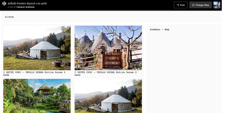
1. Airbnb
Document Layout:
<div class="wrapper"> <header class="header">Airbnb</header> <article class="content"> <div class="panel"> <img src="#" /> <span>Home name</span> </div> <!-- Rest of the home items ... --> </article> <aside class="sidebar">Sidebar - Map</aside> </div>
Main Grid:
.wrapper { margin: 0 auto; display: grid; grid-template-columns: 65% 35%; grid-gap: 16px;}
The wrapper class defines the grid container, the one that holds the core document blocks (article which is the area that the home items are contained, aside which is the sidebar map).
After the display: grid property has been set the layout has been actually defined as a grid where we can use the grid-template-columns to declare track-size of the columns using percentages.
The track-size can be a length, a percentage, or a fraction of the free space in the grid (using the fr unit).
.content { padding: 8px; display: grid; margin: 0 auto; grid-template-columns: repeat(auto-fill, minmax(230px, 1fr)) ; grid-auto-rows: minmax(264px, auto); grid-gap: 16px;}
The main grid contains a secondary container (a sub grid) with a class-name of .content. This represents the area of article element which holds all of the home items.
The sub-grid is defined with both columns as well as rows so that all of the items can be sized to fit.
There are a few new things being used here so let’s break each of them down.
When defining the columns we used repeat(auto-fill, minmax(300px, 1fr)); as:
repeat() essentially avoids the repetition of the declaring the track size for each column, but it gets more interesting when it’s used together with auto-fill.
When auto-fill is given as the repetition number, if the grid container has a definite size or max size in the relevant axis, then the number of repetitions is the largest possible positive integer that does not cause the grid to overflow its grid container.
By using auto-fill with repeat(), we’ve told the Grid to figure out how many items it can fit within the container size automatically without us having to do any additional calculations.
minmax defines a size range greater than or equal to min and less than or equal to max.
If max < min, then max is ignored and minmax(min,max) is treated as min. As a maximum, a value sets the track’s flex factor it is invalid as a minimum.
The fr unit allows you to set the size of a track as a fraction of the free space of the grid container.
For example, the following will set each item to one third the width of the grid container:
minmax allow us to specific the width the item must remain fixed at whilst re-sizing.
With the columns declared we move onto the rows grid-auto-rows: minmax(275px, auto);
We’ve utilizedminmax again here to specific the maximum height of each item being placed on the sub-grid, in this case every home will be 275px.
As a maximum, it is identical to max-content. As a minimum, it represents the largest minimum size (as specified by min-width/min-height) of the grid items occupying the grid track.
auto is used instead of 1fr in the column declaration because we want the width of the item to automatically change based on the width of the column.
@media (max-width: 1100px) { .wrapper { grid-template-columns: 1fr; } .sidebar { display: none; } .content { width: 100%; grid-template-columns: repeat(auto-fill, minmax(360px, 1fr) ) ; grid-auto-rows: minmax(300px, auto); } }
The great thing about the CSS grids in this example is that the layout only required one media query to create a simple responsive layout.
Before I settled on this one breakpoint I set up individual ones for tablet, mobile and so on but I found that it created a jolty change in the size of the home items when re-sizing on the browser so I stuck with one which provided a smoother experience.
The key difference in the layout within the media query is that the main grid which initially contained two columns defined by percentages now has one column defined with the track-size of 1fr (I’ve also hid the sidebar as per the behaviour in production).
Then, for each item the same properties and methods are used but the key difference is that I’ve increased the height and width of the items (360px, 300px).
That’s it for the Airbnb homes page, please review the CodePen example above to see how it works responsively.
2. YouTube
Document Layout:
<div class="wrapper"> <header class="header">Youtube</header> <aside class="sidebar">Sidebar</aside> <article class="content"> <div class="panel"> <img class="panel-img" src="#"> <span class="panel-title">Title of the video</span> <br> <span class="panel-subtitle">346,112 views</span> </div> <!-- Rest of the video items ... --> </article> </div>
Main Grid:
.wrapper { margin: 0 auto; display: grid; grid-template-columns: 15% 85%; grid-gap: 16px;}
The wrapper class is used again to define the main grid. There are two columns in the main grid that are associated with the <article>; and <aside> tags on the document.
I’ve used percentages to define the the track-size of the two columns.
.content { padding-right: 64px; padding-left: 64px; display: grid; margin: 0 auto; grid-template-columns: repeat(auto-fill, minmax(200px, 1fr)); grid-auto-rows: minmax(150px, auto); grid-gap: 8px;}
Another sub-grid has been denoted using the .content property again where it will hold all of the video items.
Please review the Airbnb example above for further explanations of the properties and methods below.
We’ve then defined the grid columns using repeat(auto-fill, minmax(200px, 1fr)); where every video item will be 300px wide and will automatically fill out the 1fr column using auto-fill.
The rows have been defined using the minmax method grid-auto-rows: minmax(150px, auto); where every item has a max width of 200px. The minmax specifies the maximum height of each item being placed on the sub-grid, in this case every home will be a max of 150px.
@media (max-width: 1200px) { .wrapper { grid-template-columns: 2fr; } .sidebar { display: none; } .content { width: 100%; grid-template-columns: repeat(auto-fill, minmax(200px, 2fr)); grid-auto-rows: minmax(150px, auto); }}@media (max-width: 768px) { .content { padding-right: 48px; padding-left: 48px; grid-template-columns: repeat(3, minmax(200px, 3fr)); grid-auto-rows: minmax(150px, auto); }}@media (max-width: 700px) { .content { padding-right: 116px; padding-left: 116px; grid-template-columns: repeat(2, minmax(200px, 2fr)); grid-auto-rows: minmax(150px, auto); }}
There are three different breakpoints used to reflect the responsive layout behavior of the YouTube home page.
The key difference in layout within them is that we hide the sidebar and define different columns for the video items.
For tablet and below, the column amounts are set to 3fr meaning there is 3 specific columns the videos can fit inside until it reaches mobile where it’s fixed to 2fr two columns.
As the layout shrinks the padding around the video items (left, right) increases, ensuring the size of the thumbnails do not increase.
Please review the CodePen example above to see how it works.
3. Pinterest
Document Layout:
<div class="wrapper"> <header class="header">Pinterest</header> <article class="content"> <div class="panel tall-panel"> <img class="panel-img" src="#" /> </div> <!-- Rest of the pin items ... --> </article> </div>
Main Grid:
.wrapper { margin: 0 auto; display: grid; grid-template-columns: 1fr; grid-gap: 16px;}
In the wrapper class, we define the main grid container and one single column with the track size set to 1fr.
.content { padding-right: 40px; padding-left: 40px; display: grid; margin: 0 auto; grid-template-columns: repeat(auto-fill, minmax(240px, 1fr)); grid-auto-rows: minmax(200px, auto); grid-gap: 16px;}
The secondary grid contains all of the pinned items, denoted with the .content class name where we defined the columns and rows.
When defining the columns we used repeat(auto-fill, minmax(240px, 1fr));
With the colums declared we move onto the rows grid-auto-rows: minmax(200px, auto);
We’ve utilised minmax again here to specific the maximum width of each item being placed on the sub-grid, in this case every home will be 200px.
auto is used instead of 1fr in the column declaration because we want the width of the item to automatically change based on the width of the column.
@media (max-width: 1200px) { .content { padding-right: 72px; padding-left: 72px; width: 100%; grid-template-columns: repeat(3, minmax(220px, 1fr) ) ; grid-auto-rows: minmax(200px, auto); } }
A simple media query is used to create a responsive layout where we update the .content class with additional padding around the pins. The key detail on how we handle the pins at this point is changing the auto-fill value in the repeat method to 3 which tells the grid we want no less than three columns at this view port.
That’s it for the Pinterest, a relatively simple layout compare to the others. please review the CodePen example above to see how it works responsively
That’s all for now, I’ll be adding additional layouts throughout the next year and I hope to further the complexity of the layouts each time.
Further learning:
- Most of the key learnings and the basis of this post was from Rachel Andrew’s gridbyexample
- CSS-Ticks: Complete guide grid
- CSS Grid Garden
- CSS Grid documentation
- For creating a grid system from scratch check out what Stuart Robson put together
Originally published at cameronjjenkinson.com.