
By Code Realm
Update (17/05/2018): Material-UI v1.0.0 is out! Check out this post by Olivier.
Huh? Yet another library? What’s wrong with Bootstrap? And why not v0.20?
Great questions! Let’s start with a brief introduction. In a nutshell, Material-UI is an open-source project that features React components that implement Google’s Material Design.
It kick-started in 2014, not long after React came out to the public, and has grown in popularity ever since. With over 35,000 stars on GitHub, Material-UI is one of the top user interface libraries for React out there.
Its success didn’t come without challenges though. Designed with LESS, Material-UI v0.x was prone to common CSS pitfalls, such as global scope, which lead the project on the CSS-in-JS trajectory. This is how next came about in 2016.
The journey towards better style, as Olivier Tassinari puts it, began with inline styles, but their suboptimal performance and limited feature support (think pseudo selectors or media queries), ultimately made the team transition to JSS. And boy did they make a smart choice.
What’s the hype with the v1 release?
It’s bad-ass. Not only does it address the problems inherent with LESS, but it also unlocks a ton of terrific features, including
- dynamic styles generated at runtime
- nested themes with intuitive overrides
- reduced load time with code splitting
And many more. The library is also mature enough to be used in production So much so that the team suggests v1 for all new projects going forward.
Alright, are we gonna build an app, or what?
Glad you asked! For this demo, we’ll build a simple fitness app. Everyone is bored of to-do apps by now anyway, right?
Reading is great and all, but watching is often more fun! Check out this playlist I made on YouTube if you want to build a more advanced app.
Ok, you got me convinced. How do I get started?
We’ll first bootstrap our app with create-react-app
create-react-app mui-fitnesscd mui-fitnesscode .
And what about Material-UI?
If you have yarn, the installation is as simple as
yarn add @material-ui/core
Otherwise, with npm
npm i @material-ui/core
Not long ago, we would specify@next tag to pull in the latest pre-release (for example, it might have looked like v1.0.0-beta.47). Now that both v1 and v0.x are under material-ui scope, we need to reference the core of the library with /core to target the latest release. Don’t miss that last part, or else you’ll end up with the stable0.20 dependency!
Wait, is that really it?
Almost! One last thing is fonts. We’ll go with the recommended Roboto Font from Google’s CDN:
<link rel="stylesheet" href="https://fonts.googleapis.com/css?family=Roboto:300,400,500">
Alternatively, you can pull it in from NPM with
yarn add typeface-roboto# or npm i typeface-roboto
in which case, you’ll need to have an import at the root of your project
// Make sure you only load 300, 400, & 500 font weights though!import 'typeface-roboto'
Done! What do I do next?
Well, let’s refactor our App.js component before we go any further
import React, { Component } from 'react'
export default class App extends Component { state = { exercises: [], title: '' }
render() { return <h1>Exercises</h1> }}
And why not clean up index.js while we’re at it?
import React from 'react'import { render } from 'react-dom'import App from './App'
render(<App />, document.getElementById('root'))
Feel free to remove the remaining files under src, as we won’t need them.
Where does Material-UI come in?
Fair enough, it’s time to see it in action. Let’s change the ugly h1 to a beautiful Typography heading:
import Typography from '@material-ui/core/Typography'
...
render() { return ( <Typography variant='display1' align='center' gutterBottom> Exercises </Typography> ) }}
Note that since v1.0.0-rc.0, MUI moved to
@material-ui/coreand the import path was flattened. This was the last breaking change in the pre-release.
Then go ahead and run yarn start to see the magic.
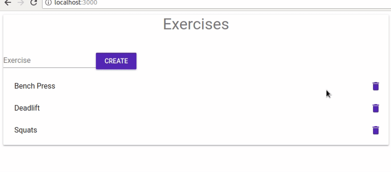
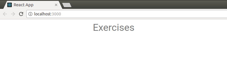 “Display 1” sized heading with bottom margin centered horizontally
We’re on to a good start! Typography component comes with a pre-defined set of type sizes. Other variants include body1, title, display2, and so on. Among other built-in props are align which we use here to center the text horizontally, and gutterBottom which adds a bottom margin.
Why don’t we expand this to a form, so we can create our own exercises? We’ll start with a TextField and bind it to the title on the state
import Typography from '@material-ui/core/Typography'import TextField from '@material-ui/core/TextField'
...
handleChange = ({ target: { name, value } }) => this.setState({ [name]: value })
render() { const { title } = this.state return ( ... <form> <TextField name='title' label='Exercise' value={title} onChange={this.handleChange} margin='normal' /> </form> ) }}
Of course, we’d need to make React happy by wrapping Typography and form with a parent element. What could be a better opportunity for a paper-sheet card-like background? Let’s reach out to Paper then
import Paper from '@material-ui/core/Paper'
...
render() { const { title } = this.state return <Paper> ... </Paper> } }}
It’s also about time to start using named imports (assuming our Webpack setup allows for tree shaking):
import { Paper, Typography, TextField } from '@material-ui/core'
Sweet! And what good is a form without the submit button? Buttons are a staple component in Material-UI; you’ll see them everywhere. For instance,
import { Paper, Typography, TextField, Button } from '@material-ui/core'... <Button type='submit' color='primary' variant='raised' > Create </Button> </form> </Paper> }}
It should read well. type is a regular React prop, color and variant are Material-UI-specific, and make up a rectangle-shaped button. Another variant would be fab for a floating button, for example.
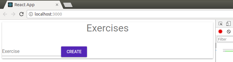 Not the world’s prettiest form, but we’ll make it look better in a moment!
It doesn’t do much though. We’ll have to intercept the form submit event
return <Paper> ... <form onSubmit={this.handleCreate}> ... </form> </Paper> }}
and then handle it with
handleCreate = e => { e.preventDefault()
if (this.state.title) { this.setState(({ exercises, title }) => ({ exercises: [ ...exercises, { title, id: Date.now() } ], title: '' })) } }
Whoa! What’s that cryptic code all about? Very quickly, we
- Prevent the default page reload
- Check if the
titlefield is non-empty - Set the state with an updater function to mitigate async updates
- Destructure
exercisesandtitleoff theprevStateobject - Spread out the
exerciseson the next state with a new exercise object - Reset the
titleto clear out the input field
Guess I should have mentioned that I’m in love with ES6 too. Aren’t we all?
But how do we list them?
Now is the right time to. Is there a list component? Of course, you silly goose!
Inside a List, we’ll loop through our exercises and return a ListItem with some ListItemText for each
import { List, ListItem, ListItemText } from '@material-ui/core'
...
render() { const { title, exercises } = this.state return <Paper> ... <List> {exercises.map(({ id, title }) => <ListItem key={id}> <ListItemText primary={title} /> </ListItem> )} </List> </Paper> }}
Let’s also hard-code a few initial exercises to get something on the screen. You guessed it, the trinity of all weight lifting workouts, ladies and gents:
state = { exercises: [ { id: 1, title: 'Bench Press' }, { id: 2, title: 'Deadlift' }, { id: 3, title: 'Squats' } ], title: '' }
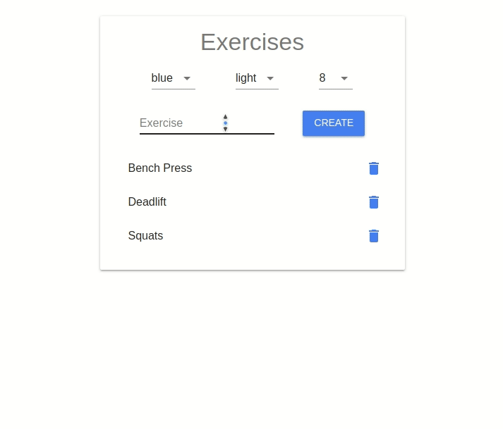
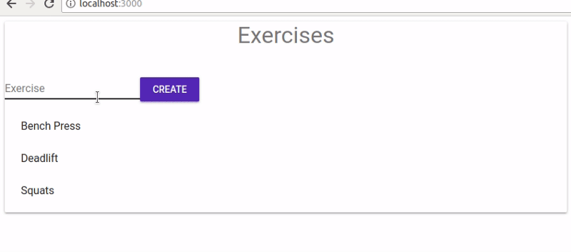 We can now create and list our exercises!
Last but not least, our users are likely to make typos, so we better add a delete button next to each exercise, so they could remove entries they no longer want in their list.
We can use ListItemSecondaryAction to do exactly that. Placed on the far right of the list item, it can hold a secondary control element, such as an IconButton with some action
import { /*...*/, ListItemSecondaryAction, IconButton} from '@material-ui/core'
...
<ListItem key={id}> <ListItemText primary={title} /> <ListItemSecondaryAction> <IconButton color='primary' onClick={() => this.handleDelete(id)} > {/* ??? */} </IconButton> </ListItemSecondaryAction> </ListItem>
...
And let’s not forget the delete handler as well:
handleDelete = id => this.setState(({ exercises }) => ({ exercises: exercises.filter(ex => ex.id !== id) }))
which will simply filter our exercises down to those that don’t match the id of the one that needs to be removed.
Can we have a trash bin icon inside the button?
Yes, that would be great! Though you could use Material Icons from Google’s CDN directly with either Icon or SvgIcon components, it’s often preferable to go with a ready-made preset.
Luckily, there’s a Material-UI package for those
yarn add @material-ui/icons# or npm i @material-ui/icons
It exports 900+ official material icons as React components, and the icon names are nearly identical, as you’ll see below.
Let’s say we wanted to add a trash icon. We’d first head over to material.io/icons to find out its precise name
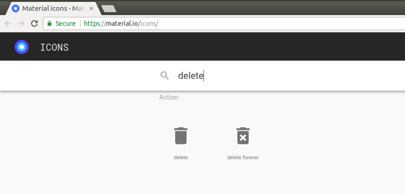 Google offers two variations of the trash icon, “delete” and “delete forever”
Then, we turn that name into PascalCase in our import path
import Delete from '@material-ui/icons/Delete'
Just like with Material-UI components, if your setup has tree-shaking enabled, you could shorten the import to
import { Delete } from '@material-ui/icons'
which is especially useful when importing several icons at once.
Now that we have our trash icon, let’s display it inside our delete button
<IconButton color='primary' onClick={() => this.handleDelete(id)}> <Delete /></IconButton>
 And with that, our CRUD app MVP can be considered done!
How can I make the form look less ugly?
Ah, styling. I thought you’d never ask! A gentle touch of CSS wouldn’t hurt. So then, do we import an external stylesheet with global styles? Or, perhaps, use CSS modules and assign scoped class names to our elements? Not quite.
Under the hood, Material-UI forks a CSS-in-JS library known as react-jss.
It’s a React integration of the JSS library by the same author, Oleg Isonen. Remember we touched on it in the beginning? Its basic idea is to enable you to define styles in JavaScript. What makes JSS stand out among other libs though, is its support for SSR, small bundle size, and rich plugin support.
Let’s give it a try! In our App component, create a styles object just like you would with inline styles. Then, come up with a key, for instance root, referring to the root Paper element, and write out some styles in camelCase
const styles = { root: { margin: 20, padding: 20, maxWidth: 400 }}
Next, import withStyles HOC from material-ui
import { withStyles } from '@material-ui/core/styles'
and wrap the App component with it, passing styles object as the arg
export default withStyles(styles)( class App extends Component { ... })
Note that you could also use
withStylesHOC as a decorator. Keep in mind that create-react-react doesn’t support decorators out of the box yet, so if you insist on using them, you’d need to eject or fork to tweak the config.
This will inject a classes prop into App containing a dynamically-generated class name for our root element
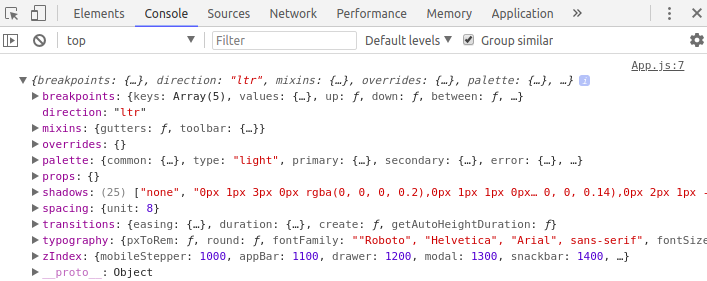
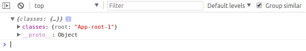 console.log(this.props) reveals a classes object
The class name is guaranteed to be unique, and it will often be shortened in a production build. We then assign it to Paper via className attribute
render() { const { title, exercises } = this.state const { classes } = this.props
return <Paper className={classes.root}> ... </Paper> }
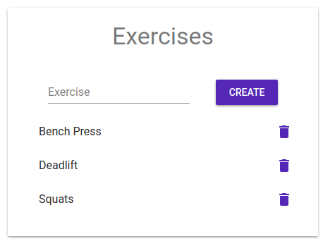
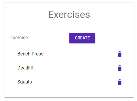 Paper component with basic styling applied
How does this magic work? Turns out, withStyles is responsible for the dirty work. Behind the scenes, it injected an array of styles into the DOM under <style> tags. You could spot them if you dig into the with dev tools
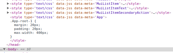 Aha! Here’s our styles for the App component.
You could also see other style tags related to native components, such as MuiListItem for the ListItem component we imported earlier. Those are auto-injected on demand, for each given UI element that you import.
That means that Material-UI will never load any styles for the components that we don’t use. Hence, increased performance and faster load times. This is very different from Bootstrap, which requires loading the entire monolithic CSS bundle, whether you happen to use its vast assortment of classes or not.
Let’s also style the form so it looks neat
const styles = { root: { ... }, form: { display: 'flex', alignItems: 'baseline', justifyContent: 'space-evenly' }}
This will make the text field and the button nicely spaced out. Feel free to refer to align-items and justify-content at CSS-Tricks should you need any further clarification on the Flexbox layout.
 This will hopefully appease our hunger for esthetics.
Sure, but what’s up with theming then?
withStyles HOC is tailored for customizing a one-off component, but it’s not suited for application-wide overwrites. Whenever you need to apply global changes to all components in Material-UI, your first instinct would be to reach out to the theme object.
Themes are designed to control colors, spacing, shadows, and other style attributes of your UI elements. Material-UI comes with built-in light and dark theme types, light being the default.
If we turn our styles into an anonymous function, it will receive the theme object as an arg, so we can inspect it
const styles = theme => console.log(theme) || ({ root: ..., form: ...})
 Default theme object with config variables, as seen in the console
The way you customize your theme is through configuration variables, like palette, type, typography, etc. To have a closer look at all the nested properties and options, visit the Default Theme section of the Material-UI docs.
Let’s say we wanted to change the primary color from blue to orange. First off, we need to create a theme with createMuiTheme helper in index.js
import { createMuiTheme } from '@material-ui/core/styles'
const theme = createMuiTheme({ /* config */ })
In Material-UI, colors are defined under the palette property of theme. The color palette is subdivided into intentions which include primary, secondary, and error. To customize an intention, you can simply provide a color object
import { orange } from '@material-ui/core/colors'
const theme = createMuiTheme({ palette: { primary: orange }})
When applied, the color will then be calculated for light, main, dark, and contrastText variations. For more granular control though, you could pass in a plain object with any of those four keys
const theme = createMuiTheme({ palette: { primary: { light: orange[200] // same as '#FFCC80', main: '#FB8C00', // same as orange[600] dark: '#EF6C00', contrastText: 'rgb(0,0,0)' } }})
As you can see, individual colors can be expressed as both a hex or rgba string (#FFCC80) and a hue/shade pair (orange[200]).
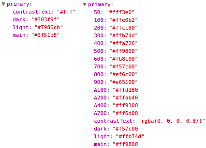 Primary intention with the default blueish colors (left) and orange color object (right)
Creating a theme on its own won’t suffice. To overwrite the default theme, we would need to position MuiThemeProvider at the root of our app and pass our custom theme as a prop
import { /*...*/, MuiThemeProvider } from '@material-ui/core/styles'
const theme = createMuiTheme({ palette: { primary: orange }})
render( <MuiThemeProvider theme={theme}> <App /> </MuiThemeProvider>, document.getElementById('root'))
MuiThemeProvider will then pass down the theme to all its child elements through React context.
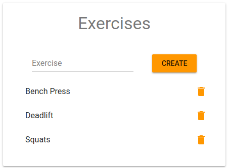 UI elements that inherit the primary color are now displayed in orange.
Though it may seem like a lot of work to change a color, keep in mind that this overwrite will propagate to all components nested under the provider. And apart from colors, we can now fine-tune viewport sizes, spacing, opacity, and many other parameters.
Utilizing config variables when styling your components will aid with consistency and symmetry in your app’s UI. For example, instead of hard-coding magic values for margin and padding on our Paper component, we could instead rely on the spacing unit off the theme
const styles = ({ spacing: { unit } }) => ({ root: { margin: unit, padding: unit * 3, maxWidth: 400 }, form: ...}
theme.spacing.unit comes at 8px by default, but if it’s used uniformly across the app, when we need to update its value, rather than scavenging across the entire codebase, we only need to change it in one place, that is, in our options object that we pass to createMuiTheme.
Theme variables are plentiful, and if you run into a use case that’s not covered by the built-in theme object, you could always define your own custom vars. Here’s a slightly modified version of our fitness app that showcases color palette, theme type, and spacing unit options
 Switching between colors, types, and spacing units on the fly
Note that the example above is only a demo. It re-creates a new theme each time an option changes, which leads to a new CSS object being re-computed and re-injected into the DOM. Most often than not, your theme config will remain static.
There are far more interesting features that we haven’t covered. For example, Material-UI comes with an opt-in CssBaseline component that applies cross-browser normalizations, such as resetting margins or font family (very much like normalize.css does).
As far as components go, we have our standard Grid with a 12-column layout and five viewports (xs, sm, md, lg, and xl). We’ve also got familiar components like Dialog, Menu, and Tabs, as well as elements, such as Chip and Tooltip. Indeed, there’s a whole slue of others, and fortunately, they are all very-well documented with runnable demo code from CodeSandbox
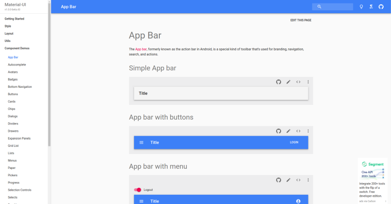 _An example documentation page for the AppBar component [https://material-ui-next.com](https://material-ui-next.com" rel="noopener" target="blank" title=")
Aside from that, Material-UI Next also works with SSR, if you’re into that. Besides, although it comes with JSS out of the box, it can me made to work with just about any other library, like Styled Components, or even raw CSS.
Be sure to check out the official docs for more info.
I hope you found this read useful! And if you like it so much that you are excited to learn more about Material-UI or React, then check out my YouTube channel maybe?
Thanks for stopping by! And big thanks to the team over at Call-Em-All and all the backers who helped to build this awesome library ❤️
Cheers,
Alex