

The United States Census Bureau estimates that more than 12% of the United States' population is living with a disability. Disabilities can include vision difficulties, hearing difficulties, mobility challenges, and much more.
And a person can become disabled at any stage of their life.
Since a significant portion of the population has one type of disability or another, it's important to develop tech that's accessible to everyone. This way we can all consume tech content and no one is left behind.
In this article, we'll cover some best accessibility practices and what you can do to make your mobile apps more accessible.
Add Helpful Descriptions to Each Element
The Center for Disease Control and Prevention's Vision Health Initiative states that,
In 2015, a total of 1.02 million people were blind, and approximately 3.22 million people in the United States had vision impairment (VI), as defined by the best-corrected visual acuity in the better-seeing eye.
In addition, 8.2 million people had VI due to uncorrected refractive error. By 2050, the numbers of these conditions are projected to double to approximately 2.01 million people who are blind, or having VI of 20/200 or worse, 6.95 million people with VI, and 16.4 million with VI due to uncorrected refractive error. (Varma 2015)
One useful accessibility tool for people with little to no vision is a voice over tool. This allows the user to listen to the content of the web page on their phone.
I would like to put you in the shoes of someone who might be using voice over on their phone.
Below is Facebook Marketplace's "reduced price" listings. Just listen to 22 seconds of this voiceover to hear how that section sounds to someone using the tool.
The voiceover says 'Reduced Price, button' to indicate to the user that this section is for reduced price items, and that there is a click action they can take in that particular focus.
Next, the focused element says, "Hide category, button" which again indicates that in this focused element, the user can take an action to hide the category.
Next, the "See all, button" gets focused. This indicates that they can take an action on this element to see all items in the category.
On the next focus, we hear, "No photo description available, button, image". What could this item be? We don't know at this point.
And for the next focused element, we hear the same thing, "No photo description available, button, image". Now two elements in this list have no content for the description.
The next focused element says, "Maybe an image of jewelry, button, image". The word "maybe" in front of the sentence indicates that the voiceover tool is not confident about what the element might be.
"Image of jewelry" is a broad description, especially if you are on a website to shop. Is it a necklace? Is it a ring? Is it an earring? Is it a set of jewelry? What material is it? What does it look like? How much is this jewelry to begin with?
And the last focused element says what we heard from the first two, "No photo description available, button, image".
This is how users with little to no vision have to navigate apps. There were four buttons here, none of them with a description. If you were using this app, which one would you click?
Now, I want to show you the video recording of the same page, which you can see below:
The first item that voiceover mentioned as "No photo description available, button, image" was actually an image of a vintage table from the 1960's and it's free.
The second item is a sticker that costs $3 that says, "I am always with you" with a red bird next to it.
The third item that only had a partial description ("Maybe an image of jewelry, button, image") is a pearl earring that is on sale for $8.
Lastly, the fourth item that said, "No photo description available, button, image" is a Pokeman card of Pikachu, that costs $9.50.
Did you expect this after the first audio clip? Probably not. If you didn't see the image or read the title, you would have no idea what's for sale on Facebook marketplace.
One way to fix this problem is to make sure that each element has an accessibilityLabel with the basic information you'd need to learn what it is without seeing it. The React Native docs tell you that,
"To use, set the
accessibilityLabelproperty to a custom string on your View, Text or Touchable".
An accessibilityLabel is a simple but yet effective way to describe the element for screen reader users.
To show you how this would work, let's code a simpler example together.
For example, we could make the Facebook marketplace table listing by adding an accessibilityLabel to the TouchableOpacity element.
Example code:
<TouchableOpacity
  accessible={true}
  accessibilityLabel="Free, vintage table from the 1960s"
  >
....
</TouchableOpacity>
The code above adds the accessibilityLabel to the element that contains the entire button. We added "Free, vintage table from the 1960s" as the accessibilityLabel.
When screen reader hovers over the element with this attribute, it will read, "Free, vintage table from 1960's, button". This will let the user know the price, a brief description, and the fact that it's a button that they can click on.
This makes this particular element much more accessible for those that rely on screen readers.
Make Sure to Describe the State of the Element
In some elements, you'll need to describe the current state of a component to the user.
For example, if you have a checkbox, you should let the user know if the checkbox is checked or not.
Another common element you'll want to describe is whether buttons are disabled on a page. If the user cannot click on the button, then you should let the user know that there is a button, but it is disabled.
The below LinkedIn post page has an example of a disabled button. The button is not active unless the user types something in the post body:
Example:

LinkedIn post page with focus on dimmed post button.
In the image above, focus is on the disabled Post button. When voice over is focused on that section, it says, "Post, dimmed, button". This lets the user know that this is a button, but they cannot click on it because it is dimmed.
Example code:
In the code below, when you focus on the button, it will say, "Button, dimmed" if its disabled button.
<Button accessibilityState={disabled ? {disabled: true} : {disabled: false}}>
Below are some other ways to let the user know about the state of an element. The screen reader will either say, "Menu item, selected" or "Checkbox, selected" if the menu item or checkbox is selected.
//Menu Item
<Button accessibilityRole={"menuitem"} accessibilityState={selected ? { selected: true } : { selected: false }} />

//Checkbox
<Checkbox label="Checkbox" selected={checked} accessibilityState={checked ? { checked: true } : { checked: false }} />
Context is Important
Since people listen to a description of the page when they're use voiceover, it's important that the context of an element makes sense and is not confusing.
This means that sometimes it makes more sense to group certain elements together. If there is more than one action the user can take in a particular situation, we should attach [accessibilityActions](https://reactnative.dev/docs/accessibility#accessibility-actions) to it.
Unhelpful Example:
Below is a screenshot I took from my LinkedIn app. This section is a link where if I click on it, I will go to another section of the app. This component also has a button where I can take more actions on this particular element.
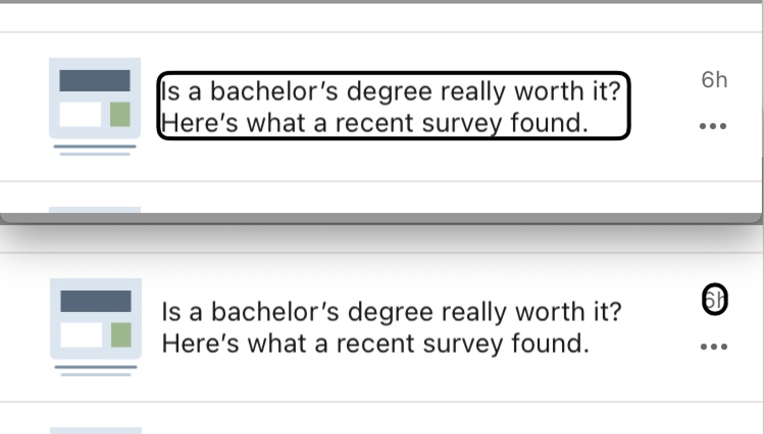
LinkedIn notification that says, "Is a bachelor's degree really worth it? Here's what a recent survey found."In first image, focus is on the title text. On second image, focus is on "6h" which is next to the title.
First, voiceover focuses on the title, "Is a bachelor's degree really worth it? Here's what a recent survey found". The next element that gets focused is "6h", then the focus goes to the three dots where the user can take more actions.
It's confusing when the screen reader says, "6h" – what does that mean? Users that can see the element can understand that this was posted 6 hours ago. But the screen reader just says "6h" which is confusing.
Also, in this one element, the user needs to focus on three different sections of it to derive all the intended meaning.
What would have been better for accessibility is if this component was grouped together and read, "Is a bachelor's degree really worth it? Here's what a recent survey found, posted 6 hours ago, actions available". This way, there is better context for the entire element.
Better example:
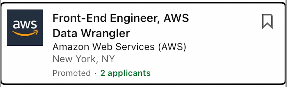
Focused component that reads, "Front-End Engineer, AWS Data Wrangler, Amazon Web Services (AWS), New York, NY," with bookmark button on the right corner.
Above is an example of another section in the LinkedIn app. This section reads, "Front-End Engineer, AWS Data Wrangler, Company, Amazon Web Services (AWS), Location, New York, NY, actions available".
Although the word "company" and "location" are not on the screen, voiceover reads it to give better context for the user. Also, the bookmark button is not another element the user needs to scroll to focus on – it's grouped together, which gives better context for the user.
Example code:
<View
  accessible={true}
  accessibilityActions={[
    { name: 'navigate', label: 'navigate' },
    { name: 'bookmark', label: 'bookmark' },
  ]}
  onAccessibilityAction={(event) => {
    switch (event.nativeEvent.actionName) {
      case 'navigate':
        Alert.alert('Alert', 'Navigated to another page');
        break;
      case 'bookmark':
        Alert.alert('Alert', 'Bookmarked this link');
        break;
    }
  }}
/>
In the example code above, a screenreader will say, "actions available, swipe up or down to view custom actions".
When user swipes up, they will hear "navigate". And after, when they swipe one more time, they will hear "bookmark". If the user wants to select either option, they can double tap when they hear the option that they want. This way, actions have better context.
Wrapping Up
With small changes to your code, you can make apps much more accessible for all users. 12 percent of the United States population is living with a disability and no one should be left behind.
People with disabilities may use tools like screen readers and much more, and it's up to you to make your apps accessible to these tools.
It is everyone's responsibility to make sure tech is accessible to everyone. Thanks for reading!