
By Hari Santanam
Using Python and Folium to clean, analyze and visualize state traffic accident data

I love data science, data visualization and analysis. Recently, I researched a project that piqued my interest — statewide traffic accidents.
Real-life data science processes and tasks are things that data scientists (in the broadest sense) have to do. This includes collecting, collating, cleaning, aggregating, adding and removing parts of the data. It also includes deciding how to analyze the data.
And that’s only the first part! After that, they have to decide how to present the output.
With that said, here is what I did in a recent project.
I collected traffic accident data from the State of New Jersey (NJ), USA for the year 2017. This was the latest year for which there was data on the NJ state government web site.
I am glad for the open policy of sharing data with the citizens, though the data organization is somewhat quirky (my opinion!), and it is not, as might be expected, straightforward.
Here are the steps I took for the project:
- I collected, cleaned, and analyzed the data.
- The data had to be split into two subsets. One set had exact geo-coordinates, one did not.
- Gathered information and prepared data.
- Created heat maps — static and with time that shows accidents by location, for the year, over a map of NJ, for visualization.
Before going forward, I’ll provide some context to those who may not be familiar with the region’s geography.
The state of New Jersey is located to the west of New York City and extends west and south (and a little north).
Basically, drivers going from New York City directly to the rest of the US (except North to the New England region and Canada) by automobile have to pass through NJ. The state has an excellent connection of highways. It also has a dense population of suburbs, and once you get past many kilometers of tightly knit older towns, there are suburban, pastoral and even rural areas.
Data prep and cleansing
Here are the steps I took to clean and prepare the data set:
- Search and research the data. I obtained the data from the New Jersey State government site. Latitude and Longitude (Lat, Long) are geographic coordinate points that can map locations on any point on Earth. Read here for more information about them.
- I used the summary data for the whole state for 2017, the latest year for which there is data.
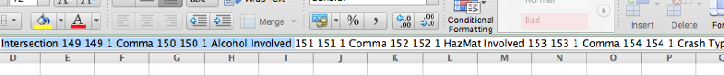
- There is a separate file that lists the headers and their descriptions. I copied the header file into Excel, parsed it, then pasted that using a text editor.

What did these steps find?
Out of approximately 277,000 rows, only 70,000 had latitude and longitude coordinates (or about 26%).
This presented a challenge. After all, the objective of the project is to produce a visual representation overlay of accident data across NJ. Here’s what I did:
I separated the rows with no Lat, Long coordinates into a new pandas dataframe. These rows did have a town name, so I decided to do separate heatmap for the towns for this data.
So there are two sets of heat maps: one for the dataset with precise Latitude and Longitude coordinates, the other for the other data with only town information.
I wrote some code to get the town Lat, Long coordinates for this data. Now this dataset is far larger, comprising 74% of the total data! This is real-life data — often incomplete and in need of cleansing and preparing.
See the initialization code snippet below.
#TSB - Import Tools, read the file, prep the data#the column names are in a different (pdf)file, so they need to be defined here
#tools below required for drawing the map with data overlayed on it
import folium import folium.plugins as pluginsfrom folium.plugins import HeatMapWithTime
import pandas as pdcolumn_names =['Mumbo-jumbo','County Name','Municipality Name','Crash Date','Crash Day Of Week','Crash Time','Police Dept Code','Police Department','Police Station','Total Killed','Total Injured', 'Pedestrians Killed','Pedestrians Injured','Severity','Intersection','Alcohol Involved','HazMat Involved','Crash Type Code','Total Vehicles Involved','Crash Location','Location Direction', 'Route','Route Suffix','SRI (Std Rte Identifier)','MilePost','Road System','Road Character','Road Horizontal Alignment','Road Grade','Road Surface Type','Surface Condition','Light Condition', 'Environmental Condition','Road Divided By','Temporary Traffic Control Zone','Distance To Cross Street','Unit Of Measurement','Directn From Cross Street','Cross Street Name', 'Is Ramp','Ramp To/From Route Name','Ramp To/From Route Direction','Posted Speed','Posted Speed Cross Street','First Harmful Event','Latitude','Longitude', 'Cell Phone In Use Flag','Other Property Damage','Reporting Badge No']#read the file and load into a dataframedf1 = pd.read_csv('/content/drive/My Drive/Colab/NewJersey2017Accidents.txt', header=None)
The first step (defining the dataset, and loading the content) is now done.
Now, the real work begins. Let’s see how much of the content is missing Latitude and Longitude values that are required to make the map work.
We will keep the records with good values in the first dataframe df1 and take the records with no Lat, Long values into a different dataset df2,
For this I will attempt to get the town names so that I can at least identify, on a different map, accident rates in those towns without specific street locations.
The code below will achieve this.
#convert 'Crash Date' field to python pandas readable month/ day/ year format df1['Crash Date'] = pd.to_datetime(df1['Crash Date'], format = '%m/%d/%Y')
#convert Latitude, Longitude columns from string to numericcols_to_convert = ['Latitude', 'Longitude']for col in cols_to_convert: df1[col] = pd.to_numeric(df1[col], errors='coerce')
#Longitude values in the original data didn't have the negative (-) #sign - this code below fixes that by replacing all Lat values with #Lat * -1. Without this, the map displays a totally different part #of the world!df1['Longitude']=df1['Longitude']* -1
#put all records with no data(NaN) for Lat and Long in separate #dataframe (df2)df2 = df1.loc[df1.Latitude.isnull()]#df2 = df1.loc[df1.Latitude.isnull()] & df1.loc[df1.Longitude.isnull()]df2.shape#df2.head()
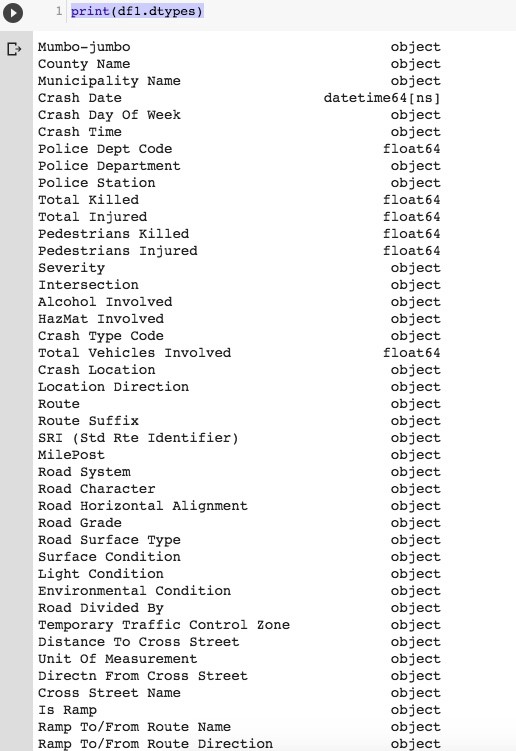
#drop records with NaN in Lat and Long from df1 (they are saved #above in df2)df1 = df1.dropna(subset=['Latitude','Longitude'])df1.shapeprint(df1.dtypes)
#run some queries on dataframe 1 (with Lat, Long available)#list accidents where one or more person killed — very serious ones#not showing the output here, too longprint(df1.loc[(df1['Total Killed'] >= 1.0), ['Municipality Name','Latitude','Longitude', 'Total Killed']])
#show accidents involving cell phone in useprint(df1.loc[(df1['Cell Phone In Use Flag'] == 'Y'),['Posted Speed','Police Station','Latitude','Longitude']])
#show crashes on Fridaysprint(df1.loc[(df1['Crash Day Of Week'] == 'FR'),['Municipality Name','Posted Speed','Police Station','Latitude','Longitude']])
#show crashes for specific town and speed limitprint(df1.loc[(df1['Municipality Name'] == 'WATCHUNG BORO'), ['Municipality Name','Posted Speed','Police Station','Latitude','Longitude']])
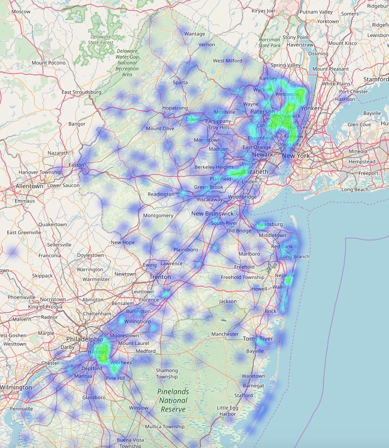
Create some Heat Maps
Let’s get the location overlaid on a heat map. We can also make a heat map to show changes over time.
#define a base map generator function#-note - if folium doesn't work properly(it didn't, at first, for me #:) - in Google Colab - I uninstalled Folium, re-started kernel and #re-installed Folium#I also saved to file as pressing run didn't output results
def generateBaseMap(default_location=[40.5397293,-74.6273494], default_zoom_start=12): base_map = folium.Map(location=default_location, control_scale=True, zoom_start=default_zoom_start) return base_map
base_map = generateBaseMap()base_map
#apply the heat map to the base map from above, and save 'm'(output) # to a file. As explained at the top of the code notes, Run didn't #work for me. I opened saved file in browser to see output
m = HeatMap(data=df_map[['Latitude', 'Longitude', 'count']].groupby(['Latitude','Longitude']).sum().reset_index().values.tolist(), radius=7, max_zoom=10).add_to(base_map)m.save('/content/drive/My Drive/Colab/heatmap.html')
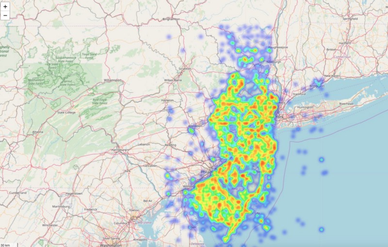

That’s good — now let’s see a heat map over time.
from folium.plugins import HeatMap#first, copy all data [all 2017 county accidents] to our map #dataframedf_map = df1.copy()
#set count field to 1 initially. Then, group by Lat, Long and count #how many are in each set of coordinates to create base map data
df_map['count']=1df_map[['Latitude', 'Longitude', 'count']].groupby(['Latitude', 'Longitude']).sum().sort_values('count', ascending=False).head(10)
base_map = generateBaseMap()base_mapm = HeatMap(data=df_map[['Latitude', 'Longitude', 'count']].groupby(['Latitude','Longitude']).sum().reset_index().values.tolist(), radius=7, max_zoom=10).add_to(base_map)m.save('/content/drive/My Drive/Colab/heatmap_with_time-1.html')
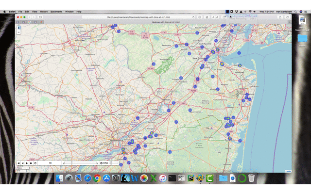
Controls on the output file (rendered in browser) — control speed and play buttons. The ‘83’ is the day in this example.
Part 2 — Create Heat Maps of the 2nd dataset
Earlier, we split the dataset and created a data set df2 for those records without specific Latitude and Longitude coordinates.
The reasons for this could be many. Perhaps the data was contaminated at the time of capture, or the police officers were too busy with first responder duties to input precise information.
Whatever the reason, let’s get location data for the towns. This turned out to be more complicated than I had imagined. It could simply be that I didn’t think of an optimal way. This is the way I did it.
In real work situations, many a time you will have to go for the ‘most viable solution’, which means the best that is possible given the time, environmental constraints and incomplete data.
#create a list of unique town names from df2 for use later to make a #call to function to get Lat, Long - easy to read each value from a #listtown_names=[]df2.dropna(subset=['Municipality Name'])town_names = df2['Municipality Name'].unique()print(town_names)
This is what we do in the next few steps. Take the list of unique town names that we just created. Then use a function to make an API call to maps.google to get the Latitude and Longitude coordinates.
Take the dataframe with town accident rates aggregated by town (grouped) and merge that with the list that has Lat and Long coordinates created in the step above.
Then, call the plot function to create a heat map like we did before for the first dataset.
#call a previously created function (listed in the gist - link is #below this code box and output), then store google geo #coordinates #in a csv file.
#Ensure that you have API token:click link to find out how:# Google maps API tokenLat_Long=[]API_KEY = 'YOUR API KEY HERE'for address in town_names: geocode_result = get_google_results(address, API_KEY, return_full_response=RETURN_FULL_RESULTS) Lat_Long.append(geocode_result)
#now, convert the list with our geo coordinates into a csv file that #will be called by another program to overlay on a map.pd.DataFrame(Lat_Long).to_csv('../Colab/town_with_Lat_Long_output.csv', encoding='utf8')
#read the csv file that has the latitude and longitude for the #records in df2, which originally did NOT have lat and longdf6 = pd.read_csv('/content/drive/My Drive/Colab/town_with_Lat_Long_output.csv')df6.shape
#merge the two datasets - one has town names and geo coordinates, #the other has town names and aggregate accident info
df7 = pd.read_csv('/content/drive/My Drive/Colab/df5_output.csv')dfinal = df6.merge(df7, on="Municipality Name", how = 'inner')
#now we draw the heat map for the 2nd dataset finally!
from folium.plugins import HeatMapdef generateBaseMap(default_location=[40.5397293,-74.6273494], default_zoom_start=12): base_map = folium.Map(location=default_location, control_scale=True, zoom_start=default_zoom_start) return base_map
base_map = generateBaseMap()base_mapm = HeatMap(data=dfinal[['latitude', 'longitude', 'count']].groupby(['latitude','longitude']).sum().reset_index().values.tolist(), radius=7, max_zoom=10).add_to(base_map)m.save('/content/drive/My Drive/Colab/heatmap_town_total_accidents_2017.html')
The gist for the code is here.
Thank you for reading all the way through. If you are a novice, each data science project is an adventure — hang in there. Unexpected (and expected) issues will arise — but so will your ingenuity, talent and application of other coders’ experiences, to get to the solutions you seek.
Please give me a clap if you liked the article!