

Want to build a responsive website with color themes? Start at the root.
If you happen to drop by my website, you may notice I’ve spruced it up a bit. Victoria.dev can now better respond to your devices and preferences.
Most modern devices and web browsers allow users to choose either a light or dark theme for the user interface. With CSS media queries, you can have your own website's styles change to match this user setting!
Media queries are also a common way to have elements on web pages change to suit different screen sizes. This is an especially powerful tool when combined with custom properties set on the root element.
Here's how to use CSS media queries and custom properties to improve your visitor's browsing experience with just a few lines of CSS.
How to Cater to People's Color Preferences
The prefers-color-scheme media feature can be queried to serve up your user’s color scheme of choice. The light option is the go-to version if no active preference is set, and it has decent support across modern browsers.
Additionally, users reading on certain devices can also set light and dark color themes based on a schedule. For example, my phone uses light colors throughout its UI during the daytime, and dark colors at night. You can make your website follow suit.
Avoid repeating a lot of CSS by setting custom properties for your color themes on your :root pseudo-class. Create a version for each theme you wish to support. Here’s a quick example you can build on:
:root {
    color-scheme: light dark;
}

@media (prefers-color-scheme: light) {
    :root {
        --text-primary: #24292e;
        --background: white;
        --shadow: rgba(0, 0, 0, 0.15) 0px 2px 5px 0px;
    }
}

@media (prefers-color-scheme: dark) {
    :root {
        --text-primary: white;
        --background: #24292e;
        --shadow: rgba(0, 0, 0, 0.35) 0px 2px 5px 0px;
    }
}
As you can see, you can use custom properties to set all kinds of values. To use these as variables with other CSS elements, use the var() function:
header {
    color: var(--text-primary);
    background-color: var(--background);
    box-shadow: var(--shadow);
}
In this quick example, the header element will now display your user’s preferred colors according to their browser settings.
Preferred color schemes are set by the user in different ways, depending on the browser. Here are a couple examples.
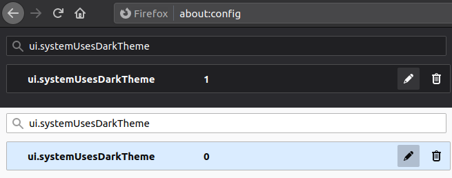
Light and Dark Mode in Firefox
You can test out light and dark modes in Firefox by typing about:config into the address bar. Accept the warning if it pops up, then type ui.systemUsesDarkTheme into the search.
Choose a Number value for the setting, then input a 1 for dark or 0 for light.
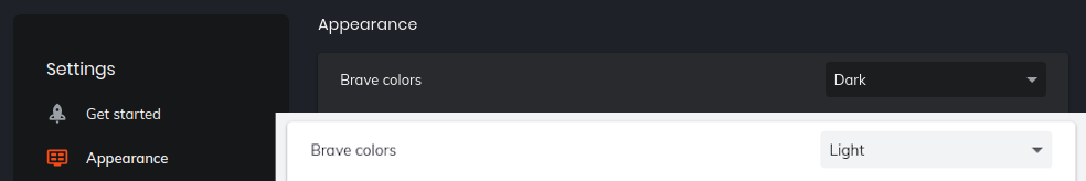
Light and Dark Mode in Brave
If you’re using Brave, find color theme settings in Settings > Appearance > Brave colors.
How to Use Variable Scaling
You can also use a custom property to effortlessly adjust the size of text or other elements depending on your user’s screen size. The width media feature tests the width of the viewport.
While width: _px will match an exact size, you can also use min and max to create ranges.
Query with min-width: _px to match anything over _ pixels, and max-width: _px to match anything up to _ pixels.
Use these queries to set a custom property on the :root to create a ratio:
@media (min-width: 360px) {
    :root {
        --scale: 0.8;
    }
}

@media (min-width: 768px) {
    :root {
        --scale: 1;
    }
}

@media (min-width: 1024px) {
    :root {
        --scale: 1.2;
    }
}
Then make an element responsive by using the calc() function. Here are a few examples:
h1 {
    font-size: calc(42px * var(--scale));
}

h2 {
    font-size: calc(26px * var(--scale));
}

img {
    width: calc(200px * var(--scale));
}
In this example, multiplying an initial value by your --scale custom property allows the size of headings and images to magically adjust to your user’s device width.
The relative unit rem will have a similar effect. You can use it to define sizes for elements relative to the font size declared at the root element.
h1 {
    font-size: calc(5rem * var(--scale));
}

h2 {
    font-size: calc(1.5rem * var(--scale));
}

p {
    font-size: calc(1rem * var(--scale));
}
Of course, you can also multiply two custom properties. For example, setting the --max-img as a custom property on the :root can help to save you time later on by not having to update a pixel value in multiple places:
img {
    max-width: calc(var(--max-img) * var(--scale));
}
Raise your responsiveness game
Try out these easy wins for a website that caters to your visitor’s devices and preferences. I’ve put them to good use now on victoria.dev. I invite you to let me know how you like it!
If you enjoyed this post, there's a lot more where it came from. Subscribe on victoria.dev to see new articles first.